Even if your site is well-structured and elegantly designed, sometimes you just need to go a little above and beyond in order to make your headings stand out and attract the attention of your viewers.
One simple solution to this issue is trying out unique fonts for your headers, thus differentiating yourselves from all the other WordPress sites using the same small family of fonts.
As far as headers and titles are concerned, serif fonts are perfect in order to achieve high-impact designs, so let’s take a look at thirty of the best ones available (but not before we teach you how to install them).
Subscribe To Our Youtube Channel
- 1 How to Add Fonts to Your WordPress Website
-
2
30 Sans Serif Fonts Perfect for Website Headings
- 2.1 1. Bebas Neue
- 2.2 2. Aileron
- 2.3 3. Simplifica
- 2.4 4. Corbert Condensed Italic
- 2.5 5. Baufra
- 2.6 6. Bitner
- 2.7 7. DyeLine
- 2.8 8. Glober
- 2.9 9. Proza
- 2.10 10. Gentona
- 2.11 11. Penna
- 2.12 12. Overpass
- 2.13 13. Foobar Pro
- 2.14 14. Audrey
- 2.15 15. Raleway
- 2.16 16. Fjalla One
- 2.17 17. Gudea
- 2.18 18. Paytone One
- 2.19 19. Allerta
- 2.20 20. Quantico
- 2.21 21. Belleza
- 2.22 22. Capriola
- 2.23 23. Wire One
- 2.24 24. Mosk Typeface
- 2.25 25. Zefani
- 2.26 26. Elianto
- 2.27 27. Ikaros
- 2.28 28. Coco
- 2.29 29. Bavro
- 2.30 30. Linotte
- 3 31. Exo
- 4 32. Roboto
- 5 33. Lato
- 6 34. Ubuntu
- 7 35. Open Sans
- 8 36. PT Sans
- 9 Conclusion
How to Add Fonts to Your WordPress Website
The entire process is straightforward, and we’re pretty sure most of you are already familiar with it – but just in case, let’s go over the two simplest methods to install additional fonts for use in WordPress.
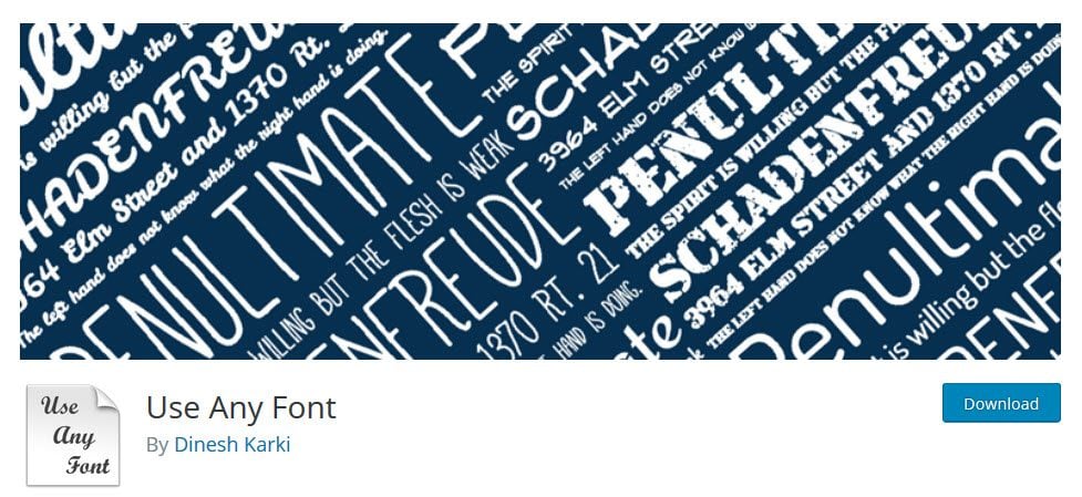
If you want to go the manual route, you can install each font you intend to use via CSS, which shouldn’t take long at all. Otherwise, we recommend the Use Any Font plugin, which takes care of all the code behind the scenes and only requires you to upload the font files using an intuitive interface.
30 Sans Serif Fonts Perfect for Website Headings
1. Bebas Neue
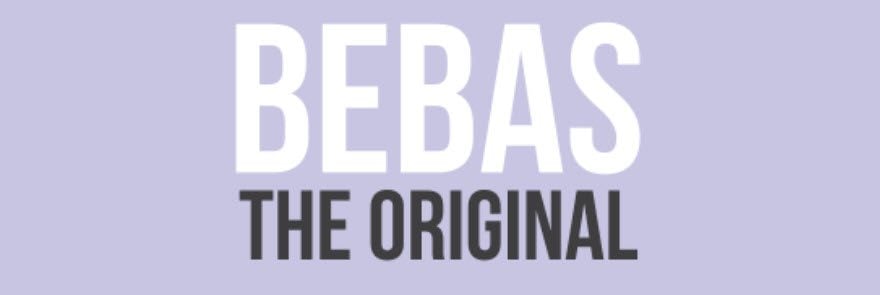
Bebas Neue is a pretty popular sans serif font – so popular in fact, that its creators aren’t afraid to refer to it as the “Helvetica of the free fonts”, and it’s pretty easy to see why. The typeface features a simple, bold design with multiple weights, which lends itself perfectly to any no-nonsense heading.
2. Aileron
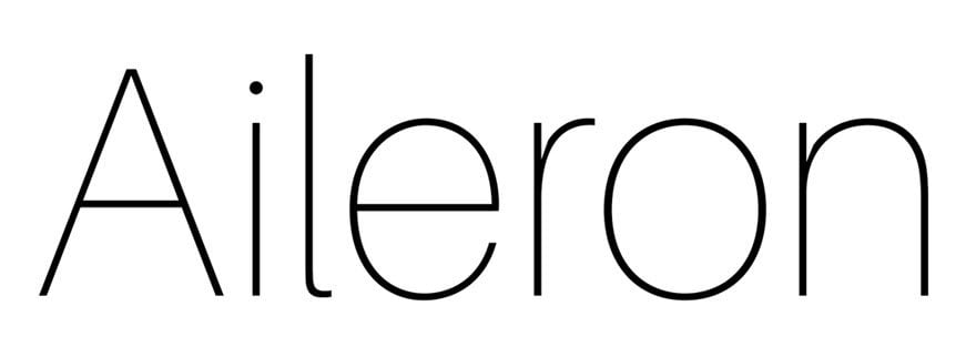
Aileron is available in ten different styles, ranging from the ultra-thin all the way to the bold. Its letters are somewhat condensed and they have pretty short arms, giving them a stocky, solid feel perfect for sober titles.
3. Simplifica
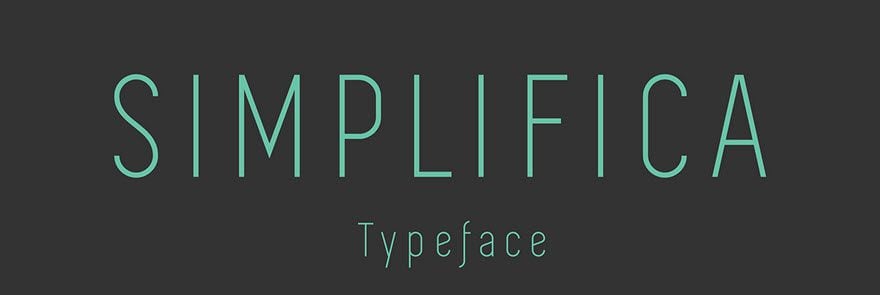
Simplifica is a sans serif font which is easily distinguished thanks to its uniform design, with thin stems and short arms. This serves to pull the eye upwards, and with a little tracking, you can obtain pretty pleasing results as far as headings go.
4. Corbert Condensed Italic

As its name implies, this font is the condensed version of the original Corbert font, with its letters being 15% closer than those of its parent. This lends itself pretty well to any designs which require a little bit of additional weight to them.
5. Baufra
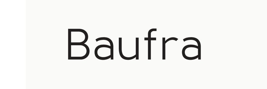
Baufra bills itself as a humanist sans serif font, influenced by those of the early 20th century. It combines geometric design with soft lines, resulting in a very pleasing effect. The font comes in six different weights and its kerning can be manually edited.
6. Bitner

According to its creators, the design of this font was inspired by the cryptocurrency movement – Bitcoin mining, to be more specific. It’s a somewhat geometric typeface, with short arms and prominent bowls, and comes in seven different variations with multiple OpenType features.
7. DyeLine
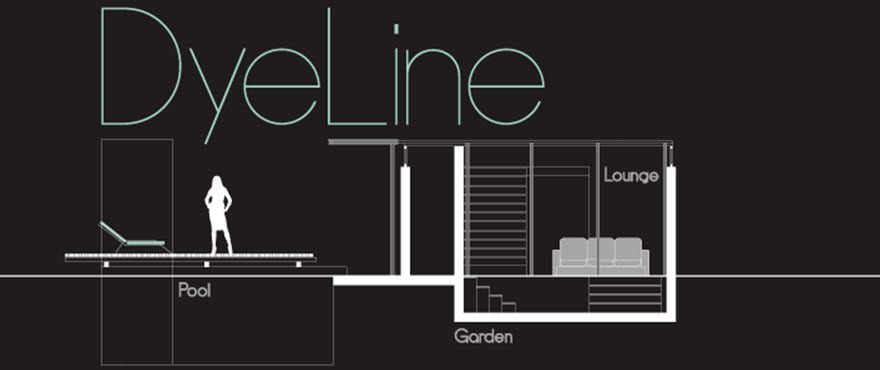
DyeLine is a font with a distinct geometric design, inspired by the clean lines of architectural drawings and blueprints. Its letters are noticeably condensed, with high cap-heights and thin stems – giving it a clean, modern look.
8. Glober
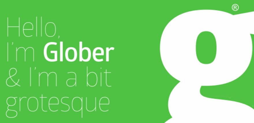
The Glober family of typefaces (which encompasses 18 different weights) is defined by its stylish geometric designs with softened finishes. They’re well suited for high-density text designs, but mostly excel when it comes to creating titles and headings.
9. Proza
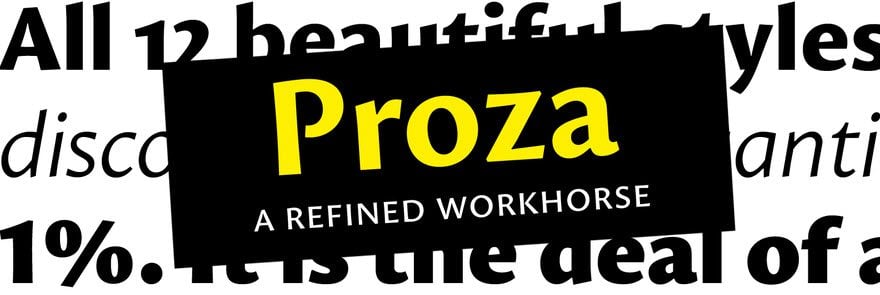
Proza is a sans serif font whose design was inspired by Renaissance typefaces such as Garamond and Jenson. It was created to work well across a wide variety of resolutions, making it usable both for text-based projects and large designs. Its designer, Jasper de Waard, worked on this typeface for approximately two years, starting when he was just 16 years old (by then he already had a font up on Google Fonts).
10. Gentona
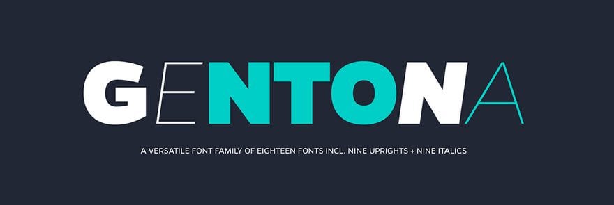
Gentona is a sans serif font designed to be used across a wide range of designs, with an emphasis on contemporary sensibilities and inspired other grotesque typefaces. Its letters go from the sleek to the robust, making the font quite visually striking.
11. Penna
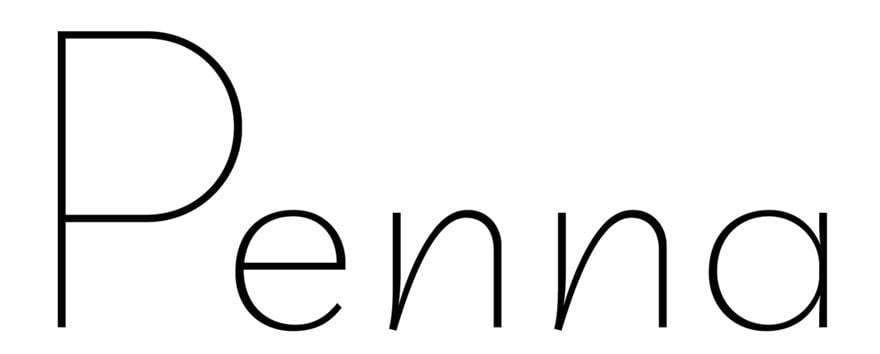
Penna is a unique font with thin stems and slanted strokes, which give it quite a playful look. It’s perfect for sites looking for a typeface that complements a minimalist look, but that can also be used to great effect in sleek headings.
12. Overpass

Overpass is an open-source font inspired by Highway Gothic and sponsored by RedHat – the folks behind the Linux distro with the same name and Fedora. It’s a simple, no-nonsense font which wouldn’t look out of place on any heading and with six different weights available.
13. Foobar Pro

Foobar Pro is a sans serif font with some truly amazing language support. It contains a few rather unusual diacritic letters which enable it to support Cornish, Guarani, Malagasy, and plenty of other languages that none of us are familiar with. However, if you happen to need a font that does support unusual languages for one of your projects, you know where to look.
14. Audrey
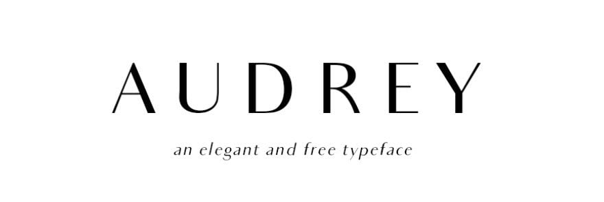
This classy font was, of course, inspired by the immortal Audrey Hepburn, and created by Cristina Pagnotta. It comes in three different weights and two variations, with sleek lettering and a great use of tracking, which gives the text an elegant look.
15. Raleway

Raleway is an elegant font with standard ligatures, which was originally designed as a single weight by Matt McInerney. The project was then picked up and expanded into eight additional styles by Pablo Impallary and Rodrigo Fuenzalida, and is still being updated to this day.
16. Fjalla One

Fjalla One is a study font with condensed letters and a medium contrast, designed specifically to look great on screens of all sizes. It’s an open-source font, which means anyone can contact its creator and contribute to its development.
17. Gudea

Gudea is a simple, functional typeface with a condensed structure which was originally designed to be used in labels and maps. However, despite not having a glamorous origin, it has grown into a versatile family of fonts that can seamlessly adapt to multiple kinds of designs – although it remains especially well suited for projects of a technical nature.
18. Paytone One

Paytone One is the brainchild of Vernon Adams – an experienced typeface designer with approximately 20 fonts to his name on Google Fonts alone. This particular typeface was designed to be used in headlines on modern sites and features a casual, playful appearance.
19. Allerta

Allerta is a font designed with signage in mind. It was created in order to be legible at long distances, and in order to achieve this effect, its designer sought to enhance the unique aspects of each letter, thus making them more recognizable.
20. Quantico

Quantico’s design was inspired by old beer packagings and military letters, making it by far the manliest font included in this list. It has a bold, geometric design, with 30-degree angles, which makes it pretty unique as far as looks go.
21. Belleza

Belleza is a classy sans serif font which takes its cues from the world of high fashion, using classic proportions and high contrasts.
22. Capriola

Capriola is a quirky font, whose design was based on basic forms seen in regular handwriting using single movements. Some of its letters include unusual glyphs, which are perfect to give headings a unique touch.
23. Wire One

Wire One is a modular sans serif font inspired by art nouveau sensibilities. Its letters are incredibly thin, which makes the font unsuitable at small sizes, but it remains quite striking (in a minimalist sort of way) when used in titles or headings.
24. Mosk Typeface
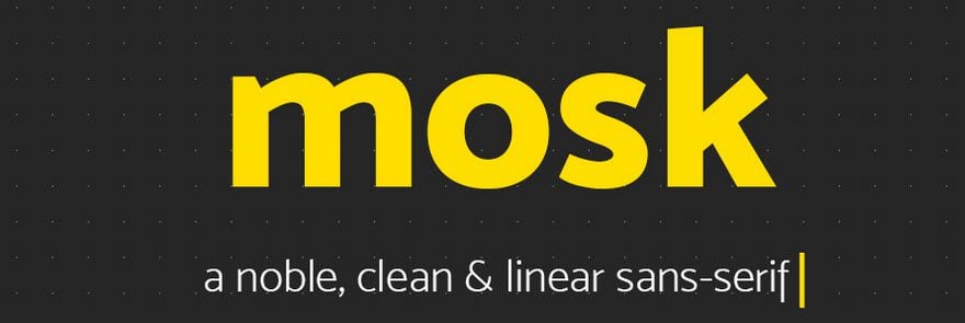
Mosk is an all-lowercase typeface with a clean linear look, that comes in nine different weights.
25. Zefani
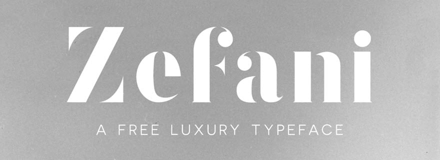
Zefani is a Didone typeface with bold lines, which was designed to give an impression of luxuriousness. It’s perfect for classical, high-end headlines.
26. Elianto
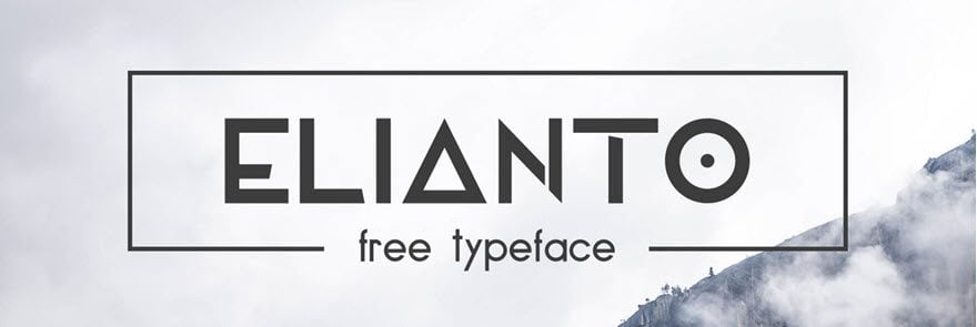
Elianto is quite different from all of the other fonts featured on this list. Many of its letters feature unique shapes and glyphs which may make it look a bit gimmicky, but surprisingly, it comes together quite nicely on headings. If you’re looking for something out of the ordinary, you might want to give this one a try.
27. Ikaros

Ikaros is a minimalistic typeface with a very narrow tracking. This high condensation makes it kind of difficult to read if you’re dealing with a lot of text, but it’s quite workable when it comes to headings.
28. Coco
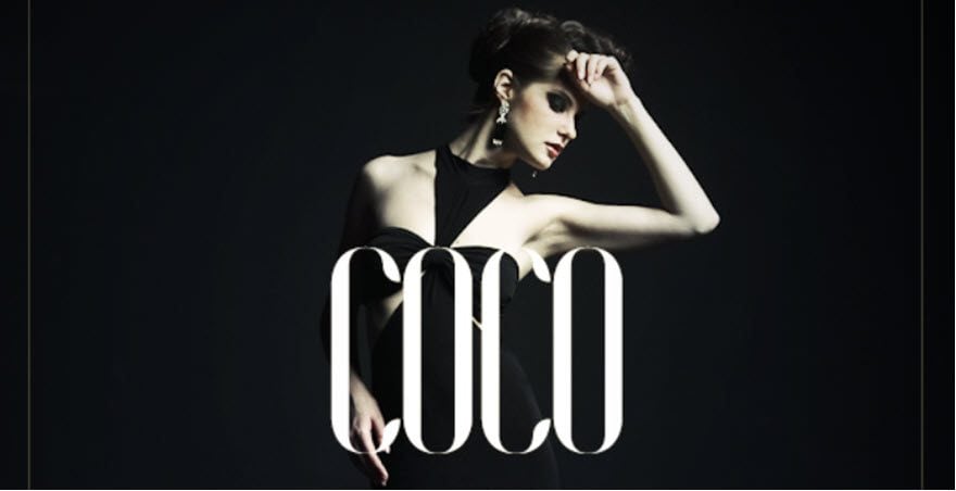
Coco is a sleek font meant for fashion projects, with high cap-heights and thin stems. It’s pretty much the kind of typeface you’d expect to find on the bottle of an expensive perfume.
29. Bavro
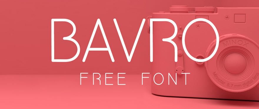
Bavro is a simple, clean font perfect for headings, developed by Marcelo Reis Melo, and available for free in multiple formats.
30. Linotte
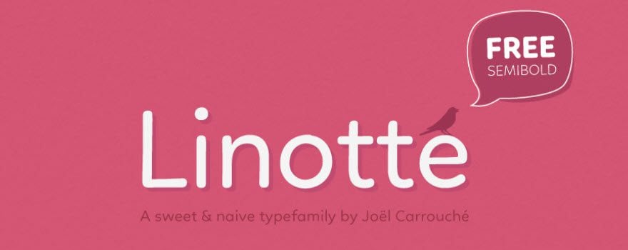
Linotte is a sans serif typeface with a rounded, friendly look to it. That, on top of a few small design quirks, make this font a good choice for projects that require a more down to earth look.
31. Exo

Exo is a fun font. With both smooth curves and defined edges and ends to the letters, Exo has a sleek modern look that will definitely garner attention.
32. Roboto

Probably my favorite body font to pair with Exo (above), Roboto also works amazingly as a header. It’s clean and refreshing, and any visitor’s attention will be drawn this way.
33. Lato

Elegant, round, and eye-catching, Lato is becoming a staple in many designers’ toolkits.
34. Ubuntu

Named after the popular Linux distribution, Ubuntu mimics the system font of that operating system. All that’s left to say is: sudo apt-get this font
35. Open Sans

No list of sans-serif fonts would be complete without mentioning Open Sans. Quickly becoming as ubiquitous as Arial or Helvetica, once you use it, you’ll know why.
36. PT Sans

Rounding out our list is PT Sans. When you need a good, stable font that won’t be distracting, but at the same time need something that’s not quite seen everywhere, PT Sans is your answer.
Conclusion
A catchy font alone won’t automatically make your headlines more compelling, but it can certainly have a positive impact on how your readers perceive your designs.
Sans serif fonts tend to be far bolder than their serif counterparts, making them perfect for headings. If you didn’t quite find what you were looking for in this list, feel free to take a look over some of your favorite sources for outstanding fonts, such as Google Fonts, Behance, and Font Squirrel.
Do you prefer sans serif or serif fonts when it comes to headings and titles? Subscribe to the comments section below and share your opinion with us!
Article thumbnail image by annamiro / shutterstock.com





4 of these are from: thenorthernblock.co.uk/fonts !!
– Corbert
– Baufra
– Bitner
– DyeLine
Thanks for sharing them Tom!
No problem, Scott!
thanks for Sharing, Tom!
Bebas Neue is my go-to for Youtube Thumbnails.
Excellent article, it’s always very frustrating for me to choose a font because in my mind, they all deliver the same message. However, I know that to be false and generally ask someone more creative than myself to choose the font :P.
If I use Use Any Font, how can I change the font of the main menu?
Hi Tal,
I’m afraid I’m not sure what you’re asking – are you referring to the menu text of your theme?
Cheers,
Tom
Hi, lovely fonts. But how can I get these amazing fonts in Divi?
With regards
Thank you for framing this article as you have. Much better than your serif article. Nice variety of fonts, too.
Just one point: Use Any Font is pay plugin and quite useless, free version only 1 font family. It should be mentioned in the post. Check Google Fonts form more falilies.
The materials were of great help
Beautiful new suggestions. Thank you so much!
You’re welcome Anja 🙂
Overpass, I choose you!
I think this font is the most suitable font for website, especially wordpress. Many people use TNR or Calibri or other fonts that I didn’t know. The most cool one is Overpass, the design is simple and also elegant for me 😀
Glad you like it Vitta!
Great collection. Mentioning the font range (latin, cyrillic, … ) would be very helpful to international readers.
Great Collection, I would always recommend this post if anyone is looking for best fonts for their blogs and also these days most of the wordpress themes comes with inbuilt google fonts future
I very love this blog….one of my fav when surfing internet. Thank you so much!
Thanks, Tom for a great article! Could you also do one on Body Text fonts? Readability at small sizes and uniqueness to stand apart from Default Sans would be helpful…
Nice idea Randy – I’ll see if we can work on that!
Nice! Thanks for this.
Great font collection. Thank you for taking the time to research and share.
Awesome tips in fonts.
This is amazing font use!! One of the best blogs to follow. Thank you
I agree. It’s what compelled me to join them. Now how can I make such a great blog for my site…hmmm