Beauty blogs are one of those kinds of websites that have a lot of relevant content aimed at a specific target audience. The bloggers behind these sites are usually very active and try to keep their visitors as up-to-date as possible with all kinds of tips revolving around beauty; from makeup to skin care, health and more. One thing you might not have known is that many of these beauty blogs use WordPress as their content management system. For this post, we’ve created a list of 11 amazing beauty blogs made with WordPress for you to discover and keep in mind while designing your next beauty blog.
1. Remarques
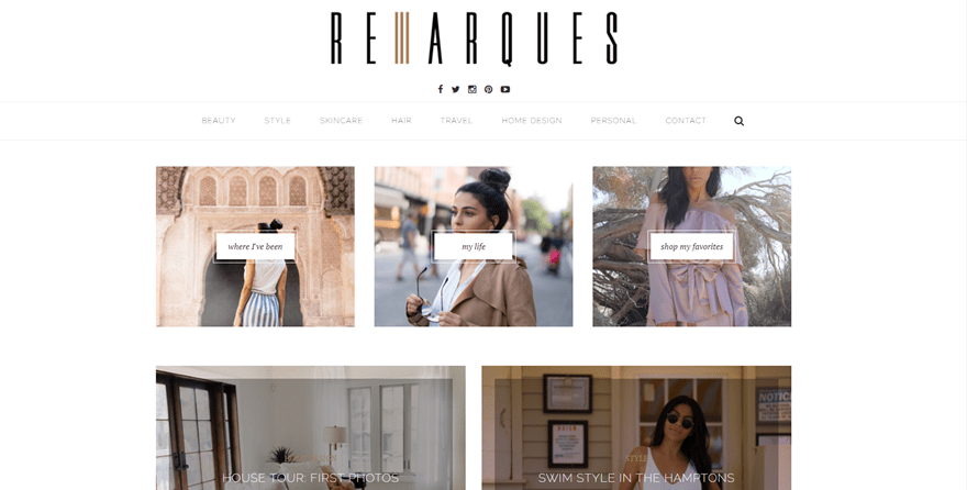
The first beauty blog in the row is called Remarques. You can find all kinds of content on this blog but the main topics that are discussed are beauty-related, such as makeup, skincare and hair. The first thing we notice is that the homepage and menu are nicely balanced. The posts on the homepage are carefully selected and beautifully presented. Instead of filling the homepage with all kinds of posts, the menu items contain a preview of the last three articles that can be found in that specific category. This allows visitors to quickly find the content they’re looking for without being overwhelmed.
2. Manface
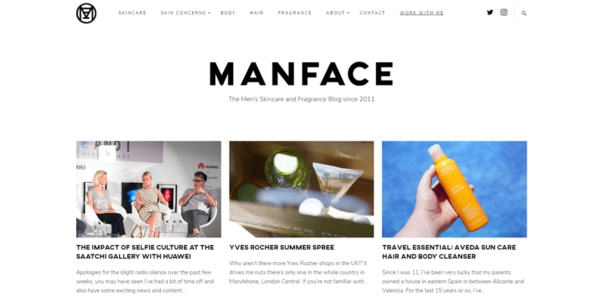
The next beauty blog on the list, Manface, is focused on all kinds of beauty factors that are relevant to men. It is definitely a go-to for men who want to explore different tips and products; from skincare to body, hair and fragrance. In contrast with Remarques, the previous beauty blog we’ve shared in this post, this website shares a lot more of their content on the homepage. The menu, on the other hand, is rather simple yet easy to navigate through.
3. The Formula
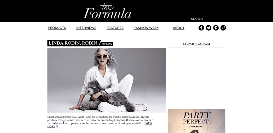
Next up, we also have The Formula blog which looks amazing. This website puts its design focus on giving that black and white balance to their website which they absolutely manage to pull off. The website is simple yet provides all the information a visitor could be looking for. The menu items seem like they are just hyperlinked, but as soon as you hover over them they catch you by surprise by showing a drop-down menu. They also have a beautiful way of showing the title along with the category a post belongs to.
4. Barefoot Blonde
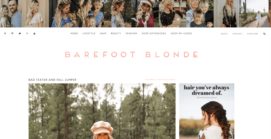
Then, we also have the Barefoot Blonde beauty blog. This website definitely emphasizes the person behind the beauty blog and uses Instagram posts on the top of the page along with the social icons to continue the storytelling process elsewhere as well. Besides that, the entire website focuses on the visual part of each post and allows visitors to share the article without having opened it yet.
5. Very Good Light
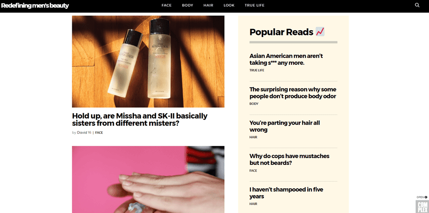
Up next, we have the Very Good Light beauty blog for men. This blogging website gives the men out there all the tips they need for their face, body and hair. One of the very pleasant things about this website is the scrolling animation that keeps you interacted with the content that you come across on their website. In overall, this beauty blog is very easy to navigate through and provides its visitors with the content they’ve created in a very straightforward and user-friendly way.
6. Beauty is Boring
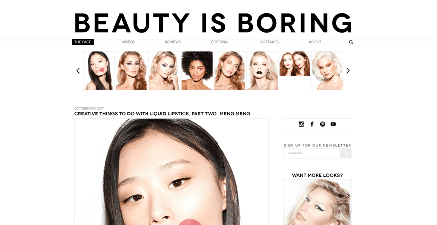
The next beauty blog we want to put in the spotlight is Beauty is Boring. This website uses mainly black and white colors throughout their website. However, they do manage to combine that beautifully with the images they use throughout the website. This beauty blog has a very recognizable way of creating their posts. Although each post is different, they use the same kind of visualities. At the end of each post, and even on their homepage, they share all the items that were used in a post and where they can be purchased; super easy for people who want to get to it right away.
7. Maskcara
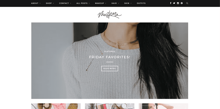
Another simple yet elegant beauty blog is Maskcara. The website starts with a slideshow of featured posts that immediately makes sure the visitors are up-to-date about all the new content that’s being provided on the blog. This beauty blog has everything you’d expect a beauty blog to have and finishes the homepage by showing visitors the latest Instagram posts from the beauty blogger.
8. Jaclyn Hill Makeup
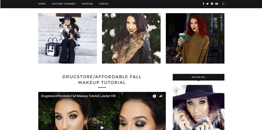
The well-known beauty blogger, Jaclyn Hill, has a pretty awesome website as well. Something we’ve seen in some of the previous beauty blogs, we see in this blog as well; the combination of black and white colors throughout the web design. That’s not such a coincidence. Most of these websites provide makeup tutorials that are already pretty colorful. By using black and white colors throughout their website, they make sure their web design matches the colors that are being used within the tutorials.
9. Nikkie Tutorials
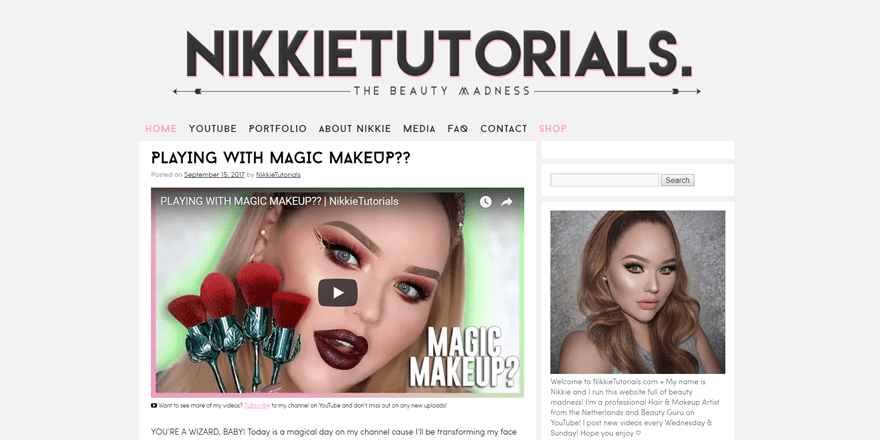
Talking about well-known beauty bloggers and makeup artists; Nikkie Tutorials definitely belongs on that list as well. Like the Jaclyn Hill website, this website is mostly used to share the video content from her YouTube channel. The website design is sober but it looks very elegant at the same time. The right sidebar bio’s purpose is to make people immediately recognize the beauty blogger’s identity and brand.
10. Amelia Liana
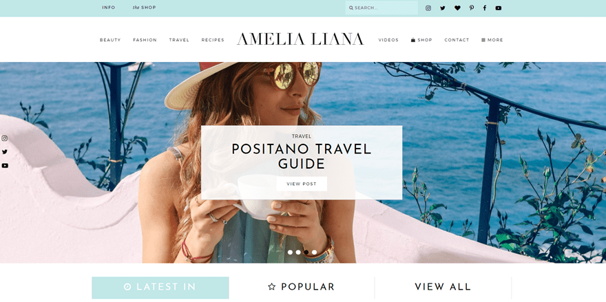
Then, we also have Amelia Liana. This beauty blog immediately gives you summer vibes by looking at the colors of the website only. The website has an awesome menu that shows you the three latest post in a very attractive way while hovering over the menu items. That allows users to immediately find the latest posts that they need to catch up with. Besides that, the website also shares three ways to navigate through the posts while being on the homepage; by latest, popular of all. Another well-thought-out extra touch this website offers is two video slideshows. You can find them at the end of the homepage and they allow visitors to look into the recent videos and vlogs.
Made with Divi
11. One Turn Kill
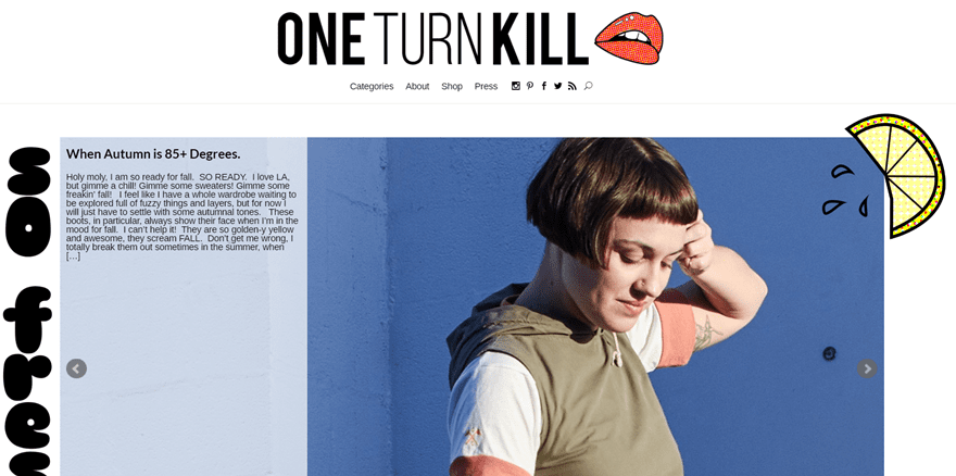
Lastly, we have One Turn Kill, a blog that is made with the Divi theme. This website is not only aimed at beauty, it also handles other topics such as looks and home decor. The website is a bundle of all kinds of stuff that might come in handy when trying to find inspiration. One of the nice things about this website is that it starts with a slideshow that showcases featured posts along with an intro to what the post is all about. This inspires visitors to click on the slide and read the post entirely.
Final Thoughts
Throughout this post, we’ve shared some great beauty blogs that are made with WordPress. These websites can give you inspiration for a next beauty blog website you want to create for yourself or for a client. If you have any questions or suggestions; make sure you leave a comment in the comment section below!
Be sure to subscribe to our email newsletter and YouTube channel so that you never miss a big announcement, useful tip, or Divi freebie!
Featured Image by Pro Symbols / shutterstock.com





Wow Just cool, for me, Maskcara is more stylish among all. I’ll definitely try to be like this. Thank you
In my opinion, I love the extra elegantthemes. Full of blog function with beautiful amazing support from the Divi frameworks.
These blogs are helpful… but it’d be much better if they focused on websites that were built using Divi… I don’t think enough sites built using Divi are showcased!
Excellent collection. Thank you.
This WordPress sites are really beautifully designed
Really nice theme, I want to have a blog like that 😀
Great collection. Beauty is Boring looks like a nice site
Good collection of images .Theme is very good..
I really like the uniqueness of the One Turn Kill page. How do you add borders to sliders in divi?
Good collection. I especially like the Manface site. Their web design is good as well.