A great color scheme is a fundamental component of a well-designed website. An unattractive color scheme could potentially turn off website visitors before they’ve even got to your content. However, it’s not always easy to come up with an appealing palette of colors on your own. If you’re having trouble, then a color palette generator could help you select the right combination of colors for a specific application.
We’ve put together a list of 19 handy color palette generators (all free) to help you create the perfect color scheme for your website.
-
1
19 Color Palette Generators That Make Web Design Easier
- 1.1 1. Coolors
- 1.2 2. Paletton
- 1.3 3. Adobe Color CC
- 1.4 4. ColoRotate
- 1.5 5. Mudcube Color Sphere
- 1.6 6. ColRD
- 1.7 7. ColorHexa
- 1.8 8. COLORlovers
- 1.9 9. COPASO
- 1.10 10. Colordot
- 1.11 11. Colourcode
- 1.12 12. Palettable
- 1.13 13. Material Palette
- 1.14 14. PHOTOCOPA
- 1.15 15. Colorfavs
- 1.16 16. Pictaculous
- 1.17 17. Palettr
- 1.18 18. Color Blender
- 1.19 19. Cohesive Colors
- 2 Conclusion
19 Color Palette Generators That Make Web Design Easier
In this post, we’ve included a broad range of tools to suit a wide variety of applications, so bear in mind that choosing the right color palette generator for your project will ultimately come down to personal preference. We advise trying a few different ones to see which works best for you. Let’s get started!
1. Coolors
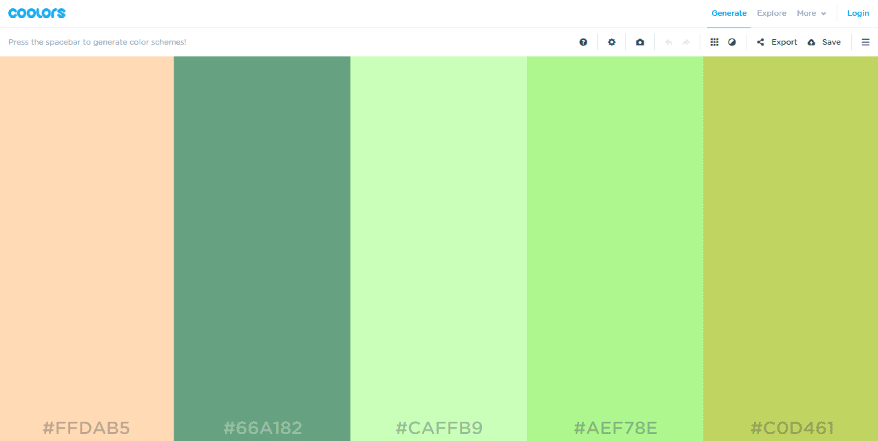
Coolors is a fantastic tool that pulls together quite a few useful features. It displays a full screen color palette within a drag-and-drop interface. From this screen you can edit each color, drag to change the order, and expand colors to show a selection of alternatives.
The generator also allows you to lock the colors you like best and auto-generate options for other colors by hitting the space bar. You can upload an image to use for inspiration, explore palettes in the Coolors community, and export your palette in six different formats. Coolors is even available as an iOS app and Adobe add-on.
2. Paletton
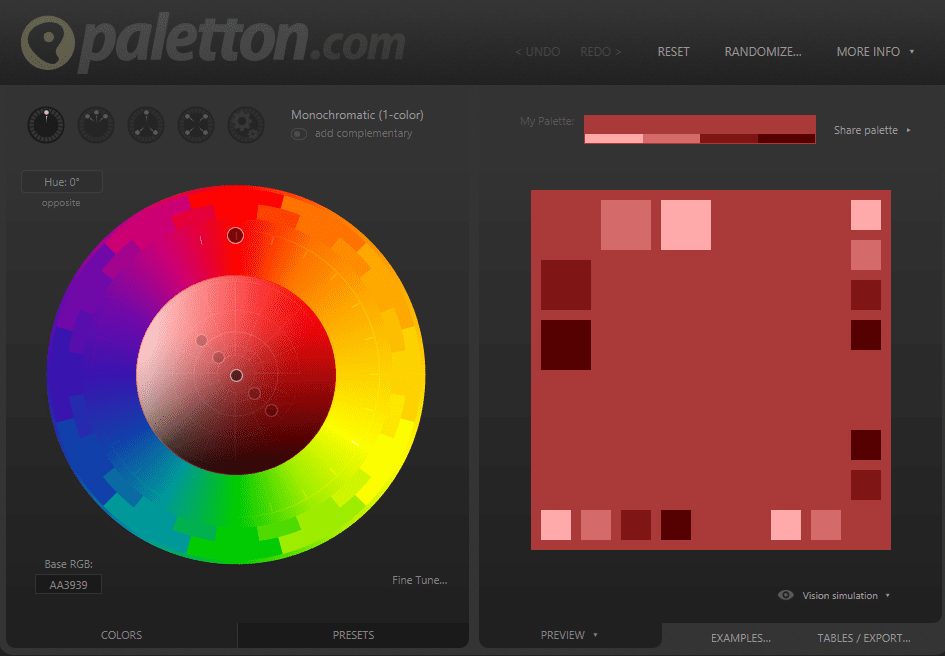
Paletton has a myriad of customization options to help you create a beautiful color scheme. Choose to use predefined options, or go freestyle and create a unique palette from scratch. Twenty-four preset effects, like bright pastel, shiny, and dark neon, can be used to tweak your new palette.
One of Paletton‘s neatest features is the live samples of the color schemes you create. With a single click, the tool can pull up a sample website design based on your palette, complete with artwork and animation. You can even test to see what each color scheme would look like for viewers with various types of color-blindness. Once you’re done tweaking, you can export your palette in several different formats, including CSS code and a color swatch PNG.
3. Adobe Color CC
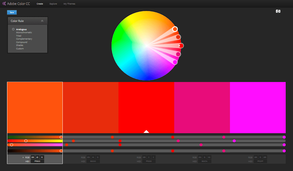
Adobe Color CC, (previously Adobe Kuler), gives you the option to start from scratch, upload an image for inspiration, or select a color palette from the Adobe CC community. Once you have your starting point, you can either apply algorithmic rules to your palette or make changes manually. If you’re using an image for inspiration, you have several effect options to customize the color scheme.
The price of Adobe Color CC’s customization ability is its learning curve. The interface is relatively intuitive, but mastering it will require a bit more time than would some of the other, simpler color palette generators.
4. ColoRotate
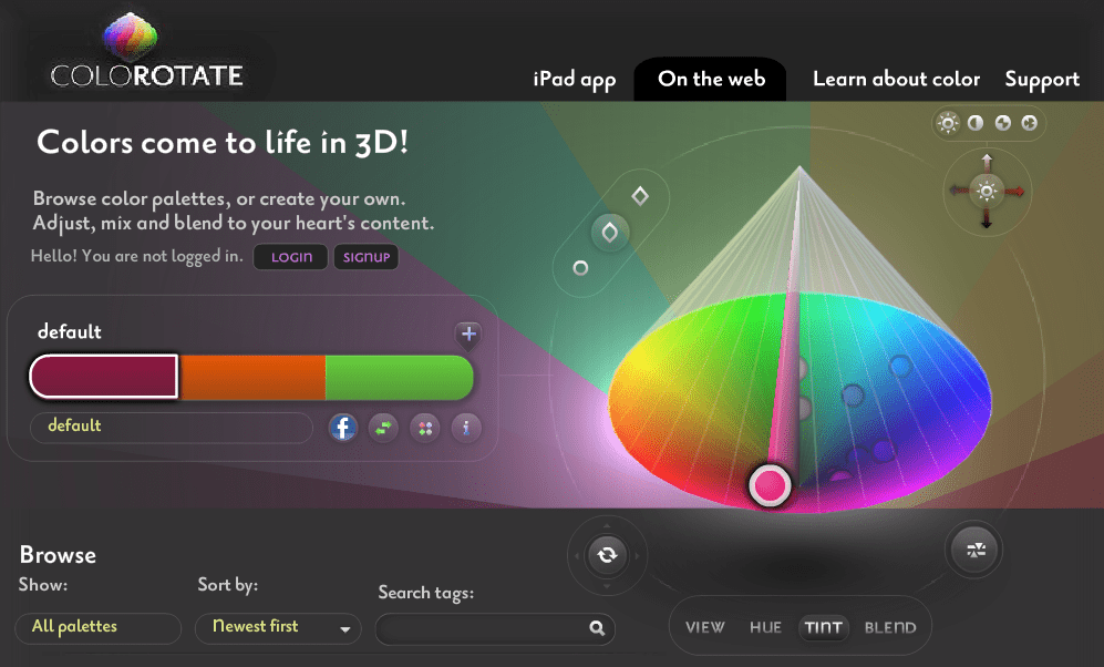
If you’re feeling the need for three dimensions, look no further: ColoRotate is what you need. This advanced tool allows you to create palettes on a 3D color wheel. You can start from scratch, upload an image, or use a palette from the community for inspiration.
The design interface is fairly complex and may seem intimidating at first. However, spend a little time playing around in the UI, and you’ll start seeing some incredible results. As an added bonus, the website offers a wealth of information on color if you want to know more about the science of an appealing color scheme.
5. Mudcube Color Sphere
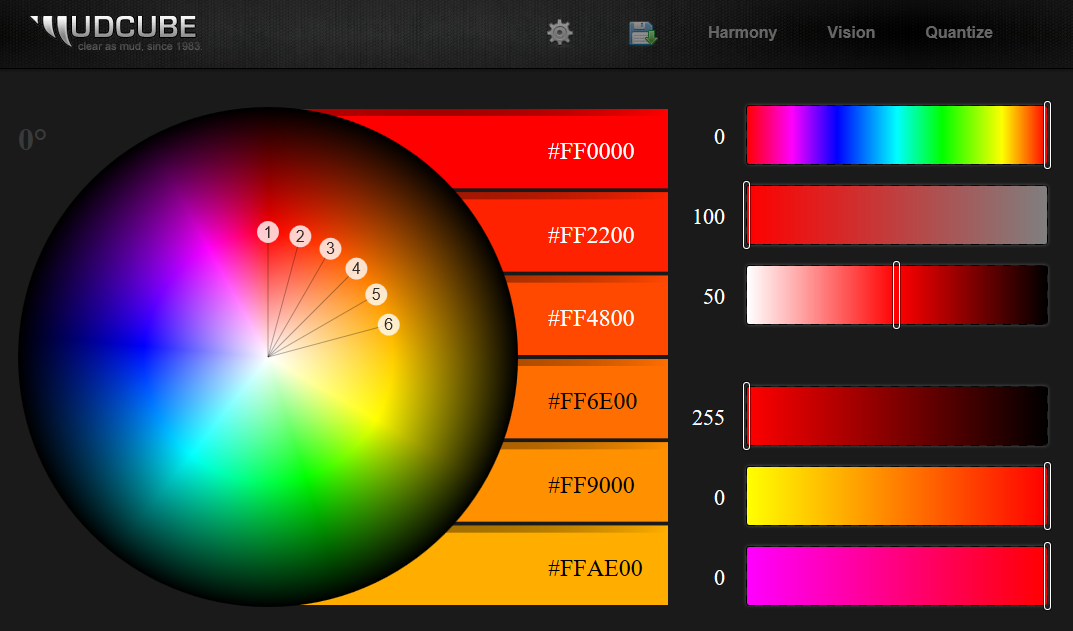
The Mudcube Color Sphere gives you ten different options for automatic color palette generation, from neutral to complementary to clashing colors. Simply select a base color, choose a generation rule, and tweak until you’re happy. Like Paletton, Mudcube allows you to see your color schemes from the perspective of a color-blind viewer. Despite some intimidating terminology, the user interface is fairly easy to use.
Once you’re happy with your color palette, either save it as an Adobe Illustrator or Photoshop file, or save your unique color palette URL to come back later.
6. ColRD
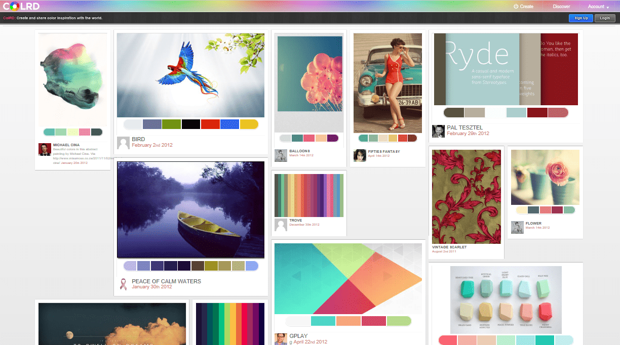
ColRD is an intuitive color palette generator with a range of options. One of its best features is a grid of 140 similar colors displayed next to the one you’re currently working on, limiting the need to tweak several control bars while trying finding your perfect palette.
Besides the standard start-from-scratch option, ColRD allows you to upload an image. Warning: this process appears to be fairly slower on ColRD than other generators offering the same feature. ColRd also features a stunning community library of images with corresponding color palettes. Even if you decide against using this tool, their library is still definitely worth a browse.
7. ColorHexa
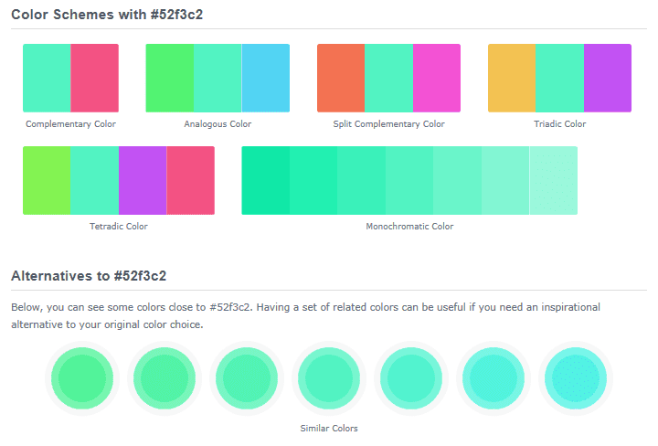
A self-proclaimed color encyclopedia, ColorHexa does not disappoint. Within the interface, you can generate palettes via various methods including gradient generation, color blending, and color subtraction.
You can also enter any color code in any form and get all of its code translations, besides palette suggestions based on the color. In summary, this is not only a neat tool for palette generation, but also an excellent resource for just learning about color.
8. COLORlovers
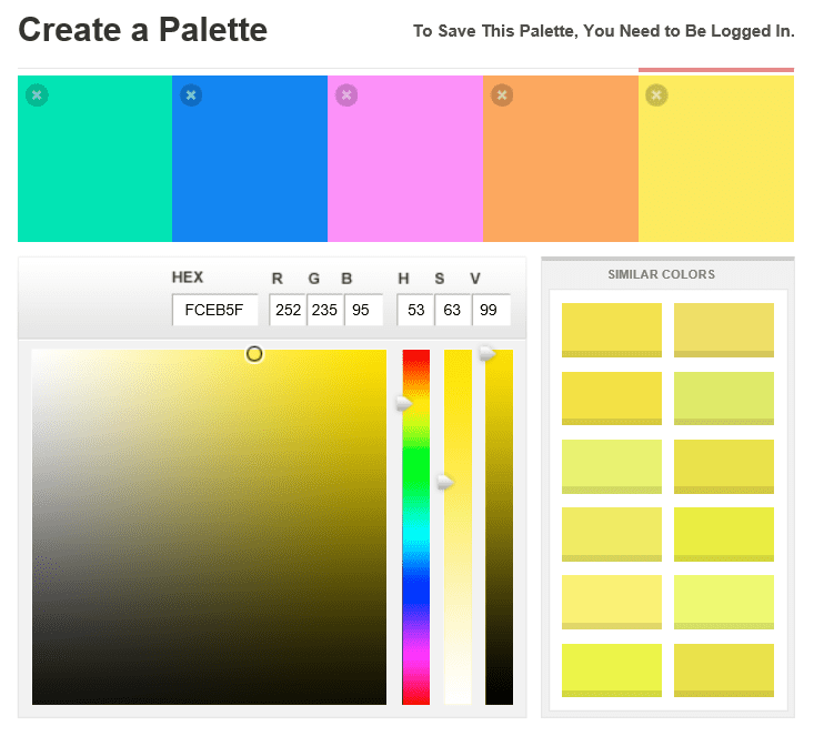
A little different from the other tools on this list, COLORlovers is primarily a community-based website where the priority is getting you to share your color scheme or draw inspiration from the library. Their tool works best if you already have a good idea of the color palette you want to create and just want to see your colors side by side. It doesn’t have any preset options to guide color generation, but it does suggest 12 similar colors next to the one you’re currently working on.
Within the COLORlovers website is also a more advanced color palette generator named COPASO (see below).
9. COPASO
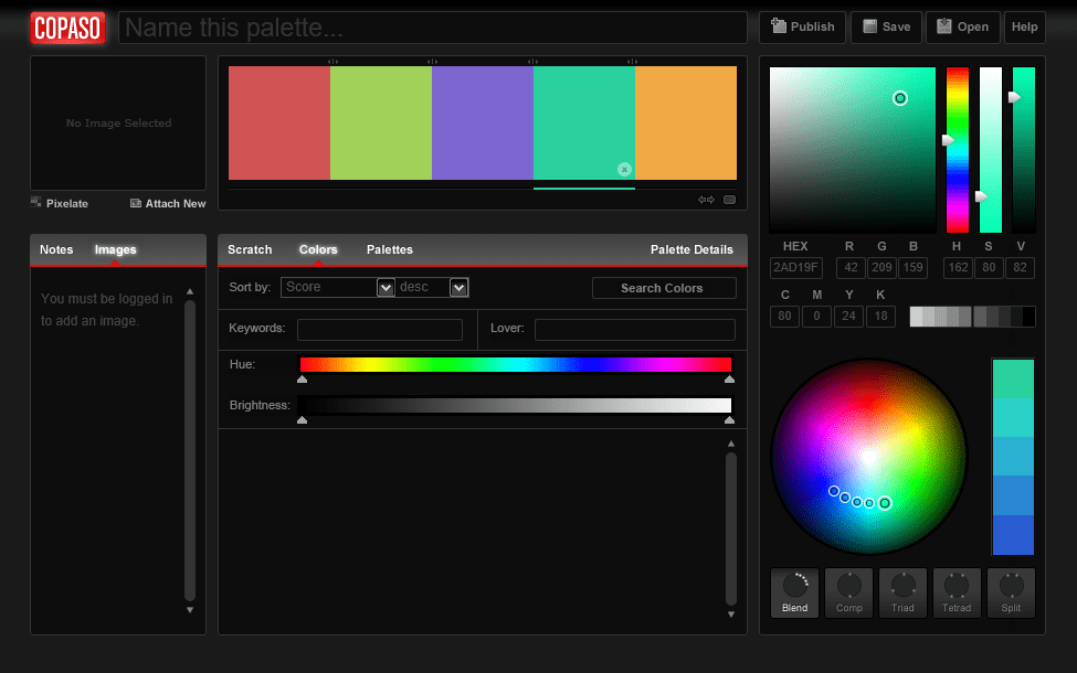
COPASO is COLORlovers’s more advanced offering. It provides many more options for generating your color palette in the form of common presets like complimentary, triad, and tetrad colors. However, while COPASO may be more advanced than the basic tool, it still doesn’t compare to some of the even more advanced options available. Moreover, the user interface is more complicated than what you’d expect for a pretty simple tool.
Again, the main draw with COPASO is the COLORlovers community. The community is a true color lover’s dream, where tons of beautiful palettes and patterns are shared and their applications discussed.
10. Colordot
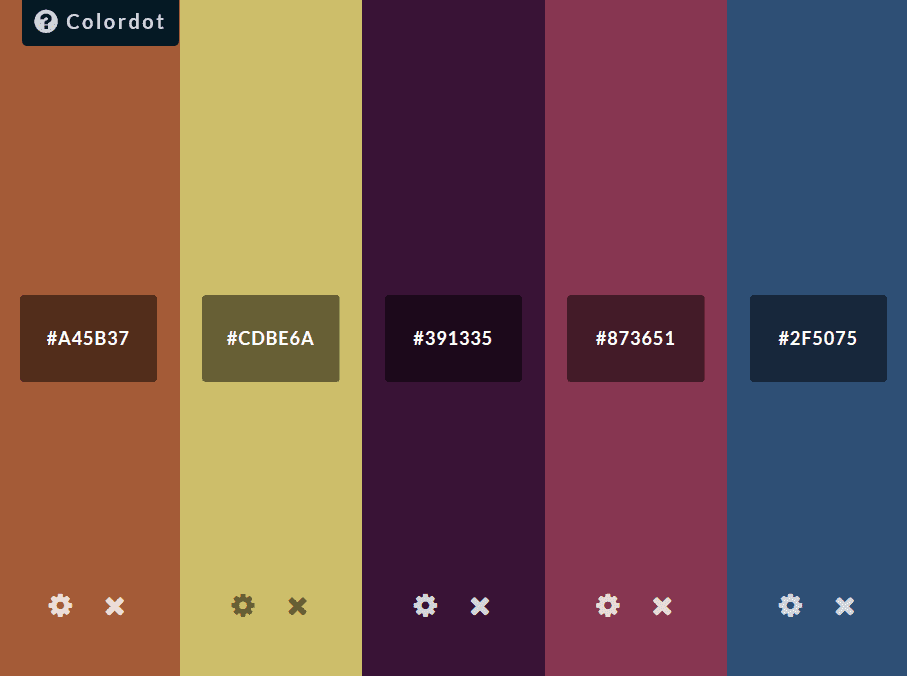
Colordot‘s unique feature is an ultra-minimal interface in which to create your perfect color palette. You change each color through your mouse movements; move side to side for hue, up and down for lightness, and scroll for saturation. Once you’re happy with a color, just click to save.
There’s no export option, but Colordot will automatically save a URL of your final palete. Colordot also has an iOS app where you can play with color palettes and also share them to your social media accounts.
11. Colourcode
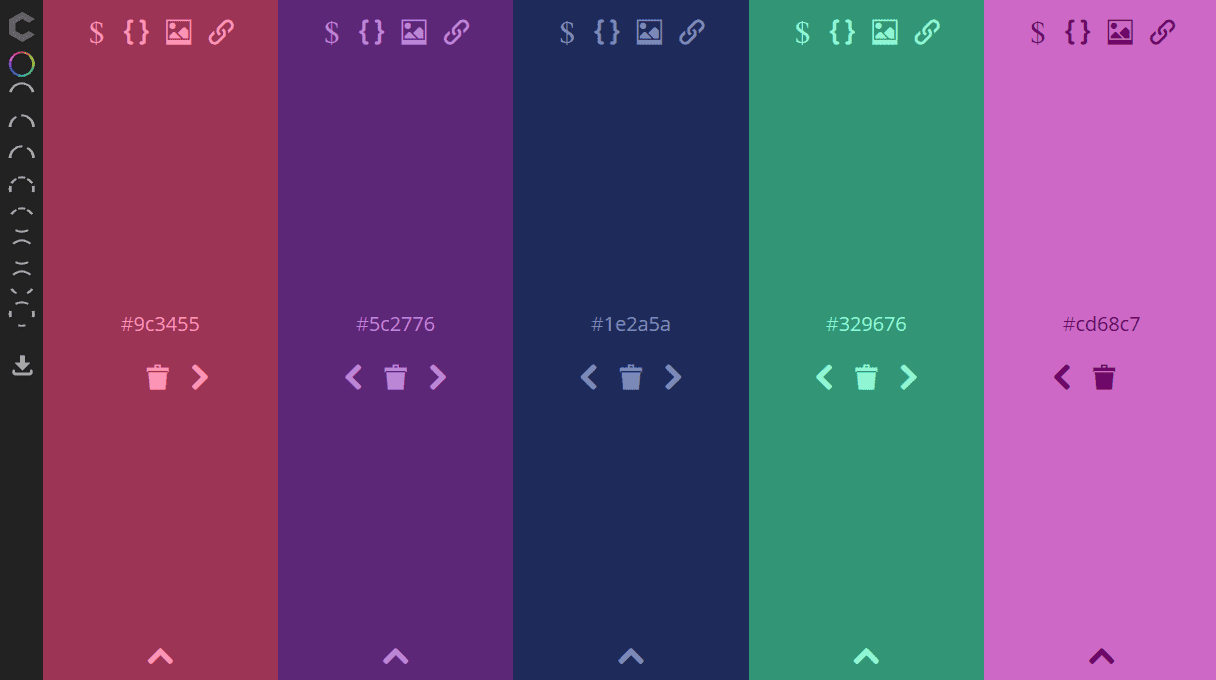
At first glance, Colourcode is near-identical to Colordot, as it features the same cursor-based color changer (you can even modify the entire color palette at once with cursor movements). However, this feature only represents the free-build tool within Colourcode; the full tool offers several other palette generation options.
Save your work in various color codes, a PNG file, or a permalink.
12. Palettable
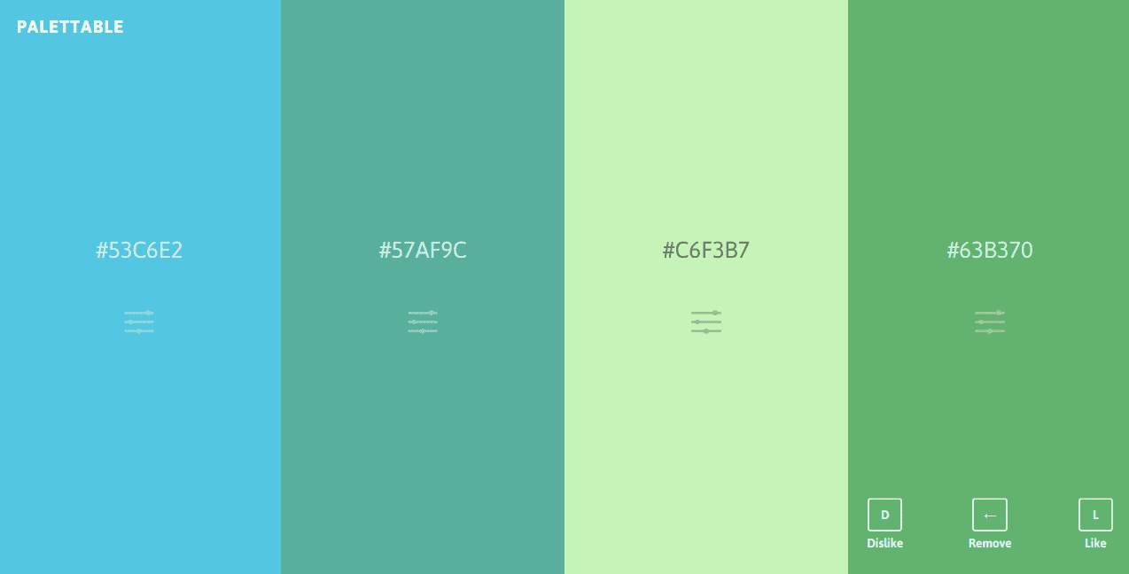
Yet another minimal color palette generation tool, Palettable‘s UI is reminiscent of Colordot, though it works differently. Palettable provides you with suggestions for colors that you can like, dislike, or customize via a color block.
The generator’s full-screen display is a definite plus, making it easier see how well your colors complement each other. The tool automatically generates a palette for each tool you create that you can return to anytime.
13. Material Palette
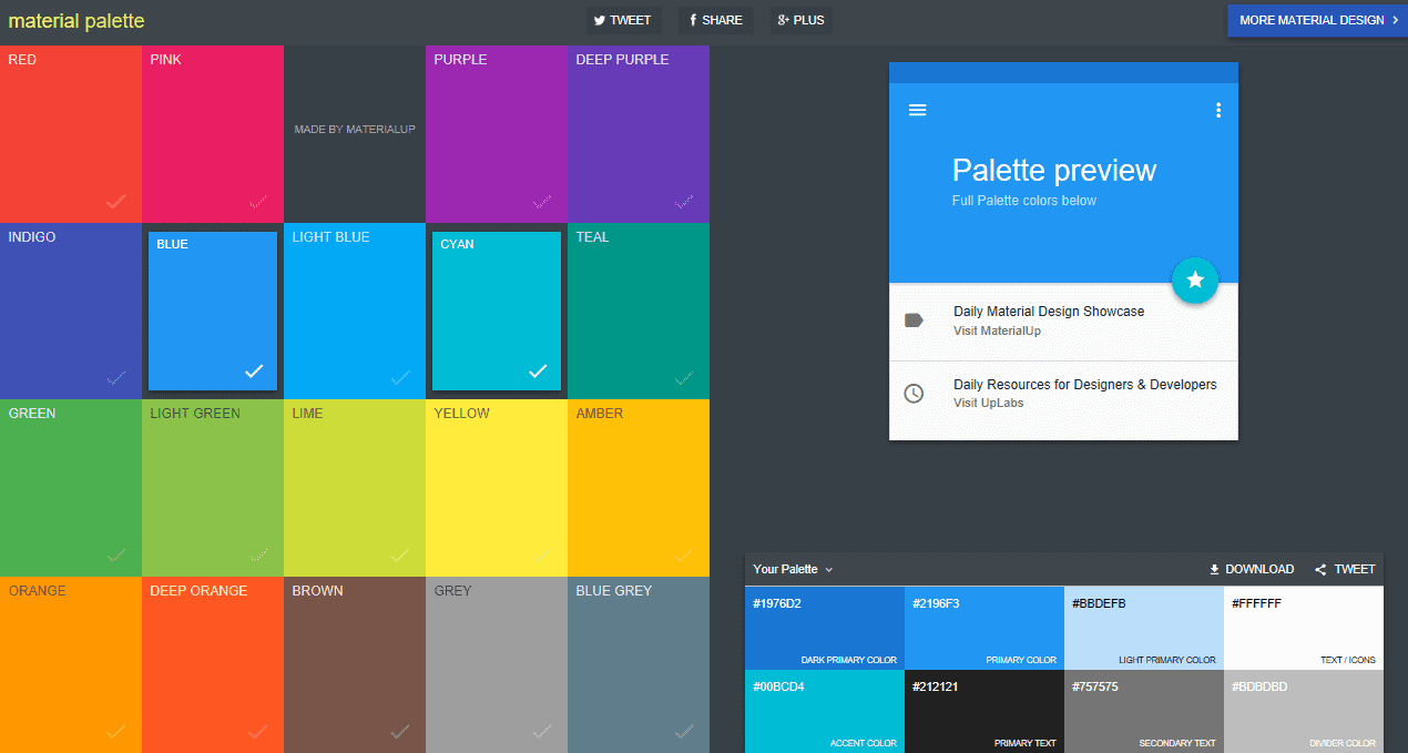
Material Palette by UpLabs is inspired by Google Material Design. This simple tool prompts you to select two colors from a choice of 19. It then generates a palette of eight colors from your choice, including the two you chose or variations of them. Even though there are no other customization options, Material Palette still manages to create some eye-catching color schemes.
The tool also offers suggestions as to how you should place each color on your site, including a primary color, secondary color, primary text color, and secondary text color.
14. PHOTOCOPA
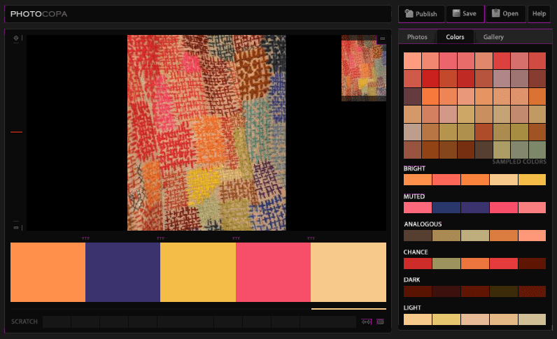
PHOTOCOPA is an advanced image-based color palette generator also from the good folks at COLORlovers. After selecting a base image (upload your own or choose from a huge gallery), you’re provided with 48 color suggestions. You also get six different color palettes to choose from, with effects like bright, muted, analogous, and chance.
A single click will open up a full screen display of a chosen palette. However, there is one drawback: the colors can’t be directly customized within the tool, so you’re limited to the palettes the tool automatically extracts from the image.
15. Colorfavs
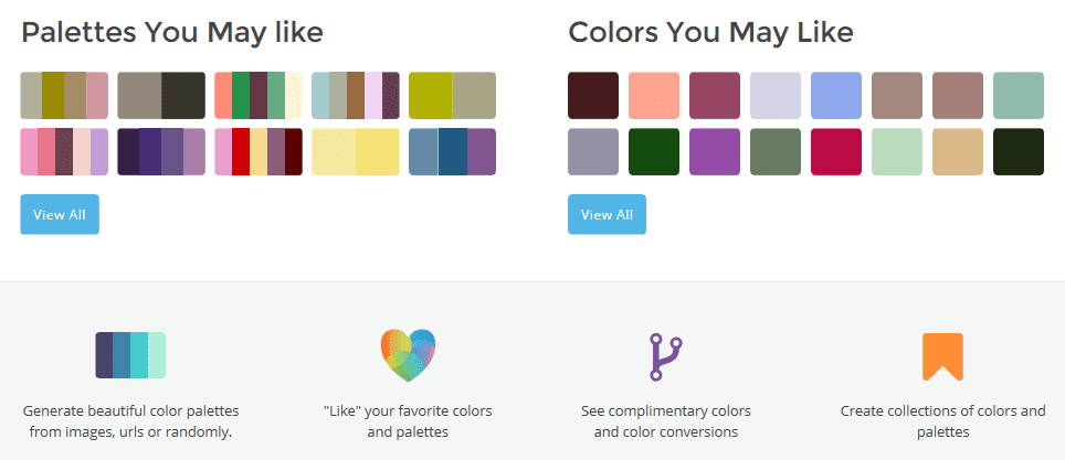
Colorfavs enables you to generate color palettes either from uploaded or web images, or randomly after setting a few simple parameters like number of colors, hue, and luminosity. For every color in your palette, you can view hex conversions, standard color schemes, gradient tones, and more.
Colorfavs also features plenty of helpful advice and suggestions from other users in its community. One of the tool’s biggest pluses is the UI design. The interface is not only intuitive, but also quite aesthetically appealing.
16. Pictaculous
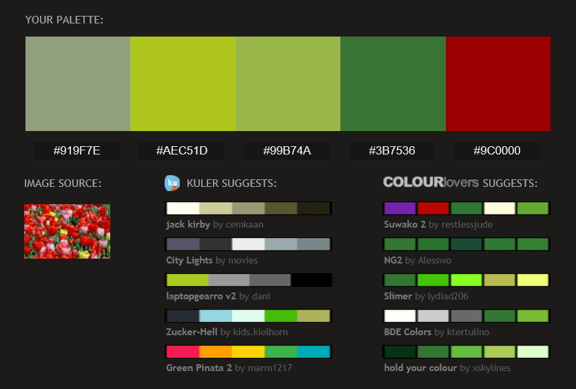
We all know MailChimp for its popular autoresponder tool, but one of its lesser-known tools is Pictaculous. Yet another image-based generator, Pictaculous creates a five-color palette once you upload your image. Its neatest feature is that it also pulls in palette suggestions from the communities at Adobe Color CC (listed as Kuler) and COLORLovers – five from each.
Though Pictaculous lacks customization options, its handy combination of suggestions from Adobe and COLOURLovers makes it worth a second glance. As an added bonus, you can export palettes in an Adobe file.
17. Palettr
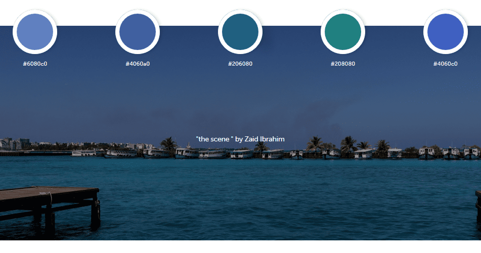
Palettr brings to the table a totally fresh take on color palette generation. Instead of constructing color scheme suggestions around an image, community post, or your own selection, Palettr creates color palettes based on a keyword. Simply enter your chosen keyword, and the tool pulls up a selection of photos related to your keyword from 500px, accompanied with suggested color palettes for each image.
I see this tool being particularly useful when you know the general theme/feel you’re trying to create, but are totally unsure of where to start with colors. You could even kill two birds with one stone by finding appropriate imagery for your website.
It is worth noting, however, that the keyword searches don’t always produce the types of images you’d expect. You may have to play around awhile before finding an appropriate palette.
18. Color Blender
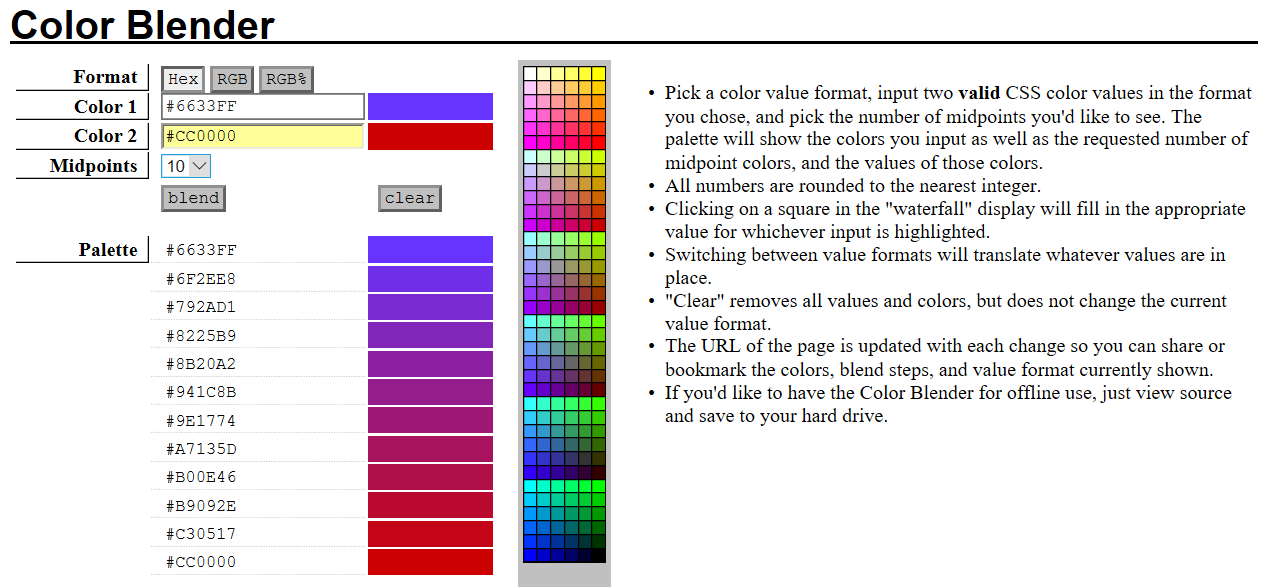
Color Blender is a color palette generator with a specific application. Simply specify two colors and the number of midpoint colors you would like to see, and the tool displays the points in between. That’s it.
Although the Color Blender interface has a rather uninspiring look, you do get clear on-page instructions, and the tool simply gets the job done. The tab’s URL is automatically updated with your specific color palette. Simply bookmark and revisit whenever you want.
19. Cohesive Colors
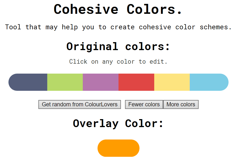
Cohesive Colors is another basic tool that offers something a little different. It creates only a simple color palette, but it also allows you to overlay the palette with a color of your choosing.
You can either start with your own color set or choose a random one one from COLORlovers. Then select your overlay color and adjust the intensity. This tool provides you with a cohesive color scheme, but doesn’t allow you to fine-tune individual colors.
Conclusion
Finalizing the color scheme for your website can be a taxing task for even the most experienced designer. Luckily, there are numerous automatic palette generators available to help you select the perfect color combination.
In this article, we’ve discussed 19 amazing color scheme generators, ranging from very basic tools to more complex ones.
One of our personal favorites is Coolors, a fantastic tool that packs ample of features in a very user-friendly interface. If you’re looking for something even more advanced, then Paletton, with its significant customization ability and range of examples, is another great pick.
A more basic option, Colourcode has a super simple interface with enough customization options to create a beautiful palette. For image inspired palettes, we’d go with PHOTOCOPA; it’s intuitive and provides excellent palette suggestions.
Whatever your specific color palette needs are, there’s sure to be a tool on this list to get the job done. Try a few out and see which ones work for you.
How do you choose color schemes for your projects? Let us know in the comments section below, and don’t forget to subscribe to follow the conversation!
Article thumbnail image by eatcute / shutterstock.com





Great posts. Most of your personal favorites are the same as mine. 🙂
Great post! I would add https://coolors.co/ too…
Hows about the Color Pickers Default Palette in Divi be fixed already? I set them to my custom color pallets but the modules load a default pallet instead. Running 3.0.17 at the moment.
Jaime, you may want to drop a suggestion for this on our dedicated forum (https://www.elegantthemes.com/contact/).
Good luck. 🙂
elegant adding colurs to my art …thanku soooooooooooooooooooooo much
😀 No problem, Shahul!
Designseeds is not an editor but a great source of inspiration to me. Recommended.
Thanks for the recommendation, Federico!
Most of my websites just have some shade of grey and I’ve been struggling to put some colors on them. Thanks for the post, it’s great. Jen’s comment is useful too! I’ll have a look at Pinterest for some inspiration.
Nelson, soon your sites will be in glorious technicolor! 😀
Thanks for your comment!
Hi Nelson, just type “Color Palettes” in Pinterest search (no quotes, obviously). Design Seeds is a good start. Then Pinterest will show more options and next thing ya know, tons of great color combo designed by PEOPLE.
Create yr own color board, secret if you want, to keep track of them. Hard to re-re-arrange on a board. I usually open several tabs, then add them according to color. But next time it gets all mixed up again, as I add more.
Lots of inspiration there! Have fun! 🙂
Being the devil’s advocate here. These are great tools. Some scary color combos. Many are really brightly saturated. That can be difficult for some to read and enjoy. Light, bright orange or blue can be soooo uncomfortable on the eyes.
AND you can have the GREATEST color palette. But ya gotta try it out.
Sometimes that perfect color doesn’t hold up in text. Headlines, links, things like that. Gotta be prepared to play a bit. Be flexible.
A tiny suggestion: also look at how color affects us.
PLUS hello PINTEREST. You can find tons of great color combos based on photos. Very inspiring!
Please don’t ONLY rely on computers. That’s NOT how Van Gogh, Seurat, Matisse, Monet, Renoir, Klimt and other great colorists created their memorable paintings.
LOOK AT ART. Also on Pinterest.
PLUS customers will often sign off colors, then see the site, and say no way. So be sure, if you are indeed in charge of colors for a site, logo or anything, you cover revisions in your contract!
Now have fun!
I know most don’t have time nor inclination to take color as seriously as I. That’s fine. BUT PLEASE LISTEN to artists too!
Don’t turn to tech for ALL your creative issues. Tech helps us … but it can never replace wisdom from artists. Many artists also wrote about the topic of color. LOTS of theories out there.
I am a trained, highly educated, exhibiting, published artist and photographer. I own many of books on color. As many classes on color I’ve taken, I’m still learning.
I’m also blessed with a highly developed sense of color. My whole life ppl commented on my colors in my varied fine art media. Color is fascinating and it’s a never ending journey studying and learning about color.
Now look and have fun :-).
Mother nature is the best inspiration for color. One single plant or tree can give you the perfect color palette.
Jenny, thanks for your unique insight into color combinations, selecting them, and your own workflow. I’m sure it will be highly beneficial to others coming across this piece. 🙂
Hi Jenny,
Would you recommend any specific book for learning color usage? The reason is I am studying print design. & It is frustrating at the start to select the color combinations that looks good.
Thanks in advance
I concur to that. I tried the color tools and I found that they don’t have the right colors I want. Instead, I go online and look at other color palette and match that.
Thank you so much for this, your timing is perfect. I am new at building websites and was wondering about how one decides which colour combinations to use.
Great tools! Now we will have happy clients.
Thanks, Jordan. 🙂
Hi,
Good resources. I looked at tools like that just yesterday. My problem was to integrate the scheme as basic colors of the site. It seems we have to go everywhere to do it. Would it be possible to make an article on how to properly change the color scheme in DIVI and EXTRA please.
Beause in DIVI there is like only 5 choices in the drop down of the Color scheme personalisation option dashboard.
Kinds regards,
We can publish some stuff on Divi/Extra color schemes for sure.
Thank you John for useful resource ..
Thanks, Siva. 🙂
Not a real generator, but a great repo is http://www.color-hex.com