We aren’t all designers. That’s a good thing for job security, obviously, but when you’re poking around the internet, you can definitely see the bad side of that, too. People simply misunderstand design terms and, because of that, design itself. Especially beginners in the field.
With the current culture of self-taught professional development, we wanted to put together a list of what we feel are the most misunderstood design terms that beginners get a little wrong. Hopefully, this will help make the internet a brighter, better-designed place over time.
1. Kerning
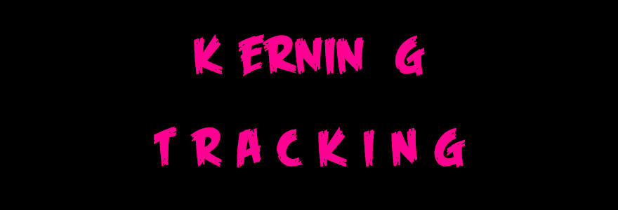
When I first learned about kerning (the space between characters in a design) from a friend, I could barely look at most billboards or advertisements. They were so painful. Letters and numbers are often haphazardly spaced apart or bunched up just to fit in an arbitrary space, regardless of legibility or aesthetics.
It wasn’t long, though, that I learned that’s not quite what kerning is. That’s tracking. While kerning is space between characters, it is the space between individual characters. Tracking is the standard space between all characters. My mind was blown.
2. Backgrounds
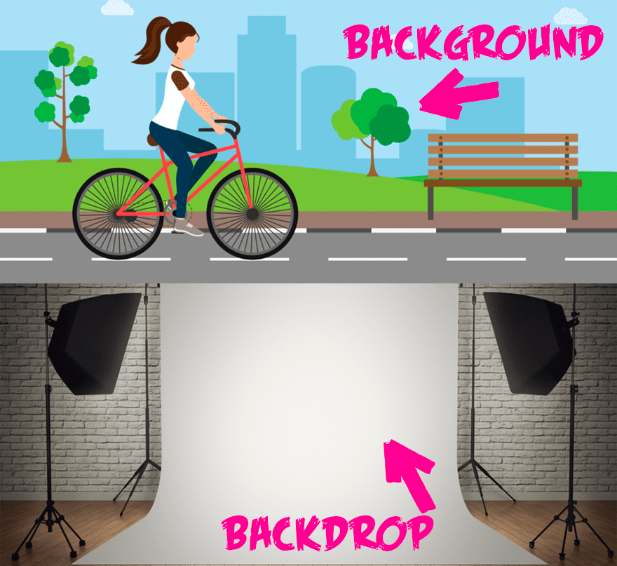
Top image by borodatch, bottom image by Boris Rabtsevich / shutterstock.com
You’d think that something being a background wouldn’t be too hard to understand. But in design terms, it often gets confused with a backdrop.
“Oh, that skyline is a beautiful backdrop for the photo!”
No, it isn’t. It’s a beautiful background. Because it’s an element part of the photo itself, behind the main focus, whatever that may be.
A beautiful backdrop, though, would be the choice of matte sheeting that’s draped behind someone as a set piece.
A background is part of the design. A backdrop is part of setup.
3. Legibility
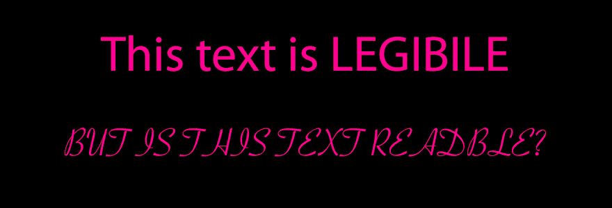
Legibility is often confused with simple readability, which is the ease in which someone can read your copy. This blog, for instance, is very readable because of its sans serif typeface. All the words are easily distinguished from one another.
It is also legible because you can easily tell each letter from the one beside it. While these differences are small, they’re important. Most sans serif and serif typefaces are both legible and readable, whereas a script/handwriting typeface might be readable, but because the letters are often conjoined or linked, they might not be terribly legible.
Which brings me to…
4. Fonts
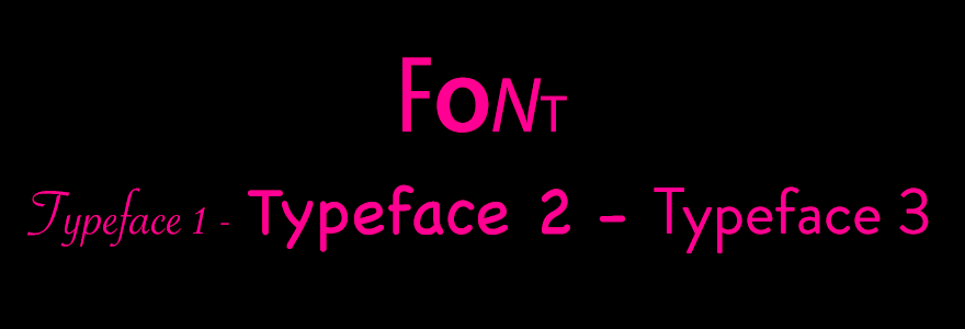
Pretty much each and every one of us uses this term wrong. We talk about Helvetica or Comic Sans being a font in conversation. My students asked me for years what font they should use in papers, and I would tell them Times New Roman (ugh, I know, but I was an English teacher beholden to MLA standards).
And I was wrong for another reason besides aesthetics, too. Times New Roman isn’t a font. It’s a typeface. If I had told them to write in 12pt Times New Roman, that would have been right. Because fonts are collections of different weights for characters–(bold, condensed, regular) while typefaces are the family of styles for those characters (Helvetica, Times New Roman, Myriad Pro).
Even in CSS, we have to differentiate these with font-family and font-weight which are dramatically different.
5. Monochrome

I see this misused a bunch. For something to be monochrome, it needs to be one (mono) color (chrome, or chroma)–which in and of itself is problematic, but we will get to that later on.
Monochrome can be variations of any hue, be it red, blue, orange, pinkish-purple, or whatever else. Just varying shades of that particular hue. You’ll have lighter and darker tints and tones.
But every part of the monochrome design be part of that single hue. And it can be of any hue, but only that hue.
6. Grayscale

Grayscale, on the other hand, is almost monochromatic, but it’s not. Many people confuse the two and use the terms interchangeably, limiting their use of monochrome to shades of grey.
But why isn’t grayscale monochrome, you ask? Because it includes white. Which in CMYK is 0% across the board. It isn’t technically a gray. A gray hue is mostly cyan with slightly less magenta and yellow with very, very, very little–if any–black. (CMYK 43, 35, 35, 0 is a good example.)
Same for black-and-white schemes. People say they’re grayscale a lot, when it couldn’t be further from the truth. They’re two totally opposite hues, and B&W schemes don’t include gray at all. That’s neither monochromatic nor grayscale.
7. Color
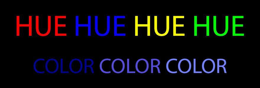
Many people couldn’t actually tell you what a color is. No, we don’t live in a real-life version of Lois Lowry’s The Giver; people just get the terms hue and color mixed up.
What we generally think of as color is actually hue–red, green, blue, yellow, pinkish-purple. And any variation of those hues, from light to dark to vibrant to dull, is color.
Blue is a hue, dark blue is a color.
8. Logos
I know what you’re thinking. “Who is this guy to tell me that I don’t understand what a logo is?” And in fairness to you, you likely do. You have eyes, after all. You have seen the golden arches and gone in for a Big Mac.
But there are different types of logos that I want to call attention to so that when you get into the design trenches, you can make the best choices possible.
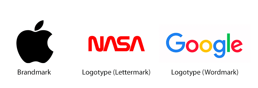
First off, a logo is just shorthand that represents a brand or a company or an item or something else. That’s it. Logotype, however, is a subset of logos that is made up of, you guessed it…typefaces. Stuff like Disney and Google and CNN and NASA all use logotypes.
But even below that, there are wordmarks and lettermarks. CNN is a lettermark because it’s made up of, you guessed it, letters. Same for NASA. They use a unique typeface to simply use letters to represent the company instead of spelling out the Central News Network or National Aeronautics and Space Administration. If they did that, like we see with Google or Disney, that would be a wordmark.
And then there are brandmarks, which is what we generally think of as logos: symbols that represent the company or brand. Apple is a good example of this, as are some TV networks (the CBS eye, NBC peacock).
9. Wireframe
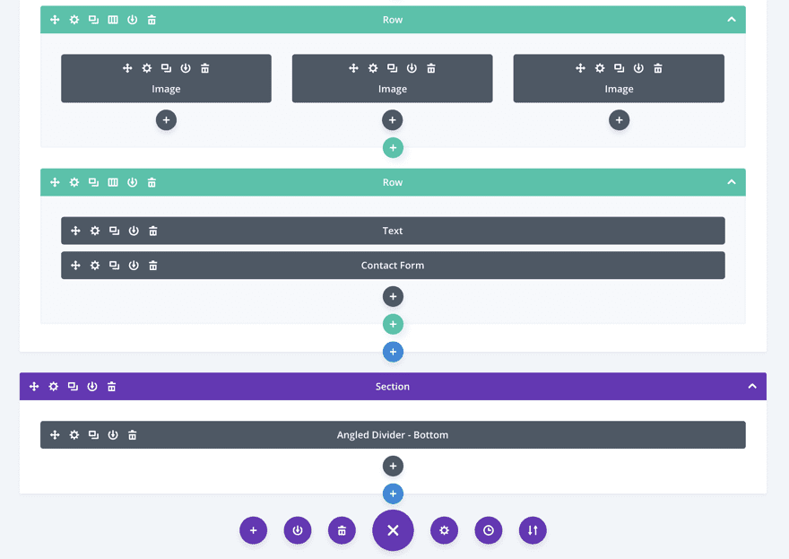
This one is used weirdly all the time, too. A wireframe is just that–a frame. It’s a basic guide that shows you what content will be there.
Divi has an excellent wireframe mode in the visual builder, where you see the entire page with representative blocks that say things like “text” or “image” or “video” without showing any content. You can see the layout of the page represented, but not what it actually looks like.
Don’t confuse a wireframe like this with a mock-up or prototype. In many ways, the visual builder itself is a prototype. You see the actual page, how it works, how all the content fits together without it being live. It’s usable, but maybe not finished.
A mock-up is likely what your design team puts together in Photoshop before sending it out for final approval. None of the content works, it’s probably all placeholder and filler, and not a bit of it is real (in that it’s not a website yet, simply a document or composite image).
10. Margins
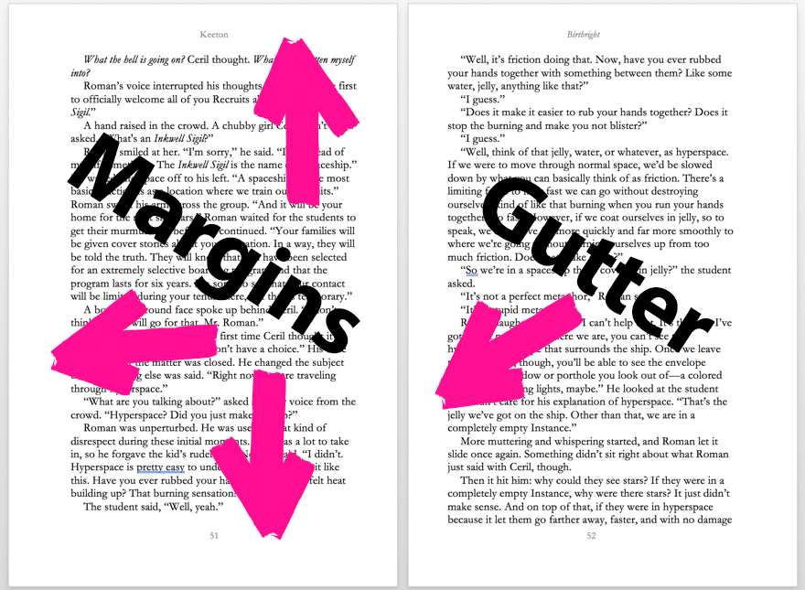
This one’s simple, but important. Margins are the space around your content on the page. The blank space between the edge of the page and your words and images are margins.
Bleed, on the other hand, is the space around the edge of the page that you leave for the printer to know where your margins begin (the space outside of even your margin edges).
Similarly, gutter is a specific term for the internal bleed between two side-by-side, printed pages that face each other. For example, on the splash pages in comic books where one image takes up two pages, there is no gutter, but in novels, there might be a half-inch gutter, even though there’s a full inch margin around the rest of the page.
11. Whitespace
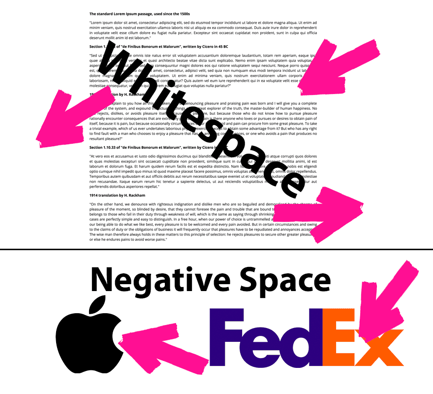
And to wrap up, let’s talk about whitespace. From here on out, do your best not to confuse this with negative space, which is decidedly different. Whitespace is unused space around your content. Large margins, space between paragraphs and/or headers. The unused space on your page is whitespace.
Negative space, though, is the use of space within shapes and content. It can be cutouts and overlays within your designs (such as the dip in the Apple logo or the hidden arrow in FedEx).
Remember, whitespace is purposefully unused space, while negative space is empty space that is used for a purpose.
What Did I Miss?
I know this isn’t a catch-all list of things we’ve all misunderstood as we started out. Design terms can be a mucky, murky mess, and the more clear we are about their definitions and how we use them, the more beautiful we can make our designs and the world around us. (And the fewer billboard and flyers we’ll see with terrible kerning and tracking.)
So hopefully this has clarified a few things, made you think about how you compose your work, and made it so that you see the world (and represent it) in a slightly different way.
What design terms have given you the most trouble wrapping your head around? Anything you want to share with other folks?
Article thumbnail by nawamin / shutterstock.com






So. How do I assess all this? Where is BJ’s mea culpa? Or defense? Why is this still up, given that the “help” it offers is in fact, untrue?
I am still astounded by the misbelief that sans serif is more legible, easier to read, better than serif.
Simple yet effective article for beginners, will share this in our beginners meetup, cheers!
You redesigned the word “Legible”
Ironically, the newer “Legibile” is much harder to read … or in simple terms, not so legible.
Good comments but still an informative article for beginners. Where are primary colors defined as dark? Legible is incorrectly spelled in the legibility image.
I agree with the comments, your definition of fonts and typefaces is back to front – here’s a excerpt from a book made for Compugraphic inc. ‘The Art & Technology of Typography’
type family
A progression of design weights with corresponding italics, condensed, expanded and ornamental styles within a type design.
type font
A set of characters that have a unified design and purpose, letters numerals, punctuation [etc.] In the technological sense, the term “font” is the hardware or software carrier of the character set.
typeface
A single variation in a type family, such as light, bold, condensed or outline.
Great article with amazing knowledge. It will really help beginners.Simply a monochromatic object or image reflects colors in shades of limited colors and Grayscale is a range of monochromatic shades from black to white and yeah! Legibility is often confused with simple readability.Readability refers to the way in which words and blocks of type are arranged on a page. Legibility refers to how a typeface is designed and how well one individual character can be distinguished from another. It’s good to see a discussion about negative space and whitespace. Playing with negative space and leveraging it to your advantage is an excellent way to gain a lot of attention for a design piece. I really like the way you explain the full article, thanks for publishing it.
How many times are you going to write ” I AND ME” :/
Nice little primer. Doesn’t replace my 3 years in design school, but still interesting. A couple folks have pointed their disagreements with your list I’d like to humbly add my own.
While on your computer tracking and kerning are different, in typesetting, historically, tracking is simply kerning applied over the whole word, sentence, paragraph etc. It’s still technically kerning.
Thanks for the list.
Nice basic glossary… It might be good to have included in the Margin section also the difference with “Padding” 🙂
The C in CNN stands for Cable, not Central.
Or for Clinton, if you ask POTUS.
Don’t go dissin’ Times New Roman for the printed page Mr. Keeton. There’s still nothing easier on the eyes for those who read a lot.
Hi B.J.
thank you for the post. Very interesting!
I am a little confused here since I am not a native speaker, you say:
“Blue is a hue, dark blue is a color.”
In my humble understanding isn’t it the other way round?
Blue is a color and dark blue is a hue, as a hue in my understanding is one of the main properties of a color?
Cheers and happy days
Max
I’m not convinced on your explanation of font vs typeface.
It is correct that Grammond, for example is a typeface. But my understanding is that a font is the file where the typeface and its settings are stored i.e. the OTF/TTF file itself is the font file.
Much like music – we don’t for example refer to songs as MP3s, but we do use their titles.
There are so many things in this article that are just flat out wrong, I can’t even begin to address them all. But let’s get to some main ones.
The literal definition of Hue is: a gradation or variety of a color; tint:. Blue is a color, dark blue is a hue. Try to explain primary colors using your definition of color and hue.
Next, Monochrome. Monochrome comes from photography where, on early film, only one photosensitive layer was present. This layer was only able to reproduce the brightness of an image in steps from white to black. (mono = 1 layer, chromatic = steps) Monochromatic literally means all the hues between white and black. Your pink picture is a tinted monochromatic image. True monochrome is only black, white and grey.
Again, you have font and typeface backwards. A font is the name of the style of letters, a typeface is what font + what weight + what size. This is why your computer has a font book, not a typeface book.
The last thing I will get into is your complete misunderstanding of wireframe. A wireframe, by definition, has to be simple lines (the lines are like wires). What you show is more indicative of an outline or a mock-up
“Again, you have font and typeface backwards. A font is the name of the style of letters, a typeface is what font + what weight + what size. This is why your computer has a font book, not a typeface book.”
Might wanna check yo-self before you wreck yo-self on that one.
Typeface: The design of the letters. (ie. Helvetica Neue Light has a certain look)
Font: A packaging of a typeface. (ie. Helvetica Neue Light is now a ttf file)
This is why our computers have a FONTbook, not a typefacebook.
Too lazy to add all the citations and links from everyone who understands type. You can google it easily. 🙂
Primary colors are dark blue, dark red, dark yellow.