Hopefully you have had a chance to download our latest theme, Divi. As mentioned in the Theme Launch Post, we will be writing a Divi-related post on our blog every day for the next 12 Days of Divi. Be sure to tune in each day for the next twelve days to get your hands on tons of Divi-related tips and resources! If you haven’t checked out Divi yet, then click the link below to view the release post with all the juicy details, and for your chance to win a free Lifetime Membership!
7 Simple CSS Tricks For Divi
You’d be surprised what a few lines of CSS can do. Today, we would like to share a few easy customizations that you can make to your Divi Theme using only the Custom CSS panel in our ePanel Theme Options. There is even a good chance that some of these customizations will be theme options in future updates of Divi. To apply this changes, simply copy and paste the code mentioned into the “Custom CSS” box in ePanel, which can be found under the Appearances > Theme Options tab in your WordPress Dashboard.
By default Divi has a fixed header that will always appear at the top of the browser. If you have a short website, or do not want the navigation bar to impede your content, you can use this CSS modification to add absolute positioning to your header so that it scrolls up with th rest of your page.

To apply this change, simply copy and paste the following code into the Custom CSS box in ePanel and click Save. If you ever want to revert back to the original style, you can simply delete the code from the Custom CSS field.
/*DIVI NAV - ABSOLUTE POSITIONING*/

#main-header{
	position:absolute;
}

.et-fixed-header{
	top: 0;
	background-color: #fff;
	position: absolute; width: 100%;
	z-index: 99999;
	padding: 18px 0 0 0 !important;
	min-height: 43px !important;
	box-shadow: 0 1px 0 rgba(0, 0, 0, 0.1) !important;
	-moz-box-shadow: 0 1px 0 rgba(0, 0, 0, 0.1) !important;
	-webkit-box-shadow: 0 1px 0 rgba(0, 0, 0, 0.1) !important;
	-moz-transition: all 0.2s ease-in-out;
	-webkit-transition: all 0.2s ease-in-out;
	transition: all 0.2s ease-in-out;
}
.et-fixed-header #logo { max-height: 43px; }
.et-fixed-header nav#top-menu { padding-top: 11px;}
.et-fixed-header #top-menu li > a { padding-bottom: 29px;}
.et-fixed-header .et-search-form { top: 46px; }
.et-fixed-header #et_search_icon:before { top: -3px;}
This customization applies a stroke outline and no fill giving your buttons a lighter feel inside your modules. This effects both dark and light text options.
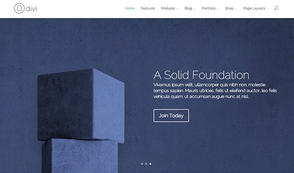
To apply this change, simply copy and paste the following code into the Custom CSS box in ePanel and click Save. If you ever want to revert back to the original style, you can simply delete the code from the Custom CSS field.
/*DIVI CTA BUTTONS - OUTLINE STYLE*/

.et_pb_bg_layout_light .et_pb_promo_button, .et_pb_bg_layout_light .et_pb_more_button, .et_pb_bg_layout_light .et_pb_newsletter_button, .et_pb_pricing_table_button {
	background-color: rgba(255, 255, 255, 0) !important;
	color: #82c0c7;
	border-color: #82c0c7;
}


.et_pb_promo_button, .et_pb_newsletter_button, a.et_pb_more_button, .et_pb_pricing_table_button {
	background-color: rgba(0, 0, 0, 0);
	border: solid 2px;
}
Buttons in Divi have small, rounded corners, but you can use this CSS to give your buttons squared-off corners.

To apply this change, simply copy and paste the following code into the Custom CSS box in ePanel and click Save. If you ever want to revert back to the original style, you can simply delete the code from the Custom CSS field.
/*DIVI CTA BUTTONS - SQUARED CORNERS*/

.et_pb_promo_button, .et_pb_newsletter_button, a.et_pb_more_button, .et_pb_pricing_table_button {
	-moz-border-radius: 0;
	-webkit-border-radius: 0;
	border-radius: 0;
}
Create a smooth hover animation with this modification. With this CSS, your buttons will transition to 50% opacity upon hover to give the user a subtle interaction cue.

To apply this change, simply copy and paste the following code into the Custom CSS box in ePanel and click Save. If you ever want to revert back to the original style, you can simply delete the code from the Custom CSS field.
/*DIVI CTA BUTTONS - HOVER*/

.et_pb_promo_button, .et_pb_newsletter_button, a.et_pb_more_button, .et_pb_pricing_table_button {
	-moz-transition: all 0.2s ease-in-out;
	-webkit-transition: all 0.2s ease-in-out;
	transition: all 0.2s ease-in-out;
}

.et_pb_promo_button:hover, .et_pb_newsletter_button:hover, a.et_pb_more_button:hover, .et_pb_pricing_table_button:hover {
	opacity:.75;
}
If you’re using section backgrounds and images that warrant a dark navigation, you can use this CSS to invert the light appearance of Divi’s menus.
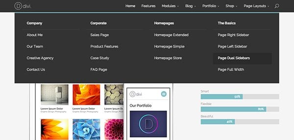
To apply this change, simply copy and paste the following code into the Custom CSS box in ePanel and click Save. If you ever want to revert back to the original style, you can simply delete the code from the Custom CSS field.
#top-menu a, .et_mobile_menu a, #et_search_icon:before {
    color: #ddd !important;
}

#top-menu a:hover, .et_mobile_menu a:hover {
    color: #fff !important;
}

.nav ul li a:hover, .et_mobile_menu li a:hover { color: #111; background-color: #2b2b2b; }

#top-menu li.mega-menu > ul > li > a:first-child, .et_mobile_menu li a {
    border-bottom: 1px solid #444;
}

#main-header, .et_mobile_menu, .nav li ul , #top-menu li.mega-menu > ul > li > a:first-child:hover, .et-search-form {
    background-color: #333 !important;
}

.et-search-form input {
    background-color: #2b2b2b;
    color: #999;
}
Round Off the Corners
Almost every every element in Divi has squared-off corners. If rounded corners are a more desired look, this CSS will round the corners of every module and menu in Divi.
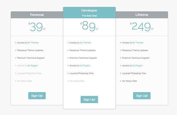
To apply this change, simply copy and paste the following code into the Custom CSS box in ePanel and click Save. If you ever want to revert back to the original style, you can simply delete the code from the Custom CSS field.
/*DIVI ROUNDED CORNERS - ALL MODULES*/

@media only screen and ( min-width:768px) and (max-width: 980px ) {
.et_pb_featured_table:nth-child(3), .et_pb_featured_table:nth-child(4){margin-top: 30px;}

.et_pb_pricing_table:nth-child(odd){
	-webkit-border-top-left-radius:6px;
	-webkit-border-bottom-left-radius:6px;
	-moz-border-radius-topleft:6px;
	-moz-border-radius-bottomleft:6px;
	border-top-left-radius:6px;
	border-bottom-left-radius:6px;
}

.et_pb_pricing_table:nth-child(odd) .et_pb_pricing_heading{
	-webkit-border-top-left-radius:4px;
	-moz-border-radius-topleft:4px;
	border-top-left-radius:4px;
}

.et_pb_pricing_table:nth-child(even){
	-webkit-border-top-right-radius:6px;
	-webkit-border-bottom-right-radius:6px;
	-moz-border-radius-topright:6px;
	-moz-border-radius-bottomright:6px;
	border-top-right-radius:6px;
	border-bottom-right-radius:6px;
}

.et_pb_pricing_table:nth-child(even) .et_pb_pricing_heading{
	-webkit-border-top-right-radius:4px;
	-moz-border-radius-topright:4px;
	border-top-right-radius:4px;
}

}

@media only screen and (max-width: 767px){
.et_pb_pricing_table{
	-webkit-border-radius:6px;
	-moz-border-radius:6px;
	border-radius:6px;
}

.et_pb_pricing_heading, .et_pb_tab_active:first-child{
	-webkit-border-top-left-radius:4px;
	-webkit-border-top-right-radius:4px;
	-moz-border-radius-topleft:4px;
	-moz-border-radius-topright:4px;
	border-top-left-radius:4px;
	border-top-right-radius:4px;
}

}


.et_pb_featured_table{
	-webkit-border-radius:6px;
	-moz-border-radius:6px;
	border-radius:6px;
}

.et_pb_featured_table .et_pb_pricing_heading, .et_pb_tabs_controls, .et_pb_column_1_3 .et_pb_tab_active:first-child, .et_pb_column_1_4 .et_pb_tab_active:first-child, .woocommerce-tabs ul.tabs {
	-webkit-border-top-left-radius:4px;
	-webkit-border-top-right-radius:4px;
	-moz-border-radius-topleft:4px;
	-moz-border-radius-topright:4px;
	border-top-left-radius:4px;
	border-top-right-radius:4px;
}

.et_pb_pricing_table:first-child {
	-webkit-border-top-left-radius:6px;
	-webkit-border-bottom-left-radius:6px;
	-moz-border-radius-topleft:6px;
	-moz-border-radius-bottomleft:6px;
	border-top-left-radius:6px;
	border-bottom-left-radius:6px;
}

.et_pb_pricing_table:first-child .et_pb_pricing_heading, .et_pb_tab_active:first-child{
	-webkit-border-top-left-radius:4px;
	-moz-border-radius-topleft:4px;
	border-top-left-radius:4px;
}

.et_pb_pricing_table:last-child {
	-webkit-border-top-right-radius:6px;
	-webkit-border-bottom-right-radius:6px;
	-moz-border-radius-topright:6px;
	-moz-border-radius-bottomright:6px;
	border-top-right-radius:6px;
	border-bottom-right-radius:6px;
}

.et_pb_pricing_table:last-child .et_pb_pricing_heading{
	-webkit-border-top-right-radius:4px;
	-moz-border-radius-topright:4px;
	border-top-right-radius:4px;
}

.et_pb_all_tabs, .nav li ul, .et-search-form{
	-webkit-border-bottom-left-radius:6px;
	-webkit-border-bottom-right-radius:6px;
	-moz-border-radius-bottomleft:6px;
	-moz-border-radius-bottomright:6px;
	border-bottom-left-radius:6px;
	border-bottom-right-radius:6px;
}

 .nav li ul ul{
	-webkit-border-bottom-right-radius:4px;
	-moz-border-radius-bottomright:4px;
	border-bottom-right-radius:4px;
 }

.et_pb_main_blurb_image img.et-animated, .et_pb_counter_container, .et_pb_slider, .et_pb_testimonial, .et_pb_promo, .et_pb_image, .et_pb_portfolio_item img, .et_pb_post img, .et_pb_blog_grid .et_pb_post, .et_pb_newsletter, .et_pb_toggle, .et_pb_tabs, .et_pb_contact p input, .woocommerce ul.products li.product a img, .woocommerce-page div.product div.images img, .woocommerce-tabs, .et_overlay{
	-webkit-border-radius: 6px !important;
	-moz-border-radius: 6px !important;
	border-radius: 6px !important;
}

.et_pb_blog_grid .et_pb_post img{
	-webkit-border-top-left-radius:4px;
	-webkit-border-top-right-radius:4px;
	-moz-border-radius-topleft:4px;
	-moz-border-radius-topright:4px;
	border-top-left-radius:4px;
	border-top-right-radius:4px;
	-webkit-border-bottom-left-radius:0;
	-webkit-border-bottom-right-radius:0;
	-moz-border-radius-bottomleft:0;
	-moz-border-radius-bottomright:0;
	border-bottom-left-radius:0;
	border-bottom-right-radius:0;
 }
Style Your Posts With a Gray-scale Hover Effect
Using CSS3 Filters, we can apply some fun effects to our Project, Post, and Product images. This customization will de-saturate any image right in your browser. Combining this with CSS transformations, we can create a nifty fading effect on hover. After applying this CSS, your blog, portfolio, and store thumbnails will fade to black & white on hover.
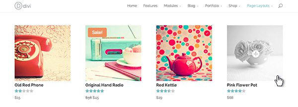
To apply this change, simply copy and paste the following code into the Custom CSS box in ePanel and click Save. If you ever want to revert back to the original style, you can simply delete the code from the Custom CSS field.
/*DIVI POST, PROJECTS, and PRODUCTS - B&W HOVER STATE*/

.et_shop_image:hover, .et_portfolio_image:hover, .et_pb_post img:hover {
	-webkit-filter: grayscale(100%);
	-moz-filter: grayscale(100%);
	filter: url("data:image/svg+xml;utf8,<svg xmlns=\'http://www.w3.org/2000/svg\'><filter id=\'grayscale\'><feColorMatrix type=\'matrix\' values=\'0.3333 0.3333 0.3333 0 0 0.3333 0.3333 0.3333 0 0 0.3333 0.3333 0.3333 0 0 0 0 0 1 0\'/></filter></svg>#grayscale");
	filter: grayscale(100%);
}

.et_pb_post img{-moz-transition: all 0.3s; -webkit-transition: all 0.3s; transition: all 0.3s}
.et_overlay {background: rgba(255, 255, 255, .25);}
.et_overlay:before {color: #fff !important; text-shadow: 0 1px 3px rgba(0,0,0,.3);}
.et_shop_image:hover .et_overlay, .et_portfolio_image:hover .et_overlay { opacity: 1; border: 0 solid #e5e5e5;}





I am using Divi Builder with Headway theme.
I’d like for all the Divi modules to have slightly rounded corners.
I found the code in this article. My problem is, I don’t know where to put the code. Divi Builder doesn’t have an ePanel, at least I can’t find one.
Can someone direct me to where I should put the rounded corner code?
Many thanks!
Every divi module, row, and section has a custom css tab.
I want to change nav bar of my website with this.
Hi, does anyone know how to change the header design of DIVI as per http://infinium.co.uk
Great Post! Simple anal, spell check spotted: the last sentence… th
Give Your Navigation Bar Absolute Positioning
By default Divi has a fixed header that will always appear at the top of the browser. If you have a short website, or do not want the navigation bar to impede your content, you can use this CSS modification to add absolute positioning to your header so that it scrolls up with th rest of your page.
This absolute positioning CSS doesn’t seem to work out of the box with the new version of divi – I get a funky odd sized semi-transparent header that still follows the page….
With regard to rounding all corners of modules, is a Section a module? I’ve wanted to create a rounded border, semi transparent background with a 1 or 2 pixel border, for the entire page so that it hovers over a background image. How can I do that just to that module?
The Round Off the Corners works great on most modules but not on the text module.. anyone know what I could add to have the rounded corners on text modules as well?
Actually, it looks like it is not effecting a text module with a background color.
Great tips. The rounded corners on every module is very nice but how can you round the corners of every row and section also? If my modules have the same background color as a row or section , the effect is not seen. Can you round the larger containers also?
Hello, thanks for the tips, but i did not see what i needed. Almost but not exactly with Give Your Navigation Bar Absolute Positioning.
i actually need my full width menu to be floating in the middle.
also how can i add custom buttons to the menu?
Hello,
In the navigation bar, I’d like to change 1 link to have a different background, font and hover color. Is there a link somewhere describing how to do this? If not, can you please help me? Thank you!
Do you have a CSS trick for putting rounded corners all round a site using the boxed layout? By that I mean, the very top and the very bottom of the site would have rounded corners. I’m finding it challenging isolating the elements to change.
HELP!!
I need to remove the blank space between the header and the first section only. I want the picture just below the logo. Or reduce the main-header size
here the site: http://playstation.increatum.org/unconvention/
Someone help me, please!
How can I put this code on my Divi Epanel Custom CSS ???
Hi
Love this theme,it will make things much easier for me. I’m just converting my site to wordpress , im struggling trying to change the color of the et buttons, Ive entered hex codes but that doesnt work, is there a simple way to change the css so that when I select say a red button, I get a darker color red.
Andrew
why can I not change the footer to a pure colour? It has a grey overlay. thanks
Hello.
How to increase the padding space in the BLOG standard layout where ALL POSTS shown in a list. There are such a mess and impossible to define one post from another. I would love to have an icon that shows the date of the post as you have here at elegant themes blog, and definitely more space between posts or even different background color. What line in CSS is responsible for all posts listing?
Best regards,
Natallia
Thanks for making divi theme. its great. i need some help with menu style . is there any css code or option to change the header Menu appearance . i am looking for some hover affect in different color after from predesigned appearance.
i want different menu style which i am unable to do . kindly help if there is any way to do it.
I’am using this theme to my website, it was very cool but i have a problem.If i want to print my page it is having css issues it’s not giving exact page to print can anybody help me to overcome this problem.Thank you. You can check here also http://www.elegantthemes.com/demo/?theme=Divi
Any answer to AJ’s question about section padding? I HATE it, but no idea how to modify. The default logo is TINY, but HUGE section padding. Strange IMHO. Otherwise, LOVE Divi. But this is killing me. Thanks!
July 5, 2014
Greetings Nick,
I’m working on a test site for a client and she doesn’t like how much padding there is between the sections. Do you have custom css coding that I could use to reduce the padding between the sections. If so, that would be awesome.
Thanks!
Hi AJ & Jenny —
I have found a workaround. It’s not perfect, but it does the trick. When you define a section, give it a css tag. Then adjust the custom css for that tag, so it will looks like this
#yourcustomnamehere {
margin-bottom: -10px;
}
(You can change the margin to whatever you want, obviously, but I find that somewhere between -5px and -10px puts my things where I want them. You can play with margin-top, too, but I haven’t had as much success)
I used divi 2.0.
How can decrease space (in 1_3 column which 2 image and 1 sidebar) between images and sidebar. Help me plz i have very bad problem.
This is a recommended update to the above CSS for the absolutely positioned header, as I had to make this change before it would work as described.
Instead of:
#main-header{
position:absolute;
}
Use:
.et_fixed_nav #main-header{
position:absolute;
}
Was having the issue with the header absolute position. The original code provided does not work.
Your CSS works perfect Brandon.
Thanks
Nick, I’ve noticed that the custom CSS field is not persistent when I push to a new server (or production servers in my case). To push to production in the past we have simply rsync’d the full wordpress documentroot and then dumped the db from our staging server, dropped it in production, and reloaded from the production dump. When we do this all the CSS directives in the Custom CSS field need to be manually entered again via the UI. It’s a curious lack of persistence that makes me wonder where/how that data is stored. We have tried adding it to styles.css and advanced_options.css. Neither worked. Can you tell me how to make it persistent?
How i can decrease the main width of divi theme. i want decrease the all pages and modules width expect header and footer. Can some one help me.
Greetings Nick,
I’m working on a test site for a client and she doesn’t like how much padding there is between the sections. Do you have custom css coding that I could use to reduce the padding between the sections. If so, that would be awesome.
Thanks!
Anyone know why I lose my tags whenever I exit a text module? Does Divi not support it? It doesn’t seem to matter if I code it in, or do a shift+enter. When I hit save and preview the page it shows up correctly. As soon as I open the text module it loses the spacing. I can’t seem to find a way around it, getting annoying.
Nevermind…found the answer –> TinyMCE-Advanced from wordpress is a wordpress plugin, which adds the option to disable the removal of and tags when saving a post and in the HTML editor (autop). After installing-activating, the option to enable line breaks can be found in the Settings->TinyMCE Advanced panel.
LOL, it lost my br tags in the comment as well.
I really appreciate the work you guys are doing, and i must say divi theme is one of the outstanding theme i have ever used. it’s just a bomb. Keep up the good programming. 🙂
i have been trying to remove the top menu link i.e the mega menu drop down from my site but all to no avail.
can yoy please help
I was wondering if someone has updated the code for Divi 2.0
I am very thankful to you if you help me. I am creating a blog using divi but I have some issues in layout
When I add side bar then there is some extra space on the left and right.
–Question is how to remove these spaces
When I insert blurb in a four column row how to reduce their distance because they left extra space and this seems awkward .
Would be nice to be able to set padding etc.
Some content between rows has a 50px pad in each row – ie 100 pixels!
Yes that extra space is a pain. I’m writing custom CSS to fix it which seems like the wrong way to go about it.
I agree, sometimes that seems like a lot of wasted space.
You! You! You… Enablers.
Nick, thanks so much for the CSS tips. Is there a possibility of more to come???
How do I get the above button styles to work on the contact form buttons?
Hi Nick,
Great overview, thanks, looking forward to trying some of these out. Quick question – is there CSS for specific text to add a drop shadow effect? If you look at the homepage here:
http://morningrainpublishing.com/
The word “Morning” blends into the background. Can I add CSS to that widget area to highlight “Morning Rain Publishing” with some drop shadow-type effect?
Thanks!
Hi there, is there a way to use rounded corners on only one page of my website? I want one only one set of images to be in circles….can I do that via CSS? I don’t want everything to have rounded corners…
THANKS!!
When inserting the “Give Your Navigation Bar Absolute Positioning” CSS code, the navi bar still moves a little when scrolling down.
What can I do?
Many thanks,
Tobi
I found a problem with the tabs on the browser Chrome. When you fix the problem?
Hi,
Can I add more than one css function in custom css field? If yes, how do I do it?
Thanks
I want to change the header of my site with my site name but dont know how this works in Divi. Can you please help me with it?
Thanks
Please open a ticket in our support forums if you need help with anything.
How do i remove the menu button on the mobile version of the site?
How do you center the Navigation menu instead of having it to the left?
Suddenly all my text is white.. Even when I type it dark and make sure dark is selected in my text module…
Please help… Thanks,
Bob
I will like to know how to make the menu bar navegation looks like the sample, i mean the submenu that opens like that, horizontal. Also the woocommerce categories is not working.
In addition, add !important where I have to this section:
.nav ul li a:hover, .et_mobile_menu li a:hover { color: #111; background-color: #2b2b2b !important; }
Great Stuff!
Dark Navigation Menu Needs some added code:
.et_mobile_menu .menu-item-has-children > a {
background-color: #333 !important;
}
I’m viewing your Demo page on an iPad Air, the page is jumping up and down, I’d like to join, just wondering what your customer service is like.
Are you aware of the page jumping?
I am having this problem also with a website I’m building right now. Adding a slider to the header is making everything below it jump up and down whenever the photo changes. Both photos are the exact same size. Is there a fix to this?
Did you resolve this problem as I have it on my divi site too only on the home page with the fullwidth slider bar? thanks.
I had the exact same problem while developing the latest layout for my site. Looking into the divi-help forums they suggested to deactivate any plugin before opening a ticket. Turned out it had something to do with the shareaholic plugin. As soon as I deactivated it everything went smooth.
I opened a ticket on shareaholics support forum, but never got a response, so I use AddThis Smart layers instead. Hope this helps.
If you need help with anything, please open a ticket in our support forums so that our team can assist you.
Something I like to do is to use lazy loading animation on any element on your page.
You can do this by adding CSS classes to anything you want to lazy load.
For example I wanted a widget to load from the left, so I added this CSS class to it:
et-waypoint et_pb_animation_left
The et-waypoint tells it that is going to be animated. And the et_pb_animation_left tells it how to animate it. In this case, it loads it from the left.
Zak, that’s cool. Did you suggest this for my logo location problem. Actually would be awesome for the site logo to scroll on from left. Where in the style sheet would I put such CSS code though? And how would I attach it to the logo graphic. ?
Hi,
I haven’t bought the Divi theme yet – still wondering if I can do certain things with it without too much hassle.
Basically I would need to make the whole theme a dark BG, and extend the header down a bit to accommodate a bigger logo. Would also like to extend the nav to be more centrally located and filling more of the screen width (more spaced apart).
Are these things easily achievable? I’m willing to spend a little on CSS tweaks by someone who knows that stuff 😉
Thanks,
Jason
Hi Nick,
thank you again for your incredible work! I’m new of this blog so I ask you to have some patience. I have a question, in Divi Theme can I increase the font dimensions in “fullwidth slider” section “add new slide” part “heading”. Because I want increase the size of the title of the full slide.
Thank you in advance!
All the best
I bought elegant themes and I’m trying to use DIVI theme, but I would like to modify the dimension of my slideshow in the home page. The problem are:
1 – if I use the slider module and I upload a background image, only a part of the picture is visible.Only using parallax effects it is possible to see all the picture.
2 – if I upload a slide image, the image showed in the page is too small and left positioned, and I cannot modify it.
I would like to have a page with a large slideshow and I wish the images were visible in their entirety also into the slideshow.
Do you think it would be possible?
thank you for your answer
ciao
paola
If you need help with anything, please open a ticket in our support forums so that our team can assist you.
i opened one , but nobody replays.
sorry, I’m new in elegant themes and I hope to find some help.
ciao
Now that I’m starting to look at Divi I realise how useful these CSS changes are.
Also useful to know where the custom CSS editor is.
Thanks for providing.
Hi, I am making a site which has little content on some of the pages and the problem I’m having is that the footer is appearing in the middle of the page!
Is there any CSS snippet that can keep the footer to the bottom of the page like a sticky footer possibly?
Thanks.
Some feedback and questions:
1. In the “Tabs” module, how about providing a color picker for not only the background color of the tabs, but also the text color?
2. Is there any easy way to adjust the colors of a tab module? If so, how does one go about doing so?
Thanks for this great theme, it was the reason I bought a Elegant Themes membership. I’m just hoping that more “hacks” can be made into dropdown/clickable options instead of copy/paste features for even faster deployment over multiple sites, or give end-users a better opportunity to tweak their sites’ looks without having to actually delve into the code.
Thanks for listening!
Vincent
Great tips, thanks for all the hard work. My subscription has already paid for itself! Any way we can get the social media icons to float like in the foxy theme tweak?
The article “Style Your Posts With a Gray-scale Hover Effect ” did not work. The code is the same? 🙁
How I could use the color # F7F6F3 in Navigation Menu ?
Hi Fabio.
Just go into the css file and find .container { …. #main-header
Then just change the background color there.
the grayscale does not work for me on firefox (turns everything white) or on IE (has no effect). It only works on Chrome for me.
Just wanted to say thanks for these codes. It’s a good start for me on editing my new site using the Divi theme. This was my first time purchasing a theme and I am glad I did. Keep up the good work developers at elegantthemes 🙂
There is a simple to way to turn manual sliders auto it’s been covered in the Divi support forum.
These are some great CSS tips and tricks. What I would love to figure out and have been having trouble with is: In the sliders, text is hard to see unless using specifically colored images behind the text. I would like to know how to add the overlay effect as is used with the buttons in the slider to the title and description to make it easier to read regardless of image background. Any help with this would be greatly appreciated. Keep up the great work!
Anyone knows how to customize the circle containing the menu on mobile navigation ? What a weird bug mine just disappeared and displays “67” instead.
Any idea how we can deactivate mobile theme for a single page? Is there a way that can be done?
Hi Nick,
The CSS for graying is not working on Firefox. The images are disappearing there.
Thanks
Puru
Nice tips – I sure appreciate being able to add them to my toolkit.
My New Year’s wish is for a way to set the slider to auto play. I’m experimenting with javascript now but it’s scary. My client LOVES their new Divi site but insists on an auto play slide show.
Please, please consider providing this for us in the “12 Days” of Divi.
Nice tricks, it will help all the designers !
Now thats what I call incredibly useful CSSand practical as well. Will save hours hunting through CSS.
Gray-scale Hover Effect:
how to reach the opposite effect, i.e. having de-saturated images which turs in original color on hover?
Hi Mac, the :hover pseudo element means “when the pointer hovers the object” while the grayscale(100%) value means “apply a full grayscale effect to the object”.
So if you want the original object to be in grayscale and the hovered in original colors, you may want to apply the effect by default to the object and remove it when hovered.
This should gives something like this :
.et_shop_image, .et_portfolio_image, .et_pb_post img {
-webkit-filter: grayscale(100%);
-moz-filter: grayscale(100%);
filter: url(“data:image/svg+xml;utf8,#grayscale”);
filter: grayscale(100%);
}
.et_shop_image:hover, .et_portfolio_image:hover, .et_pb_post img:hover {
-webkit-filter: grayscale(0%);
-moz-filter: grayscale(0%);
filter: url(“data:image/svg+xml;utf8,#grayscale”);
filter: grayscale(0%);
}
Also you may not want this effect to be applied to all these classes : .et_shop_image, .et_portfolio_image and .et_pb_post img. you may want to remove those you don’t want the effect to be applied to in order to avoid overuse of the effect.
I didn’t re-subscribe yet to ET and don’t plan to do it in the near future so I’m afraid I cannot test in real life especially to eventually edit the .et_overlay class.
Hope this helps you.
Anyone having any luck with the fixed position header. In Chrome and Safari it doesn’t seem to work for me.
I think you might try the important attribute. It worked for me…
#main-header{
position:absolute !important;
}
I’m having the same issue. You found a solution?
If you care about your site’s speed and it’s effect on your conversion rates, here are my two cents about (but not limited to) the border-radius snippet.
The theme already contains a relatively high number of vendor prefixes; so except if your website’s statistics show a significant amount of old browsers (which I really doubt), you may want to apply the 80/20 (or 99.991/0.001 in this case) Pareto law and discard the prefix for – amongst other – the border-radius property.
As the caniuse.com great reference shows, it’s almost fully supported now.
Additionnaly, here is a quick note for those who use tools like Lea Verou’s -prefix-free or NetTuts’ Prefixr (or WBond’s Sublime Text editor plugin).
If you really love vendor prefixing your stylesheets, the very last version or WordPress integrates Sass – as a reference for the future generations who will live in outer space, I’m talking about the v3.8 as of today. So why not use snippets from kits like bourbon.io to manage them automagically.
Well, I spent my two cents and have no more credit by now.
From Paris with love 🙂
especially don’t tell about divi existing to anybody in slovakia from where i’m 🙂 i know customization boa bla bla but customers are not stupid … if you create site for them and they say i see somewhere this graphics design ….
It seems all website in next 2014 year will the same look (divi of course) i love divi but i hate if anyelese create the same looking site for customers and that is minus for me 🙂 Don’t tell too anybody else about divi please !!!
@Swerens I agree. We could get active on the ET Google Plus Forum, just like the guys @studiopress for the Genesis Framework have done
I really like this wordpress theme so far and I was wondering if you guys could make a Sign up form module for user so that they can access diffrent pages that are restricted
let me ad something, check out these css drop shadow tutorial http://www.jb-webs.com/jb-website-builder-wicki/css-framework/css-moz-styles/moz-box-shadows/ what makes it so cool is, you need just copy paste 2 code Blogs into your page header / body and it will work … super easy
I’d bet some sort of forum for sharing CSS tips and tricks, discovered by Divi users, would be very popular!
Merci pour tout, c’est juste génial.
How to style posts with gray effect but reverse? Ie they start as b&w and on hover they get color? I think this way is better.
I agree – thought the same straight away. wish i could tell you how!
Thats awesome..
The rounded Corner makes the punch for the Layout, thanks a lot….
btw: with the Grayscale CSS the same effekt here. FF and Chrome on Mac and Win.
Dark background header and gray-scale are one of the awaited effects.. Thanks Nick & team..
I would really love to see some creative layouts for blog posts too..
Nice code snippets. I will use it in localhost to test them. Thanks for sharing it.
I’m just wondering which value resource or rrick, you will show us tomorrow!
Great, that kind of customization take a few hours to do, thank you Nick, this a value resource, i remember that other good way to do instead of the css in the epanel is by creating a child theme, but i guess that is only better if we also made php changes, please tell me Nick, just for add a few css lines, wich is better way to do, childtheme or epanel css?
divi features is awesome. but, if the features of the divi will also be added in elegant builder?
Regard
I was testing some CSS since I’m playing with DIVI but all I need is in this post! Thanks guys! you rock!
Wow! I absolutely LOVE CSS tricks like these. Absolutely awesome.
Perfecto. Justo lo que necesitaba para ajustar el sitio web que estoy preparando. Saludos.
wow, this is by far the best divi day! would love to see more of this in the future.
I’m loving all your posts about Divi, and this one is especially useful! Not being a coder myself I appreciate it when someone hands me useful code that I can use to improve my sites.
Never cease to amaze!!! Best template company ever!
Very Very Handy and usefull tips how to use the css style with DIVI…
Every day the DIVI will be stronger and stronger!.. 😉
Maybe a crazy question…
I think it will a BIG problem to make a better theme than DIVI in the future for you guys, how will you manage that?
Regards,
Ray
I think our main goal will be to make Divi better, rather than making a new theme that is better than Divi.
We will continue to make new niche themes that are entirely different than Divi, which will make them better for certain situations. Divi is in its own class though 🙂
Definitely it is!
@Nick that’s what I though… better that way 😉
Awesome tips!
The support forums should have something like this to help people with common questions and save duplicate posting.
I’m hoping for auto sliding slider by the twelfth day?!
There is a simple to way to turn manual sliders auto it’s been covered in the Divi support forum.
Could you please point me to the right forum for this info?
Thanks!
This will be added to a future version of the theme, but not by the 12th I am afraid.
My site changed after updating. I do not know CSS coding. The modules are taller (I do not know how to correct this) and the install for aWeber is not working and the sign up shows twice and is totally off. aWeber said the theme was overriding them. I have requested help and written over 10 request begging for help and no one will help me. I will pay someone to go one line with me and show me how and where to correct this.
I hope someone here will respond.
Sorry to hear that you are having trouble. Please open a ticket in our support forums so that our team can assist you.
Hi Nick! Is there a way wherein I could move the text and the button of the fullwidth slider to the right or left? Thanks!
Try the Meta-slider plugin (not from elegant themes) – it works really well with DIVI
Divi is an extraordinary theme, but I have some issues with the slider and my suscription ends 🙁 Do you have any idea how I can fix it? :'(
no one really cares though, i like this one.
Hi Nick, did you guys manage to get a way to make the slider auto for the Divi theme? thanks!
There is an Auto Rotation option in the latest version of the theme. Be sure to update your theme to get access to the latest features.
HI Nick. I have Divi 2.1.4 and cannot find the AutoRotate feature. Can you point me to it please?
Any idea when this feature will be added? We have an immediate need for it.
Great Theme. I was trying to get the sidebar added to the woocommerce category page. I was told it is not easy. I see this in almost all the themes. What is the issue in adding it to the Divi?
Great stuff. Thanks ET!
Amazing and nifty CSS feats for top of the chart theme-Divi!
this looks amazing!
Ok GRT Idea posting this/these tips (and just can copy/paste) NOW I’m renewing my membership!! (didn’t like how buttons had no ‘life’ and luv sharp corners) Congrats on keeping up your Amazingness and for such an In$ane Price!!
I like Divi and all of the tips and tricks! Dying for a client to want a new look.
Excellent post thanks again! They all worked great for me except the Grayed-Out posts. On my site it simply made all the images disappear (including the ecommerce module) when hovered over.
Yes I found that the ecommerce images completely disappeared as well on hover and that seemed to be related to the greyed out image script. Once I removed it, my ecommerce image hover returned to normal. Must be affecting the same selector.
Which browser(s) are you seeing this issue occurring in?
same for me.
Disabled it. It would be a nice ouch.. if it worked.
FF and Chrome. Didnt try Safari or IE. I guess if nobody else is having the issue I’ll open a thread in the forum to keep the trouble-ticket off this section… unless you prefer to openly address it here.
I’ve had the same problem with Firefox it turns to white. Nothing happens on IE and Opera. It works on Chrome though.
Same…
Good stuff thank you
Wow, this launch is reaching epic proportions.
A new religion, the Divi cult, unfolding before our very eyes.
Praise the Lord!
Halleluyah…! Chuckles…
I just tried the ‘gray scale hover effect.’ However, it doesn’t gray-scale the pictures, unless turning them completely white is the desired gray scale effect. Could it be that it doesn’t work for .jpg images?
Having the same issue.
Excellent tips, thanks for sharing! Have been working with Divi all week, it’s packed with so many goodies It’s making me totally rethink how I manage WordPress sites for the best!!
This list is so great. As a CSS newbie this is so helpful. Thanks!
Thanks for the post. I have already been playing with the modifications on the dark header and I am noticing a quirk. When you go back to the larger sized header after scrolling down you will see a white background for a split second before it reverts to the correct color scheme.
Any thoughts on a fix?
Great, thank you Nick
Nice!!
Thanks for the tips!