There are all kinds of websites out there running on WordPress. From e-commerce websites to business websites, news websites and more. Although the ones we just mentioned are on the top of people’s minds, WordPress websites go a lot further than that. There are WordPress themes available for basically anything you can imagine. There’s, for instance, a huge amount of educational websites that are made with WordPress out there. Whether we’re talking about universities, colleges or training programs; WordPress has been there and done that.
In this post, we’re going to take a look at 14 different educational websites on the internet that run on WordPress–and do a pretty good job at it as well. The websites might inspire you for the next educational project.
- 1 1. Harvard Gazette
- 2 2. Georgia State University
- 3 3. College Choice
- 4 4. Bennett College
- 5 5. Skillcrush
- 6 6. International Gem Society
- 7 7. Washington State University
- 8 8. NC State University
- 9 9. Drew University
- 10 10. University of British Columbia
- 11 11. Eastern Institute of Technology
- 12 12. Concordia University
- 13 Made With Divi
- 14 Wrapping up
1. Harvard Gazette
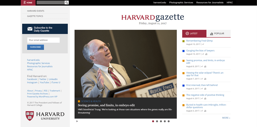
The first example is probably very well known; the Harvard Gazette. The Harvard Gazette is an official part of the Harvard website and thus the university itself. The site is in between a news website and educational website but knowing that it originates from Harvard, the university, we’d say it leans a bit closer towards an educational website. They handle all kinds of topics; from campus culture to arts and culture, science and health and more.
Although the main Harvard website doesn’t use WordPress, they did figure that WordPress is a great option if you’re looking to share articles on a weekly if not daily basis. The website itself has a very serious and clean look. It contains the highlighted posts in the first part of the website and they include the ‘latest’ and ‘popular’ categories as well. The website also contains a vertical navigation that stays fixed throughout the whole website.
2. Georgia State University
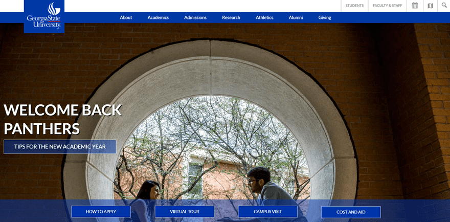
The next website in our list of educational websites that are powered by WordPress is Georgia State University. One of the things you can notice on this website is the dominating professional blue color they use in their logo. They decided to use that same color often throughout their whole website. The primary menu consists of seven main menu items that represent the core of the university. The style they’ve used throughout all the pages on the website is rather clean and professional–a feeling the university wants to make sure their visitors link the university with.
Their homepage gets to the point by offering their visitors immediately what they’re looking for within the hero section. They also provide their visitors with an interacting factor by including a combination of input fields to find your field of study.
3. College Choice
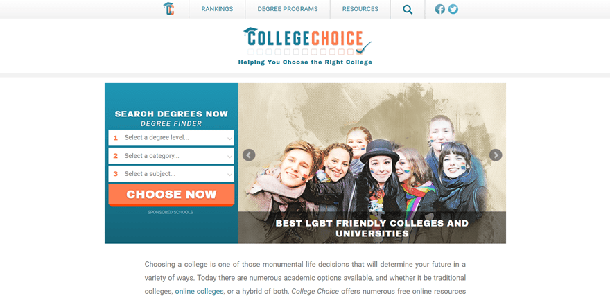
Up next is College Choice. A website dedicated to helping students make the right choice for their future. They immediately start off with a, what they call, degree finder. This website goes straight to the point and focuses on delivering the needed information to the right people.
They made sure their website doesn’t have a lot of extra factors that might distract their visitors from the message they’re trying to send and the service they’re trying to offer. The website is a great collection of degree programs, rankings and resources that help future students in every step of their way.
4. Bennett College

The fourth example in the list is Bennett College. Bennett College is a college based in Greensboro. Their hero section contains the three elements that define the Bennett college; programs, applications and donations. By placing these in their hero section, they immediately make their visitors aware of how the college functions.
Besides that, the rest of their website is also very elaborated. Five of the six menu items contains other pages that help every visitor find exactly what they’re looking for.
5. Skillcrush

The next website we want to put in the highlight is Skillscrush. Skillcrush offers people job-training programs for all kinds of web-related careers. From freelance WordPress developer to visual designer, web designer and web developer. Their website uses a nice balance of fresh colors, illustrations and real-life pictures.
Skillcrush is the ideal example of what a user-friendly website looks like nowadays. In contrary to university websites, this type of educational website focuses more on the commercial side of their business. They, for instance, offer an e-book to attract customers. Something you wouldn’t often see at websites that are dedicated to universities and colleges.
6. International Gem Society
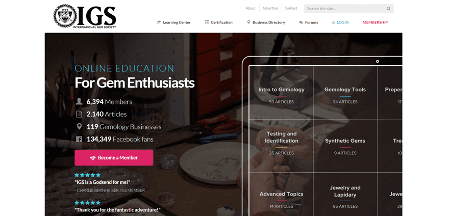
Moving on, we’re going to take a look at International Gem Society, which is an online education platform that helps people become experts at gems. They have members from continents all over the world (except for Antartica, apparently).
Their website helps every member (or potential member) on their way towards becoming part of a community where people learn from each other. They have the straight-forward website that offers all the information visitors need and they include social proof to convince them in the process as well.
7. Washington State University
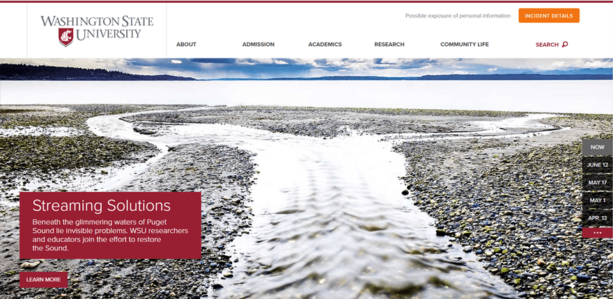
When we take a look at the website of the Washington State University, we come back to the same type of website as the first one in this list. Very typical for universities and colleges is to use their logo color throughout the rest of their website to accentuate the content that is being provided. That’s not really a coincidence though. The logo of the university is usually something students and teachers feel proud of. By showcasing the colors of their logo on their website, they reflect a certain feeling of belonging and pride.
The website consists of five pages in the primary menu that contribute to the added value this university brings.
8. NC State University
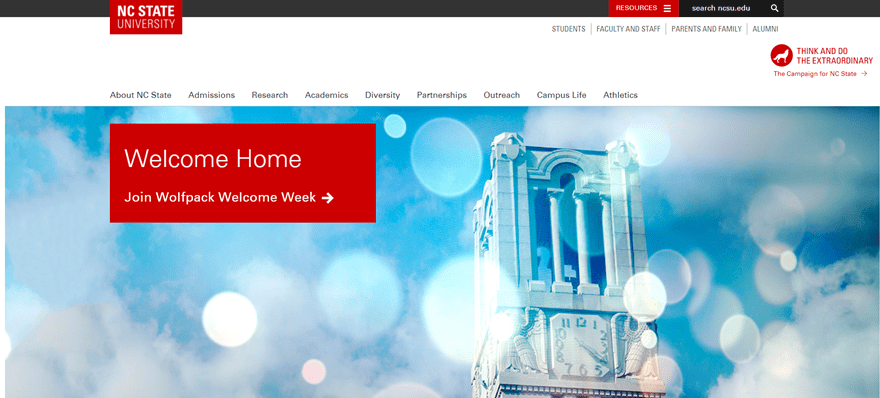 Another university that earned its spot on the list is the NC State University. This university is located in Raleigh, North Caroline. In overall, their website looks clean and consisting of all the needed information.
You can notice the same color balance in this website as well; the logo color is the most used color on the website and accentuates and defines what the university is about. With its nine additional pages, it offers the students a complete insight on what one can expect from the university on different aspects.
9. Drew University
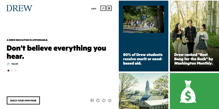
One of the most out-of-the-box educational websites in this list is definitely the website of Drew University. Rather than following the same structure as the other pages, they decided to create a certain division on their website; a left and right part. The left part remains fixed whereas the right side is scrollable and the content depends on how you navigate on the left side.
Besides the excellent look and feel of their website, they also try to convince their potential students by putting the favorable facts out there.
10. University of British Columbia
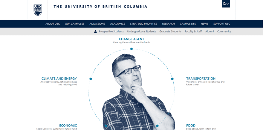
Another website that surely differentiates itself from other university websites is the University of British Columbia. Although it also maintains the logo color throughout the whole website, they also make use of fun animations. While scrolling on their homepage, you’ll also notice that they rather share visual content than written content as other university websites rather prefer.
They provide their visitors with two navigations; one focused on what the university offers and one on that puts the focus on the people behind the university and the community feeling.
11. Eastern Institute of Technology
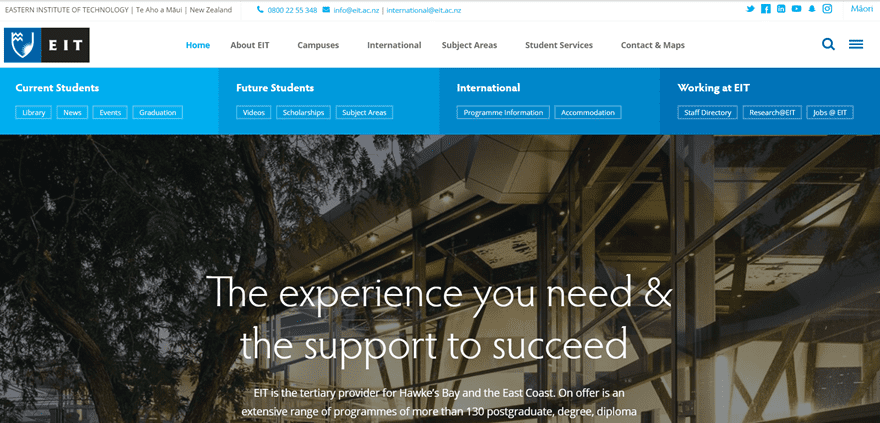
One of the last educational websites in the list is the Eastern Institute of Technology. They started their website off with their strongest assets. They provide their visitors with the needed information and put things such as their international program in the spotlight.
Additionally, the website contains six extra pages that emphasize the message they’re trying to bring on their website right away. With their hero section and catchy headline they immediately show you that the Eastern Institute of Technology is the place to be if you’re looking for experience and support combined.
12. Concordia University
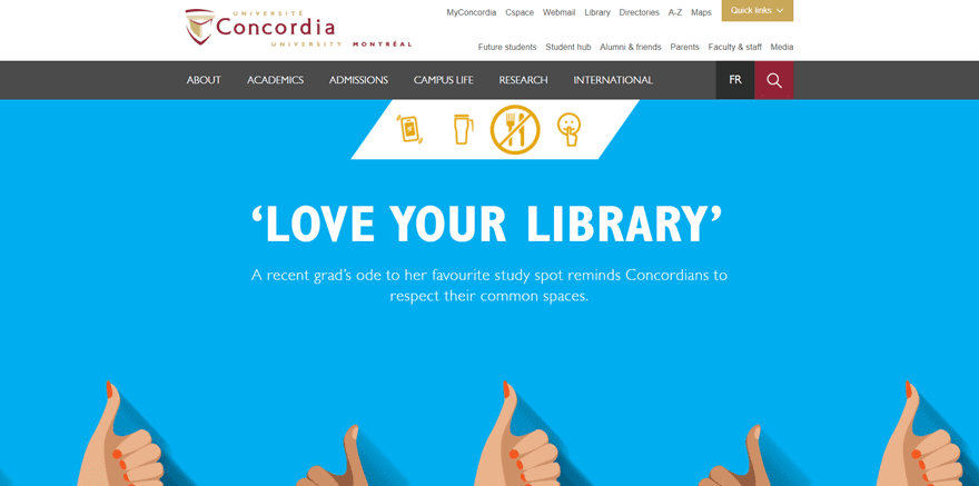
Next, we also have the Concordia University that uses WordPress to share their website with the world. They immediately start their website off with some illustrations, something which is not that common for university websites but it gives a nice look and feel to the complete website.
Also, unlike most of the other university and college websites we saw in this post, their website doesn’t get dominated by the color used in their logo. They rather use it to accentuate certain elements of the website.
Made With Divi
13. Digital Strategy School
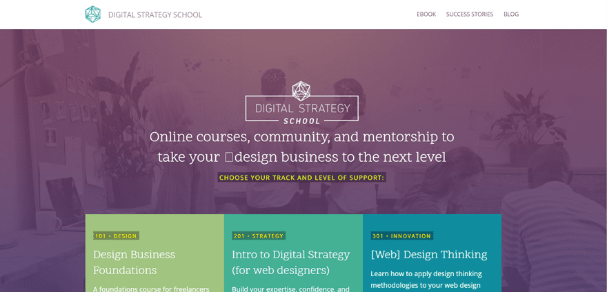
Last but not least, we think the Digital Strategy School is worth mentioning. This website was not only made with WordPress but with the Divi theme as well. The Digital Strategy School offers a ton of online courses to its audience and tries to keep up with the community feeling as well.
Their website is the nice kind of simple. The one where you can navigate easily through the different pages and content provided to the visitors.
Wrapping up
In this post, we’ve shared some nice looking educational websites that run on WordPress. If you have any questions or suggestions, make sure you leave a comment in the comment section below!
Be sure to subscribe to our email newsletter and YouTube channel so that you never miss a big announcement, useful tip, or Divi freebie!
Featured Image by Jiw Inka / shutterstock.com



thanks for arranging the list, it was really good. I am looking for some photography website which running on wordpress. can you provide me some websites name and it will be great full if you also give me any tutorial for making a photography website in wordpress. thanks!
Don’t forget MIT
Nice collection guys. I think WordPress generally is a great tool for edu based sites.
We use it for schools and colleges in Australia a lot and its always done a great job and delivering for our clients.
Hi there,
I would like to find out what is the LARGEST site recorded that was built with DIVI? Is there a size limit to the number of pages? Will Divi be robust enough to handle sites like big Universities etc. Or at what point will the performance be affected?
Even I created an educational site using Divi with available templates. So easy!!
Was hoping to see examples of educational sites vs educator sites as the title suggests. As I read this though, I understood the confusion:
This post contains a number of misused words and terms. As though it’s been written by someone whose first language is not English.
Disappointing post this time, Divi team.
Good collection and good sites.
The websites’s links don’t open in a new tab. 🙁
Too easy to escape ET. No, No. 😉
Andy
“Digital Strategy School” is not linked …. 😉
Thanks for the heads up. Fixed!
Great list. I designed our Seminary website with Divi. It is fabulous!
I agree with you, J.R. Miller… Divi has fabulously changed the game in WordPress website design. Oh and I love the weekly FREE page layouts.
I also created educational website using divi. Thanks a lot Elegant Themes. Divi is totally awesome!
ME too Rizal.
Love the DIVI work.