ThemePunch makes some of the most popular plugins out there for WordPress. Essential Grid is one of the top earners in their library, right alongside Slider Revolution. Over time, Essential Grid has become one of the most sought-after and most successful plugins on CodeCanyon. So we wanted to give the plugin a highlight and let you folks decide if it’s something that could improve your sites.
Essential Grid
Grid plugins aren’t uncommon. In fact, our own Divi builder has a Portfolio module that serves this purpose. But Essential Grid goes far beyond what most other grid plugins have done, which is why even after many themes are including their own custom grid templates, folks are still buying EG licenses every single day.

Simply using the original sales blurb will tell you what you can do with EG:
Essential Grid Gallery is a premium plugin for WordPress that allows you to display various content formats in a highly customizable gallery grid. Possible applications range from portfolios, blogs, galleries, WooCommerce shops, price tables, services, product sliders, Instagram, YouTube, testimonials and anything else you can imagine.
But what their blurb doesn’t tell you is just what all that customization consists of. That’s our job, and we intend to do it. So let’s dig in and see what all the fuss is about.
Getting Started
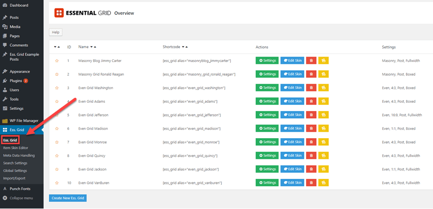
First of all, remember that this is a premium plugin. You will need to head over to CodeCanyon and snag the download for $27 USD. Then go through the manual installation process (Plugins – Add New – Upload). At this point, you will have 3 new items in your WordPress admin dashboard: Ess. Grid, Punch Fonts, and Ess. Grid Example Posts. To begin with, let’s look at the simple Ess. Grid.
The first menu item is where you put in your activation code, check for updates, changelogs, that sort of thing. They do give some simple instructions on how to use the plugin which boil down to: use a shortcode or drag the widget to a sidebar.
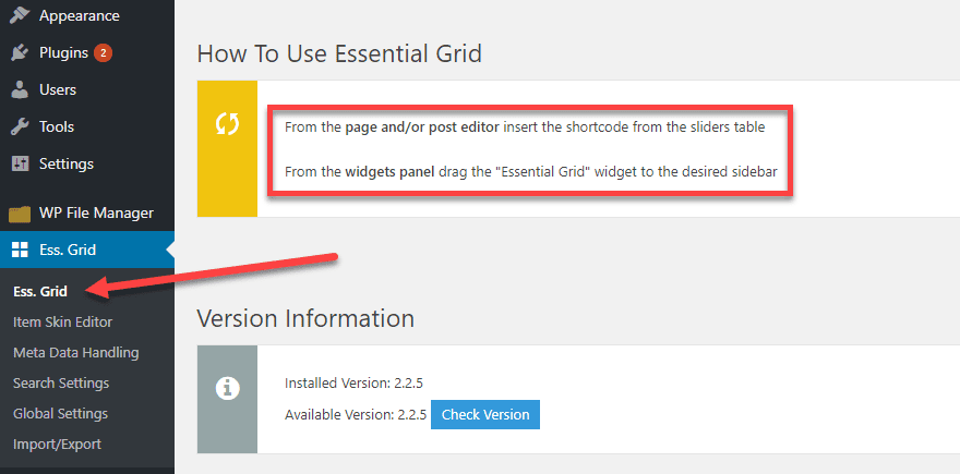
This page will also be where you come to create any new grids you want to use, so get used to clicking that button.

Item Skin Editor
Under Item Skin Editor, you have all the basic templates that Essential Grid comes with. You can edit these on a skin-by-skin basis, changing whatever you want to about it. Or using it as is. You can even create your own from scratch.
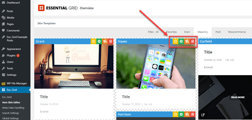
In here, EG gives you the option to sort via tab for different types of grid items. (Even spacing, Masonry design, Posts, or WooCommerce product grids.) As you hover over each one, it will animate and display titles, excerpts, color overlays, etc. that you can customize by clicking on the green gear icon.
Inside this options panel, every single element can be edited. From the spacing between elements, the icons that show up, animation style and duration, links, shadows, media types and fit, everything.
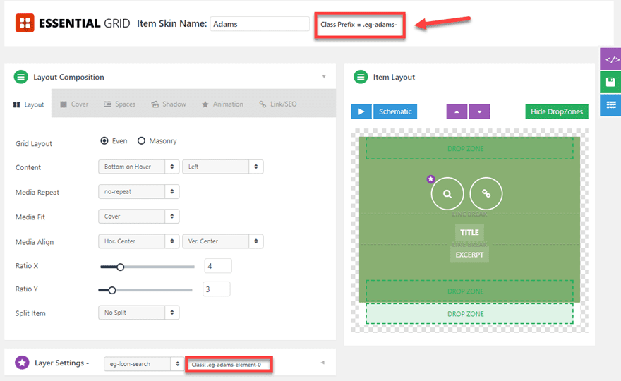
I would like to call your attention to the fact that Essential Grid has the CSS Classes in plain view for you to manipulate however you want. If for some reason you can’t find the perfect design option within the options here, you can add it yourself via custom CSS.
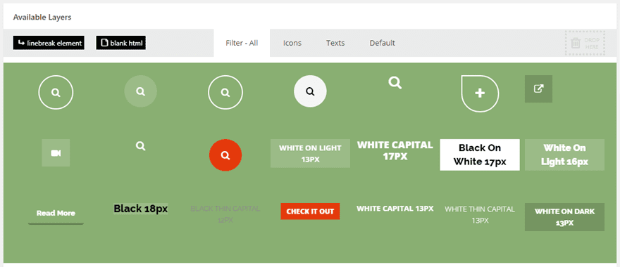
At the bottom of the page, you get a bird’s eye view of every layer you have access to and how it is currently styled.
Meta Data and Search Settings
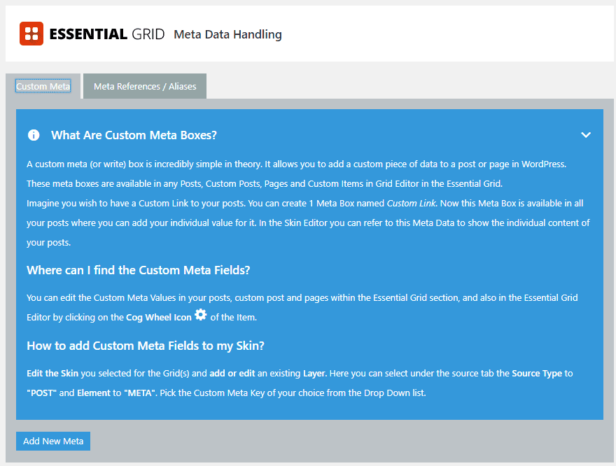
The skin editor is probably the most robust individual part of Essential Grid, but EG doesn’t shirk those options elsewhere. You can create custom meta boxes under Meta Data Handling that gives you the option to place boxes for custom functionality that you may need out of the plugin.
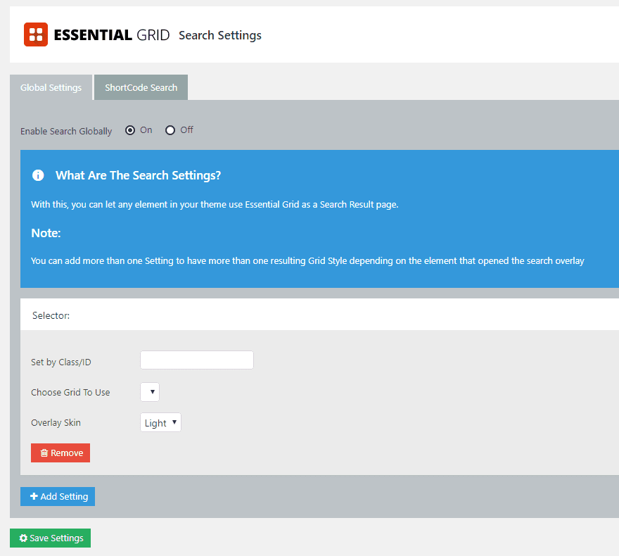
You can do pretty much the same thing under Search Settings, but for (you guessed it) searches. EG works as a search results page, too, so if you’re not happy with the way your normal archives and such look, this is a great way to fix them up quick.
Global Settings
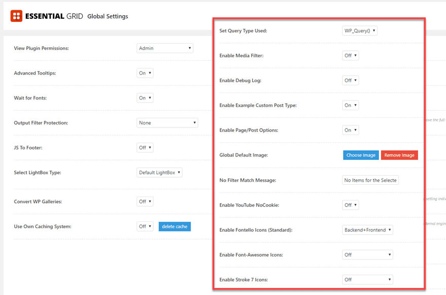
Just like they sound like, the Global Settings cover all your bases. You can set permissions for who can change and edit grids, how the fonts and JavaScript load, what you do for caching, where you get icons from, setting a default image for grid elements, and so on. If it applies to the whole plugin instead of a single element like skins-only, you’re going to be able to find it here. The impressive part is the control you get — many plugins don’t give you an option for choosing what kind of query you use, but EG lets you choose if get_posts() or WP_Query() works best for your site (and if you don’t know what that means, just leave it default. It’s good how it is.
Import/Export
When you’re first setting up the plugin, you should definitely check out the Import/Export page. If you click the Import Full Demo Data and Import Social Media Demo Grids, you will have a huge array of initial templates that you can start with. They’re good, too, so just click the button and the import/download is almost instant.
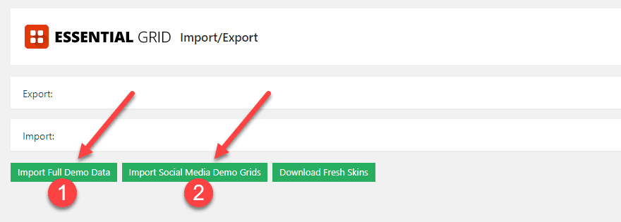
The imported grids will appear at the bottom of the list when you navigate back to Ess. Grid. Your new library of grids will meet you there.
Ess. Grid Example Posts
The second of the new admin menu options is the Ess. Grid Example Posts. It’s an odd choice to make for a menu title, as this is where your templated grid items will probably live. You see, all of those posts that are listed on this page are actually the contents of the boxes contained within the grids under the Ess. Grid overview.
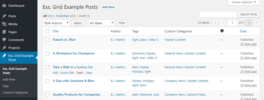
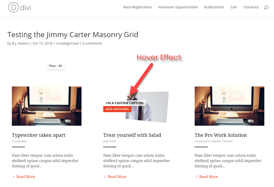
When you use the shortcodes that you get from the overview page in whatever post or page you want to display the grid, these are the individual items that pop up.
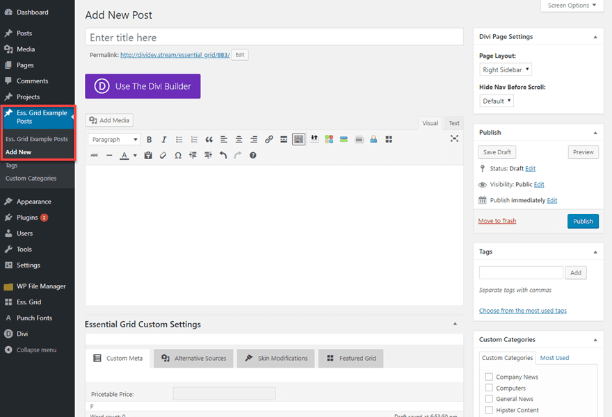
Creating a post for a new grid is easy, too. It works just like adding a new post of any other type. Just hit the Add New button under this heading and set your parameters.
Using a Saved Essential Grid
Whether you’re using the templates or make your own, you need to know how to use them. Everything revolves around shortcodes with Essential Grid. If you have a specific grid that you want to use over and over, you will need to click on Create New Ess Grid under Ess. Grid‘s overview page in your admin panel. Inside, you choose everything from how you can sort the items in the grid, what loading animation it has, where its elements actually come from, and you get to name it.
When you name it, you also get to choose its shortcode alias. That alias is only used to call this particular grid using the Essential Grid shortcode. I also chose to use the same ID for the CSS ID just in case in the future, I wanted to make external tweaks.
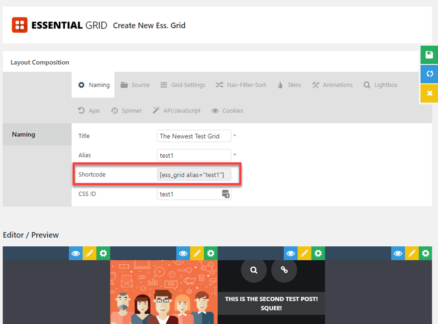
Just put the shortcode in a post or page’s text editor, next.
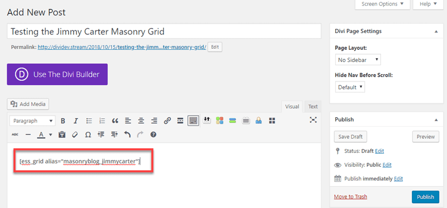
And voila!

Using a One-of-a-Kind Essential Grid
If you know you just need to display something on one page or in one post, there may not be any reason to go through the trouble of setting up a whole new grid, making new posts for its content as templates, and making aliases and all that. You can instead simply generate a dynamic shortcode from within the post editor itself. Just press the Essential Grid Shortcode Creator button in the toolbar.

Then you will need to go through the steps to tell this shortcode what content you want it to render. You can choose one of the predefined ones from the overview menu (without having to go copy/paste its shortcode manually), or you can make your own based on the options presented.
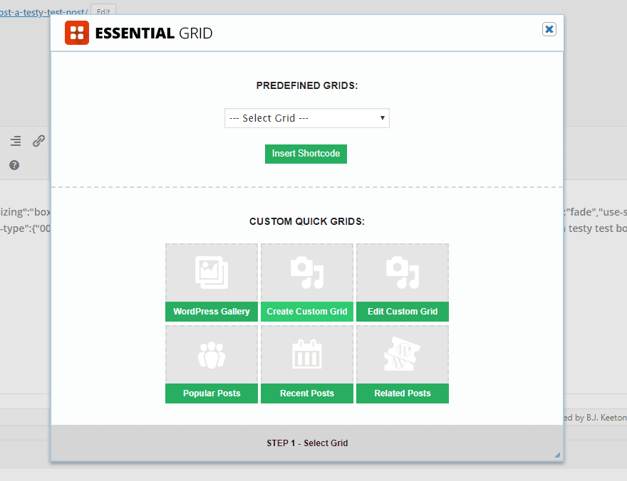
You will go through pages to choose all the same options that you have elsewhere (animations, layout, etc.), and when you’re ready to go, press the Generate Shortcode button.
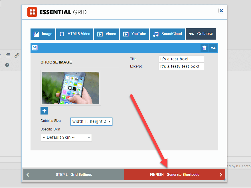
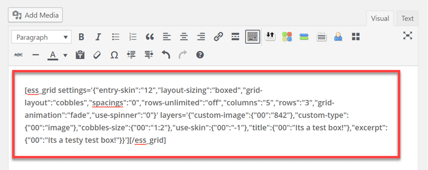
As you can see, the shortcode that is dynamically generated is far more complex because it holds all of the information about the grid itself.
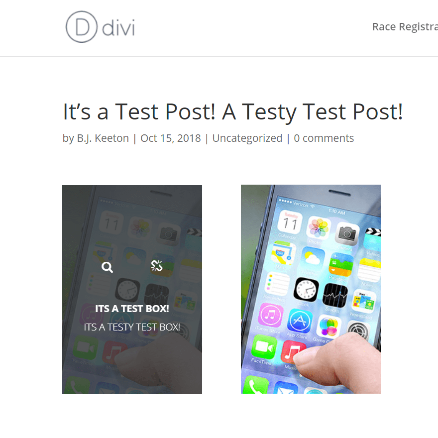
But when it’s rendered, there’s no difference. Especially if you chose to apply a skin during creation.
Essential Grid Widget
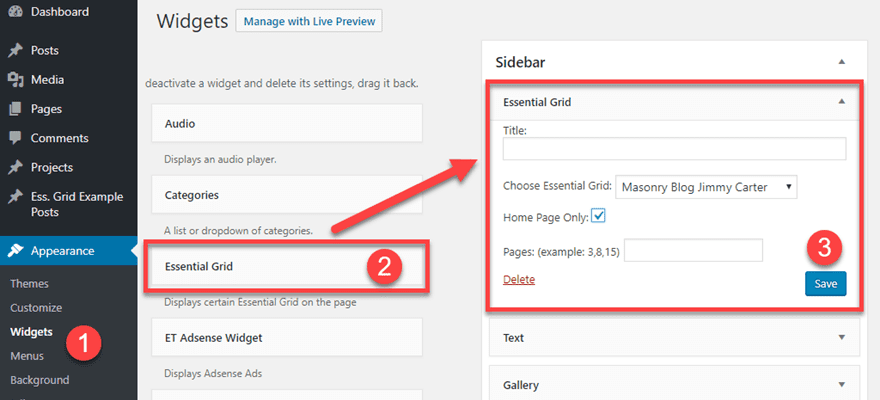
Finally, you have the option of putting any Essential Grid that you’ve created in a widget. This one is easier than any of the others to set up because it’s literally drag-and-drop. Go into Appearance – Widgets, select the Essential Grid widget and drag it to where you want it to render. If you want it on the homepage alone, you can set that, or you can pick any of your premade grids. However, you cannot create a dynamic grid this way as you could above. These must be pre-generated.
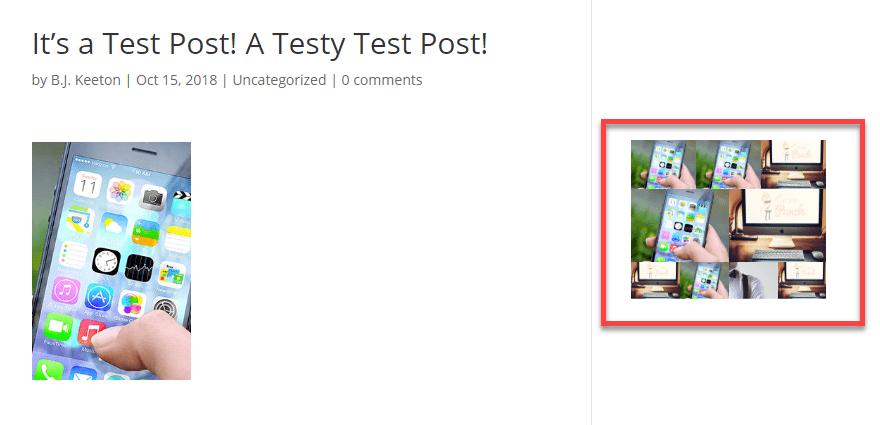
One thing to keep in mind, however, is that not all of the layouts look good in a sidebar. You might get some of your content rendered very strangely, but don’t freak out. If that happens, just go change the settings so that it will display differently — boxed instead of fullscreen maybe or Even instead of Masonry, maybe. Experiment until it looks the way you want it to. It’s probably a good idea to make a sidebar-specific grid for this. (You can just duplicate the one you want there and tweak it instead of the original.)
Punch Fonts
And finally, there’s the last bit of customization you get with Essential Grid. Punch Fonts is a simple interface for using Google Fonts in EG. That’s it.
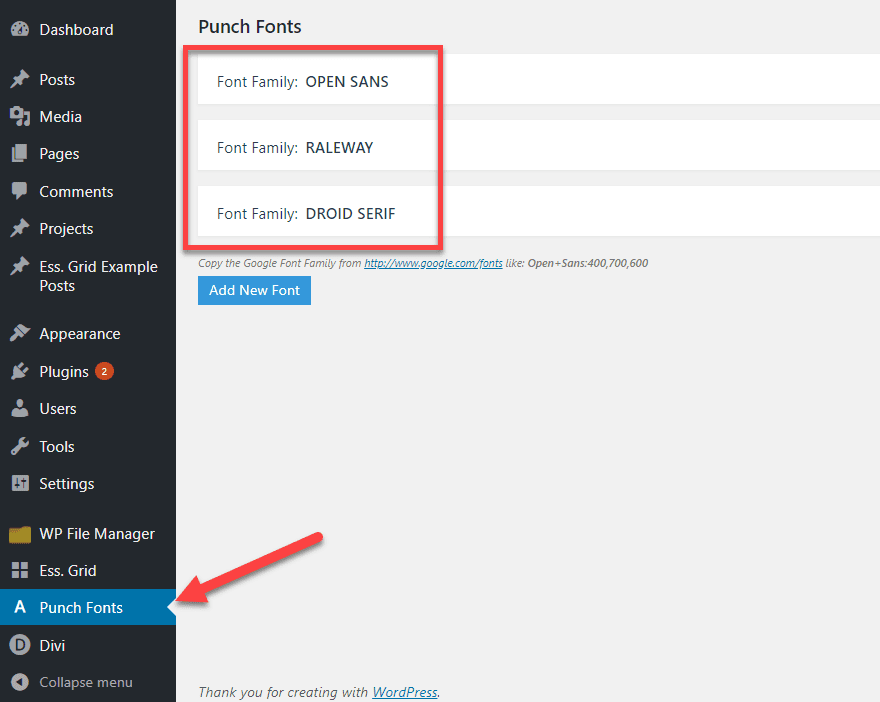
You can choose which fonts you want to be installed by pressing the well-titled Add New Font button. If you follow the link in the modal to Google Fonts, you will find the parameters you need, and the plugin will pull the font into your site.
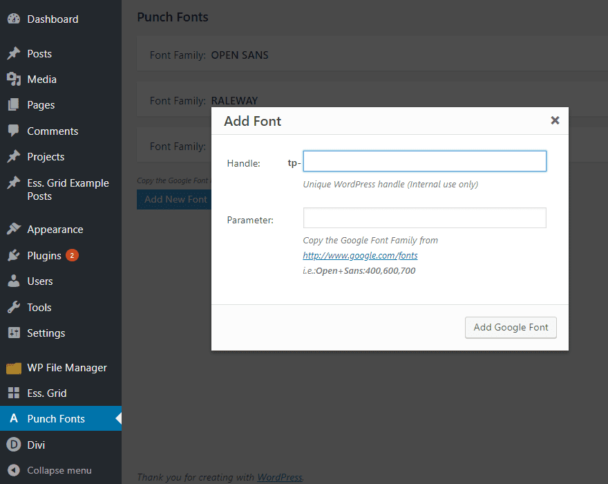
And when it says the tp- moniker is for internal use only, that just means it’s basically the same as the alias earlier. You will see that when you’re applying the fonts to things. So name them appropriately.

Final Thoughts
Overall, Essential Grid is one of the most robust and powerful grid plugins out there. If you’ve ever used Slider Revolution, then the layouts and layers work very similarly to that, and you should feel right at home. If not, there may be a bit of a learning curve as you figure out which pieces fit together. But once you do, you will be able to create some truly beautiful pages.
If you don’t need this level of customization, you may not want to pay the premium price. There are plenty of other grid plugins out there that may suit your needs. Additionally, depending on how heavy you make the grids, site speed could become an issue. I mean, you can customize your loading animation for a reason.
However, if both necessary and done correctly, the plugin really shines. There is a reason Essential Grid is the number 1 seller in its category. And if you check ratings and the support threads, ThemePunch is quick to reply and help.
So for $27, it is probably worth the price of admission. Plus, if you’re a theme designer, you can purchase their extended license and include it as a pack-in for your own themes. Which is pretty cool.
Do you use Essential Grid? Let us see some of your creations in the comments!
Article featured image by Bloomicon / shutterstock.com



I just want to say how much I respect a company (Elegant Themes) for promoting a product (Essential Grid) that you feel is best in class, even when it competes somewhat with your own product. I already am a lifetime member of Elegant Themes – Divi is best in class as far as website themes go! – and now have an even higher level of respect for your team.
Can we use it with elementor visual builder??
Your themes are superb by the way.
Can you use this plugin multiple times for the 27$, or do you have to buy a license for every site you use it on?
New version doesn’t work well with divi. If you use new version, animations in divi don’t work. Older version works ok.
The biggest problem with ES Grid is that it is terribly laborious and taxing on the server and can slow a site down. It can also crash browsers on older Windows machines because it takes so much to run on the site as well. I have had a number of times that people can’t even see the features of ES Grid because their browser doesn’t support the code or simply can’t process it. Not to mention, ThemePunch has had a ton of bugs that have been listed in Sucuri over the recent years making me steer clear of ES Grid and Rev Slider. I haven’t used any of their products in well over a year because of these few reasons. Though they’re a great product, they just aren’t worth the headache when everything their plugin does can be achieved through hand building the code into the site and it won’t cost you the runtime and security issues.
Good point – have any of their plugin updates improved this situation? Or is this the current situation? Thanks
Will we be able to build similar grids when the Theme Builder is released? Will we be able to use any combination of modules with dynamic data to create a layout displaying information about a single post etc, then loop that layout into columns/rows etc? Is that how the Theme Builder is going to work?… I certainly hope so.
Will the Theme Builder allow us to build grids that can be inserted into any page, not just build archive pages? The Blog module should be replaced by a generic Grid Module that allows us to build a layout using any combination of modules and dynamic data, then loop that layout into grid form. This could be used to display blogs or any dynamic content we wish.
How does it work with the Visual Builder? If I built a page using the Visual Builder can I still use this plugin on that same page?
Yeah, you absolutely can. Since it’s shortcode based, you can just put that into any space that renders a shortcode. Like a Text module, for instance. You’d just have to work within the confines of the page for spacing (which is the case, regardless).
We’ve been using Essential Grid for years now, it’s on everyone of our 9 sites and on many of our clients sites. It’s way more than a blog feed, we use it for our holiday cottage sites, it’s the backbone to these.
Sure it’s a little bit complicated at first, however once you get the hang of it, it surpasses any other gird system we’ve trialed. Robust and totally flexible and can do ‘just about’ anything. Support is great too.
Worth every penny and the effort. Recommended.
Or ET can update the blog module. Only a few options can make that module really useful. Right now it’s just nothing(!?!)
Essential Grid has way too many options, enough for confusing a person. In real world nobody needs that much options altogether.
If ET just update “The (backdated) Blog Module” with some minor features then it can solve the real world scenario (well, most of the cases) without bloating the site with enormous amount of features(!) like Essential Grid.
I am with you on the options. There are so many that it takes a while to sort them all out. Most people really don’t need that many options, but it’s nice to have them when you do. Admittedly, when it comes to stuff like Slider Revolution, I’ve opted for simpler solutions because the number of options far exceeded my needs, but I know there are lots of sites out there who use EG as the cornerstone for displaying their content. It just has a huge learning curve because of the crazy number of options.
However on the other side of the coin, with so many options, a person can choose one thing, another person can choose something different, and so on down the line, and guess what, chances you see any two grid patterns looking like they are cookie cutter, follow the leader kind of patterns is reduced substantially with so many options. Many options, in my opinion, that have the people who are confused, well, the world is full of different kinds of people, and some can choose without confusion, and some need time to choose, and some just can’t make up their mind, my vote is for the creative process that gives us all the options we need to make the choice we want to make, if that’s OK with it’s too many and nobody needs all those options groups.
Great post!
I might consider giving EG a try, but up until now, I’ve been using The Grid which I really like.
From the outside they look a lot alike.