Lifestyle blogs are the ‘it’ sites of 2017. And let’s be honest, who doesn’t enjoy browsing these beautiful, funny, interesting, and insightful sites in their free time. But if you are looking to set up your own lifestyle blog, competition is harsh and you’ll need to bring your A game.
Luckily, we have put together a list of stunning lifestyle blogs that use WordPress. These should help give you a clear understanding of which design elements you should include in your own WordPress lifestyle blog. And, more importantly, these site’s should provide the inspiration to get you started on your new project quick smart. Enjoy…
- 1 1. The Londoner
- 2 2. Jorden Bunker
- 3 3. Hannah Gale
- 4 4. Poppy Loves
- 5 5. Mantelligence
- 6 6. Jess Ann Kirby
- 7 7. The Quintessential Man
- 8 8. Forever Amber
- 9 9. George Hahn
- 10 10. The Blonde Salad
- 11 11. Street Gentry
- 12 12. Twenty First Century Gent
- 13 13. Ms Critique
- 14 14. Hello Gemma
- 15 15. Pinoy Guy Guide
- 16 Final Thoughts on Lifestyle Blogs
1. The Londoner
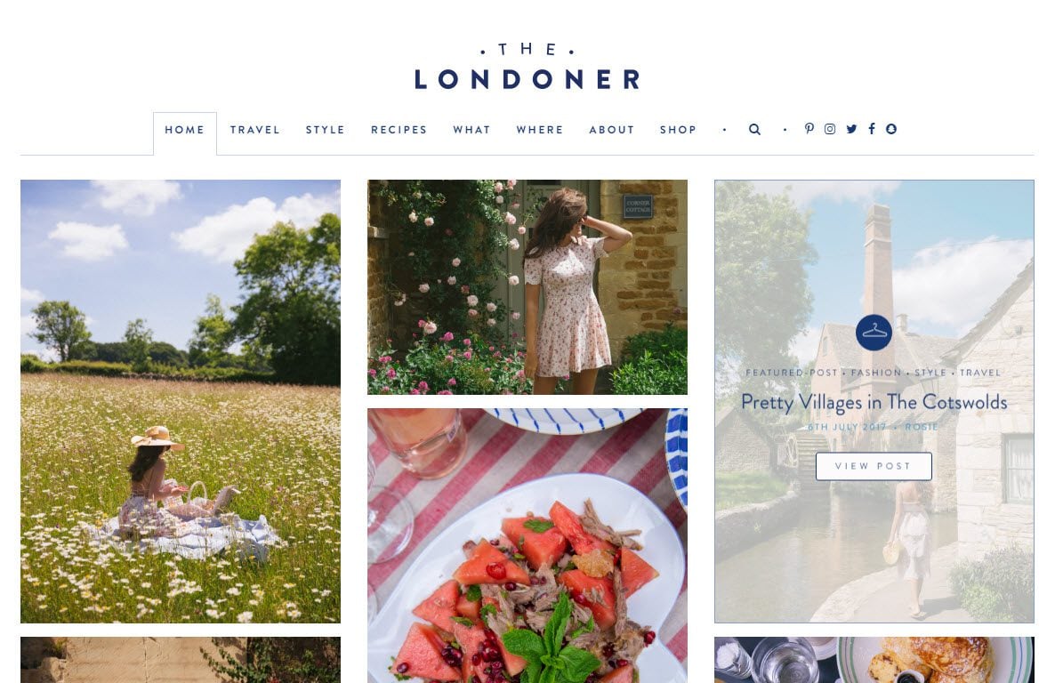
The Londoner is a minimal website that uses beautiful images, displayed in a grid layout with white borders. Text overlay is displayed when you hover your cursor over an image. This allows the site to maintain a minimalist look, whilst providing its audience with the information they need. A color scheme using shades of blue gives a relaxing and tranquil feel to this lifestyle blog.
2. Jorden Bunker
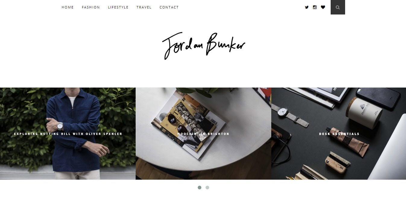
Jorden Bunker uses a collage of images in a slider on the homepage. This helps to display the range of content his blog offers, from lifestyle pieces to fashion and travel. The WordPress website uses a sticky menu bar, so the navigation options are available to his audience at all times. This makes for a great user experience, as visitors can quickly access the content they want, instead of having to scroll back up the page.
3. Hannah Gale
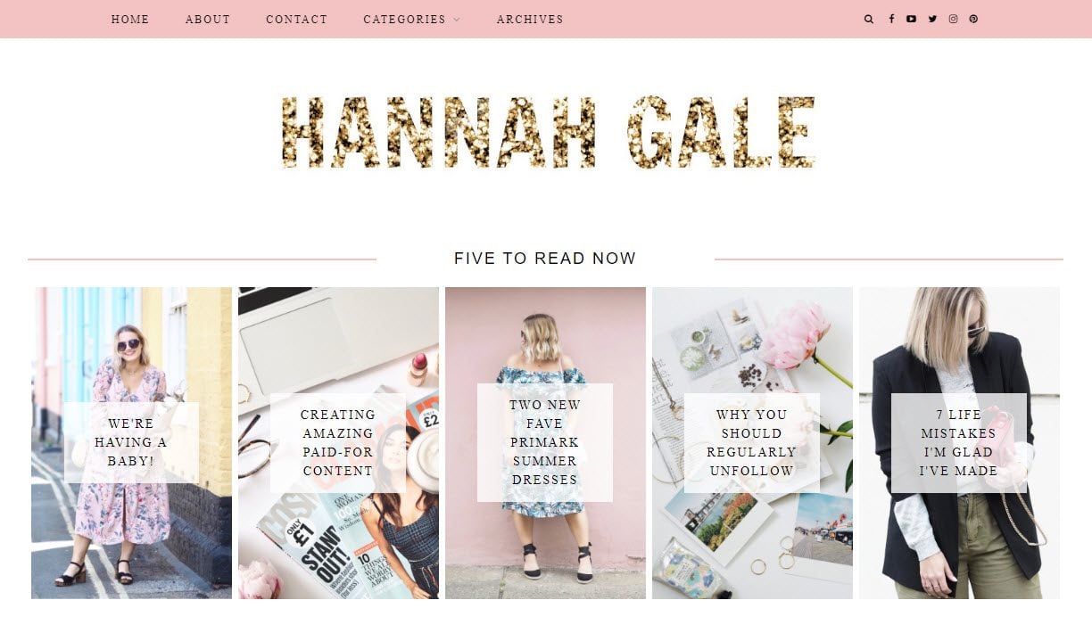
Hannah Gale’s WordPress website is extremely well organized. The homepage is arranged in sections, displaying top articles, Instagram images, recent blog posts, and more. A ‘follow me’ area towards the bottom of the page provides a link Hannah’s YouTube channel, presents six different social follow buttons, and has an email signup form. This site has everything you need to grow your lifestyle blog a large following.
4. Poppy Loves
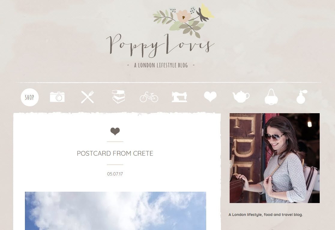
Lifestyle blogs generally tend to opt for a white background, black text, and an extremely minimal style. Poppy Loves uses a patterned background, a colorful logo and quaint images instead of text in the menu. This creates a warm look and feel, and immediately gives this site an edge over other lifestyle blogs. Beautiful, well laid out images are also key to this website.
5. Mantelligence
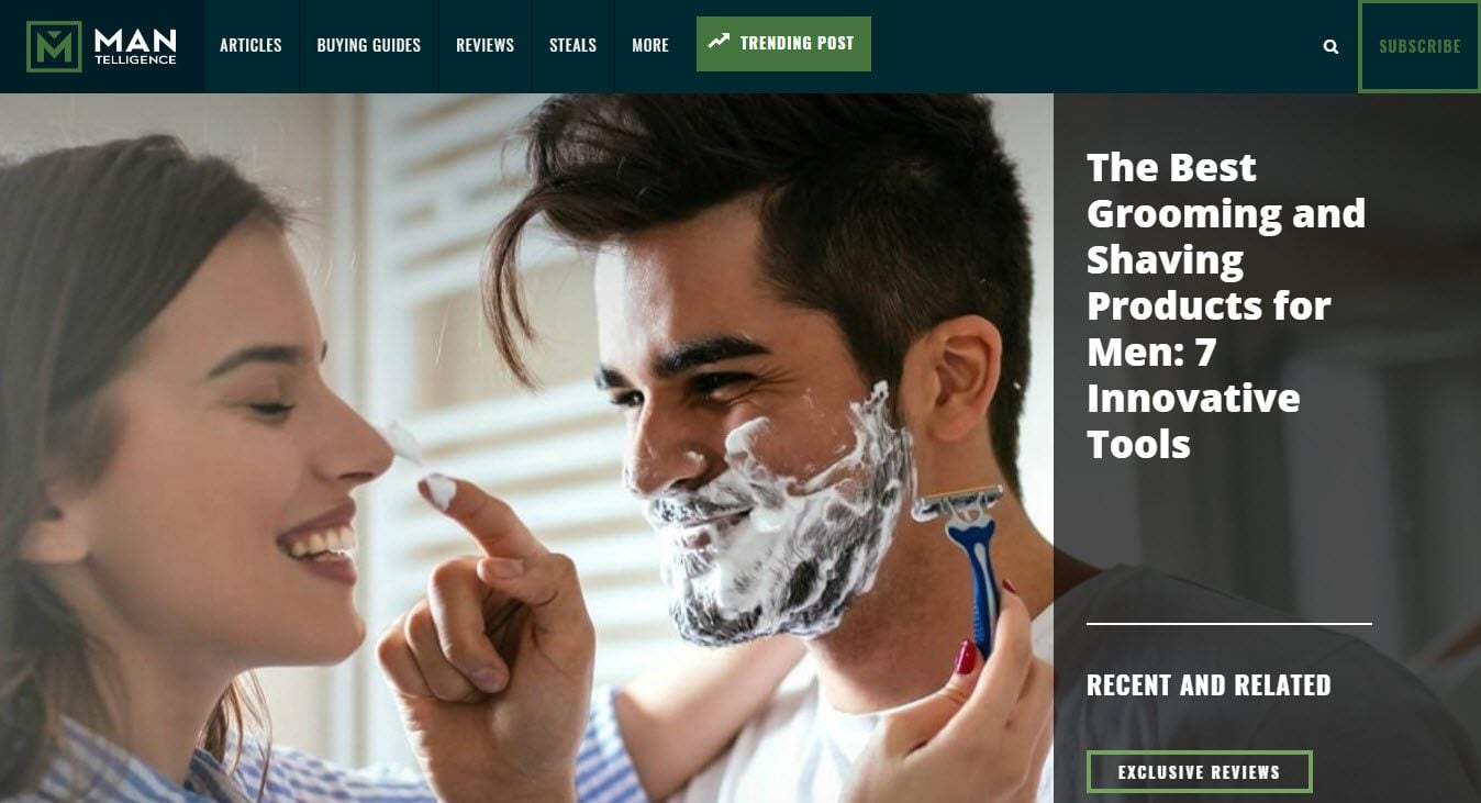
Mantelligence uses large clear images and a clean, neat layout. This helps it appeal to its audience and provide a strong user experience. The homepage is divided into sections including most recent posts, popular posts, social media buttons, an email signup form, and an advertising banner displaying Google Adsense adverts. A static menu also sticks to the top of the page at all times, enabling visitors to easily select another page if wanted.
6. Jess Ann Kirby
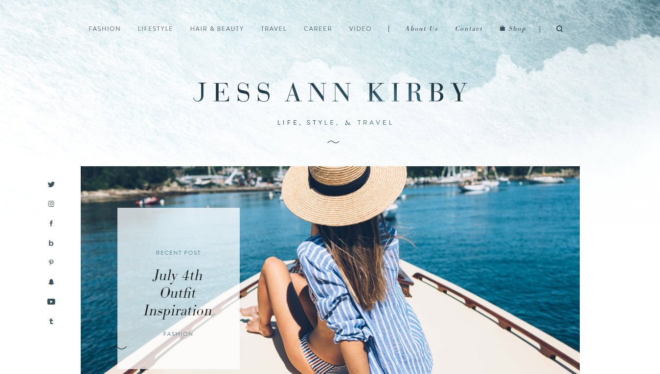
Jess Ann Kirby‘s blog is packed full of content. Subjects include lifestyle, fashion, hair and beauty, travel and more. Jess posts a regular vlog, and her audience can access her videos on the site, or via her YouTube channel. A ‘Shop’ also displays images of Jess wearing different outfits. If you are interested in purchasing any of these items of clothing, there are links available taking you to the sites selling these products. Affiliate marketing like this is a good option for those wishing to monetize lifestyle blogs. After finding a good affiliate program to join, choose an affiliate plugin for your blog that can help you along your monetization journey.
7. The Quintessential Man
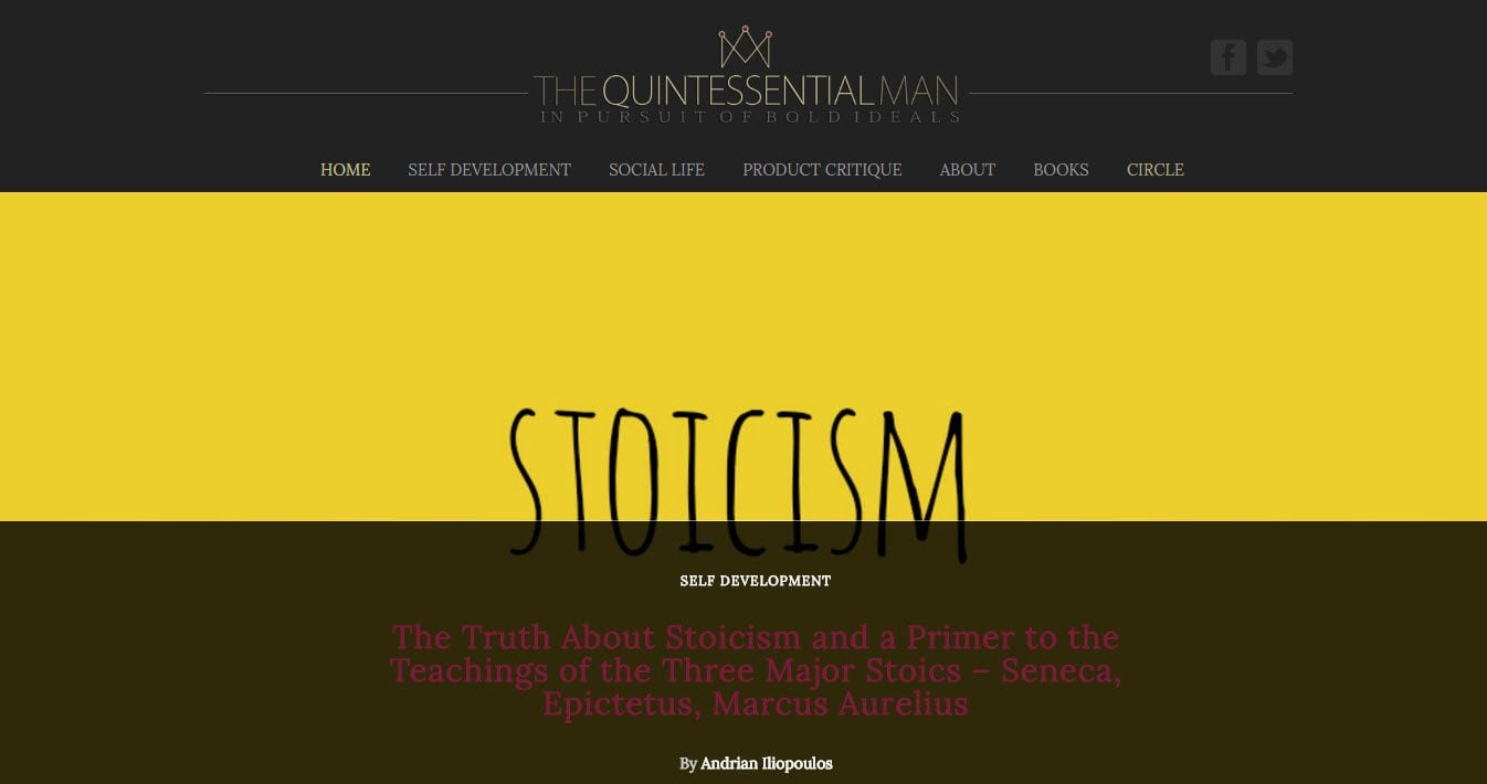
The Quintessential Man contains a level of high-brow content that is reflected in the design and style of the blog. The homepage consists of a list of the most recent blog posts that have been published on the site. A sidebar displays all extra information that visitors may need, including an email opt-in form, a search bar, social media buttons, popular posts, a Twitter feed and more. A free eBook is also offered as a lead magnet to encourage visitors to sign up to the blog’s monthly newsletter.
8. Forever Amber
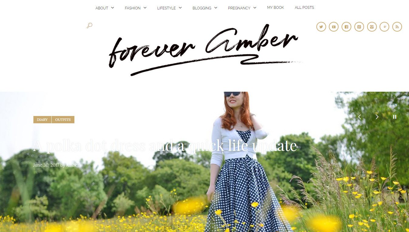
Forever Amber uses a full-width slider on the homepage, with text overlay and links to content related to each image. A large Instagram feed shows her recent images and encourages visitors to follow her. Social follow buttons are displayed at the top of the page and in the footer. A large section of the homepage also advertises Amber’s new book, with a link taking visitors directly to Amazon.
9. George Hahn
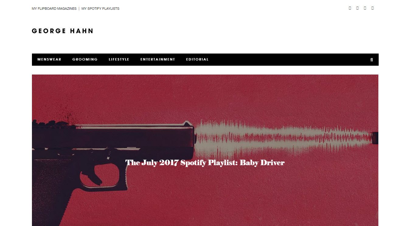
George Hahn has a pretty cool design and style, helping this WordPress website immediately appeal to its target demographic. The homepage displays a large slider of images with text overlay. This is followed by a selection of blog articles, arranged according to content. A sidebar shows a number of widgets including social media follow buttons, an email opt-in form, and some advert space. Adding adverts to lifestyle blogs, in sidebars or banners at the top of a page, can be a good way to generate revenue for your website.
10. The Blonde Salad
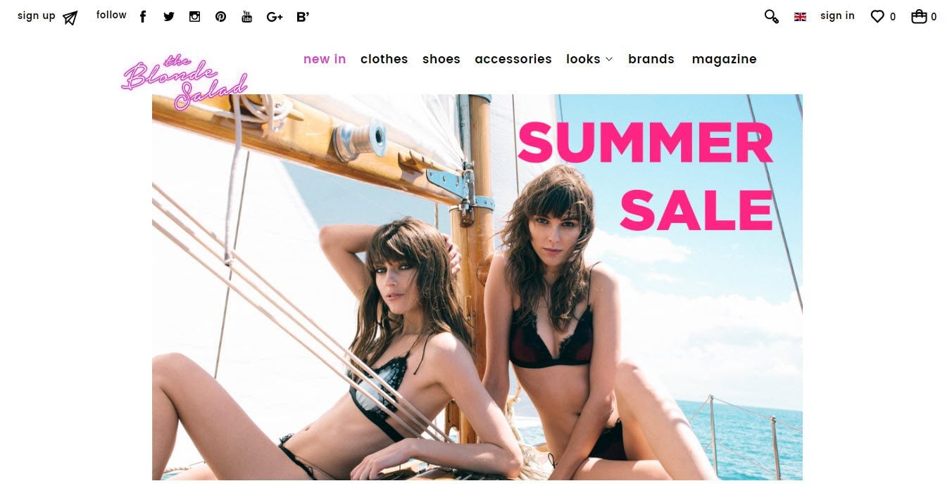
The Blonde Salad has a fun and slightly crazy feel to it. Using a combination of bright colors with bold and chunky black text, as well as vividly busy images, this lifestyle blog immediately catches its audience’s attention. A large drop down menu displays images under each page heading, to encourage visitors to view the site’s range of content. A shop also sells clothes, shoes, and accessories, all of which can be purchased on site.
11. Street Gentry
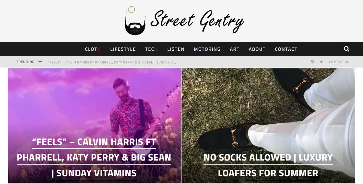
Street Gentry uses a block black, white and gray color scheme to create a rather manly feel to this lifestyle blog. The drop down menu shows the most recent articles that have been posted on each page. The footer displays three widgets, including social media follow buttons, an email opt-in form, and again the site’s most recent blog posts.
12. Twenty First Century Gent
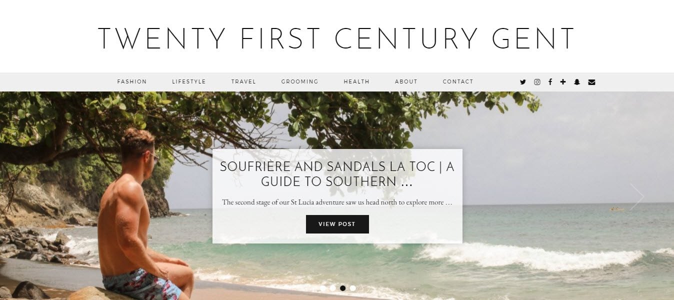
Twenty First Century Gent has a classic feel to it. It is a stylish and minimalist website, with a black, gray and white color scheme, and a clean layout. A large Instagram feed runs along the bottom of the home page, to encourage visitors to follow Twenty First Century Gent on Instagram. The site’s most recent video is also promoted at the bottom of each page, to spur viewers to follow the blog’s YouTube channel.
13. Ms Critique
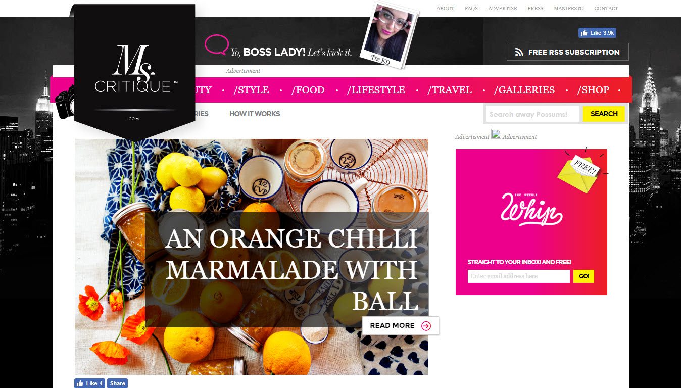
Another of the lifestyle blogs that stands out from the crowd is Ms Critique. This is a fun and lively WordPress website that uses a bright color scheme and vibrant images to grab the reader’s attention. A drop down menu lists the large amount of content that is available on Ms Critique. A sidebar also displays ‘must have’ products, with affiliate links to help the site make money.
14. Hello Gemma
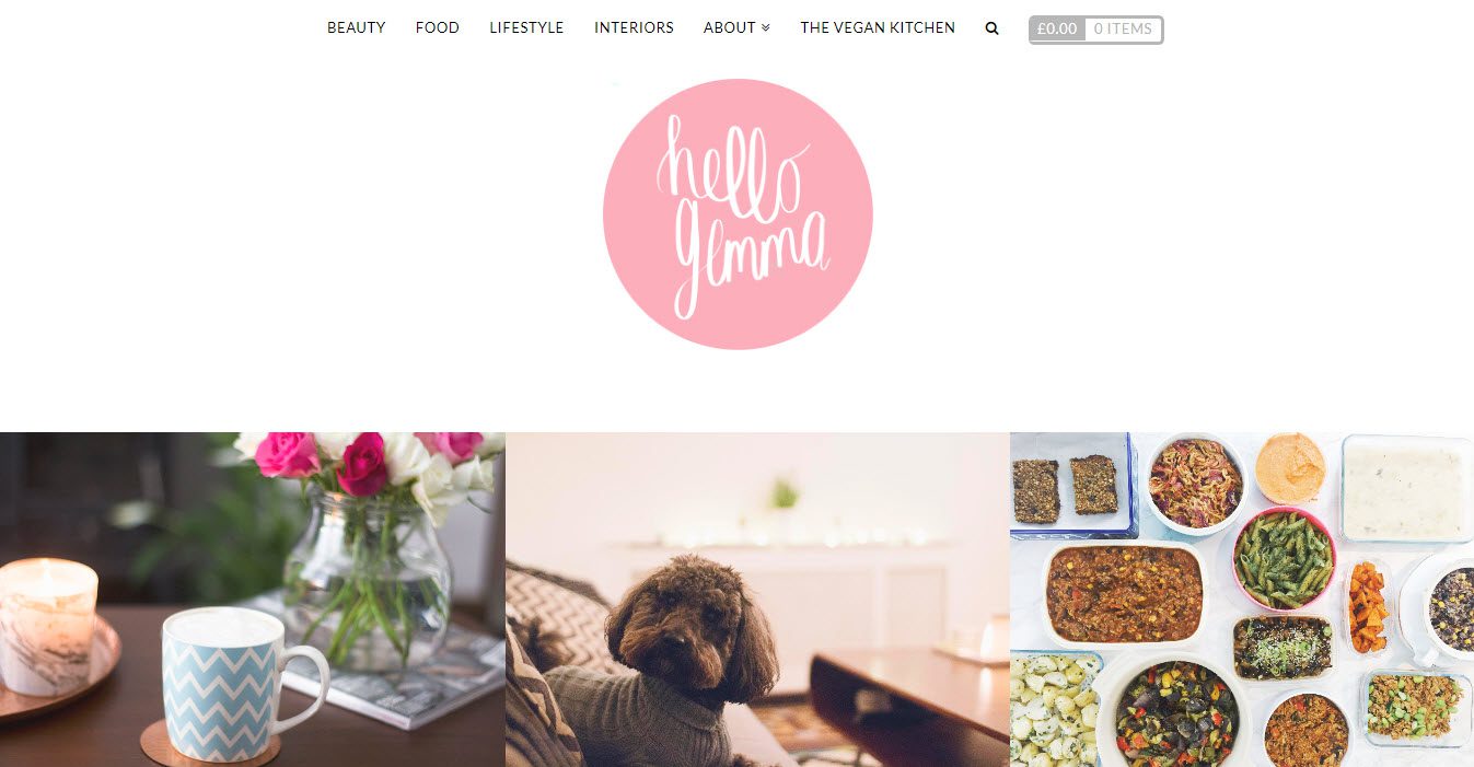
Hello Gemma displays a large logo on her homepage, followed by a selection of attractive and colorful photos. Each image displays text overlay when scrolled over, and when clicked on the relevant blog post will load. The homepage also contains a YouTube, Instagram and Snapchat feed. Gemma also promotes her own book onsite, which visitors can then purchase via PayPal.
15. Pinoy Guy Guide
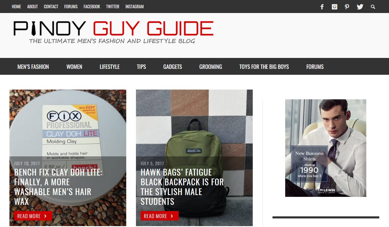
The Pinoy Guy Guide is extremely well organized. The homepage displays a selection of the most recent articles, and a drop down menu shows images of the newest articles in each category. An extremely large footer shows important information, including latest comments, a newsletter signup form, social media buttons, and text about the blog.
Final Thoughts on Lifestyle Blogs
There are so many beautiful and well-designed lifestyle blogs, choosing which ones to feature in this article was a tough decision. If you come across any WordPress lifestyle blogs that have interesting, eye-catching, or useful design elements, please share them in the comments below.
Which design elements will you be using when you design your lifestyle blog? Please share your thoughts in the comments below…
Featured Image by Macrovector / shutterstock.com




Thats a great portfolio! For designs here pictures are the eye catching stuff but when you cut images for low speed users it takes away the feel of the site.
I would love to be able to style a grid blog post. Like the one in Pinoy Guy Guide website using Divi. Can anyone help me out?
I would like to style a grid blog like Pinoy Guy Guide too, maybe someone from DIVI can help out on this?
I clicked through the first five. I’m assuming they are all Divi. They take too long to load on mobile.
I wish you had a slimmed down version of this theme or more optimized for mobile.
Yes the entire homepages load slowly, but that’s not the developers fault. It’s the owners for having too much content.
However the homepage blog content loads instantly, on my LTE and HS service on a Note 5.
I have plenty of issues with Divi but those sites loading slow is not to do with the theme rather some images haven’t been optimised correctly, probably no caching, and I have no doubt they’re on crap hosts.
I have a few Divi sites and they load instantly. Themes can slow down a site but more often than not it’s something else.
Divi is pretty quick for what it is.
Hello Megan, a good selection of design and content, I keep the one and the twelve, WordPress + DIVI are a winning combination. Salu2 and thanks from Asturias.
Thanks for the comment Asturias, and glad you liked the article.