Earlier this month we introduced Divi 2.4, the biggest upgrade in Divi history and a giant leap forward for our most popular WordPress theme. There are so many great features to explore in this update that it was hard to describe them all on the release post, which is why we have decided to do a 2-week series of informational blog posts that will aim to teach you how to take full advantage of Divi 2.4 and its new options. In part 13 of this series, I am going to do a full walk through of a demo page we created to show off the power of Divi 2.4. I will also compile a library pack that will include all of the elements from the page that you can add to your very own Divi Library for personal use.
If you haven’t been following the Divi 2.4 mini blog series, I highly suggest that you read through our previous posts before diving into this one. Because we’ve covered lots of features at length throughout the series, I will be linking out to those posts as I talk about them rather than giving you repeat content.
- 1 Take a Quick Look At the Demo Page We are Going to Build
- 2 Looking at the High-Level Page Structure
- 3 First Things First. Defining The Typography
- 4 Building The Fullscreen Header
- 5 Fullwidth, Equal Height, 3 Column Row
- 6 A Seamless Fullwidth Image
- 7 Adding Images That Touch The Edge Of The Section
- 8 Adding A Gallery To a Fullwidth Row
- 9 Three Column Image Gallery
- 10 Using the Same Contact Form On Every Page
- 11 Configuring The Navigation Header
- 12 FREE Interior-Demo Library Pack
- 13 Fullscreen Header
- 14 3 Column Fullwidth Gutterless Row
- 15 2 Column Fullwidth Row
- 16 2 Column Fullwidth Row
- 17 2/3_1/3 Column Fullwidth Gutterless Row
- 18 3 Column Fullwidth Gutterless Row
- 19 Global Contact Footer
- 20 The Full Layout
- 21 How To Use This Library Pack
- 22 Adding Library Items to Your Page
Take a Quick Look At the Demo Page We are Going to Build
I chose this page to cover because of its wide variety of Divi 2.4 features such as the new theme settings, fullwidth rows, fullscreen headers, global elements, transparent background colors, custom css, advanced module settings and so much more.
Looking at the High-Level Page Structure
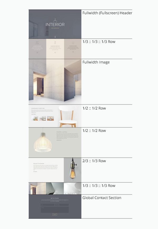
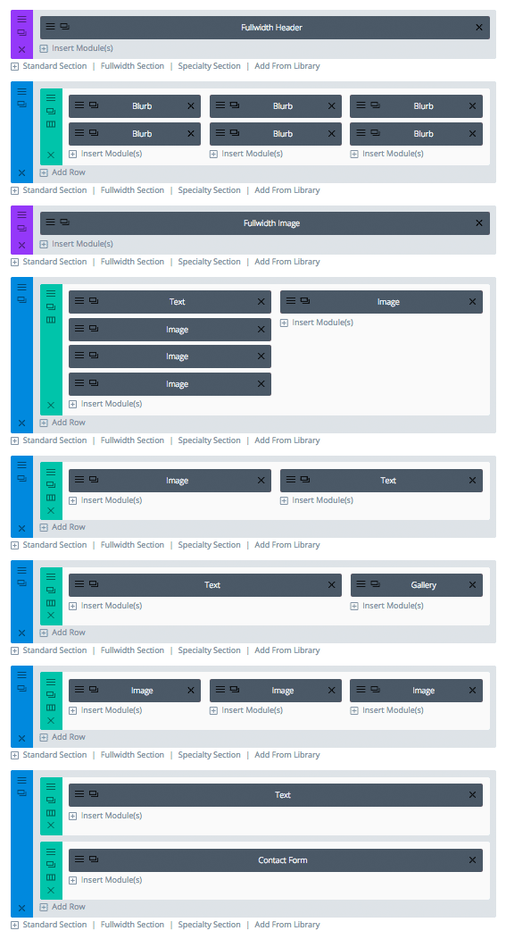
Before getting into the fine details, here is an outline of the page structure. I will be going through each of these sections in further detail, but take a few moments to understand how the page is broken up.
First Things First. Defining The Typography
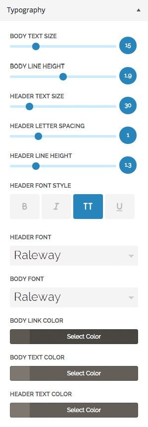
One of the first things I always do is define my typography. This helps inform color, content, and the overall texture of the page. Here is a look at my typography settings for this demo. All of my other general settings use Divi’s defaults.
More information about the new theme customizer
Building The Fullscreen Header
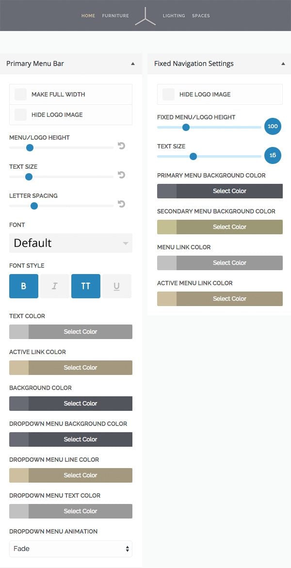
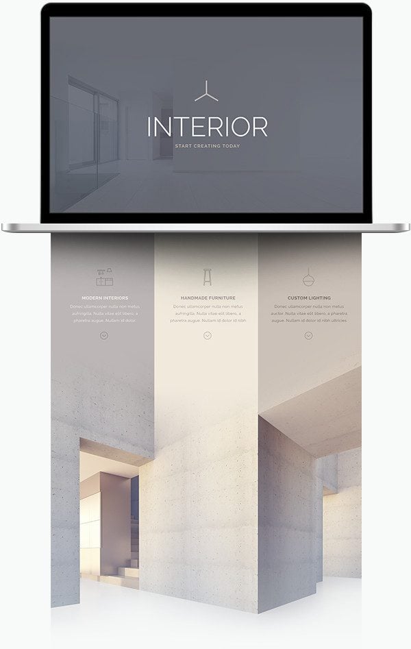
The first section of Interior’s homepage is a Fullwidth Section with a Fullwidth Header Module. In this module I’ve added a parallax background image, Logo, Title, Subheading, and Scroll Arrow.
An in depth look at Fullscreen Header Modules
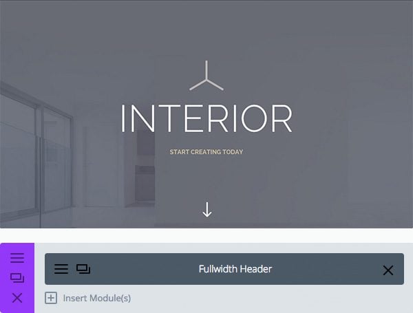
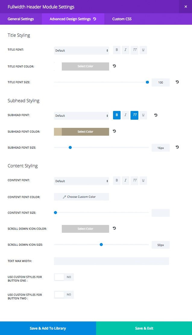
Here is a a look at my General and Advanced Module Settings. You can click on the screen shots for a larger view. Some costomizations to note here are my choice of scroll arrow (general settings) and subheading font styling (advanced settings)
Fullwidth, Equal Height, 3 Column Row
The next section on our page is a three column row that has been set to fullwidth, and given a custom gutter that removes the spacing between columns. Inside each column is a blurb module to establish the icon and text, and then another blurb module to add an icon that links to sections further down the page.
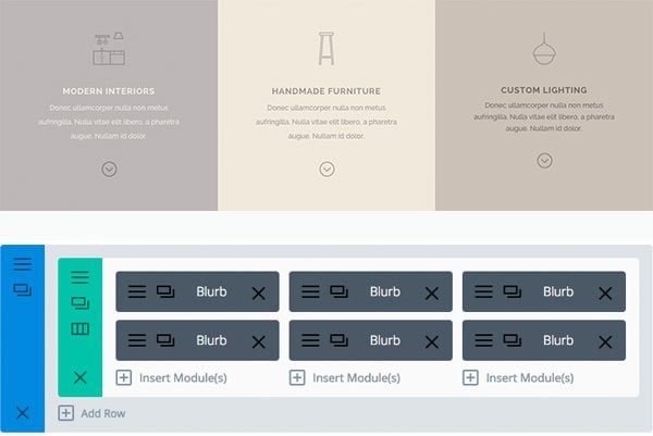
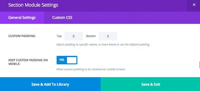
Section And Row Settings – Before looking at the content here, let’s look at how the Section and Row are built. First, I defined custom top and bottom padding of zero for the section and the row and turned on “Keep Custom Padding on Mobile” because I want to keep that gutterless look on mobile devices as well. Screenshots below.
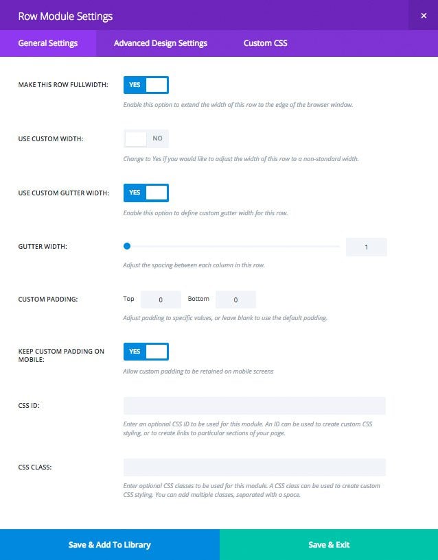
General Row Settings – I turned on “Make Fullwidth” and used a custom gutter width of ‘1’ in the Row Settings so that no matter what the user’s browser width is, the 3 columns span the fullwidth. Note that a gutter width value of ‘1’ removes all the space between columns.
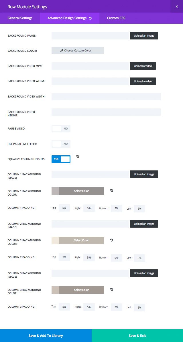
Advanced Row Settings – I’ve given each column its own background color, custom padding (5%), and turned on “Equalize Column Heights” so that the column heights are always the same no matter their content. I used percentages for my column padding so that it grows and shrinks proportionally with the browser width for a more fluid experience.
More Information on Divi’s New Row Settings
Creating the Contents Inside Each Column
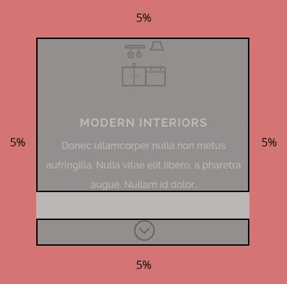
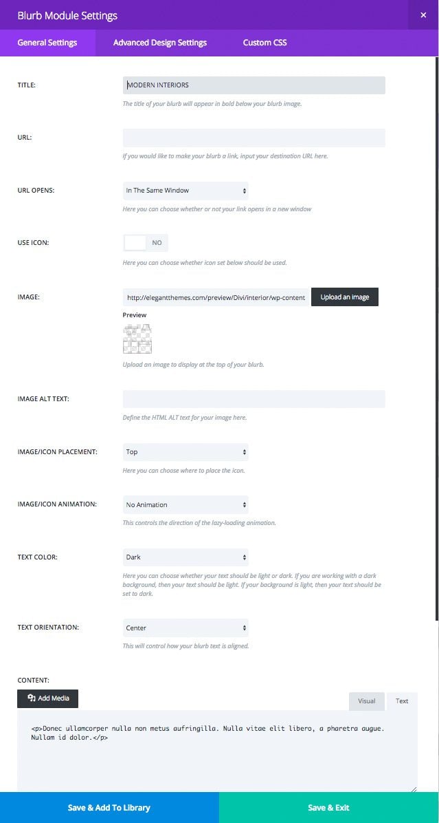
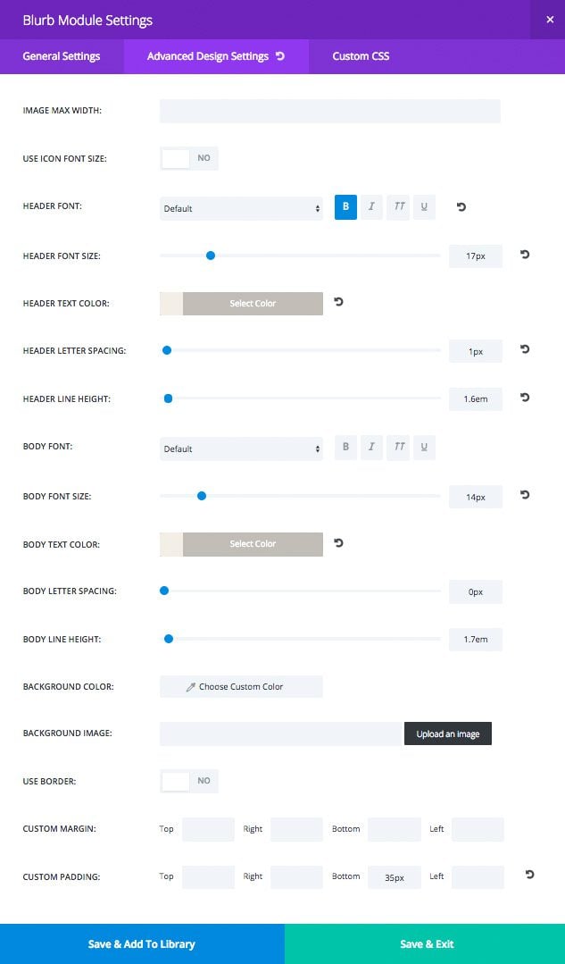
As mentioned before, there are two modules inside of each column. The first chunk of content is made up of a Blurb Module with a custom image, title, and content. The title and content have been styled via the Advanced Design Settings in the image below on the right. Because each column has a different background color, all three blurbs have different advanced color values.
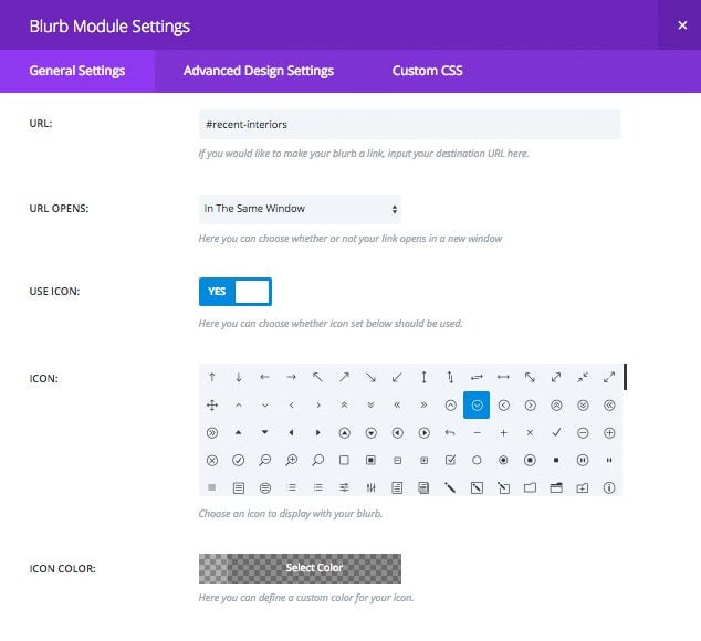
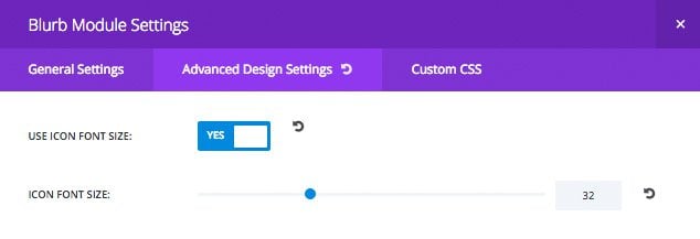
Scroll Icons – The scroll Icon was added via another blurb module with “Use Icon” enabled. I selected the desired icon and icon color, and then set a custom icon size in the advanced settings. Notice that I used a transparent black for the icon color so that I could clone the same module onto all three column background colors.
Adding Smooth Scrolling Links – You can also see that I gave the scroll down icon a url of #recent-interiors. I have also given the Recent Interiors section of my page a CSS ID of “recent-interiors”. You can link to any element with a unique CSS ID by simply adding a ‘#’ in front of the ID. Normally this would quickly jump into place, but Divi will smoothly scroll to any internal links you add to your page. I’ve given all three scroll arrows different internal page links so that they all scroll smoothly to the appropriate section.
A Seamless Fullwidth Image
Next, I added a fullwidth image that works perfectly with the three columns I added in the previous step. Let’s be honest, this seamless relationship required quite a bit of photo manipulation and a little bit of luck. In short, I edited a stock image so that it had perfect 3 column divisions, and faded the top part of each column into the exact color values of the columns above.
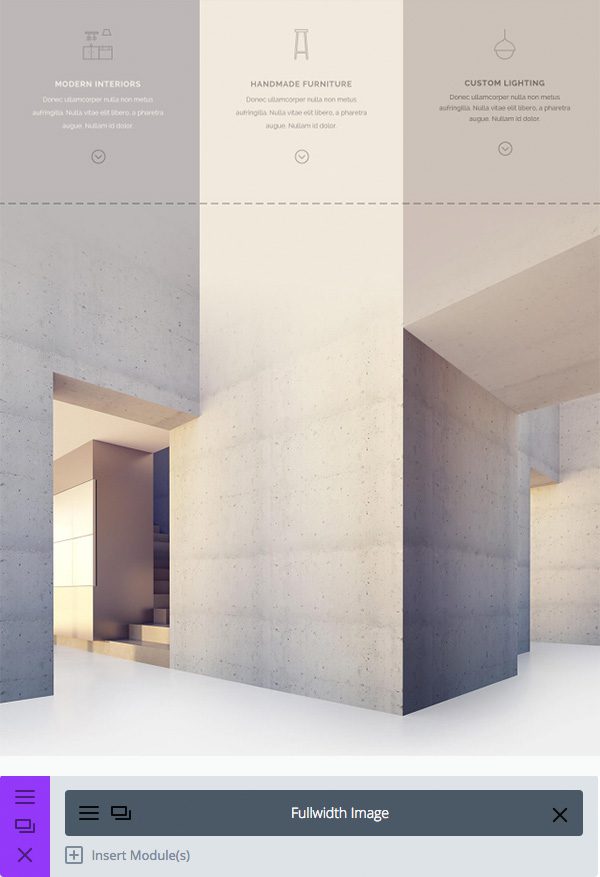
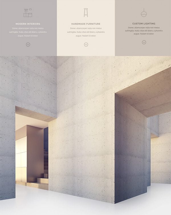
While this greatly enhances this specific layout, it is not required to make it a strong page. You can see what this page would have looked like without the seamless transition.
Adding Images That Touch The Edge Of The Section
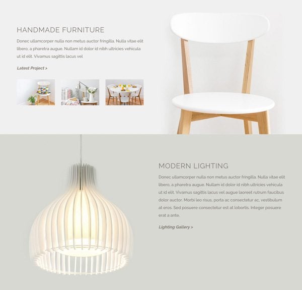
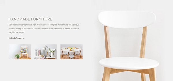
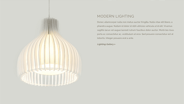
These two sections are 2 column rows that have been made fullwdith. Unlike the fullwidth 3 column row above, I am not using a custom gutter width so that the contents still have some breathing room (highlighted in red). I have however, removed the bottom padding from the first section and row so that the chair touches the bottom edge of the section (blue line). Similarly, I removed the top padding from the lamp section and row so that the lamp touches the top edge of the section. Another customization to note here is the custom top padding I added to the the Text Module in the bottom right of the image below.
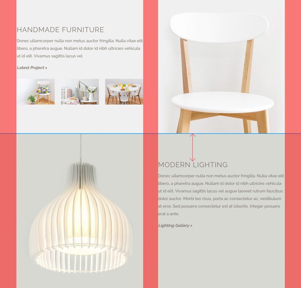
Seamless Images and Section Background Colors
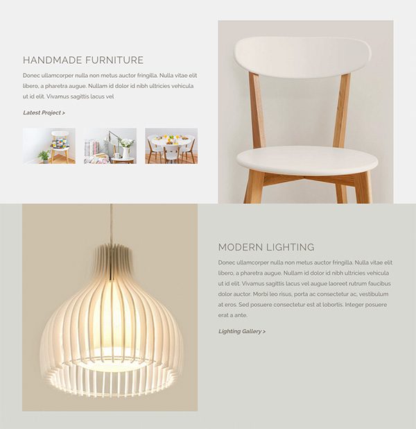
It may look like the text content of these sections is on top of a larger background image, but in fact, the images are in their 1/2 columns but they just happen to fade perfectly into the background color of the section.
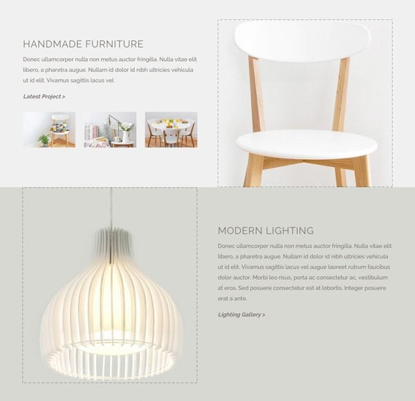
This is yet another example of how the right images being used with the right background colors can greatly enhance the design of the page, but in my honest opinion, it is not what defines the page layout. For example, this layout still loos great with unmodified imagery.
Adding and Styling The Text Blocks
The text blocks are simple Text Modules created in the text editor, versus the Visual Text Editor. Here is what my input looks like and I let my theme typography settings handle all of the text styles, sizes, and colors outside of a bit of inline styling for my custom link.
<h2>Handmade Furniture</h2>
<p>Donec ullamcorper nulla non metus auctor fringilla. Nulla vitae elit libero, a pharetra augue. Nullam id dolor id nibh ultricies vehicula ut id elit. Vivamus sagittis lacus vel.</p>
<a style="font-style: italic;" href="#"><strong>Latest Project</strong></a>
But What About Those Three Little Images?
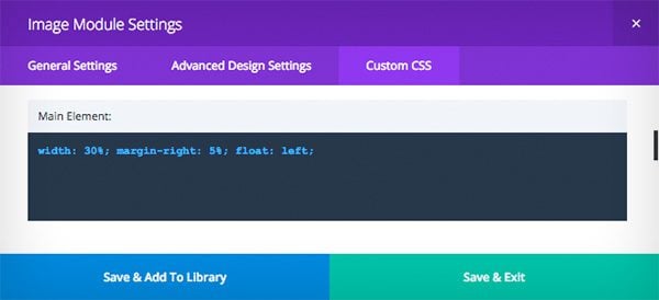
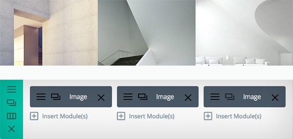
While I could have added a grid of images with the gallery module, I added three separate image modules with a bit of custom css for the sake of showing off Divi’s new Custom CSS feature. So what this actually looks like in the builder is this.
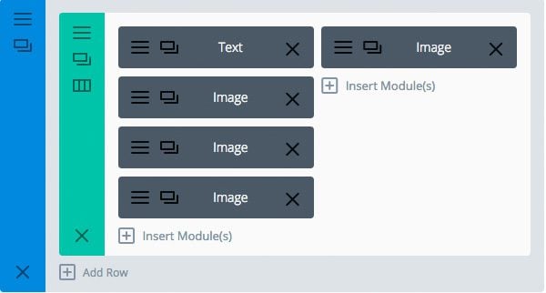
In the Custom CSS of each image I told the module to be 30% wide with a margin-right of 5% (the last image has a margin-right of 0).
A Full Post About the Custom CSS Tab
Here is the final result, with the image widths and margins adding up to 100% width.

Adding A Gallery To a Fullwidth Row
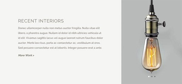
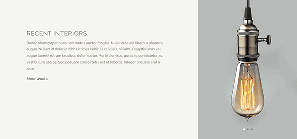
The gallery module looks really awesome with the new fullwidth gutterless rows. The next section on our page shows off this example in a 2/3 :: 1/3 column row. Again, I have defined 0 top and bottom padding for this row and the section. The contents of the 2/3 row are pretty much the same as the other text blocks in the previous example so I will mainly be talking about the 1/3 column gallery in this section. I will, however, note that the text module on the left here has custom padding of 15% on all sides to give it a lot of breathing room.
Things to Be Careful Of When Using this Layout
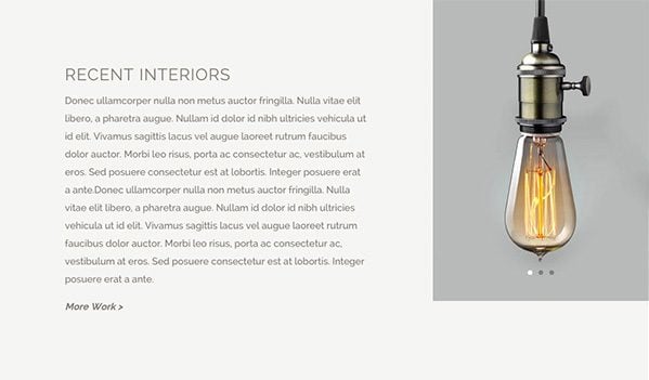
This layout is much stronger when using images that are all the same height. This way the gallery and section aren’t constantly changing heights based on the current slide. Another height issue is the possibility of the text column becoming taller than the gallery if there is too much text content, or your images are too short in height. If your text content happens too be too long, it will create a gap below the gallery, but is not the end of the world.
Three Column Image Gallery
This may look like a gallery in a fullwidth row, but is in fact a three column row with an Image Module in each column.
Why Not Use A Gallery Module?
There are advantages and disadvantages to using a Gallery Module. I specifically chose to use this unintuitive method to raise these points.
Gallery Module Advantages – If I were to have used a gallery module I would have only had to use one module instead of three. This advantage is multiplied in the case of me wanting to add more images to this section. Another great advantage is being able to click an image to trigger the gallery lightbox where the user could then arrow through the image gallery in lightbox mode.
Gallery Module Disadvantages – I knew that I only wanted to show three images in a single row here, and the gallery module displays four columns in a 1 column row and breaks down to two columns at certain breakpoints. This would cause an uneven breakdown, which is why I chose to use three separate image modules.
Using the Same Contact Form On Every Page
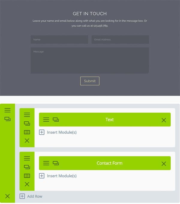
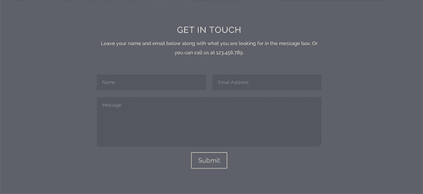
Wanting to add the same contact footer on every page, I used the new Global Element Feature in Divi 2.4. If you happened to still skip over my recommendation to read our previous posts, this is where I put my foot down and strongly suggest that you do 🙂 At the very least, please read our in depth post about Global Items and the Divi Library.
Now that I have saved this as a global section, anytime I want to contents of my section such as the phone number or ‘Send To’ email address, I only have to do it once, instead of on every single page of my website.
Limiting the Width of My Contact Form
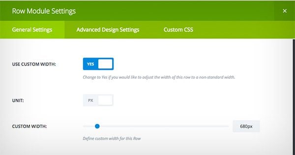
It’s hard to see that its happening, but I am limiting the width of the content in this section using the new “Use Custom Width” row option. Using this new setting I told my rows to never be wider than 680px because I feel that the pricing table module and text line-length were too wide when using the default 1080px width. In case you missed it, here is More Info on the All New Rows Settings.
Styling the Contact Form
As mentioned over and over again in this series, there are so many ways you can style your modules using the Advanced Design Settings. With the new settings I was able to use a transparent background color for my form fields. Here is an in depth post about Using Transparent Colors in Divi.
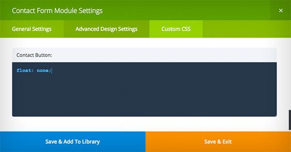
If you are a Divi veteran, you may have noticed the centered ‘Submit’ button. This might not look so great with a captcha, but because I am not displaying a captcha, I used the Contact Form Module Custom CSS tab to manually center the button with on simple line of css.
Choosing A Header Format
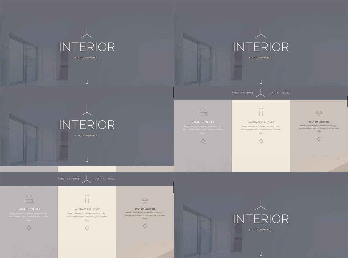
After building out a few more pages it was time to stylize the navigation. I am already displaying the logo in the fullscreen header at the top of the page and I want the user to explore the home page of the site before going to other pages so I chose to hide the navigation until the user scrolls. My logo is also symmetrical and I only have a few links so using a centered inline logo also seemed to work really well for this site.
A Full Walk Through of The New Navigation Settings
Styling The Navigation
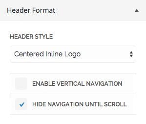
I am only showing the navigation after the user scrolls, meaning the user will only see the Fixed Navigation. However, I still need to style my Primary Menu Bar to configure the text styles in my navigation. I also set a logo height that is slightly smaller than its height in the Fixed Navigation so that it has a subtle zoom effect when the fixed navigation appears on scroll.
FREE Interior-Demo Library Pack
As promised, all of the pieces that we’ve gone through in this post are available for download so you can import and use them on your own site. Below I will do a quick recap of all of the items that are included in the Library Pack. As always, we take licensing very seriously at Elegant Themes so we cannot share the exact images used in this demo, but will include everything else as it appears in the Demo. I will also generalize the text since most you aren’t building interior design websites 🙂
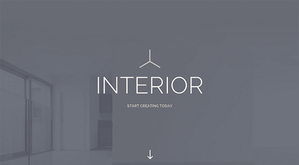
Fullscreen Header
Library Item Type: Module
3 Column Fullwidth Gutterless Row
Library Item Type: Section
Make sure to assign internal links to your down arrows if you add this section to your page. To do this just give the section you want to link to a unique CSS ID, for example, CSS ID = contact_footer. Then, just type #contact_footer into the url field in the Blurb Module Settings and your’e done!

2 Column Fullwidth Row
Library Item Type: Section
This item has zero bottom padding on the section and the row so that your image touches the bottom edge of the section.
2 Column Fullwidth Row
Library Item Type: Section
This item has zero top padding on the section and the row so that your image touches the top edge of the section.
2/3_1/3 Column Fullwidth Gutterless Row
Library Item Type: Section
Note that if you add this to your page, the gallery will not appear. Divi uses the WordPress Media Library to create galleries, which doesn’t allow us to pre-populate galleries in Divi Library packs.
3 Column Fullwidth Gutterless Row
Library Item Type: Section

Library Item Type: Section
Beware, this is a global section, so if you add it to multiple pages, they will all be in sync. I have also included a non global version in the library pack.
The Full Layout
Library Item Type: Layout
Also included in the library pack is the entire layout in case you just want to use the whole thing! I didn’t include the global contact footer in the layout, but it is included in the download so if you want to replace the non-global contact footer with the global one you can easily do so.
How To Use This Library Pack
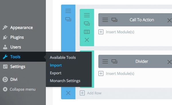
Downloading and importing this pack into your own site is doable with just a few steps. First, download the linked file below and unzip the compressed file. This is the file you will import into WordPress. To import them into your library, navigate to Tools > Import. Select the WordPress link at the bottom of import type list, and you will be prompted to upload the file. You will then have access to these modules for you very own use. Reminder: Before uploading, be sure to unzip the zip file! Only XML files can be imported.
Adding Library Items to Your Page
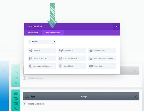
Once an item has been saved to the library, it can be added to any new page from within the Divi Builder by clicking “Add From Library” button when adding a new module, row or section to the page. I have added an ‘Interior’ category to each item in this pack so you can filter by this category if you already have lots of other items in your Divi Library
We hope that this series has left you a lot more informed, motivated, and inspired to use this brand new Divi to create amazing websites. We promised 14 posts in this series, so stay tuned for one more exciting Divi post tomorrow 😉





If I wanted to manually upload the interior-library-pack, what folder would I add it to?
This is an AWESOME post! I can’t thank you enough for the specifics you provided.
We build A LOT of Interior Design websites and rarely find anything about them, so this post was a true gem for us. Thank you again!
Hi, during a try of downloading plugin called Download importer I see such an information: Parse error: syntax error, unexpected ”post_autho’ (T_ENCAPSED_AND_WHITESPACE), expecting ‘)’ in /home/platne/dzielinska/public_html/pv/wp-content/plugins/wordpress-importer/wordpress-importer.php on line 583
What should I do?
This is great! Thx.
This is great work really appreciate it, i have not yet bought the divi theme but inclining towards buying the theme. Really appreciate the detailed tutorial for the demo above.
Only one important issue is that can we have more detailed tutorial for the other showcase divi examples such as the demos on this link http://www.elegantthemes.com/blog/theme-releases/divi-2-4 and this link https://www.elegantthemes.com/gallery/divi/
Divi is the greatest thing that’s come along in years. I am thrilled to have a lifetime membership. You guys really deliver. Thank you.
Hi Kenny,
This is really awsome. I was wondering what the best height would be for the pictures used in the gallery?
Thanks,
Helen
I can’t import the pack anymore into Divi. Is this due to the new update DIVI had? I would like to use this package. Cheers!
Hey Lars, first be sure Divi theme is actived on wordpress! Then you will can import it. 😉
It should be noted that percentage padding — such as it’s used in the 3 column gutterless row here — only works properly in Blink and WebKit browsers. Definitely not Gecko.
Do you know where any documentation for that is? I spent quite a while yesterday trying to figure out why this wasn’t working in Firefox, yet I could get it to work in some situations in an html editor
I have added the library pack but cannot find the whole page laayout. please help
From a person who is NOT a web designer, thank you. This new update makes life MUCH easier.
These documentations are awesome and very helpful – i never bought a theme and got so much support with postings only. most questions i had are almost done with this blog. thanks a lot!
Does this theme supports plugins to upload products via csv, like WP All Import?
This is such a treat. I am loving the Divi .update. Thank you for the tutorials.
Can we expect any downloadable library packs?
THANKS!!
more tutorial like this magic one pleeeeease!!!! 😀
Kenny,
Thanks for great post. I have follow most of it, but the navigation menu isn’t working. I have hidden it until scroll, but instead there is no menu at all.
Would be great to understand why this doesn’t work.
I think I may have found the solution to your “no menu” issue since I had the same problem for a while. Be sure your “page template” is set to Default and not Blank Page. After I made that change it fixed everything and I was on my way with no further issues.
Great layout and a really good example of great images and colors working together.
I do have a pretty big issue though, when I import the library and set it as my page layout I find the site takes over 60 seconds to load. The actually layout loads first but the parallax header effect does not load for over a minute this actually echoes down the page. I have no other plugins running and its a complete fresh install on my host.
Anyone else have this issue?
I have tried to follow the directions to import the library files, but when I go to tools, import, WordPress the only option it gives me is to upload a particular plugin that helps you import blog posts from other blogs. No option to select file. What am I doing wrong?
When in Tools >Import, you need to choose the ‘WordPress’ importer. This will prompt you to install the WordPress Importer plugin. Do so. When it has completed, you can use it to import the library files.
Thank you so much for Divi 2.4! Big time saver, and your team is so awesome with the shortcuts, libraries, and overall awesomeness.
Question:
With the settings shown in the image here [http://cdn.elegantthemes.com/blog/wp-content/uploads/2015/06/interior-blurbs-row-adv.jpg], my Row-of-3 was not turning up gutterless; I had to change the padding settings you showed in the image from 5% for all – to – 0 for left and right. Do you think I missed another important step that was giving me gutter, or is the image incorrect?
Just beautiful, an amazing site, and the post shows how easy it can be to create such a great page! Thank you for this great article, keep it up guys!
Kenny, this is an awesome posting. We discussed a lot in the facebook-group about the way using the new features to display such a great design.
This update of divi is really super cool.
A few small suggestions to make divi still more flexibel:
1. Fullsize Slider (showing button down available like full size picture)
2. Second and third menu can be switched off in mobile version
3. Using different logos for navigation and default
Best regards and looking forward to your improvements!
Alvaro
I would totally love to have these features as well especially the full size slider with the down button idea.
I’d also like control over the down buttons internal link. I’d like to give it a destination.
Turning off menus would be great too.
A thorough tutorial and one of the secret gem of Divi2.4. You talk of luck and hope its added along in the builder library. 🙂
Thanks a million Kenny for revealing a secret.
Cheers!
Looks lovely. Now I want to redo everything I’ve done today. Thanks for the information. I never leave a comment but had to this time. This is beautiful work.
Best post ever! More! I want more!! Pleeeasssse!
(and thank you!!)
This is incredible! Divi 2.4 works so well I ‘accidentally’ figured out some new layouts for my websites.
Also, thanks for these blog posts Kenny, well done and thoughtfully presented.
What an experience… Elegant Themes makes everyone look professional.
Thank you.
Thank you so much for this tutorial it is very generous. I’m so glad you chose this demo as I fell in love with this one of the three you used to show off the features of the site. AWESOME, and thank you again.
Thank you very much
Giving time to explain details is the most think i like and makes your explanation unique and complete
Regards
Thanks bunches for this tutorial!
How about a few more layout libraries/tutorials like a masonry simulated site? It would be a great competitive advantage for you and pull in some of the print designers that are floundering with web coding.
Now I have to get my own site!
g\\
“This is yet another example of how the right images being used with the right background colors can greatly enhance the design of the page, but in my honest opinion, it is not what defines the page layout. For example, this layout still loos great with unmodified imagery.”
correct word is “looks”
Apart from that, all good. Thanks!
Vraiment super cette dernière version de DIVI, bon travail !
J’ai suivi votre tutoriel, mais j’ai rencontré un dysfonctionnement avec Explorer V11 : le titre et le sous titre ne sont pas centrés verticalement dans le header, et le logo n’apparaît pas dans la barre de navigation lors du scroll; avec Chrome ça fonctionne très bien.
Il serait intéressant de savoir pourquoi ?
Quoi qu’il en soit j’aime beaucoup cette présentation
Merci
Paul
Bonjour Paul,
J’en profite qu’il y ait un français dans la salle !
Est-ce que les images sont fournies dans le pack ou non ? Lors de mon essai les images n’y sont pas. Pareil pour toi ?
Merci
Bonjour Stef,
Et bien oui il y a même des Français sur le forum !
Je suis un fervent utilisateur de DIVI et j’en suis très heureux.
J’ai pu réaliser ce tutorial à l’identique, mais les photos n’étaient pas dans le zip, je les ai téléchargées directement à partir de l’adresse html.
Mais vous n’avez pas répondu à ma question sur l’anomalie de fonctionnement avec Explorer ?
A bientôt
With the latest version of Divi, is the official recommendation to still use a child theme or not?
Man this looks awesome! Divi is really neat! I’m going to look into it a little more to decide what I wanna do with it 🙂 Thanks for showing us the power it truly has!
Terrific post, thanks so much for sharing!
Are the names and emails collected by the contact form aggregated somewhere? Or is it merely a convenient emailer? Currently we are using Bloom linked to Mail Chimp for opting in, and another plug in for our sign up page, to give visitors the option to leave a message, but it doesn’t seem a good idea to offer three different sign in options, although they are each providing a different function. In the search of simplicity, does the contact form from Divi link potentially to a database?
Best money ever spent, thank you.
thank you .
Thank you for this! Very educational. Over my head, to be honest, in a few (many) places, but extremely helpful – I learn something from all these posts. I still haven’t figured out why my site doesn’t load well on a phone, but I’m an Illustrator, not a designer, so I suppose one day I’ll get it right if I keep reading these posts. Thank you for everything! I ♥ Divi and ElegantThemes. 🙂
how to use library, and re-build demo page
https://youtu.be/H0PSLCaLoZs
Horrayyyy!!!! You guys finally showed us how Divi really works. It has taken me about 2-3 months of headaches trying to get over the WordPress & Divi learning curve
Hi,
Possible to have a compendium of all articles from your blog about 2.4 ?
PDF or HTML format ?
i have problem with margin into in entry-content class – why i see a additional margin? .entry-content p{margin-bottom:0px !important} …not remove this margin…
Thanks for all those examples to get the best out of Divi. Awesome.
But I still can’t use the xml file : “invalid content type”. Maybe because I’m in French and all the labels are in english.
It was the same with the previous pack for some of us, and I don’t think someone gave a solution.
thanks
Tom
Me too have problems with importing the xml file. I have imported it, but it doesn’t show in the library. How could this problem be solved?
Hi, love your work on Divi. For my own website I unfortunately need to stay with the limitations of Shopify because of the POS I need, sigh… However I have a couple of other clients who have WordPress sites which I would like to migrate over to divi. I currently have 2 others on divi. Is there a blog on how to painlessly move from current theme to divi? Do images get saved for example. Am I able to edit divi before I switch themes like I can in Shopify or do I have to pull the down the website while I make the changes. Although the current themes are drag and drop I don’t think this would translate automatically into Divi?
I was really thinking you guys should do a free upgrade on Divi for us, or maybe just do a special plugin that lets us get those functions on the Old Divi…
I use Divi 2.1 and I like some features but why can’t you guys do a plugin for free updates? That would be very generous, please reply!
they do have a free plugin for updates
But you need an account right?
Great tutorial! Can you guys please create a “recipe” of the others Divi samples also?
You guys really are at the forefront of the #digitalfrontier!
My query comes in the sizing of these images for this type of layout – specifically getting the 3 columns and the faded image to line correctly?
how does it cater for all the diff screen sizes?
What a guideline Kenny. I like that demo and you give me what I need, thanks for share.
Kenny,
Any way you can let us know what CSS/how you sometimes add the effect of an image overlapping a proceeding / succeeding section? I’ve noticed it with the edges of an iPad or iMac sometimes bleeding into the previous section.
I’d love that bit of CSS to add to my site.
Thanks in advance,
Scott
Your design style is incredible!
Clean simple elegant …!!
Love this theme & the endless possibilities that go along with it.
I am not using it enough .. but everything I do with it just blows me away!
The update was a huge leap forward … But then all this useful information you provide along side it is so helpful! But then even still you have the forums with people helping there too …. Insanely brilliant from an awesome Web DEV company!
The best I have seen or experienced! Keep up the great work 🙂
It seems that this demo is not fully responsive? The text “INTERIOR” does not fit in the screen in mobile. Tested in Android orig. browser and Chrome, and iPhone4. Fix for it?
http://elegantthemes.com/preview/Divi/interior/
Do some extra mobile CSS to make the font smaller??
Thank you, these are the instructions and explanations that expected .
Flight now to try and put in my new website .
Great, this is it!
The heading word Interior doesn’t show up right on mobile??
How did you add extra text below the heading in the Global Contact Form?
Dorette, the heading in the global contact form is actually made from a separate text module above the contact form.
Thanks Kenny,
so then the title for the contact module is empty.
Looks amazing. Did something like this (a bit less pretty, but I thought it was pretty cool) one of my sites awhile back. Ended up dropping it because it was too slow, especially on mobile, and WordPress still has occasional hiccups with responsiveness, so every so often something that looked great on 9/10 screens would go haywire.
Can’t speak for the responsiveness, particular, but your demo site flew through the load. I was impressed!
Thank you for this awesome resource!
You guys are amazing. I have seen many people in community asking for information relating to this demo. Not only have you guided people through the creation process but you have supplied some library items too. Elegant Themes going above and beyond. By far my favorite company in the WordPress community.
What a great demo example, clean and beautiful…… we need more stuff like this from the Divi theme… good work. Keep up the good work…. 😀
I imported the XML, and the modules show up in my divi library, but when I’m on a page and insert a module and try to use one, they dont show up in the list of library modules to choose from. Has anyone else experienced this?
Click the far right option “Add from library” BELOW a section.
Also Load From Library>Add From Library for the Interior Demo :: Homepage Layout
hi Justin,
Lots of the items in the library pack are actually not module, but sections. Instead of adding a regular, fullwidth, or specialty section, choose to add a section from the library.
Excellent tutorial showcasing the features of Divi 2.4, Kenny. Keep it up!
Thanks for all this and Divi 2.4, I’m beginning to use it exclusively on all my projects. Love it, great work.
LOVE LOVE LOVE…. AND THANK YOU, THANK YOU, THANK YOU for the extra goodies 🙂
Divi offers a lot and helps to make professional websites. What we cannot seem to be able to do is to copy the layout of the recent posts page onto the search results, posts by category, archives page. It would be great if your team could make this possible (soon).
Request this in the Theme Suggestions page and there will be more chance of it happening.
Thank you so very much for not only designing such an unprecedented theme but for taking so much time to explain the designing details. Thanks guys for all your hard work.
Kenny, you never fail to amaze and inspire! Thank you once again!
This is great, and with a lot of explanation we can redo easily.
Thanks a lot
Will importing the XML into WordPress remove any work already in place?
Will exporting the XML into WordPress remove any work already done on the site?
This is a great format for a post. The step by step process is perfect. Thanks.
You all should feel extremely proud of what you have produced. This tutorial series has been fantastic. All of the articles have been very helpful in explaining what can be done with the new Divi theme. This particular article was very-very well done. It is truly amazing how far website design has come- especially with the addition of your new product. Thanks for all your hard work. These new changes open up so many new opportunity paths. I look forward to seeing where this all evolves. GREAT JOB ! Thanks. -Marcus
So amazing. <3
I am already very excited about the next installments of these series. Great work!
One more post in the series…. Can’t wait!!
A really great synopsis of Divi 2.4’s capabilities. Incredible theme. Thanks so much.
Beautiful, Kenny. I might use this layout for a new site of mine.
Congratulations guys !
Divi 2.4 is a top notch theme. Your support crew is excellent and to top it all, you give the best advices and material around to build magnificent websites…
I think we can it a “Bigger bang for the buck “… and there’s so much fun around the corner…
Thank you !
Very detailed! Thank you so much for this post. The interior demo is by far my favorite 2.4 divi demo!
Very useful thanks … 😉
Thanks as always. A great wrap up for the new theme.
With all due respect, I cannot agree with the following statement:
“This is yet another example of how the right images being used with the right background colors can greatly enhance the design of the page, but in my honest opinion, it is not what defines the page layout. For example, this layout still loos great with unmodified imagery.”
What makes this page look this great – and it does look amazing – is the use of images and how they blend in with the layout. Nothing more and nothing less…
Thanks for the tutorial, it’s very useful. But the real takeaway from this demo page is that the images DO make the site.
There are so many more variables. Great typography, use of white space, contrast, etc. You can even use power-clashing techniques to intentionally make the pictures stand out and it will still look good because the foundation is set up very well.
I just would like to say that a love you guys.
Hi Kenny,
Will the DIVI builder be extended to the search pages and archives of WP? It seems like such a waste to not be able to take those same pages to the next level?
Z
Who, seems my comment has been deleted. No clue why.
So I was saying: great work, but search and archive pages are a major issue with Divi since the start.
Yes, this is a very long overdue feature, the search and archive page just look aweful right now.
This is outstanding work otherwise!
Zaf, a really good question indeed!
Truly above and beyond… this is just fantastic! Thanks Nick, Kenny and the ET team for this wonderful update, and all of these blog posts to guide us through the learning curve.
This is wonderful. Thank you so much for sharing the step-by-step info!
Very generous to offer this. Great blog posting and certainly will help lots of folks (including myself) with ideas and direction for using the wonderful theme!
Thank you for the resource and instruction!
I have always admired how you seamlessly blend certain sections together in your designs. Thanks for sharing your tips and tricks!
EXCELLENT, EXCELLENT, EXCELLENT! I don’t know about other designers but I broke into the graphics field back in 1986, everything was done on boards and sent to pre-press, no computers, yes hard to imagine! So for those old timers like myself web design has been a nightmare to learn and implement but through video tutorials and blog tutorials it has been much easier over the years to grasp the art of web design. The days of Dreamweaver are behind me now that I found WordPress and Elegant Themes, it’s so much more intuitive and visual and the Divi theme has made life much easier and tutorials such as the one above is excellent! Keep up the good work, and keep the tutorials coming!
Excellent Kenny, thanks a lot
Just AWESOME.
Very, very beautiful.
So clean. So stylish.
I will rebuild your page “just for fun” to learn everything about these extremely cool DIVI features.
Thank you.
You are the best!
If you need translations into German: ask.
Please keep on doing this great work.
Steve Jobs would have used DIVI for the Apple page
Stefan, I will support you with the German translation 🙂
PS: Also thinking about rebuilding it just for fun…
Nice, thanks!
Thanks guys and now all I have to do is come up with a few layout ideas…. now let me think…
Thanks for a fabulous series of Divi 2.4 posts.
Kenny, great blog with very usefull information.
Thanks
Thank you!