Two days ago we introduced Divi 2.4, the biggest upgrade in Divi history and a giant leap forward for our most popular WordPress theme. There are so many great features to explore in this update that it was hard to describe them all on the release post, which is why we have decided to do a 2-week series of informational blog posts that will aim to teach you how to take full advantage of Divi 2.4 and its new options. In part two of this series, we will exploring some creative ways you can use advanced settings and how to import/export saved items into your Divi Library. We are even throwing in a Divi Library Pack that includes all of the elements from this post so that you can use them on your own site!
- 1 How the Divi Library Can Shave Hours Off of Building Your Site
- 2 Exploring the Advanced Design Settings in Divi 2.4
- 3 Create A Testimonial Slider
- 4 Give Your Pricing Tables a New Look
- 5 Gutterless Rows
- 6 Boxed Blurb Module
- 7 Transparent Contact Form
- 8 Fullscreen Header
- 9 Saving Your Own Items to the Divi Library
- 10 Adding Library Items to Your Page
- 11 Download The Library Items Described in this Post
How the Divi Library Can Shave Hours Off of Building Your Site
If you haven’t explored Divi 2.4 yet, you are probably asking yourself: “Wait, what is the Divi Library?” Put simply, it’s a new place for you to save individual Modules, Rows, Sections or even entire layouts that you have built using the Divi Builder. Once an item has been saved to the library, it can be quickly accessed from within the builder. These library items are like tools in your new web design toolkit, and can be used when creating new pages on your website or when creating new websites for your clients.
If you were a Divi user before the update, you might be familiar with Divi’s ‘Save Layout’ feature, which was and still is an amazing feature, but with the power to save out just bits and pieces of your layouts makes page building just that much faster.
Now that sections, rows, and modules have their own sets of advanced design settings, you can spend a lot more time configuring the elements on your page. This can also make highly customized elements a pain to build over and over again. But thanks to the Divi Library, you can save those complex pieces to the library, which can then be used on another page or even on another website.
Exploring the Advanced Design Settings in Divi 2.4
Although each element’s advanced design settings are unique on a per item basis, there are a lot of settings that they share and that you should become familiar with. Not only will this speed things up, but more importantly, it will let you get more creative when dreaming up the design of your website when you know what the possibilities are.
Custom Padding and Margin
Give the contents of your module a little more breathing room by adding custom padding or margin. You can define padding/margin for the top, right, left, and/or bottom side of your module.

Custom Border
Adding a border around your module is as easy as choosing a border weight, style and color.

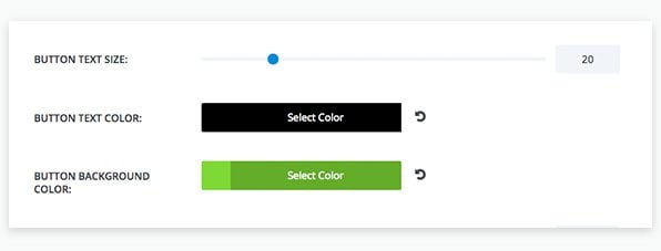
In addition to site-wide button settings, you can also define custom button settings on a per module basis.
Background Color / Image
Now you can add a background to individual modules. Combining this with custom padding, you can create some really creative modules.

Text Options
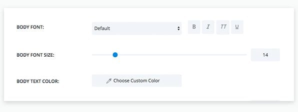
If your module includes text elements, you will find all kinds of settings for typography in the Advanced Settings, such as font, color, style, size, line-height, and letter spacing.
These are just the basics! Below I will go through a few modules that have more unique settings to show you how to make your website truly unique.
Create A Testimonial Slider

This is actually a fullwidth slider module that is taking advantage of the new custom padding option for sliders. In the advanced settings of a slider module, you can define the top and bottom padding of any slider. To achieve this affect, I have used the slide title as the testimonial content, the slide body content for the attribute, and reduced the slider padding quite a bit since testimonial sliders are usually shorter in height than a regular page header slider. Another reason to reduce padding is so that you can get creative and add more elements around the slider such as a blurb like in the screenshot below.

Give Your Pricing Tables a New Look
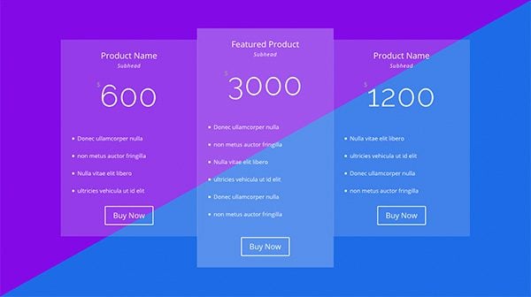
Divi’s Pricing Table module might take the win for the the most advanced settings. Configuring your tables can take a while, making this module a perfect example of something you can use the Divi Library for. The pricing table module above, is a nice modern styling of Divi’s pricing tables, and the split background color is simply to show you that you can import this module into your own page and add it over any background color that supports white text.
I’ve edited quite a bit here, but the gist is that I’ve removed the default borders, customized all text to be white, modified the buttons to be white, and given transparency to the table background colors. You can also see that I have given the featured pricing table a more opaque background with the module’s featured-table design settings.
Individual Table Control
One last thing to note about the advanced settings in the pricing table module is that you can customize the tables across the whole module, but also on a per table basis. For example, you could give each table its own background color to make each product really stand out.
Gutterless Rows

Gutterless rows are one of the coolest things you can create in Divi 2.4. We will go more into the new Row options in an upcoming post, but I wanted to include this for the sake of creating a Divi Library Pack for our readers. What you are seeing here is a two column row that has been made fullwidth with no space between its columns. The settings below illustrate this configuration
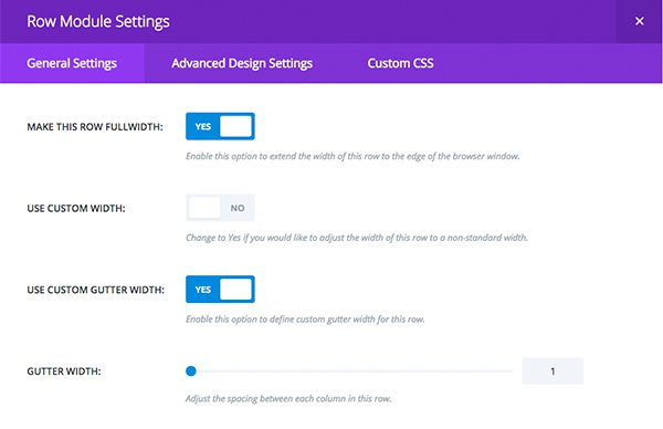
The coffee image is actually a column background image, and the columns will always remain the exact same height with Divi’s new Equal Column Height setting. Also included in the library pack is this same row but with the image on the left. Combining the two results in a nice alternating layout.
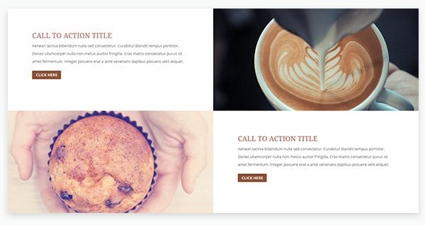
If you download the library pack and place these rows into your own layouts, the call-to-action module will inherit your theme’s typography and button styles. Stay tuned for more in-depth posts on Divi’s all new theme customizer options.
Boxed Blurb Module

Adjacent blurb modules can sometimes clash with each other. Adding a border around them can be a really nice solution if you are feeling they need a little more separation. Before Divi 2.4, you would have to do this with custom CSS, but now you can do it by simply using the module border options. When adding a border, you will want to add a bit of custom padding so that your content doesn’t crash into the border. In the example above, I used 40px padding, which is a good value across all breakpoints so your boxed modules will still look great on mobile.
Taking this same idea of a bordered module and adding it to a section with custom padding, you are able to achieve a whole new look by using an almost identical module as the ones above. This is a great example of how these new advanced settings open up the world of design opportunities.
Transparent Contact Form

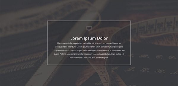
The new contact form settings let you control things like, form background color, border style, text color, and form field rounded corners. In the module above, I have chosen a transparent background color, white border, and rounded corners. All of these settings are fully customizable. You can choose a semi-transparent background color, choose your border thickness, and even define a custom rounded corner radius.
Fullscreen Header
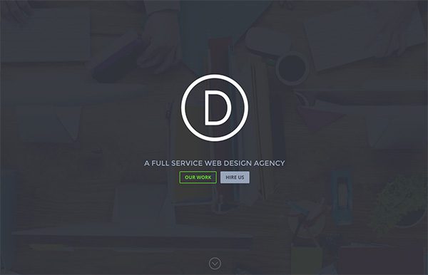
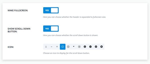
Divi’s Fullwidth Header module can now me made ‘Fullscreen’. This makes it so that no matter what size your browser is, it will fill the screen and vertically center its content. In the example above I’ve uploaded the Divi logo into the new Logo field, and added two call to action buttons. The fullwidth header module also gives you the ability to add a “scroll” icon that, if clicked, will smoothly scroll down to the next section. There are 11 pre-made icons you can choose from along with being able to define its size and color. Another one of my favorite features of this module is the background color overlay. The background you see here is actually a very bright and saturated image with a semi-transparent dark overlay to help the text stand off of the busy image.
Saving Your Own Items to the Divi Library
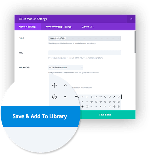
When creating or editing a new module, row or section within the Divi Builder, you will notice a brand new save button on the bottom of the settings windows called “Save & Add To Library.” This is accompanied by the standard “Save & Exit” button on the right. When you click the “Save & Exit” button, your module settings are saved on the current page and the settings popup is closed. When you click “Save & Add To Library,” the module is still saved on your page, but it is also added to your Divi Library.
Adding Library Items to Your Page
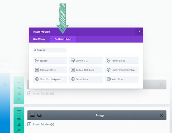
Once an item has been saved to the library, it can be added to any new page from within the Divi Builder by clicking “Add From Library” button when adding a new module, row or section to the page.
Download The Library Items Described in this Post
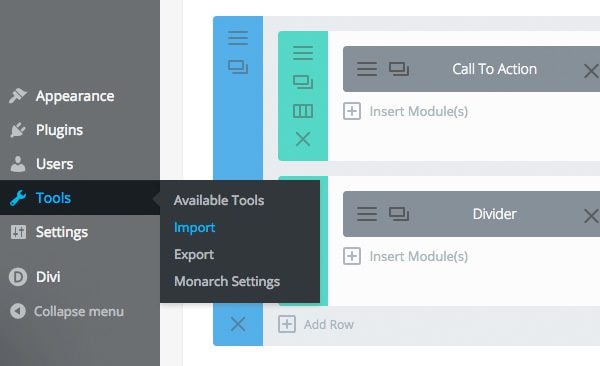
Click the link below to download the items described in this post. To import them into your library, navigate to Tools > Import. Select the WordPress link at the bottom of import type list, and you will be prompted to upload the file. You will then have access to these modules for you very own use. Before uploading, be sure to unzip the zip file! Only XML files can be imported.
I hope that this brief look into advanced settings will help you with creating your own modules and possibly even motivate you to share them with the community 🙂




Thanks Kenny, i think it’s great and also easy 😀
All the images on this post are broken. 🙁
I just installed this. I get a boat load of options in the customizing area, but I lost all the original customizer options such as “Header and Navigation!” What do I do now?
Hi Robert, sorry you’re having that problem. We’d be happy to help you out in our support forum.
Thanks Nathan. Fixed. User Error
I’m loving this..
Thanks guys!
Saves time…
The best!
I have updated my WP to 4.3 and my Divi to 2.4, all seems to be fine, except I downloaded the layout library (UNZIPPED xml file) and the new page templates dont show up in my library even though it says the installation was successful. Specifically I am looking to use “Project Basic”, “Filterable Portfolio 1” and “Filterable Portfolio Grid”.
Has anyone else had a problem with them not being listed in the library after a successful installation? Thank you in advance for any insights. 🙂
please make sure you’re trying to use theme in the right placement (section / row / module). For example, select a module then you will see the library contents imported.
I thought I had the same problem but then after searching the forum I realised it’s for the page components not for load whole page from library.
Did you figure this out?
I’m having the same problem. It’s saying that it’s been installed and to have fun, but nothing is showing up.
same here .. just uploaded the unzipped version and only the ‘Section Centered Boxed Blurb’ shows up
I just set up my 3rd client website using the Divi Theme, and I get more impressed every day with all the tools and new applications, etc. that continue to get added. I’m in awe and I bow to the gods.
This is a great article and excellent input, Kenny. Thank you for this and the very helpful templates. I’m new to Divi and this provided some valuable concepts for me. I’m very curious, where future plans for the Divi library might lead us to.
I’m a bit behind the times and just catching up with all the new features of Divi 2.4. Great job team! Upgraded to 2.4 without too many issues and managed to get rid of most of the custom CSS we were using in the child theme. Yay. Now I’m looking closer at the cool things I want to implement and I’m stuck on something really simple. The split diagonal background you are showing being the pricing table. I’m sure it’s simple — so I thought I’d ask.
Thanks again for all your hard work.
Greetings from Africa, Nigeria. Though am new to Divi met 2.3.and now am loving Divi 2.4 it blew my mind and imaginations away. Awesome job to the ET gangs, :). Kenny and Eileen thanks for the post and insight. If the interior tutorial could be put here in the future we would love it. Thanks a million times.
Onwukwe Peter. O
I have a ticket open in support – but they a swamped it seems – so maybe someone out there can assist.
I create a row and add modules and then Save to Library – if I then go to the Divi library I see it listed but when I try and add from library I am told “You have not saved any items to your Divi Library yet. Once an item has been saved to your library, it will appear here for easy use.” – but the categories are listed .
Any advice would be appreciated!
I can’t wait to customize my current sites with divi 2.4. Big thanks !
Hi Kenny,
great Fullscreen Header sample, how to do with a slider Two buttons like in this example?
Thanks
Help a novice out. Who wants to list out: Step1, 2, 3, etc. to create a gallery like the one shown at http://elegantthemes.com/preview/Divi/cafe/gallery/
I must be missing something simple but it is eluding me for some reason.
Thanks for any insight!
Hi there!
I’m using your nice gutterless columns. They look great on desktop, but unfortunately not so great on mobile. I get full-width columns with alternating photos, like “CTA1;photo1;photo2;CTA2”
I’d prefer to just hide the divider columns at responsive resolutions. Thoughts?
Same here! Looks awesome on desktop but on mobile the images stack up on top of each other and you don’t know which photo goes with which CTA… would love a solution 🙂
Great update but yeh i wish the contact form had a few extra field options like to add an extra field or two for say a phone number or a website, etc. like this very comment area that way i wouldn’t have to go to 3rd party plugins & form builders etc to gain the extra field or what not.
Hopefully in another upcoming update.
Last Divi update really shocked me. I’m serious.
This theme has become totally epic and it’s changing the way I create websites.
Subscribing with you is one of my best choices ever.
Hey guys, when I try to create a testimonial slider like the one you’ve got in the example above, it won’t save the slides when I put “quotes” around any of the slide headings after the first one. The first slide I add with quotes around the heading works, but when I add a second slide with the quotes and click save, when i go back into it the slide heading is empty. Not sure if this is a bug. I am on 2.4.3
Wow, thank you Kenny!
in the 2 column gutterless rows with the coffee as a column background, which module is used for the coffee image?
The left one is a call to action, but im not sure what the second one is, I tried using the text one but the background won’t show up unless i place text on it, and even then it will only show as a background to the text
The coffee image is actually a column background image. In the Divi example, I believe it’s the background image for column 2.
As usual, patience is the virtue of calamity. Thanks ET team
Hi: I went through all of the steps – and unzipped the file – and received messages that it failed to import all of the files that were not already there. What went wrong? Kathy
Can’t wait to get started using 2.4. So many idea are floating around right now. Near limitless possibilities. Thanks ET
Thank you for this.
Great to have this add on pack. Would love it if you could add a Tel. number field to the contact form in the next release 😉
Hi everyone, took it upon myself to build my own website (like beginner here) and jumped on Divi 2.4. imposed the library xml file, then I got this..
Remember to update the passwords and roles of imported users.
Thanks
Thank you very much for this…
I also would like to know how to create gutterless gallery. It looks so amazing!
DiVi 2.4.2 TOTALLY HOSED a client web site that was built with DiVi 2.3.2. Layouts were messed up. Some pages that were supposed to be 3×1 (3/4ths of the page for content with a sidebar on the right) became 50/50 split. Some pages lost their sidebar completely. That site was set to automatically update themes. Thankfully a lot of my sites and client sites are on Managed WordPress and they’re not set up to automatically update themes. Another client site that’s on a regular CPanel hosting account was set up update automatically but I got to it in time to turn auto-updates off.
Just letting you know.
Yeah! Totally messed up one of my e-commerce sites and another in development. 🙁
Seems like main culprit is introducing 80% width on container and rows with several knock-on consequences. Not so simple to fix in child theme.
Don’t understand why this was necessary.
Guys – I appreciate the great new stuff that you are bringing to us, but you really need to give existing websites some notice of what is coming before dropping bombs like this.
Estes dias mesmo estava pensando nas ferramentas e funcionalidades que melhorariam o Divi,
Hoje de manha desperto com esta surpresa, para bens era o que estava precisando.
Wow, thanks a lot for this!
I already figured out how to accomplish some of the things you outlined in the post since I really liked the new showcases for the theme, but it’s even better to hear it from the master himself and also get my hands on some sweet library items that I can use on my sites. What an excellent post Kenny, please keep up the amazing work! 🙂
Hi Kenny,
Thanks for an amazing and helpful post. I’m falling more and more in love with Divi by the second…you never need another theme.
Thanks so much guys for all your hard work which is so very much appreciated! 🙂
Divi your the best. Amazing update,I’m like a kid in a candy store looking at all these new features and settings. Question though..why 2.4 and not 3.0…is there plans to expand from this new version?
Please make something which is fully compatible with BuddyPress. I was a member of Elegant theme but currently I am not using Elegant theme. Just because my website runs BuddyPress and yours is very difficult to customize especially for BuddyPress.
Wonderful!
Now, i only need to know how to make a gutterless gallery.
This is fantastic, you have not really touched on the abilities with Woocommerce, is their any settings out of the norm that can make a shop look good and function great.
Hi,
Is there any tutorial/post can be available how these case studies (Divi Cafe) have been executed?
It would be of great help to explore the Divi 2.4.
Shailendra
First of all #epic release!
Secondly, thanks for the free downloadable library zip file. More of this please! Also, we appreciate you doing blog posts about the features and how to use them. This is fantastic stuff!
Hi,
Thank you so much for the gift!
Is it possible that there’s a little bug on the testimonial slider?
When I select dark text it doesn’t apply. Only light text.
Sorry, just figured out. We must remove the colours on the advanced design settings!
I like your fullscreen header. I’d like to put a menu underneath it (easy, using the menu module in a full width section, using the blank page template) and then have the menu stick at the top of the screen when the user scrolls down (is it possible?).
Thus I could put my entire home page under the fullscreen header.
I tried using the default template with the regular menu, with “hide nav before scroll” activated, but this creates an awkward effect with the logo, which is essentially never seen full-size.
Ah, the answer is to go into the Customizer and adjust the height of the logo in the fixed menu options. Set the height to a little lower than the height of the logo as set in the Primary Menu Bar options and it won’t disappear into nothingness when the menu shrinks.
Thanks for the update Jonathan
Wow! I watched your amazing demo pages yesterday, and could not AT ALL figure out how you did those beautiful gutterless text + image combos. Thank you very much. I can only hope you guys come out with some sweet documentation for this theme, there are so many awesome possibilities.
Hi there, I am testing 2.4 in my own local site, and My Full Width and Heigh Header shows not vertically centered and my “Down Arrow” it shown below the fold, any idea what is going on?
I can not provide link since it is under development in a localhost.
I found that this “style=”padding-top: 116px;” is the problem, how do I change that to “0”? I have no options in the module nor the config.
I cleared browser cache, everything, it drove so nuts that I delete the site and start over and I found the following:
If you use the menu with the logo inline in the center of the menu, it ads the 116px, not sure why but is there!
It is a bug? or it is intended to be this way for some reason that I can not understand?
I was very conscious and making the changes one by one, refreshing not using the menu with the logo in the center, and there it is. no matter what do I do, the style=”padding-top: 116px; Appears again.
Any idea? Thank you in advance 🙂
I’m having the same problem, tried it on said site, but have also tried center logo on other sites for testing and it is offset on each one.
There appears to be numerous bugs. Another one that is frustrating is using column bg images, i’ve tried numerous configurations and can’t get any of them to function?
Would be great to see some help here- Thanks
Thank you for this!
So I started right in on configuring the testimonial slider idea and I’m having an issue.
When I put the text in (10-20 words) it doesn’t save when I update or preview? It does if I keep the word count low though. In the post it says use the title but doesn’t seem to work for me.
Any ideas?
Well I figured out my own issue. You can’t put quotations in the Title area or it removes the text.
Thanks for the great job. Downloaded everything, but still out of time for test it….. what about compatibility with qtranslatex???
thanks again
Thank you, thank you, thank you.
This is such a huge help to us novice users. I hope you continue to add posts like this to your blog after the 2 weeks is finished.
Would be awesome if you did a post like this once a week for ever after. I think most of your users are using Divi so it really helps us get ideas and understand how designs are accomplished.
Again, thanks very much and hope to see this style of post continue after the 2 weeks….pretty please.
I’m still trying to figure out how to add partial opacity background so it is easier to read text on Slider images. The old code I found to modify the CSS is still working but I think a built in feature would be great. I know picky, picky. Or am I missing something.
Here is the code I need to install on each Divi Theme site I create.
/* Set the semi-transparent background color */
.et_pb_slide_content,
.et_pb_slide_description h2,
.et_pb_more_button_wrap {
background-color: rgba(0,0,0,0.5);
}
/* Hide the content area if empty */
.et_pb_slide_content:empty {
visibility: hidden;
}
/* Add 30px of padding to the background */
.et_pb_slide_description h2 {
padding: 30px 30px 10px !important;
margin-top: -30px;
margin-left: -30px;
margin-right: -30px;
}
.et_pb_slide_description .et_pb_slide_content,
.et_pb_more_button_wrap {
padding: 0 30px 30px !important;
margin-left: -30px;
margin-right: -30px;
}
@media only screen and ( max-width: 479px ) {
.et_pb_slide_description h2 {
padding-bottom: 30px !important;
}
.et_pb_more_button_wrap {
display: none;
}
}
/* Give the background rounded corners */
.et_pb_slide_description h2 {
border-top-left-radius: 15px;
border-top-right-radius: 15px;
}
.et_pb_slide_description h2 {
border-bottom-left-radius: 15px;
border-bottom-right-radius: 15px;
}
@media only screen and ( max-width: 479px ) {
.et_pb_slide_description h2 {
border-bottom-left-radius: 15px;
border-bottom-right-radius: 15px;
}
}
I have the latest version of DIVI Version: 2.4.2 installed, but the library pack installation gives me a long list of “Failed to Import – invalid post type errors” errors.
I have the same error message when I try to import. I’m also using Divi 2.4.2
Looks great! Hope rounded and other alternative corners will arrive soon…
Thanks Kenny, sincerely, ET has furthered empowered us with these sterling features and the tutorial are goldmines! The gutter-less row, fullscreen slider and background overlay ,the transparent box/blurbs and paddings are some of the tweaks I kept bordering the support but not anymore. However, would there be an option to make background slider infinite scroll with subtle movement? I don’t want to believe that its only Revslider that can be hack to do this. Please peep http://themeforest.unitedthemes.com/wpversions/brooklyn/demo8/
I’m enjoying the tutorial and getting the feel of the new spaceship of web design even when everything is packed full in the customizer…whoops!
Thanks a million Elegantthemes!
Cheers 🙂
Divi really is the gift that keeps on giving. Thank you to the Elegant Themes for an unbelievable update!
You guys really are amazing. Thank you.
I was expecting good things from you with the next Divi major update, but I have to say you exceeded my expectations. All I can say is,
“Wow, great job!” You guys are the super heroes of code.
Thanks for the pack, Kenny! You guys have really outdone yourselves with this update. I use lots of different themes in my webdesign business, but more and more, it is looking like Divi will be all I will need. The global library will save me TONS of time in the future. Keep up the good work!
These look great but I can’t get them to work. I have them loaded into my library and I can see them under the divi library but when I go to create a page and hit ‘load from library’ and then look under both tabs nothing new is there. The “add from library” only has check box for ‘Replace the existing content’
Any insight as to how I can use these?
In Divi 2.4, you can “Load From” library when adding modules, rows, sections and layouts. So depending on what you are adding, different items will be available. For example if you click “insert module” and then “add from library,” only modules will be available. If you click “load from library” at the top of the Divi Builder, only Layouts will be available.
Thanks…I feel goofy. I totally knew that.
Hi Kenny!
Thanks for such a helpful guide for using new Divi 2.4 features.
There are just infinite possibilities opened up with Divi 2.4. I still cannot believe how flexible and versatile Divi 2.4 is.
We loved Divi at the first version and have fallen in love with it all over again!
This is phenomenal. Thank you!
Thanks! This has been such a great week thanks to you guys! Looking forward to more of these posts.
I unzipped, then import and get a long list of errors:
Add this code to the functions.php of your active theme or child theme to stop update notices appearing on the dashboard.
function remove_core_updates(){
global $wp_version;return(object) array(‘last_checked’=> time(),’version_checked’=> $wp_version,);
}
add_filter(‘pre_site_transient_update_core’,’remove_core_updates’);
add_filter(‘pre_site_transient_update_plugins’,’remove_core_updates’);
add_filter(‘pre_site_transient_update_themes’,’remove_core_updates’);
Sorry that was not what I meant to paste in the reply 🙁 This is the error:
Failed to import “Header”: Invalid post type et_pb_layout
Failed to import “Global Text Module Test”: Invalid post type et_pb_layout
Failed to import “fullwidth header”: Invalid post type et_pb_layout
Failed to import “Global Image Test”: Invalid post type et_pb_layout
Failed to import “Global image Test 2”: Invalid post type et_pb_layout
these are just a few
Do you have Divi 2.4 installed? This post type wont be registered until the theme is active.
I have the same issue. although i have already activated my Divi 2.4
Hi
same issue here, Divi 2.4, all updated, Zip unziped, and “invalid post-type” everywhere!
Does anyone know a workaround for this? Can we manually import these into the database?
I found the solution, do this:
1-download & install 7-zip
2-Un-zip the et modules library that you get from this et post.
3-Right-click on the .xml file and archive it using the 7-zip.
4-Now import the .xml file into wp
I did this and got the modules imported but when I go to the Divi edit, I only find few of the above described modules … How to find the rest?
I’m so in love with the new features from Divi. I just started creating my shop before the update came out and I’m still learning how Divi works.
Thank you for everything also to include a 2-week series with explanations as it is hard for me as a beginner to figure out what these awesome theme can do.
Your Demo Site Divi Cafe and Divi Fashion are very inspiring. I would love to create similar style for my sites.
With the provided library pack are the different styles from these two sites included? This would make my life much easier. 🙂
I imported the file and I see them under Divi -> Divi Library
But when I open up a page they don’t show up in the Library there. Instead I have now every file double in it.
Any suggestion how to solve this?
the same is happening with me and any solution?
Same problem here. Unzipped it. Imported it. Try to Add from Library, I get a spinning indicator that it is think, but not getting anywhere. New 2.4.2 install on a very small testing site.
Same issue, the ‘Add from Library’ tab is empty even though Divi > Divi Library shows the Divi 2.4 Library Pack.
I was on an earlier 2.4 release and upgraded to 2.4.6.1 with the same results. I deleted the Divi 2.4 Library and attempted to import them again only to get a bunch of “Layout … already exists.” errors. ‘Add From Library’ is still empty.
Exact same issue here – imported the .xml – can see them in the library, but when inserting to a page there’s nothing that can be inserted (empty “insert from library” list)
on test site – new wordpress install – new divi 2.4.2 install – then import of .xml file.
Exact same issue here – imported the .xml – can see them in the library, but when inserting to a page there’s nothing that can be inserted (empty “insert from library” list)
on test site – new wordpress install – new divi 2.4.2 install – then import of .xml file.
I mean the predefined layout show up double now. The “add from library” is empty beside the one I made myself yesterday. This one dosen’t show up double.
Nevermind. Forgot to unzip it. Thanks!
Great article. Thank you. However, I’m having a hard time importing the library pack. I’m getting:
Sorry, there has been an error.
This does not appear to be a WXR file, missing/invalid WXR version number
Any ideas?
Hi Erik,
You need to unzip the files before you import them. See the outline in the article, as well as in the reactions above & below 🙂
Excellent article. I really liked the how-to screen shots. These tutorial articles are very helpful. Thanks for all your efforts. It looks like a promising future for Divi users. -M
just downloaded the new modules and played with the transparent contact form… WOW…. easy to make ’em really beautiful, without any skill on our part
Thanks!
Trying to upload the file, I get an error: “This does not appear to be a WXR file, missing/invalid WXR version number”
I’ve used the upload file before, so not sure if I’m doing something wrong, or it’s the file.
Yep you need to unzip the file before uploading as outlined in the post.
Hi,
Great page builder. This might become my favorite…
Just one remark : you cannot change a status (global or not) of a resource in the library (not even in the details section) or did I miss something ?
Bart
ps : I’m also missing the famous Noto (google) font !!!
Speaking about fonts: which library is being used?
Thanks for these, I’m now giving the a go!!
Please keep them coming
Will the Divi Photoshop files that come with the theme be updated with the new templates (ie. Divi Cafe)?
Nick and All,
My friend owns Divi 2.3 and showed it to me. I’m an old pilot and own small businesses. I cried with joy when I saw what Divi 2.3 can do. Actually, what I can do with Divi. Then, a couple of days ago he showed me Divi 2.4! And I don’t think you can do any better than this! Someone told me about WordPress threee years ago and last month I personally thanked him for changing my life. Now, with Divi 2.4 (I guess we think alike) I’m free to create what I want. Thank you and feel free to quote me. Jeffrey B., BSME, MBA (Phi Kappa Phi), Mensa.
Jeff,
Exactly share those sentiments. Divi is heaven.
Jim M, …
Jeff : Do you know they plan to do even better ? Divi 3.0 will be awesomer 🙂
Hi! I tried to import the library pack as you said, but the process failed. Check this message out: “This does not appear to be a WXR file, missing/invalid WXR version number”
Thanks,
Jordi
Hi Jordi,
Be sure to unzip the file before you upload it. Only XML files can be imported into the library.
Thanks…. I think library and global library are just totally awesome and will streamline our work amazingly well.
Divi Rocks
(and so do the ET folks)
==>Jim
Downloaded the zip file and imported it as explained and got this error.
Import WordPress
Sorry, there has been an error.
This does not appear to be a WXR file, missing/invalid WXR version number
Never mind, i unziped the file and it works.
Hi Rubin,
Make sure to unzip the download file before importing it. Please let us know if that wasn’t the issue or still does not resolve the error.
Did you unzip it before uploading?
You need to unzip the file before uploading, so that my be the problem.
You beat me to it 🙂
me too haha!
Greetings Kenny/Nick
I’ll attempt non-rambling, so here goes…
Downloaded/Uploaded the xml file, but the set-up you mention for the Gutterless Rows (rows with image left/right) is not therein contained.
That being said, not difficult based on your description to recreate.
However, with caveats…
For one, responsively (at least on my ride with Chrome), those ’empty’ columns with image backgrounds and equal height columns work exactly as described for desktop, but in tablet and phone widths, those ‘columns’ disappear. In itself, not such a bad thing given that the flow would have them stacked (Text-Image-Image-Text) vertically.
Placing a matching photo into this ‘column with either Text or Image module, given the nature of the ‘equal-height’ columns pretty much fails as then they overlap with the background unattractively at mid breakpoint widths.
And losing the background-image results in un-equal column heights.
But, the good news is our newfound ability to create magic with the 2.4 framework.
Thanks for customizing divi to such a finer level and thanks for the share
Thanks!! I’ll be playing with this pack this weekend.
This is AMAZING!!!! Elegant Themes, this is way better then the apple watch 😉
Haha! I agree, much better than the iWatch. Also much better than all other mobile devices that aren’t the iPhone.
haha 😉 definitely better 😉
Fabulous! Now we can get down to serious business design at last!
Great article, thanks for the samples! I agree with Amy… Christmas in June!
WOW this is like Christmas during June! More awesomesauce for Divi lovers. Thanks to all at ET;)