Last week we introduced Divi 2.4, the biggest upgrade in Divi history and a giant leap forward for our most popular WordPress theme. There are so many great features to explore in this update that it was hard to describe them all on the release post, which is why we have decided to do a 2-week series of informational blog posts that will aim to teach you how to take full advantage of Divi 2.4 and its new options. In part six of this series, I will walk through the many new ways you can customize your website’s navigation header.
- 1 The All New Header & Navigation Customizer
- 2 Brand New Header Formats
- 3 Centered Inline Logo
- 4 Hide Your Navigation Until After The User Scrolls
- 5 Primary Menu Bar Controls
- 6 Let Your Menu Span the Width of the Browser
- 7 Hide Your Logo in Your Primar Navigation
- 8 Easily Adjust Your Menu/Logo Height
- 9 Primary Navigation Typography Controls
- 10 Header and Dropdown Menu Color Settings
- 11 Animate Your Dropdown Menus
- 12 Secondary Menu Bar Controls
- 13 Fixed Navigation Settings
- 14 Hide Your Logo After Scrolling
- 15 Specify Navigation Styles for Mobile Devices
- 16 A Few Examples to Kick Off The Creativity For Your Own Navigation
- 17 Endless Possibilities
The the customizer gives you so much more control than you had before. Give your fixed navigation a custom design, hide/show your logo on scroll, and even center your logo inline with your menu links
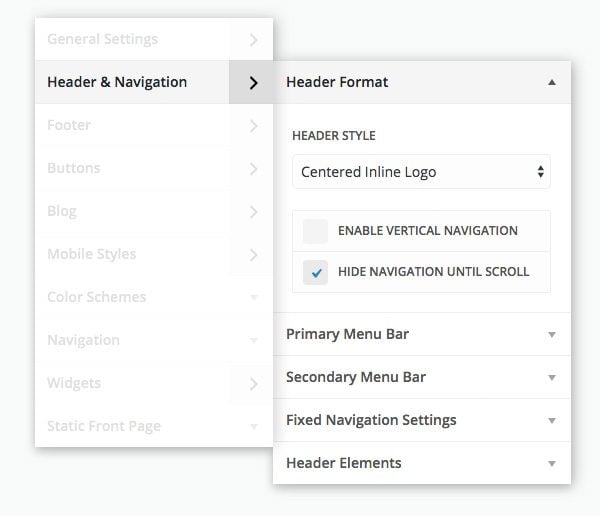
Brand New Header Formats
Two settings that are new to the “Header Format” tab are the Centered Inline Logo header style and the Hide Navigation Until Scroll setting. Both of these options can drastically change the look and feel of your header with just a click of the mouse.
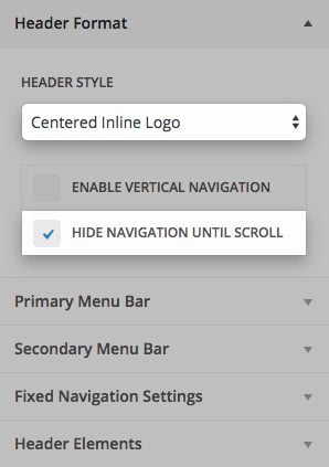
Centered Inline Logo
Centering your logo can be a good design decision for many reasons: you could have a very symmetrical logo, have only a few menu links, or you could have centered page content and you want your header to be consistent. Centering your logo while also placing it inline with your menu links can justify any reason you may have for centering your logo, while also reducing the height of your navigation.
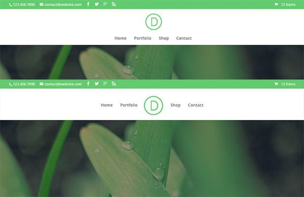
You can see the height difference in both centered logo header styles. Even though I made the logo bigger for the inline version, my nav height is still less than the stacked version.
To ensure the best use of the centered inline logo, make sure to have an even number of menu links, and to consider the length of your menu item labels.

You can see in the image above how an odd number of menu items or menu items with extreme length differences can effect the inline logo layout.
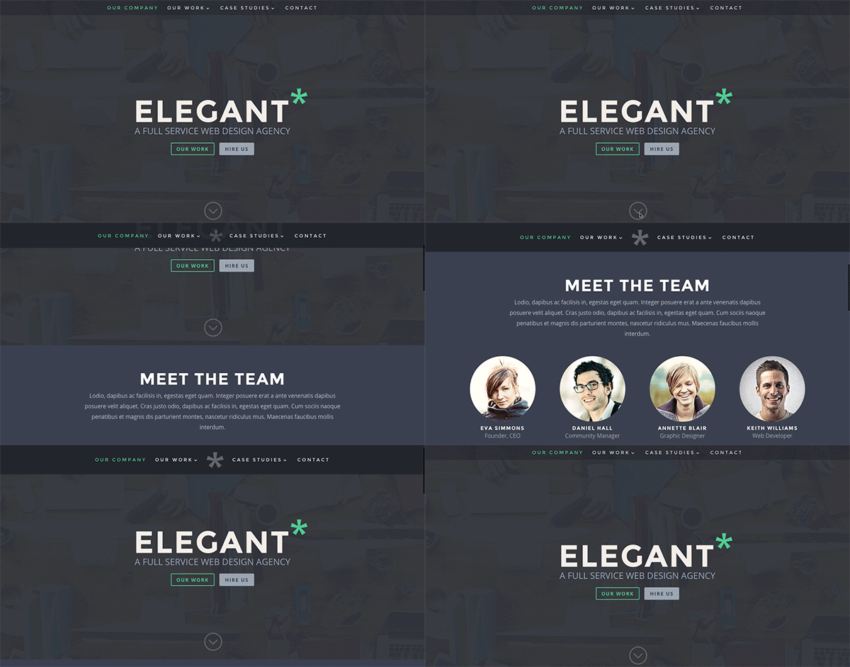
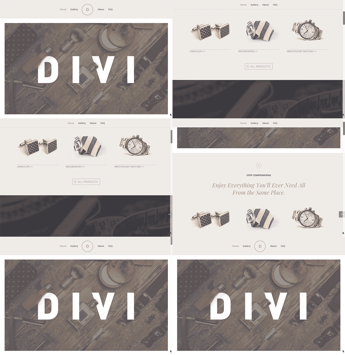
You may not want your logo and navigation links to interfere with the first section on your page. This is common with fullscreen headers, or headers that already contain your logo and/or a call-to-action that you want to stand out more than your menu links.
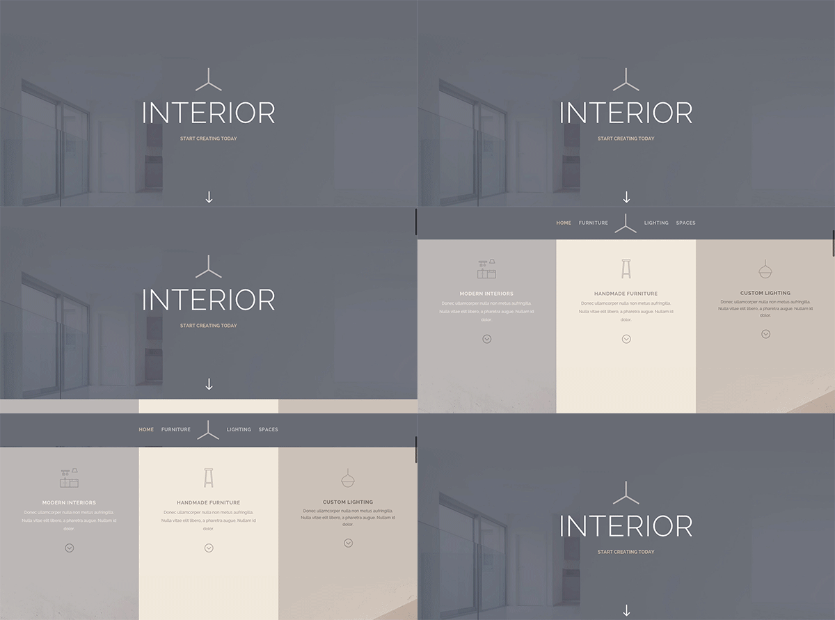
Deactivate this Effect on Select Pages
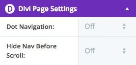
Perhaps you only want this effect to take place on your home page or other select pages. If this is the case you can choose to turn this effect off on a per page basis
We’ve completely revamped the control you have over your primary menu bar in Divi 2.4. With settings like “Make Full Width”, “Menu/Logo Height”, and “Font Style” you can give your website that unique touch to stand out.

By default, your header content is contained by your main content width. The new “Make Full Width” option in the Primary Menu Customizer lets your header content break out of the container and take on the width of the browser. This can look great if your first section’s content is not constrained by the main content width. For example, a fullwidth image or slider module.
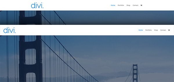
Here you can see the difference between default and fullwidth navigation
This option is primarily useful when you have enabled Fixed Navigation so that your logo appears after the user scrolls. Hiding your logo before scrolling is a nice option if you’re already displaying it in the first section on your homepage.
Depending on the design of your logo, you may want to increase or decrease its height. This new control lets you do that with a simple range slider.

This control will never stretch your logo beyond the size of the original image asset, but will continue to effect the height of the header.
Controlling the font, size, color, style, and letter spacing of your menu links is doable from right inside the customizer. Whether you want your menu links to match the typography of your main content or drastically contrast the items on your page, you can easily achieve countless combinations and designs for your own header.
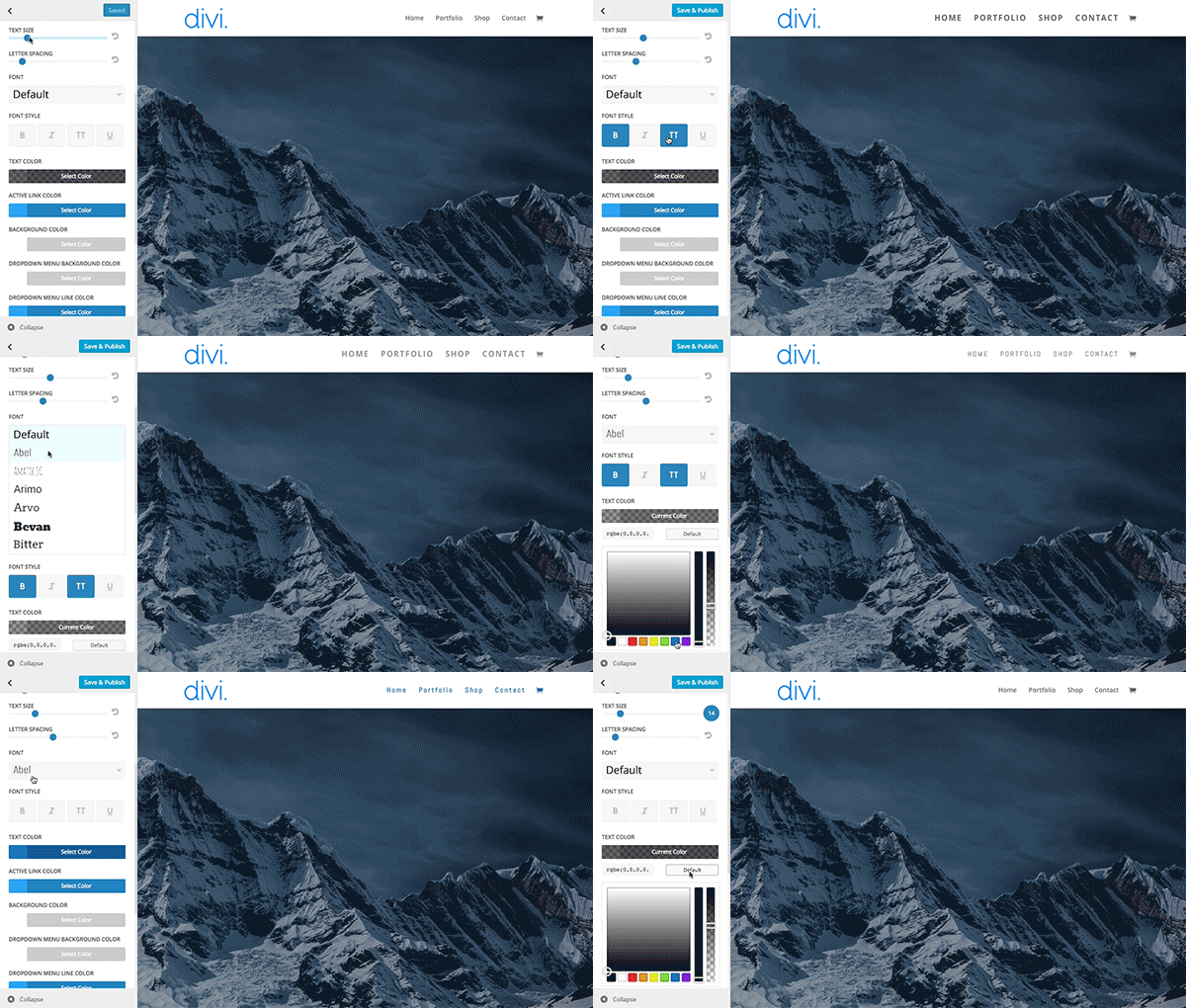
In addition to unlimited color options, you can also choose the transparency of your colors. If you choose a transparent background color for your header background, the first section of your website will be tucked underneath and extra top padding will automatically added so that your navigation won’t overlap its contents.
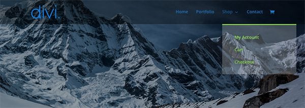
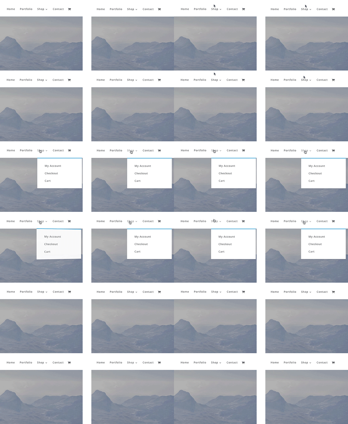
The last setting to go over in the Primary Menu Customizer is the new Dropdown Menu Animation setting. If your menu links contain dropdown menus, you can now choose from four intro animations: Fade, Expand, Slide, and Flip.
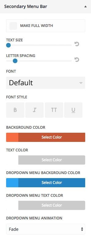
All of the design settings that you have for your Primary Menu Bar are also available for your Secondary Menu Bar. Your Secondary Menu Bar will only display if you have defined a phone number, email address, social network links, and or have a secondary navigation menu assigned.
Here are just a few examples that show how you can use different combinations of colors, fonts, and type styles to design your secondary navigation.

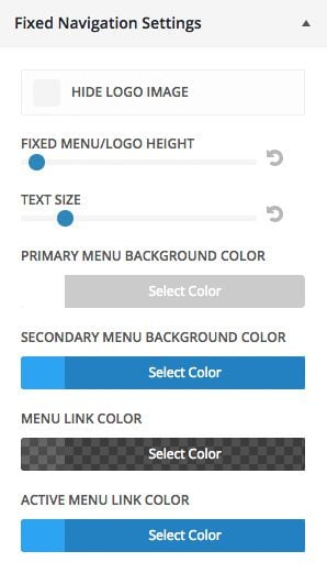
By default in Divi, when the users scrolls down the page, the navigation bar sticks to the top of the browser, the logo shrinks a bit, and the header decreases in height. The header that you see after scrolling is your Fixed Navigation Bar, and now you have full control over what it looks like. The colors and size settings in this customizer will smoothly transition from their Primary Menu settings. For example, if your “Active Menu Link Color” was green in your primary nav, and blue as seen below, it would fade to blue as soon as the user starts scrolling.
Hide Your Logo After Scrolling
In contrast to hiding your logo in your Primary Menu Bar, you can choose to hide it in your Fixed Navigation so that it disappears after the user scrolls. This can be a nice way to have the fixed navigation take up less screen space while browsing your site.
The Divi 2.4 Theme Customizer also has a new Mobile Styles menu that lets you define a few mobile settings for you navigation.
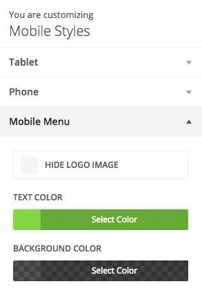
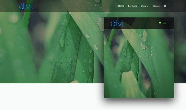
In this example, I have darkened the header background on mobile and changed my menu links to be green.
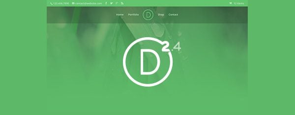
Finding the right combination of these settings can take a bit of finesse, but spending the time to find that perfect balance is worth it. Here are some examples to show you just how many different ways you can combine these settings so that your website navigation is truly unique.
Shrink Logo & Text On Scroll
In this example, I decreased the logo height and text size in my Fixed Navigation settings. Even after shrinking the the nav links, I increased their legibility by darkening the header background color and whitening the nav links color.

Full Transparency
If the first section on your page is made up of a solid color, or even an image with a simple background, you can get away with a full transparent header background color. However, when the user scrolls, you will want increase the opacity of your background color so that your logo and nav links are readable.

You may want to hide your navigation entirely when the page is loaded. Remember that there is a new setting Hide Navigation Until Scroll that will let you achieve this. In the case of not having a logo, using the Centered Header style is a nice way to display your menu links.

Display Your Logo After The Users Scrolls
In contrast to a couple of the above examples, this combination shows the logo and menu links increasing in size after the user scrolls. This can be a good solution if you really want your navigation links to be very visible and readily available to your users no matter where they are on the page.

Endless Possibilities

The examples go on and on. Combining your logo orientation, background colors, text colors, text styles, and display settings, there are so many ways you can create something that has your own personal touch. If you’ve already had a chance to explore these settings we would love to see the different combinations you have come up with in the comments. While we are extremely excited with what the new header options have to offer, we also know there are many ways to make Divi’s header settings even stronger. As always, we love hearing your suggestions and we will do everything we can to keep pushing the envelope.




Aló! I’m trying to change the hover color of the menu. Is it possible?
Thanks!
Love the theame it really is awesome and i feel stupid asking however. I can not seem to find where to change the logo.
Hi Kenneth. Not a silly question. I’m new to Divi and have spent a couple of hours playing around, but still I can’t find where to change the logo. Help!!!
You can change the logo out under Divi > theme options.
Hi Kenny,
this is very helpful! Thanks a lot.
question:
I want exactly to do that, what you have described under “Full Transparency”:
– First: the menu should be full transparent: I could manage that!
– Second: when the user scrolls, I want to have full opacity of background color: What to do that? My menu remains transparent?
Many thanks.
Payam
I’d like to utilize the options that hide or show a logo on scroll, but I don’t see that it’s a possibility to exclude that function from individual pages. This seems like it would often be a great solution on a front page, but not always others. I’m familiar with individual page settings, but don’t see anything helpful there and have been unsuccessful searching for info. Thank you!
Is it just me, or are there many missing images in this post?
Hi, one question…
is it possible to place image in Divi Mega menu??? If Yes how..
Thanks
Is it possible to show the primary navigation bar without the submenus, and then have the submenus show when one is looking at the pages that the primary navigation bar takes you to? I’m looking for a way to have the viewer look at the page linked to the primary menu without seeing the submenus, but then being able to see the submenus once they’re on the page linked hto the primary menu. Thanks!
Hello.
I wish to customize the DIVI theme to have buttons along the top. Is there a way to add CSS to get a button that is simliar to the “read more” button on the slider homepage of this site? http://www.sorensenchiropractic.com/chiro/
Thank you for your prompt response. Is there a way to set up a menu widget or something in the code that would allow for this as well? Thank you!
Here is a Divi Quick Tip we created to go over this very thing: https://youtu.be/IxIQkbCVs_g?list=PLF17V-5878mWVOcXf16DqIwStUtMS53ef
strong post Kenny!
Hello,
I have a question regarding image and header. I would love to have an image on the top of the page, above the header, not below. Is there a way to do it? If not, are you considering adding this feature to Divi? Thank you for your reply!
Hi,
Is there an ‘official’ method for doing this please?
http://www.divithemeexamples.com/add-button-main-navigation/
Yes you can find that tutorial in the Divi Quick Tip section of this post http://www.elegantthemes.com/blog/community/the-divi-nation-podcast-episode-13-following-your-bliss-with-dave-cahill
Thank you Nathan
Hi,
Is there any way to increase the width of drop down menu items, so that it can show the drop down menu item of 4-5 words in a single row.
Hello ! there is a way to make the divi theme menu on mobile devices to stay fixedo when scroll page down in mobile ? In the same way that this theme http://www.infodatahd.com ? I will change theme for divi, but would like this feature.
Yes that is possible with Divi.
How??? PLEASE DESCRIBE HOW!!
Can you describe how? I cant see an obvious setting…
Please remove my coments ?? Thank you
Need to make mobile menu fixed too
.
I want to use the new “Hide Navigation Until Scroll” functionality but the checkbox doesn’t seem to be available anymore in the customizer (under the header & navigation – > header format). I have gone through all the sections of the customizer and can’t find where it may have been moved. Was that removed in a recent update? Is there a manual way to accomplish?
Hi Carla, sorry you’re having trouble with that. Please make a ticket in our support forum so one of our support staff can help you get that sorted out. It’s definitely still possible. http://elegantthemes.com/forum
Is there a way to make the secondary header bar hide when a user scrolls?
Hi there,
Is there a way to add social icons to the primary menu, rather than the secondary? I prefer not to use the secondary menu at all but would still like to have my social icons appear at the top of the page.
It is possible with a bit of customization. I think someone on our support staff could help you out with that in our forum.
Hi, does anyone know if this is a bug? My main page header/navigation bar only fades in when i scroll. Perfect, just what I want. On subsequent pages the same menu is just fixed at the top and scrolls down when i scroll down. This is fine, but i dont want it showing when i first visit the page (just like the main page).
I’ve tried every option but cant seem to see anything. Looks like the logic is there but it just doesnt filter from the main page to all other pages.
Any ideas would be great……
thanks
Hi Andy, sorry you’re having that problem. We can most easily help you out in our forum.
http://elegantthemes.com/forum
I have spent one hour trying to figure out where you upload the logo. I went to customize and then general settings and is definitely not there.
If you go to Divi > Theme Options it will be there. Under the general settings of your ePanel.
It is not there on mine
Never mind found it thanks
Why we are not upgrading to Divi 2.4!
with the introduction of many customisable features of the theme, although it may appear a nice addition, it actually renders the styling via css files way more complicated. Some of these custom features are set via jquery on the browser and declared inline into the html element, making it very hard to over-rule with css, except with the use of ‘!important’ flags.
Divi 2.4 might a fine tool for the layman but a curse for the developer.
We upgraded a recent site running divi 2.0 and were stumped to see many of our previously customised child theme css overruled by the parent theme upgrade
Anyone else not seeing the Fixed Navigation Menu option? I upgraded to the latest version and its still not there.
How do I make the background image responsive and fit on a cell phone so the whole image displays and not a cut off version.
When I add the centered inline logo to my header, the height of the header gets huge and it messes up the dropdown navigation. How do I keep the height consistent?
thanks!
This is probably because your logo height is too tall. Just a guess. I’d go to your customizer > header > logo height and try shrinking it down a bit. If that doesn’t work, check out the forum for fixes. There’s a really good chance someone else has had this issue before. If by some odd chance there is no existing post on how to fix it, create a new ticket and we will gladly take a look at your specific issue.
Trying to disable the navigational panel for a single page (Not hide while scrolling but hide altogether). Can this be done?
Thanks
I believe if you use the blank page template it removes the menu altogether.
Thanks, I used the blank template. I want the menu bar present, just not with any options showing on it. Is there a way to achieve this (for the specific page)? Maybe if I could create a new template and assign it for that specific page?
Is there a way I can have a background graphic repeating horizontally behind the logo and menu items?
Hi there, i try this option that the logo appears after scrolling down, but i dont see the logo on the live page, only in the backend on the theme options there it looks all.. do i make something wrong?
Here is the Page, thanks for your help
http://jura-kristalle.ch/kitten/
Regards
Nicole
Divi rookie here. I am looking to enable single page navigation within several of the pages on my website but I do not have the “ET Settings” button in my page editor. Does anyone know why it may not be there? I do have a “Divi Page Settings” box with “Dot Navigation” and “Hide Nav Before Scroll” options.
Thank you!
hello,
I would to know what is the easyest way to get my menu on the left and the logo on the right and also to get the menu under the header !
thank you,
philippe
I am trying to give my site the same look as the Interiors sample you display where the navigation is hidden before scroll.
I ‘feel like’ i have the all the settings correct but….when you go to my main page, the navigation is there for a few seconds, then it disappears never to return whether scroll or not. As well, it leaves a large black bar across the top of my fullwidth header image that scrolls with the page.
I am sure I am doing something wrong but i have been at this for hours and cant seem to figure it out.
People on this message stream keep mentioning something about adjusting the ‘fixed Navigation’. I do not see this option anywhere within the theme customizer and I have scoured it.
Super confused and in need of help please
Hello, I would like to know if is possible to leave mobile menu fixed on the top.
Whow can I do with CSS or other easy way?
Thanks
Hello
I am working away on DIVI but got two problems right off.
I enabled a child theme so I could change the footer….
I created a page and then changed the Footer height and went back and forth trying different heights.
Problem is the actual page created is not being affected by the changes while the dynamic pages created from posts is……how do I fix that?
Also is the Blog Posts Listiing….why doesn’t it format it properly?
It does not recognise new lines/sentences and just garbles it in one paragraph.
Also how to put in custom amount of characters to show??
Divi looks wonderful! I have never used this theme. We already have Superstore, do you think Divi would work on our site okay…we just purchase and make the theme switch, is that correct?
I’m very impressed with the options for the header.
How possible is it to add an option to the navigation styles for mobile devices to select the type of navigation. The drop down menu is nice and usable but I’m a big fan of the off canvas menu.
I would love to see an off canvas mobile menu added to the Divi theme as with many of the themes I’ve used you’re stuck with only one type of mobile menu.
Also the mobile menu shows the main nav items and all the sub-menu items as default. It would be nice to have an option to show only the main nav items in the mobile menu (as the list can get very long with some web sites) with the ability to see the sub-items by tapping on a main nav item.
Thank you for these excellent options for additional header and navigation modifications! They definitely are appealing.
On a separate note for future fixes, I’m not sure if this has been brought up elsewhere, but the Vertical Navigation options appear to be having some issues in Divi 2.4.x
You can see some examples on your demo pages (like http://www.elegantthemes.com/preview/Divi/centered-logo-dark/ and http://www.elegantthemes.com/preview/Divi/home-basic/), in which the menu jumps around when scrolling, and covers the logo itself.
Thank you for keeping this in mind, and keep up the great work!
Is the demo you have showing at
http://elegantthemes.com/preview/Divi/interior/
available as a template?
I would love to have it available as a starting point
I love Divi. I really do. But I can’t stand the way the header navigation shrinks upon scrolling. I am currently forced to give it absolute positioning so that it scrolls up with the page. I would LOVE to be able to have the navigation menu stay where it is as I scroll, but without shrinking. Is this possible?
Thanks for this awesome theme!
Make the Primary and Fixed navigation heights the same.
Tried that. Doesn’t work.
Yes it is possible. You can control the size of the “Fixed Navigation” in the Theme Customizer, making it the same size as your Primary Navigation.
Hi Nick / Divi Team,
I don’t see the settings for the Navigation anywhere in the customizer or within Divi. I see where I can change the height for Primary Menu Bar. That’s it.
Can you tell us where the changes made in the customizer to the logo size are stored? I can’t get these changes to stick outside the customizer window. .
how to remove the grey line under the primary menu and between the content and the sidebar?
in your demo there is no line under the navigation and between the content and the sidebar, what is the trick?
Wow, this theme update is super confusing out of the box and something as basic as a header function is too tedious to figure out. What a shame.
Hey, i noticed the h1 logo saying INTERIOR, is not acting responsive, or how do you say it in this demo page http://elegantthemes.com/preview/Divi/interior/
It just satys big if resizing browser.
Otherwise everything looks really good!
From your examples:
“Full Transparency
If the first section on your page is made up of a solid color, or even an image with a simple background, you can get away with a full transparent header background color. However, when the user scrolls, you will want increase the opacity of your background color so that your logo and nav links are readable.”
OK, where do you set the increase the opacity of your header background color so it will go from transparent to more opaque when the page is scrolled? I looked all through the settings and could not find out how to do this to duplicate your example.
WoW! So much stuff!!!! I am blown away guys. Thank you!
I was wondering where is the menu to set the control to “Deactivate this Effect on Select Pages” regarding Hide Nav before scroll?
Thanks!
Honestly, what’s the point of allowing the comments if questions are not answered.
Hi Elijah,
Sorry we missed your question. You can access the Exploring Divi posts in the Resources category of our blog (linked below). I hope it helps 🙂
http://www.elegantthemes.com/blog/category/resources
With the scrolling/fading/hiding logo in navigation bars:
Can you make it where instead of the company logo showing or hiding, it could be full scale or reduced scale or, full scale and then abbreviated when the navigation bar shrinks to save space when the user scrolls down? The swap from full to scaled down is a simple matter of re-sizing but for the second option (my preference) I would like the image file to actually swap to a secondary image file that contains just the company name on one line instead of a full blown logo.
Make sense? Looks like a great way to build a nice website, great work on this!
This new release of DIVI 2.4 is one of the most exciting and pleasurable experiences in my life right now. Thank for this great fun. I am happy I chose to switch my entire web design over to DIVI earlier this year. Your instructional videos and these blog posts make it really easy and enjoyable to get into the the theme and explore and try new ideas. Thanks again. Great work. I recommend you to every body now.
How do you get the menu background to be transparent? I don’t see any options for this in the customizer.
“In addition to unlimited color options, you can also choose the transparency of your colors. If you choose a transparent background color for your header background, the first section of your website will be tucked underneath and extra top padding will automatically added so that your navigation won’t overlap its contents.”
Why is there no option to include a logo or make it inline with the Full Width Menu in the builder when creating a page from a blank template??
+1 Manolo !!!
Most pages don’t need the far right “blog sidebar,” and the easiest way to accomplish this is just to use a blank page template (instead of adding code!).
So we need a way to include a logo inline with the Full Width Menu header!!!
this is great, now we have great control over header design and element than earlier, thank you guys keep it coming 🙂
This update is absolutely amazing! I only noticed the update this morning and spent the entire day playing with new features. already redesigned my homepage 🙂 and got 100% for mobile user experience on Google Page Speed Insights. It is absolutely fantastic – one shop theme shop.
With that said – looks like the the Explorer logo rendering issue is still there. Luckily only 7% of my visitors are using IE, but still. Would be nice if it could work on all.
I notice that the upgrade adds a blank section to the top of the page when viewed on mobile/cellphone – I have so far been unable to locate where this is as I would like to turn it off.
Is it a bug?
I’d appreciate if you could give me a pointer as to where to look.
Thanks for all the good work!
Thank you very much! Great work – the new DIVI is wonderful ! You guys are amazing! Greetings from Germany 🙂
Just one idea for the next update: Font style primary navigation bolded when the item link is active. Actually I can change only the color.
This theme is so great! I re-built my entire site on it (www.StopLosingWomen.com) after having used Thesis for 2 years, and I was able to do it all by myself (instead of hiring someone like I did the first time). And it looks AMAZING. Funny enough, I had downloaded the 2.0 version last month, and was able to include the upgrade into the design last minute with NO problem. Thanks!
There are nice example of header. Divi 2.4 come with smooth flexible options.
Can it possible in Divi to set logo at right on top and just below it a icon of menu ( when hover on icon menu is open in vertical style).
I was part of the lovefest a few days ago when the release was announced. It looked so feature-rich. And it is. After using it for three days this week I think it’s bug-rich too. I’ve decided to protect my current sites from the upgrade though I am building a new site with it. Cautiously optimistic.
Thanks for listening.
Phillip
Hi Kenny, I’m a bit busy right now to follow all tutorials – will all Divi tuts be available online at a later stage at some dedicated part of ET site?
It is truly amazing. For now, I’m trying to get my Divi websites unfuckedup, but when I’m done with that I will have a lot of fun. Thank you Elegant Themes!
Is there anyway to keep the header fixed so it doesn’t scroll when you scroll the page?
hey cathy! have you tried going to fixed navigation settings and setting the fixed menu/logo height?
+1
This has been a pain for me in the past and still is. Divi is getting better but I can’t understand why there isn’t some way to turn this feature off.
Yes I have Catherine but that hasn’t made the header stay at the top. It still scrolls with the page.
I hate to sound like a broken record, but this part of Divi is broken. 2-3 hours of my evening completely wasted.
I’m working on a new site for a new client this evening, and more than once I’ve considered downgrading to Divi 2.3. As much as I’ve had to hack 2.3 CSS, at least it *worked*.
I’ve yet to understand why Divi 2.4 can’t just have a fracking checkbox in the Header config that says “DONT RESIZE THE HEADER OR THE LOGO WHETHER IF PEOPLE SCROLL OR NOT”.
+1
We’ve been using Divi for a while for several sites, and this is a real point of pain.
We love Divi and all the new customization options are sweet, but this issue is stupefying.
The header used to shrink on scroll. Now the default is it to enlarge on scroll.
Please make it easy to edit, or just kill the feature.
Check Fixed Menu Height under Fixed Menu Settings. It needs to be smaller than what Primary Menu is set at for for the header to shrink.
I’m having an issue with the new settings for the drop down menu. I made sure the colors were set to white and that the transparency was zero yet the secondary drop down menu is still showing as transparent which doesn’t work. How is that remedied? One site example is evolvingwellnesscoaching.com. You can see what I mean by moving the cursor over services and products.
Otherwise, I LOVE the changes!
Is anyone else having issues with trying to turn off the Hide Your Navigation Until After The User Scrolls on a page other than the main page?
It says it is off in the Divi Page Settings but the nav is still hidden.
Yeah, I’m also having the same issue, only works in certain pages, but in others even though I set it off,still hides.
So good… every day I use new Divi I found fantastic features!
Thank you
The new controls are awesome. Using the sliders to adjust the settings is not very accurate. It’s difficult to stop them on a specific number. It would be nice if we could type them in, or even use the arrow keys for fine tuning.
I find zooming in on my browser to adjust the toggle gives better accuracy (control +)
Amazing tutorial Kenny and while I can dig and shake the new Divi update with time, it would be nice to create amazing demo templates outta of its plethora features…
Regards
Thanks for this article. I noticed you displayed the dot navigation option. Could you please explain what dot navigation is?
Thanks,
Nathan
Hi Nathan. When you create a page that uses many sections each dot will take you to a particular section to make navigating a long page easier. See my comment to Chris above with links to how it works.
Is there any way to keep a full width header image “responsive”?
If I use a normal section and choose full width –> module –> image, it stays responsive.
If I use a full width section –> module –> header, as I shrink the brower, the background image just gets cropped instead of squeezing down.
So, anyway to make the background image in the full width header, responsive?
YES! Please … how can we make the slider images responsive.
I have sliders with people on them. When the screen gets smaller the people lose their heads. (sort of like I’ve lost mine trying to figure out how to fix it)
There is really no way to avoid this. The background image will be cropped differently depending on the size of the browser being used to view it. It’s best to think of your BG images as textural. If there is important information that must be displayed, it should be added to the slider image or the title and content text.
Fun I try the new menu in full screen… terrific
(just option “on”/”off” with hide nav until scrool doesn’t work “on” or “off” but if off on specific page : it’s stay on “on”)
the result : http://blog.appisurf.com/
Thanks for this very good job.
How about just to keep the header there all the time with the logo staying the same size? Why make extra work for the most basic option?
Just make your Fixed Navigation and Primary Navigation the same size in the Theme Customizer. Then there will be no change on scroll.
Erm… yeah, that doesn’t seem to really work. At least at the moment.
It’s also complicated by the fact we have pretty sliders (which are wonderful for newbie site authors, I suppose), but cannot type an actual VALUE for a slider. It’s annoying as hell trying to make 2 different sliders have a value of “212” or “209”.
Seriously Nick, I love your themes and I love and respect your work.
But this consistent situation with ET to not just have allow a logo be 100% – the actual size of the PNG – and NOT resize when people scroll… it’s mystifying, man.
Yes I am having difficulty with this one. I want a header that is there all the time and keep the same size on all pages. Can’t seem to get this right. I have tried to do this via the logo area but this keeps shrinking on scroll even when I used the fixed header. I tried using the full width header but that only works on one page so I have to add it to every page but this disapears as the user scrolls Grrrrrrrrrrrrrrr
Same request: logo maintain size despite scroll, and without the nav links crawling up into the logo space. I had this customized.
I figured out how to fix
Under Appearance > Themes > Customize > Header and Navigation
1) set Primary Menu Bar > Menu/Logo Height to your selected value
2) Set Fixed Navigation Settings >Fixed Menu/Logo Height to the same value
This was after commenting out my previous customization, which seemed to be ineffectual now, anyway.
Works when I’m logged in the customization module, but still shrinks on scroll when logged out / in a different browser. I’ve tried flushing every possible cache. I think I must either have had the wrong answer, or else it’s not propagating properly.
Same issue here.
In the Customizer, I see both fields to the same value. In the “preview”, it’s locked at one size.
I *Save* and exit, then go back to a site page. Refresh, and the damned thing still shrinks when scrolling.
Double-check the Customizer – yep, the numbers are identical.
This is maddening. I shouldn’t have to spend 45 mins, seaching post after post, trying different methods (and failing) just to get a 210 pixel Logo to always be 210 pixels.
Actually, it works fine when I’m logged in to the customization module, but still shrinks on scroll when logged out / in a different browser. I’ve tried flushing every possible cache. I think I must either have had the wrong answer, or else it’s not propagating properly.
It’s amazing. I found a bug in 2.4.2. With centered inline logo the mega menu is not working.
Hola Kenny, there is a bug when you set “Hide Navigation Until Scroll” it add almost 110px apron to the header and the “Down arrow” goes below the fold, it was recorded as a bug for one of the Fcbk Group users, do you have any idea when it would be resolved?
Thank you
Facu, got a solution for you from ET. I’m using a Fullwidth Header. In the Fullwidth Header Module Settings > Custom CSS > Main Element area add this code: padding: 0 !important;
Facu I am having the exact same issue. Thanks to your comment I know I’m not the only one.
The more I play the more I learn – Divi 2.4 .
Your daily tut blogs are fantastic too. And now to be creative with all these new tools.
Thanks for all of this
What’s the protocol for making the menu transparent on the home page but not transparent on the sub pages? Say I want to have a dark background or a dark picture in the header on the home, but all my other pages have white backgrounds. How can I make this work? By configuring the menu in the customizer, it makes it appear everywhere like that. Right off the bat I’m thinking use the customizer only for the home page, then create a new full width menu to put at the top of every other page while configuring them as a blank page. Are there any other ways?
This should get you close to what you’re looking for, Mike:
http://unitednetworksonline.com/featuredposts/how-to-setup-an-alternate-header-in-divi/
+1 I would like the logo to be hidden only on my home page and then fixed on all other pages, doesn’t seem to be a easy way to do this?!
Awesome sauce! Just wondering if I’m missing it or what… I don’t see any way to specify rollover and active link colors for the primary nav text. Is that somewhere else?
You’re right, I didn’t find these options
I’m having a problem getting the image to show up under the transparent menu. All that shows up is the page background.
What is the dot navigation control? i can’t figure that out.
If you look at the right hand side of this website http://193sow.org you will see a shaded block with three dots. Each dot leads to a section on the page. Best used for longer pages. I added it here so you could see it.
Also see this page http://www.elegantthemes.com/blog/theme-changesbug-fixes/divi-2-1-introduces-new-one-page-website-features-a-ton-of-additional-improvements
I was looking for a way to hide the logo on the home page. You gave me two ways to do that — maybe three.
It would be nice to have all these updates and the original launch copy collected in one package with a comprehensive search function.
Love the new options. I still need a simple way to set the logo size itself.
This logo resize had me puzzled as well. It’s in a container that forced it smaller. Here is the workaround CSS I used to make the container bigger:
#logo{max-height: 82% !important;}
You can go bigger, but then the logo will touch the top and bottom of the header. A little bit of padding is always good.
Right after I also figured out the CSS for the logo and its container, I found that it can be done in the new Theme Customizer, under Primary MenuBar. There are 2 sliders: Menu Height and Logo Max Height (as % of menu height).
Thanks Jaime…that’s exactly what I was looking for.
Me too, before I could customize my logo size , header … by css easily, now seems very difficult even impossible because seems not control by css in Divi 2.4 but in ET code.
+ How tio define a size with-out value in px ? not easy, something missing
Very sort but very confused with this new version
Agreed. Before the upgrade, the logo was the size I wanted, but the upgrade has made it smaller and no matter what I do with the css I still can’t restore it.
Perhaps, the new logo-resize setting will do the trick?
Very, very nice the theme. How can I cover the the screen with one image like a Elegant Demo?
Thanks.
Using the new FullScreen Header option in the Fullwidth Header.
Really like what I am seeing with the upgrades my only challenge is how easy is it to adapt an existing Divi site to the upgrade? It kind of seems like a totally new ball game and might require a fresh start throwing out all the existing css etc for responsive and stuff? or am I wrong?
These are all amazing additions but my personal favorite has to be the animated dropdown styles. I don’t think I have seen those on any other theme thus far.
I was thinking the same thing. This will really make some of my basic sites look more modern. Easy fix for those clients who want all the bells and whistles.
Fantastic options!
Just one small idea: Just hide the Secondary Menu Bar on scroll.
Fantastic options!
Just one small idea: Just hide the Secondary Menu Bar on scroll.
I guess reverse compatibility was not a consideration when developing this version. It blew up my customized header, and forced me to go back in and restyle things. I don’t like rework.
Hi Chris, I had the same and the solution that I found was this:
For every page go to:
1-edit page
2-publish again
Than it looks the way it was…
Kind regards,
Joffry
I also had issues with headers on my Divi sites. I actually had to use a site backup to go back and see how it was supposed to look. The worst part was that I wasn’t expecting it since I hadn’t done any child theme customizations. A warning that the header could break when upgradring would have been nice. It’s not a big issue though and I understand if you weren’t aware of it.
I am a member of the Divi theme user group on Facebook and some of the Beta testers warned us that this was more like a new theme, rather than an upgrade. I think that this should have been called Divi 3 to make it clearer that this was such a dramatic upgrade. I do however recommend that any mods you do should be done in a child theme and never apply it to the main theme.
The upgrade also messed up the header section of a site I have just completed. The upgrade has added a new div with class logo_container around the logo. It’s a bit of a nuisance as I have had to go back and recode some of the my child-theme styles.
Hey guys, so I have to say I understand what you’re going through. I have 10+ Divi sites that I hacked the junk out of the header.php for my custom needs, mostly to add features they added in 2.4 with WYSIWYG editors!! Lol
However!!! I can’t say that I hold it against them. There would be no way to add all of this functionality without completely rebuilding the way the header works.
Let’s all count our blessings and be happy ET created the powerhouse that is DIVI!! 🙂
So do you allow text up in the header or is that still a hack to the header.php?
About the transparent background, I had a lot of trouble getting this to work on my site. The support staff have insisted that custom CSS is required to get the image to be in the background. But you say in this post that it should happen automatically?
I’m having the same problem. The only thing that shows up under the transparent menu is the background.
Mine too…
Nice one Kenny.
I know we can make local servers using Mamp and the likes but if we could get a Library Viewer to read our xml files on our local machines in between moving them to other websites it would be amazing.
We could build up an arsenal of design elements to deploy at whim.
Just an idea.
Thank you for the posts.
Yesterday I was thinking about a similar thing, why not offer subscribers a cloud solution? This could be extended as well, perhaps to include elements others have chosen to share. Perhaps we could vote on them so the really great elements are easier to find? It could add a whole new dimension to ET.