Earlier this week we introduced Divi 2.4, the biggest upgrade in Divi history and a giant leap forward for our most popular WordPress theme. There are so many great features to explore in this update that it was hard to describe them all on the release post, which is why we have decided to do a 2-week series of informational blog posts that will aim to teach you how to take full advantage of Divi 2.4 and its new options. In part three of this series, we will talking about how to use the Divi Builder to build beautiful and compelling blog posts.
Blog Posts Are Changing, For The Better
The story driven post is the start of a blogging revolution. Designers have been doing it for years in print media, where design programs gave them free reign over the page. Creating dynamic articles where typography, shapes and images intertwined to give each page its own personality. As the web has evolved, so have posts, transforming slowly from plain paragraphs into mixed-media masterpieces.
One of the first classes examples of a mixed-media story-driven post is the New York Time’s Snowfall article. Scrolling down this page is more than your average reading experience. Such posts take full advantage of what the computer and the browser has to offer, combining videos, images, text and interacting with visitor behavior (such as scrolling) to create a more dynamic experience.
Since then a lot of similar pieces have popped up, such as the Paul Ford’s recent 38,000 words article “What Is Code?“, which pushed the boundaries even further. These break-out pieces can be a welcomed change for your readers, and the extra time you spend perfecting the design of your articles can lead to increased vitality. This is the future of online publications, and this is how you can stand out from the crowd.
Stories Can Be Told Visually
Stories can be told in different ways. When we read a novel, we rely solely on words and our imagination. This differs greatly from the cinema, where narration has been replaced by be different techniques – a combination of words, sounds and visuals that have been carefully framed, acted and arranged. Blog posts are not dissimilar, in that they are a mixed-media canvas with tools and techniques available to them that often go unused. When you read Pitckfork’s project Glitter In The Dark, each scroll of the mouse wheel is a new frame in online flip book that pulls you forward one image at a time. When you explore Killing Kennedy by National Geographic, you are taken back in time in an surreal online experience.
These types of blog posts are now possible with Divi 2.4, as the builder has now been enabled for all post types! Using the Divi Builder, you can construct some pretty amazing things that were never possible before using the standard TinyMCE editor that ships with WordPress.
The Anatomy Of A Beautiful Divi Blog Post
A good blog post tells a story, and tells it well. To tell a good story on a visual medium such as the web, you need to think about more than just what you are writing, but also how your writing is displayed. Using a good theme with some great base typographic style is a good start, but you still need to make some decision on your own, such as the order and structure of the elements on your page.
1. Don’t Be Afraid To Ditch The Sidebar – Sidebars are becoming increasingly less necessary. Even if you have a sidebar on your entire blog, you might consider removing it from a post or two so that you can take advantage of the full width of the screen (much like the “Snowfall” and “What Is Code?” examples above). If you really want to keep the sidebar widgets on the post, but you still want to go full width, considering adding them to the bottom of your page in a 1 column row using the Sidebar module. This is possible using Divi’s new “Fullwidth” layout option for posts, found within the Divi Theme Settings box.
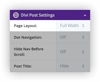
2. Don’t Get Too Crazy – Sometimes simplicity is your best friends. With all the modules available in Divi, it might be tempting to add a tone of stuff to your post. Consider that even when limiting yourself to basic elements, such as Text and Image modules, you can still create an inspiring post based solely on how those elements are arranged using Divi’s column layouts. The example blog posts below were created almost entirely of text and image modules.
3. Use Photos With Care – Beautiful imagery can make a post look amazing, but bad imagery can also ruin your design. If you use photos on your blog, take care to pick high quality images that have a cohesive style. Finding good photos can be a challenge, so be sure to check out our post on the subject.
4. Use Columns To Make Content Digestible – Long blog posts can be especially hard to take in when the same format is repeated over and over again (text, image, text, image, text image). It can be difficult to tell what things relate to each other, and you can be easily lost in the post. Using Divi’s column layouts, you have the opportunity to construct a layout that makes sense for the content you are displaying.
5. Be Aware Of Your Space – Going Fullwidth is a great option, but using a Sidebar can look great too. But don’t forget to consider the space available for your content based on the size of your sidebar and your website’s content width. Generally, placing text inside of a 1/4 column row might be difficult to read when you have a sidebar enabled. Try sticking to 1/3 columns and above.
6. White Space Is Your Friend – Give your images and text some room to breath. With Divi, every module, row and section has custom spacing controls in the Advanced Design Settings tab. Sometimes adding some extra space around your text can make it your article more easy to understand. Don’t worry about things being “above the fold” or you page being too long. A smart man once said, “no page can be too long, only too boring.” An effective story is intriguing, and curiosity will pull your visitors down the page naturally.
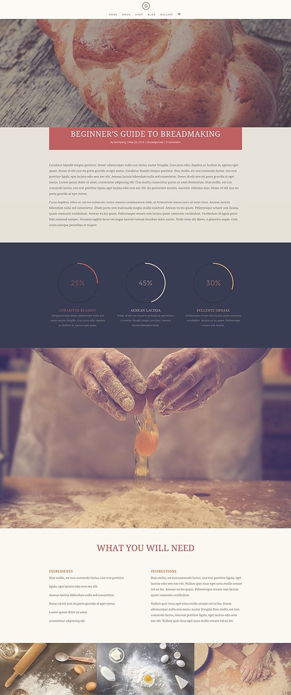
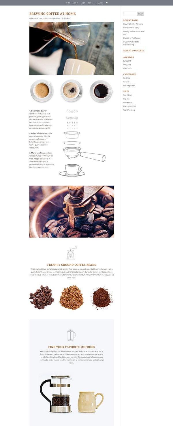
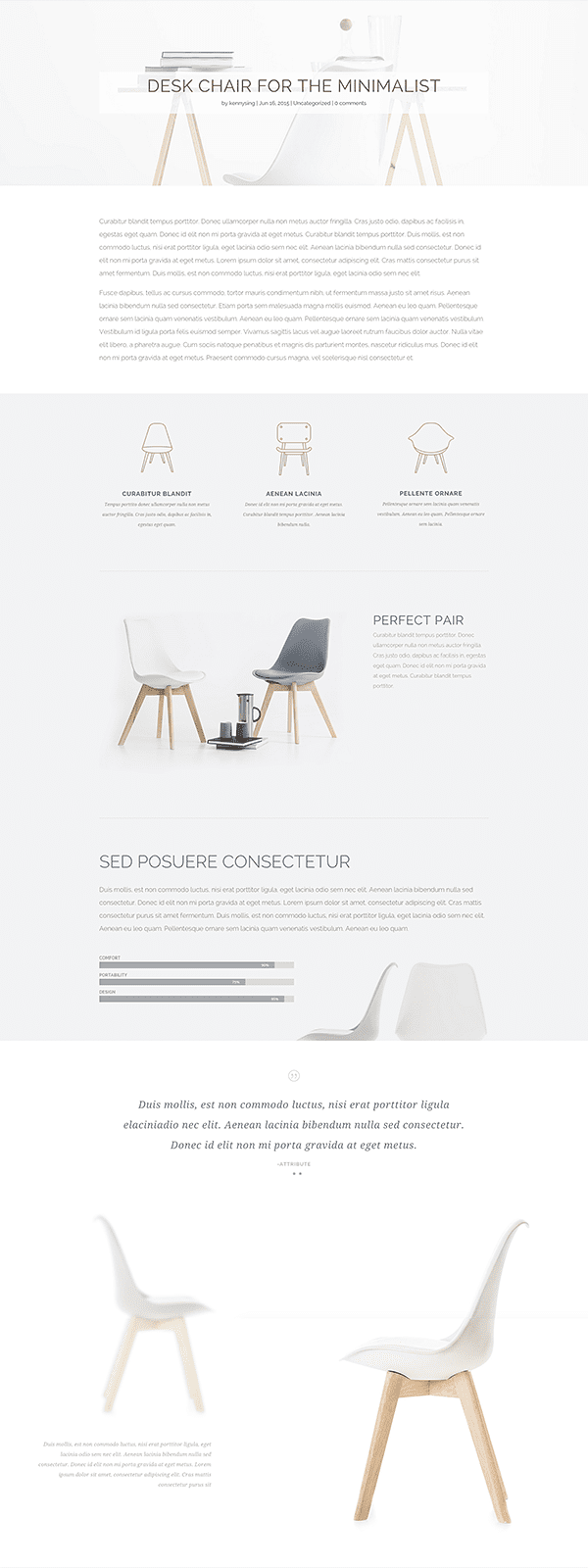
7. Marry Your Text And Imagery – In a well crafted blog post design, each piece of content plays a small part in a bigger picture. Each image should be away of the text around it. There are so many opportunities to create compelling layouts by letting your text, images and background colors play together. Notice in the post below, how the bend in the chair gives way for the bar counters to the left of them. Notice in the post above how the detailed steps to creating an especially are accompanied by instructional images to the right.
8. Using Sections Backgrounds To Organize Content – Using Sections to separate larger chunks of content is a great way to make your article more organized, much like chapters in a story.
Use Divi’s Post Title Module To Give Your Post A Unique Look
Before Divi 2.4, all posts had a uniform layout, including the post title and meta data. With the introduction of the Divi Builder for posts, we wanted to make sure that everything about your post was customizable, including the display of your standard post elements: Post Title, Meta Data and Featured Image. This is now possible using the Post Title Module.
Disabling Standard Post Title Display
When writing a post with Divi, the standard post title display can now be disabled. Once disabled, you are given free reign to use the Divi Builder to construct your entire post, including the post title.
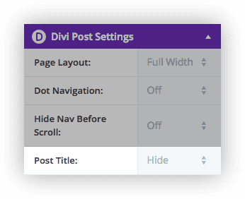
Using The Divi Post Title Module
Once the standard Post Title has been disabled, you can use the Divi Post Title Module to automatically add a customized and beautifully-styled post title to the top of your page.
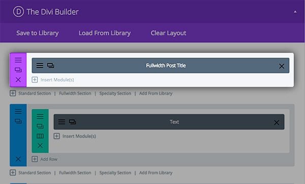
This module automatically displays important post information, such as your post title, author name, post date, comment count, categories and featured image; all the things you would normally find at the top of your post. These pieces of information can be toggled on and off, and can also re-arranged into different layouts and styles using the Post Title Module settings.
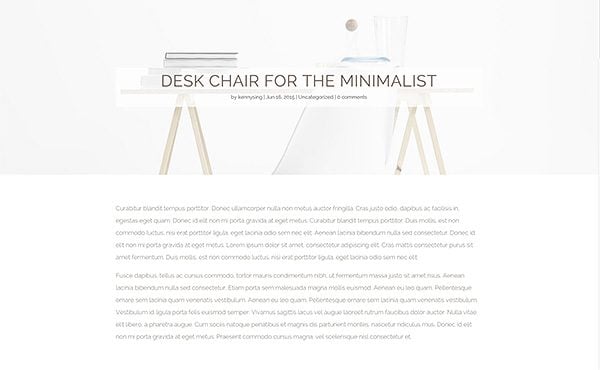
This allows you to create a completely new look for your post blog. For example, on the following post we have disabled the standard post title display in favor of the Divi Post Title Module. We set the module to display the Featured Image as a background, and also added custom text styling for the title and a semi-transparent background to the text. There are a wide array of looks that can be achieved using different combination of post title settings.
Have Fun And Start Experimenting!
I hope this post gives you just a few ideas about how the Divi Builder can be used to help your blog stand out from the crowd by building story-driven, mixed-media articles that are rarely found outside of huge online publications with big development teams. Trying spending some extra time on the design of your next post and see what happens. Trust me, your visitors will be blown away!




Is there a link to download .xml files for these great looking pages you built ?
The Blog post module lets you change the color of the Title text (I want it to be Orange). But when you update and preview changes, it stays the same default “pink-ish” color. is there a way around this?
Hi David, sorry you’re having this issue. For help with Divi please check out our forum for possible solutions. If none exist yet, you can create a new ticket http://elegantthemes.com/forum
I just tried Divi… Wow! Just wow!
Hi, I have two questions, one is about the post /cafe/beginners-guide-to-breadmaking/ which shows a bg bread table and in front a hands throwing an egg in png., which module can do this, i tried differents but doesnt let me put the first png image similar to the egg at the same size, and the other question is if this library pack works with the last version of divi, because i have imported this but it did not work at all, there is a way that could work, very in love with this diagramming, thank you.
I’ve been reading a lot about DIVI lately and as much as I’m reading reviews, comments and FAQs I can’t find the following:
A way to use a module where it’s possible to filter what blog posts are shown based on: “most popular posts”, “recent posts”, “category posts”.
I’ve read about the new “blog” module, but from what I read you can only filter by category?
If it’s not available, can you recommend another way to achieve that?
Hi,
I have two simple requests for the next update.
1. Lock the top of the text editor so that it’s always accessible. I love the Divi Builder but I don’t often use it because I have to scroll back up for ages to make any alterations.
2. Put in the ability to have the blog page laid out so the there is a thumbnail image on the left and an extract to the right of it.
Thanks for all your hard work.
I’m developing a site for a local butcher and on the pages I’ve set a background image of a chalkboard. The primary menu has a transparent background and the links are white. There are blog modules on the homepage with a Read More link. However, when the Read More link is clicked, the full blog opens up on a white background. This means that the primary menu links are invisible. Ideally I’d like to set the same chalkboard image on all the full blog posts. Can anyone help me? The URL is villagebutchertottington.com. Thankyou.
Keep it up ….. best theme ever….
Will there be any way to enable comments on divi builder pages?
Need Some Help, How do i switch from Divi Builder to Default editor without erasing the content? or is there any way to edit the code, because i need to edit some paragraphs with replace all plugin and dont want to edit by opening tab after tab.Thanks
Unfortunately you cannot switch back and forth between the default editor and Divi Builder. It’s one or the other.
Here’s a major problem I see with blog layout. My blog is currently in grid layout, but whenever someone navigates to a category page the blog shows in full width mode. I want my blog post to show in grid layout on all pages, it’s very confusing and inconsistent to have it grid layout on some pages and full width on others. Surely there has to be some fix to this.
How do i adjust the padding between blog posts within a divi blog module?
I would like part of my site to have a ‘drudge report’-type feel with little space between posts that link out to other sites articles.
So I am trying to use the Divi builder when creating my blog posts and I am trying to use the format for the “how to make bread” post. How would my posts page pull content from said post? Is there some sort of post content module?
I using Divi Builder withing posts and have a big problem with ‘truncate_post’ function because if I have only 1 short sentence of copy it will pull all the other content i.e. text inside a global blocks which I don’t want to show
Basically on landing page I have used a blog module to show posts in a grid with “read more” button and inside posts where there is just a couple of words the blog module will pull not only the text from my text area but what is below as well –> below I mean other global blocks i have created (i.e. email form with address etc)
The problem is on landing page where I use the Blog Module – it pulls 270 characters and if my copy contains less then it will show staff I don;t want to show as it is a part of the layout not copy (i.e. address inside the contact form)
Any idea how to solve this?
I’m wondering if ET will be adding a ‘Page Break’ module or functionality to the builder?
I added to a text module and it worked, however, there wasn’t any css to go along with it and the second page was not formatted correctly. Several of the hero articles you point to use this feature. I believe that its necessary with these long form posts.
thanks… keep up the good work. I love what I’m seeing!
downloaded zip file – extracted then upload using wordpress importer.
all file show in divi library, however when i try to upload from library in a section or module I only get the ‘blurb option’ or pricing section dependent on wether uploading to module or a section. can you advise how to upload the others???
thanks
Divi is still missing page builder integration to custom post types that is, in my opinion, a must have feature.
Thank you, thank you, thank you! I’ve been waiting the ability to craft blog posts like this since my company first moved to Divi. I’m surprised you didn’t call this release 3.0!
I was very excited to see that you could set a background picture and also set a background color with transparency, but was slightly let down by the execution. I was really hoping that you could do both at the same time. It would be so great to be able to use a stock photo and then apply a color overlay so that you don’t have to generate images in photoshop every time you want to tweak the colors a little bit.
I also second the call for 5/5 and 6/6 column layouts.
Otherwise, AMAZING work on Divi 2.4!
Plain and simple, you guys just rock – completely raising the standards on what should be expected from theme developers. Hands down best customer support every – not just good at coding but great at business and listening to what is needed. You guys care about your customers and that is invaluable! Thanks and much love!
best support *ever
I’m wondering if you have addressed the blog layout as well as the post layout. This is one of the things that we have most often had to work around in the sites where we used Divi. Many of our clients do not want either a fullwidth featured image or a grid layout; they want a traditional blog layout with a thumbnail image on the left and the text on the right (and wrapping below the image).
So far in exploring 2.4, despite the many wonderful features, I don’t see this as an option.
Did anyone get an answer to this question? Before the upgrade, when you set a featured image on a post, a thumbnail was automatically created and the post was formatted so the larger full size image was displayed when someone clicked on the Read More link. Is this feature just gone or accessed somewhere else?
Yes I wondered this as well
I agree. I’m looking for this blog layout as well.
Hi Guys
I’m am incredibly excited about the new Divi – and love this new series of posts!
What I would absolutely LOVE to see is videos showing exactly how your designers are creating these example posts and pages. All these various features are very overwhelming for design amateur like myself – but I think actually seeing what is being done step by step would make a huge difference in my level of understanding (and potential for creating something similar on my own).
Thanks!
B.
Divi had maintained its greatness from the beginning but ET keeps making it better by listening to their customers. So many of the small would-love-to-haves I had been thinking about have been addressed and offered in 2.4. Keep up the great work. Customer for life.
Nick and staff,
Thank you, once again, for a brilliant post. I’m learning more about how to run a marketing business from Elegant Themes than I am from some of the big gurus. You are so right that story is now a driving force. If we want an audience to whom we can sell, we have to grab their heartstrings before they will let us anywhere near their pursestrings. Story, told right, does just that. I’m loving DIVI 2.4 I’ve upgraded all of my sites. My newest, coachescooperative.com will be built on it as well. Keep being brilliant.
How will this update affect the plugin that in the Divi forum Elegant Themes support team has directed me to install to be able to use the page builder on posts?
Will I now have to rebuild all of my posts!?
Question – anyway to disable the comments or change where they are located like we can with the post title? On a site I’ve been developing we’ve add a couple sections to the footer on every page, but on the posts it still shows the comments between the added footer modules and the footer that comes with Divi which looks odd. If there’s a way to do the comments like the post title that would be ideal! Thanks.
At the risk of being annoying, consider this the small voice asking about Extra. Divi is gorgeous – I’m using it to build a friend’s site – but for my own site, I need a newspaper theme. I’m using one now that I purchased from Themeforest and is functioning fine, but I am limited in what I can do with it. I need a builder so that my posts (and stories) are better showcased.
Is there an ETA for Extra? Thanks for any info.
thanks for the awesome features in divi.
Nick: you are making the world wide web a better place to be. Period!
GREAT addition to the builder – but is it working with custom post types?
You guyz changed everything. Keep it up!
I think the pictures that you use makes the posts more appealing. But the pictures that I use can ruin the whole look and feel.
I love writing longform. To help readers navigate the post content, I usually use Table of Content plugin. It would be great if the TOC can be generated automatically in Divi.
Thanks for taking time to produce these tutorial blog articles. It helps the beginner better understand what is available. I look fordward to reading and learning what is yet to come. -M
I’m having a difficult time duplicating the “Desk Chair For The Minimalist” blog design above. How do I get the Full Width Post Title to show my featured image at full size. Even with my image at the same size as yours (1920 x 1118), it seems to be only showing about 1/4 to 1/2 of the image. Any ideas?
I’m having the same issue as Bill. When I use the Fullwidth Post Title, my featured image does not display full size whenever I select Featured Image Placement: “Title/Meta Background Image”.
It only shows about 1/4 height.
It’s October and this is still happening… Would be great to get some options in the advanced design tab so that I could see more than 1/4 of my header image.
Hey all, sorry for the confusion. This is not a bug. All you need to do is adjust your padding in the advanced settings tab.
All these blog posts are wonderful. Big help, and nice work. I believe i understand 85 percent of Divi 2.4 at this time. Brilliant design. But for some reason I can’t understand the paradigm for the Custom Padding options. Please write an article explaining where those affect what types of spacing and when. I know it seems rudimentary, but its confusing the heck out of me. Thank you.
This is simply amazing, Nick. Thank you. 🙂
Honestly, I figured you would sleep for a couple of weeks after the release. Don’t forget to take some time out for yourself. You and your team truly deserve it. We’ll all still be here. 😉
Thank you so much Nick
I am waiting for tax time here in Australia to buy the ‘once of’ because divi is simply beautiful.
Hopefully the tax gods look favourably on me, I know it is tax deductible as it is part of my professional development.
Keep up the awesome work.
Louis
looks like my mock up proposed got cleaned from the post.
Hi Nick,
Great update to an already amazing theme. However I am struggling to setup a nice blog front-page layout. I found that there are only the earlier version of the layouts still available in 2.4
|
|
|
|
|
Could you guys release some library of blog layouts for front pages? I am sure other people would love it.
Cheers
Harmeet
Is there a way to have sections/modules effect posts globally?
For instance, if I wanted to always have a giant full-width featured image up top with the post name across it, could I set this up to happen by default on posts?
Used dive, it’s really neat. With a little bit of training- client’s can easily grab the control to customize their business wp sites.
Just great, thanks for the tutorial. Now we begin telling the story and lively creative news…!
May I ask,can a section background image be full (gutterless) when you have a blog post with sidebar?
I absolutely love the versatility Divi provides. User experience is so very important in our fast paced digital world. When we have the ability to engage past the first 5 seconds we’re winning. Thanks for updating. I’m a happy designer who loves ET.
Thanks Nick. This is a timely post as I’ve been testing some of the new features such as Post Title Module.
I’m wondering if there is an easy way to change the Divi Post Settings (e.g. turn on full width or hide post title) for all blog posts? I have 900+ posts published so it wouldn’t make sense to change each post individually.
Peter
I’m in the same boat.
Me too!
is it possible to add the possibility to display custom fields into a post module?
We need to go beyond just that…
http://codecanyon.net/item/woo-detail-product-page-builder/7605299
Nothing would be more fun for Ecommerce sites then being able to override Woocommerce pages with a DIVI page template….
The one big thing I can think of off the top of my head that Visual composer can do that DIVI can’t….
ALSO it would be great to have custom posts and with the DIVI page builder have a GLOBAL custom post template for that custom post type. Custom fields in a post is one thing, but we got to go big… REAL BIG…
The only thing that bums me out is that once I come up with a beautiful blog template using the above suggestions is that I have to go back and do dozens of blog posts individually to update them to the new look and new template.
I think every post will be built slightly different, based on your content. As for the header, you can use a Global Post Title Module on all your posts, and if you ever want to adjust the style of your blog post headers across your entire site, you only have to do it once.
I’m having a difficult time duplicating the “Desk Chair For The Minimalist” blog design above. How do I get the Full Width Post Title to show my featured image at full size. Even with my image at the same size as yours (1920 x 1118), it seems to be only showing about 1/4 to 1/2 of the image. Any ideas?
You have to change the post page to full screen and not show the sidebar for the image to show up full screen.
Bill, Kenny explained that feature in yesterday’s blog post – http://www.elegantthemes.com/blog/resources/exploring-divi-2-4-a-free-library-pack-built-with-divis-new-advanced-design-settings
Just search for the header titled “Fullscreen Header” in it and you’ll see some screenshots on how to accomplish it. 🙂
Thanks for the response and suggestion, Nick.
Nick,
Divi 2.4 is great 🙂
Is it possible to create some kind of child themes with it? 🙂
I agree, at this point I only use the child theme for the text in the footer.. too bad :(, because just about all else can be done inside the theme options or the page builder.
I agree, at this point I only use the child theme for the text in the footer.. too bad :(, because just about all else can be done inside the theme options or the page builder.
Hi Nick,
I think you guys out did yourselves with this new update 🙂 I have been a member for some time but never really used Divi but now I am tempted to switch to Divi mainly for the post builder that is a real game changer. Keep up the great work and I look forwards to sharing this with my audience.
Again amazing work!
Sounds good. Nick, you did a nice job.Divi 2.4 surprise me a lot by its features.keep up.
I guess a blog post template can be made and saved to save time on future posts?
Thanks Nick. Will the page builder plugin be launched soon?
Yes the builder plugin will be launching soon. Right now we are focused on the Divi 2.4 launch, answering questions and fixing bugs. The next thing to be released will be the Divi Builder Plugin. My guess would be in ~4 weeks.
Hello Nick!
I like very Divi, I use all my work.
Divi 2.4 awesome! Very well done, congratulations! I look forward very Divi Builder plugin.
It would be very good multiple columns 5/5, 6/6 layout. Especially now that we have the full width row.
And more animation for each module, for example, text modules, etc.
Divi 2.4 is already the best and easiest to use site builder, but I think it’s still missing …
What do you think?
I agree, Divi is an amazing theme, 5/5 and 6/6 column layouts would make it even more amazing.
Would love to see 5 and 6 column layouts!
I think we are all on board for 6/6. :).
Hi Nick,
Divi v2.4 is awesome and these follow up posts are even more awesome 🙂
It is great to hear that we can expect the builder plugin in about 4 weeks.
I have a couple of questions on this.
Once the builder plugin is released, will the builder functionality in divi be removed so that to get the current functionality, we need to install the builder plugin in divi?
Secondly, once the builder plugin is released, what will be the rough ballpark time frame within which we could expect Extra?
Thanks
Raj
Separete the builder from the theme it’s a great move! Do you guys have any plan to redesign the “epanel” or integrate it’s functions into the customizer?
I think Nick posted once before that the Epanel was going to get a makeover so it looked a whole lot more like DIVI, Bloom, and Monarch…
No time table for that release.
All the new features are great but there are a couple of things I would like to see added, that would allow us to better customize our pages and create truly unique layouts on a page by page or global basis. Using the Global Library would make it easy for us to add these features into a saved layout, which would be so amazing.
First I would like to see a module that allows us to insert any navigation menu at any point in the page, instead of the current full-width menu which does not have the same functionality, and have the added option to style it if we wish. This would allow us to add it under a full page image for example. The menu would then behave as normal, if fixed it would remain at the top of the screen when scrolling, so awesome.
We could then create:
LOGO | MENU
MENU 1 | LOGO | MENU 2
MENU | LOGO
CUSTOM LOGO | MENU | AWESOME IMAGE OR TEXT
TEXT LOGO | MENU
Well, you get the idea.
I am sure there are many ways the people at Elegant Themes could implement this, such as adding an option for an entire section to be fixed, columns that would not be visible on mobile, the menu to display as an icon bar on mobile devices, etc. and menus to be inserted in the same manner as any other module, not only as a full-width section without our logo.
Second I would like to see a widget module, which would allow us to insert widgets anywhere on the page. I think this would be an amazing extension of the Global Library concept, and also allow us to take full advantage of the ability we currently have to create new widget areas, but they would not be limited to use in the sidebar.
Hate to sound greedy, but I think these additions would make the amazing Divi theme even better.
If you think these are good ideas and would like to see them added, everyone please reply to this post with a thumbs up so the awesome people at Elegant themes will consider adding these to Divi.
You can add a custom sidebar to any place on the page. You can create custom sidebars in Appearance -> Widgets. So basically, you can insert a widget ~anywhere~ on the site.
Thanks for the suggestions from Oliver and Richard. The widget use as explained by Oliver is pretty straightforward so it looks like an easy enough way to insert the widgets.
As for the full width menu hack, this is not what I was referring to. The hacked menu would require a lot of custom styling to reduce its size and make it behave in the same manner as the primary menu. I am hoping to see a menu “section” that could behave in the same way as the default primary menu and not require custom css to accomplish. It would be styled using the Divi builder allowing us to create custom menus anywhere on the page. Settings like “fixed” and various text, border and background options would make it an amazing module.
James I posted this earlier this week, but I guess it needs posting again….
How to HACK DIVI in the header:
http://s91585912.onlinehome.us/howididit/whatidid3.html
How To copy the fullwidth Menu module over to the Standard Module Section
http://s91585912.onlinehome.us/howididit/whatidid4.html
For Widgets anywhere you want You could go with this plugin….
https://wordpress.org/plugins/amr-shortcode-any-widget/
Smashing Richard, love the fullwidth menu hack. And yes, would be great if that could be standardized!
Kudos!!!
Helen
+1 for the menu…
Great ideas James – I would like to have these additions too. This theme is great, but could be much greater. Hope the people at Elegant Themes could implement this 😉
I wonder: Can one set the Full width Post Title to be used by default?
That’s coooool! Thanks for the additional information to the release post! 🙂 (y)
Thank you for the Divi Page Builder now used in Post. We can change the sidebar width in Divi Theme Customization.
But When you give Sidebar 33 size – Google Ad’s Popular Ad Slot Square 300px Width is not inside the sidebar ! 286px is the maximum Width for the Sidebar.
Consider to make min Sidebar Width to place a Google Ad or popular Ad by Affiliates !