Last week we introduced Divi 2.4, the biggest upgrade in Divi history and a giant leap forward for our most popular WordPress theme. There are so many great features to explore in this update that it was hard to describe them all on the release post, which is why we have decided to do a 2-week series of informational blog posts that will aim to teach you how to take full advantage of Divi 2.4 and its new options. In part nine of this series, we explore an exciting way to use Divi’s new Global Modules.
Creating A Unique Style And Making It Global
Today I will be showing you how to create a unique look for your blog, and how to unify that look using Global Modules. Why is this combo so important? Because once you have created your new blog look using the Global Post Title Module, the style can be changed across your entire blog without having to edit every single post! There are 3 important pieces to this puzzle:
- The new Post Title Module that allows you to automatically pull post meta information, such as post title, author, date and featured image and display those items in a unique way.
- Divi’s new post-level features that allow you to use the Divi Builder on posts, as well as remove the post’s sidebar and default post title.
- The Divi Library and Divi’s new Global Library Items that allow you to sync a single module, row or section across multiple posts or pages on your site.
Step One: Creating Your New Blog Post Design
To kick things off, we will be customizing our blog post layout to be completely different than the standard Divi blog. By default, blog posts in Divi take on a classic style. There is a sidebar on the right, blog post content on the left and a post title / featured on top. It’s a format we all know and love, but it’s also a format that looks just like every other blog on the internet. So why not try to mix things up a bit? Divi makes it possible.
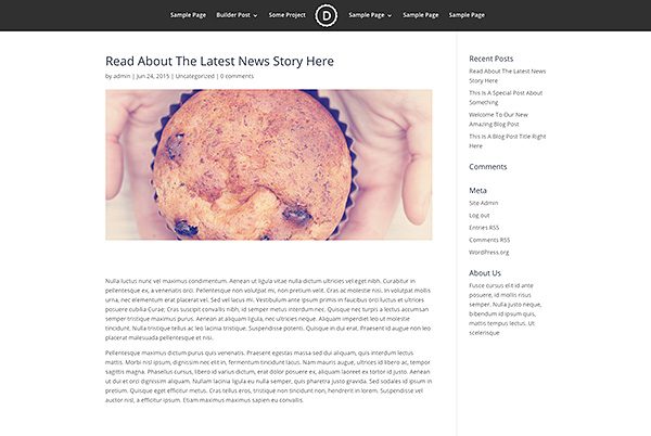
First things first, let’s change up our overall structure a bit by removing the sidebar in favor of a full width layout. This can now be achieved using the Page Layout setting within the Divi Post Settings box. You will find this box either to the left of below the post editor when writing your post.
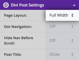
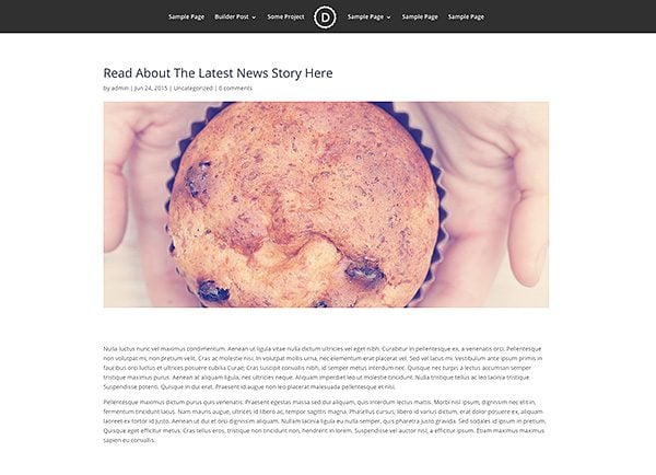
Once we select the “Fullwidth” layout and save, you will see that the sidebar has been removed from the post entirely. This gives us more room to work with. Since we will be using the Divi Builder to construct our post, this full width layout will give us the option to take advantage of Fullwidth Sections and Fullwidth Modules to create engaging posts in a style similar to Medium.com.
In particular, we will be using Divi’s new Fullwidth Post Title module to give our blog post a more unique and enticing header. Before we can do that, however, we first need to remove the default title display that gets automatically added to the top of each blog post. This can also be achieved from within the Divi Post Settings box mentioned earlier.
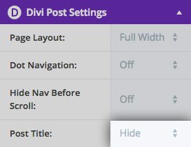
After selecting “Hide” for the Post Title option within the settings box, you will notice that the title, meta data and featured image that typically gets added to the top of the post has been removed.
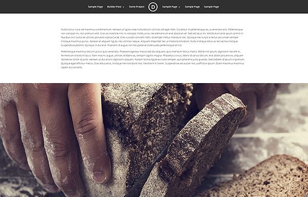
Now that the default post title has been removed, we can add our own customized version using the Fullwidth Post Title Module. To get started, make sure you are using the Divi Builder to builder your post by clicking the purple “Use The Divi Builder” button above the post editor. This will enable the builder and allow you to construct your post from top to bottom using builder elements.
To add our new customized title, add a new Fullwidth Section to the top of your post, and then add a Fullwidth Post Title Module within the section.
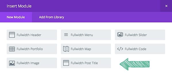
This will launch the settings box for the post title module where you can adjust the display of your custom post title. There are lots of options here, including:
Show Title – Inside each post title module, you can choose which pieces of information you would like to display. If you would like to disabled the title altogether, and only display your featured image and meta data, then this option can be disabled.
Show Meta – You can also choose to hide all of the meta information that typically gets added below the post title, such as post author, date, and categories. Disabling this option will hide all of the information at once. You can also disable individual pieces of meta information using the settings below.
Show Author – This will disable or enable the author name within the post meta box.
Show Date – This will disable or enable the post date within the post meta box.
Date Format – Here you can adjust the format used for your date display. For example, you could switch from 1/23/2015 to January 23, 2015, and so on.
Show Categories – This will disable or enable categories within the post meta box.
Show Comment Count – This will disable or enable the comment count within the post meta box.
Show Featured Image – Displaying the featured image is optional. If you would like to hide the featured image for the post, then it can be disabled here.
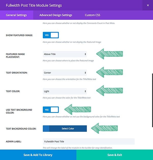
Featured Image Placement – If the featured image is enabled, you can choose from various display methods. You can place the image above the title, below the title, or even use it as a background image behind the post title.
Parallax Effect – If the featured image is being used as a background image, then you can enable parallax mode.
Text Orientation – In addition to controlling which text elements appear in your post title, you can also adjust their orientation, choosing between: left, right or centered text.
Text Background Color – Applying a background color to your text will place a colored box around your title.
Text Color – You can choose between light and dark text for your post title. If you have applied a dark text background color, consider making your post title text light to ensure that it’s readable.
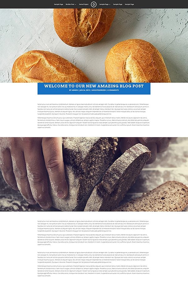
Utilizing these various settings, you can create various styles for your blog. As an example for this tutorial, I will be using the settings shown in the screenshot below. Most notably, I have chosen to place the featured image “above” the post title. I have also added a “text background color” and adjusted the post title font, style and size within the Advanced Design Settings.
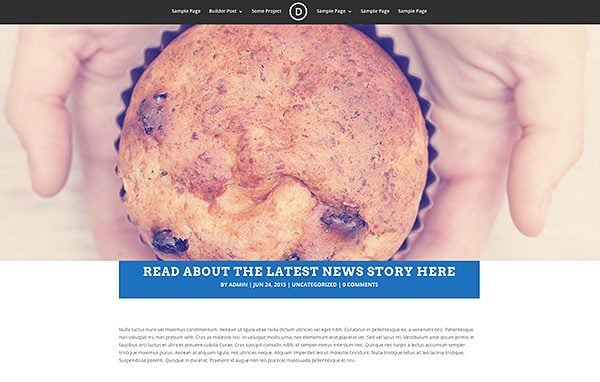
The end result is a completely different looking post when compared to the default Divi post layout! We have now created a unique style for our blog that is different from every other Divi blog and WordPress blog on the net! Experimenting with the various settings within the Post Title module can yield a multitude of results.
This new header style looks particular great when combined with Fullwidth Image Modules. Since we are using the Divi Builder to construct our post, there are many new layout options to take advantage of.
Step Two: Sync Your New Layout Using Global Modules
Now that we have created a unique look for our blog post, the next step is to unify our entire blog under the same style, and to make that style easy to manage. So what’s the main problem we are solving here? Creating a new post title module with the exact same settings each time you write a new blog post takes time. Furthermore, if you have created 1,000 blog posts and used your new post title module at the top of each, what would happen if one day you want to adjust the layout? You would be forced to go through all 1,000 blog posts to adjust the post title module inside each one! That doesn’t sound like much fun at all. Luckily we can avoid the hassle by saving our custom post title module to the Divi Library as a Global Module. I won’t be going over everything to do with Global Module, since this has already been covered in our previous post. Be sure to check that out if you want to dig a little deeper.
To save this post title to the Divi Library, click the “Save & Add To Library” button when editing the module or the module’s parent section. In this case, I saved the entire Fullwidth Section to the Divi Library. During the save process you will notice an option to “make this a global item.”
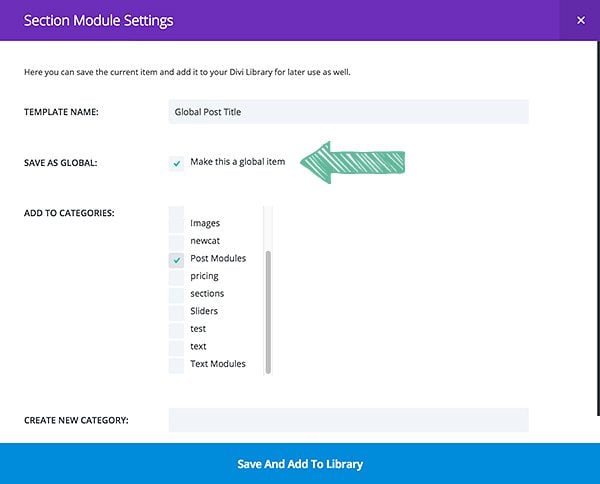
Once the item has been saved as global, you will notice that it turns green within the builder. Global items can be easily identified within the builder by their green color.
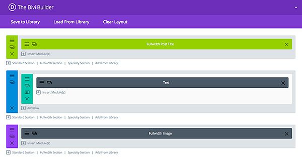
The next step is to add this same global section to the top of each new post your create! Since the post title automatically grabs the information from the current post, there is no need to edit the module when adding it to a new page. Your post title, meta data and featured image are grabbed by the module without additional instruction. The module only controls the organization of those elements, which will be shared by each instance of the global module.
Whenever you write a new blog post, click the “Add From Library” link when adding a new section, and locate your newly-saved global post title.
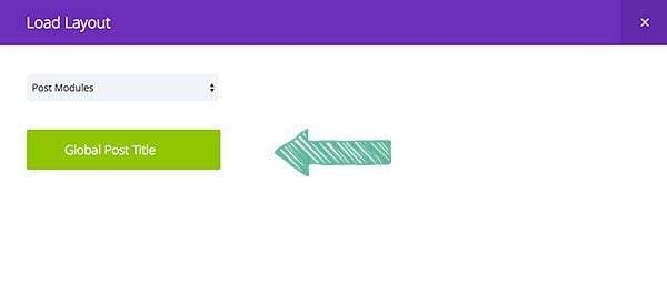
Once this post title has been added to each of your blog posts, they will all share the same exact header format! There is no need to do anything except add the global module to the post since the module automatically grabs the post information for the particular post it has been added to.
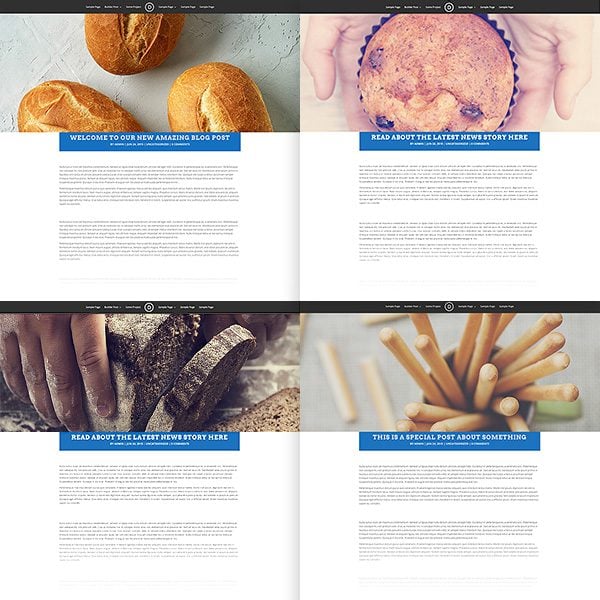
We have now unified the entire look and feel of our entire blog using the Divi Builder! What’s even more important is that if we ever want to change the appearance of all of our blog posts, we only have to edit the global post title module once! Since this same mode has been added to each page, once you have edited the module in one location, the change will be pushed to all instance of the global module.
In just a few clicks, we can adjust our blog’s design. For example, here I have changed the post title background color to red, and I have adjusted the featured image location to be used as a background image (instead of being placed below the post title).
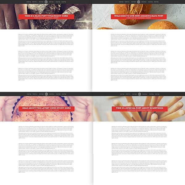
In just a few seconds, our entire blog style has been altered!
A Brand New Blog That’s Easy To Manage
My goal here was to not only show you how to create a unique looking blog using the Divi Builder, but also how to do it in a way to makes it easy to manage. This is a perfect example of how powerful Divi’s new Global Library Items can be (especially when used for modules that grab their content dynamically). I hope you are enjoying using the Divi Builder on your blog posts, and I look forwarding to seeing all the beautiful posts you create!




Hi there
The pictures that you have linked to this article are no longer there and hence I cant see what you have done… Would you be able to update please?
Just found this tutorial which is great, but I’m also looking for a way to reset the Divi Post Settings, so that they automatically reset to “Full Width” and “Hide” post heading as suggested here. I have reset all previous posts manually, but this is currently not working when I create a new post. Am I missing something?
This is really important for my client as she is partially blind, and I don’t want her having to change this setting every time she creates a new post.
Thank you.
Any chance of fixing all the broken images on this post?
Thanks for the great instructions. Now I’m wondering if I have to set the DIVI Post Settings to “wide” and “hide title” for every new blog page, or if there’s a way to set the default settings? Thanks!
Divi builder with new features is awesome. BUT, for customizing a blog, where I have a lot of posts already online, the feature of global library item is not of any use.
As a future upgrade I hereby request the possibility to edit a default blog and single post layout using the same options as available in page builder.
Best regards – Dariusz
I love this feature of DIVI. I’ve been building my site for awhile and have just turned my attention to the Blog. I was getting stuck until reading this post. I’m looking forward to experimenting with some styles to see what looks great. Thanks Nick!
Is there anyway to set a custom default layout for all blog posts? I’ve got a site where users will post from the front-end but I’d like all the posts to have the same full-width title layout – is this possible?
Also, thanks for the amazing theme & the divi builder plugin!
I don’t think that will be possible from the front end. You can however save blog post layouts via the Divi Library for use from the backend.
So there’s no way to set the default blog single layout as a divi template?
i mean by default.
I am very new to Divi and love it, but I may have missed something. How do you update all your existing posts to a generic custom blog layout? i.e. how do you remove the sidebar from all existing blog posts, and format the blog title (centre align) for all blog posts. Thanks!
Hi there! I Love Divi but am struggling a little bit to get used to the update. My biggest question right now about using the Divi builder on posts is this: how can I get my entire article to show up on my blog page, not just the title? My articles are relatively short and I would like for the whole post to show up on the blog page. Right now it just shows the title. On the blog page’s settings I have “Show Content” checked. Not sure what I am missing here.
Thanks!!
Hey Lucy, sorry you’re having this little hiccup. The best place for us to help you out with that is in our forum. You can create a ticket there and we’ll take a look at what might be causing that.
It’s easy to create a “Blog Grid” for Front-Page but, not able to find a way to use the same “Blog Grid” layout for other “Category Archives” . These archives keeps showing a “Standard Blog” layout.
Am I missing something?
Hello Tush, I was searching a half day and did not find anything so far – did you find a solution, for how to style the category archives?
Hey Tush, sorry you’re having that issue. I’d recommend checking out what people have done in the support forums. If you can’t find an answer there already just create a ticket and the support team will help you out.
Sounds great Nathan, Will explore support forums. Thanks for quick feedback. Really appreciate it.
Hey! I´m using Divi to create mi new blog and it’s doing great! I just want to do something I can´t find how to get it… On you blog page with your abstract post, I would like it to shows my post title before the image.
How can I switch the order?? It’s for sure something stupid, but I really want to do it so some help would be nice 🙂
I am owner of one site and currently using a free theme from wordpress. I need to know what is the charges if I wish to use one offered by you?
I only want to display post titles in a page, and no excerpt or post content. Can this be done? I am not able to do this in Divi. For example, i want to display the title of posts from”Tutorials” category, and no excerpt or content.
You can do it in another way :
– Create a new widget area (you can add a category widget customized to show only titles…)
– Go to your divi page builder and create a new “sidebar” module
– In this module, select the widget you previously created
Hope it’ll help 😉
Hi,
For me, setting the Post Title to be hidden does not do anything. I’m still getting the regular post title shown above my full width post header. I’m not using any child theme, and just updated to the latest Divi. Thanks!
I have the same problem.
It would be nice if there was also an option to just make the individual posts stay in the same layout you create for your main blog page instead of having to go through all of this for each post.
Hello Dustin,
Thanks for considering what many feel is a really valuable feature. Here is my idea of how it could be done .
Looks like a great idea. BUT, what happened to the info that was in the right hand column? Where did that disappear to and how is that made available?
Thanks for helping a Newbie to WP!
This is great what you do. Divi will be better with such improvements.
I just wondered why you still didn’t make several variants of customer’s templates additionally to one in classic style? For example it may be the templates with two sidebars, with editable global header with possibility to use Divi Builder, etc.
How to set up the Monarch plugin to work with this type of post? Social icons inline appears now below the title not below the post…
Also, if the post has a featured video it can be problematic…
Appreciate your feedback..
Hi Hitch,
If you could, please create a new ticket in the Support Forum so we can take a look at the issue you described. Thanks! 🙂
In your first example, there is a padding top (130px) before the featured image. How can you delete this padding ? i put 0 in margin, padding and css module but no effects.
Thx
I also noticed that changing the excessive padding to zero had no effect. This was the case anywhere I tried it. Why pretend to give us the option? But this is far from being my greatest disappointment with this theme that I had such high hopes for.
This the future of blogging and Divi has done it. However, why is so hard to achieve some of the sample sites layout and tutorials? That’s the only “phew” I have with the update right now…
I just updated my blog theme from Simplism to Divi. Can you reverse engineer this feature on older posts?
Quick question when using the featured image behind the title – My featured image is super thin… It does show the entire image in smaller sizes of the window but in the full desktop view it cuts it in half. Quick fix for that?
I sent a message above that doesn’t look like it was answered but thinking it has something to do with the aspect ratio. Why is it that you can have title underneath or above and get the entire featured image but when you over lay it cuts it down? How can we fix that?
I am struggling mightily with that and tearing my hair out. I have even mimicked the actions of the video and get the same result you describe. If you ever figured that out it would be awesome to know what the solution was.
Try adjusting your padding.
There are obvious limitations to this module. My posts are being screened out and your support group won’t even respond with a sentence when I ask in detailed fashion about the issue. It is completely ignored. There is no way to gain the result you show in your YouTube video without something custom beyond what you guys are telling us. I can only conclude that this is a known issue. The behavior simply doesn’t make sense. I have sought support nicely and professionally on the issue. Just wow.
Hi Paul, I don’t know if you’re still struggling with this, but I did find that if I changed my padding on the bottom, it does fix it.
This most definitely seems like a bug, though. In what instance would someone upload a large image and only want to see a tiny sliver of it?
Hopefully this will be fixed in the next version.
I appreciate the response but when matched up against your YouTube video it appears something is missing in your response. You actually told me how to locate the title itself snugly along the bottom border of the image which was to set the padding to 0 pixels (you gave the answer in the comments section to SwellGod). If I do that, the image size gets all messed up. Somehow your images on YouTube come out the right size based on your featured image. The same for Nick’s tutorial on YouTube where I can see one of his images is 795×597. However, I see some resizing to his second image so there must be some set parameters involved in the built in coding. I want to get the look you appear to have in your video on YouTube where you discuss using the Divi Builder for posts. I mean what was the size of your photo there? You got a nice sized almost square image AND were able to set the padding 0px to get the title on the lower border of the image.
Sorry to ask in this setting but the support forums are completely ignoring my queries multiple times which makes me think something is being withheld on this subject for whatever reason. At least you gave me something with the padding.
Thank you Nathan.
Hi Paul, there is nothing being withheld on the subject. It might just be hard to tell you exactly what is causing your website not to behave as expected without seeing it. I can tell you however that the image sizes we’re using in the videos is quite large. In my example I’ve used an image with the dimensions 3000px by 2000px. I’ve used 400px of padding top and 0px of padding on bottom.
I’m very hesitant to incorporate Divi Builder blog posts into my website. What happens when one day I decide to go to a different theme, for whatever reason, and all of my 100+ blog posts no longer work… I’m happy to have to recreate a few pages here and there, but to recreate 100’s of blog posts seems like a very good reason not to implement this new feature. Thoughts?
Hi Matt,
Divi’s Builder will soon be available as a plugin which will allow you to take your page and post designs with you to any theme. You can learn more about our future plans for Divi’s Builder here.
Dustin, the new Divi Builder plugin will be a good thing.
But it doesn’t address Matt’s issue of having to set it up manually in 100’s or 1000’s of posts.
How can a Divi post header style be applied automatically to a site with say 250 or 500 existing posts?
Dan,
Divi does not currently include such an option. Though it’s definitely something we’ll consider for a future release. Thanks for the feedback 🙂
Dustin, thanks for considering what many feel is a really valuable feature. Here is my idea of how it could be done; if you could submit this to the feature request list:
How to apply a Global Post Title Module template style to a website with 500 existing posts
For the many users who don’t require custom page builder elements in posts but do wish to style the look of the post template, it would be much faster & cleaner to leave the builder out of the posts and apply a new style post template at a global level.
If we could design a Global Post Title Module in Divi Library and then have the option to select it in the Customizer to be applied across all posts – this would solve the issue. This would save having to go through and individually apply it to every post which on a large site would simply not be practical.
Thanks,
Dan
Fantastic idea…could you please please implement this. I definitely need it.
I agree with this.
Does creating blog posts with the Divi builder hurt their flexibility if moving them to another theme one day?
I’ve followed the instructions above to get the layout for my blog which looks better than it was. My problem is that i’ve saved it as a global setting as you pointed then opened an existing post, gone to add from library, clicked the dropdown and selected the category but it looks like it’s loading but get the following message as if i haven’t saved but i obviously have as it shows up in the dropdown.
You have not saved any items to your Divi Library yet. Once an item has been saved to your library, it will appear here for easy use.
“Ha! TYPO!”
I love Elegant Themes, esp Divi.
But I have always had this complaint. In the Fullwidth Post Title Module box you will notice a descriptor on the left, such as “Show Featured Image.” Then, below the Yes/No toggle, you will see an explanation in italics. In this case it says, “Here you can choose whether or not display the Featured Image.” In this case, and in virtually ALL similar instances, the explanation simply repeats what the heading already says. Doesn’t “Yes/No” mean the same as “whether or not”?
The explanations offer no detail, amplification, or clarification; just a sentence version of the headline. Thus, I get no value from reading this explanation. It’s either unnecessary or unfulfilling.
I challenge you to look at ALL your explanations and rewrite them so I learn something from them; or delete them.
Also, in this instance (and frequently in these updates) there is a type: the word “to” is missing.
I was using 3rd party plugin for global view rendering. Divi 2.4 got it on board. Thanks for highlighting this feature.
Thanks for all of your hard work. This tutorial is very helpful. Have a Great weekend. -Marcus
What affect does having the text in different modules and all the short codes have on SEO for the blog page?
Little to none. Shortcodes are not part of the HTML output, and search engines don’t pay much attention, if any, to non-semantic tags (divs etc).
Like everyone else, I love all these new options. It would be incredible if there was a way to use the Divi builder to build a post template that would automatically be applied to posts, rather than having to use the Divi builder to build every post. This would be incredible. I love using Divi to style my posts, but I don’t really want to go back and edit all my blog posts. I also prefer the writing experience in the standard WordPress editor for true posts. Hopefully a feature like this is coming soon. I only have a few pages, so I don’t mind using the Divi builder on each one – but some sort of post template (and a blog template – but I assume that’s coming in Extra) for all posts by default would be AMAZING.
I agree as well.
I’m starting a blog for a Divi website now and it seems like I should just be able to make one design for the blog page and one design for each post, and just apply it globally.
There’s already a setting on a post edit screen called “Divi Post Settings”… it seems like I should be able to create a page layout under the subheading “Page Layout” and choose a page layout I create in Divi.
Samuel,
You’re totally on point here. I’m working on a plugin that will allow exactly this. 🙂
Hello Justin, everyone,
Any news about what you mentioned here ?
Any solution would so much be appreciated !
Michel
This. It would be so great to be able to build templates with the divi builder (i.e. single post, post type, archive pages).
Looking at the example from the post, it would be impossible to add another module between the post content and the full width picture at the bottom without editing every single post.
I agree 100%. It doesn’t sound like good practice to have to use Divi builder for all posts, just to help you style the look of the template. I would rather be able to to build a post template outside of the posts and set that as default within the customizer.
I agree with this. FURTHER… I’m unclear if there’s any way to impart these designs on the category archives for instance? As far as I can see there’s still no way to customize them so they’re left in the standard plain right sidebar layout. I realize we can create custom templates in a child theme but I’m talking in Divi directly. THANKS!
Thanks for sharing this tut….. Divi is full of customizable option, one of best themes i found.
Regards
Great stuff Nick,thanks!
I was wondering how to get rid of the feature image. I still need to have one so it’s available for thumbnails and previews but I didn’t actually want it to show within the post.
Is there a simple way to adjust the line length? I would like to have my posts like this but the line length is far too long for readability. I’d like to keep my blog at 800 px wide since that’s the width of my photos.
There’s no rule that says you have to display the featured image, the article is just using that for illustration. There is a Yes/No selector next to Show Featured Image in one of the screenshots above.
I hope there is. Most folks are unaware that there is physical limit to easy readability when it comes to line length. But there is. Hopefully, there is a way to do that. Maybe by padding?
Rows have a Custom Width setting in % or px and modules have a Max Width setting in whatever units you choose (e.g. em for readability).
Hi Nick & The Team!
Guys, you simply become unstoppable! The ability to use Divi Builder on Posts alone is worth the whole 2.4 update 🙂 You guys are simply unbelievable!
Can you add a blur to the featured image when it is the background image?
This looks awesome, but is there any way for this to work retroactively? I already have 800 posts and I’m looking for a way to make them look different without re-loading every one.
I have the same issue. What about adding Divi to a site that already has hundreds of posts? Doing this manually is insane, even with the Global option, we woul have to edit one by one…
I second this request. I have hundreds of existing posts, and don’t want to have to open EACH one, add a POST HEADER MODULE to each, and then have to remove each one if I ever change themes, or if my clients decides in the future not to go with this method. It would be nice to have a means to apply the “post header module” to all my posts, and then perhaps a different one to all my pages. Please let me know if you add this functionality.
I think this is more of a WordPress question than a Divi question. I’m sure there’s some way to edit all posts with a search and replace function at the DB level that will retroactively edit all your existing posts.
That said, with that many posts created, you probably have a pretty regular post schedule anyway. Just start creating new posts with the new layout moving forward. Eventually the old content will cycle out into the archive anyway. Alternatively, you could adjust the layout of only your most popular posts first or run a recycle post campaign every so often to do a little at a time, over time.
Just spitballin ideas here.
I was thinking the same thing. I think it would be nice if there were two way to do this. The one described in this blog post, and one where you just change the global style for each category. One of the options could be to add the module to the top or the bottom of the post. That should cover 99% of all needs.
I second this request. And also the ability to have it automatically added to new posts.
How about a button that makes ALL blog views such as searches and categories appear as grid. X Theme has this right out of the box. Seems like they missed the very basic things in some key aspects of this theme design. These lapses in a few CRITICAL items make the theme a nightmare.
+1 on both of these… must be able to do retroactively AND make it default.
I was using wp types and views for even basic post title query for some custom display requirement. Very happy to see this feature in DIVI 2.4. You guys really elasticated the wordpress for newbies to play with techie customization.
Full 100% Global is nice and all, but I am thinking we need Category Specific Global as well.
I am not able to use Divi to add a grid to my main posts page, or even category or other posts archive pages. Am I missing something? I am aware you can create a page and use the divi blog module, but that doesn’t help as I cannot edit the ACTUAL POSTS PAGE as well as the post category pages. Why Does This Matter? Each post has a byline that states author, date and category. When people click this category they are greeted with the standard wordpress archive template, an ugly list of my posts, not the stylish blog grid system used in the divi blog module. Please let me know if I am missing something here, I go to the wordpress main blog page within wordpress page editor and it will not allow me to create a new layout or even use the divi page builder at all. As a work around I could manually add pages for use use as category pages with different urls to the actual category archive, and then re-direct all archive pages to go to this new page (very hacky and time consuming way but a work around none the less). Is there a way to show the posts grid module on the main blog page and category pages without creating addition dummy pages to deal with this.
I would think you would just create one per Category… then you can edit as needed…
Maybe I’m missing the connotation of your request, but can’t you just make global modules for each category and add them to all posts in the category to accomplish that?
I agree with you, that way you can even give every category different styles to show the difference between them. Colors, fonts, layouts.
You can create a different global module for each category. Then you can manage them independently.
can you please provide details how to apply this to a category? I cant seem to find it. Thanks
Hi Nick,
Once again great work by you and your team 🙂
A quick question…
I would like my category archive page to have the same grid layout as my Blog page. Is this possible within Divi?
Many thanks
I too am wondering this does anyone know? My actual category pages look ugly. A workaround I have found is create new pages with urls and manually create a category page, then re-direct the category and blog url to these new pages. Very time consuming and hacky though. Surely Divi has a setting I am missing to change the layout of the actual blog and archive pages without creating manual addition pages.
Rock on Nick! Bloody brilliant! I bought thesis a year ago to use as my website theme and never managed to understand it well enough. Your divi is brilliant! It’s easy to use and there’s tonnes of help and advice, like these super amazing blog posts. I can’t recommend you highly enough. You’ve transformed my web-building experience. Thank you so much. K
Very nice.
How about custom post styles by category or by custom posts?
Or maybe Expert will have those possibilities ?
I wonder if the people at Elegantthemes have to create their own CUSTOM POSTS plugin before they will even allow it.
I want custom posts just like woocommerce to have overriding page/post templates You got to go big… REAL big…
The new Post Title Module & customization plus Divi builder’s availability for Posts made all the difference .. thank you for that 🙂