Last week we introduced Divi 2.4, the biggest upgrade in Divi history and a giant leap forward for our most popular WordPress theme. There are so many great features to explore in this update that it was hard to describe them all on the release post, which is why we have decided to do a 2-week series of informational blog posts that will aim to teach you how to take full advantage of Divi 2.4 and its new options. In part eight of this series, I am going to talk about the new and creative ways you can use semi-transparent background colors in Divi.
- 1 Introducing Color Pickers With Alpha Sliders
- 2 How Transparent Background Colors Can Add More Flexibility To Your Site
- 3 Transparent Module Backgrounds
- 4 Full Transparency
- 5 Add A Transparent Background Color to Help Your Modules Stand Off A Background Image
- 6 Use Full or Semi-Transparent Background Colors In your Navigation Header
- 7 Even Columns Can Have a Background Color!
- 8 Customize The Gallery, Shop, and Portfolio Module Hover Overlays
Introducing Color Pickers With Alpha Sliders
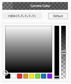
In Divi 2.4 we introduced new color pickers with alpha controls. These let you select and input RGBa color values.
What is RGBa?
RGBa is a color value that is defined by its RGB value plus an alpha value, which is what that little ‘a’ stands for. You can think of the alpha value as an opacity value.
For example…
Black can by represented in a couple different ways: #000000; or rgb(0,0,0);
We can use a third method that looks like this: rgba(0,0,0,1); where the 1 represents its opacity on a scale of 0 – 1. Using this scale we can create a 50% transparent black with rgba(0,0,0,0.5);
How Transparent Background Colors Can Add More Flexibility To Your Site
Adding a bit of transparency to background colors is a quick way to achieve a cohesive color palette. You can see below that true black on true white is a bit harsh, and that dark and light grays are a little easier on the eyes. You might be asking yourself, “Why not just use a solid gray value then?”. That’s a good question, and hard to argue, until you start adding colored backgrounds into the mix. A slightly transparent black when it’s on a white background is simply a dark gray, but turns into a dark blue on a blue background.
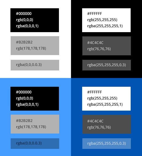
You can see that semi-transparent black can look the exact same as a dark gray when it’s on a white background, and how a semi-transparent white can look the same as a light gray, but when you you move to a colored background, the benefit of an rgba value is more apparent. This is a good thing to keep in mind when choosing background colors for the elements on your page.
Transparent Module Backgrounds
In Divi 2.4, modules now have a Background Color setting in their Advanced Design tabs. This means different things for different modules. For example, the background color of a Call-To-Action module controls the background color of the module’s entire container, whereas the the background color of an accordion module controls the background color of the individual toggles. Here are a few examples.
Use Transparent Backgrounds for Slider Slides
In the example below, I used transparent background colors for each slide in my slider. I then added a background image to the section that can show through due to the transparency.

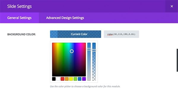
This is what the background color picker looks like in the context of an individual slide
Use Transparent Module Background Colors To Create A Cohesive Color Palette
When adding modules with a background color to a section that already has a background color, it can be hard to make those two colors work well together. And when you do get those colors to work nicely, what happens when you change your background color?

One easy way to make these work together is to use a semi-transparent background color on the module. If you want it to be slightly darker than the section color, use a semi-transparent black. If you want it to be slightly lighter than the section color, use a semi-transparent white. This removes the trouble of choosing cohesive background colors and makes it much easier to update your section background in the future. In these examples I used 25% black and 25% white.

Full Transparency
The Contact Module is a good example of a module that works well with a transparent background color. It even looks great when you use full transparency and add a border using Divi’s new border options. In the example below, I even use a semi-transparent border color so that a bit of the background shows through.

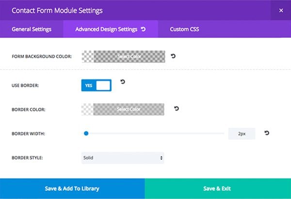
This is what theses settings look like the the Advanced Design Settings of the Contact Form Module.
Add A Transparent Background Color to Help Your Modules Stand Off A Background Image
Often times we want the best of both worlds. Those worlds are often times text and image. Unfortunately these two things don’t always work well together, but thanks to the alpha color pickers, it’s easy to remedy this dilema with a quick module background color. Note that I added 40px of custom padding to each module below so that the content doesn’t crash into the sides of the module.

This use of transparent color can also be really cool when using a parallax effect on your background image.
Let’s Take This Example One Step Further
In the example above, I used the same alpha value for all three modules. Let’s see what happens when I turn this into a fullwidth row, remove the column gutters, and mix up the alpha values.

In this example, I have also set the row and section padding to 0 for a true gutterless look.
You can now add transparency to your navigation background colors. Read more about how to customize your header navigation.


Even Columns Can Have a Background Color!
Giving a column a background color is really convenient if you have multiple modules in a column and you want them all to sit on top of a background color. Rather than giving each module a background color, you can simply customize the column they are in. Given that this post is about transparency, here is an example of how you can use semi-transparent column backgrounds to create a beautiful image overlay.

To achieve this look, I have given the section a parallax background image, added a two column row with a semi-transparent background color on column 2, and placed a simple text module into the right column with a bit of custom padding for extra breathing room.

Making the row fullwidth, removing the column gutters, and give the row/section zero padding values can give this layout a whole new look.
Customize The Gallery, Shop, and Portfolio Module Hover Overlays
Customizing the hover overlay of gallery images, portfolio projects, and shop products is easily doable with the new alpha pickers. Say you want the overlays to match an accent color of your brand, you can now choose a semi-transparent overlay color for your hover state.

The alpha pickers in Divi are yet another small addition that can make a big impact on your website’s design. Combined with all of the new features in Divi 2.4, we are really excited to see what you are going to create next. Make sure to post your own examples in the comments if you’ve already had the chance to deep dive into the update.




Sorry, am I missing something?
I used to open up background/colour click the colour and then use a slider to add opacity.
Now there is no slider. Do I have to learn every code for every tint that I might ever use?
Where is the simple slider?
I have the issue that the opacity is not showing anymore when before it did. Whats going on? Plugin conflicts you say? Its imposible to play with color and image opacity, there is no such an option anymore.
Yes, there’s a high possibility that this is a conflict with 3rd-party plugins or custom codes. Have you tried enabling Safe Mode in the Support Center to confirm that?
Something is conflicting with Divi if the Alpha color slider is missing. I suggest that you try activating Safe Mode in Divi Support Center to confirm that.
Hi There
I would like to place a semi transparent background color over the full width map module. My client loves the map as a header but wants to fade it a bit. Thought I could do this by placing a semi transparent color over it. Not sure if I can do this with CSS?
Hey there,
Does anyone know how to set the header settings to look like the second example above? (the one where the header starts fully transparent, then has a dark semi-transparent background on scroll?
It looks like a good article, the images on this post are not displaying so I cannot understand the article and effects
Am I correct that I can’t use semi-transparent BG colors with unique “slide” BG images? (i.e. if I had three slider “slides”, each with a unique image, I cannot apply a semi-transparent BG color overlay?)
I’ve seen a few people who’ve asked this, but not sure there is a firm answer that it isn’t possible.
You cannot add a single background overlay to all slides in a slider. You can however, use the same overlay settings on each individual slide.
Yep you can, look at this link for the CSS code.
We are having an issue with setting up the background for the Contact Us Form with transparency. We also trying to figure out how you cut out the logo for the cafe sample? Is there a tutorial on this or some sort of guidelines to follow? Please and thank you
Hi,
Is it possible to add Semi-Transparent Background to Divi Slider Text? Can we do it using the “custom css” options?
Thank you.
Hallo!
In image “transparent-rgba-diagram.jpg” there is a small error.
It is written rgba (0,0,0.0.3). Should be written rgba (0,0,0,0.3).
Comma, no point.
hallo!
A little error in image transparent-rgba-diagram.jpg?
rgba (0,0,0.0.3) > rgba(0,0,0,0.3)
How do I change the color os the SHOP products Hover?
I see I can change on the Portfolio and on the Gallery. But for the Shop Module Customizer it doesnt show the ICON / BACKGROUND color option…
Thanks, Divi is getting better and better!
Hey Caju, I’d recommend asking specific customization questions in the support forums or in a group like Divi Help and Share on Facebook or Divi Theme Users (also on Facebook).
It sure would help if you would include screenshots for these setups. Thank you
Great post… I am learning so much with these tutorials! Keep up the great work ET.
I admit, after the first vision of the theme DIVI updated I did slati of joy, but then using it and trying different implementations for my new websites I am a bit ‘stopped.
Several modules do not work perfectly and some are in conflict with them.
For example: if I do fullwide slide in full screen, then all slide make the same dimension. maybe I would get on the same page with different heights slide. Or if I change spaces and line spacing of a text they change all and some even overlap or have different spacings. Maybe this appear only to my desk, but I try with different website where DIVI work.
In short, the idea is great but is a little bit confused.
I think it’s bettter to create a blog, a page, where you indicated the css for each different function (at least the ones in frequently use).
I until now, thanks to your perfect service, I have always done so and I was perfectly . Then, in this way you could change the css of each item or page, so as to be completely independent.
Your work is great and very important and your theme and your support timely and accurate. Keep it up, you are great. Thanks
I love the transparent background on slides that “overlays” the background image. I was doing this before with custom CSS, and I’m glad that this is now baked in. Once I updated Divi I noticed that my CSS for this was “broken” and so I was really happy to see that there is an easy way to achieve this. However, I followed the instructions in the article above and my background images are not “tinted” as they should be by adding the transparent background color. What am I missing here? I’d like to get my site back to what it was before the upgrade. TIA
How’s the “MIX & Match” effect achieved here (half way down) http://elegantthemes.com/preview/Divi/fashion/
I would like to see a code option (with the color picker) to be able to use anything from RGB and hex to full gradients. I’ve already been using RGBa and gradients by not setting any color (Divi 2.0) and adding css classes.
Is there a way to add the Transparency affect to “Specialty Sections”? The Background colour doesn’t appear to have an Alpha variable.
I have been adding the effect to other areas throughout the site, but can’t seem to add it to my main section, as its using a Specialty configuration.
Above article probably should have noted the Text Module DOES NOT support transparency (by design??). However, Blurb, Call To Action, etc. DO.
Once I realized that, then yes all of the above gorgeous effects became possible!
Great post about a great theme!
But it’s kind of frustrating but I can’t figure it out, how to make a section as described above, with a green parallax background image with a two column row and with a semi-transparent background color on column 2.
For me, the transparent text area cannot be made with a non-transparent margin surrounding it. Or how to achieve this? I tried following the instructions below the image, but no.
Help is much appreciated…
Sorry about that. Two seconds later I solved it… 🙂
My language (Estonian) is not supperted, thats why I always work with the .po file. This time there are some issues, can you please (double) check those files.
Some phrases dont “translate”, like contact form and post comment meta data.
Great post. Learn lots of new things from the post. Keep it up.
Hi Nick,
There is a bug with Primary navigation bar when transparency is being used.
When I choose black and transparent it ends up being grey (white background comes up behind it). If you choose blue, red or any other colour it will end up being a lighter shade.
Just wanted to see if you were aware of it and if you have any idea when it will be fixed.
Cheers,
Shane
I love the new semi-transparent backgrounds, and have already started working with this. There is one thing I am having trouble with though and would appreciate if anyone has any thoughts on how to accomplish this.
I have created a 4 column section, with image backgrounds. I then inserted blurbs into the columns, made them equal height and it looks fantastic. However, there is one problem, the content of the blurbs is not equal height so the semi-transparent overlay does not completely overlay the blurbs at certain resolutions, due to the varied content of the individual blurbs.
Anyone know how to force the blurb overlay to fill the height of the columns in this scenario? If anyone cares to check it out look at the four blurbs near the bottom of jamesturner.xyz
I would love to have the semi-transparent background of the blurbs fill the entire column.
One thing I have found that works is setting a minimum height and using only three columns, because the responsive break points seem to work just fine in this scenario.
Hi James,
Our support team is available to offer advise for these kind of questions. If you could, please open a new ticket in the forum and we’ll be happy to assist you 🙂
Hats off. Take a bow. Roses into the ring. Kudos.
The Divi upgrade has changed the game for me. Just when I was considering hiring someone to do what the Divi upgrade now allows me to do for myself.
My favorite thing isn’t the theme itself, it’s the company. The read me guides and videos are priceless. I LOVE LOVE LOVE that you include design concepts in the vids, not just how to configure each module. Learning creative ways to use these tools will expand the already immense value of this theme.
I will def shout Elegant Themes from the rooftops and have already spread the word to my local web community.
THANK YOU!
Every thing is just amazing at ET.
Can anyone let me know which tool is used to create gif images (above)?
The first thing I tried was the transparent overlay in my slider as per your example….
“I used transparent background colors for each slide in my slider. I then added a background image to the section that can show through due to the transparency.”
It does not work for me. It seems like if the background color were on top of the background image and I set the alpha to 100%, I wouldn’t be able to see the image. Am I missing something here?
Thanks for the great theme and new version 2.4!
I don’t understand the point of a slider if every slide has the same background image.
It would be better if each slide can have a separate image, and then a color overlay (maybe even the same dark color) can be applied to all slides and actually overlay the individual background images.
That’s the point of this post. Your background colors do not need to be 100% visible. You can make them semi-transparent, letting the background image show through.
If you set the alpha slider to 100%, then nothing will be visible behind it.
When I follow the instructions in this blog for creating a transparent overlay on top of a background image in a slider, the transparent color does not appear in Chrome, Safari or Firefox.
Thank you for your patience and help.
The BG image is applied to the section, not the slider. Is that how you set it up?
I’ve tried too.
In the slide parameters, I’ve added a background image and a background color with transparency and it doesn’t work.
The color is “under” the image, so we don’t see it.
Thank you for your help.
Okay…Got it.
Thanks! I Love the effect!
I could be confused here but what I think people want to know is can we make a semi transparent layer over top of slider images?
I’ve been using the following CSS to add areas for the Title & Body text on a slider.
.et_pb_section {
padding-top: 0;
padding-bottom: 0;
}
.container::before {
display: none;
}
/* Set the semi-transparent background color */
.et_pb_slide_content,
.et_pb_slide_description h2,
.et_pb_more_button_wrap {
background-color: rgba(0,0,0,0.5);
}
/* Hide the content area if empty */
.et_pb_slide_content:empty {
visibility: hidden;
}
/* Add 30px of padding to the background */
.et_pb_slide_description h2 {
padding: 30px 30px 10px !important;
margin-top: -30px;
margin-left: -30px;
margin-right: -30px;
}
.et_pb_slide_description .et_pb_slide_content,
.et_pb_more_button_wrap {
padding: 0 30px 30px !important;
margin-left: -30px;
margin-right: -30px;
}
@media only screen and ( max-width: 479px ) {
.et_pb_slide_description h2 {
padding-bottom: 30px !important;
}
.et_pb_more_button_wrap {
display: none;
}
}
/* Give the background rounded corners */
.et_pb_slide_description h2 {
border-top-left-radius: 15px;
border-top-right-radius: 15px;
}
.et_pb_slide_description h2 {
border-bottom-left-radius: 15px;
border-bottom-right-radius: 15px;
}
@media only screen and ( max-width: 479px ) {
.et_pb_slide_description h2 {
border-bottom-left-radius: 15px;
border-bottom-right-radius: 15px;
}
}
Sorry I did not mean to reply twice.
Hi Nick,
What I was trying to say is it does not work for me. If I set the background color to rgba(43,132,209,0.5) all I see is the background image with no color overlay. If I take out the background image and leave the background color at .5 alpha I can see the the transparency over the body background color (#fff) so it just looks like a light blue.
What I was trying to say is it does not work for me. If I set the background color to rgba(43,132,209,0.5) all I see is the background image with no color overlay. If I take out the background image and leave the background color at .5 alpha I can see the the transparency over the body background color (#fff) so it just looks like a light blue.
always been a fan of full/semi transparency backgrounds..;)
Where are the instructions to make the transparent header? I didn’t see them on the linked site.
What if I want 3 different pics in slider and still have semi transparent background for whole slides? Is this possible right now?
I cannot wait to set aside some time to play with this. I used to find the me customisation time consuming and cumbersome. Thank God ET and of course Divi 2.4.
Keep up the great work.
I love using semi transparency in my designs. Being able to do it within the theme as opposed to Photoshop will make life easier and open up many new possibilities.
Is there a possibility to add several menus? Have two upper menus?
You could try the new Fullwidth Menu module.
I tried this but there’s a conflict between the transparent color setting of the Fullwidth Section and the transparent color setting of the Fullwidth Menu Module.
The transparent color set in the Module overlays the (transparent color) Fullwidth Section so you see the Module background show up as a darker color.
I’ll post this in the forum:
https://www.elegantthemes.com/forum/viewtopic.php?f=187&t=441662
You could create a child theme and a special template file that will allow you put DIVI in the header.
http://s91585912.onlinehome.us/howididit/whatidid3.html
Then you can have any number of full width menu modules you want…
Seems New Divi 2.4 is a colorful package for all wordpress needs.
I love the new background colors and transparency settings! I ESPECIALLY love the Background Color Overlay option in header images. It makes it SO nice and easy to add a splash of color without having to fire up Photoshop every time I need to make a small change.
I would love to see it spread to other modules. Anything that has a Background Image/Color should have the Background Color Overlay option as well.
Amazing work with Divi 2.4. You should all be very proud.
YES! YES! … The background color overlay is fantastic. It would be great to have it available on pretty much everything.
FYI, there’s a mistake with the Live demo link.
Absolutely beautiful!!! Thank you so much for breaking down all this info … the Divi update is really something special! Nicely done guys!!!
You explained how to make a transparency in the photos. I would be grateful if you explain how to make a video slider “similar”.
The problem is that the video is too light and it would be desirable shade.
Of course it would be possible to
handle the video.
But if I have the opportunity to apply a transparent layer mechanisms Divi, then why not. Thank you in advance for your reply
Even I am looking for this. Can anyone reply if that is possible. Else I have to look for options to do external tools.
I’m going to ask a really stupid question to other members… please bare with me. 🙁 Is the only way to add a button through the “Call to Action” module??
lol… I might be completely overlooking something! 🙂 Thanks.
Regarding buttons…
Thanks everyone for your input, much appreciated! 🙂
I also miss the opportunity to make single buttons
there’s an “add ET button” using text module or other modules where you can add content, hope that helps too 🙂
Yeah but they are awful looking, look nothing like the theme. Can anything be done about that?
Hi Janet!
It’s not a stupid question at all! 🙂
“Call to Action” module is one of the ways you can add a button to your website. It really depends where that button goes on your website. There also options to add CTA buttons within the Standard/Full-width Slider Modules.
Yes, you can use html code when you add text but use “text” instead of the “visual” editor or use the brand-new “code” module. The code will be like this: Click Me!
or like this:
Continue
…. check form in html resources to see other options,
sorry this form does not allow to insert code