You love Divi. Of course you do. Divi rocks. That’s why there’s the hashtag #divirocks, right? But what about Monarch, our social sharing plugin that comes with your Elegant Themes membership? #monarchrocks, too, and part of that rocktitude is being able to create contextual social fly-ins.
Monarch is really powerful, and once you’re familiar with its settings and design options, you’re going to be able to really set up some fantastic opportunities to maximize engagement with your users.
Fit for Royalty
If you’re not already a member, just hop on over and join up so you get access to Monarch (and Divi, Bloom, Extra, and everything else that comes with your membership!). Once that’s done, log in to download and install Monarch.
It’s a Bird…It’s a Plane…
No, it’s just the Monarch fly-in panel. Which is way cooler than a bird or a plane. If you go to your Tools -> Monarch Settings you can see that you can make the Monarch fly-in active in the Locations tab. You’re done! Congrats! You have Monarch social fly-ins live on your site (once you hit save changes, that is).
But–there’s always a but, isn’t there?–you don’t have any contextual social fly-ins. And that’s the difference here.
When you’re trying to engage your audience, context is key. Your site’s visitors ignore pop-ups, fly-ins, and other kinds of modals because they’re everywhere. If you rely on the context of your site and/or articles to present your audience with a reason and opportunity to share your content with their base, you’re beating the odds.
The Terrific Trio
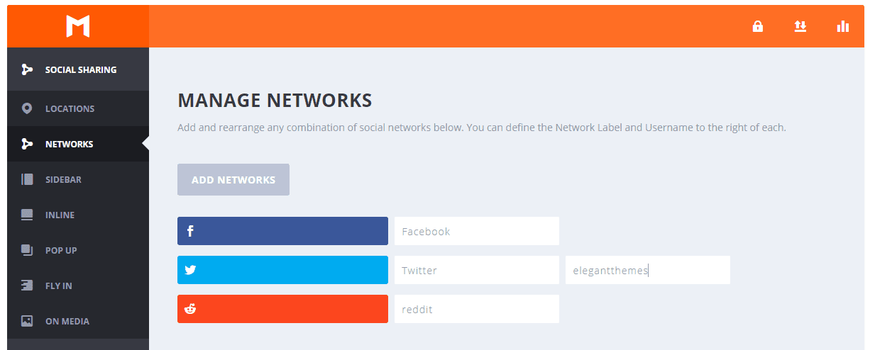
First of all, when you go into Monarch Settings -> Networks, you can choose–obviously–which networks you want to offer your visitors as options to share. When thinking about contextual social sharing, you don’t want to overwhelm. Or just social sharing in general, honestly.
I am going to limit my entire Monarch plugin to three options–Facebook, Twitter, and Reddit. Three options is plenty, plus you can actually call out networks in your post (or other ways using Monarch shortcodes, which I’ll show you later).
The Greater Context
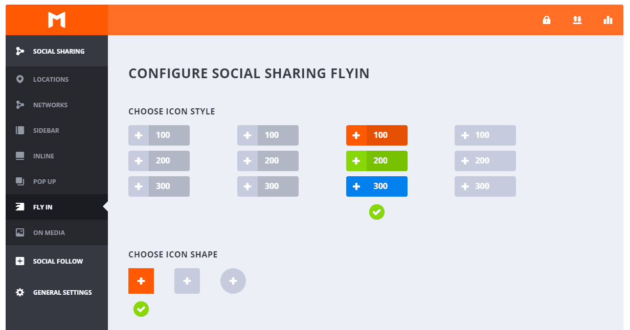
Now we can move into the Fly In tab and get to work. Depending on your site, the design of the fly-in may change a bit. I am going to demo an example with the free Divi layout pack for coffee shops (because I think it’s pretty). It is full of sharp corners, so I went with these options 3 and 1 for the same aesthetic on Icon Style and Icon Shape.
As you move down, the fun part of contextual social fly-ins starts. We get to edit the Title and Message that our visitors see. These are my favorite parts of social fly-ins because they let us directly interact with our visitors instead of simply asking them to Share This or something equally generic.
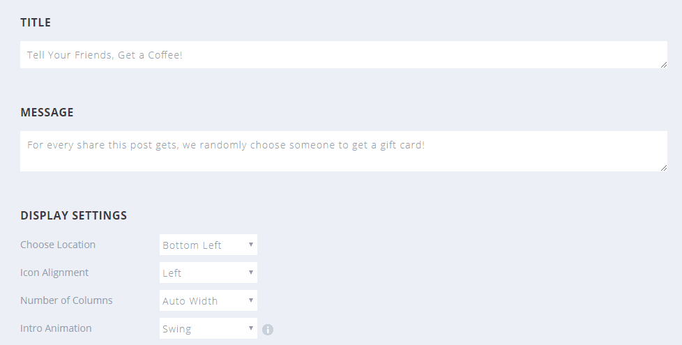
By using the fly-in as a call-to-action for your visitors, you can really draw their attention more than most social sharing areas. I want to use this fly-in as an attention-grabbing CTA, so I am using copy that snags their eye: Tell Your Friends, Get a Coffee! For every share this post gets, we randomly choose someone to get a gift card!
After all, everyone loves free stuff. After that, I want to make it look different than normal, so we want to choose the Bottom Left to be a little different, have the left alignment for icons, and let it auto adjust the columns so we can beautifully target visitors with any viewport.
What I like the most in Monarch is the Intro Animation. Most fly-ins slide up, so we are gonna Swing into frame to really make ours stand out.
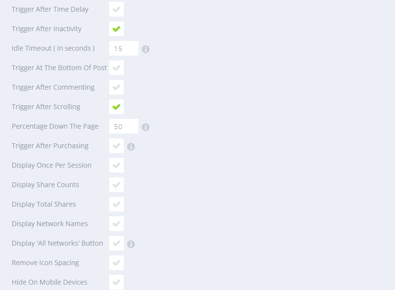
There are also a ton of when-to-display options for Monarch. Choose these as you think would work best for your visitors–you know them better than I do.
Dark Roast or Light?
Since we are making it all contextual, Kenny and his team have put together a delicious color palette for us to use. We want the contextual fly-ins to stand out, but at the same time, we will want it to match the site itself.
By choosing colors used in the free coffee shop layout pack, we will add a bit of flavor to our sharing widget. (Get it…flavor?)
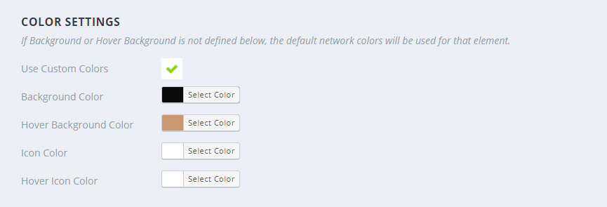
The Background color should be #0a0a0a, and the Hover Background Color needs to be #c99872. Maybe it goes without saying, but you need to enable the Use Custom Colors checkbox to adjust these settings.
Locally Sourced Fly-ins
One of the few limitations in Monarch as it stands right now is that you can’t choose specific posts or pages to show a fly-in, nor can you have more than a single kind of sharing widget per type (only one fly-in or end-of-post, etc. per site).
That’s okay, though. Fly-ins don’t need to be overdone.

You can get around this slight limitation by using Custom Post Types. If you aren’t familiar with setting them up, no worries at all. We gotcha covered.
As you can see in the image above, I have created a coffee custom post type, and this fly-in will only show up on these particular pages. This will give you a bit of greater control on the context your users will have to share your stuff.
Skinny Contextual Monarch Fly-ins for…
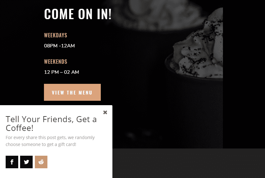
And that’s it. The white background works well to give contrast to the darker tones of the coffee shop layout back, and the colors the design team put together are fantastic with the hover effects that Monarch provides.
These kinds of contextual social fly-ins are pretty easy to put together for any site, not just the coffee shop. I find that you can do a lot with both Monarch and Bloom (available with your Elegant Themes membership, by the way) to make a wonderful user experience no matter if you have a travel site, a yoga site, or a coffee shop.
Enjoy contextualizing, Divi Nation!
Article featured image by Mascha Tace / shutterstock.com



Awesome. Thanks for this nice article.
Hey #monarchrocks team,
What a coincidence.. yesterday I was reading an old blog about this plugin. Still wondering, do you have plans adding Whatsapp for mobile?? You would make a lot of people happy….
Merry Christmas!
and when Divi and monarh will fully support vk, odnoklasniki, mail.ru? This is very lacking
For a complete newbie like myself, a short screen capture video to help me better understand what it is and how to pop it in, would have augmented the article very nicely.
How easy would it be to still add in a “how to” accompanying video?
Thanks for the tutorial, B.J.!
The example incentive of getting a gift card is definitely a good one, and it leads me to a related question: how can we track the post/page to where one’s content was shared (so that one can select the random winner, for instance)?
I know Monarch features a dashboard that tracks the number of times something was shared per social network, but how about finding out where it was shared, and/or by whom, specifically?
Thanks again for your good work, and any additional feedback you can provide on this.
I’d like to know this, too. Where can I check who shared my blog post when I’ll be selecting a winner?