When creating an eCommerce website for your business, or when designing one for a client, one of the first things you’ll wonder is which content management system to use. Among all the different options you have, WordPress is highly recommended and frequently used. The reasons behind this are the simplicity of use and the various themes and plugins out there that’ll allow you to achieve stunning results. In this post, we’ll specifically show you 10 inspiring mobile eCommerce website designs made with WordPress that look as good on mobile as they do on desktop. With these mobile designs at the back of your mind, you can easily distinguish bad, good and excellent mobile eCommerce website designs from one another.
1. Overclothing
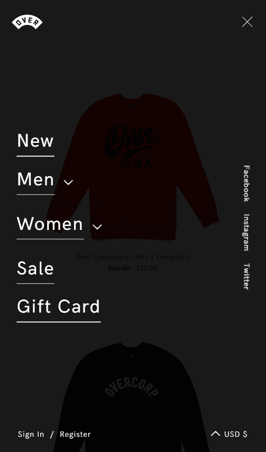
The first inspiring mobile eCommerce website design we’d like to share with you is Overclothing. This website is a perfect match of minimalism and a great representation of the products that are for sale. Take a look at the mobile menu, for instance. The mobile screen size doesn’t limit the website from having the logo, the pages, the currency, the login and the social media channels displayed beautifully. Although all this information is present, the menu doesn’t feel too overwhelming or confusing. Besides that, the products are also showcased in a very qualitative way with high-quality images and the needed simplicity that puts the products in the spotlight.
2. Zanerobe
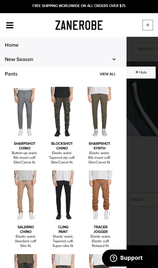
Up next, we have Zanerobe. This eCommerce website made with WordPress takes responsiveness to the next level. One of the great things about this site is the product preview in the menu itself. This is usually something you wouldn’t expect from a mobile eCommerce website design, but Zanerobe gets the job done. The experience visitors have on mobile isn’t compromised and is practically the same as on desktop or tablet. In brief; this website is just a great example for people out there who are starting their own eCommerce website.
3. Jardan
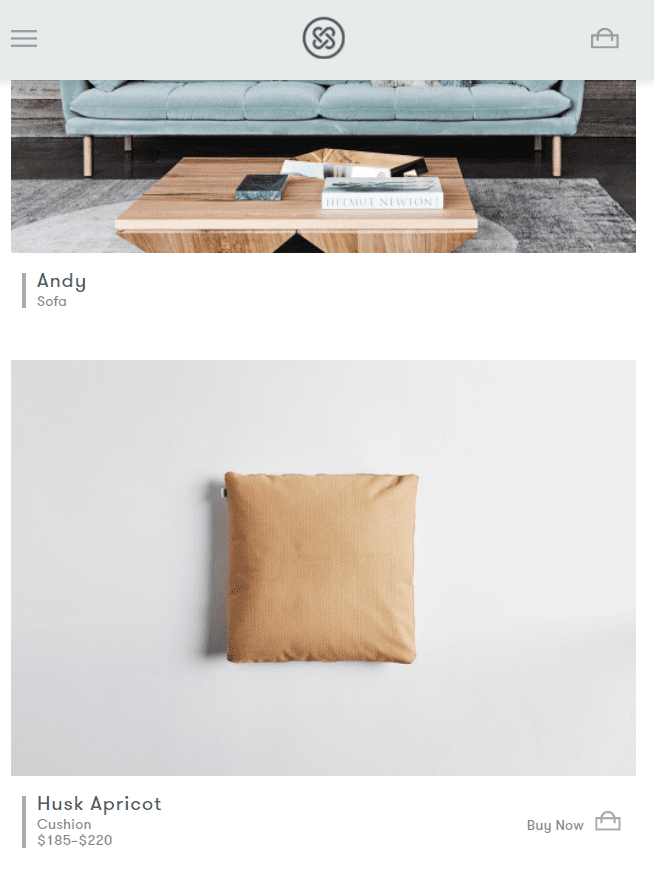
Then, there’s also the Jardan mobile eCommerce website design. This website definitely manages to give their visitors the same experience on mobile as on desktop. With a minimalistic description and a subtle yet noticeable call to action for each item in the shop, the website is enjoyable to scroll through. Besides that, the menu is also very user-friendly with the multiple product categories that are easy to navigate through.
4. Dark Horse
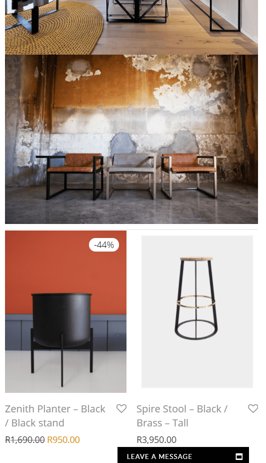
Moving on, let’s take a look at the Dark Horse mobile eCommerce website. You can easily scroll through this website and imagine why you’d really want their products to be part of your interior. They’re not only showing you what you can purchase, but they’re also showing you how the result of it can look like. By using enough product images that are put into context, they manage to tell a story. The website looks as good on mobile as it does on desktop and it has a live chat that helps visitors in their search as well.
5. Vu
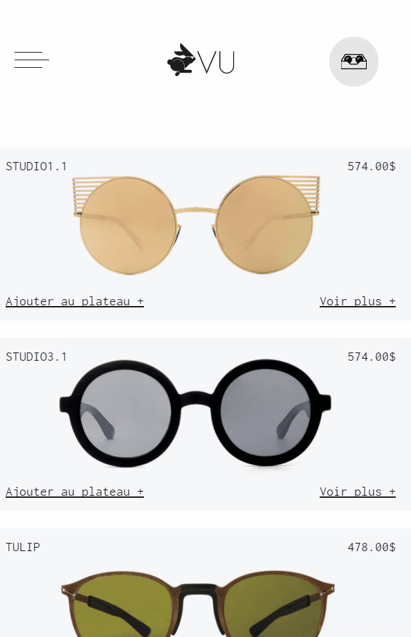
Next, let’s take a look at Vu, an eCommerce website that undeniably manages to leave a mark on their visitors with their modern design style. One of the fun things about this website is the menu. They have deliberately chosen to emphasize their two main categories of products, which is something they haven’t done that much on their desktop website. That makes it clear that they’ve spent a lot of separate time designing the mobile version as well. Besides that, the product items are very easy to navigate through and look just awesome (+1 for using a beautiful and intriguing font).
6. Prigipo
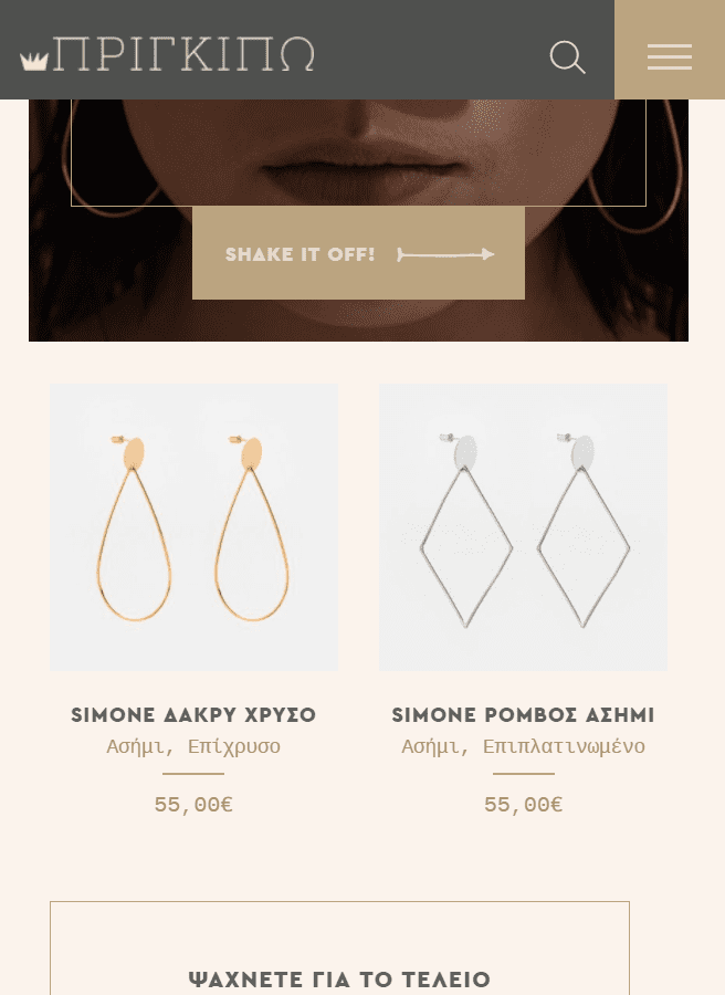
Then, we also have the Prigipo mobile eCommerce website design. The colors that are being used on this website immediately give visitors a wealthy and qualitative feeling, which matches the products that they’re offering on their website. There are also nice effects that appear on scrolling and they made sure the experience and user-friendliness are kept on mobile if not improved.
7. Juvente

Or what about Juvente? This eCommerce website immediately gives you a fresh and healthy feeling by just looking at it, on mobile as well as on desktop. They’ve also done a great job at maintaining the visuality within their menu; when you click on their anti-aging products menu item, you immediately see the products that they offer. This allows users to skip different steps and pages and go to the end destination. By shortening the time that is needed to navigate, you allow visitors to spend more time on the product pages they’re interested in.
8. Sodashi
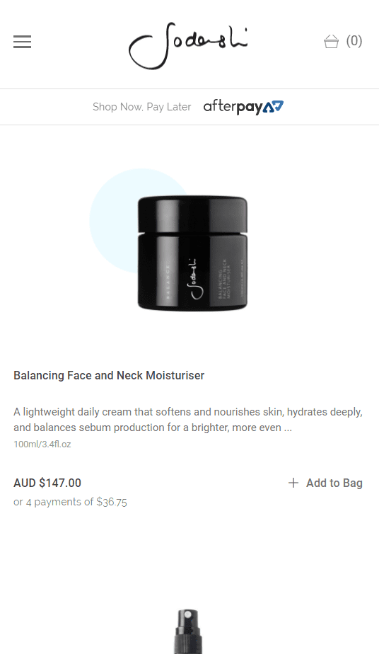
Another inspiring mobile eCommerce website design is Sodashi. One of the unique things about this mobile eCommerce website design is the amount of information they share about each product on the homepage. Some would say it’s too much information yet this website manages to make it look natural. The simplicity of the design and layout allows the website to be content-rich. The Sodashi website also manages to keep their product pictures in the same style. And to top it off, they present them in a slider that works with a left and right swipe on mobile.
Made with Divi
9. Sweet Cecily’s

The first mobile eCommerce website made with Divi that we’d like to share with you is Sweet Cecily’s. This website immediately starts the homepage by representing all the product categories visually which can help visitors with their search on the website, something which contributes to the user experience. Each product also contains a review with stars that allows users to search through the popular products easily. Besides that, the style of the website is just cozy and gives you a reason to stay a while longer.
10. Modern Pink Paper
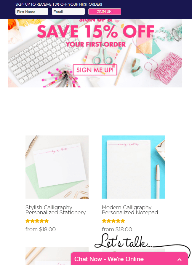
Another great Divi eCommerce website that looks great on mobile, and the last eCommerce website in this list, is Modern Pink Paper. One of the great things about this eCommerce website is the review that gets displayed along with every item that is for sale. Another interesting thing about this layout is the fixed offer at the top of the page that contains a call to action which is relevant for visitors that are scrolling through the different items. On top of that, the chat option also stimulates the communication between the website owner and the visitors.
Final Thoughts
In this post, we’ve shown you some stunning eCommerce website designs that live up to how their desktop version looks like as well. These examples can stimulate your imagination and help you build your next eCommerce website that looks great on both desktop and mobile. If you have any questions or suggestions; make sure you leave a comment in the comment section below!
Be sure to subscribe to our email newsletter and YouTube channel so that you never miss a big announcement, useful tip, or Divi freebie!
Featured Image by Photoroyalty / shutterstock.com



Cool
I love that of Overclothing!
It’s pretty simple and beautiful 🙂
I would be a little embarrassed to share this blog post, when only 2 of the worst ones are possible in Divi. I would love to see more built-in customization in the future! 🙂
I’ve found Divi e-commerce themes very frustrating so far – I wish Divi would design, administer and support some kind of WooCommerce linked plugins and themes. So far I’ve justed wasted money and time – Divi itself is excellent but the e-commerce themes on the market place are amateurs.
are these built with divi and woocommerce?
Impressive! Divi never ceases to amaze me.
Their desktop version are not that great, but they look great on mobile view, I would like to know if they are all divi or not?