In 2014 Google announced their release of the Material Design language. Their original goal was to address issues with app design for Android devices. The argument was that flat design did not translate well to smaller screens. They felt that a design lacking in clear visual cues impeded mobile users’ ability to take action.
Matías Duarte, Google’s vice president of design, explained:
“Unlike real paper, our digital material can expand and reform intelligently. Material has physical surfaces and edges. Seams and shadows provide meaning about what you can touch.”
And that’s basically what material design is now: a way to make design elements look touchable.
By releasing the new design language and guidelines, Google hoped to resolve UX issues and confusion for Android app users. Two years later, their design language has surpassed the realm of mobile apps and is now a principle regularly utilized in web design.
-
1
13 Sources of Material Design Inspiration
- 1.1 1. Behance
- 1.2 2. CodePen
- 1.3 3. Dribble
- 1.4 4. Google Design’s Material Design Awards
- 1.5 5. Made with Material
- 1.6 6. Material Design Blog
- 1.7 7. MaterialUp
- 1.8 8. Pinterest
- 1.9 9. Reddit
- 1.10 10. Tumblr – Material Design
- 1.11 11. Tumblr – Material Patterns
- 1.12 12. Material Palette (bonus resource)
- 1.13 13. Google’s Material Design Resources (bonus resource)
- 2 Conclusion
13 Sources of Material Design Inspiration
As its creators, Google’s own properties are likely to be the best examples of material design available. That said, a surprising number of inspiration and showcase websites have been dedicated to the topic. This is a collection of our current favorites:
1. Behance
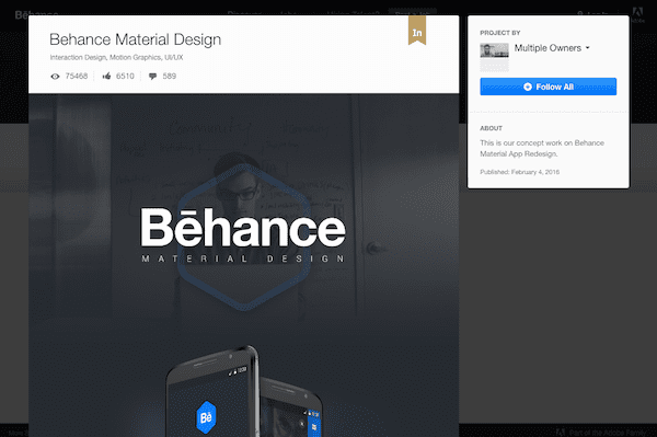
A great example of a website perfect for siphoning design inspiration from, Behance has board after countless board of examples you can reference. Behance also happens to make use of material design well enough on their own, with boxes that subtly stand out from the grid, shaded backgrounds to help direct attention, and clear indicators for clickable actions.
2. CodePen
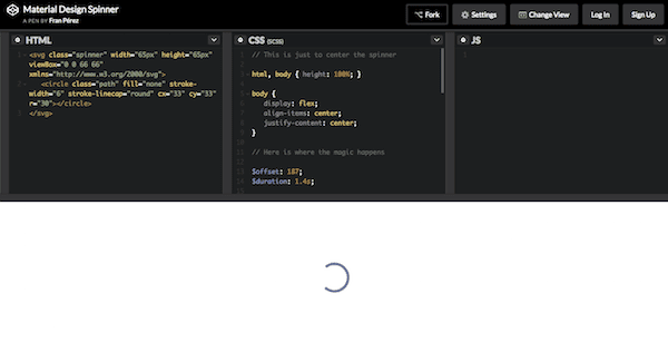
CodePen, the self-ascribed “playground for the front-end side of the web”, is a developer’s goldmine when it comes to material design. Not only are you getting to see some really cool examples of material design in action, but you can see the underlying CSS, HTML, and JavaScript that developers used to build that design or animation.
3. Dribble
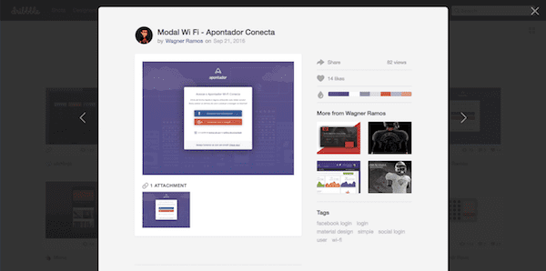
If you’re not familiar with it, Dribble is a social network for designers, developers, artists, and other visually creative individuals. A search for “material design” within their site just goes to show you how pervasive material design really is, both within web and app design. You can find inspiration here from something as simple as an icon all the way to a full website design.
4. Google Design’s Material Design Awards
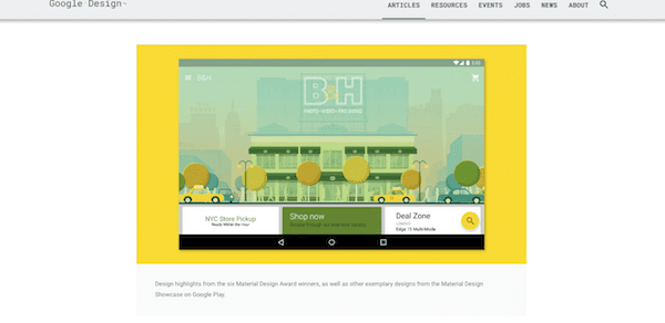
A year after Google launched Material Design, they honored six of the best-in-class apps with their first ever Material Design Awards. You’ll recognize many of the websites–along with the 12 honorary mentions–on this list. If you don’t, or if you’re not currently using their apps, we’d strongly encourage you to take a look at them now. If Google takes the time to label someone as innovative, it’s well worth the look.
Here’s a highlight reel from 2015’s winners:
5. Made with Material
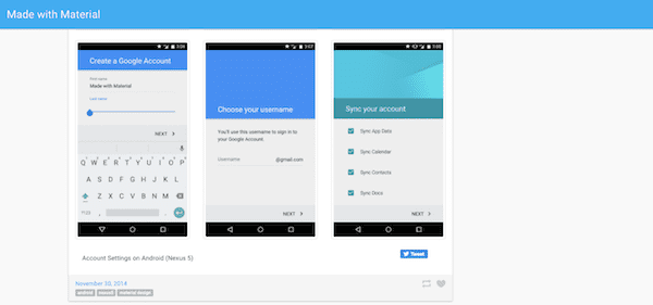
Dating back to November 2014, this website serves as a great source of inspiration for material design. The bulk of the site showcases high-resolution screenshots of websites and mobile apps that employ the material design technique. And while it may be easy to get lost in these inspirational examples, don’t forget to check out the reference material they’ve included for developers in the top-right sidebar. Those’ll come in handy if you do choose to go this route.
6. Material Design Blog
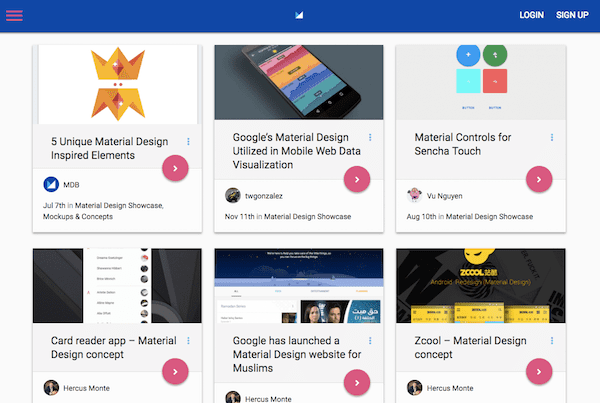
This blog happens to be one of our favorites not only because it covers a whole host of tools and topics that might interest you as it relates to this topic, but also because it does a bang-up job of employing the design technique themselves. If you haven’t had a chance to witness their animations in action, visit the site and click on any of their blog posts.
7. MaterialUp
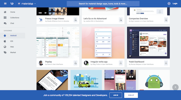
Part of the Uplabs family of websites, MaterialUp focuses solely on the topic of material design: website examples, mobile app screenshots, tools, tips, and more. Even if you don’t find something of use right now, take a look at the design of their website. The layout and look are reminiscent of Google Drive’s, right? If you’re looking for a resource you can trust, who better to turn to than one that does a good job of executing on those design principles themselves?
8. Pinterest
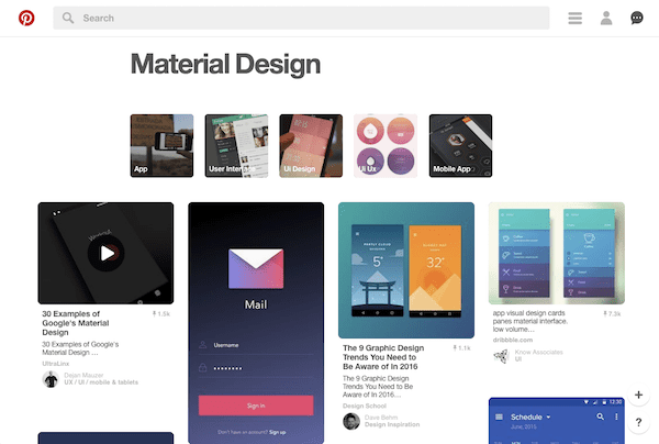
If there were ever going to be an image collection site named as the top source for design inspiration, Pinterest would share that honor with Behance. With a quick search for the term “material design”, you’ve got instant access to videos and images of websites and apps putting this design trend to good use.
9. Reddit
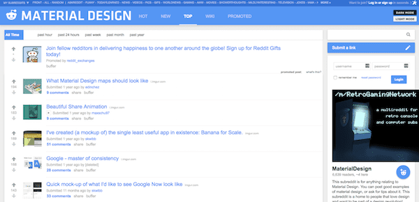
Reddit is probably not the first place you’d think to go when you’re looking for design inspiration. Lo and behold though, there is a Material Design sub-reddit. About half of the posts in here are design revamps people have made to improve upon a material design. The other half are original design submissions that designs want feedback on. If you’re heavily invested in material design, this would be a great place to review and discuss other designs with like-minded individuals.
10. Tumblr – Material Design
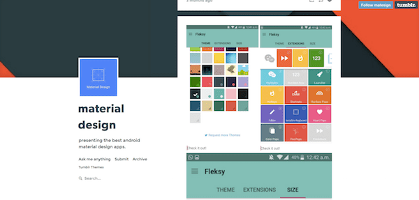
Regardless of whether you design Android apps, iOS apps, websites, or something else, if you’re interested in learning more about how to properly execute material design, this is a good resource to check out. Scroll through this Tumblr feed and you’ll find examples of all different types of content to serve as inspiration for your next project.
11. Tumblr – Material Patterns
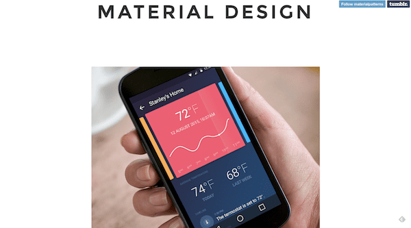
In another example of an inspirational Tumblr feed, Material Patterns showcases a lot more variety than we’re used to seeing in these types of resources. From travel booking apps to music players, and social media pages to mapping apps, this is an excellent resource for material design enthusiasts. There is a lot of color, fantastic animations, and just a great mix of content to scroll through.
12. Material Palette (bonus resource)
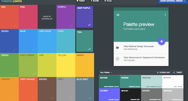
While I wouldn’t go as far as to call Material Palette a source of inspiration when it comes to material design, this is an absolutely fantastic resource for finding the bright color palette your material design needs. Pick out any two colors and then let the app generate your website’s new color palette for you based on material design best practices.
13. Google’s Material Design Resources (bonus resource)
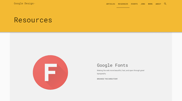
Here is another bonus resource for all your material design needs. Of course, the Google Design website is the perfect model for how to execute material design, but what’s most important here are all the resources Google has provided in order to help designers and developers create the perfect material design for websites, apps, and more.
Conclusion
When Google came up with the Material Design design language back in 2014, the end user was always at the forefront of their mission. How could app (and later web) design be improved so that navigation and UX became more intuitive? Their solution was simple enough: build upon what worked in the past (namely, minimalistic and responsive designs) and infuse more real-life qualities into it.
When you’re ready to get started, take some time to review Google’s guidelines and specifications. They will provide you with a solid base to work from. Then, when you’re ready to start designing, you can use the material design resources above to help inspire your design process and take your material design in a unique direction.
Now over to you: Do you think material design will last or is it just a passing fad?
Article thumbnail image by Legend_art / Shutterstock.com




Fabulous List, Thanks for share interesting post.
Hi Legend! Google’s Material Design is really useful, especially with regards to colour matching and fonts. I uses it a lot when designing my site.
One of the things that it recommends is that your body font should be set at 90% opacity.
I am a graphic artist by trade and build websites using Divi for clients. I use the BIG 3 Adobe products (Photoshop, Illustrator and InDesign) for most of my designs for those websites. I also use, to a lesser extent, Premiere Pro and After Effects. Those products do all those things that this list has on it and far more. I would recommend people take some graphic design classes from Lynda.com or Skillshare to get a better handle on design itself no matter what media you are using. Design is design and pleasing to the eye and why. The psychology of fonts, colors and layout is a BIG factor… Divi is the best thing to come along for graphic designers that do not want to learn code but still want to build a powerful website using their graphic art skills.
Hey John, I think there might be a bit of confusion here. This is not actually a list of design tools, but sources of inspiration. Glad you’re enjoying Divi though! Hope you can glean some inspiration from this post to use with it 🙂
Great list, thanks. Here is a useful material design color palate site I like to use when I need one of their colors.
https://www.materialui.co/colors
Thanks Brandon, that site looks great!
Google’s Material Design is really useful, especially with regards to colour matching and fonts. I uses it a lot when designing my site.
One of the things that it recommends is that your body font should be set at 87% opacity.
My question is what is the point of Elegant Themes espousing the benefits of thsi Material Design when their own Div theme does not allow you to set an opacity in the body font (from within the Divi Options).
I had to overcome this by setting CSS for the body font within the Divi customiser, but off course this does not now work within the new Divi Visual Editor. The CSS from teh Divi customiser is completely ignored by Visual Editor.
I did report this a couple of weeks ago through support, but have not received any constructive advice on how to overcome this problem.
Just a word of warning about ET not promoting something it can not support.
Hi Paul,
I am new to Divi, so, please, take my points with a grain of salt, but I have difficulties following some of your critical remarks concerning Divi in the context of material design.
You said,
“One of the things that it recommends is that your body font should be set at 87% opacity.”
In the Google MD documents, I don’t find any hint that your *body font* should be at 87% opacity, generally — rather, that, for dark text on light backgrounds, the most important (primary) text should have an opacity of 87%. On the other hand, for white text on dark backgrounds, primary text should have an opacity of 100%.
You said,
“My question is what is the point of Elegant Themes espousing the benefits of thsi Material Design when their own Div theme does not allow you to set an opacity in the body font (from within the Divi Options).”
As far as I can see, you can set any opacity you want for any font within the Divi Options: Divi > Theme Options > General > Custom CSS. Or do I miss something here?
Conversely, I cannot really follow the workaround you are then mentioning,
“I had to overcome this by setting CSS for the body font within the Divi customiser”
In the Theme Customizer, under
General Settings > Typography > Body Text Color
I don’t see any possibility to set an opacity for text in that place.
How did you manage that or did I misunderstand your remark?
Being a newbie, as I said, may I ask you what notation you are using to set, e.g., a 87% opacity for black text on a light background? I don’t find it in the Google MD documents.
Do you use “color: rgba(0, 0, 0, 0.87)” or other (hex plus opacity) notations?
Thanks!
Hi xtradivilove
I will be delighted to clarify and to answer Nathan’s question.
First of all you are correct the way to set opacity is to use the rgba notation and this is what I set:
/* set body text style and opacity */
body{font-size: 20px; color: rgba(0,0,0,0.85); line-height: 1.5; font-family: PT Sans, Open Sans, sans-serif;}
I had to set this in the Divi Theme Options, custom css.
This is because as I stated before the Divi Theme Customiser> General Settings> Typography, where you would expect to be able to set this value does not allow you to set rgba values (only hex).
In addition Google Material design also suggests having a number of heading sizes (h1, h2, h3, h4, etc)
However the Divi Theme Customiser>general settings>Typography only allows you to set one size and one colour for Header text.
As such all H1, H2, H3, h4, etc all then default to what you have set for header text.
I therefore overcame this, after consulting with ET support by some more custom css in the Divi Theme Options.
This is what I use:
/* Set h1 h2 h3 h4 styles */
h1{font-size: 44px; color: #005275; line-height: 50px; font-family: Verdana, Lato, sans-serif; }
h2{font-size: 26px; color: #05043b; line-height: 1.9; font-family: Verdana, Lato, sans-serif; padding-bottom: 10px; }
h3{font-size: 22px; color: #05043b; line-height: 1.7; font-family: Verdana, Lato, sans-serif; padding-top: 10px; padding-bottom: 10px; }
h4{font-size: 22px; color: #004d40; line-height: 1.7; font-family: PT Sans, Lato, sans-serif; padding-top: 10px; padding-bottom: 10px; }
This also has the advantage of enabling you to vary the padding before or after each h1, h2, h3, etc – just like you can do within Word for different Head text.
Similarly I also set my own custom css for link, hover and visited, as there is also no way of setting these within the Divi Theme customiser.
Again, I consulted with ET support to create these and they agreed with my solutions to these issues.
Here is the link, by the way to the Google Material Design recommendations on Typography
https://material.google.com/style/typography.html#
Now to the specific problem with all of this:
These custom css no longer work when you view your page from within the Divi Visual Builder.
It does still work however when you view the page at the front-end after using the back-end editor.
Therefore you have no way of being able to se what effect any changes that you make within Visual Builder have in a true wysiwyg way.
To answer Nathan’s question, I have reported this to ET support and they have basically said “well that is how the Visual Builder Works”. They stated that is not possible to overcome this problem and that the only way to overcome the problem is recreate all of my site using the Visual Builder.
I asked if it would overcome the problem if I moved all of my custom css into my child theme instead, and was told no it would not make the slightest difference.
How teh child theme developers overcome this I have no idea.
In other words ET support are telling me to take it or leave it.
There are also a host of other Divi settings that I have used that dont get rendered properly by the Visual Builder
It took me 6 months to create all of my pages, before going live in July, and I do not intend to rework all of these pages just so that I can use the Visual Builder.
As such the Visual Builder is completely useless to me.
This is very disapointing, as was hoping that this would make it easier for my customers to use Divi, but as it has turned out, it has made it just too difficult for them to use.
This is a real shame as I was really excited about Divi 3 coming along and providing a real unique selling point to offer my customers.
I hope this clarifies things better for you.
Hi Paul,
Thank you very much for your extensive answer, which I only discovered today. After some initial testing I’d contend that the VB is mostly WYSIWYG and that at least some of the phenomena you are mentioning are due to the specifics of CSS and to specificity in particular (not to forget the “!important” declarations of the parent style.css and, e.g., the consequences of the general settings of the text color as light or dark). Interesting topic, but, unfortunately, the commentary column is now getting way too narrow to continue the discussion in a reasonable way. 🙂
Thanks again for your answer!
Hi Paul,
The builder (front-end or backend) should default to the customizer settings. If this is not happening for you it may be a bug. Please create a ticket in our support forum.
http://elegantthemes.com/forum
Thanks!
Nathan
MaterialUP it’s my favourite one, any time that i’m looking for some inspiration “material design” style i found always some things interesting. Other website in the list are great to but not focused as materialup, IMHO.
Still really confused as to what it exactly is. I think it will pass!
Craig,
the material design newest trend in design that is fast catching up. the guidelines have been framed by google. primary inspiration of design has been Paper.
new android & lot of interesting website has fast adopted the material design.
Hiya, it’s actually Dribbble with 3 b’s 😉