In the past photoshop was not only a part of web design but perhaps the primary tool for it. Sites were designed by designers in Photoshop and then “sliced” and coded by developers for the web. While remnants of this method remain, the design and development community have adopted many new tools for web design, creating a larger “toolbox” of which Photoshop is just one option for a number of different tasks. An option that, make no mistake, is still incredibly useful.
Today it is rare to see a website consisting entirely of images in the way they used to. However, images still play a massive role in modern web design. When it comes to WordPress, the biggest role they play is page and post content. Or if you’re an Elegant Themes member using Divi or Extra, you’ll find that you’re constantly hunting for the right images to use as section or row backgrounds.
In all of these instances, striking imagery that is custom suited to your brand and/or content is paramount. But unless you have a photographer working for you then this may be quite the challenge. That’s where photoshop and the image manipulation tutorials I’ve compiled in today’s post come in! Using these tutorials and free high quality images you can find around the web, you can still create content or design elements that are uniquely your own.
13 Photoshop Tutorials That Will Help You Boost Your Web Design Game
The tutorials I’ve compiled below are by no means an attempt at a comprehensive list of photoshop tutorials for web designers. They are however tutorials I have found useful and recommend to others.
Face-Aware Liquify
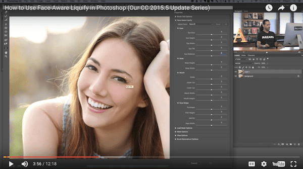
On June 20, 2016, Adobe released the Photoshop CC 2015.5 update. If you’ve made the switch, then you’re already aware of the two newest features that came along with it: Face-Aware Liquify and Content-Aware Crop.
The Face-Aware Liquify feature is an upgrade to Photoshop’s Liquify filter. Using facial recognition software, the liquify functionality pertains only to the face. It allows designers to enhance the photo subject’s facial features or to manipulate them for an exaggerated or abstract artistic effect.
Watch the Photoshop Tutorial (Run Time: 12:18)
Content-Aware Crop
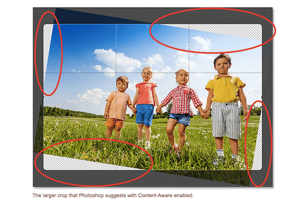
With minimalist design all the rage these days, it’s important to create balance in imagery. You must also utilize just the right amount of white space. However, photos don’t always have that perfect spacing or balance built into them. You can use the standard crop feature to make an image work for your purposes, but it won’t always do it neatly.
Tired of cropping out people’s limbs? Sick of adding boring white space to an image in order to make it fit? Then this new Photoshop feature is one worth trying. It will help you learn to fill in photos with matching details from the surrounding elements. It also provides you with more flexibility in cropping.
Bokeh Effect

If you’ve ever had to rely on stock photography before, you know how frustrating it can be. Not to mention how time-intensive. Digging through photo after photo in search of that perfect image for your web design can be exhausting. The subject looks great, but the overall photo doesn’t give off the effect you want to convey on your website. This isn’t a strictly stock photography issue either.
For designers looking to bring a sharper focus to the subject of a photograph, a bokeh effect is one way to do that. In essence, it’s a blurring of the background so that everything but the subject remains out of focus. One of the more commonly seen examples of bokeh is the one used in this Photoshop tutorial.
While it’s clear that the background is lit by a number of bulbs, each of them is blurred. This makes where they appear to be random balls of light. This helps to create a softer mood for the overall photo.
Watch or Read the Photoshop Tutorial (Run Time: 7:49)
Dispersion Effect
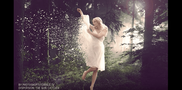
Even though web design continues to move toward hero images and minimalistic design, this doesn’t change the fact that movement still intrigues and helps to engage your site’s visitors.
For designers wanting to retain a flat site design while giving their images more movement, a dispersion effect can be used. By chopping into the subject of a photo and dispersing the small bits outwards, designers can give basic images more life and play into the overall mood of the website better.
Watch the Photoshop Tutorial (Run Time: 12:29)
Motion Photo Effect
The motion photo effect is a combination of bokeh and dispersion. This brings focus to a photo’s subject and movement to the photo as a whole.
This is an important effect for any designer to master. Why? Because motion is so integral in capturing your website visitors’ attention. Plus, it can convey a lot about what’s going on in a photo,
Comic Bookify
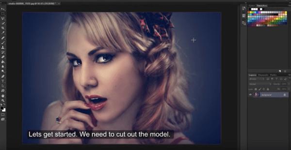
Captain America, Suicide Squad, Deadpool, Batman v Superman, The Walking Dead, The Flash. 2016 has definitely been the year of the comic book-to-movie/TV adaptation.
What better way to sync your brand up with what’s trending in pop culture than by applying a retro, comic book-like style to your site’s design?
Watch the Photoshop Tutorial (Run Time: 7:10)
Double Exposure
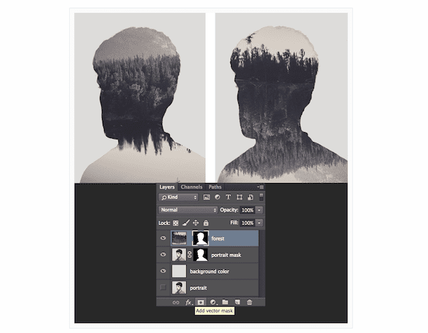
Developing websites can sometimes be a tricky balancing act. You want to include attention-grabbing imagery, but you don’t want to take any of the focus away from your content. Without that story, how will visitors know what you do or why they should relate?
Some images are innately imbued with a story. Just one look and visitors to the site will know what you’re trying to say without having to read anything. Double exposure images can seamlessly merge two distinct yet related images into one. This essentially presents visitors with a particular mood or better understanding of the subject.
Day into Night
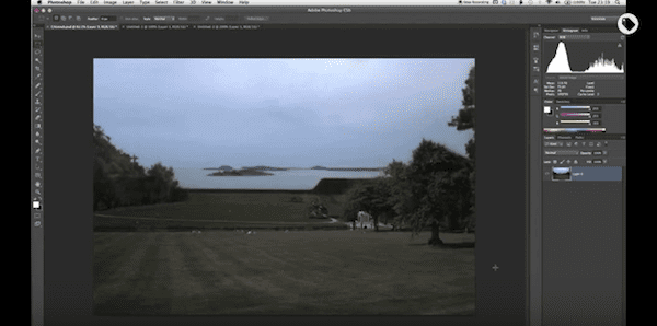
One of the great things about Photoshop is that it gives web designers more power over the images they’re given. Let’s say your team conducted a photo shoot during the day or just couldn’t get the right kind of shots they needed at night because it was raining.
With Photoshop, there should be no need for reshoots. If the photos you want to include in your site’s design call for a nighttime shot, you can easily adjust the exposure to achieve that effect.
Watch the Photoshop Tutorial (Run Time: 4:45)
Photorealistic Icons
![]()
“The devil is in the detail” is one of those phrases every web designer should keep in the back of their mind at all times. And when it comes to the details that make up a site’s design, there’s no better place to start than with the icons.
Hero images and calls-to-action tend to get the most attention but that doesn’t always have to be the case. Whether it be the favicon, loose elemental icons, or even a mascot icon that guides visitors throughout the site, these design elements don’t need to take a backseat.
Your website should tell a singular story. It should have one cohesive look that ties it all together. So rather than allow your icons to go flat and get lost in the design, give them an extra pop by applying a realistic effect to them.
Dramatic Shadows
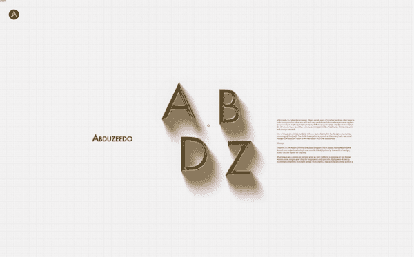
Even if a site’s design calls for minimalistic styling, you can still add a touch of flare and extra depth to the typography and basic objects. This is especially the case if they’re the only elements on a page.
This is a very simple Photoshop tutorial. Yet it’s an effect that’s really useful for web designers to master if they want to give their text or smaller design elements more pop.
Text + Photo Merge
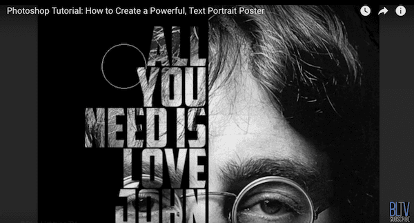
With social media such a powerful force in a brand’s marketing arsenal, it makes sense that the lines between collateral and social media blur. This includes your website, by the way.
Memes are a great example of this. You take an image and place relevant text on top of or around it. That’s really no different than what is done in most hero images. So why not take it to the next level and create an effect that merges your hero messaging and photo in a unique way?
Watch the Photoshop Tutorial (Run Time: 11:06)
Text + Background Merge
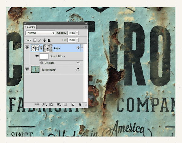
Thanks to Photoshop, web designers can apply some really cool tricks to give the content of their website extra personality. In this Photoshop tutorial, a logo is merged with an aged and textured background. However, this guide could be used for any sort of text-and-complicated-background layering effect.
Logo + Image Merge
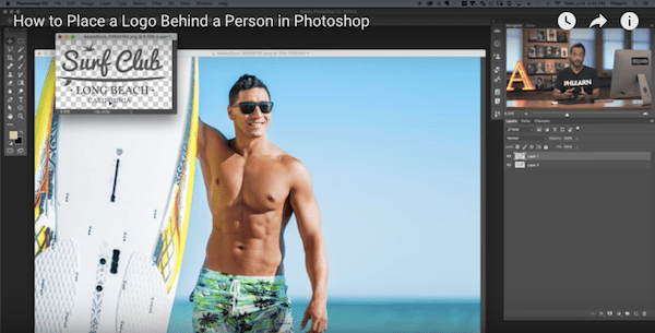
While the two Photoshop tutorials above focus on how to merge text with an image, this one focuses on how to layer a logo with an image. This may not be something commonly used in web design since the logo is ever-present at the top of the web page. But it will definitely come in handy for e-commerce websites looking to fuse their brand identity with product images.
Watch the Photoshop Tutorial (Run Time: 11:06)
Wrapping Up
I hope you found a tutorial or two from the list above that you can use on a future project or that inspired you to try something new. If you’re a Divi or Extra user you may also want to check out a post we published during the Divi 100 Marathon called 5 Ways to Get Creative with Divi Image Asset Preparation in Photoshop for even more great tips and tricks.
Now over to you: What design trick have you learned from a Photoshop tutorial that leveled up your design game?
Article thumbnail image by venimo / Shutterstock.com




Some nice effects here.
Many will also work in traditional print applications as well as web.
Thank you.
I could see myself working dramatic “shadows” into my future website concepts – a few of the tutorials do peak my interest (since I’m pretty new to the design game).
Gimp (and/or Inkscape) tutorials would be cool. Some of us are on Linux machines. 🙂
Great tutorials Suzanne. Thanks for sharing with us.
Great tutorial. Learn many things from the post. Try to post few more Photoshop tutorials regularly.
Wow.. great TUTS.. thanks for sharing.
i am a Photoshop Designer so i think this article specially for me to make my design more effective in my blog.
Thanks. 🙂
Great comments and resource – Thanks for sharing !
Awesome collection of ressources! I’ll be sure to check them out when I have time 🙂
Thanks so much for tutorials is very useful for those who use this software!
Cool tips, thanks! Great Photoshop plug, too. Now for the wallet-challenged, like me, why not try them with Gimp (the open-source version of Photoshop)?
These are good Photoshop tutorials. I have already watched some of these tutorials.
Thanks Suzanne for taking the time to compile this set of Photoshop Tuts, they’re going to be very useful indeed. I already use some of these effects but now I have some new skills to master! Excellent!
For a newbie to web design, which Photoshop features and skills are the most important or should be learned to start producing crisp and polished sites?
Hi Vivian, if you’re looking for a solid base to work from, check out this post on Divi image prep: https://www.elegantthemes.com/blog/divi-resources/5-ways-to-get-creative-with-divi-image-asset-preparation-in-photoshop. This’ll give you a good primer on how to create high-quality imagery for your site. (Then you can start playing around with tutorials!)
Thanks Suzanne! Will be going through many of these to refresh my skills. Great collection!
Suzanne,
Definitely some learning opportunities here. Thanks very much.
I have been a fan of Aaron from Phlearn for years. He’s funny but also very clever with PS. Some of his techniques are incredibly sophisticated.
Cheers,
John.
Thank you for such quality posts!
Awesome – you lot always seem to deliver an article just when I need it.
Cheers
These tutorials are great! Thank you!
Little Linda Pinda Designs
Great collection of resources. Thank you!
Did you actually check the resources? Some of them “do not exist”.
Thanks, Ben! Let me know if you’ve had a chance to try out any of these and what you think!
Great list! Question/feature request about images: I love Divi but one of Divi’s competitors now offers a feature where uploaded hi rez images are automatically turned into lower rez/scaled images optimized for phone, tablet, desktop, etc. and displayed automatically without any tweaking from the user. Is this something in the works for Divi?
I know tinyjpg has a free plug in you can install.