The money is in the list.
That is what you’ll often read when it comes to the importance of building your email list. It may sound like a crazy notion, but it’s really not. People today are busy and distracted by life and everything that it throws at them. Some could come to your site once, love what they read, and then leave and never come back because they forgot about you.
Sure, your content was helpful and rocked their world, but that’s not enough to get them to come back. The best way to get those viewers to come back and to keep coming back is to remind them to do that, and you can only do that a few ways. The number one way?
Email marketing and the list you create!
Methods For Capturing More Email Subscribers

Picture by Bloomua via Shutterstock
Never Underestimate The Power Of Amazing Content
First things first: your content.
If you’re content stinks (for lack of a better word), then you’re not going to see email sign-ups no matter how many of the methods you implement from this list. Therefore, your focus should always be on your content first and everything can follow after that.
Again, high-quality content is numero uno. And as a note, amazing content doesn’t always have to be long-form to be great.
I recently wrote a post on the blog where I talked about SEO and what High-Quality Content can be and what it means. If you need a bit of help understanding exactly how to create solid SEO content, then check out that post to get some good ideas and help get you started.
Now on to the good stuff!
Use a Popup, Popup Bars, and Fly-Ins
Yes, I know — these things can be extremely irritating, but they’re effective when used correctly. Now, should you use all of these at the same time and bombard your audience with all these distracting and frustrating elements? Well, no, obviously you don’t want to do that either.
You can think of these opt-in forms as the seasoning to the main dish that is on your website. There is almost nothing more revolting than going to eat a meal and having your taste buds beat to death by the overuse of something like salt — belch!
Similarly, you would not want to leave a bad taste in the mouth of your viewers by jumping them with a whole bunch of these popup opt-in forms. The point is that you can use them and they work, but don’t overdo it.

Here’s an example of a floating popup bar that I use on my blog
Start with something less in your face like a popup bar plugin (Hellobar or AddThis are some nice free options for these) and then try a popup like Ninja Popups or Optin Monster to see how that does for you. All of these plugins offer different features and options that make it easy to use or exclude them from your pages.
Here is a nice case study of how Buffer boosted their signups utilizing some of these things tactics and plugins:
Another important thing to remember is to make sure to use the double opt-in feature in these apps in order to make sure you’re collecting the sign-ups that really count. We have some helpful plugin reviews about opt-in form plugins and popup plugins that are worth you looking into:
- The Best WordPress Newsletter Optin Plugins To Help you Gain More Subscribers
- The Best WordPress Popup Builder Plugins
Run a Contest
If you’re seeing a lot of traffic to your site with a low bounce rate, but you haven’t seen a lot of sign-ups lately, then running a contest is a great way to gain email subscribers.
Not only do these give you the chance to largely increase your subscription list, but they also give you the opportunity to grow your social following and connect with other businesses who want a way to get their product out to the right audience. You increase your sign-ups, your audience has a chance to win something that they want, and if you are giving away a product from another business, then you have the chance to forge a good connection there too.
Brenda wrote a nice post about how to run a contest on WordPress and lists some nice plugins for doing just that. I’ve also recently tried out a newer plugin and software called Gleam that made it super easy to start and run a contest.
Offer a Free Opt-In
This can be highly effective, but again — you have to do it right. Offering an opt-in like, “Sign up for our newsletter and receive the Ultimate list for…” has worked well for many online entrepreneurs who want to steadily grow their email list, but that’s because they created something that resonated with their audience. Just look at these examples:
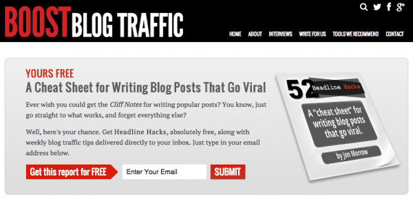
Example of Free Opt-In on Boost Blog Traffic
Jon Morrow offers a seriously cool and free PDF download that you get simply by signing up to his email list.
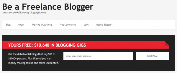
Example of free opt-in on Be A Freelance Blogger
Sophie Lizard does something similar by offering a catchy e-book to an audience of people who come to her site looking to make money from blogging. (Relevancy is important too.)
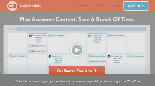
The guys at Co-Schedule offer a free trial of their WordPress plugin in exchange for your name and email address.
Hubspot is another great example of this. They give away hundreds of e-books, among other things, that you can download and learn a lot from. I could go on and on with lists of ideas, but I think you get the point.
The one nice thing about opt-ins where newbies often go wrong is that they don’t have to be extensive. If you planned well enough and came up with an idea that you know would resonate with your audience, then you could create your free giveaway in a few hours and launch it within the week.
You get an email subscriber and your viewer gets the freebie that they wanted — nice, right?
Another sort of new tactic that works, but one that many people haven’t been using, is the Scrolling Sidebar. That is where a section of the sidebar scrolls with the page so that it never leaves the sight of the viewer. This can be a nice way to get your viewers’ attention without throwing something up on the screen that could distract them from your content.
WP Beginner has a nice article about how to set this up on your site. You can find the link below:
Use Calls To Action That Lead To A Well Designed Landing Page
Calls To Action are a powerful tactic that you can use in every blog post you create from here on out or add to your homepage to help steadily increase your newsletter sign-ups. The greatest power comes from these when those CTAs lead to an awesome landing or squeeze page that further convinces people to give you their email address.
CTAs come in a few shapes and sizes, and there are plenty of ways to execute them. The Opt-In examples I gave above are also considered Calls To Action because they grab attention and prompt responses. Obviously, using CTA’s with a landing page is something that works with so many big-name people and companies using them, but there is a sort of art to it.
If you’re new to this idea and want to learn how to better capture viewers’ attention and sign-ups via this method (you really should), then here are some links to help get you started:
- Resistance Is Futile: 17 Calls To Action You Can’t Help But Click | These examples are based on the homepages of popular websites.
- Free e-book: Turn Strangers Into Supporters with Effective Calls-to-Action | Funny thing about this book is not only do you come to this page after you click on an effective CTA, but it also brings you to this landing page where you opt-in to download the book by handing over your email and other details.
All of these links come from HubSpot because they have a lot to offer on the topic and you can learn so much from their e-books. A simple Google Search will also help you find some great information on the topic of CTAs.
Did you know that you can get people to sign up for your email from your Social Media platforms? It’s true, and many of the popular email campaign services out there offer a feature that allows you to do this.
For example, MailChimp has an application where you can connect your sign-up form to Facebook. You can also use Twitter Cards in WordPress so that you can tweet out your site’s sign-up page and get your social following to follow back to the page and subscribe.
Wrapping It Up
Email subscriptions are important — there’s no really arguing with that fact. They help you to get your audience to keep coming back, they help generate revenue, and they connect you to your readers. That is all majorly important in terms of running a successful, money-generating online business.
As I mentioned above, your focus should start with your content and then you can go from there. These methods are all great ways to grab a viewer’s attention, but let’s not go crazy and implement everything all at once. You don’t like being bombarded by a gazillion popup ads, so don’t do it to your viewers.
Balancing popups with CTAs and other methods can take some time to get right, but don’t hold back from trying to grow your subscription list either. Have you guys used any of the methods listed above? Did something work? Did it not? What other methods would you include in the list? Let us know below.



What plugin are you guys using at ET to generate the pop up in the corner?
Good article.. Greatly highlights the importance of email subscribers. Popup are worst thing if they take the whole screen.
Floating widgets at the top or at side are better option.. though they move with screen but dont disturb the content, I would put the same on my site and recommend to others too
Okay,
I am way off subject here.
I saw a referral for hostgator (you’re an affiliate I am assuming)
naturally I checked to see who you are hosted by and it says GoogleCloud. Do you have any posts on Google Cloud? If not, you should consider doing one. I see your alexa and google rating is pretty high which is good, perhaps you can add in also the average cost. I see they have a $300 credit for two months.. .
You all are cruel with the comments!
Give Elegant Themes a break here. Obviously you get something out of these blogs if you are here reading.
A while ago I was lurking here and I got a pop up asking me if I wanted to “test drive” a theme.. So I signed up and guess what? Still waiting to test drive a theme.. LOL!
I belong to several theme clubs and usually buy a package after trying one..
I’m getting really tired of seeing the popups on THIS site, given that I subscribed long ago.
Funny how the article mentions that you should use Pop-Ups that are not annoying when Elegant Themes’ own blog is using one of the most obnoxious Pop-Ups that I’ve ever seen…
You can’t click it away with Esc and it doesn’t remember that you’ve clicked it away, so I have to do it day after day when I visit this blog. Those are, in my humble opinion, MUST HAVES for a Pop-Up. This is the only site I regularly visit that I let go away with it… if it were any other website, I would have long stopped bye since it’s simply too annoying (and, quite frankly, embarassing. This company is producing so many good things, why do they not get this little thing right?!).
I’m using the Subscribe Widget by GetSiteControl.com. You can use custom colors, etc. and you can also setup the popup to fade right or left at the bottom of the screen when e.g. the visitor scrolls down on a page (that means that they have finished reading the article). You can also target the popup – e.g. to make it show only on some of the pages of your website.
I would also welcome such plugin in the ElegantTheme’s plugins collection. It would be a great addition to the membership value.
Great (and timely) post. Not only the HOW part, but pointing out WHY. Sure “Everyone’s doing it” and it makes us feel popular, but reminding us of the real value of building that list– as a start of a relationship–now that is a good reason to capture those emails! Thanks.
“If *your* content stinks…” ha ha, maybe the worst place in an article to use the wrong word.
Otherwise, thanks very much! This is very timely for me as I am revitalizing a theme and plugin review site. Great info, good job. 🙂
Grear posr. Just in time. I just started today working on how I can capture new leads. I decided to use ninja pop up. And I have now turn it to a squeeze optin. If you don’t enter your email you won’t read my stuff. Ethical bribe. Exchange is no robbery. Plus I am paying for you to be on my list. And giving you good content so I am lije if you wouldn’t give me your email: bye bye
Also important to to make sure your CTAs don’t pop up for folks who got to your blog/site from your email newsletter: They are already subscribers! I know Elegant Themes already has this issue at least for one subscriber, but its support team said they have changes in the coming months that will take care of that. It might be nice if you share the solution with other readers of this blog. Thanks!
I agree – I’m looking for a solution on how to not show the popup to the readers who are already subscribed to my blog.
Wow, thanks for some alternatives that are NOT popups or flyins or whatever annoying kinds of things. I have made a pledge not to use those and I’m sticking to it, no matter how much potential money I will not make as a result. Good to know there are other ways. This sidebar thing looks interesting.
This is what I am trying to build now. After getting the email addresses, how can I manage the email users? I do want some posts sent to their email, but some posts do not. Instead of telling the system everytime, do I have a better way to do it?
disable your plug in for the posts you don’t want to show when posting?
You could create a category or a tag that you apply to only certain posts that you want to be sent via email, and then create an RSS campaign based on the RSS feed for that tag or category. Most email systems such as Mailchimp support RSS campaigns.
Ariel great post on capturing email subscribers. Very informative good stuff.
Hi Ariel,
I use optinmonster to generate a popup to get email subscribers. I also give a away an ebook as incentive for signing up. This method has been extremely helpful in growing my list.
As you stated, it takes a bit of time and tweaking to get right but it is well worth the effort.
Adam