

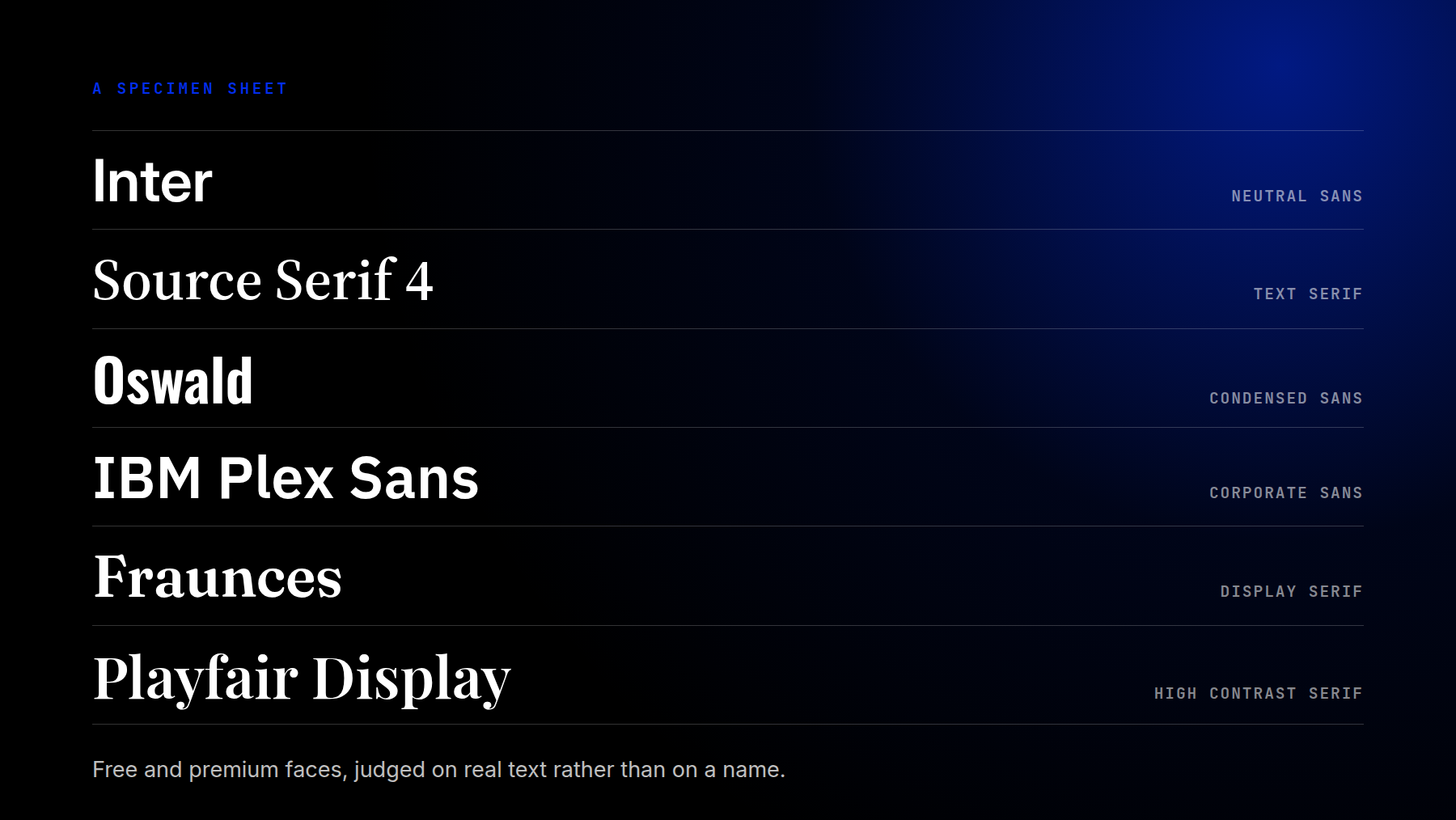
A professional font is an oxymoron of sorts. You want it to convey professionalism, dependability, and durability without bringing too much attention to the font itself. We’ve done some digging and found 30 great fonts (most of which are free to use) that will help you achieve a professional look in your industry.
- 1 What Makes A Font Look Professional
-
2
Free Professional Fonts For Websites
- 2.1 1. Inter
- 2.2 2. Oswald
- 2.3 3. Raleway
- 2.4 4. IBM Plex Sans
- 2.5 5. Source Serif 4
- 2.6 6. Roboto Slab
- 2.7 7. Plus Jakarta Sans
- 2.8 8. Noto Sans
- 2.9 9. Libre Franklin
- 2.10 10. Fjalla One
- 2.11 11. Public Sans
- 2.12 12. Catamaran
- 2.13 13. Literata
- 2.14 14. Archivo
- 2.15 15. Fraunces
- 2.16 16. Playfair Display
- 2.17 17. Poiret One
- 2.18 18. Signika
- 2.19 19. Dosis
- 2.20 20. Exo 2
- 2.21 21. Patua One
- 2.22 22. Hammersmith One
- 3 Premium Fonts For Websites
- 4 The Best Fonts For Corporate And Business Websites
- 5 Why Variable Fonts Changed What Professional Looks Like
- 6 How To Use These Fonts On Your Website
- 7 Frequently Asked Questions (FAQs)
- 8 Pick One And Move On
What Makes A Font Look Professional
Nothing about a professional font is decorative. Four things separate the faces that work on a serious website from the ones that only look good in a specimen.
A real weight range. A website needs at least three weights to build a clear hierarchy. A single-weight display face leaves you nothing to contrast against.
Restraint at large sizes. Slanted crossbars, swashes and decorative ligatures work in a logo and get in the way in a navigation bar. Where a face offers a plainer version, use it.
Legibility at small sizes. Most body text on a website is set between 16px and 18px. At that size, a tall x-height and open apertures are what make a font comfortable to read. How it looks at 72px tells you nothing about that.
A license you can hand a client. The free fonts below are all open-licensed, so you can use them on work a client pays you for. The premium ones list their price.
Free Professional Fonts For Websites
All 22 are open-licensed and available through Google Fonts. You can pick them from the font menu in most builders, or download the files and host them on your own server.
1. Inter
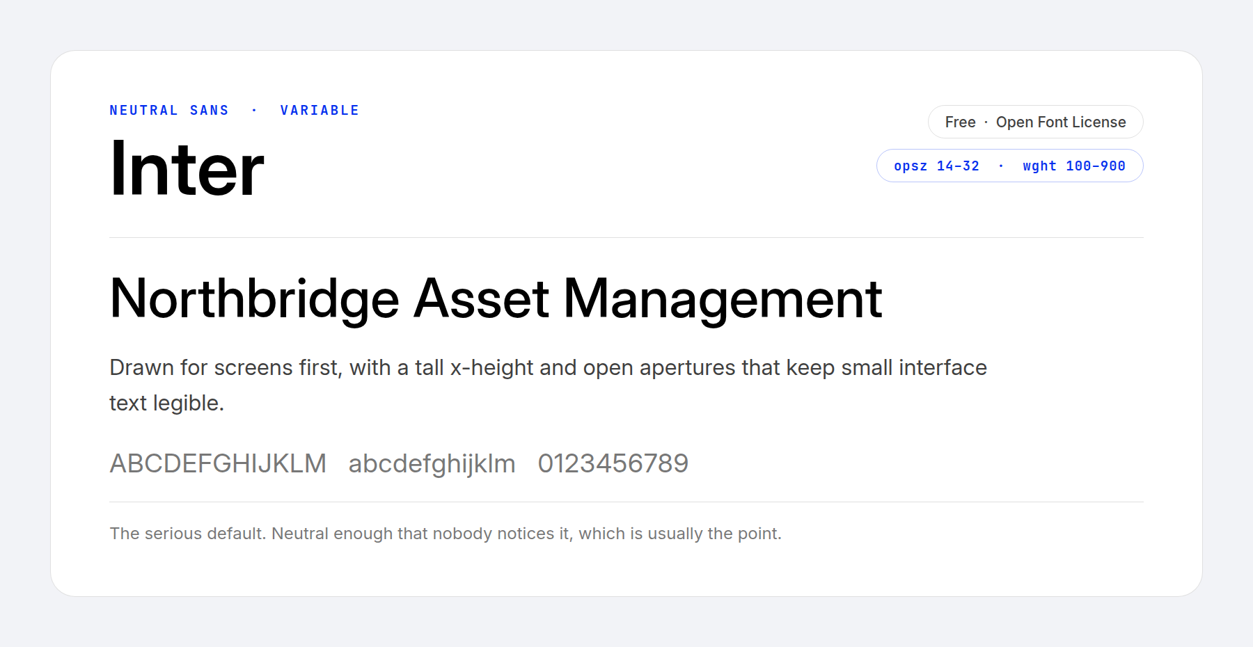
Inter is the closest thing the web has to a default professional typeface. Rasmus Andersson designed it for screens first, with a tall x-height and apertures that stay open at interface sizes.
Inter is neutral enough that readers look at your content instead of your typeface. It runs from hairline to black and carries an optical size axis, so one file covers both a caption and a hero headline.
Price: FREE ǀ More Information
2. Oswald
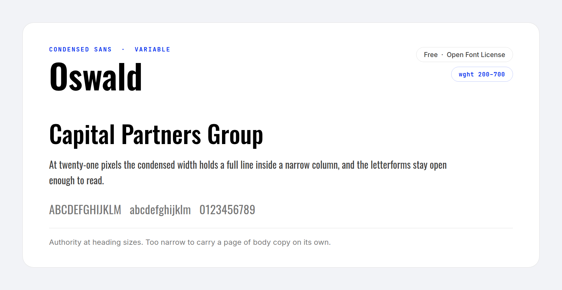
Oswald is a modern take on Alternate Gothic, a typeface first released in 1903 and immortalized on the web through the YouTube logo. Its designers redrew every classic character for digital screens.
Oswald is plain and unfussy, which suits strong headers and logos. The condensed width packs a long headline onto one line, and the weight axis runs from 200 to 700.
Price: FREE ǀ More Information
3. Raleway
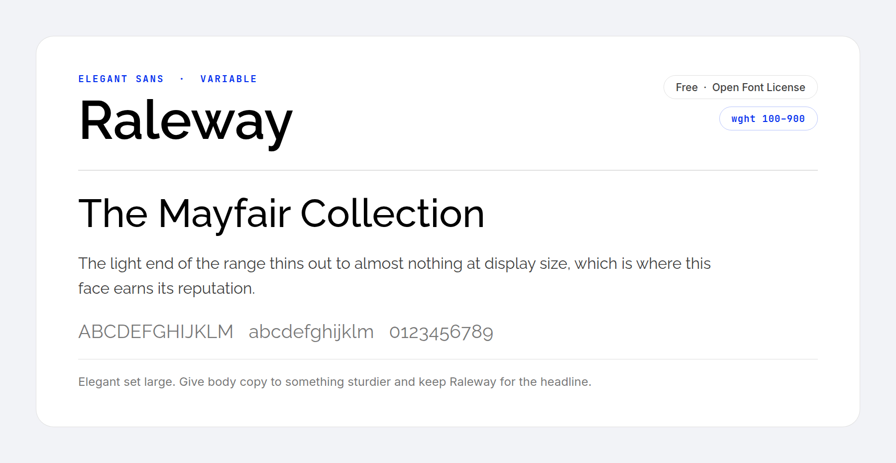
Raleway is a sans-serif built for large sizes, which is to say for headings. It started life as a single thin weight, unsuited to almost anything, and grew into a family that now runs the full 100 to 900 range from one variable file.
The heavier italic styles are sturdy and elegant at once, and they would sit comfortably in the logo of a luxury men’s brand.
Price: FREE ǀ More Information
4. IBM Plex Sans
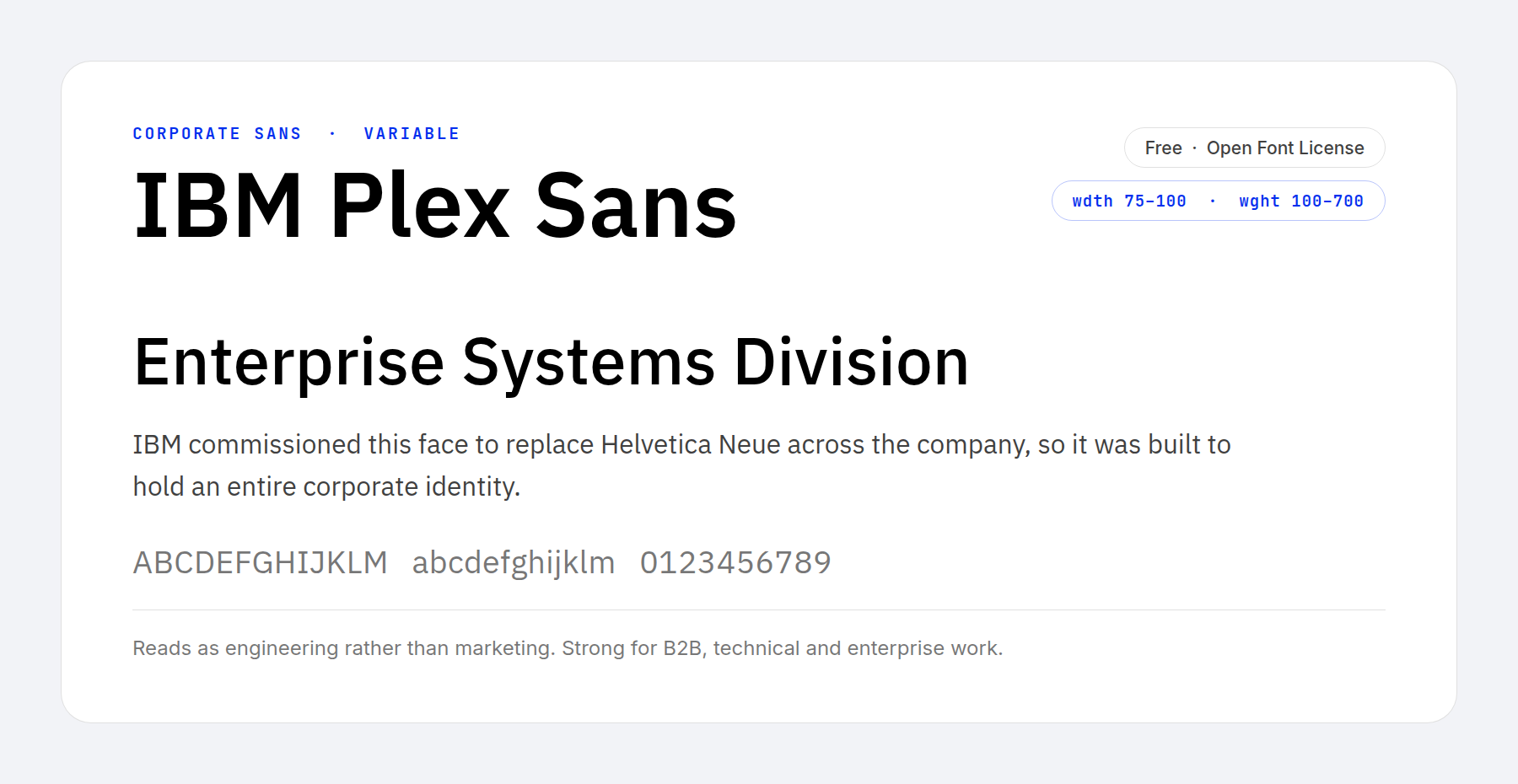
Most free fonts were drawn hoping somebody would use them. IBM Plex Sans was commissioned to replace Helvetica Neue across an entire company, which means it was built to carry a corporate identity end to end and then given away.
It suits technical, enterprise and business-to-business work, where a marketing typeface would undercut the content. A width axis sits alongside the weight axis, so tight interface labels and wide display lines come out of the same file.
Price: FREE ǀ More Information
5. Source Serif 4
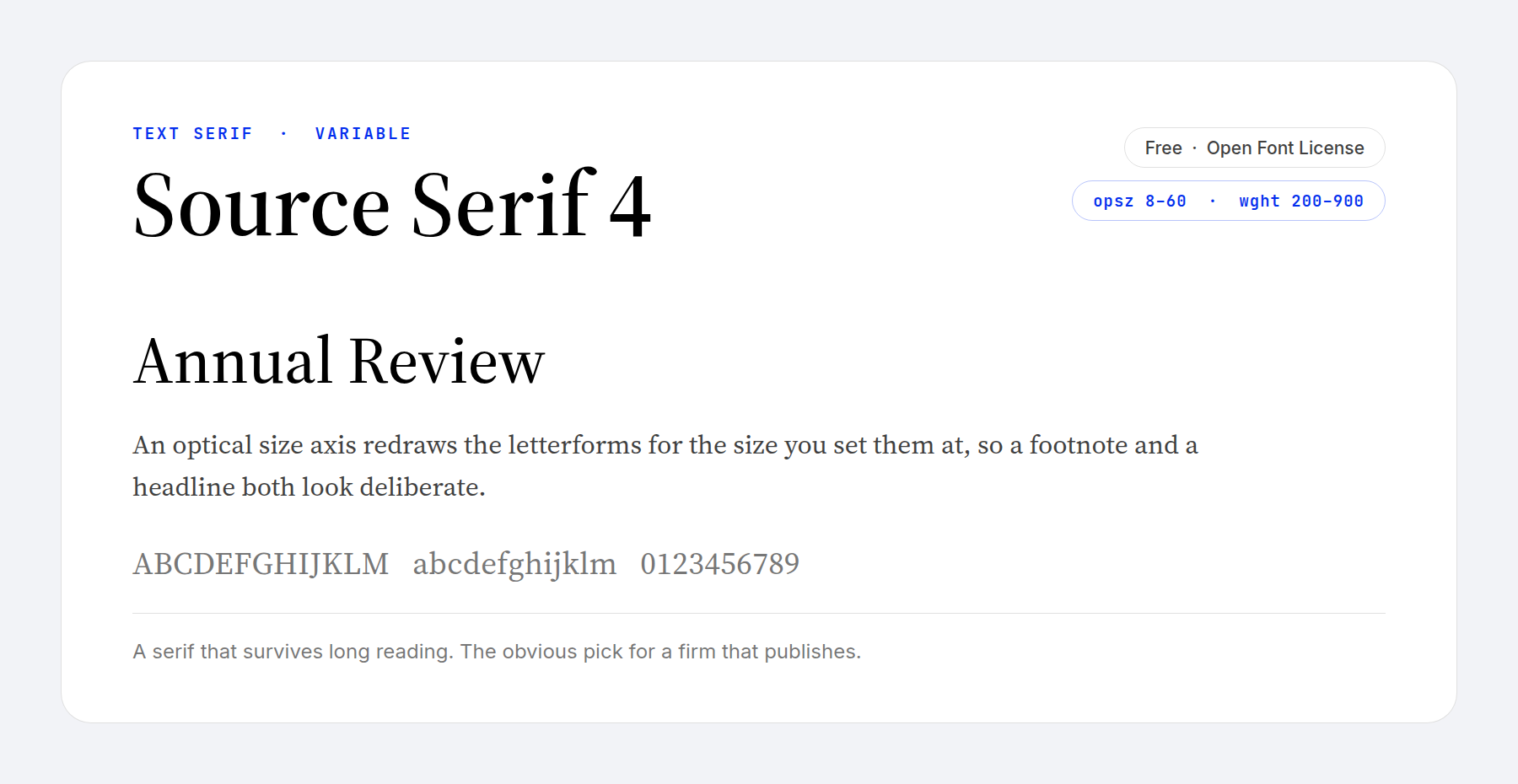
A serif signals seriousness faster than any sans, and Source Serif 4 is the free one that holds up under real reading. Adobe designed it as a text face, so the proportions are settled rather than showy.
Its optical size axis is the part worth learning. The letterforms are redrawn for the size you set them at, so a footnote and a headline both look deliberate instead of scaled. For a firm that publishes anything longer than a landing page, it is the obvious pick.
Price: FREE ǀ More Information
6. Roboto Slab
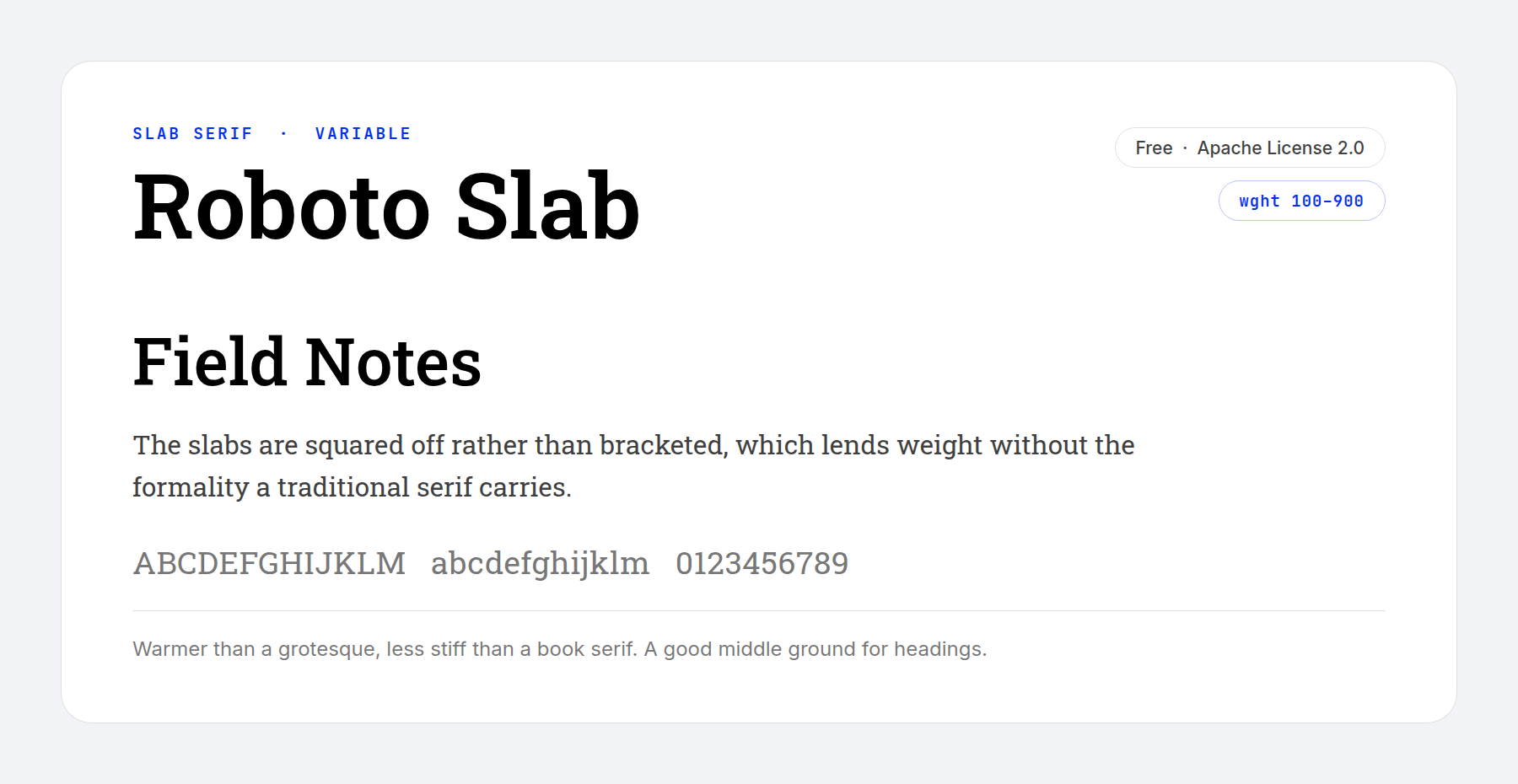
Roboto Slab mixes rigid skeletons with unexpectedly soft curves, and it was drawn to let readers hold a steady pace thanks to the natural width of its characters.
The slabs are squared off rather than bracketed, which gives it weight without the formality a traditional book serif carries. That makes it a useful middle ground for headings on a site that wants to feel established but not stuffy. It carries the Apache license rather than the Open Font License, which changes nothing for a website.
Price: FREE ǀ More Information
7. Plus Jakarta Sans
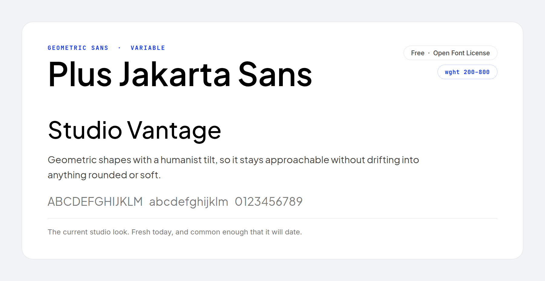
Plus Jakarta Sans is geometric at its base with a humanist tilt laid over it, so the shapes stay approachable without softening into anything rounded or childlike.
A lot of studios pick it when a brief asks for modern and premium in the same sentence. That popularity has a cost. It looks current now, and a site set in it will be dateable later, the same way a geometric sans from a decade ago is dateable now.
Price: FREE ǀ More Information
8. Noto Sans
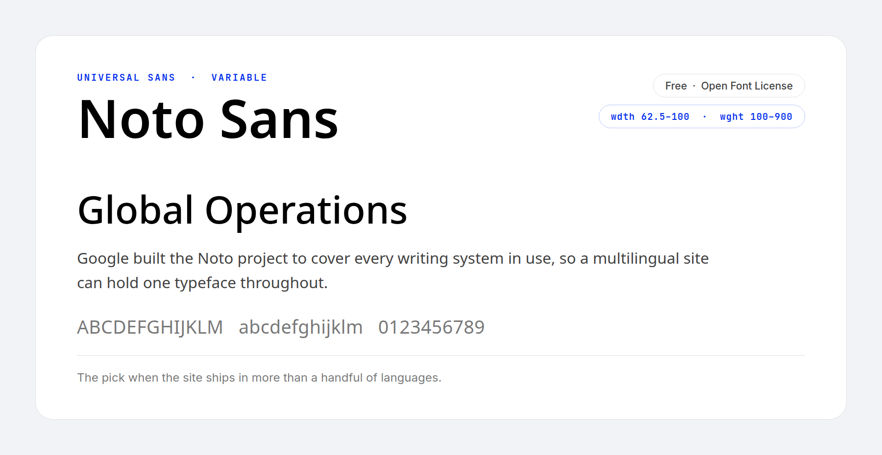
The Noto project exists to cover every writing system in use, so no reader anywhere sees a box where a character should be.
For a site published in more than a handful of languages, that coverage is the reason to use it. One typeface holds the English, the Greek, the Devanagari and the Japanese, and the page keeps its shape across all of them. As a Latin sans it is plain, which suits body text.
Price: FREE ǀ More Information
9. Libre Franklin
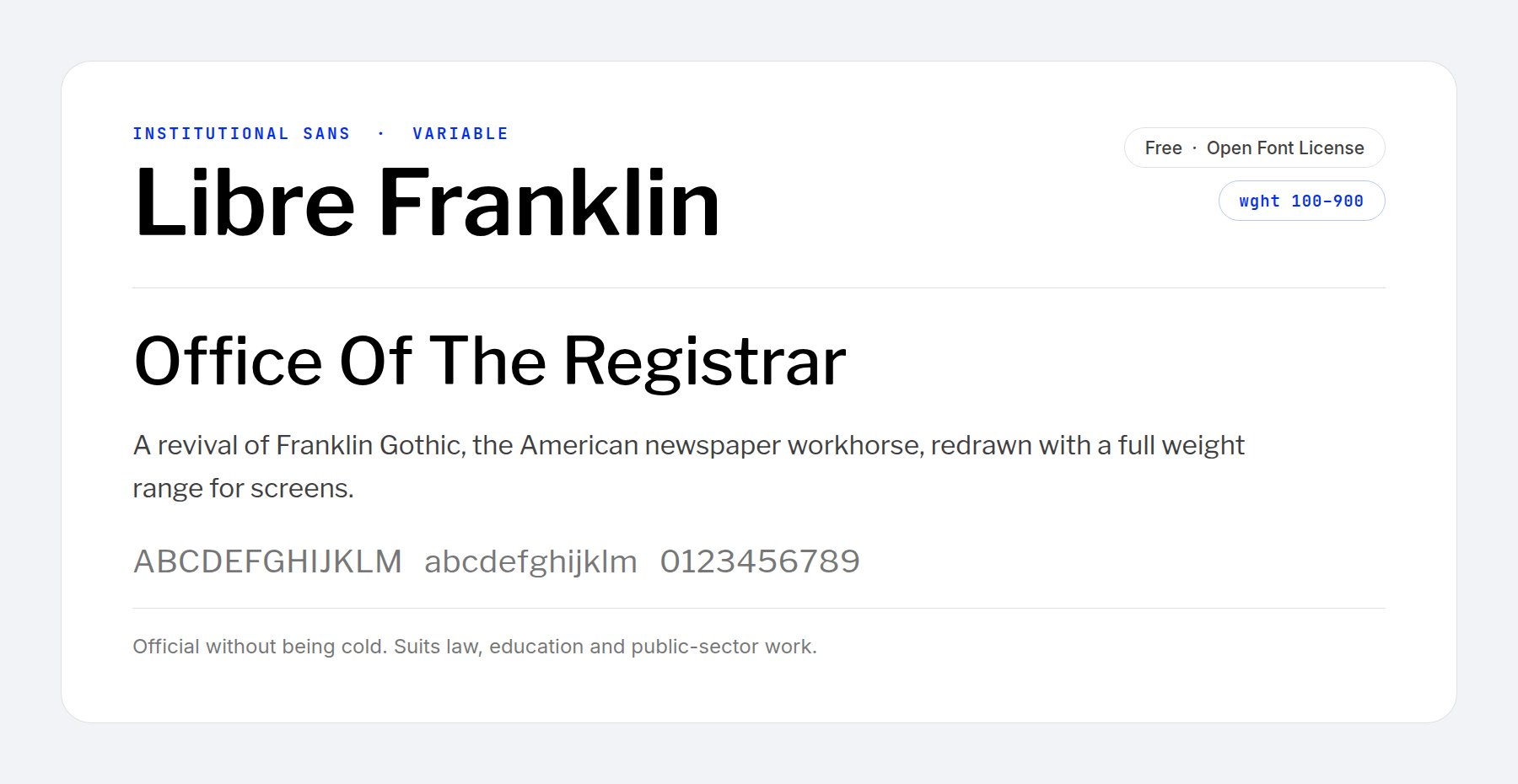
Libre Franklin revives Franklin Gothic, the American newspaper workhorse that set headlines for most of the twentieth century. The revival adds a full weight axis and screen-ready spacing.
It looks official without looking cold. Law firms, universities and public bodies all need type with authority behind it rather than a sales tone, and this is the free face that does it best.
Price: FREE ǀ More Information
10. Fjalla One
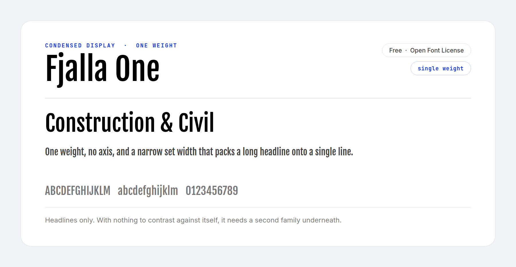
Fjalla One is clean-lined and uniform, with character widths even enough to read pleasantly at most sizes. It was designed for modern screens.
Fjalla One ships a single weight and no axis, so it cannot build a hierarchy by itself. Give it the headlines and give a second family everything underneath.
Price: FREE ǀ More Information
11. Public Sans
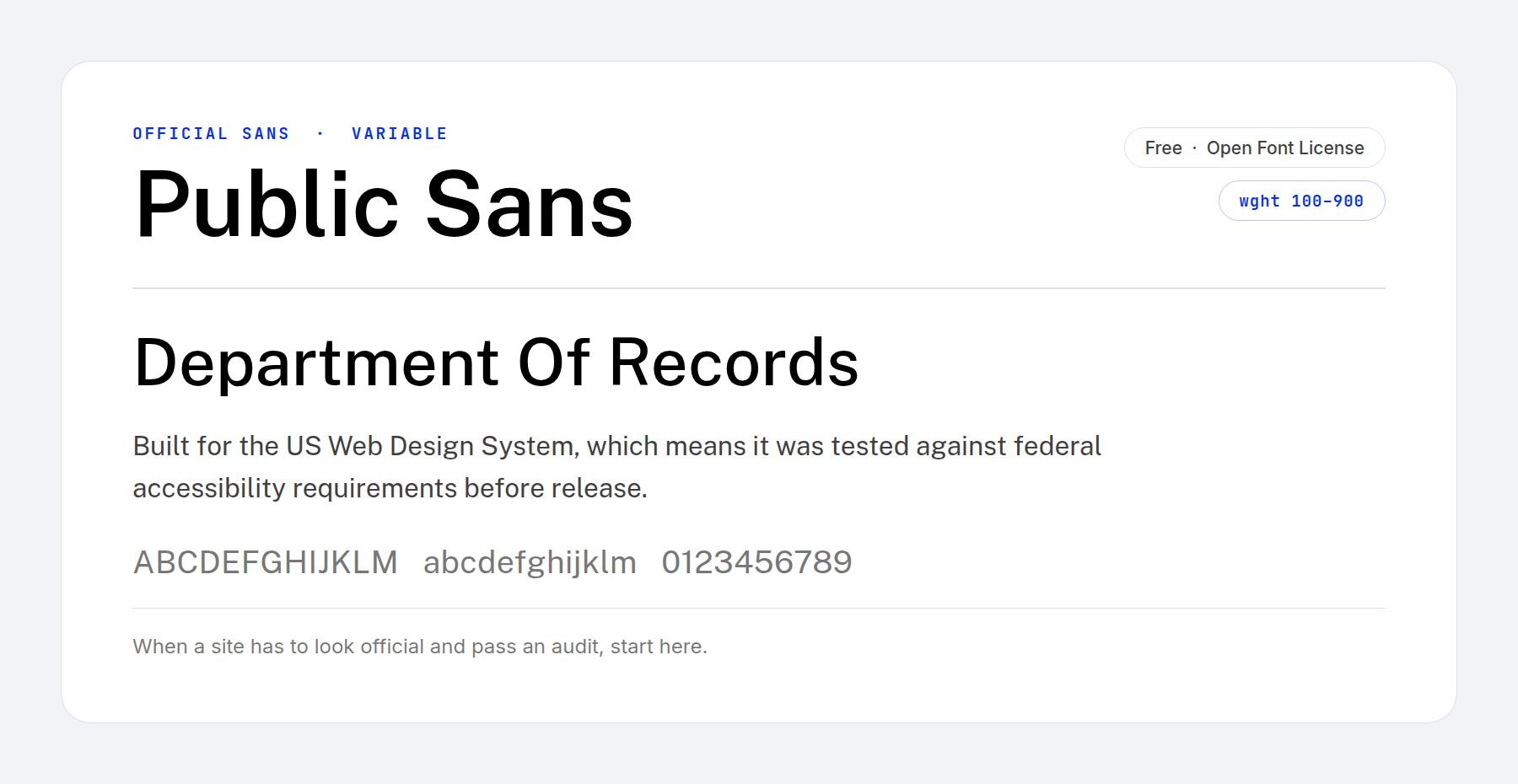
Public Sans was built for the US Web Design System, the standard federal agencies build their sites against. It had to clear accessibility requirements before anybody shipped it.
When a site has to look official and pass an accessibility audit, starting from a typeface somebody already tested against contrast and legibility rules saves an argument later.
Price: FREE ǀ More Information
12. Catamaran
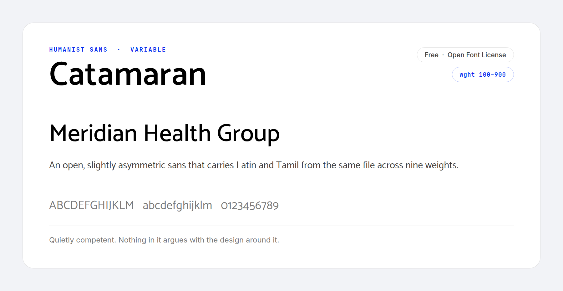
Pria Ravichandran designed Catamaran for screens, and it covers Latin and Tamil from one file. Nine weights follow classic typographic convention, with a few unusual details such as the asymmetrical legs.
The result is competent and undemanding. It stays out of the way of the design around it.
Price: FREE ǀ More Information
13. Literata
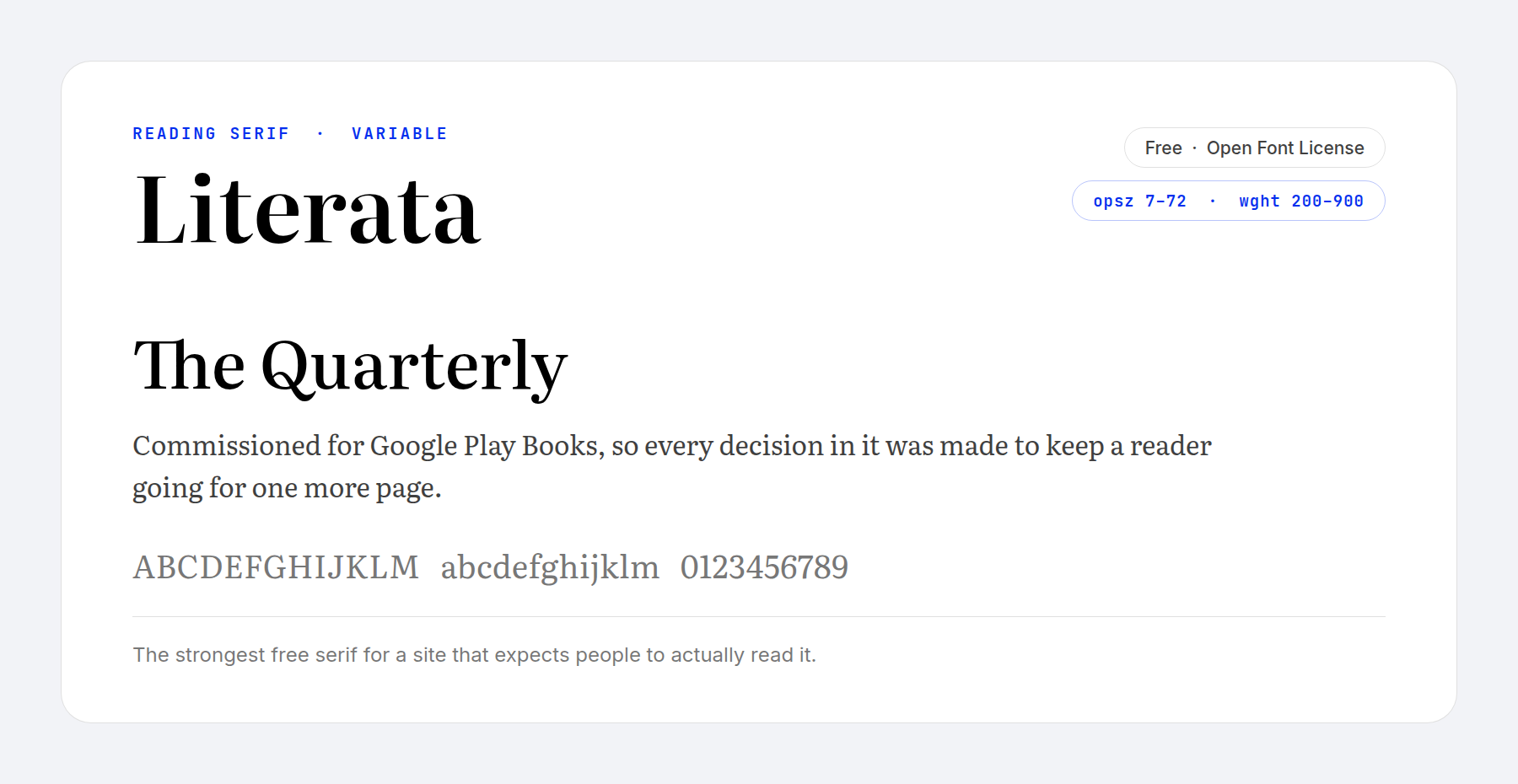
Google commissioned Literata for Play Books, so it was built for sustained reading rather than for display.
On a website that means long-form content that people finish. Case studies, reports, documentation and anything else where the measure of success is whether somebody read to the bottom. An optical size axis runs from 7 to 72, so the same file handles a caption and a chapter opener.
Price: FREE ǀ More Information
14. Archivo
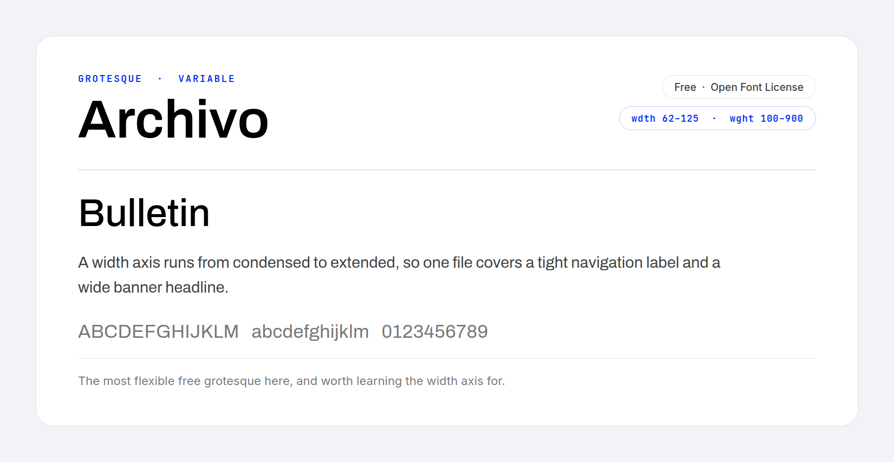
Archivo is a grotesque in the American newspaper tradition, and it carries a width axis as well as a weight one. The width runs from 62 to 125.
Few free fonts carry a width axis. One file gives you a condensed navigation label and an extended banner headline in the same typeface, with no second download and no stretching in CSS.
Price: FREE ǀ More Information
15. Fraunces
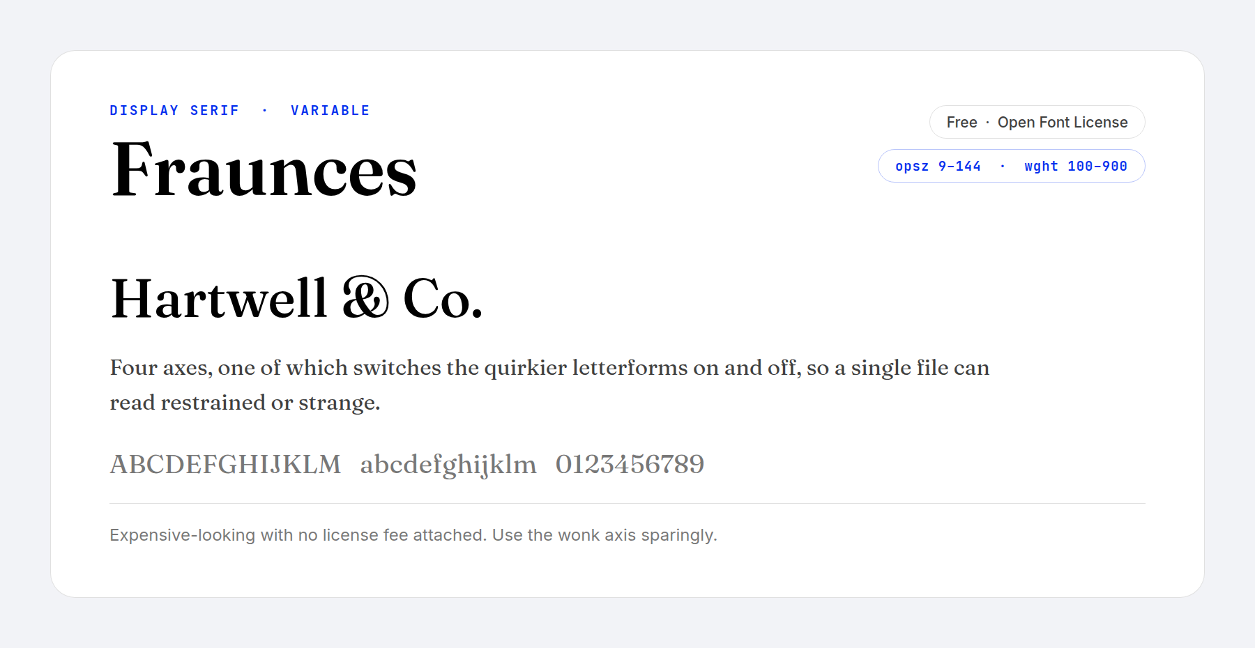
Fraunces gives you a premium display serif without a license fee. It draws on the soft, wonky display serifs of the late nineteenth century and rebuilds them with four axes.
Two of those axes are unusual. One softens the terminals, and one switches the stranger letterforms in and out, so one file suits a law firm at one setting and a record label at another. Use the second one sparingly.
Price: FREE ǀ More Information
16. Playfair Display
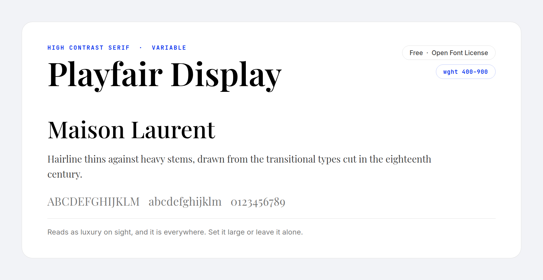
Playfair Display sets hairline thins against heavy stems, a contrast borrowed from the transitional types cut in the eighteenth century. The effect is expensive and immediate.
Two warnings come with that. The contrast collapses below about 20px, so this is a headline face and never a body one. And it is everywhere, which blunts the effect. Set it large, set it rarely, and it still works.
Price: FREE ǀ More Information
17. Poiret One
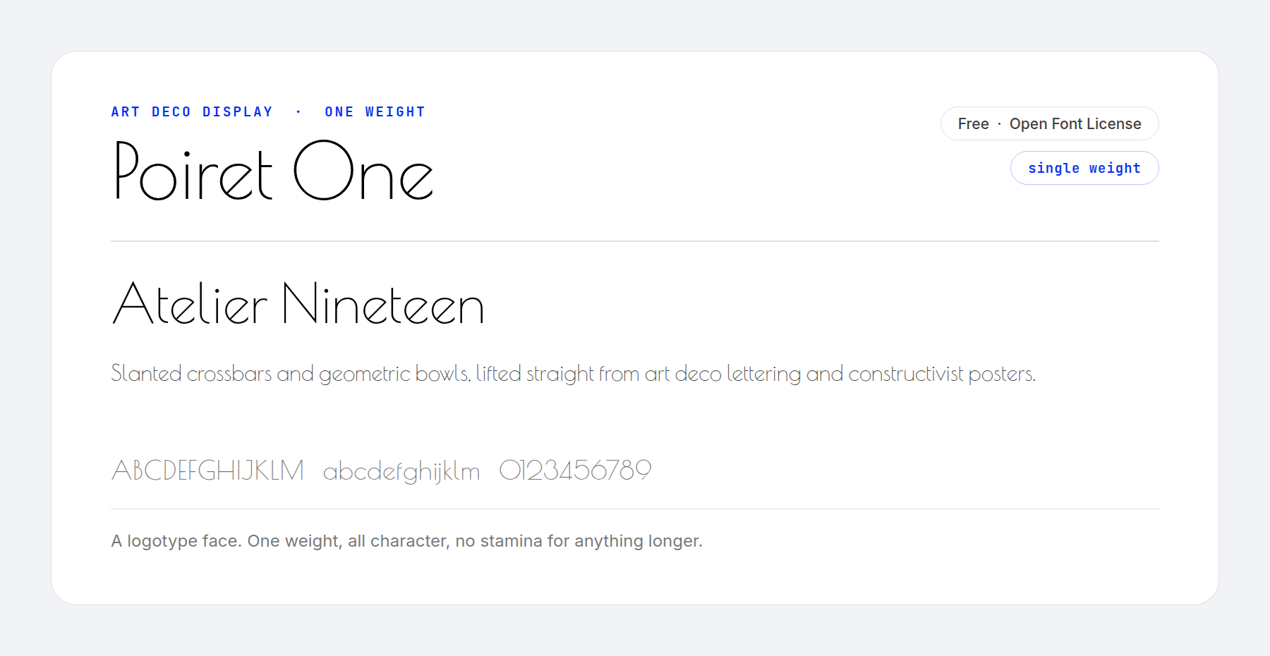
Poiret One offers a fresh geometric design, recognizable at a glance by its slanted crossbars. Its creator names art deco and constructivism as the sources, and both read clearly in the letterforms.
That makes it an obvious choice for logos, titles and headlines, anywhere a spotlight falls on its sleek lines. It is also a single weight with no axis, so treat it as a logotype face and nothing more.
Price: FREE ǀ More Information
18. Signika
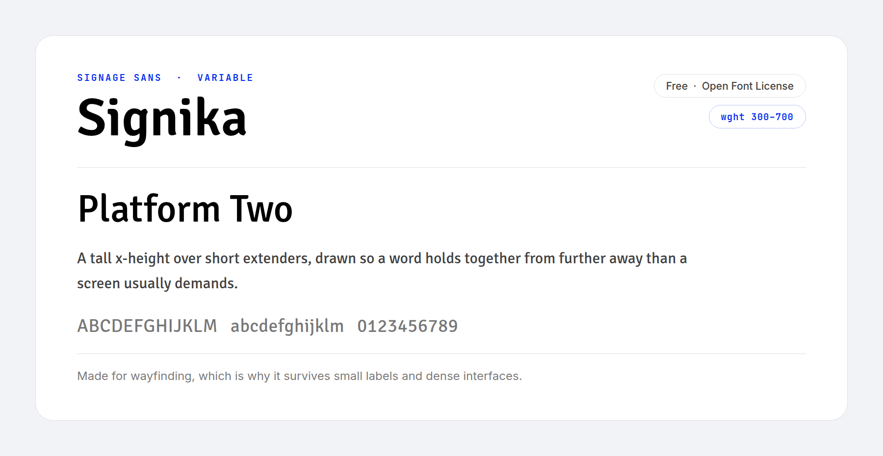
Signika is a gentle sans-serif for places where readability comes first. A striking x-height keeps a word legible from further away than a screen usually demands, which is why it also holds up in print.
Wayfinding was the original brief, and that clarity carries straight over to dense interfaces and small labels. Use it for dashboards, tables and form fields.
Price: FREE ǀ More Information
19. Dosis
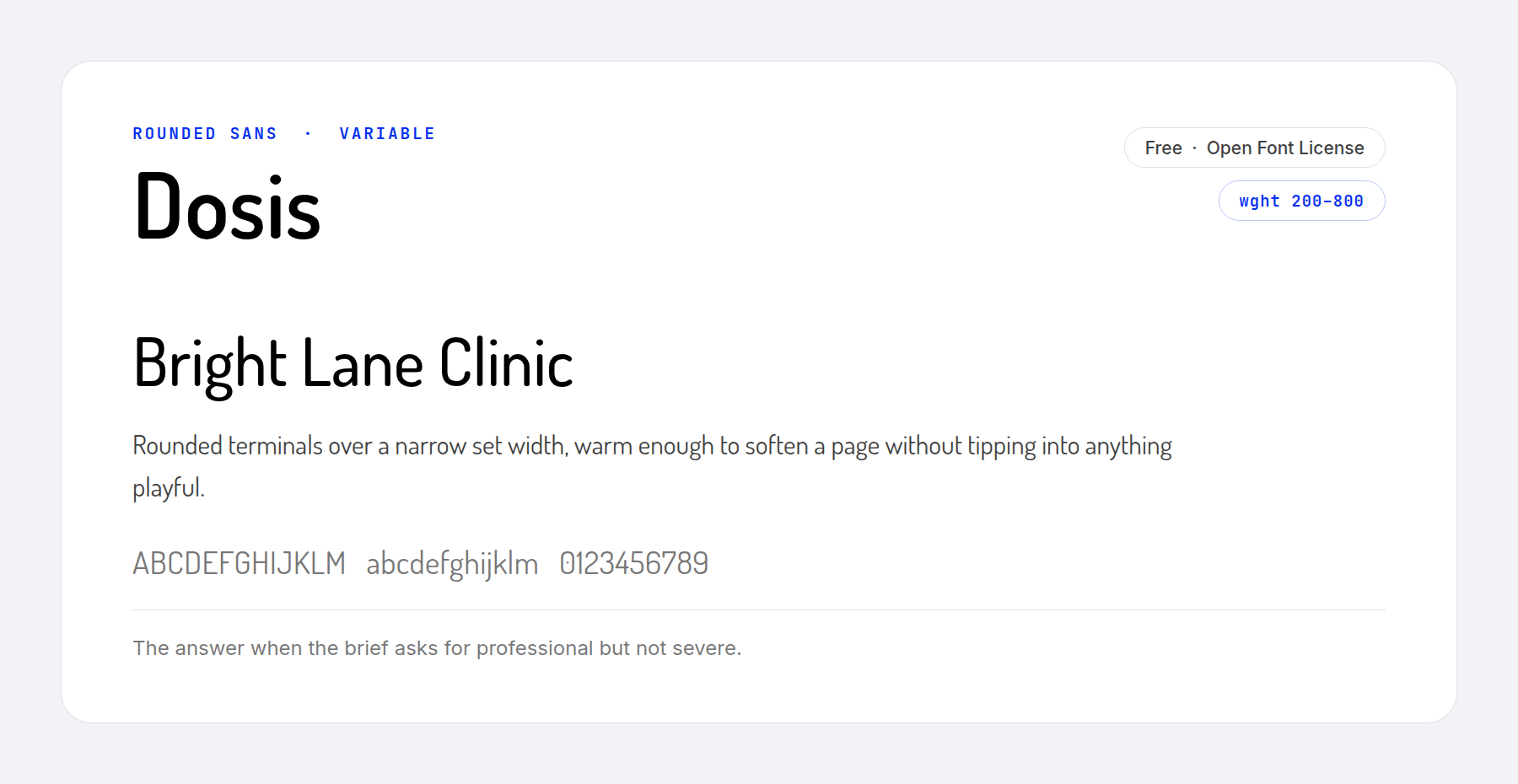
Dosis pairs soft curves with heavy stems, and the combination is friendly without being casual. It suits a professional site that wants some warmth.
Clinics, schools, charities and wellness brands usually ask for professional but not severe. Dosis fits that, and its weight axis runs far enough to build a proper hierarchy.
Price: FREE ǀ More Information
20. Exo 2
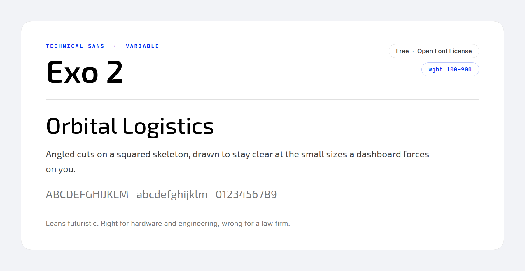
Exo 2 takes a futuristic idea and aims it at a mix of high-tech and elegance. Angled cuts sit on a slightly squared skeleton, and the whole thing was tuned to hold together at small sizes.
That tuning makes it a sound option for mobile displays and for the cramped corners of a dashboard. Its futuristic character does restrict it. It fits hardware, engineering and anything in motion, and it fits a law firm badly.
Price: FREE ǀ More Information
21. Patua One
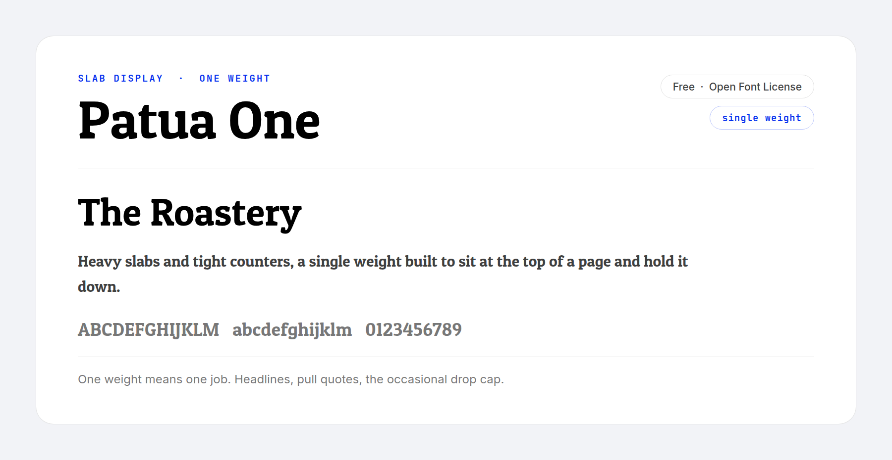
Patua One is a slab with high contrast and a sturdy feel, an exceptional addition to a roster of header fonts. Heavy slabs and tight counters give it the weight to sit at the top of a page and hold it down.
One weight limits it to headlines, pull quotes and the occasional drop cap.
Price: FREE ǀ More Information
22. Hammersmith One
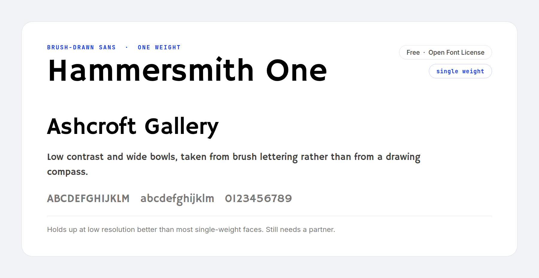
Hammersmith One has low contrast and softer lines, drawn from brush lettering rather than from a compass. You can see it in the generous width of the letters e and s.
It adapts unusually well to lower resolutions, which makes it a safe pick where you cannot control the screen. Like the three faces above it, though, one weight is all you get.
Price: FREE ǀ More Information
A paid font buys two things. The first is a face nobody else on the results page is using, which is worth more than it sounds when every competitor is set in the same free geometric sans. The second is a bigger drawing budget, which you see in the details.
Check the license tier before you buy. A desktop license covers mockups, not the live site, and a webfont license is usually a separate charge. On a client project that belongs in the estimate rather than in your margin, alongside the other line items that decide how much a web design costs.
23. Argent CF
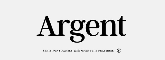
Argent CF is a dashing typeface with elegant curves and near-uniform x-heights that give it a compact look. That compactness makes it a strong alternative to setting a line in capitals, with similar presence and more class.
Price: from $35.99 per style ǀ More Information
24. Greycliff CF
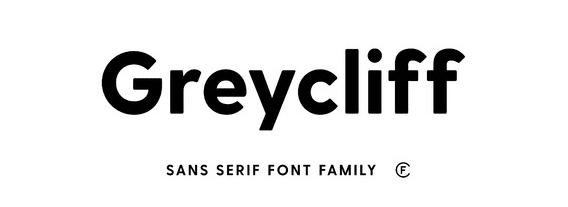
Greycliff CF suits designers who favor a rugged professional face. Strong capitals, steep shoulders and clipped tails give it a durable, geometric look.
Price: from $35.99 per style ǀ More Information
25. Manifold CF
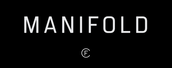
Manifold CF imitates the cold precision of a terminal display, close to a science fiction interface. Wide kerning and strong clean lines make it poor for long text and excellent on headers and logos. A variable version of the family is sold alongside the static cuts.
Price: from $35.99 per style ǀ More Information
26. Quincy CF
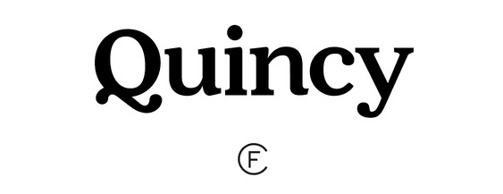
Quincy CF is a classic with flowing letterforms, soft corners and playful tails. It would sit comfortably on a perfume campaign or an extravagant fashion magazine, and it is the warmest face in this half of the list.
Price: from $35.99 per style ǀ More Information
27. Metropolis
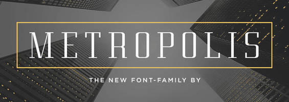
Metropolis takes its name from the 1927 science fiction masterpiece and then declines to copy it. The slanted, jagged letters of the original poster are gone, replaced by pleasing geometric shapes, short curves and long serifs.
Price: $16 ǀ More Information
28. Oregon
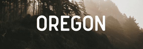
Oregon is a simple face with an attractive vintage style, its smooth edges imitating the bleed of an old printing press. Despite the retro leaning it looks decidedly modern, and it would suit the logo of a high-end fitness brand. One warning: it works best against small amounts of text.
Price: $19 ǀ More Information
29. Portland
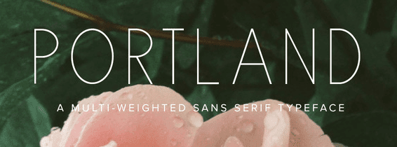
Portland is a slender all-caps face with an understated elegance that suits luxury lifestyle blogs particularly well. Its base weight is judged just right, though the proportions fall apart a little in the light and bold cuts.
Price: $15 ǀ More Information
30. AQUILONE
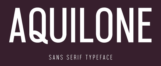
AQUILONE is built from condensed geometric shapes, a timeless design that would look at home on any premium website. The all-caps character set limits it to headlines, logos and short labels.
Price: $20 ǀ More Information
The Best Fonts For Corporate And Business Websites
A corporate brief narrows the list fast. The site has to look established and straightforward, it has to survive a legal page and a pricing table, and it has to look the same in a PDF as it does in a browser.
Four of the fonts above carry that load better than the rest. IBM Plex Sans was drawn for exactly this job and has the corporate provenance to prove it. Libre Franklin gives you institutional weight without coldness. Public Sans brings tested accessibility, which is the argument that ends a procurement review. Source Serif 4 covers the annual report and the long case study.
Pair one of those with a single display face and stop there. A business site running four typefaces looks indecisive, not versatile.
Why Variable Fonts Changed What Professional Looks Like
Most of the free fonts on this page are variable fonts, and the difference changes how you pick one.
A traditional font ships one file per weight. You download Regular and Bold, you get Regular and Bold, and a third weight is a third download. A variable font is one file holding a continuous range. Inter runs from 100 to 900, and every value between is yours to set, not just every hundred.
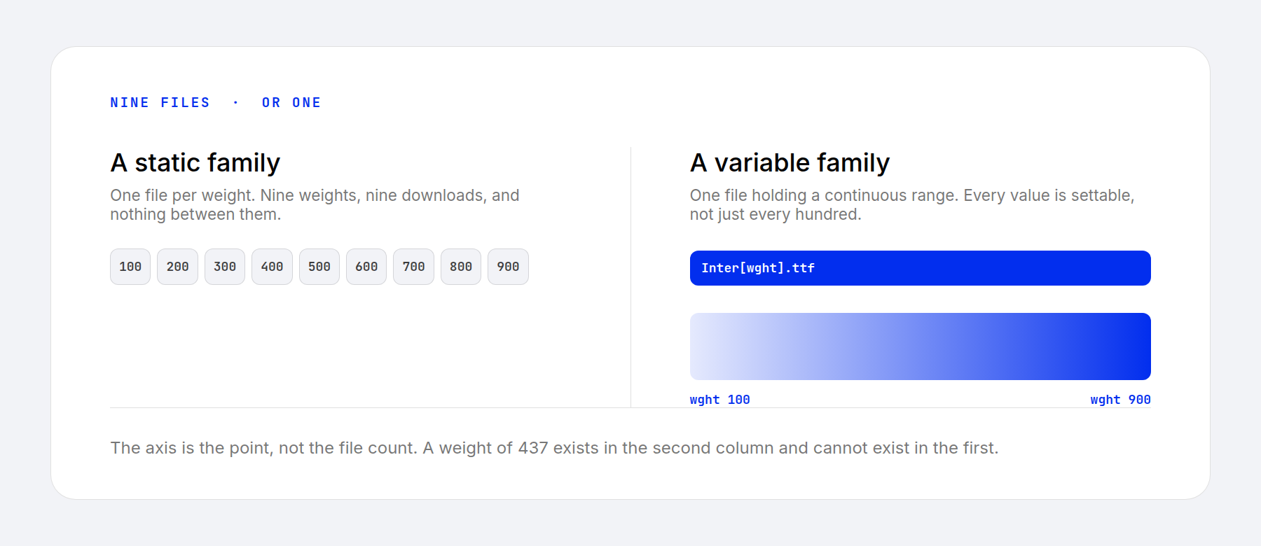
Some families add a second axis. Archivo varies its width from condensed to extended. Source Serif 4, Literata and Fraunces carry an optical size axis, which redraws the letterforms for the size you are setting rather than scaling one drawing up and down.
Optical size is the most useful axis for professional work. Display faces turn heavy-handed at small sizes and spindly at large ones. An optical size axis gives you the drawing that suits the size you are setting. It is also why responsive typography keeps turning up in the current modern UI design trends: type that adapts to its container rather than to a breakpoint.
Divi 5 supports variable fonts natively, and there are seven variable font setting combinations if you want to see how far the axes go.
How To Use These Fonts On Your Website
A downloaded font works on your computer. Getting one onto a live website is a separate step, and it is where a lot of type decisions stall.
Divi covers both routes. Google Fonts are built into the font picker, so Inter or Literata is a dropdown selection with nothing to install. For a paid face, Divi takes the font file as an upload and makes it available throughout the builder like any other option.
[IMG – Uploading a custom font file in the Divi font picker]
There is a third route, and for any site with European visitors it is the safe one. Serving Google Fonts from Google’s servers sends your visitor’s IP address to a third party, and a Munich court ruled that doing so without consent breaches the GDPR. Self-hosting the same open-licensed file sidesteps the question and usually loads faster. Download any free font on this page and serve it yourself.
Frequently Asked Questions (FAQs)
What font family looks most professional on a website?
Can I use my company's Microsoft Office font on our website?
Are premium fonts worth paying for on a website?
Pick One And Move On
Typography rewards a decision more than it rewards a search. Any of the thirty above will hold a serious website together, and the difference between the best choice and the third-best is smaller than the difference between choosing and stalling.
If the brief calls for something with more character than this page offers, three more collections pick up where it stops:
30 Sans Serif Fonts Perfect For Website Headings
30 Best Handwriting Fonts For Web Designers
11 Free Harry Potter Inspired Fonts
Which font are you setting your next client site in?





My favorite font family seems to be Roboto Slab and Raleway. They have more personality than Arial but not so much that words are difficult to read.
Hi
So how do I use any of these (or other) fonts from within divi?
Use Any Font is free for one (!) typeface only!
Is there an alternative?
There are alternatives available – such as WP Google Fonts and Easy Google Fonts – but your mileage may vary when it comes to functionality.
Hope this helps. 🙂
Thank tom for the plugin. Metropolis has been a very classic font and my all time favourite.
Thanks, Kodi!