Using only CSS and our Custom CSS box in ePanel, you can do some awesome things! Today I will go over 6 simple tricks that can alter the Foxy Theme is some really cool ways. To apply these changes, simply copy and paste the code mentioned into the “Custom CSS” box in ePanel, which can be found under the Appearances > Theme Options tab in your WordPress Dashboard.
This change will transform your navigation bar into a floating navbar with a fixed position. No matter where your visitors scroll, your menu items will be easily accessible at the top of the screen. This can improve visitor engagement as it promotes additional clicking and website exploration. Using this code, the floating navigation bar is removed on mobile devices to ensure that the small screens are not obstructed.
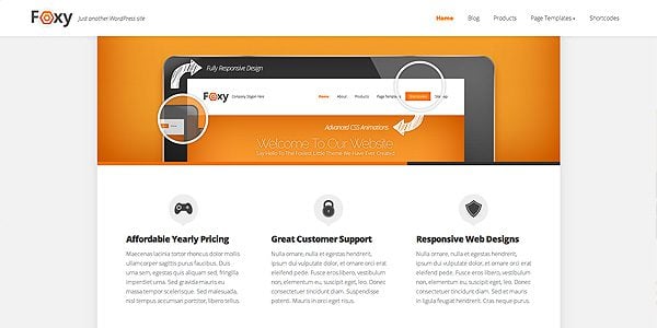
To apply this change, simply copy and paste the following code into the Custom CSS box in ePanel and click Save. If you ever want to revert back to the original style, you can simply delete the code from the Custom CSS field.
/* Fixed Navigation Bar */
@media only screen and (min-width: 768px) {
#main-header {
	position: fixed;
	width: 90%;
	text-align: center;
	margin: 0;
	top: 0;
	background-color: #fff;
	padding: 20px 5% 20px 5%;
	z-index: 100;
	left: 0;
	box-shadow: 0px 0px 20px rgba(0, 0, 0, 0.1);
	}
#body-area {
	padding-top: 74px;
}
}
Center Post Headings Inside The Thumbnail
This is a fun change that centers your post titles within the featured image box. In some ways, this style is more cohesive with the way that titles are already displayed on category pages, but it’s really up to you to decide which layout you prefer!
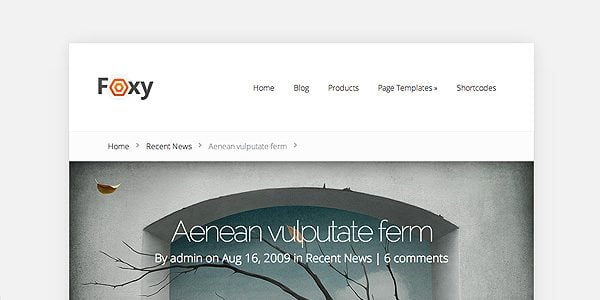
To apply this change, simply copy and paste the following code into the Custom CSS box in ePanel and click Save. If you ever want to revert back to the original style, you can simply delete the code from the Custom CSS field.
/* Center Post Headings */
.et_full_width_image .post-heading {
	padding: 0;
	width: 100%;
	position: absolute;
	text-align: center;
	background: none;
	color: #fff;
	margin-top: -360px;
	font-weight: ;
}

.post-heading p.meta-info, .post-heading p.meta-info a, .post-heading h1 {
	color: #fff;
}

@media only screen and (max-width: 1300px) and (min-width: 961px) {
	.et_full_width_image .post-heading { padding: 0; margin-top: -260px; }
}

@media only screen and (max-width: 960px) and (min-width: 768px) {
.et_full_width_image .post-heading { padding: 0; margin: -220px 0 0 -60px; }
}

@media only screen and (max-width: 767px) {
	.et_full_width_image .post-heading { padding: 0; margin: -180px 0 0 -60px; }
}

@media only screen and (max-width: 479px) {
	.et_full_width_image .post-heading { padding: 0; margin: -120px 0 0 -40px; }
	.post-heading p.meta-info { font-size: 14px; }
}
Style Your Website With Rounded Corners
Some people like hard edges, while others like soft rounded corners. By default, the content container in Foxy is simple and boxy, but this can be easily changed using a few lines of CSS. If you would like to give you website a more rounded look, then look no further! You can also adjust the size of the curve by changing the “30” values below to something smaller or larger depending on your desired result.
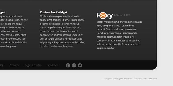
To apply this change, simply copy and paste the following code into the Custom CSS box in ePanel and click Save. If you ever want to revert back to the original style, you can simply delete the code from the Custom CSS field.
/* Rounded Corners */
.container {
	-webkit-border-top-left-radius: 30px;
	-webkit-border-top-right-radius: 30px;
	-moz-border-radius-topleft: 30px;
	-moz-border-radius-topright: 30px;
	border-top-left-radius: 30px;
	border-top-right-radius: 30px;
}

#footer-area .container {
	-webkit-border-bottom-right-radius: 30px;
	-webkit-border-bottom-left-radius: 30px;
	-moz-border-radius-bottomright: 30px;
	-moz-border-radius-bottomleft: 30px;
	border-bottom-right-radius: 30px;
	border-bottom-left-radius: 30px;
	-webkit-border-top-left-radius: 0;
	-webkit-border-top-right-radius: 0;
	-moz-border-radius-topleft: 0;
	-moz-border-radius-topright: 0;
	border-top-left-radius: 0;
	border-top-right-radius: 0;
	overflow: hidden;
}
Remove Slider Transition Animations
Personally, I love the transition animations in the Foxy slider. They aren’t for everyone, however, and if you are looking to give your homepage a less flashy and more streamlined appearance, then these animations can be easily removed. Luckily we used pure CSS for this slider’s animations, instead of using javascript, so we can adjust the animations using CSS as well. Adding the following code will remove the slide and bounce effects in favor of a classic fade.

To apply this change, simply copy and paste the following code into the Custom CSS box in ePanel and click Save. If you ever want to revert back to the original style, you can simply delete the code from the Custom CSS field.
/* Remove Slider Animations */

#featured .slide.et-active-slide img, #featured .slide.et-active-slide h2, #featured .slide.et-active-slide .description {
	-webkit-animation-duration: 0;
	-webkit-animation-delay: 0;
	-moz-animation-duration: 0;
	-moz-animation-delay: 0;
	-o-animation-duration: 0;
	-o-animation-delay: 0;
	-ms-animation-duration: 0;
	-ms-animation-delay: 0;
	animation-duration: 0;
	animation-delay: 0;
}
Social media has become an important part of any website, and some website owners will want to put extra emphasis on their social media profiles. By default, Foxy places a link to your Facebook, Twitter and Google+ pages in the footer. To make these links more prominent, we can pop them out of their container and make them stick to the side of your page so that no visitor will miss them!
To apply this change, simply copy and paste the following code into the Custom CSS box in ePanel and click Save. If you ever want to revert back to the original style, you can simply delete the code from the Custom CSS field.
/*Make Social Media Sticky*/

#et-social-icons {
position: fixed;
z-index: 11;
left: 0;
top: 45%;
background-color: #333333;
padding: 20px 10px 10px 15px;
margin: 0;
-webkit-border-top-right-radius: 8px;
-webkit-border-bottom-right-radius: 8px;
-moz-border-radius-topright: 8px;
-moz-border-radius-bottomright: 8px;
border-top-right-radius: 8px;
border-bottom-right-radius: 8px;
}

#et-social-icons a {
padding: 0;
clear: both;
float: left;
margin-bottom: 10px;
}
Stylize Your Website Using Flat Design
Throughout Foxy’s design, we implemented an inner shadow effect to give the slider, buttons, tabs and call-outs a bit of depth. Recognizing the popularity of the “flat design” trend, however, I am sure that some users will want to remove these shadows in favor of a simpler design. These shadows can be easily removed using the follow code. The result is a single highlight color throughout the theme.
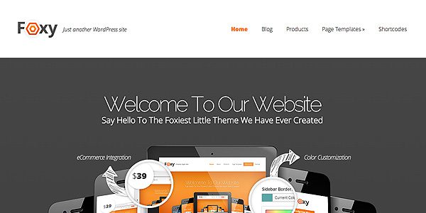
To apply this change, simply copy and paste the following code into the Custom CSS box in ePanel and click Save. If you ever want to revert back to the original style, you can simply delete the code from the Custom CSS field.
/* Make Things Flat */

#featured, #top-navigation > ul > li.sfHover > a, #top-navigation > ul > li > a:hover, #home-tab-area > ul > li.home-tab-active, #footer-bottom li a:hover, .mobile_nav, #callout {
-webkit-box-shadow: none !important;
-moz-box-shadow: none !important;
box-shadow: none !important;
}




Hi there,
really nice tricks, thank you!
Best regards,
Sebastian
Thank you !!!
Very nice guys. Can some of these techniques be applied to other responsive themes in your portfolio? IE Nimble? I especially like the floating SM icons. Sweet!
This is great , very helpfull, thanks
Great idea! I’ve used rounded corners in my web site and they look gorgeous 😀
Hi Mariana! Nice to see you working on Halloween 😉
Great tips, Nick! Thanks so much!
Just applied 3 of these tips to my site. Flawless. Great job guys.
Don’t you guys ever get tired of pleasing your customers??? 😉
Hi Nick,
Big thumbs up to all your team for your new blog. You’ve made some really nice changes to your blog model and I have no doubt that it is for the best. I would be curious to see your new conversion rates with this tweak 😉
Keep up the good works. I keep getting back way more frequently on your blog since then.
Oh and nice tips!
Cheers
Hi Nick,
This is not just a trick….it’s a tutorial that can help me become a designer. Thanks for sharing….I think it’s high time I simply buy an elegant themes.
Thanks for sharing.
you’re opening my horizon, thanks a lot Nick-ET!
That’s very cool!
It would be awesome to have a couple of such changements for every (newer) theme!
Such things are worth paying for 😉
Agree! Was just about to add that suggestion.
Is there a way to have these tips attached to the themes themselves?
Great suggestion. I happen to find these tips looking for the version number on Google.
Right on time 🙂 Thank you! I’m just rebuilding my website into Foxy-based one.
That my friends is 6 Foxy gold nuggets right there. Top stuff guys.
Great, thank you Nick, and i have a question, the Floating Social Media Buttons can be use with other theme?
I’m loving these tops, tricks and givea ways that you guys have been giving us all recently. Thanks for all the extra work that’s gone into them.
Anything planned for a CSS post aimed at The Professional theme?
Cool! And Nick, any news on divi?
That was wonderful tips, can we have for Nexus ?
Floating Navigation
Sidebar width universal 300px or more.
I added a Pinterest Tutorial for adding Button with counter and bookmark all the images at the same time !
http://www.animhut.com/tuts/codex/new-pinterest-button-with-counter-and-pin-all-images/ will be useful if we have a shortcode in you new theme.
Nice tricks. Thanks for sharing them.
Very useful, as usual.
Thanks
I am working on Foxy Theme these days for a client, great css tricks
Thanks! Great job! Love these tips! Want more of them now 😉
Hello This is really a very good job.Can you do the same for other themes ? Thank you very much. Karine
Hi !
Great stuff !
Note: I think there’s a little z-index problem with the arrows of the slider, as those arrows “pass over” the navigation bar when the nav bar is fixed.
Fix this by adding the following line to the code ET gave you, just below “#main-header {”
z-index: 9999 !important;
Cheers!
¡Muy bueno!
Gracias
First of all, thanks! This is great.
Quick question/issue for anyone out there – When I use the custom css to fix the header to the top of the screen (so it stays there when scrolling) it covers up the text in my slider. I don’t know CSS, but I have been messing around with the settings and can’t get it to stop covering up my slider text. Thoughts?
Thanks again!
J
Some nice little tweaks there.
Thanks
Absolutely LOVE these! Keep ’em coming! Great work. So helpful. Just one of the things that makes Elegant Themes stand out among the rest.
I tried them all out – All awesome but decided only the rounded corners were useful for what I was looking for. Might add some of the other codes as the design develops.
Dear Nick,
Great information. Why not for all themes. After all the tickets ET had to solve you have enough information to fill 20 Blogs. After filling the blogs, the amount of tickets will decline. And that would be great news for ET.
I’d love to see more “design option” posts like this for your themes.
Thanks for the great tips! Any hint for us waiting for Divi to come out? I’ve had to use other themes while waiting for this one to come out, can’t wait!
Wow folks, these tricks rock!!!
We’re utterly thankful for all these freebies, tips & tricks. Indeed this is a game up for ET. As much as we like all this free stuff, we are however running out of patience with Divi now! Any approx. dates for its release? I’m sure it’ll be worth the wait but I have, like many other members here put hold on projects just for that amazing theme.. More focus on that please!!! Many thanks to your efforts from one happy customer:)
I have some other themes that these ideas would work great on. Can I use them on other themes that arent responsive?
thanks again for sharing!
It is not required anymore to use vendor prefixes for “border-radius”. So, why not make code more simple?
Thanks for posting this. Loving the rounded corners and floating social’s.
Amazing. Thank you so much! These small enhancements are what helps set you guys apart from the competition. I’m so happy to be a customer 🙂
Dear all,
I am so impressed by your continuous efforts! Thank you very much for that!
PLEASE provide us with some CSS tricks for Nimble Theme too and keep delighting us!
Kind regards 🙂
hey Nick,
was wondering, I am using the Vertex theme, yet I really like the trick of adding a floating social box on the pages, is it possible for you to show us some code that will work on that theme?
cheers….
Hi sir , please , i need your help , i have a big issue and i need your help and support to fix it.
Best wishes
A.j.
Any pointers on how to remove the menu rotation animation on hover?
Hi there! I wanna to say a lot of thanks for your team! <3 Actually Im have to use the FOXY theme! And I have got some questions about it. How can I make a product slider as you have in demo in the end of page? Thanks a lot for answering.
Can someone PLEASE tell me how I can remove the Foxy logo and use my one instead.
Thanks
This is outlined in the theme readme and out documentation. You can define a logo via the Appearances > Foxy Theme Options.
Love the code for the rounded edges. Thank you so much!
I found these tricks very useful, but there is a little problem with the trick of centering the Post Headings Inside The Thumbnails… when I pasted the code into the Custom CSS box in ePanel the color of the Title (h1) is white (#fff) and it looks great over the image, but then titles of pages disappear, because the background is also white…
I love your documentation – some of the best of many WP designers – and the theme is very easy to use and customize. Question: this theme has many issues with Internet Explorer. It looks stretched out, and fills the entire page, as opposed to the nice clean box with background on Firefox and Chrome. Also, the footer has squashed the links and social media icons against each other.
Is there any documentation for this or are there fixes? Thanks!
If you need help with anything, please open a ticket in our support forums so that our team can assist you.
Hello Nick.
I am the customer, dont’ have an account and willing to pay someone for this simple task. I am not website design compatible.
All I need is to change the background color from the ORANGE in the FOXY Theme, to the RED on the LOGO.
That simple…. but my web developer left the country. Cannot get a hold of the guy.
Thanks!
These colors can be adjusted easily right from the WordPress Customizer. When you log in to your dashboard, click Appearances > Customize and then chose your desired colors.
Hi there – I’m using the css option – Make Social Media Sticky – Looks great.
Is there a way though to incorporate Linkedin icon to the bar? In the theme menu I notice there are options for Facebook, Google +1 and Twitter but not LinkedIn.
Any help would be appreciated.
These are awesome! All of them worked for me except the centering of the title and making the image full screen on the featured slider which is the one I want more than anything by a long shot! Any idea why it might not do anything? Also, when I put the scrolling header code in it made the header full screen width, going over the top edge of the grey background. I’d like that if I could make the whole page full width and drop the background altogether.
Well done!!!
Tried all off them and nothing happens when removing slider transition animations. Tried via child theme and via custom CSS box. Any idea?
Thanks!
Julio
Love this theme however my background image is only around the footer, is there a way to make it the full page? i’m probably just missing something simple however i have tried a bunch of ways and can’t get it to display the way i want. do you have a CSS code for this?
If you need help with anything, please open a ticket in our support forums so that our team can assist you.
I have a question. In number two above (Center Post Headings ), there is a subheading: Home > Recent News > Aenean…. >
How do we remove this subheading from all pages please? I can not find anything in the theme options. Thanks for your time. Cheers
Scott
When uploading a background image, it only appears around the footer, is there a way to make it the full page?
My client is using the Chameleon Theme from 2012.
Does that version have the .css styling box?
I’m looking under “Appearances” “Chameleon Theme Options” and I can’t find one.
Thanks very much – very useful article btw!
how to add widget to homepage ? there is no option for this.