You’d be surprised what a few lines of CSS can do. Today, I would like to share a few easy customizations that you can make to your Fable Theme using only the Custom CSS panel in our ePanel Theme Options. I have based these tips off common questions that we receive in the support forums, as well as a few things that I personally think are useful. To apply this changes, simply copy and paste the code mentioned into the “Custom CSS” box in ePanel, which can be found under the Appearances > Theme Options tab in your WordPress Dashboard.
Due to the long, scrolling nature of Fable, enabling a fixed navigation bar can save your visitors a lot of time. This change will make your navigation bar stick to the top of the page, even as you scroll down, making your menu items easily accessible no matter where your visitor is on the page.
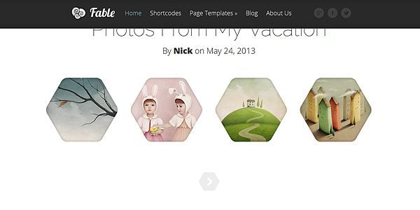
To apply this change, simply copy and paste the following code into the Custom CSS box in ePanel and click Save. If you ever want to revert back to the original style, you can simply delete the code from the Custom CSS field.
/*Fable Fixed Navigation*/

#main-header {
width: 100%;
position: fixed;
z-index: 10;
top: 0;
}

body { padding-top: 86px; }
Re-Skin The Video Player Using Flat Designs
“Flat Design” is a hot topic these days. The trend advocates a move away from skeuomorphism and towards a more simplistic, less-detailed style. We can easily strip away the realism from Fable’s video post format, and replace it with a simple CSS-based container. The result is a much simpler, faster-loading and streamlined appearance.
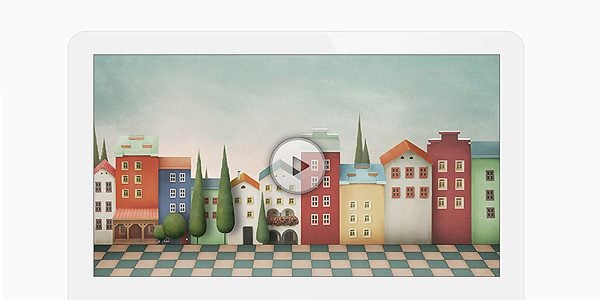
To apply this change, simply copy and paste the following code into the Custom CSS box in ePanel and click Save. If you ever want to revert back to the original style, you can simply delete the code from the Custom CSS field.
/*Make Video Player Flat*/

.et-video-container {
background-color: #F1F1F1;
border: 1px solid #DADADA;
background-image: none;
-webkit-border-top-left-radius: 40px;
-webkit-border-top-right-radius: 40px;
-moz-border-radius-topleft: 40px;
-moz-border-radius-topright: 40px;
border-top-left-radius: 40px;
border-top-right-radius: 40px;
}

@media only screen and ( max-width: 767px ) {
	.et-video-container {
	-webkit-border-top-left-radius: 20px;
	-webkit-border-top-right-radius: 20px;
	-moz-border-radius-topleft: 20px;
	-moz-border-radius-topright: 20px;
	border-top-left-radius: 20px;
	border-top-right-radius: 20px;
	}
}

@media only screen and ( max-width: 479px ) {
	.et-video-container {
	-webkit-border-top-left-radius: 10px;
	-webkit-border-top-right-radius: 10px;
	-moz-border-radius-topleft: 10px;
	-moz-border-radius-topright: 10px;
	border-top-left-radius: 10px;
	border-top-right-radius: 10px;
	}
}
Social media has become an important part of any website, and some website owners will want to put extra emphasis on their social media profiles. By default, Fable places a link to your Facebook, Twitter and Google+ pages in the header. To make these links more prominent, we can pop them out of their container and make them stick to the side of your page so that no visitor will miss them!
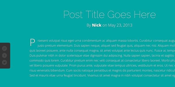
To apply this change, simply copy and paste the following code into the Custom CSS box in ePanel and click Save. If you ever want to revert back to the original style, you can simply delete the code from the Custom CSS field.
/*Make Social Media Sticky*/

#et-social-icons {
position: fixed;
z-index: 11;
left: 0;
top: 45%;
background-color: #333333;
padding: 20px 20px 10px 15px;
margin: 0;
-webkit-border-top-right-radius: 8px;
-webkit-border-bottom-right-radius: 8px;
-moz-border-radius-topright: 8px;
-moz-border-radius-bottomright: 8px;
border-top-right-radius: 8px;
border-bottom-right-radius: 8px;
}

#et-social-icons a {
padding: 0;
clear: both;
float: left;
margin-bottom: 10px;
}
Stylize Your Gallery Posts Using CSS Filters
Using CSS3 Filters, we can apply some fun effects to our Gallery posts. One of my favorite filters is the Grayscale filter, which can desaturate any image right in your browser. Combining this with CSS transformations, we can create a nifty fading effect on hover. After applying this CSS, your gallery thumbnails will fade to black & white on hover.
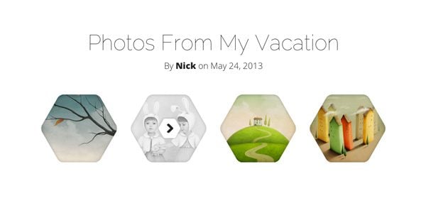
To apply this change, simply copy and paste the following code into the Custom CSS box in ePanel and click Save. If you ever want to revert back to the original style, you can simply delete the code from the Custom CSS field.
/*Stylize The Gallery Using Black & White Hover*/

.et-main-gallery a:hover img {
-webkit-filter: grayscale(100%);
-moz-filter: grayscale(100%);
filter: grayscale(100%);
}
Remove Automatic Post Drop-caps
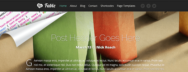
By default, the theme starts each post with a Drop-cap to emphasize the beginning of the paragraph and catch your visitor’s eye. However, this style isn’t for everyone, and removing the drop-caps is quite easy! After adding this code, the large letter at the beginning of each post will be reverted back to the standard font size and weight.
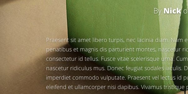
To apply this change, simply copy and paste the following code into the Custom CSS box in ePanel and click Save. If you ever want to revert back to the original style, you can simply delete the code from the Custom CSS field.
/*Remove The Dropcaps*/

.format-standard .entry-content > p:first-child:first-letter, .entry-content > p:first-child:first-letter  {
display: inline;
float: none;
margin-right: 0;
margin-top: 0;
font-size: 18px;
}
Remove Title And Meta Info From Quote
By default, the Quote post format includes a title and meta info. This looks great, but sometimes blogs of a similar style choose to remove these elements to better emphasize the quote itself. This can be easily achieved through a couple lines of CSS. Once added, the title and meta lines are removed and extra space is added to even out the design.

To apply this change, simply copy and paste the following code into the Custom CSS box in ePanel and click Save. If you ever want to revert back to the original style, you can simply delete the code from the Custom CSS field.
/*Strip Down The Quote*/

article.format-quote { padding-top: 150px; }
article.format-quote header { display: none;}




Gracias Gracias
Another awesome resource guys, thanks Nick! Keep it up!!
You say this is for the Fable Theme – how many of these can also be used for other responsive themes?
Charlie Seymour Jr
The code here is specific to Fable. Attempting to apply similar changes to our other themes would require different techniques.
Thank you Nick, can we have this for Other responisve themes – esp the Floating navigation and Social Button.
Please ?
This is awesome, thank you very much for thinking in everything!
Great tips – will these codes work with any elegant themes?
would it be possible to produce a set of codes that do mods to any themes? for those of us who just don’t know any CSS
The code here will only work with Fable, but we plan to release similar tips for other themes in the future 🙂
Great, Nick. Thanks so much!
fingers crossed for Nexus theme 🙂
please do!
Thanks a lot NIck-ET…you blew my mind with your ingenuity!
Nice. I will try it!!! 😀
Great examples — well beyond the color and alignment examples I thought might be included.
Thanks!
Awesomely useful post and it’s geared toward your paying members!
I feel all warm and fuzzy inside now!
I’m not using Fable, but always good to keep up to date with a little CSS.
The CSS filters look interesting so I may try the effect on other images.
What Texx said!
Trim theme next please?
Excellent!
For the fixed nav bar I’ve added the line:
opacity: 0.85;
for a little transparency and it looks great.
Thanks Nick!
Nice touch Daniela 🙂
NO. WAY.
I just emailed a request in today asking for this kind of Blog Post — and here we are.
THANK YOU! Looking forward to more…
Happy to help Joe. Stay tuned for more tips and tricks!
These kind of posts are brilliant! Thanks so much please keep the coming. Will also save a lot of repeat posts on the forums.
Keep up the good work guys!
Would love to see floating social options for other themes 🙂
What Luke just said!!!
I’d like to see some “cool” Chameleon CSS & Memoir. BUT I want to make sure you know how much I appreciate SO much these last blogs. Awesome ideas.
Great tricks! Love them.
Thanks
Nice CSS Tricks Nick. Your team done great job. Go on & on !!!
More of this kind, please!! Lovely!
VERY useful. Thank You!
Nick, thanks for your helpful information. Keep going.
Nick, bedankt voor de nuttige informatie. Ga zo door.
Now thats useful and practical! Keep them coming please!
Great stuff! I really appreciated! 🙂
Are there plans for doing this for other themes as well?
That would be great!!
Thanks for all of the valuable resources, greatly appreciated.
AWESOME, more tips and tricks, thanks. The social bar should have an exit button, I’m using my mobile and it is taking to much real estate.
Thanks, much appreciated tips.
Very helpful CSS tricks, guys! Thanks for sharing!
Bookmarked.
Thanks for the CSS tips guys, incorporated the social media sidebar to my site 🙂
Nice tutorial.
Thanks for great tips.
I do have a question regarding Fable hopefully someone can help…
When I write new post using “Gallery” template, the gallery images are duplicated in two places, on the top of the post and also in the body of the post.
From the sample I saw, only one set of images from the gallery should be shown on any single post, but mine appears also in the body of the post. Please help on how I can eliminate the images in the body of the post.
You can see an example of my post at the link below. The two image sets are at the very top and very bottom: http://blog.artistviewpoint.com/2013/12/10/chapter-1-technique-for-drawing-eyes-and-eyebrows-s1/
Many thanks
Loc
it is cool B)
I have some photos with both light and dark elements that make text at least partly unreadable. In those cases, is there any easy way to apply a text background? Thanks.
Is the Fable theme the pro version of the beautiful Serene ?
Hello Nick, great theme! I’d like to hear your thoughts on how I can make a story with about 10 chapters for example, without disorienting the users view. Fable is has a blogging navigation, like a next navigation.
Hi Nick. This was a very helpful post. However I have two questions:
a. Is there RTL support at this point for Fable?
b. If I use the first trick to make a custom CSS, will I lose it after a theme update?
Unfortunately there is not RTL support for Fable. As for the CSS question, if you make the CSS edits on a child theme style sheet you will have no problem with updates wiping them out.