Today I want to do something a little different. We talk a lot here at Elegant Themes about how to use Divi and what the theme can do, but today I want to take a look at how real people are using it.
Now, when it comes to assessing a theme like Divi’s design and performance, I usually look no further than the theme demo. This will give you a good idea of layout possibilities, customizations, and the built-in functionality on offer.
However, a versatile, multi-purpose theme like Divi is capable of so much more than we could possibly showcase using a few purpose-built demos. To demonstrate this – and to show off Divi’s full potential – we need to look out into the wild, to see real world, live websites built using Divi.
And that’s exactly what we’re going to do today! In this post, I’ll be presenting a collection of 25 stunning Divi sites that you can use for inspiration – and at the bottom of the page, I’ll give you the opportunity to share your own Divi-built website.
With the introduction out of the way, here is a small collection of my favorite websites built using Divi. This collection is presented in no particular order.
- 1 1. Findability Science
- 2 2. Dan Dascalescu Photography
- 3 3. sLavi Photography
- 4 4. Fashion or Famine
- 5 5. M for Montreal
- 6 6. Mini-You
- 7 7. Sushi à la maison
- 8 8. Masons Bar and Bistro
- 9 9. Share Vancouver Island
- 10 10. Timeline Missions
- 11 11. Blog Genesis
- 12 12. Academy of Mine
- 13 13. Windsor Bergen Academy
- 14 14. Dan Carr Photography
- 15 15. Goodwings
- 16 16. Samui Garden Villa
- 17 17. Dokkoon Shop
- 18 18. The GlobalChurch Project
- 19 19. Nomad Capitalist
- 20 20. Art and Craft Film
- 21 21. Devlin Photos
- 22 22. How to Beast
- 23 23. Sweet Cecily’s
- 24 24. Heidi Brockmann
- 25 Final Thoughts
1. Findability Science

With a full-screen background video greeting visitors, the Findability Science website certainly makes a memorable first impression. It also uses parallax effects with eye-catching results. Primarily a consulting firm, Findability Science specializes in “findability” – giving its customers real world metrics they can leverage to grow their business.
2. Dan Dascalescu Photography
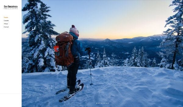
Dan Dascalescu has put together a gorgeous photography website using the Divi theme. With a clean and tidy left-side navigation menu, his stunning photos are given center stage.
3. sLavi Photography
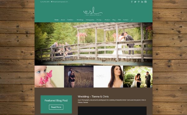
Continuing with the photography websites, next up we have Ottawa-based Stacey Lavi’s stunning site. Stacey takes a different approach, adding a beautiful custom background image that really complements the site’s elegant color scheme. Again, her photography work remains the site’s focal point, as you’d expect.
4. Fashion or Famine
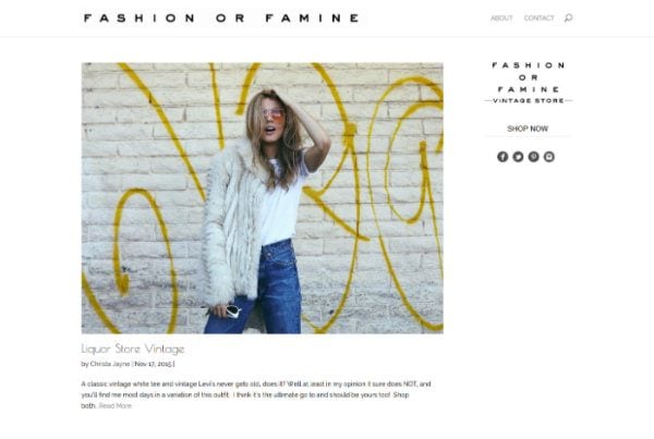
Want to see how Divi looks when kitted out with a more minimalist design? Then check out the blog for vintage clothing store, Fashion or Famine. With large featured images and stylish typography, this website shows that you don’t have to use Divi’s many advanced design modules to build a beautiful website!
5. M for Montreal
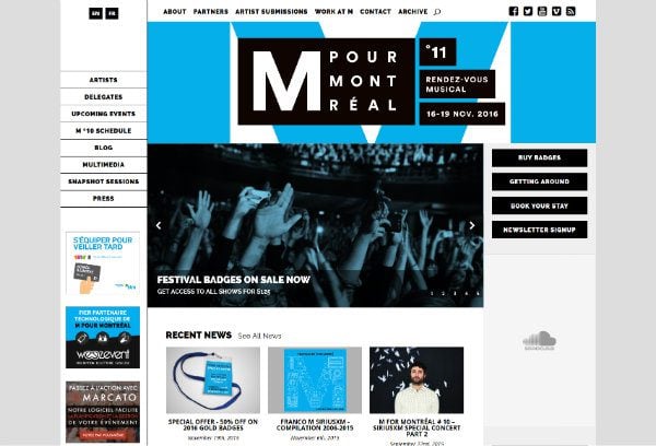
Another of my favorites here. This time it’s the website for M for Montreal, a music festival for up-and-coming local musicians. Compared to many other sites featured in this collection, M for Montreal has a lot going on. However, thanks to a clever design, it still feels uncluttered and organized.
6. Mini-You
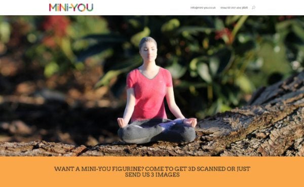
Next up, the rather innovative and quirky Mini-You website. Mini-You promises to make realistic mini figurines or busts of you, requiring just a quick body scan or three photos to work from. Their website reflects their brand well, with lots of fun images showcasing their unusual products.
7. Sushi à la maison
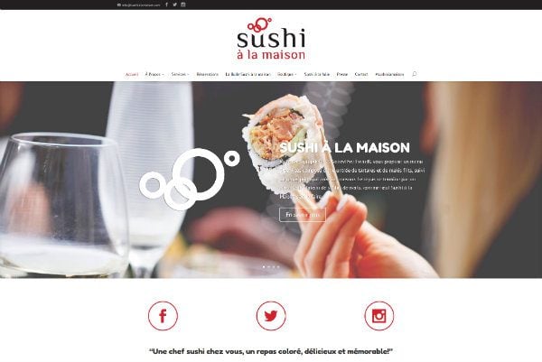
You can also use Divi to build impressive restaurant themes, too, as demonstrated by this awesome French sushi restaurant, Sushi à la maison. The website looks simply stunning, with bold image slider, distinct social media icons, and links to the restaurant’s in-house product range. Sushi à la maison also integrates a table booking solution – an important practicality of running a restaurant.
8. Masons Bar and Bistro
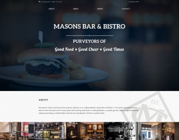
Back to back restaurant websites then, with Masons Bar and Bistro featured next. The website uses images prominently, with a full-width homepage image accompanying stylish image grids, and beautiful parallax effects defining the headers of each section. To provide all the information a visitor could need, the website also features a map, plus menu and contact form functionalities.
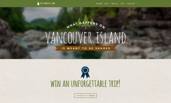
Next, we have a site built to spread word of the stunning Vancouver Island. As you might expect, this site is heavy on images, showcasing the area’s natural beauty. The site is clean and well organized, presenting everything a tourist needs to know about the place – including some gorgeous gallery images.
10. Timeline Missions
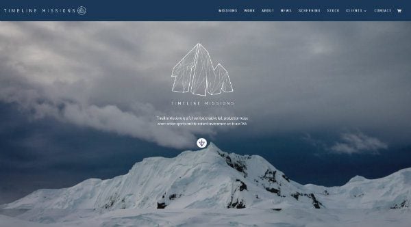
In my opinion, the Timeline Missions website demonstrates just how jaw-dropping a Divi website can be. With its full-screen background image and stunning parallax effects, the website is the perfect showcase for the team’s “missions.” In case you’re wondering, they specialize in incredible snow-based action films, as seen on their must-see Vimeo page.
11. Blog Genesis
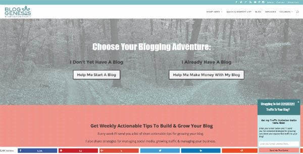
Next, we have a great example of how Divi can be used as a blogging theme – the design of the homepage even doubles up as a landing page. However, of particular interest to me was the site’s blog section. Site owner Ashley Rader uses beautiful branded thumbnail images on her blog, alongside a simple sidebar with lots of white space. There’s also a well-designed footer area, complete with stylish opt-in form.
12. Academy of Mine

Academy of Mine uses a bright and colorful, flat design with great effect. The homepage features an introductory video, plus it clearly lays out the benefits of using its services. Head over to the pricing page and you can also see the Divi pricing table module in action!
13. Windsor Bergen Academy
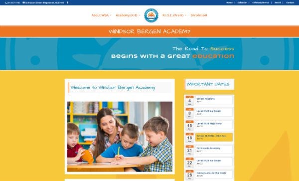
The Windsor Bergen Academy is a private school for children with learning, behavioral, and attention disorders. The website reflects the academy’s mission well, with a fun and colorful design, plus a playful font.
14. Dan Carr Photography
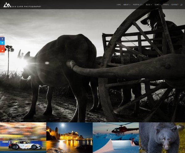
Another visually stunning photography website, and this time, it’s the turn of Dan Carr. So far we’ve featured three photography websites, with each looking completely different, proving Divi can be used in many different ways. Dan Carr opts for an impressive full-screen photo, with additional images displayed in an organized grid further down the page. This website also uses several of Divi’s more advanced modules – it features parallax effects, gridded blog posts, and a stunning image gallery. Definitely one of my favorites!
15. Goodwings
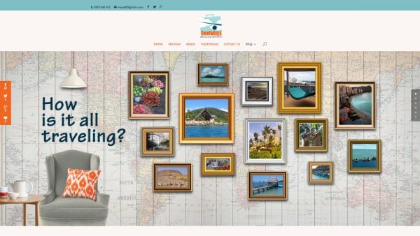
Goodwings is a fantastic travel agency service, allowing you to book tailor-made trips all over the world. The homepage features a stylish full-width image, plus customer testimonials, and a convenient contact form. The website also features a blog with clean, organized, boxed blog posts.
16. Samui Garden Villa
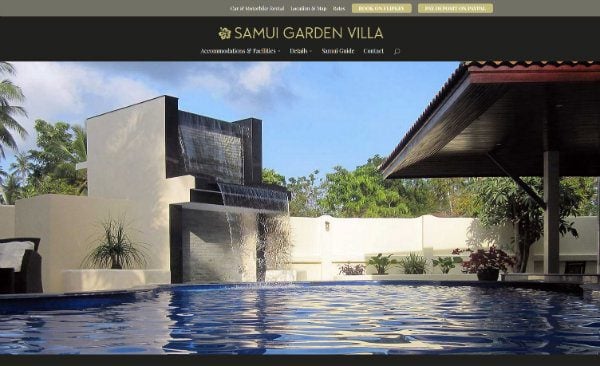
Luxury accommodation requires a sophisticated, elegant website to match. The Samui Garden Villa website gets the requirements spot on, with its beautiful choice of images, parallax effects, and a timeless color scheme. Of course, practicality is a website’s primary purpose, and Samui Garden Villa integrates a fully functional booking solution via Flipkey.
17. Dokkoon Shop
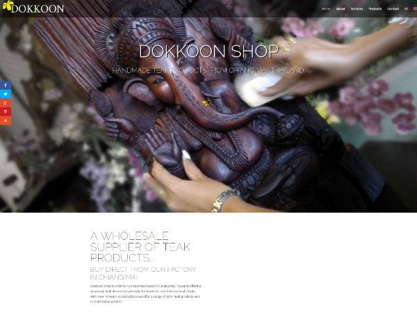
Another quirky eCommerce store up next: Dokkoon Shop, makers of beautiful, hand-crafted teak products, such as sculptures, clocks, and candle holders. As you’d expect, product images are displayed prominently on the homepage, with a dedicated section linking to some of their latest products further down the page. Be sure to check out the store section of the site, giving you a better idea as to how a Divi-built eCommerce store looks and behaves.
18. The GlobalChurch Project
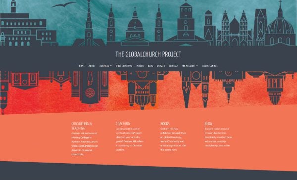
Wow is all I can say about the stunning GlobalChurch Project website, with its beautifully contrasting color scheme. The homepage links to subscription options, latest videos, and also displays its partner logos. The blog section is equally impressive, despite going a completely different direction with the design – it keeps things clean and simple, using a distinct font and displaying a non-intrusive email opt-in form.
19. Nomad Capitalist
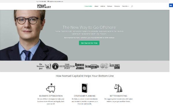
Next we have Nomad Capitalist, a beautiful example of Divi being used as a corporate theme. The website uses strongly defined sections, testimonials, plus pop-up functionality when a visitor shows exit intent. Andrew Henderson is the site owner, and his website helps online entrepreneurs and digital nomads stay on top of (and improve) their financial situation.
20. Art and Craft Film
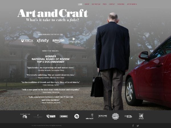
This website was designed to promote the documentary film, Art and Craft. It uses a relatively simple design, with a large full-screen image, plus a carousel linking to all the places you can watch the film. At the bottom of the page, there’s another carousel, this time linking to the partners. This is another prime example of Divi’s versatility, demonstrating that the theme can be used in just about any industry.
21. Devlin Photos
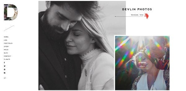
Another photography website, and another example of how a creative mind can put Divi to work in an impressively eye-catching way. This time the site owner is Lisa Devlin, a wedding photographer from the UK. The design is exceptional, with images of different sizes slotting together to create stunning results. There’s also embedded video and image sliders on the homepage, making the whole site feel sophisticated, stylish, and dynamic.
22. How to Beast
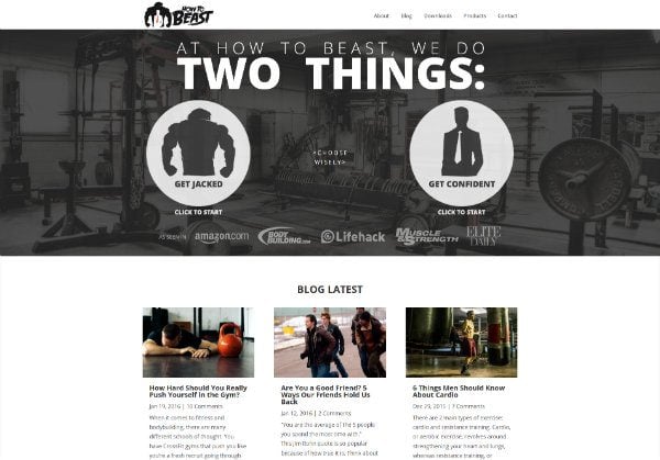
With its choice of bold title font and simple design, How to Beast screams masculinity. Unsurprisingly, the website is aimed at men who want bulk up and become more confident. The blog looks professional with its clean design, small thumbnails, and organized sidebar. It also features a simple email opt-in form at the top of the page, which is perfectly in keeping with the rest of the site’s aesthetics.
23. Sweet Cecily’s
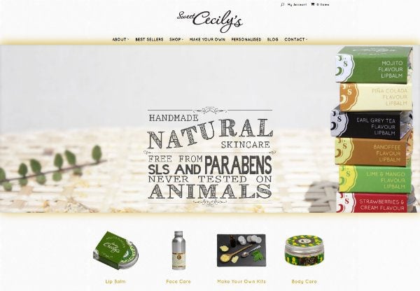
Sweet Cecily’s is a gorgeous, Divi-WooCommerce combo selling natural skincare products. The site uses a branded custom background image and also utilizes a beautiful black-white-gold color scheme. The store section is beautiful and easy to navigate, making it super-easy to browse their products. The website also features a masonry-style blog which looks simply stunning!
24. Heidi Brockmann
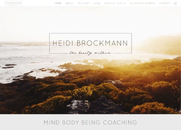
The final theme in today’s collection is also the most elegant: Heidi Brockmann’s, a mind-body nourishment coach. The website uses soft colors, elegant fonts, and natural images that really suit the brand down to a tee. There’s also a stylish blog section featuring large, boxed thumbnails. All in all, a really beautiful website.
Final Thoughts
Restaurants, blogs, photography, eCommerce, business – you name it, Divi can do it. Hopefully, this collection of websites has given you an idea of the quality of design you can achieve with Divi. With flexible layouts courtesy of page builder functionality, almost unlimited customization options, and 40+ powerful content modules, Divi gives you an ideal platform for building your perfect website.
Of course, we could never cover every single deserving Divi site out there in one post. So if you have a Divi site that you’d like showcased in the future you can email a link to our editor at nathan at elegantthemes.com with the subject line: DIVI SITE SUBMISSION.
Editors Note: Due to the high likelihood of spam, we will not be allowing links in the comments to Divi websites. If you’d like the opportunity to be featured in a showcase like this one in the future please submit your designs via the instructions above. Thanks!
Article thumbnail image by Dooder / shutterstock.com.



So stoked to have one of the first sites I ever built featured! Timeline Missions!!!
Thanks for the great examples! Elegant Themes has empowered us since day one 4 years ago when we first started our branding studio. Now with the Divi theme, we are able to achieve so much more in terms of design and efficiency. Can’t wait for Divi 3.0 =)
I have just updated my wedding photography website paulnewbery.com very impressed with it so far. I need to do some few tweaks but very impressed so far 🙂
Hi
Is there somewhere we can submit our Divi sites to get them shown? We only use Divi and would like to showcase our sites and our client sites.
Thanks
Yes! You can submit your Divi sites to me via the instructions above 🙂
Very nice collection!
Awesome sites!
And some of our larger clients are using it as a framework too, which gives us the ability to design the sites how we want them…
I really like the Sushi A La Maison for a client! Is there a tutorial or would the developer share any tips? I don’t think it’s that hard to read when you look at the actual site and it’s possible to change the colors to make it even more readable.
Hi Cathy, I’m sure you could request a tutorial or tip from the creators of that site. Their contact info is at the bottom of this page: http://www.ketchose.com/
Shaun, thank you so much for including Greedie Goddess in your examples. I really appreciate it. I’ve put together a quick article on creating the navigation section I’ve used on the Greedie Goddess site. Hope this helps others. Thanks again 🙂
https://divi.space/blog/creating-a-hero-navigation-section/
Well, using WPSNIFFER chrome extension, some of these sites are apparently NOT divi (such as Vancouver one), while others have masked their theme so it does not show as divi.
I’d love a tutorial on how to change so instead of showing Divi to theme sniffers it would show the site brand as the theme name.
Hey Shaun,
Thank you for sharing this awesome collection of Divi sites. Divi is the best Business WordPress theme I have ever seen.
Nice Work!
Links to the sites would be nice 🙂
The title of each site is linked up.
I liked about the explanation of using “Blog Genesis” a blog theme on Divi site. I will give it a try. Cheers
These websites are so cool and example of a good web design. Greedie Goddess is really an awesome website, however most of them are really nice.
Hi Nathan,
I LOVE these types of posts regarding Divi design. However, I have an idea to make them a little better.
I’m sure you probably reach out to these awesome site owners and notify them that you’re featuring their site, but what would really push these types of posts over the top is to have the site owner include their Divi Layout Builder design.
That would allow people like me, who are NOT designers, the ability to replicate aspects of these stunning websites.
What do you think?
What does everyone else think?
Thanks for all your hard work, I appreciate it.
Warm Regards,
Brandon Davis
Great examples of design… To bad none of them score well with google page speed. This will definitely affect the SEO score for these site in the future. I see this as a missed opportunity by DIVI. It seems like most wordpress sites have a major issue when it comes to page scores it would be great if DIVI could address this and deliver not only on the promise of developing great sites but efficient ones too
Love the various designs. The first one (Greedie Goddess) is amazing.
However, does anyone have any clue how http://www.slaviphotography.com/couplesengagement-portfolio/ has been made. Is this page done with just Divi or is it a plugin?
Just the Jetpack plugin and tiled galleries.
Thanks for the list Shaun!
Always fun to see Divi sites and the possibilities which lie within.
However, some of these designs would certainly not make my list. For instance, number 2 “Findability Science” , “sushi a la maison”, and many others do use fancy Parallax backgrounds or other fixed backgrounds which make the superimposed text nearly illegible due to lack of contrast. Some at various screen sizes, other at nearly all screen sizes.
The home screen text usually conveys the most crucial message of the site and should always be easily readable.
I’m still astounded by the number of site builders who choose “fancy” and “beautiful” over readability and clear written communication.
My opinion 🙂
Cheers!
Gilles
I will agree with you though. Hard to read fonts are a no-no no matter how nice the background images look.
Richard How did greedie godess do blue ribbon on menu bar?
CSS…
#et-top-navigation {
background-image: url(http://greediegoddess.com/wp-content/uploads/2015/06/greedie-menu-background-ribbon.png);
background-repeat: no-repeat;
background-position: left top;
padding-right: 8px;
padding-left: 40px;
}
Brilliant, Thank you.
How is the carousel of sites to view done on the art and craft site?? I need this feature!!
Please help!
We did #8 and it’s only one of many : ) Thanks for including us in the list ! Looking forward to Divi 3.0. This theme saves us time and money !
Nice collection. I like the photography websites.
Great post Shaun!
I’m honoured you linked to two of my sites as well, I really appreciate that you’ve spent the time to look at them and then write about them!
Thanks
I seriously love Divi. Greate coding structure and very easy to use (even it might be a bit limited at first, but with time I could find out some new ways). Thank you guys =)
How do I sumit sites to possibly get featured?
Just email them to me at nathan at elegantthemes.com with the subject line: DIVI SITE SUBMISSION
Nathan Can you let us know how greedie godess site did such a creative navigation menu.
SJ James created that website. I’ll ask him if he’d like to create a tutorial or two and if so I’ll be happy to share them through our Facebook and Twitter accounts. I’ll also post a link in this thread.
SJ James, Cory Jenkins and Geno Quiroz are intuitive Divi and Extra extentionist (permit me to use this word)! They keep producing awesome Divi portfolios. I longed to easily customize the header menu. Another bespoke is the Art and Craft. DO Divi/Extra has a fullscreen module yet Nathan?
Yes, Divi has a fullwidth header module which can be made fullscreen in that module’s general settings.
Brilliant
To Nathan And all here as well:
Well they are using a child theme, but not needed for what they did and what you could do with the menu.
One thing they are using is dancing script for the font for the menu.
Another thing they have installed is the Menu Icons plugin. This is a simple free plugin that will allow you add icons to the menu. You can even use an uploaded image which is what they have done.
Lovely goodies. I keep coming back to use Divi for all the reasons. Thanks a million Elegantthemes for giving us this bespoke solution to build sterling, modern, well-coded and stunning website faster than ever.
Thanks Shaun for sharing these wonderful examples of websites made using Divi. This clearly shows that there are unlimited options available with Divi. How to Beast, Nomad capitalist and Sweet Cecily’s are some really good ones.
Cheers!
Why we are not in this list x) ?
It’s possible our author simply wasn’t aware of your site. You can submit your site to me for future consideration by emailing a link to me at nathan at elegantthemes.com with the subject line DIVI SITE SUBMISSION.
I’m an (infrequent) How to Beast reader; I like the site and its content, but I would never list it among the top Divi sites. It is basically Divi straight out of the box with minimalistic adjustments. Not that this necessarily a bad thing, but some of the the problems Divi ships with (monospace in textareas instead of the respective font that you chose for the page, just to give one example) have not been addressed.
If someone cares at least a bit about cohesive design, this site is quickly eliminated from any such top list.
I’m not going to nit pick on the other pages, I liked a lot what I saw in many cases, but generally speaking, I would have been a lot more impressed if this list featured 25 websites that all blow you away and not “just” 15 – 20 + a few that somehow made the list.
I’m really satisfied working with Divi and I’m quite pleased with the result of this site that we launched recently.
I’m only building my website in Divi! 🙂
Yes please please give us tutorials on how to create unique rather than samey sites. Greedie Godess menu bar especially
Thanks
Hey Niamh, here is a tutorial on the Greedie Goddess site that its creator SJ James wrote up in response to this post!
http://www.elegantthemes.com/blog/tips-tricks/best-cdn-services-for-wordpress-users
I love the first design.
These are great sites. I wish someone or some site can show me how to do this step by step 🙂
+1
In my comment below, I asked for the Divi Builder Layout of each site. Even a screen shot would be nice to at least get the layout.
I second that Cliff..
Thank you very much for these examples. They truly are inspiring.
I would be interested to know how people get big full-screen images to load quickly. I think that Divi helps, yes?
I would say that fast loading images are probably to do with good hosting and a good content delivery network.
If you’re not familiar with different hosting and CDN options, these links might help.
Hosting: http://www.elegantthemes.com/blog/resources/wordpress-hosting-review
CDN: http://www.elegantthemes.com/blog/tips-tricks/best-cdn-services-for-wordpress-users
Thanks a lot for the benchmarks! Quick question, how can I get two buttons next to each other like in the example of https://sharevancouverisland.com/?
Cheers,
Joern
Joern,
Just noticed your question and we wanted the very same thing only last week.
For our Fabulous Norfolk website: http://www.fabulousnorfolk.co.uk/
We used this CSS:
.home_button .et_pb_more_button {
font-size: 16px !important;
background: rgba(255,255,255,0.23) !important;
border-width: 0 !important;
border-radius: 2px !important;
font-weight: normal !important;
font-style: normal !important;
text-transform: uppercase !important;
text-decoration: none !important;
color: #fff !important;
margin-right: 3px !important;
margin-left: 6px !important;
border: 1px solid #fff !important;
}
.home_button .et_pb_more_button:hover{padding: 0.3em 1em;
}
.home_button .et_pb_button:after{display:none;
}
And this code in a text module:
Stay in NorfolkExplore Norfolk
Works a treat. Pete
You can place two button modules next to each other. You could also use the call to action module.
Cheers!
WOW!!! I am absolutely thrilled, honoured and so humbled to be included in this list! 🙂 You have no idea how much this means to me, I put my heart and soul into my website so to have it recognised in this way is truly amazing.
Thank you SO much Elegant Themes! One of the best decisions I ever made was to purchase Divi- I don’t think I ever would have been able to design my own website if I hadn’t!
I’ve recently just become married and so my website is now actually heidirose.com.au instead of heidibrockmann.com, but it should redirect there anyway.
Thank you again!
Much love,
Heidi
So glad we could feature you, Heidi! Hope you keep making rad stuff with Divi 🙂
Thank you Elegant Themes and Divi. But let us not forget the fact that the creativity of the designer/s should be receiving the accolades and not the instrument they used. Divi makes my life easier, but can’t produce the ideas.
I commend many of the above designers.
A cool follow up to this post would be a series on how to recreate some of the layouts listed here. Some of them are fairly obvious how to do, but some others… I would have no idea those sites were Divi. I’d love to see how those sites were done.
+1
The mini-you.co.uk/ website uses the Codeflavors Floating Menu for the menu.
I would say most of the sites listed are basic implementations of the DIVI theme
Richard, How was greedy goddess nav menu done?
Well they are using a child theme, but not needed for what they did and what you could do with the menu.
One thing they are using is dancing script for the font for the menu.
Another thing they have installed is the Menu Icons plugin. This is a simple free plugin that will allow you add icons to the menu. You can even use an uploaded image which is what they have done.
Richard Do you think a site with buttons like this could be achieved? Appreciate your thoughts.
Just images for the menu?????
Thanks Richard
In the beautiful GlobalChurch Project they appear to have diagonal (as opposed to strictly horizontal) parallax row edges. Is that something 2.7 can do out of the box or is it a plugin? Thanks.
Me too!
I also want to know how they did the diagonal row edges. So cool!
Can anyone tell us?
I second Danny’s request – I’ like to see a post like this on Extra sites.
Only dancarrphotography.com was done with Extra.
Nice work. I love divi and look great. Thanks. Magda.
What fun! On Greedie Goddess how are those home page illustrations done with the animation / rollover?
Here is a tutorial SJ, the creator of that site, put together: https://divi.space/blog/creating-a-hero-navigation-section/
Awesome post Shaun!
Feel very privileged to be mentioned on it for two of my sites, thanks!
These are beautiful sites and great inspiration.
I used divi for my first web design (no previous experience) and it is so easy to learn and use I plan to continue using it for a long time!
I would love to see some tutorials on how to pull a Greedie Goddess type site. I thought it was particularly nice.
SJ, the creator of that site has actually written up a tutorial in response to this post. Here it is!
https://divi.space/blog/creating-a-hero-navigation-section/
+1
Salemcontracting.ca is a good example of a smaller industrial type site. thanks Divi for getting an update together so fast when wordpress tried to break everything with the lovely 4.5 – “lets stop java and animations update”. I just checked the site and sure enough, all animation stopped and a quick click later and divi update is done and the site is back as it should be. For some themes out there, this would not be a quick fix…..maybe a good blog post would be how to rollback from a catastrophic wordpress update.
I’d love to see a post like this with stunning Extra sites. So far one of my biggest problems with the theme is that it does not allow for a lot of customization out of the box, so most sites built with Extra look too similar.
Second that. We need a little Extra attention 🙂
Yes Danny very true, would like to see more customisation
Some of these are awful, logos cut off, shocking typography, poor design, are you kidding us!
Dan Dascalescu Photography has four pages each with one image? Am I missing something. Why is it even on the list?
i agree. Try this DIVI 2.5 website with plugins and CSS to the home page just right.
ctothemb.com
Can you add links so we can click through to these sites?
Click on the titles Robert. Elegant really needs a make over.
The first one is a really awesome design. Congrat!
Hi Nathan
Great examples.
How did “Greedy Goddess” do that animation thing on the home page with the hover over?
Thanks for all your great blogs!
This is how it was done:
#greedie-hero-section.et_pb_section .et_pb_text img:not(.wp-smiley):hover {
-webkit-transform: scale(1.05);
-moz-transform: scale(1.05);
-ms-transform: scale(1.05);
-o-transform: scale(1.05);
transform: scale(1.05);
}
Thanks Richard!
Can you tell me how they got the image overlayd on the background image?
And do you know how they did the menu?
So creative!
Always good to see some other Divi based websites. Thanks for sharing!
I especially love #1 and #19. #25 is also great with the whole minimalistic content thing it has going on.
I love divi and look forward to continue working with all of the customizations it has to offer. I have been working on my company site making improvements as I go.
Thank you elegant themes for your quick and awesome support.
Jesse
Shaun, Thank you for including one of my Divi sites in this list. I am humbled to be included amongst such beautiful designs!
I love greedie godess site and I have a site like this with for a client, is there a tutorial on how to do images for the header and have a site like this
Hi Niamh, thanks 🙂 I’ve written a tut on how to create a navigation section like we have on Greedie Goddess https://divi.space/blog/creating-a-hero-navigation-section/
Cheers
I’ve have to agree with Greedie Goddess website = Awesome!!!
So impressive, I couldn’t just scroll down the comments without congratulating SJ James on his work.
Cheers’
Hi, our web agency has a DIVI website and uses DIVI for lots of projects. 😉 Thanx for the great work!!!!
This is a great list! Lots of inspiration. Divi is the best theme out there. I do almost all my sites in Divi and will defiantly use this list as inspiration for my next designs.
We recently launched our agency new site, all built with Divi and some minor customizations; we love Divi.
dancarrphotography.com is made with the Extra theme
Great stuff! Divi has truly opened a whole new world.
Shaun excelent list,
the Divi sites are increible, congratulations, good work…
I’m reviewing the web designs and I do not understand how I can make the image covers the first screen space.
Just use the full with header, there you can choose “make fullwidth” & voila!
Wait… What? Divi 3.0…. Awesome. Can’t wait.
Sorry, might have given the wrong impression with that first line. I’ve edited it. We will be publishing more on Divi 3.0 and when people can expect to see more in a few weeks.
So we are jump from version 2.7 to 3.0??
I liked the second design that is Findability Science
“To celebrate the upcoming launch of Divi 3.0, today …”
Stupid comma 😉
But seriously – any more teasers on that?
Anymore there was a DIVI 3.0 teaser?
Haha great finding!
Nothing at the moment. We’ll be publishing quite a bit more in a few weeks though.
Hey, great examples. I just launched Zeemboo!, a Divi powered website where I will post Swift programming tutorials.
Nice Work Elegant Themes, and thanks for Divi.