With its impressive ~60% market share, Google Chrome clearly appeals to a majority of the world’s population. And that means its design is…well, built to appeal to the majority. But just because it appeals to the majority, that doesn’t mean it’s the right look for you. Thankfully, Google themes let you completely change how your Google Chrome browser looks.
Keep reading to learn a little bit more about how Google themes work and then get a look at some stylish, but functional, Google Chrome themes for designers and creatives.
- 1 What Are Google Chrome Themes? Are They Safe?
- 2 How to Install (or Uninstall) a Google Chrome Theme
-
3
Best Google Themes for Designers Using Google Chrome
- 3.1 1. Designer Theme
- 3.2 2. Material Dark
- 3.3 3. Weather Time London Theme – Daylight
- 3.4 4. Galaxy View
- 3.5 5. Plumage
- 3.6 6. Colors
- 3.7 7. TD1.8
- 3.8 8. Flat Coloured Theme
- 3.9 9. CosmicDust STD
- 3.10 10. E4 Dark v2.1
- 3.11 11. Purple Pink
- 3.12 12. Cardboard Day
- 3.13 13. a e s t h e t I c
- 3.14 14. Color Fusion
- 3.15 15. Mountain Lake
- 4 Go Solo and Make Your Own Google Theme
- 5 Wrapping Things Up
What Are Google Chrome Themes? Are They Safe?
Google Chrome themes are a purely aesthetic change to how the Google Chrome Browser looks. That is, they won’t add any functionality by themselves (that’s what Google Chrome extensions are for).
They’re also pretty low-key in what they change. Because it would be problematic to have themes actually affect the content rendered by Google Chrome, all they do is:
- Change the background of your empty “new tab” screen
- Switch up menu styling, as well as styling for other non-rendered content
But while the changes aren’t huge, Google themes can give you a more pleasant working environment, which is a valuable thing by itself.
Are Google Chrome Themes Safe to Use?
When you install a Google Chrome extension, you should always be careful because extensions have the power to actually change the content that your browser renders.
As far as I can tell, those worries don’t apply to Google Chrome themes. Because these themes are pretty much just:
- A background image
- Various color changes
There’s not really any danger of them doing anything malicious. I went looking for confirmation of this and found this statement from Google:”themes have no code or server-side components.”
In fact, themes are basically just a single .JSON file.
I still recommend sticking to themes from the Chrome Web Store just to be safe, though.
How to Install (or Uninstall) a Google Chrome Theme
It’s incredibly easy to install a Google Chrome theme from the Chrome Web Store. Once you’re on the page of the theme that you want to install, all you need to do is click the Add to Chrome button in the top right of the box:
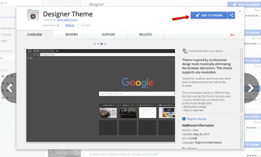
Chrome will run an automatic check, and then your theme is live!
If you don’t like it, you can always click the Undo button to revert to your previous styling:
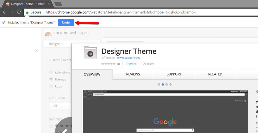
And if you’d like to uninstall a Google theme at a later date, all you need to do is go to Settings, search for “appearance” and click the Reset to default theme button:
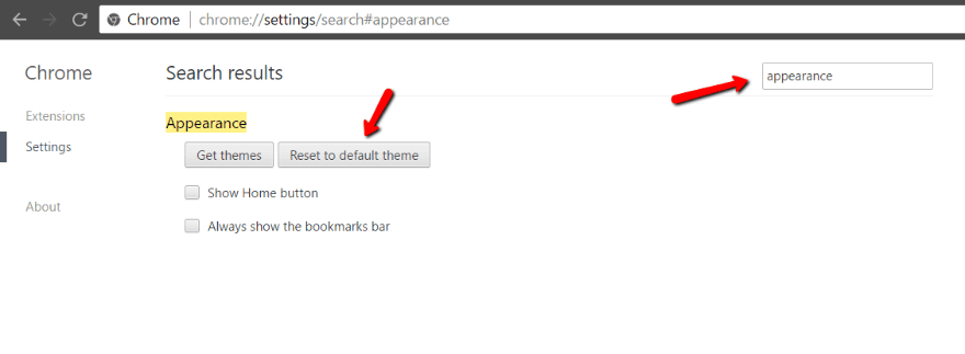
And you’re all back to normal with the click of a button.
Best Google Themes for Designers Using Google Chrome
Normally, when we create one of these lists, we try to give you some insight into the objective criteria we used to build the list. That’s a bit harder with Google themes because they’re inherently subjective. That is, the only difference is in appearance.
For that reason, I’m just going to do my best to include a diverse set of themes that I believe should appeal to most designers and creatives.
1. Designer Theme
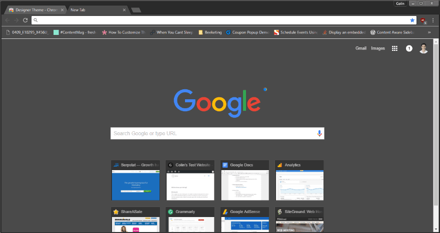
Let’s start things off with the aptly named “Designer Theme”. It uses dark colors inspired by professional design tools as the base for its look.
If you want something dark and minimalist, it’s a great option. Pretty much every element is dark gray and quite easy on the eyes in comparison to the default Google Chrome theme.
Price: Free | More Information
2. Material Dark
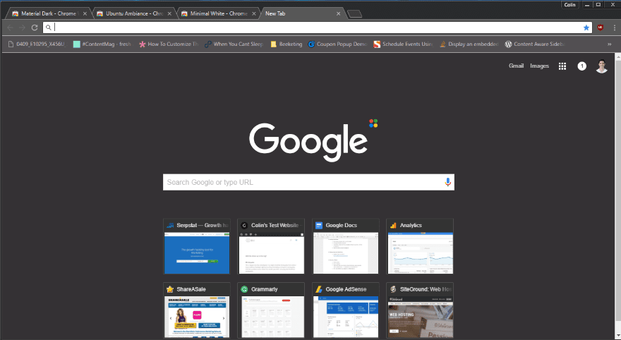
Material Dark is another dark, minimalist theme that tries to follow material design principles as much as possible. Obviously, it can’t completely change the interface because of the limitations placed on Google themes.
But like Designer Theme, it’s easy to look at.
Price: Free | More Information
3. Weather Time London Theme – Daylight
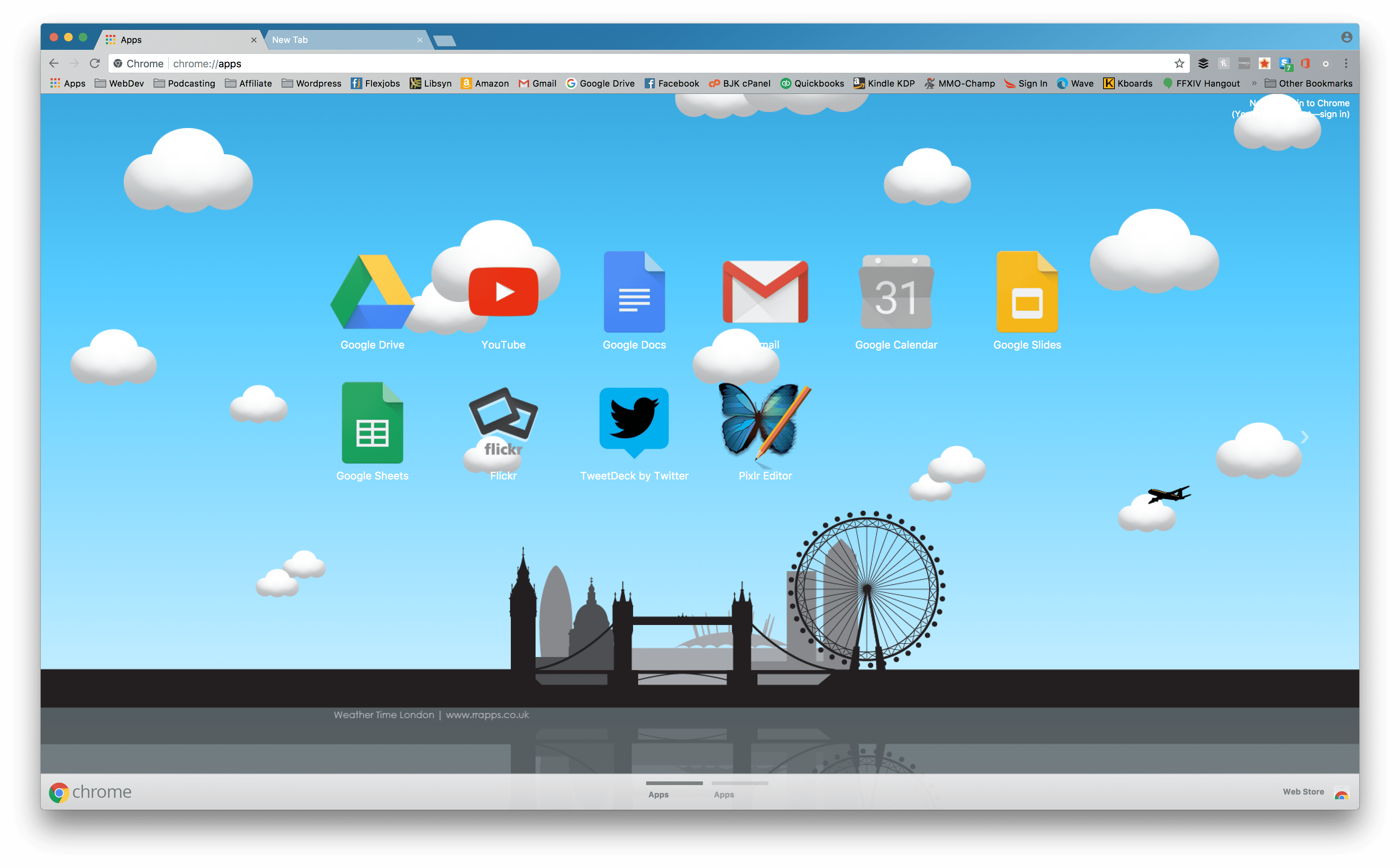
In stark contrast to the above themes, we have a bright daytime scenethat still gives you a good minimalist feel. The vector background scales to any resolution you use, and the bars have a fantastic level of transparency that keeps things separated and never cluttered.
Price:Free | More Information
4. Galaxy View
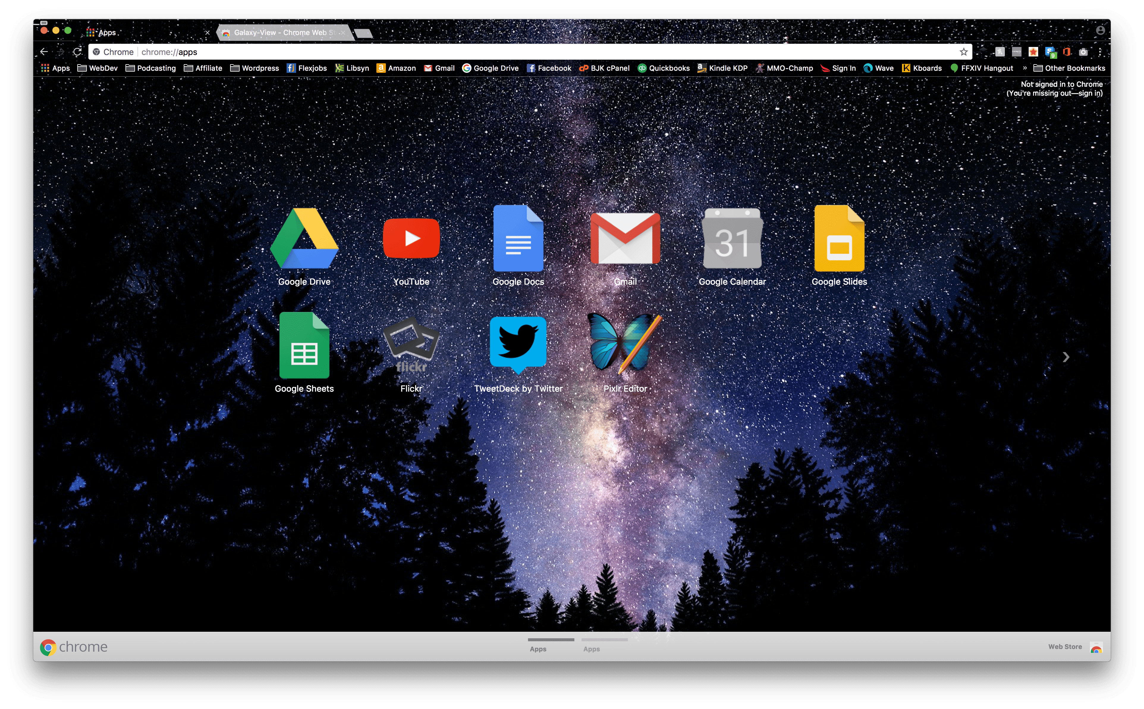
Designers often draw on nature for inspiration, and there’s no better place to start with that than space. This fantastic view of the stars will undoubtedly keep you inspired and ready to shoot for the moon for your clients.
Price:Free | More Information
5. Plumage
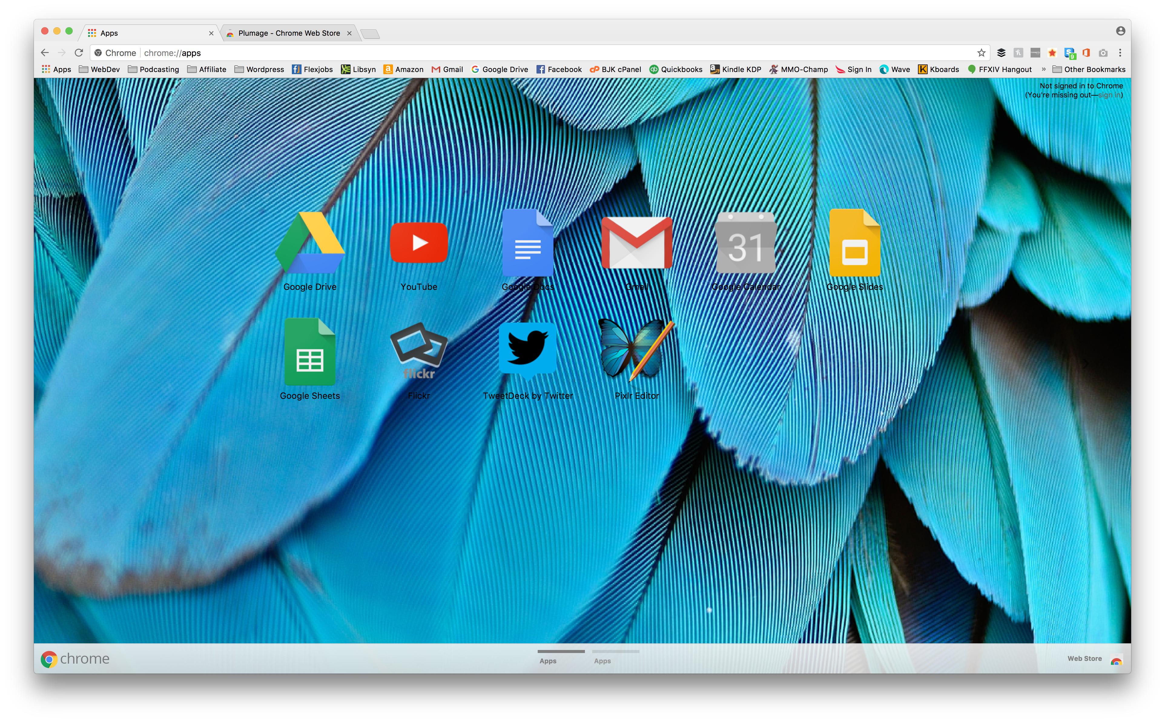
The only bad thing about Plumage is that sometimes the texture of the feathers overlaps the text of the app icons. If you can deal with that, then you should definitely enjoy this theme with its vibrant colors and fun (unintentional) shifting as you swap between desktops or move the Chrome window around.
Price:Free | More Information
6. Colors
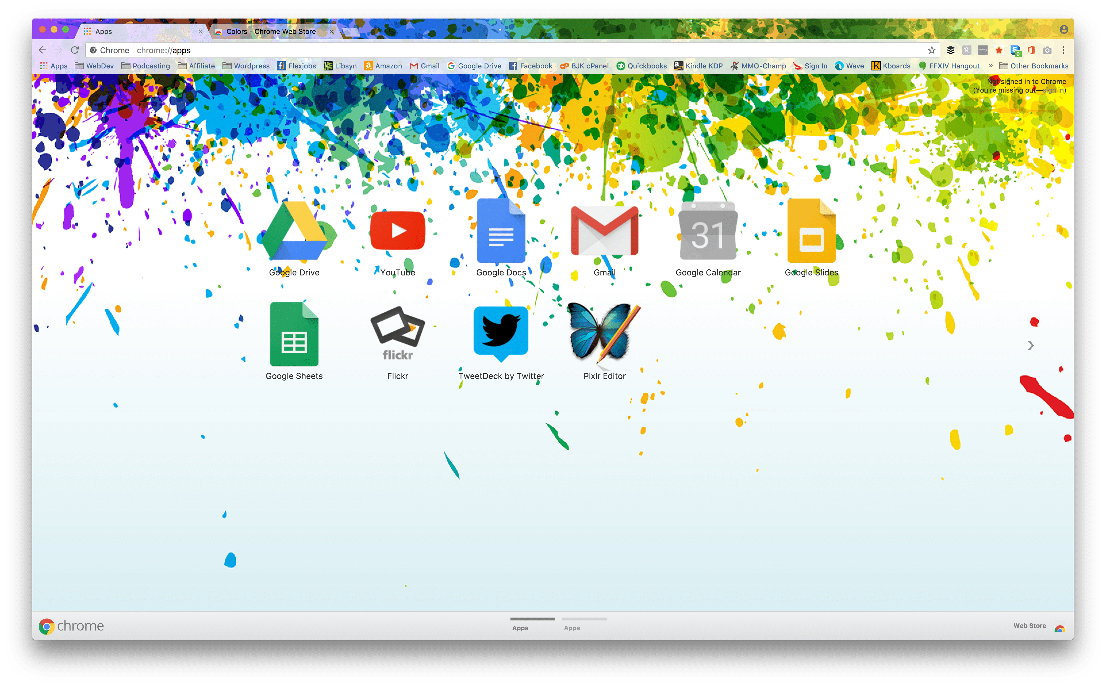
When you install a Google theme called Colors, you know you’re in for a treat. Literally giving your browser a splash of color, this theme works really well to give you a bit of a pick-me-up whenever you open a new tab. You can’t not perk up when you see something this pretty.
Price:Free | More Information
7. TD1.8
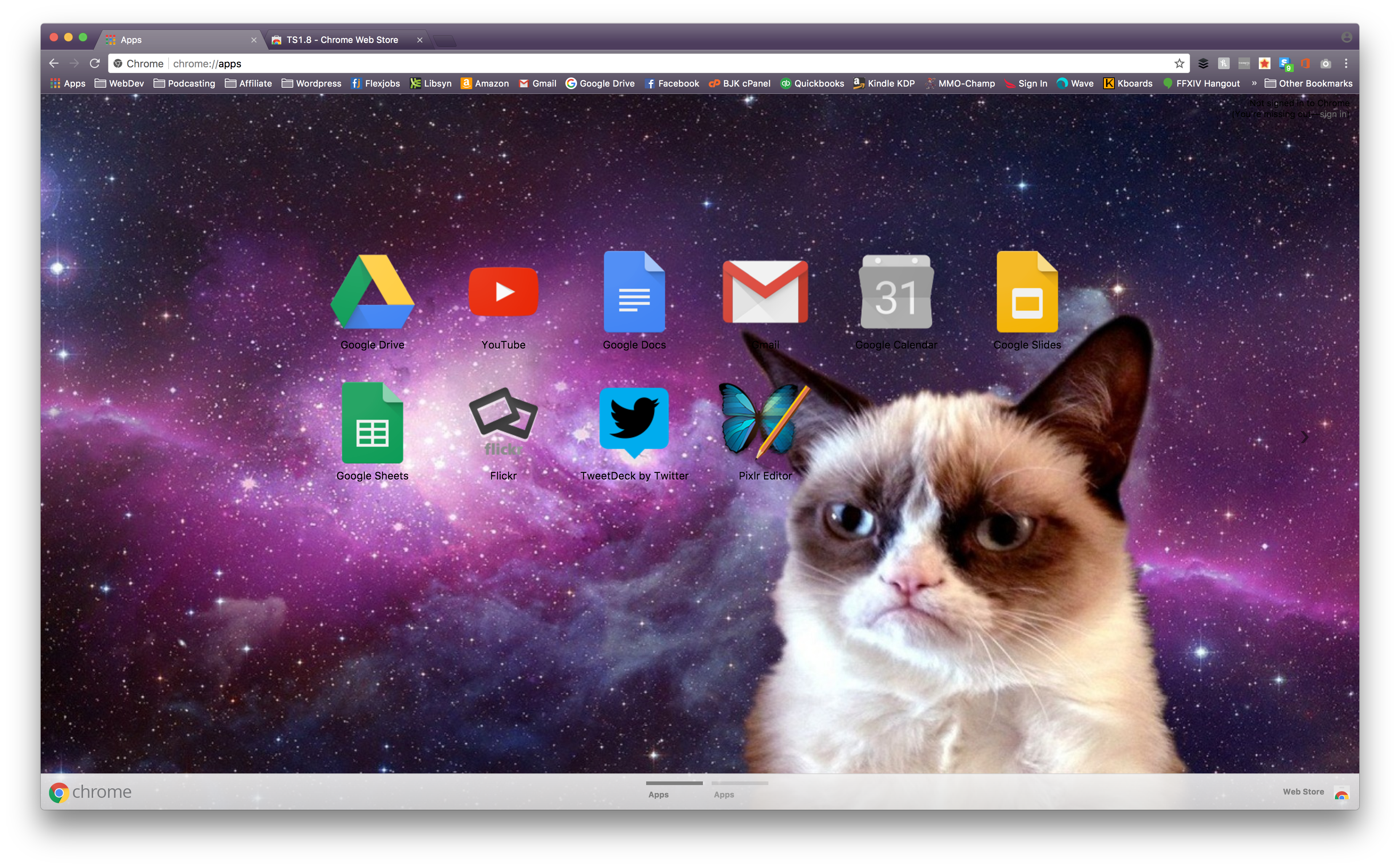
You’re welcome.
Price:Free | More Information
8. Flat Coloured Theme
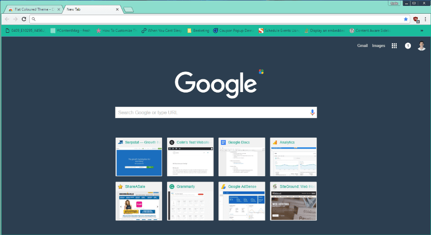
Tired of the dark minimalist themes? Flat Coloured Theme brings in some color in a manner that’s still soft on your eyes. Teals and greens accent the dark new tab screen.
Price: Free | More Information
9. CosmicDust STD
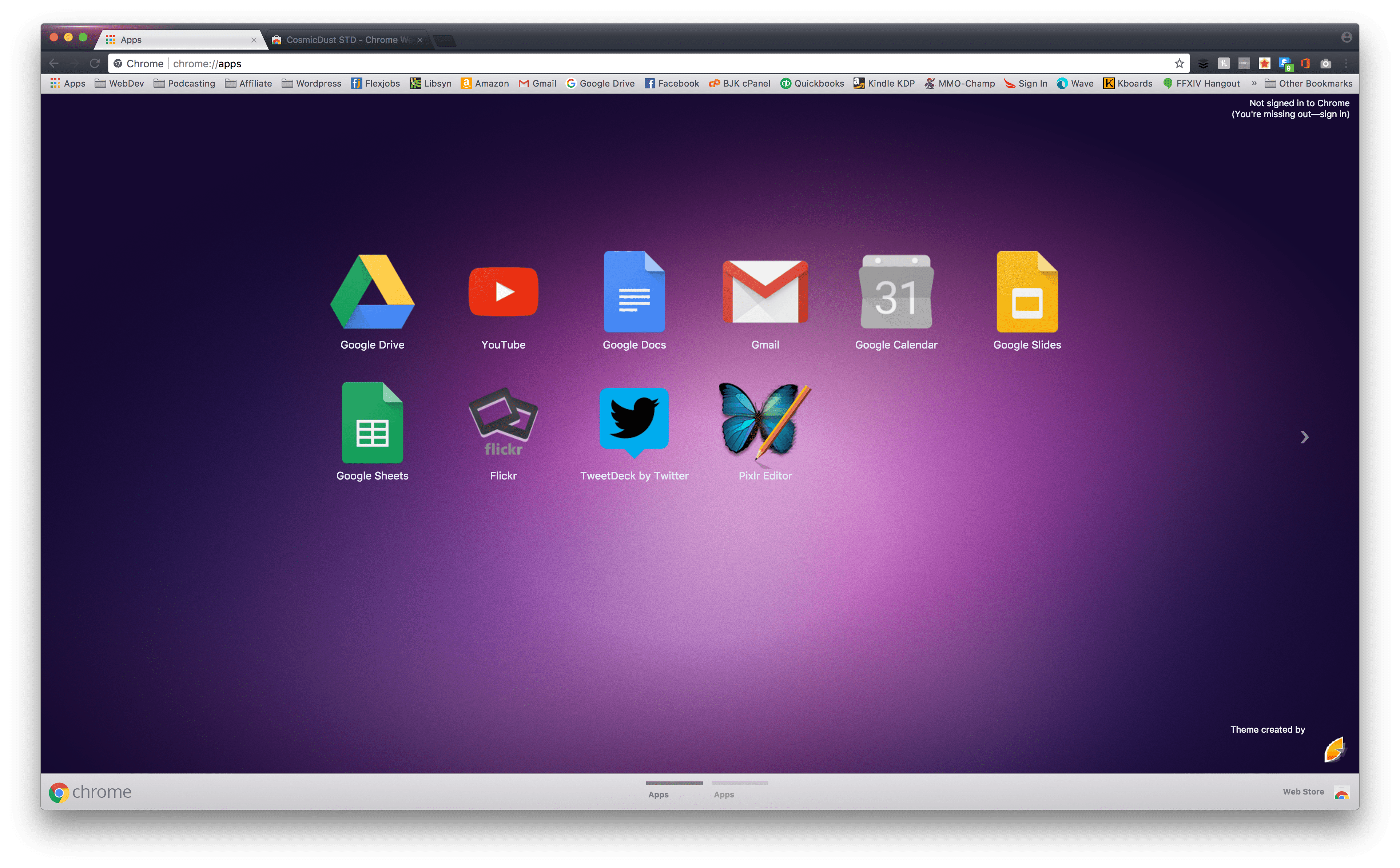
The magenta gradient background is soothing and calls back to early Mac desktop backgrounds, and the light bars/tabs contrast nicely with the dark theme for the rest of the browser and inactive tabs. It’s simple, but also slightly more than minimalist.
Price:Free | More Information
10. E4 Dark v2.1
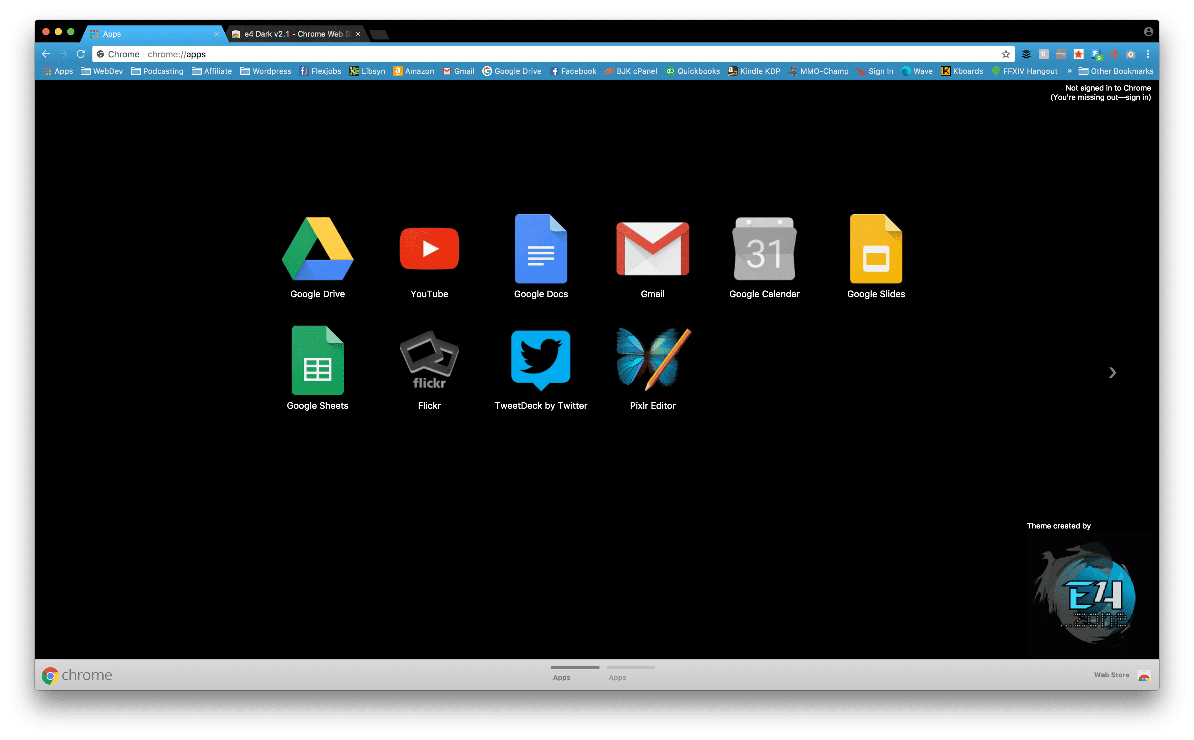
I wasn’t originally sure if I liked this theme, but after using it on my own for a while, the simplicity really worked for me. The black background is simple and stark with your icons, but the bright blue never seems to get old. The colors contrast well with each other, and everything is just simple and uncluttered and clean.
Price:Free | More Information
11. Purple Pink
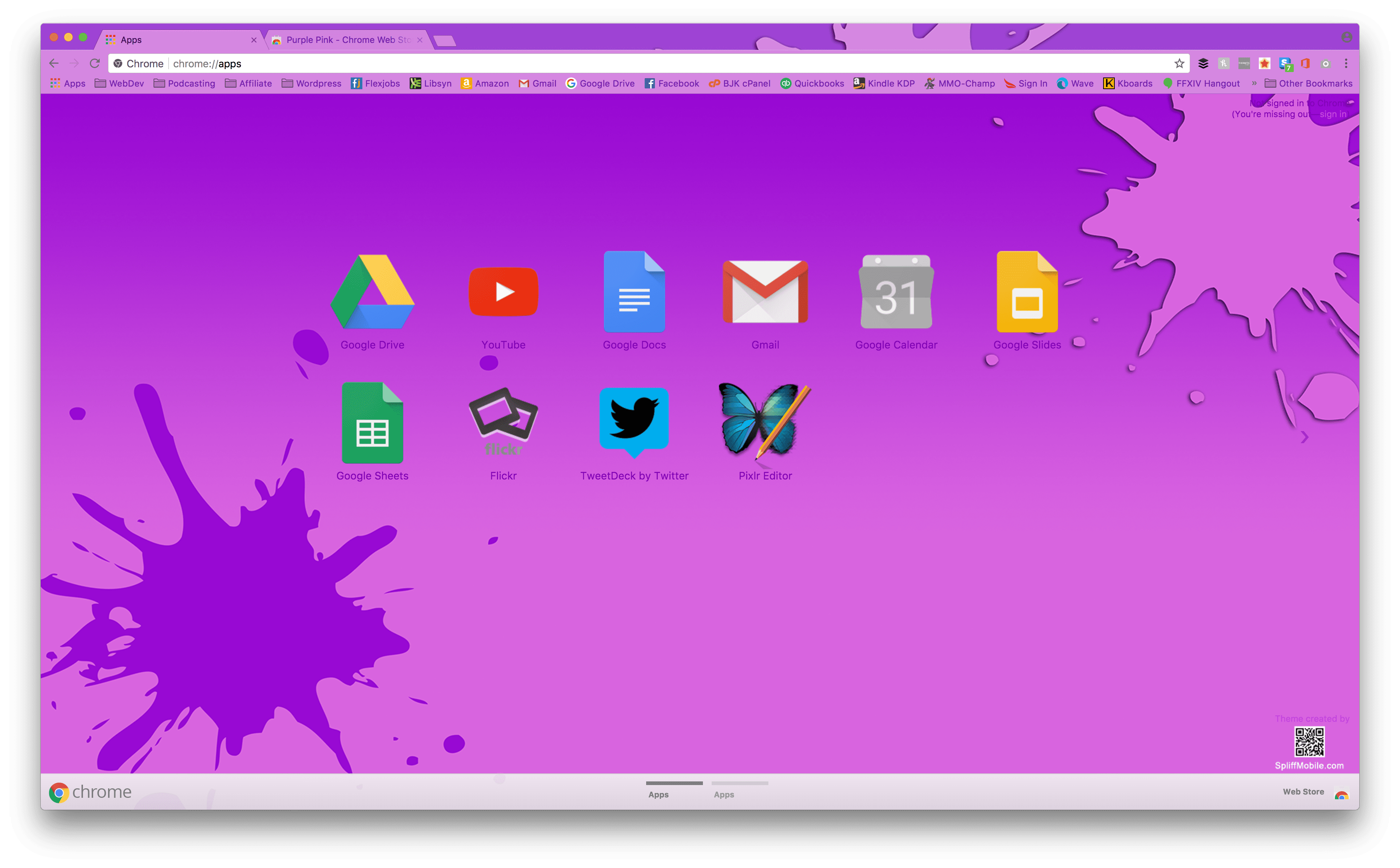
Bright colors can really make a bad day turn into a good day. Purple Pink is a theme that could easily fall into the way too much category for many people. But I really liked its monochromatic colors and vibrance. The different shades and transparencies between tabs, bars, and backgrounds just works and keeps the hues from being overdone.
Price:Free | More Information
12. Cardboard Day
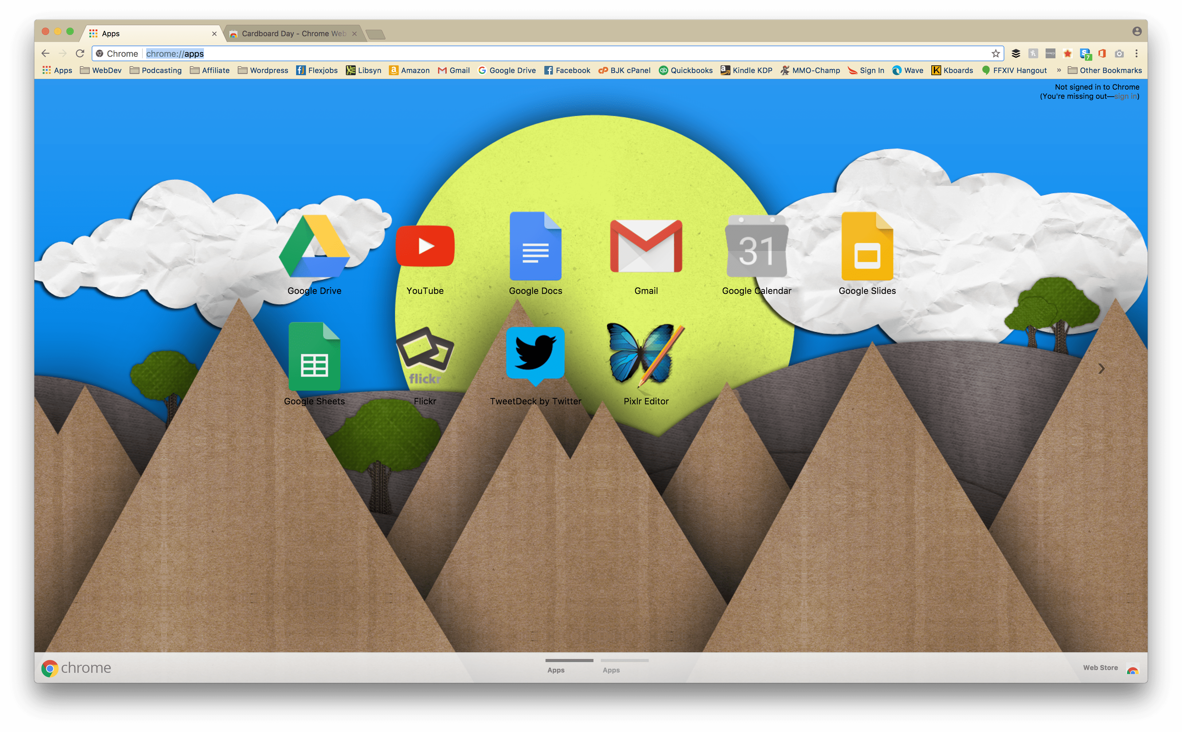
It is very easy to get into a design rut. Far too easy. Cardboard Day breaks away from the minimalist, flat, material design that permeates so much of the internet today. It’s fun, but not loud. And it’s light (but not grey) bars and tabs really make it pleasant to use beyond the papercraft design.
Price: Free | More Information
13. a e s t h e t I c
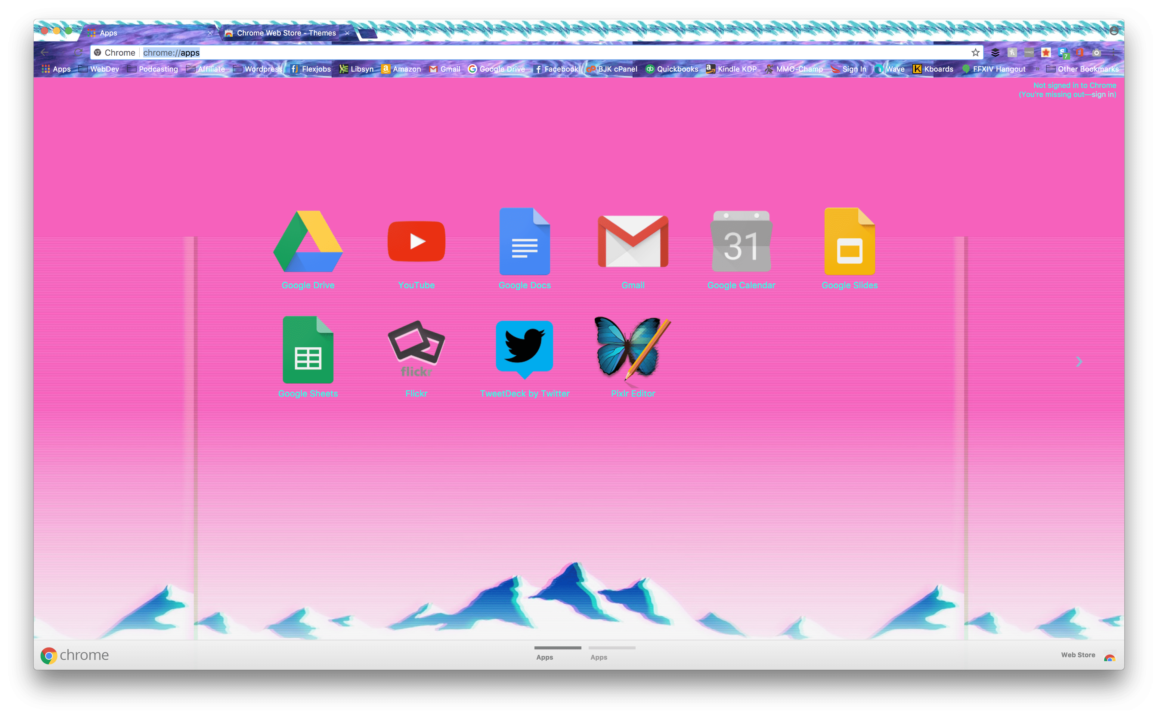
And for unlucky number 13, I couldn’t resist a what-not-to-do theme. The background image is fine. It’s bright and fun, and it delineates the app area well. It makes use of color and contrast well. But the tabs and bars? You can’t read them at all. That wouldn’t be an issue if there weren’t the crazy patterns obscuring favicon, too! There are three different patterns at work in the toolbars and tabs alone.
Consider a e s t h e t I c a warning.
Price:Free | More Information
14. Color Fusion
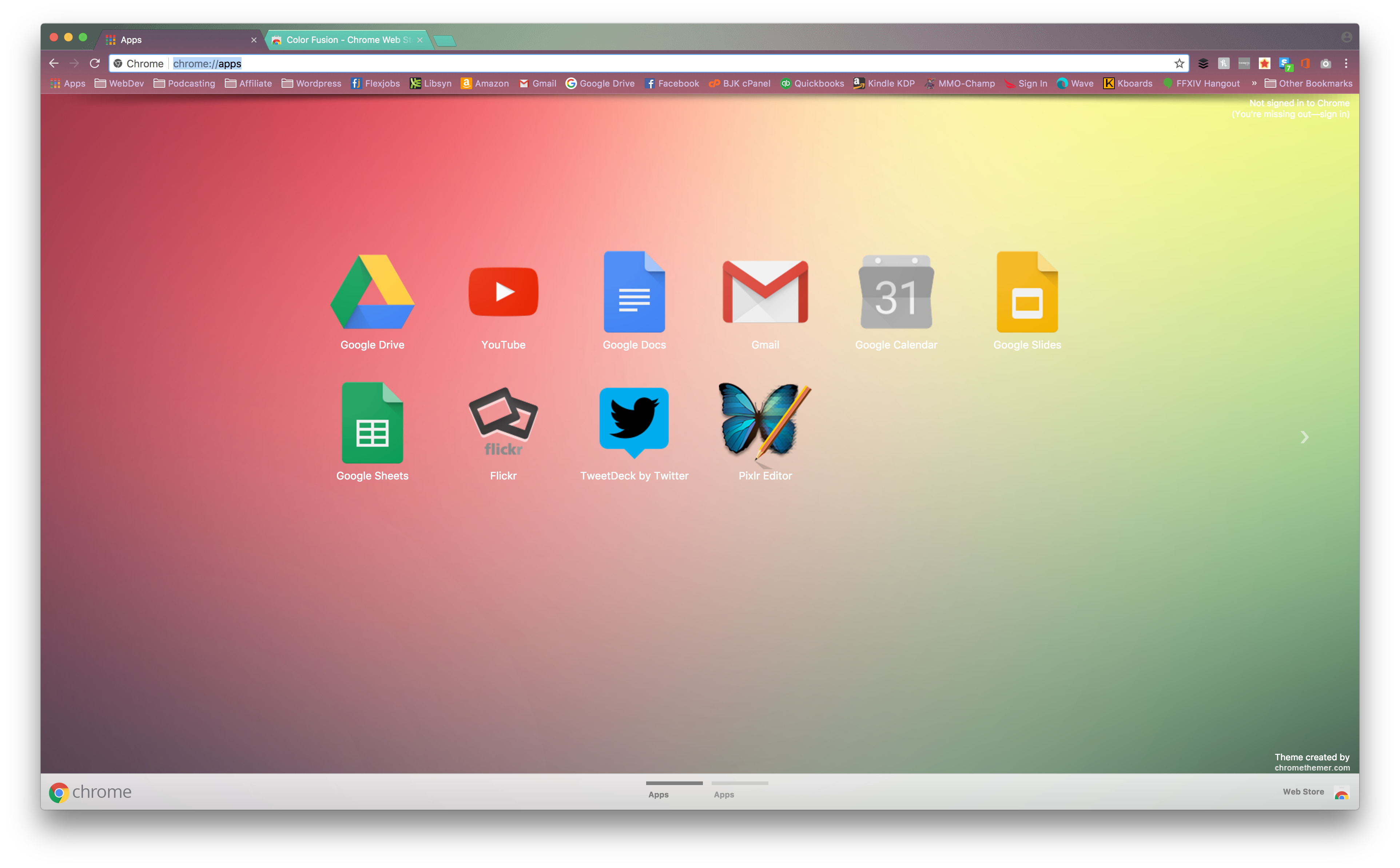
Quite the opposite of unlucky number 13 up there, Color Fusion does everything right. Soft and complimentary colors are spread out evenly, and the active tabs and toolbars have a nice level of transparency that don’t impede utility and function. Interestingly, too, the more vibrant tabs are the inactive ones, so you have to get used to that. But it works somehow.
Price:Free | More Information
15. Mountain Lake
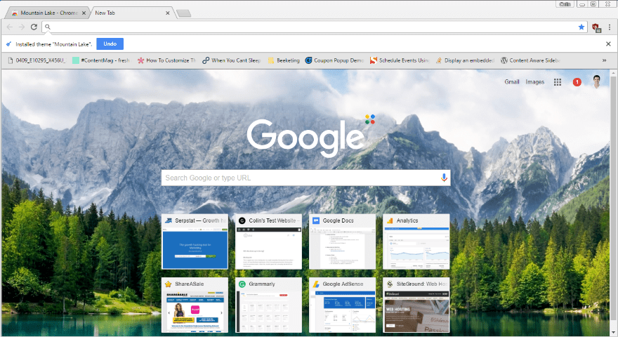
And finally…let’s end with a theme for when you’ve been working all day and just want to stare at a gorgeous mountain lake when you go to open a new tab. There’s no creative styling on this one – just gorgeous imagery.
I wanted to include at least one theme that wasn’t focused on interface color changes. And while you can find plenty of gorgeous photography backgrounds, this one was my personal favorite.
I encourage you to find the one that brings you a little peace and relaxation.
Price: Free | More Information
Go Solo and Make Your Own Google Theme
Are none of the above Google themes doing it for you? You can easily make your own using a free Google Chrome extension called Theme Creator. No code required!
And if you feel like sharing, you can always upload the theme that you create to the Chrome Web store for others to use.
Wrapping Things Up
While using one of these Google Themes isn’t going to double your productivity or anything like that, they can make your work just a little bit more pleasant. And that’s just as important as productivity.
Now over to you – have you ever played around with Google Chrome themes? Which one is your personal favorite?
Article thumbnail image By Santitep Mongkolsin / shutterstock.com




Just an FYI- the 404’s are due to bad links that need to be corrected in the post.
Cosmic Dust–
post link:
https://www.elegantthemes.com/blog/resources/https:/chrome.google.com/webstore/detail/cosmicdust-std/apidnjfojpnbepflbnldceejhokbgokk
correct:
https://chrome.google.com/webstore/detail/cosmicdust-std/apidnjfojpnbepflbnldceejhokbgokk
Color Fusion–
post link:
https://www.elegantthemes.com/blog/resources/https://chrome.google.com/webstore/detail/color-fusion/nlbhgldkknkdbmokgljifjohkembinbd
correct:
https://chrome.google.com/webstore/detail/color-fusion/nlbhgldkknkdbmokgljifjohkembinbd
Also #7 is named incorrectly. The correct name is TS1.8 & it’s located here:
https://chrome.google.com/webstore/detail/ts18/hnhhmlalomhpoaelhcgmaeobmbbhfnkf
What about a Divi customisable Chrome theme 😉 ?
404 Errors on all the links 🙁
That’s odd. I’m testing in Chrome and I don’t get that.
404’s here too. 🙁
I’m getting 404’s on a majority of the links as well. Tested in Chrome and Safari. Just FYI. 🙂
Hi Nathan,
With Safari, the link is :
https://www.elegantthemes.com/blog/resources/“https:/chrome.google.com/webstore/detail/color-fusion/nlbhgldkknkdbmokgljifjohkembinbd?hl=en&pli=1”
I think, it might be only
https:/chrome.google.com/webstore/detail/color-fusion/nlbhgldkknkdbmokgljifjohkembinbd?hl=en&pli=1
Regards
Hello,
Extensions tools for developers might be a more useful topic, instead of themes.
Not a bad idea. Noted. 😀
+1
+1
Mmmm… This is a bit WP/Web/Marketing out of topic, isn’t it?
Putting a little effort in one’s work space is a good idea. I forget to change it up.
You’d be surprised at how often I forget to change away from the default wallpaper on both my phone and computers.