A new year is here, which means it’s time to toss out all our old and bad habits. Right?
Of course, doing away with bad design habits is always a good thing. Inefficient processes and outdated techniques should always be replaced once you have a smarter way of executing them. However, doing away with the old? Well, if 2018’s web design trends tell us anything, it’s that “old” design trends from 2017 aren’t going as far away as we might think. In fact, much of what I’m about to share is going to look quite familiar, just with a more modern twist.
Now, although many of the web design trends in 2018 are similar to ones you’ve been using the last couple years, that doesn’t mean it’s time to kick back and relax. The web design trends of 2018 have evolved a great deal as the technologies we use to execute them and our knowledge of what users want have been further refined.
So, let’s take a closer look at what each one entails as well as some real-world examples that demonstrate each web design trend nicely.
9 Web Design Trends It’s Time to Master in 2018
The following web design trends have already started to leave their impression on the web, which is why there are already some cool examples of these trends in action. Keep reading to discover more about what’s behind each of these design trends and to find out why these may be beneficial to use in your own WordPress web designs this year.
1. Vibrant Color Schemes
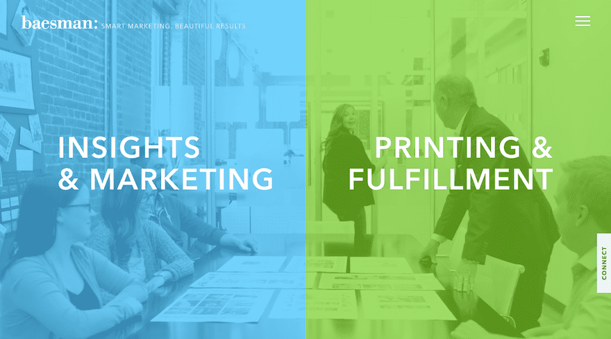
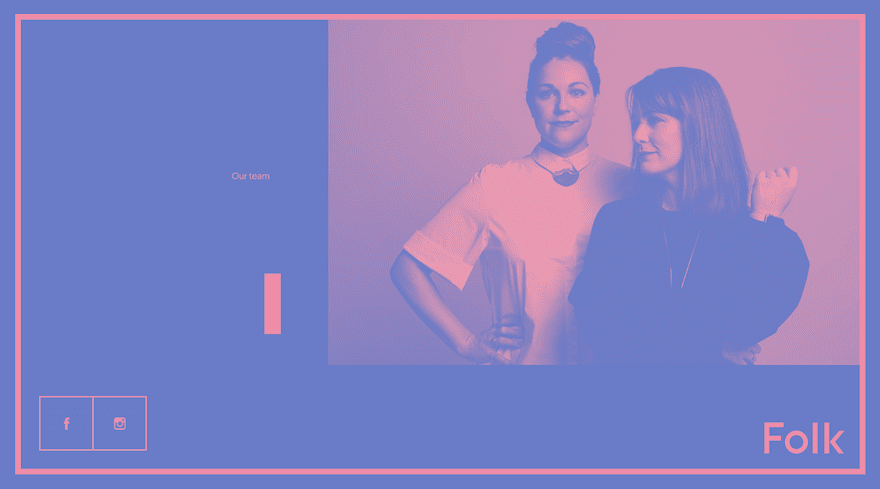
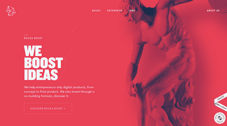
When Google came out with Material Design in 2014, it pushed the boundaries of what web designers had been willing to do up to that point, especially when it came to color. Thanks to the success we’ve seen with Material Design and what it’s enabled designers to do with bright colors in a controlled setting, 2018 is giving designers the thumbs-up to experiment with it even further.
Vibrant color schemes are perhaps the tamest part of this trend as we’re also going to see more experimentation with double exposure, gradients, and photo saturation.
2. Rebellious Typography Choices
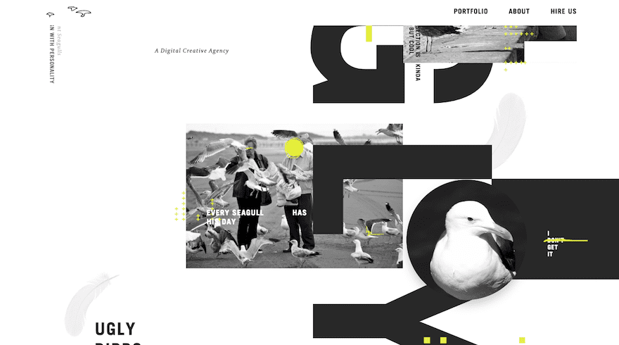
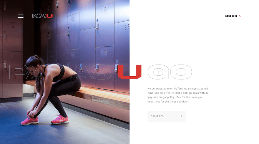
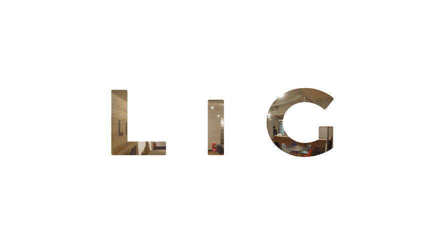
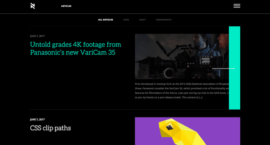
First off, let’s be clear that this one isn’t about anything other than header text. The rules established regarding the readability of standard paragraph text are ones that should never be broken. That said, header text–especially on the top of a home page–is a different story.
In 2018, we’re going to see a major shake-up in how this header text is styled. It’s going to be:
- Bolder
- Oddly spaced
- Transparent
- Weirdly misshapen
- Haphazardly placed
- And who knows what other techniques designers will come up
Needless to say, web designers are going to have a lot of fun pushing the boundaries of text this year.
3. Asymmetry
Users have been trained well to understand how websites work:
- Use the top navigation to find other pages.
- Scroll down to read more.
- Click the flat, colorful buttons for more information.
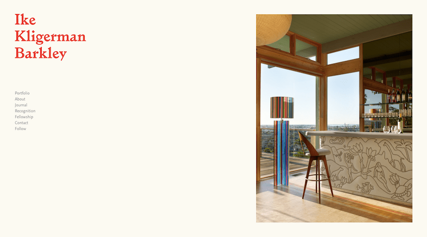
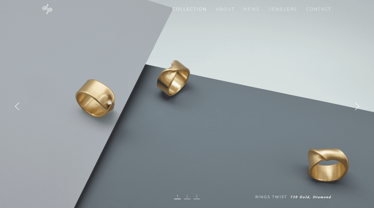
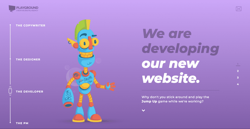
Now that they’ve got the basic principles down, designers are free to experiment with layouts and grids, using unexpected changes and asymmetrical balance as a way to surprise and delight users along their journey.
Playground Creative Digital Agency
4. Experimental Video and Animation
Another way web designers will be shaking up design is with video and animation, though not in the ways we’ve traditionally seen it used. While there will always be a need for explainer videos and scroll-triggered animations, 2018 will bring with it more experimental uses of video in the form of cinemagraphs, particle backgrounds, virtual or augmented realities, and even animated thumbnail images.
Ann Street Studio Amangani Example
5. Micro Interactions
Animation doesn’t always have to be big and bold. This is especially the case now as colors and typefaces become brasher and rebel against more traditional and safer norms.
Instead, what we’re going to see more of in 2018 are micro interactions. This means designers can use animation as a sort of signal or reward for visitors that properly engage with their websites. Rather than continually throw movement at visitors, this subtler touch will surprise and delight visitors as they engage with less obvious elements on the site.
6. Sticky Elements
As you can see, 2018 will test the waters in terms of how much the users’ experience can be disrupted with shocking amounts of color, unexpected movement, and even typography that requires them to work a little more than usual. That’s why it’s nice to see that not all web design trends for this year will be so disruptive.
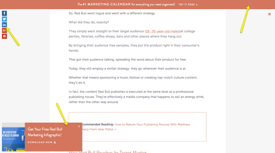
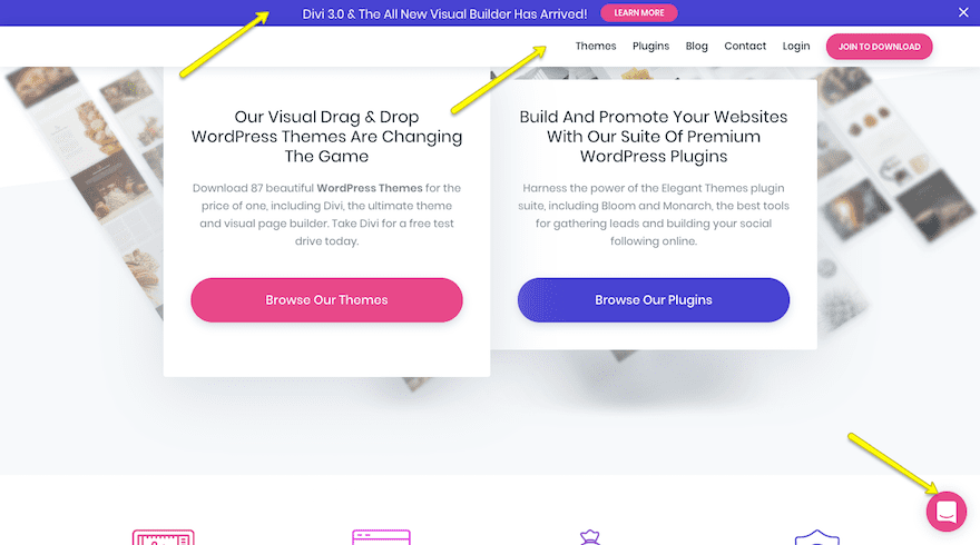
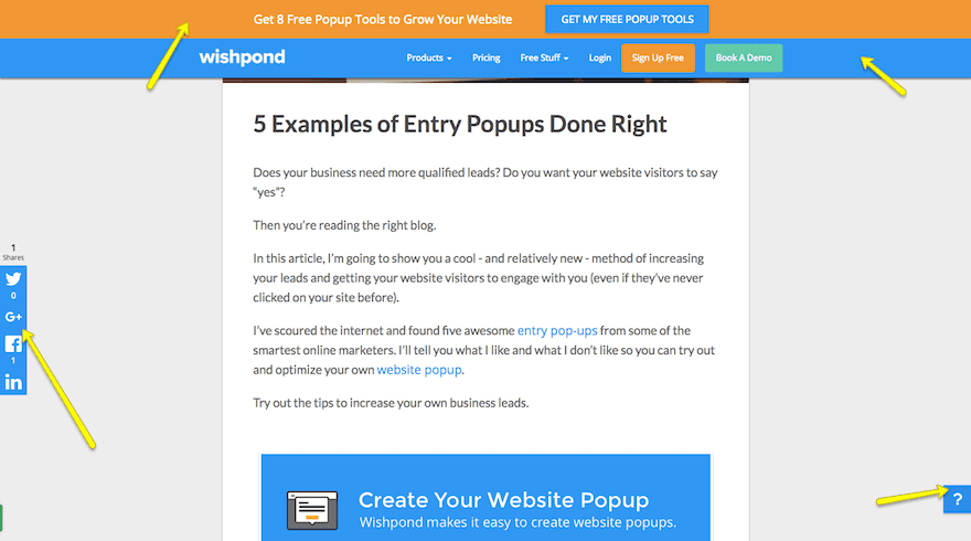
Take the sticky elements, for instance. Sticky navigation and hello bars are not new concepts in web design. That said, designers wisely recognize the benefits in making certain elements “stick” to the sides of a website in order to reduce friction while sharing messages in an unobtrusive way with visitors.
7. Hand-Drawn Elements
In the not-too-long ago days of early web design, stock images were the hot thing. They were easy to find and didn’t require you to do much work other than search, purchase, and download. Then there was custom photography. It gave designers a chance to put a personal spin on a website’s design.
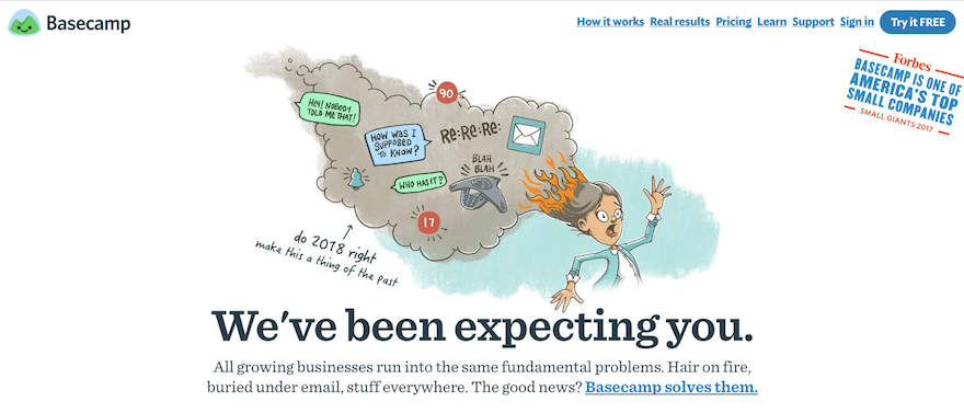
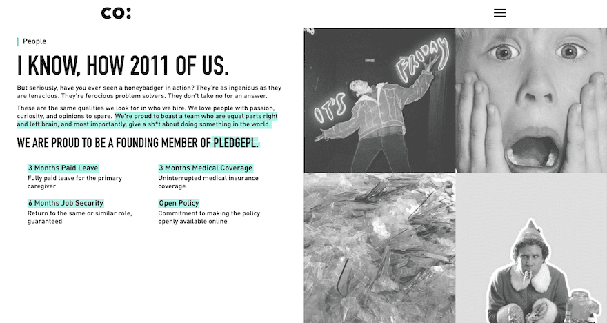
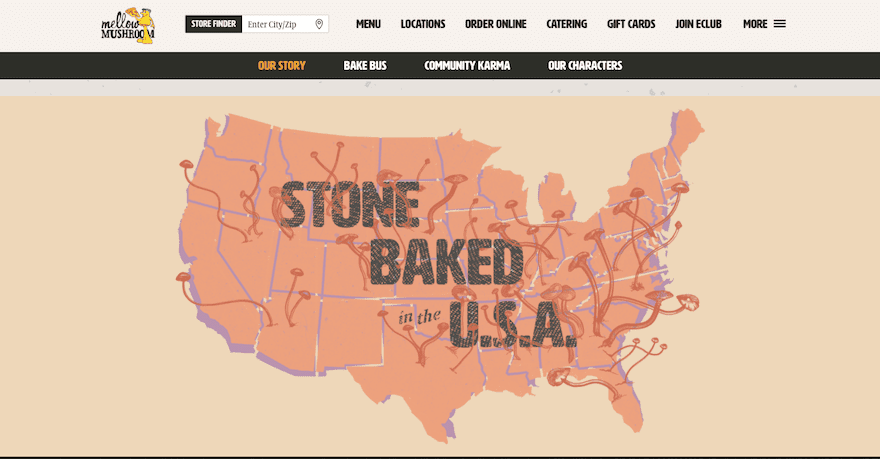
Obviously, neither of those design options will go away as stock and custom photography still have their place. However, for designers that want to put a creative spin on a website and make it uniquely their own, you can utilize the hand-drawn trend. This, of course, doesn’t mean you need to illustrate a website totally from-scratch, but you can infuse hand-drawn elements like images, text, and even highlighting within it.
8. Fluid Shapes
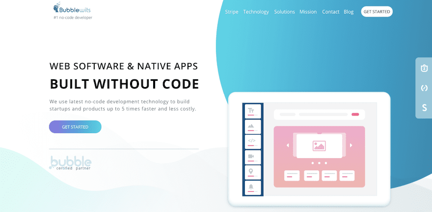
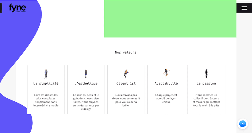
If you want to know where the fluid shape design trend comes from, all you have to do is look back at the geometric-focused designs that dominated websites the last few years. Basically, this trend says that geometry rules, but it needs to not be so severe all the time. Oh yeah, and it’s okay to give your shapes some depth and movement if you want, too.
So, basically, moving into 2018, you’ll want to round some of those sharp edges on your websites. And bring back the 3D layering of Material Design.
9. Mobile Prioritization
Finally, there’s the prioritization of the mobile experience. Mobile-friendly websites, responsive web design
… with these techniques mastered, it makes sense that Google is just about ready to take this up a notch with mobile-first indexing.
This means that sites will no longer be primarily ranked on the desktop experience. In the near future, Google will use the mobile version of the website for determining rank. And, as the mobile experience takes an even greater priority in your web design process, you’ll find other mobile-first initiatives, techniques, and tools making their way towards you. In 2018, specifically, you can expect to see more websites relying on SVGs (instead of JPGs or PNGs) as well as more websites going through Google AMP.
Using These Trends in 2018
One of the great things about web design is that it’s a constantly evolving thing. While each of the web design trends of 2018 will require a slight reconfiguration of how you design WordPress sites, they shouldn’t require that you learn a completely new technique. It’s simply a matter of rewiring your brain to look at design a little differently this year.
Now, over to you. Were you surprised to see any of the web design trends mentioned above?
Article thumbnail image by Andrew Krasovitckii / shutterstock.com




In some projects, they have to put these trends together and make a brilliant design.
Anyway, thank you for your suggestion
Some really good information here. I still think Typography plays a huge part of a design, being in design for a few years now, I have seen things come in and out of fashion. Gradients are now slowly coming back in, as well as drop shadows, people are using them in new ways, out of the box ideas.
Mobile first has been a thing for a few years now, and yes Google is going to be indexing mobile first.
I would like to know peoples thoughts and opinions on things such as flexbox and bootstrap, that allow us to create responsive web apps without the use of media queries, do you think Google will penalise us for using these technologies?
Thank you for the great post.
Thanks for sharing this blog
Hi,
Really very helpful ideas, thanks for sharing your research.
How were the coloured blocks achieved that overlay the header image (fade with hover and link out) on the baesman site?
Topic of selection and listed these trends,Awesome!! as these topics really searches the most and trending designs in past few years like flat designs, creative typography and animation rock the design’s world…….
Good and interesting article,it is attractive.Nice points you have shared.
thanks for the list , really useful
Great article on web design very interesting topics and very important to follow these trends while designing… Vibrant color schemes impressed me a lot, will definitely use these tips on my design and keep rocking on the designs.
Mobile friendly themes has been the best so far especially when it promotes good user experience.
Great article! very informative and this is awesome suggestions for website design and development.Thanks for the guideline. It’s very helpful.
Based on the feedback that I get from clients and UX sessions with the public, none of these, except maybe the hand drawn sites, would be at all acceptable for the UX experience. I suppose it depends on your audience but trends normally end up in the Good Will pile while classic design lasts for years. People want information, pictures and color are goo, but bombarding the senses never sold much for me, in brick and mortar or online … maybe on some mind altering substance …
That’s my experience too. My users tend to jump right from the content page that brought them to the site, to the contact form or social media button. Fancy stuff on a landing page is irrelevant to them. Takes a few seconds more to interpret that and they are not there to sightsee.
“good” … not “goo”
laptops in the sun are not a great trend either!
2018 is all about mobile friendliness
Great insight, we offer web design here at the company and see how video banners and background are on all-time high.
tank you
Thanks for very useful posting. Really 2018 Web technology will be mobile friendly. So mobile friendly strategies should be implemented.
You seem to have missed the wonderful animation Apple.com is using on its pages, and the movement to JAMStack static sites that use JavaScript, APIs, and Markup … no PHP, no databases, etc.
Great insight, we offer web design here at the company and see how video banners and background are on all-time high. So are full-width designs so basically no borders. Folks are loving parralex design which offers some layers and a sensation of depth
Awesome! Just loved it.
I would like to add some points here
1. Cinemagraphs
2. Gradient Backgrounds
3. Split screen designs
4. Knock out texts
5. Isometric and Image Grids
6. Dash of color
7. Particle Background
It would be amazing using 2 or 3 of these ideas together. I recently saw a web design company website’s homepage which uses the combination of the dash of color with particle background and it looks classy and attractive.
So let’s see this as a roadmap for Divi. By far not everything can be done in ET’s most important theme in a simple way.
Interesting article. I get the impression, though, that those “trends” more or less are totally against the recent design principles of making life for web audiences easier. Minimal design, flat design, material design, simple iconography and typography, symmetry, sticky navigations and other things all had the very positive effect of making websites very acccessible, especiall for the mobile devices. Trends like rebellious typography and asymmetry go the opposite way – I doubt that audiences will have positive experiences here. It seems the flat design trend has grown stale, I admit that 90% of the websites now look pretty similar, and that someone is trying to make a radical difference, now. Being different does not always mean being better or more successful. I would be very careful at adopting those trends without a second and a third thought.
folk … i love it .. i love all of them .. IN FOLK how did it happen 😀 ?
Love these designs! I’ve always played with colors…These are such great examples!
Good to read. Too many moving parts though—distracting unless used with great restraint. Some of it is just too choppy.
Thanks for the info.
I like the micro interactions and animations. Adding a few even simple background shapes that move or logos that resize slowly over time are a nice additions. Especially for pages that people are on for a long time.
What do you guys use for your little speech bubble ‘chat’ box on the bottom right (under point 6)? I’m curious.
Hey Kristin, that is the Drift plugin 🙂
Great job Brenda and Elegant Themes! Thank you for pulling these together. It’s very helpful to see where we’ll be going this year.
I love these ideas, I think these trends should be considered by every web-designer
Thanks for the trends.
The “new” look with the use of typography in the headers reminds me a lot of some of my late ’80’s communication arts design annuals…have a look.
I hope the sticky elements trend is used with some restraint. A sticky menu header, cool. Another pop-up asking me to subscribe or the always annoying let’s chat pop-up or the multiple stickies blocking my interaction with your site will be just as annoying as it was last year. (Glad you showed the Elegant themes example. Makes my point. A Hello bar, two pop-ups and a chat icon. Can’t see page at all…)
Love the type stuff, Have always loved asymmetry. Thanks again for the trends.
Hi
Love the website trends. The question is can all these websites functions and designs be created with the Divi Theme?
There are really some amazing text features like the one you can see the office furniture through the text.
Please create some tutorials around this, if it is possible.
Thanks, Great post.
Shane
Hey cool beans, thanks for the share Brenda this was a great read.
Referring to the mention of Google AMP, can someone suggest one or several key resources to understanding 1) AMP itself and 2) if and how Divi and AMP can we used together? Also, are there viable alternatives to AMP and, if so, how do they compare. Thanks!
Me too! 🙂
+1
I would love to know this too.
I agree with Jean-Francois. And I am not convinced about Google AMP. Take a look at this article, it is continously updated: http://adrianroselli.com/2015/10/googles-amp-html.html
Chopped off text. I’m loving simplistic and modern and major minimalism trend in 2018.
Chopped off text. I’m loving simplistic and modern and major minimalism trend in 2018.
Nice post Brenda. We have just revamped our website using bold fonts, colours, gradients and many of DIVI’s new features !
I love the transfer this year are turning out. There has been a movement towards brighter colors and animation. What I find interesting is that there seems to be about a two year cycle from when these trends started and became popular.
I wouldn’t follow blindly all those schemes. While Sticky Elements, Mobile Prioritization, and – in some cases – Vibrant Color Schemes make sense, I am less convinced about the future of Asymmetry or Rebellious Typography Choices, except for some very specific uses. If it would become common, it would not make most websites more attractive.
Thank you anyway for your efforts in listing those trends: it encourages one to think and to explore new paths!
I am just straight up glad that colors are really in now. I was getting incredibly tired of the dark greys and blacks that designers were using for years, and it made every site look so bland and similar. I really do think the move toward color is a fantastic trend. Heck, even if it’s a dark site that you’re going for a pop of color can really bring it to life.
I love the new creative trends. The challenge I always have is that the majority of my clients don’t “get it.” They want to stay bland. One little offset or filter and they request that it be changed. I’m still working on one client to keep the logo overlapping into the top bar on the site. I guess that I have to find some more exciting clients.