Have you ever landed on a web page, started reading the content only to be interrupted by a pop up or distracted by a link to a landing page advertising a free product if you enter your email address? That’s a squeeze page.
It’s called “squeeze” as the customer is intentionally squeezed through a sales funnel to this landing page. Or alternatively, it’s a way of squeezing customer’s email addresses out of them!
Initially the interruption from what you originally went to the site to read can be annoying. But then you see what is being offered to you and it turns out to be totally worth it. All you need to do is give away your email address – usually with the acceptance that you’ll be marketed to – and you’ll get a free eBook, an email series of useful information, or “subscriber exclusive” video content, for instance.
And for the marketer, it’s a really valuable tool. Setting up the free product will take a little bit of time and investment to make sure it’s a worthwhile product to send out. But then the data you get as a return is like gold. Once you have prospects’ email addresses, you can build a relationship with them through your email marketing, leading to the ultimate goal of a sale.
The Squeeze Page Offer
The free product that’s offered on a squeeze page needs to be something that can be sent via email. The whole idea of the offer is that it is an exchange of information and therefore an email address is required to be able to view the product.
A link to a video that’s freely available on YouTube wouldn’t work, since your readers will be savvy and know that they can simply search for it online themselves. They may question why you’re collecting email addresses when it appears you don’t need to use them. Also, sending something via email rather than to a location where anybody can access it gives the product a feeling of exclusivity. This is a great start to a customer-supplier relationship.
Good examples of squeeze page products are an eBook on a topic related to the product or service you sell online; a white paper that gives insights into the industry that your customer is interested in; a report with industry research statistics; a discount; or a series of informative emails that make up a course.
When so much information is free online these days – from written to video content – it’s important to communicate why this product is different and why it’s worth signing up for.
One of the best ways to do this is to go down the series email route. This allows you to send many emails, which will build your relationship as your reader gets used to receiving information from you. Since the content will be sent out over a series, it makes digesting that content easier than if it were all to be sent in one go. This makes email series more beneficial than white papers (however, bear in mind that certain audiences, like businesses, appreciate the hefty amount of information that’s supplied in a white paper).
The Elements Of A Good Squeeze Page
The design of the page needs to focus your reader’s attention on the offer and the offer only. Distracting pieces of content should be avoided. This includes links to other websites or even other pages within your site. You don’t want to navigate your readers away and risk losing them and their sought-after email address.
Instead, the page should make it clear what you want your customers to do. A squeeze page isn’t about tricking your readers; the exchange of information is a transparent transaction. So the content should almost suggest that the reader take the offer or leave it and move to another page. A time limit to the offer can help with this.
However there are some good ways of adding content that will assist in encouraging sign ups. Adding a widget to social media sites is a great way to show who of the reader’s friends are fans of the site, or statistics that show how many people have already benefitted from your product. Both encourage the reader to join too. You can also add a well-executed video explaining the benefits of signing up, rather than letting the copy do the talking.
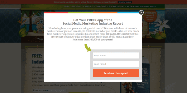
Keep the sign up form simple and ask for the bare minimum. Asking for too much too soon is a sure fire way to scare readers off. Instead, lead them to a thank you page that asks for more details and let them add this once you’ve safely got their email address. But do try to get the information as the more you know about your customer, the better relationship you can build by sending them more tailored marketing emails.
Squeeze Page Formats
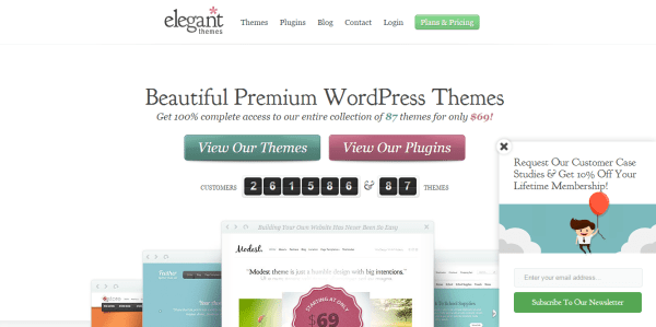
One example of doing this well is through a pop up squeeze page. The reader is forced to click on the X to remove it from the page they were originally reading, thereby giving them the take it or leave it offer.
Just make sure that it is easy to remove with a large and clear X, otherwise the interruption could lead to a negative user experience. This is especially so if your website isn’t responsive (which, by the way, it should be in this digital age), as it’s hard to move the page to where it needs to be to click on the X.
The alternative is to set your homepage as the squeeze page, also known as a splash page, so that users who first come to your site are greeted with your offer. Make sure you make it clear that the splash page isn’t your “real” home page by using a link to go to the home page in case those who aren’t interested in the offer simply navigate away from your site completely.
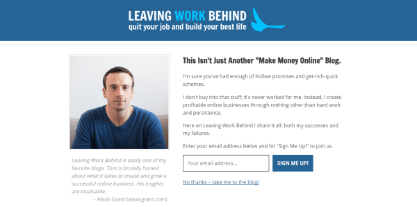
It’s also a good idea to add a cookie so that regular readers don’t get to your site via the splash page every time.
However you decide to deliver your squeeze page, make sure the reader receives their free product as soon as possible. It’s an unfair relationship if they give and then don’t get something back until later. This is where an autoresponder tool comes in handy, which you can use with many email service providers or plugins.
How To Create Your Own Squeeze Page With WordPress
SqueezeMe
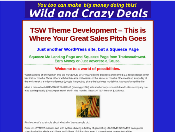
One option is to use a specific theme for squeeze pages. SqueezeMe is the only one available on the WordPress theme section. It is a one-page site that’s very simple but has full WordPress functionality, so you can add a blog and other bits to the site. However, the example provided isn’t the best example of a squeeze page as it looks rather “salesy” with a dubious product.
Current
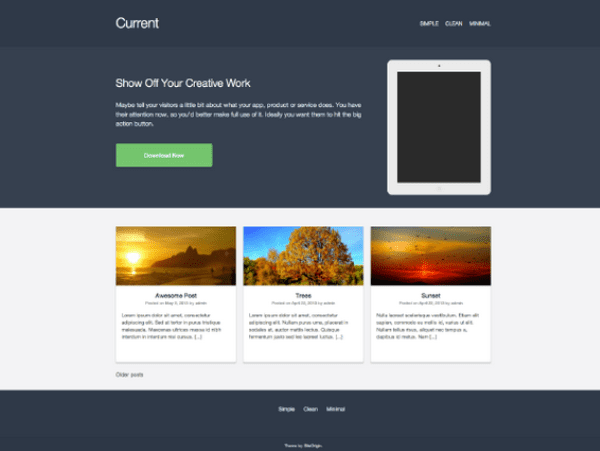
Another theme that includes the ability to add squeeze pages is Current. This is a well-designed theme for any website, however it has the extra benefit of featuring a Page Builder integration (although not nearly as robust as our WordPress page builder). This makes building pages incredibly easy with the drag and drop feature, meaning a squeeze page is an easy addition to your site.
The theme was built with app and software products in mind, but it is equally good for simple websites and blogs. It’s selling point is the large header space, which you can use to showcase a product to customers immediately upon opening your site.
Estate
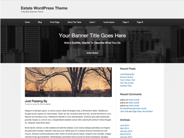
Also check out Estate for similar features. Created by Site Origin, it’s the epitome of their extreme simplicity style – it’s essentially a blank canvas on which to build your website. The options available to customize your site means it’s simple, but powerful. Use the widgets to add videos, images, and price tables, for example.
WP Lead Plus Free Squeeze Page Creator
If you’d prefer to stick to your current theme, you can simply opt for a plugin. As with all plugins, this allows you to build your site as you’d like it by having a base design through your chosen theme and picking and choosing what extra bits you’d like through the plugins.
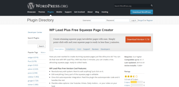
WP Lead Plus Free Squeeze Page Creator is a really good option as it makes creating and editing a squeeze page a breeze. It has a one-page autoresponder feature, so you just need to plugin the code and you don’t need to worry about sending the communications. You’re able to add your logo or choose a background, plus choose one of the 20 stunning template options. You can integrate with Facebook to allow your readers to leave comments. You’re able to check your conversion results through the analysis feature.
The performance of the squeeze page itself is fantastic. You have multiple choices of where to place your pop up across different pages of your website. The pop up can be unblockable and the opt in can be a two-step process, increasing your conversion. Choose to allow the pop up to appear on exit intention or after a specific amount of time.
Bueno Gato Free Popup Creator
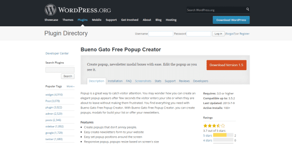
A similar plugin for the pop up option is Bueno Gato Free Popup Creator. The creator promises to provide pop ups that won’t annoy people, which can be used to build your email list and offer your newsletter. You can set where the pop up will appear on the screen really easily – you edit the pop up as you see it. The pop up won’t get caught by ad filters as it’s unblockable, plus it’s responsive to any screen size.
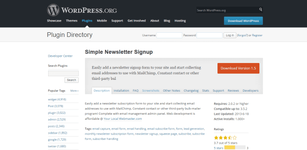
Simple Newsletter Signup is another option if you want a static page for sign ups. It does as it suggests: allows you to add a newsletter sign up option on your website, really simply. It’s designed to be used with an external bulk email program, like MailChimp or Constant Contact.
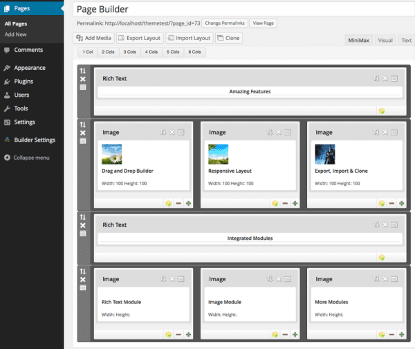
MiniMax – Page Layout Builder
Other plugins that have been designed for easily building landing pages and are suitable for squeeze pages include MiniMax – Page Layout Builder. It allows you to track the success of the page, create AB tests, and design pages without coding knowledge that work with your existing theme. It’s particularly great for beginners as it has a drag and drop feature. You can add sliders, galleries, drop-down menus, testimonials, and many more options without any coding or html knowledge.
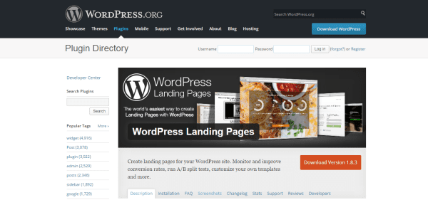
WordPress Landing Pages
WordPress Landing Pages is very similar but has the added benefit of allowing you to pre-populate forms. The creators are offering a growing number of third-party add ons to enhance your experience even further. If you have some design or developer knowledge, you’ll be happy to know it’s extendable with a number of actions, filters, and hooks available to use. It’s plugin agnostic, so you can choose whichever form plugin you’d like.
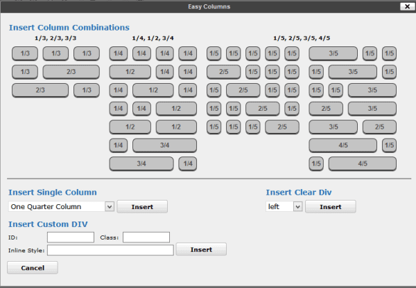
WP Easy Columns
Finally, if you want to build your own landing page, using the plugin WP Easy Columns with an existing theme means you can create a grid layout or magazine style website with a huge number of columns. For squeeze pages, this means you can add a newsletter sign up in the column of existing pages.
Wrapping Up
For whatever page option you choose, squeeze pages are a great addition to your site if you want to build your email list. Email addresses are so valuable and collecting them should be part of your marketing strategy if you want to build a relationship with your existing readers and customers, and for promoting your product or service to new ones.
Encouraging your readers to part with their email address can be tough. They need to choose to do so, and offering a free product in exchange is good start to your relationship. As discussed, this could be a one-off or a series of information – the important thing to remember is that it has to be useful, otherwise the exchange won’t feel equal.
The other key part of this strategy is to make sure your readers see that this exchange is an offer. There’s no use in spending your resources setting up the product and autoresponder if no one sees it! Whether you choose a separate landing page and use a plugin to build the different features of this page, or a pop up from a plugin, make sure it’s appropriate for your audience. You’ll know if it works by the sign up rate, which you’ll be able to see from the statistics in the plugin.
WordPress has so many options for customizing your site, including plugins, so use this freedom to add a squeeze page and see the start of many new customer relationships.
Now I want to hear from you. Do you use squeeze pages on your site? How have you implemented them? I want the details!
Article thumbnail image by Bolkins / shutterstock.com



Full agreement with both above… I almost always leave a site that does this sort of stuff as soon as I can…
Squeeze me and i immediately leave your site. Am old enough to remember the 1st wave of popups some 10 years ago, and the (well deserved) back clash it provoked,. Here in Western Europe, we don’t mind being consumers as long as you don’t take us for idiots. Agree with Paul Peters’s comment above. The effects of the Capitalist Discourse (Cf. Jacques Lacan) are particularly nefarious. Rather than “acquire users”, try to seduce them. Love me, and I will love you back.
What an appalling article.
De-humanize and reduce human beings to just being “prospects”.
What kind of awful space are you going to end up in if you think this way?
PS – how is the Squeeze box (bottom right hand corner) generated on this page? Plug-in?
While I agree that pop-ups and squeeze boxes can be annoying I am looking at using them for notification purposes. I have a client that is a vet and I intend to use a squeeze box to notify short-term changes in operating hours (public holidays) or to notify large animal clients of important events (herd health management seminars or on farm demonstrations).
Does anyone else use squeeze boxes in this way?
These pop ups are reall not for me. But thanks for sharing.
Brenda I have found optimize press the best tool out there for building landing pages, that have many good templates for landing pages and squeeze pages. But one should also know about the main elements of the suqeeze page you have explained here to make a converting page, so thanks for sharing 🙂
Squeeze pages are less useful when your target population are marketers or bloggers like some of the people commenting on this thread. It is however a gold mine when used with the general population. Pop ups must be customized to fit on different gadgets, otherwise they can be annoying if they cover the whole screen.
there we go, someone that understands what this is all about. 🙂
Imagine you are meeting a blind date at a restaurant. You’ve been told only the basic facts – male, 30’s, good job, wants kids. He sits down, you start to chat and learn more about him, when suddenly he whips out a box containing an engagement ring, gets down on one knee and asks you to marry him, tells you he needs an answer RIGHT NOW.
Or how about this. You’re in a movie theater, the lights dim, the movie starts and the plot starts to suck you in when suddenly a huge pop-up appears on the screen. It says you’ll get free popcorn if you buy RIGHT NOW and sign up for their frequent buyer program.
These sales pitches come across as graspy, needy, ill-timed and likely to antagonize the customer.
That’s how I feel about pop-ups that rudely get in my way when I’m trying to read the content on a website.
I’m a smart consumer. I know how websites and signups work. If I like what I see, I’m going to look for your signup box, so please put it in a location on the page that I can find easily.
Excellent analogies, Karen! *nodding vigorously in agreement*
Sometimes I think the insistent pop-ups only serve to make me NOT want to do business with the company. Someone who doesn’t think about how annoying the pop-ups and squeeze pages will be to potential customers doesn’t instill confidence in me or make me want to give them my hard-earned dollars.
+1
The problem with squeeze pages (like this one we’re on right now) is when their content exists mainly to squeeze people, and the content itself (or any discussion it generates) is considered less important in its own right by the people who are producing or paying for it.
Never knew that it was called ‘squeeze page’ but a nice name and very appropriate also. But this page only works, as you correctly said, if you are giving away some thing really valuable.
First time I heard of Mini Max Page Layout Builder… might be something to take a look at.
Thanks for the info!
Earlier I use Premise plugin by Copyblogger and now searching for new plugin and theme by using that I can easily create squeeze pages in less time..
“interrupted” “distracted” “annoyed”
I’m a website designer, but I’m a user too. Squeeze pages are aggravating and off-putting. And that bad taste transfers from the squeeze to the website itself. Let me read your website without getting in my face. Let me take the time to build a relationship with you because I value your content. Stop being so rude!
Squeeze pages are the new pop-ups and quite as unpleasant as the originals.Pop-up blocker, anyone?
I spend as little time as possible on websites with squeeze pages. I hate them and will NOT subject my customers to them on my own websites. Obnoxious advertising is, well, obnoxious. Just because a squeeze page is possible does not mean it is a good idea to make one. Sort of the 2015 version of 1990’s blinking gifs. Awful then, awful now.
I’m glad it’s not only me who finds these pop up things hideous. It’s like small children waving their hands in front of your face when THEY are ready to talk to you, even though you’re having another conversation.
God I hate those things. I would never subject anyone coming to my site to that kind of aggravation. Kind of surprised you are promoting it.
+1
I’d use ET’s Divi theme and Bloom plugin.
I think my issue with the squeeze page (especially when used as the greeting / splash page of the website) is that it comes too soon. If the visitor is coming to your site for more information about you and your products or services, they might want to first get some basic idea of what you do and whether or not they like it and trust you enough before they sign up for anything. But if the first impression they get is a splash page telling them to sign up for something, they might just click out and go away. I’ve often left websites because I wasn’t ready to commit to signing up for something right off the bat without first getting a chance to see the person’s website, what it’s like, if it looks professional, what they offer and if it seems like something that works for me.
Likewise for pop-up messages. If they pop up once, okay, I’ll either join the email mailing list or I’ll “x” out of it and wait to decide. But if the pop-ups keep popping up on every page of the website as I’m trying to click around and get a sense of what this company’s all about and if they have something to offer that I’m interested in, then I just get irritated because it seems like the pop-ups are more important than letting me as the customer decide for myself when I’m ready to commit to joining a list or purchasing something. Even if the offer is free, it’s annoying if I’m not ready and haven’t had any time to actually see your site first.
That’s why I prefer the pop-up message to show up once only and preferably in an unobtrusive area (like lower left or lower right corner of the site, instead of in my face), and once the customer has x-ed out of it, the pop-up shouldn’t show up again. Instead, the offer should be relegated to either a sidebar or footer area so that the customer can decide for him or herself when or if they want to sign up. The offer will be available at any time from the sidebar or footer, but it won’t be so “in your face” that the offer seems inescapable and therefore really annoying.
+1
I too hate pop-ups and ET is a bad offender. I have been building a site using Devi and, as a beginner, I am constantly referring back to the documentation pages, help, my own page, the devi live examples, the ET home pages and so on. Working intensively by returning to these pages a great many times a day means constant, really annoying pop up offering % off in new level of membership. ANd even after clicking the x it just moves to the bottom poking its ratty little head out, only to keep popping up repeatedly. Spare us please! This is the only agressive marketing nuisance on the whole site – bad policy, bad psychology and total turn off.
+1
I’d never use them! I hate them… at least never on a personal project…
Agreed. They are presumptuous and annoying.
Or with page builders or short codes like Visual Composer, Thrive Content Builder and Beaver Builder?
Or, you could just NOT implement one of these and stop annoying your site visitors.
Bart the point is to create a lead funnel, if you don’t do this, you don’t get a funnel, and if you don’t have a sales funnel, you are not optimizing your top line revenue from web traffic.
Awesome idea!
The WP easy columns is a great plugin to work with. We’ve used it on many different occasions and it’s super easy to use.
Start with the DIVI and the blank page template. That will work.
And with the Bloom plugin!
That’s what I was going to say! it’s so much simple with DIVI …