Job websites, they are one of the most searched kinds of sites out there. People spend hours on them on a regular basis, in the hope to find the perfect job that matches their profile. Most people have their favorite job websites which they always consult, such as indeed and CareerBuilder, Glassdoor and LinkedIn, bookmarked on their browser. But what is it that makes these job websites so great? What do they have in common that appeals to the visitors? In this post, we’ll be sharing their best practices.
- 1 They Have an Advanced Search Form
- 2 They Put Companies in The Spotlight
- 3 They Work with User Accounts
- 4 They Let You Upload Your Resume/CV
- 5 They Have Recommended Jobs Follow You Around
- 6 They Use Simple & Trust-Building Colors in Their Design
- 7 They Provide Additional Resources
- 8 They Give Tools to Stay Notified of New Job Postings
- 9 Create Your Own Job Website: Needed Tools
- 10 Final Thoughts
They Have an Advanced Search Form
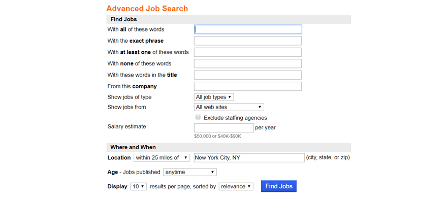
First of all, all of the best job websites have the possibility to search in an advanced way. Without the advanced search possibility, it probably won’t even make sense to create a job website. It’s one of those things that most visitors expect because the needs are specific and people expect accurate results that match their profile. Of course, this goes both ways; the navigation and user experience needs to be as good for the job seekers as for the employers who are looking for relevant candidates.
They Put Companies in The Spotlight
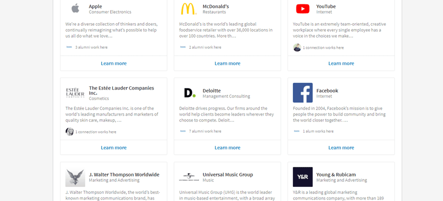
A job website isn’t just about people finding a job; it’s also about allowing employers to showcase their company and make it attractive to the people they are seeking to hire. The best job websites out there realize that and spend a special amount of time creating a section where it’s all about the employers. That includes reviews, job openings specific to that company, company info and in some cases (like LinkedIn) you can see which people you know already work at these companies.
They Work with User Accounts
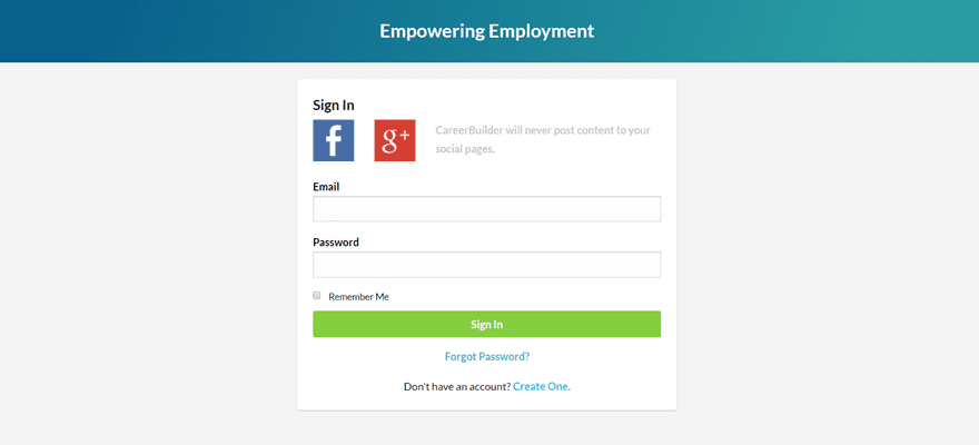
Another thing that every good job website has is a login system. Visiting a job website is usually not just a one-time thing. People will most likely not find the job they are looking for at first sight. They will keep an eye on the new job vacancies that come out every day. That’s why allowing them to create a user account is one of those things that people expect from a good job website. People want to be able to see the past jobs they applied for and the status of those applications. By allowing both job seekers and employers to create accounts, they’ll have the information that they need each time they visit your job website within reach.
They Let You Upload Your Resume/CV
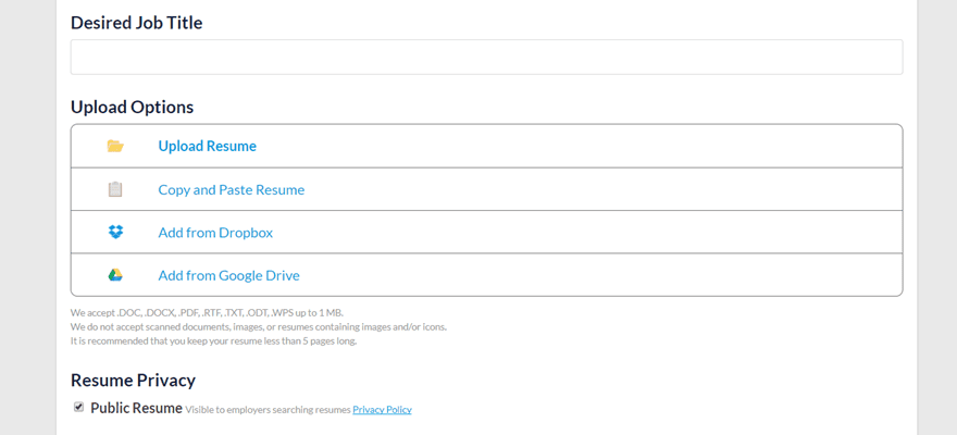
If job seekers can look for open job positions, companies should be able to search for available profiles as well. It doesn’t have to come from one side only. Every great job website realizes that and makes sure that the user experience for job seekers is as good as the one for employers; finding and being found is a two-way road. Offering your visitors the possibility to be found is as much a benefit to employers as it is to them. They don’t have to be continually looking for a job to get an opportunity.
They Have Recommended Jobs Follow You Around
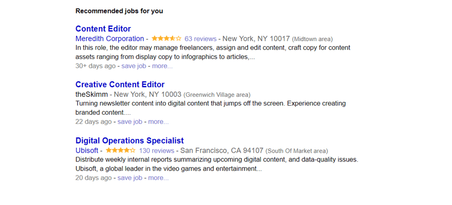
As an owner of a job website, you want your visitors to be helped as quickly as possible. That’ll only improve the way they feel about your website, the likeliness that they’ll recommend your website to someone else and how often they visit your job website. By showing them the recommended jobs you have for them, they can easily find their way through the best job vacancies that they likely will apply for.
They Use Simple & Trust-Building Colors in Their Design
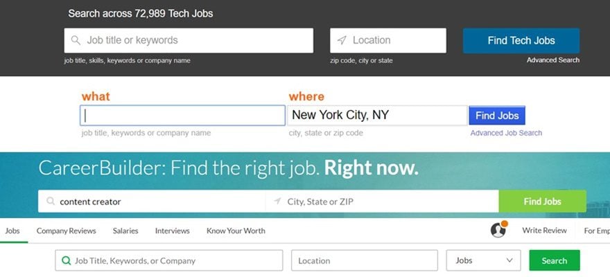
There is no need to crazy with the colors on a job website. Finding good candidates and finding the right job is usually not something that people feel entertained about, it’s a serious matter that needs the same serious design from a job website. The best job websites out there, therefore, choose more neutral colors that reflects a trust-worthy feeling. Using a neutral blue color, such as Indeed and LinkedIn do, for example, reflect a certain emotion of trust and security which are both things people look for in a job as well. Career Builder and Glassdoor, on the other hand, use green colors that usually reflect positivity and wealthiness.
They Provide Additional Resources
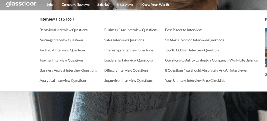
Lastly; all of the best job websites provide additional resources to their visitors. Whether we’re talking about preparation, tips and tricks, or reviews; the additional resources that you provide to your visitors can be the reason why they stick with you. By sharing this kind of information, you make sure you are the expert that tries to intermediate between two parties by offering added value and insight.
They Give Tools to Stay Notified of New Job Postings
When a company is a popular place to work, people tend to check in regularly for new job postings that may fit their skills. By adding an email segment or new subscriber list to your email marketing platform, you can easily keep people up to date. And it is easy to implement.
Simply, find an email newsletter opt-in tool that you like. Create an opt-in form that only displays on your careers pages. If you want to get fancy, include checkboxes that allow people to select what types of jobs (HR, Marketing, hourly) they are interested in being updated about. Then, you just need to send periodic emails based on those lists/tags that inform people who really want to be a part of your team. Sourcing talent from people who know your business’ services and products is a great way to hire talent that will do good work for you.
Create Your Own Job Website: Needed Tools
WordPress as Your CMS
One of the quickest and easiest ways to start creating your own job website is by choosing WordPress as your CMS system. The popularity and user-friendliness of WordPress mean that you have neverending possibilities with the platform. Especially if you are someone who isn’t a professional coder, WordPress is an excellent way to get started. It allows you to have a credible website without having to start entirely from scratch.
Job Board Theme or Website Builder
Once you create your WordPress website, there are some possibilities out there that will make it easy for you to create a job website. You could, for instance, opt for a WordPress theme that is entirely dedicated to creating a well-functioning and appealing job website. On the other hand, you could also use a multifunctional website builder such as Divi, which allows you to make your website more authentic. If you choose a website builder, you will need an additional job board plugin which we’ll talk about next. You can also consider a directory plugin and one of the best form plugins if you want to create very customized job boards.
Job Board Plugin: Wp Job Manager
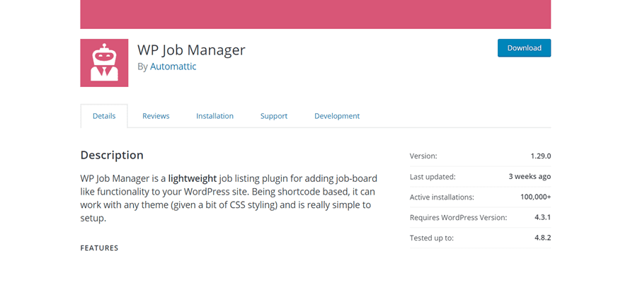
If you’re using a website builder, you can choose to go with the free WP Job Manager plugin. However, depending on which add-ons you want to include in your job board, you may have to pay extra. One of those add-ons that you might need is the Resume Manager which adds the resume submission and resume listing possibilities to your website. The free version, without any add-ons, includes, among other things, searchable and filterable searches, a login system, and more. The WP Job Manager is an excellent recommendation if you’re just starting out with building a job website and you want to get to the fundamentals right before upgrading your game.
Final Thoughts
Recognizing the strengths of the best job websites out there can inspire you to make your own. In this post, we’ve shared some best practices that all of the best job websites have in common. On top of that, we’ve also shared the needed tools that’ll help you create your own job website right away. If you have any questions or suggestions; make sure you leave a comment in the comment section below!
Be sure to subscribe to our email newsletter and YouTube channel so that you never miss a big announcement, useful tip, or Divi freebie!
Featured Image by Bakhtiar Zein / shutterstock.com



I have had a somewhat bad experience while running a job website. am not saying its not worthwhile but you gotta be prepared and determined.. speaking from my personal experience.
nice write up though!
Hey Donjete, I like this post, it’s a great idea that can be used for more than “just another job site” It’s got a lot of potential to become a broader “Niche type job website” for example people could just specialise in job categories that they have experience in themselves, opening doors to be able to concentrate on writing great content about the specific niche industry.
Just my thoughts.
Please can you conciser if you have time to include making this post a bit more complete and perhaps do a follow up to this post (part 2) maybe because it’s a great topic.
🙂
I agree, a very incomplete post and instead of showing how this can be achieved with wordpress + Divi + WP Job Manager it’s points out relevant facts we already know like what Job websites have in common.
I agree, a very incomplete post and instead of showing how this can be achieved with wordpress + Divi + WP Job Manager it’s points out relevant facts we already know like what Job websites have in common.
Please note it’s really hard to run a job board site using WordPress as your CMS. I have been there and I own a job site using WordPress and I sometimes wish there could be solid templates to create a very appealing job websites like the one mentioned in this post
i dont think having a job website is worthwhile based on my personal experience while owning one!
Thanks,
which plugin do you recommend to upload files using divi?
Nice information, am planning on creating a job site soon but am wondering if i should use wordpress.
Job websites are a waste of time and money End of story.
The article seems to be incomplete after listing out so many ‘what companies use’! It ends with just a WordPress/Divi and a free plugin. Really?! Do the companies really use only that much, I wonder!
i had the same question as i scrolled down. I think this article could be a nice Part I of a 3 parts series.
I felt that way too, it ended abruptly.
“They Use Simple & Trust-Building Colors in Their Design”
The sample color seems strong on top and gradually lessen to the bottom part, I assume the goal was to first catch user’s attention.
Great post Donjete. Really interesting and a unique article- Thanks for sharing. These sites always seem quite advanced – never realized they use plugins! Thanks, Jeremy
So what plugin / resource is being recommend for a login system?
Thanks for asking that! 🙂
I use the plugin digimember since one year now. It’s really simple to set up a login system and manage your memberships too.
So this is my personal advise :).