In today’s post we are going to take a detailed look at one of web design’s (and therefore WordPress theme design’s) biggest trends of the last several years: parallax.
We’re going to define what parallax is in theory, what it is within web design, and why someone might want to use it; accompanied by some great examples implemented by talented designers/developers.
We’ll then go over several different ways anyone can implement the parallax scrolling effect on their WordPress website either by using code, plugins, or Elegant Theme’s own Divi page builder.
- 1 What is Parallax?
- 2 What is a Parallax Scrolling Effect?
- 3 Why Use Parallax in Web Design?
- 4 Great Examples of the Parallax Effect in Action
- 5 How to Create a Parallax Effect in WordPress with Code
- 6 Parallax Effect Plugins for WordPress
- 7 How to Create a Parallax Effect in WordPress with Divi
- 8 In Conclusion
What is Parallax?
“Parallax” is the word used to describe the difference in the apparent position of an object when viewed from two different vantage points. A good example of this, taken from Wikipedia, is the apparent position of a speedometer needle in a car.
When viewed from directly in front, the speed may show exactly 60; but when viewed from the passenger seat the needle may appear to show a slightly different speed, due to the angle of viewing.
What is a Parallax Scrolling Effect?
In web design, parallax (as described above) is really just a “special effect”. An optical illusion achieved by animating multiple layers of background and foreground images at different speeds to give the impression of depth. The resulting variations in a user’s point of view as they scroll past these images is what we call “the parallax scrolling effect”.
Why Use Parallax in Web Design?
To date, parallax has been widely considered a mere web design trend. Something aesthetically pleasing, but ultimately unnecessary. Many, particularly among the design community, have expressed frustration at parallax’s popularity and longevity. They are eagerly awaiting the day when the general public (i.e. clients and customers) ceases to be enamored with it and it quietly fades away into internet past.
Personally, I’m still a bit intrigued with parallax. As with most things, I think there is a middle ground to be found. I’m not a fan of extreme and/or pointless parallax for its own sake, but at the same time I can’t help but be impressed by and somehow more deeply immersed in content that “uses parallax well”. Something I’m still unsure how to clearly define, but nevertheless “know it when I see it”. Another phrase that tends to upset creative types. Myself included.
All of that said though, I have observed a general rule of sorts that applies to creative technology and trends which may explain (in part) why parallax has the staying power it does. It’s something I explored rather deeply in an earlier post here on the elegant themes blog.
That general rule is this:
Any novel form of communication is at first used for its own sake, because it’s different and interesting. But over time the novelty fades and, if long-term wide-spread adoption is the goal, it must find a utilitarian niche to fill; something useful it does better than other alternatives.
Is there such an instance in which the parallax scrolling effect fills a utilitarian role in web design and/or content creation better than all of the other alternatives? I think so. In fact, there might be several. The first and most obvious example that comes to my mind, is any instance in which the parallax scrolling effect itself helps to illuminate the information being shared.
The first two examples in the section below, I think, prove this point quite well. In each instance parallax is used to varying degrees (with other design techniques) to achieve a more immersive experience that communicates facts/data in a delightful way. Sort of like an interactive display at a science museum which uses a fun activity to cement the lesson in a visitor’s mind.
The first two websites in the section below are prime examples of this use case in action.
Great Examples of the Parallax Effect in Action
There are countless examples of parallax in web design that could potentially be show in this section. I chose the examples I did because, to me, they represent cases in which the use of the parallax effect actually enhance the over-all experience and help to either tell a story or explain facts in a more impactful way.
Tesla Motors

In this example, the parallax scrolling effect is used sparingly but to great effect. It is one of many clever design elements used to elevate a mere FAQ page into a compelling story about taking a trip in a Tesla vehicle.
Space Needle

At the Space Needle website you can use parallax scrolling to travel over 605 feet up the needle and learn about fun stuff to do in Seattle along the way.
Game Boy

On this site you can use parallax scrolling to scroll your way through some old school style tetris for Game Boy’s 25th birthday.
Sony
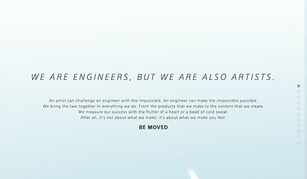
As part of Sony’s Be Moved campaign they created this website to tell a compelling story with parallax scrolling.
Highway One
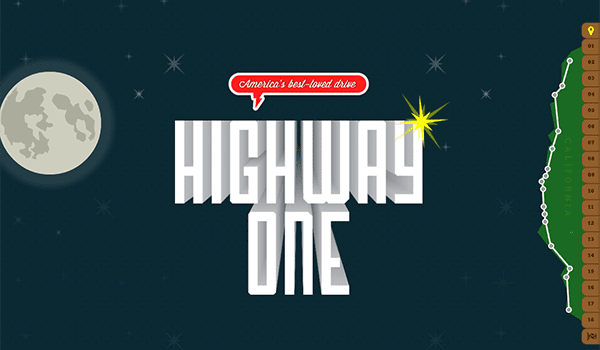
On the Highway One website you can use parallax scrolling at the intersection of storytelling and game-play.
How to Create a Parallax Effect in WordPress with Code
When it comes to creating a parallax effect in WordPress with code you have a few options. You can add a parallax custom post type to your existing theme–as shown in this tutorial by Andrei of Wevo Studio–or you can create your own theme with pages that use a custom parallax page template of your own design.
In all honesty though, unless you are developing your own theme or simply want parallax development practice, you are probably better off using one of the plugins below or a theme that comes with parallax pages already. The tutorial I’ve linked to above literally does the exact same thing as many of the plugins below. The main difference being that with a plugin the hard work is already done for you.
If you are actually looking for some good development practice with parallax, then you should check out the following tutorials too:
- How to Create a Parallax Scrolling Website
- Simple Parallax Scrolling Tutorial
- Pure CSS Parallax Websites
- A Simple Parallax Scrolling Technique
Parallax Effect Plugins for WordPress
If using the code above is not something that you’re able to do, comfortable with, or simply uninterested in, there are several plugin options for WordPress users. I’ve included four different plugins below–both premium and free–that should have you creating parallax posts and pages in no time.
Parallax One Page Builder WordPress Plugin

The only premium plugin on this short list, the Parallax One Page Builder is designed to help anyone build parallax scrolling pages with any theme. It comes with various effects, gallery and portfolio capability, custom SEO tools, and much more.
Price: $22 | More Info & Download
Parallax Scroll

The Parallax Scroll plugin uses a parallax scroll custom post type to allow anyone to create posts or pages with parallax elements.
Price: FREE | More Info & Download
Parallax Gravity – Landing Page Builder

Parallax Gravity is designed for building landing pages. So while this will not allow you to add parallax elements to your existing post/pages, you can create new landing pages with parallax elements in them.
Price: FREE | More Info & Download
Aesop Story Engine

With the Aesop Story Engine, parallax is just one of several storytelling modules available for use. Used in conjunction with either an official Aesop theme or any theme running the Aesop compatibility script (which can be found on the plugin page linked below) anyone can include parallax elements in their long-form posts or pages.
Price: FREE | More Info & Download
How to Create a Parallax Effect in WordPress with Divi
If you’re a Divi user, as I’m sure many of you are, then you can include parallax elements on literally any page you choose to create using Divi’s built-in page builder.
Here’s how:
First, make sure that whatever page or post you’re creating is in page builder mode.

Next, click on the settings button for any background section.
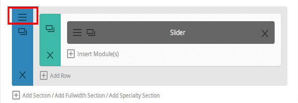
You’ll be brought to a screen like this one. If you scroll down you will have the option of enabling parallax. You can choose between CSS or true JavaScript parallax with the simple click of a button.
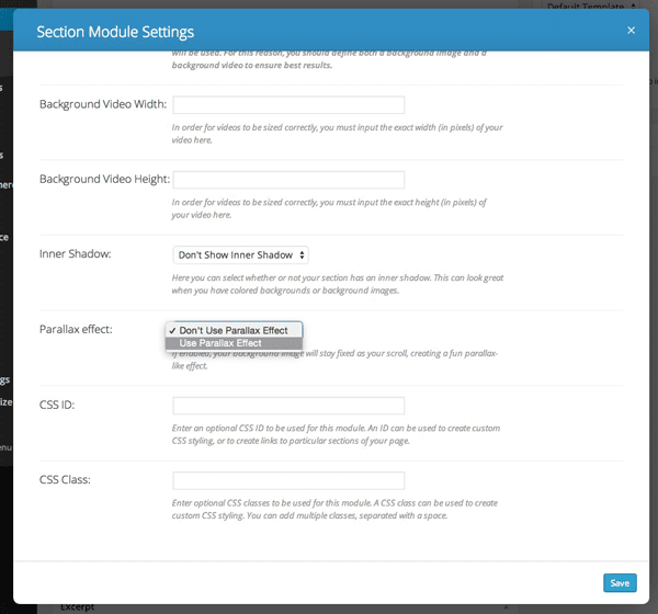
When your preference is set, simply click save on the settings module, save draft on the page, and then preview. If you’re unfamiliar with what this effect looks like with Divi, check out the divi demo for various examples.
In Conclusion
Parallax, like or not, doesn’t appear to be going away any time soon. As time goes by however, I think seeing it done on a page just for the sake of having it there will certainly fade away. What we’ll see instead are tasteful instances of parallax, used in conjunction with other design techniques, to achieve an elevated user experience.
In today’s post we learned how to add this kind of parallax to our WordPress websites through code, plugins, and via the Divi page builder. If you have anything to add or comment, we’d love to read your thoughts in the comments below.
Article Thumbnail by Bloomua / Shutterstock.com




Someone can tel me how we can force parralax on mobile?
Thanks guys!!
Parallax are great, and yes they wont be gone anytime soon. But dont you realize that they are great on only on desktops, laptops and mobile apps?
Mobile browsers dont usually show parallax websites at their best. Furthermore, they are a lot larger in size than most other types of web pages.
When considering mobile first and the increasing number of mobile users, i think parallax sites are better to be a complementary. They are indeed great, but i still find VR-styled web design to have a better future. Dont you think?
I noticed the pictures are no longer working. Any help?
I give up. How do you play the games online in parallax? I have an LG G3, Which I thought could do html5, but I just get a birthday cake and a happy birthday wish to Petr and find nothing interactive but for how to share it.
Hi there,
Great post. I am using VideoPro theme on my website. Can I make it parallax. Waiting for any professional assistance.
Thanks in advance!
How would you go about doing something like this http://colouredlines.com.au/ where the page below is shown as the homepage slides across?
Awesome info and examples. Idea! You guys have done some great DIVI CSS Tricks posts.
How about a post with “DIVI CSS Tricks for Paralax?” Maybe with a few live samples, image sizes used and code used in the module???
I’ve put the Paralax to work sparingly with good results, but I know I (and others) might be missing out on some cool tricks. Hope Yiu guys can cover that… I’ll keep my eyes open!
I am a Divi user. I turned the parallax feature on. Didn’t like it so I turned it off. Except, even though I set the options to off, it’s still displaying as on. I’ve cleared my cache. Even redid an entire slider (tedious). And now I simply can’t get rid of the undesired parallax affect. How do I report a bug? Help!
Hey Nick, how’s it going? I hope all is good and business is as well. I am in serious need for the knowledge on how to achieve these effects in Divi
http://travis-sichel.com/ [I would like to do that hover movement style]
and also: http://www.apple.com/imac-with-retina/ [I would love to make this zoom style effect]
H.E.L.P P.L.E.A.S.E!!!!
It is a great article. I think Divi is amazing, however the demos sometimes use too much parallax. There is a video however where Nick (Elegant Themes founder) shows off a beautiful rocket ship parallax. It’s truly awesome.
I’ve also noticed in the demo pages that some of the parallax is not the stock “out of the box” stuff that you get with the theme by default – there is something more sophisticated going on, as the animations are rather complex.
By the way, the tutorial I mentioned is here:
https://www.youtube.com/watch?v=IXxnrlv0QO0
Great work overall team!
Cheers.
I wonder which parallax effect on the Divi theme is better in terms of SEO? CSS or JavaScript?
Nice one, parallax will keep reigning if there’s no other cool alternative. However, one of the coolest parallax used on Divi even better than those made by ET and some of those sites posted on your article using parallax is changing of a tool van or something color to different ones but you won’t know you are actually scrolling parallax! It was fantastic and the designer just vaguely shared the tip which wasn’t indeep hey, but I can’t dig the link out to the comment but I know its on ET site. Thanks for your review story teller.
Cheers
I was going to use the Divi parallax widget but when viewed on some phones, the fade in text did not show up.
Parallax Effect on website is a great way of story telling or presenting visual information on one page, though for websites that offer simple services like design, insurance or marketing, I woundn’t recommend them. This effect is just not suitable for selling a service.
Excellent post Nathan and thank you for sharing. From last few days I am working on Parallax effects in new designs and this article is really interesting specially the plugins you listed.
Thank you Nathan for sharing. Great post about Parallax design. The sample websites are amazing specially the SpaceNeedle website.
I used DIVI to design a Real Estate website and my client love the parallax effect on the homepage. http://keyrealtygroupinc.com
Thank you Elegant Theme for the awesome DIVI platform!
Some sites do it well, but i have seen many that are irritating. When trying to read and scroll the background moves is a pet hate, it makes me lose my place in a paragraph. I did a parallax banner on my folio. Still not sure about it.
http://www.travis-sichel.com/
I like the site Travis. How did you set up the grid format in your portfolio?
“menu’s” is not corrent. The only time you use the ” ‘ ” character is when you are contracting two words. Here’s what you do: ask yourself if “menu is” makes sense. That’s what menu’s means.
Hi thanks, I will remember that. My grammar is terrible.
Hey Travis, freakin’ Awesome Job. how can i achieve that effect? Is there any tutorials that can teach me or can you please teach me?
Hi. The theme I used has a parallax effect built in. It is called “Salient” for WordPress. Otherwise check out this little plugin http://matthew.wagerfield.com/parallax/
Thank you Nathan for an excellent update on Parallax effects.
You have inspired me to try Aesop Story Engine for a children’s story that I have been co writing.
Happy New Year.
Bill
As was said, this “newest thing” I think is really being overdone just because you can do it. People get carried away and many sites take forever to load. I personally don’t like all the scrolling it uses. I want to see my information right in front of me. But thanks for the interesting article.
Hi Nathan,
thanks for the great article. I really love the parallax effects in Divi. One question though: is there (now) or will thee be a parallax effect in Divi that also works on mobile? Or a button to “force” it on mobile? That is the only thing I was missing in Divi!
Great theme otherwise, and great article as well with awesome examples!
Greetings from Germany,
Flo
I know I am writing one year late but I found now this post …
To force the parallax method on the mobile just write this css rule : .et_mobile_device .et_pb_slider_parallax .et_pb_slide , .et_mobile_device .et_pb_section_parallax .et_pb_parallax_css , .et_mobile_device .et_pb_slides .et_parallax_bg.et_pb_parallax_css {
background- attachment: fixed ! important ;
}
I hope it can help someone
Christophe can you tel me where exactly i need to put this code? Thanks!
Nathan,
I like parallax but like anything else it should be used tastefully. The examples you gave were incredible, especially the space needle site.
I recently stumbled upon a website for a nootropic supplement that is one of the most amazing displays of parallax design I have ever seen. https://www.onnit.com/lucid-dreaming/ I would love to see a more in-depth article on how to create some of these more complex animations in the future.
Thanks for a great post. Have a happy new year.
Adam
Apple has done amazing things with the parallax effect on their website. The Retina iMac page is likely the best example out there.
http://www.apple.com/imac-with-retina/