Looking ahead to the future is natural around the beginning of a new year, and this is especially true if you’re an avid WordPress user. The Content Management System (CMS) continues to evolve at an ever-growing pace, and while 2016 was dominated by talk of the REST API, 2017 promises just as much excitement.
In this piece, we’ll offer eight WordPress trends you can expect to see in 2017, how they might affect you, and how you can get onboard. We’ve ordered the trends from most to least likely, so let’s get started!
- 1 1. A Rise in Mobile-First Philosophy
- 2 2. Increased Security Involving HTTPS and Encryption
- 3 3. A Focus on Improving Microinteractions
- 4 4. The Rise of SaaS as a Developer Business Model
- 5 5. An Increase in the Use of Video Headers
- 6 6. The Use of ‘Failure Mapping’ to Enhance the User’s Experience
- 7 7. An Increase in the Popularity of Multipurpose Themes
- 8 8. The Evolution of Virtual Reality Within WordPress
- 9 Conclusion
1. A Rise in Mobile-First Philosophy
While ‘mobile-friendly’ has been a watchword of increasing importance over the last few years, 2017 will start to see more and more WordPress sites developed with the concept in mind. For the uninitiated, this means designing with a focus on mobile devices primarily. Over the next 12 months, we’ll see more designers optimizing for small screens, then scaling up.
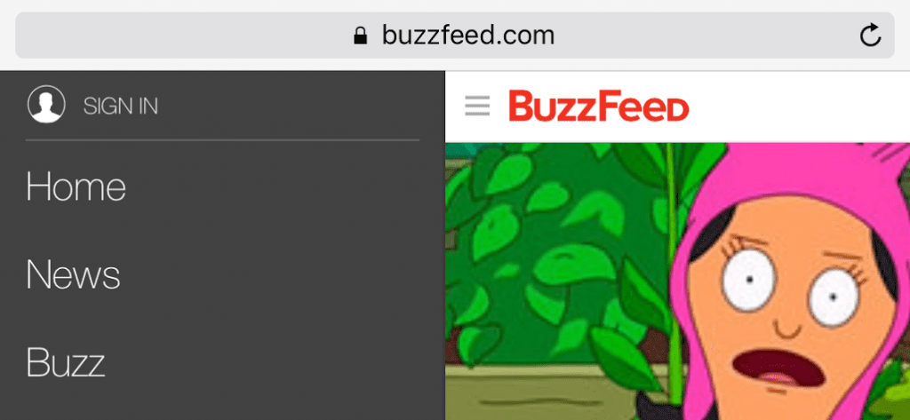
BuzzFeed has mobile-friendly nailed, including a responsive drop-down menu that works with any orientation.
The major reason for this move is (of course) the increase in the use of mobile devices for everyday tasks – including browsing the web. With over 60% of searches coming from mobile devices, it makes sense that developers will want to focus on these users.
If you think mobile-first might be for you, there are some excellent guides to help you get started. However, plenty of WordPress themes – including Divi – are already coded with small screens in mind. It means you won’t have to look far for a suitable option.
2. Increased Security Involving HTTPS and Encryption
With security being a perennial concern for all website owners, it’s always at the forefront of any future WordPress enhancements. Hyper Text Transfer Protocol Secure (HTTPS) is essentially a secure version of HTTP. The ‘secure’ part means that the data sent between your browser and the website you’re connected to is encrypted.
While larger sites have been somewhat slow to convert to HTTPS, both Google and WordPress have upped their efforts to get sites onboard. 2017 is set to be the transitional year for many site owners and hosts. What’s more, with the success of Let’s Encrypt, it’s now easier than ever to offer security for your visitor’s data.
HTTPS can be cumbersome to install, but Let’s Encrypt is a breeze to use. If you’d like to secure your website, firstly, check with your host as some are now offering certificates with their packages. However, if you’d like to manually install your certificate, Let’s Encrypt offer comprehensive guidelines for doing so.
3. A Focus on Improving Microinteractions
Interstitial anxiety is a term you might be hearing more often in 2017. It describes a temporary state of tension felt by a user after they trigger an action, and wait for a response. As such, delays caused by aspects such as loading times or latency issues could wreak havoc with your bounce rate.
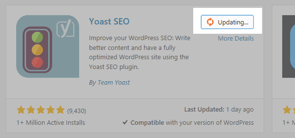
In order to overcome this issue, microinteractions will come sharply into focus. In a nutshell, they’re animations or effects that indicate to the user something is happening on your site. There are plenty of examples you probably see on a regular basis including page load spinners, checkmarks when form fields are complete, and shopping cart confirmations. One example is the animated red circular arrow icon that appears when you update a plugin in WordPress:
By using microinteractions to reduce interstitial anxiety, you can improve the overall user experience, and hopefully reduce bounce rates. One simple method to incorporate them is to add a preloader animation via a suitable plugin. Alternatively, if you’re Divi user, you might want to try the Divi Switch plugin. This premium solution offers hundreds of customizations, and integrates superbly with the Divi Builder.
4. The Rise of SaaS as a Developer Business Model
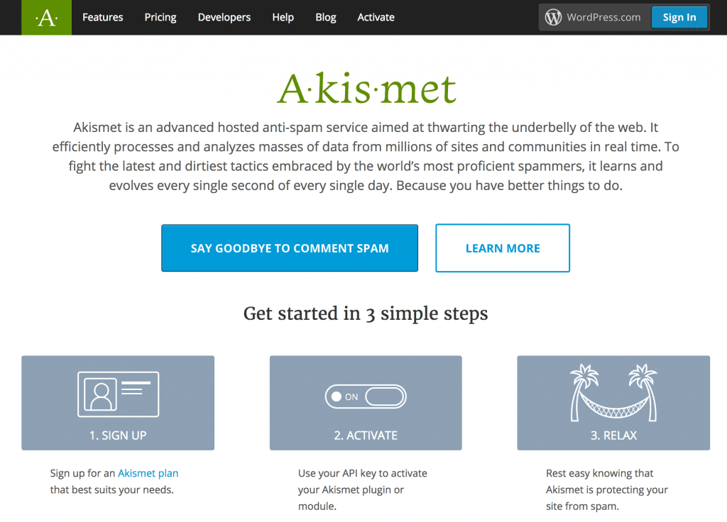
While Software as a Service (SaaS) as a business model is not a new concept, the majority of premium WordPress service providers have traditionally used a one-off payment approach. These payments might include support and updates for a specified period, but require an entirely new purchase when it comes time to renew. In 2017, we’ll likely start to see a shift to more developers using the SaaS model, with services auto-renewing at the end of a term. For example, Akismet is a widely used WordPress solution that offers a freemium SaaS service.
Although there are drawbacks, an SaaS model is ultimately a win-win. On the one hand, developers get to earn continuous income for their efforts, while WordPress users receive continued support and regular updates for the software they’re using.
With that in mind, if you’re a developer you may want to consider the switch. Once you’re set on making the jump, it’s time to put your plan into action. However, if you’re a customer, it’s important to be aware of the business model your chosen WordPress solutions use. After all, spiraling costs could mean you’re forced to use a poor-quality alternative.
5. An Increase in the Use of Video Headers
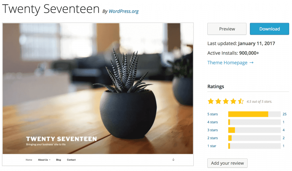
Video headers are also not a new concept in WordPress. They have a number of benefits – they’re attention-grabbing, they provide immediate exposure to a particular product, and they can also entertain. Given this, we’re betting on a likely spark in their popularity, mainly down to the inclusion of a video header in the new Twenty Seventeen default theme:
To take advantage of this trend, you can choose from one of the many other themes that come with video header functionality. However, if your current theme doesn’t give you the option, you may want to look into some workarounds.
That being said, Divi enables you to insert a video header using the Fullwidth Header module:

Once added, you can upload a video into the Section Module Settings screen, then enter its exact width and height into the relevant fields. You can also select whether you want to enable the pause button or not.
6. The Use of ‘Failure Mapping’ to Enhance the User’s Experience
Our next WordPress-related trend is failure mapping. This basically involves mapping out various user experiences, and finding potential flaws. Examples might be an unintuitive navigation menu or a confusing call to action. Of course, this undoubtedly will improve the user’s experience, particularly for those who are not your primary target. In fact, WordPress has guidelines on web accessibility that touches on this to some extent.
On the whole, it means we may begin to see more flexible ‘niche’ themes arrive on the scene this year. We may also see a rise in the popularity of multipurpose themes (more of which in a minute).
With more people online than ever before, we’re seeing an increase in the demographical range of users – for example younger children and older adults. These groups have varying levels of computer-literacy, are potentially more familiar with different applications, and have different viewpoints all-around. In a nutshell, by making your website suitable for only one type of user, you could be missing out on a larger readership and customer base.
It’s a complex concept, but to begin with failure mapping, map your visitors’ journey and look out for potential issues for a range of personas. Based on your overall observations, make changes as necessary. Don’t be surprised if you find that removing or combining certain elements seems like the right course of action. Simplifying and streamlining your site will typically make for a better user experience than adding more elements.
7. An Increase in the Popularity of Multipurpose Themes
Multipurpose themes have been around for a long time, but their star is on the rise in 2017. Themes such as Divi offer a myriad of benefits, but they also eliminate the learning curve associated with using a different niche themes for every project. What’s more, many multipurpose themes also have a solid support community for receiving and giving help.
When choosing a good multipurpose theme, you’re generally looking at its overall functionality rather than specifics. For example, clean and lean code, plenty of customization options, and excellent support are all three elements you’ll want to consider.
Once you have your requirements, it’s time to go shopping! While you can find some free multipurpose themes on the web, plumping for a premium option is usually the way to go.
8. The Evolution of Virtual Reality Within WordPress
We recently explored Virtual Reality (VR) and WordPress in-depth, and it stands to be a big trend in 2017. VR is no longer limited to the gaming industry, and WordPress is looking to lead from the front in this regard. It was recently announced that WordPress.com blogs will support VR images and videos, and developers are already creating plugins for using VR with self-hosted WordPress, such as WP-VR-view:

The implications for combining VR with WordPress are potentially huge. For example, adoption by e-commerce sites could mean customers no longer need to visit a store to interact with a product. It also has massive potential for use in areas such as real estate, travel, and sports. Admittedly, there are potential drawbacks to consider, such as designing for both VR and regular users, and the enormous amount of bandwidth required.
However, if you do want to get onboard, your first stop should be the WP-VR-view plugin. It’s one of the only plugins available, and enables you to create a VR WordPress experience with Google Cardboard compatibility. It’s just as well that it has some excellent reviews and ratings!
Conclusion
WordPress’ development is constantly evolving, and given this, it’s sometimes difficult to keep up with the latest trends. Missing out on what’s in store for 2017 could see you fall behind. Given some of the upcoming innovations, becoming an early adopter will be crucial for a modern-looking website.
In this post we revealed eight of the most important WordPress trends for 2017. Let’s recap them quickly:
- A rise in the use of mobile-first web design.
- Increased security involving HTTPS and encryption.
- A focus on improving microinteractions.
- The rise of SaaS as a developer business model.
- An increase in the use of video headers.
- The use of failure mapping to enhance user experience.
- An increase in the popularity of multipurpose themes.
- The evolution of VR with WordPress.
Do you know of any other WordPress trends to look out for in 2017? Let us know in the comments section below, and don’t forget to subscribe so you can follow the conversation!
Article thumbnail image: ideyweb / shutterstock.com



Wow, nice insight john
I believe it’ll hard to follow these trends in a third world country where speed matter most. Perhaps no. 5 & 8 would be overwhelming for some of us with a limited bandwidth…
Thanks, Alifa. 🙂 You make a valid point, so it’s important to prioritize what you implement based on your own situation.
Please clarify #1. Does Divi scale up, is it mobile first?
Hi, Evan! You’re right to wonder – Divi isn’t mobile-first, but is fully responsive. 🙂 Thanks for your question!
Well, I guess it’s not mobile first.
Evan (lifetime divi member)
Hi ET
Being a 360 Photographer as well as a designer I am very excited by the thought of using 360 images in wordpress. Do you have any plans to bring VR to divi?
To the best of my knowledge we don’t have plans to add any VR specific features right now. However, there will likely be quite a bit you can do with the code module. Additionally, as VR on the web progresses we can study what people are doing with it and make better decisions on how best to include features for it (or not) in Divi.
always a good read, John. thanks.
You’re welcome, Dawn! Your feedback is appreciated. 🙂
Hi, John
# 5: On Divi header, you must upload videos from your WP media, I’m using KK divi and the same thing and you can’t see or watch the video on mobile devices.
Twenty seventeen allow you in the header to type URL to the video that you would like to display, the videos are hosted on youtube or somewhere else.
I believe Divi should allow us to display URL videos on the header.
Cheers
Thanks for your insights, Hector. Please let us know about any suggestions you have for future versions of Divi in our forums (https://www.elegantthemes.com/forum/).
voice command on mobile .. examples “about” and it will show about us page
When will mobile only slide-in(off canvas) menu be coming to Divi?
It seems Divi is little behind in mobile menu support.
Hi Ash. If you have suggestions for future versions of Divi, feel free to post about them in the forums (https://www.elegantthemes.com/forum/).”
I am quite intrigued by point no. 6 & 8. Failure mapping is quite complicated subject. In the past, I found it difficult to capture my customer’s view about my site overall experience. I still remember installing a plugin (“webengage”) on the homepage to capture my customer experience or suggestion about my website experience. But believe me, I did not even receive one email in 6 months. I really do not know how to improve on this point.
Hi Rajesh! You make some good points. It’s a hard element to get right – often it’s all about how to compel the visitor to respond. If you talk to email marketers, they’ll have similar concerns. Our advice is to keep researching and looking for new avenues to try. Good luck. 🙂