![]()
Extend Styles Offers An Incredible
New Way To Design In Divi
Extend Styles is one of the most amazing design efficiency improvement for Divi yet, allowing you to extend any design style from one module across the entire page in a single click.
Extend Styles is a brand new feature for Divi that expands upon some of its most unique and useful innovations. Extend Styles allows you to take any customized style and extend it throughout the page, or to specific elements within specific locations with the click of a button. What could normally take hours can now be accomplished in just a few seconds. If you like a color, font, border style or box shadow, and you want to use it elsewhere on the page or even across the entire page, you can now extend those styles and make sweeping changes in no time at all. It really feels like magic!
![]()
Design Entire Pages At Once
Using Extend Styles
Extend Styles allows you to make sweeping design changes across your entire page and save hours upon hours of design time.
Extending Styles Is Easy
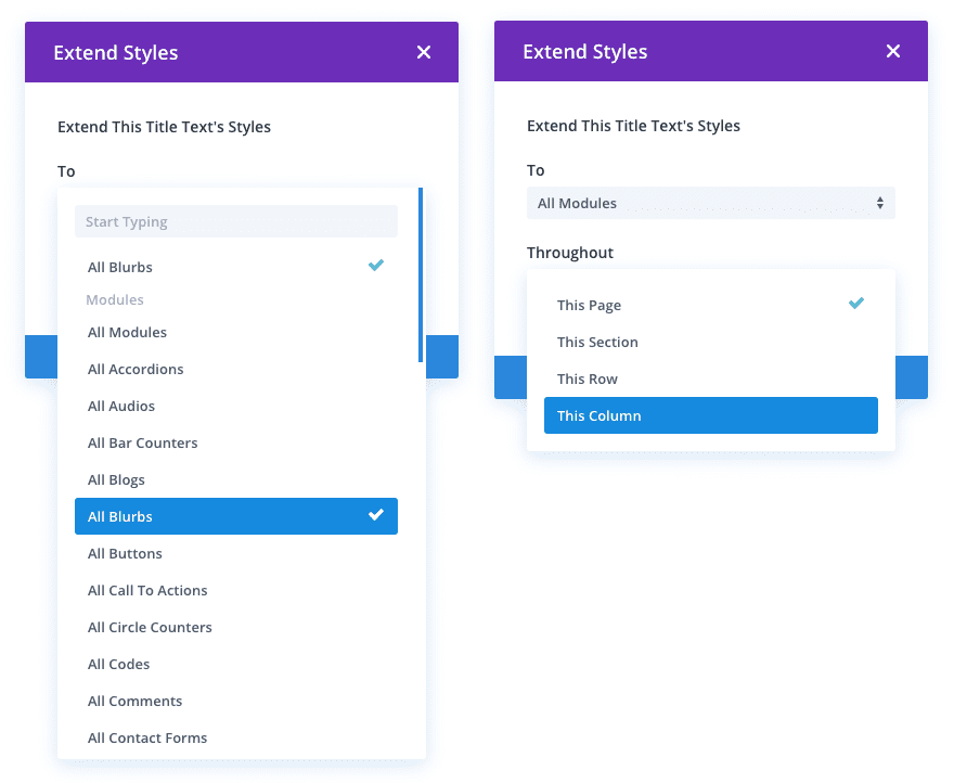
To Extend Styles in Divi, simply right click on any element, option or option group, and choose the Extend Styles option. You can then choose where and to which elements you would like to extend the styles. You can extend styles to specific modules within specific locations, or you can extend styles to all modules across the entire page using location and element targeting.
Greatly Improve Your Efficiency
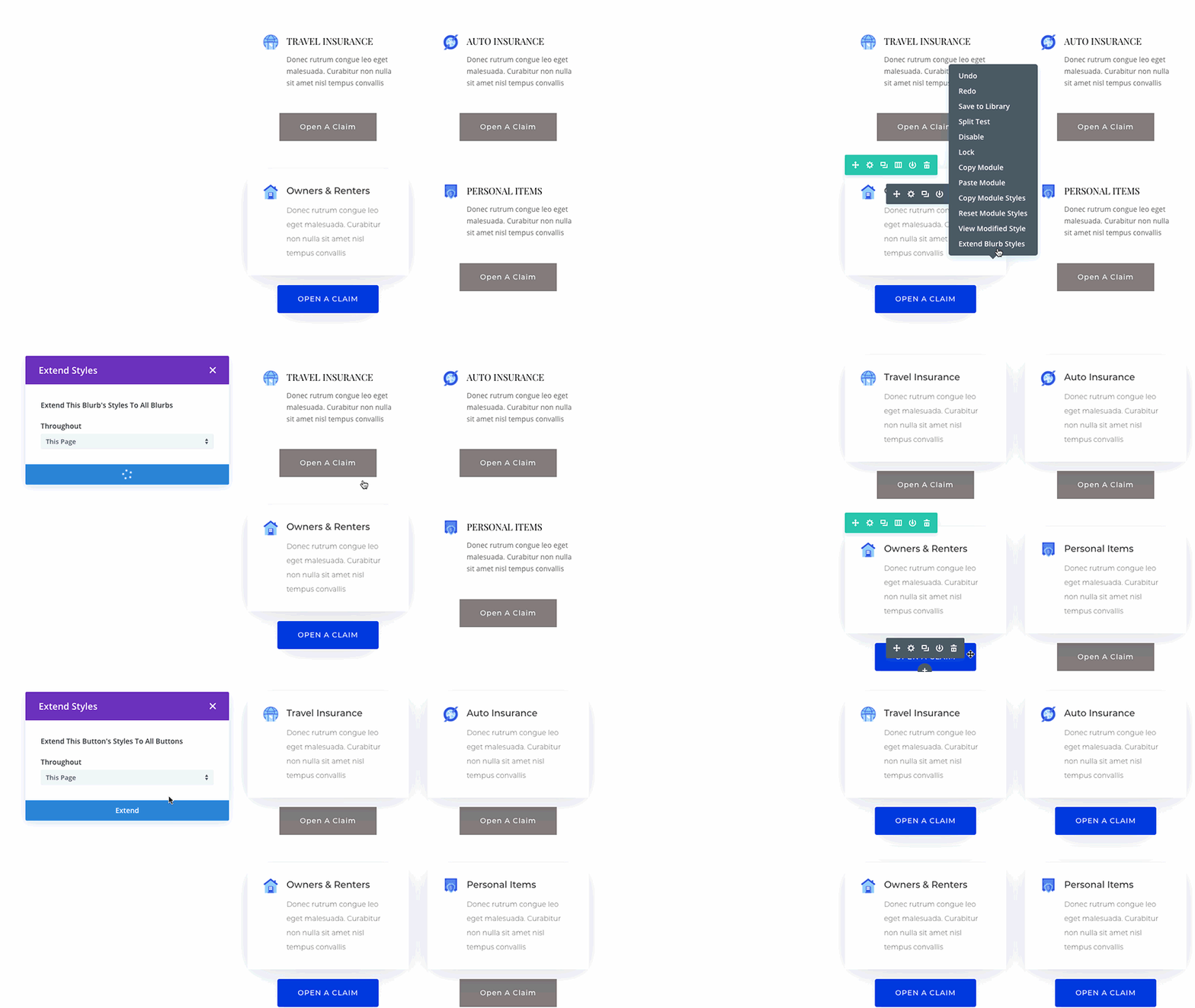
Let’s say you have finished wireframing a new page, and now it’s time to start customizing the design. Instead of applying your desired title font, weight, color and text size to every single module one by one, you can simply extend those styles to all modules instantly. Let’s say you want to use a unique box shadow and border style combo on all of your page’s images. Simply right click on an image module and extend those styles across the entire page with a single click. You can even extend styles within specific and uniquely designed locations by limiting the extension to parent rows and sections.
A Fully Realized Set Of Styling Tools
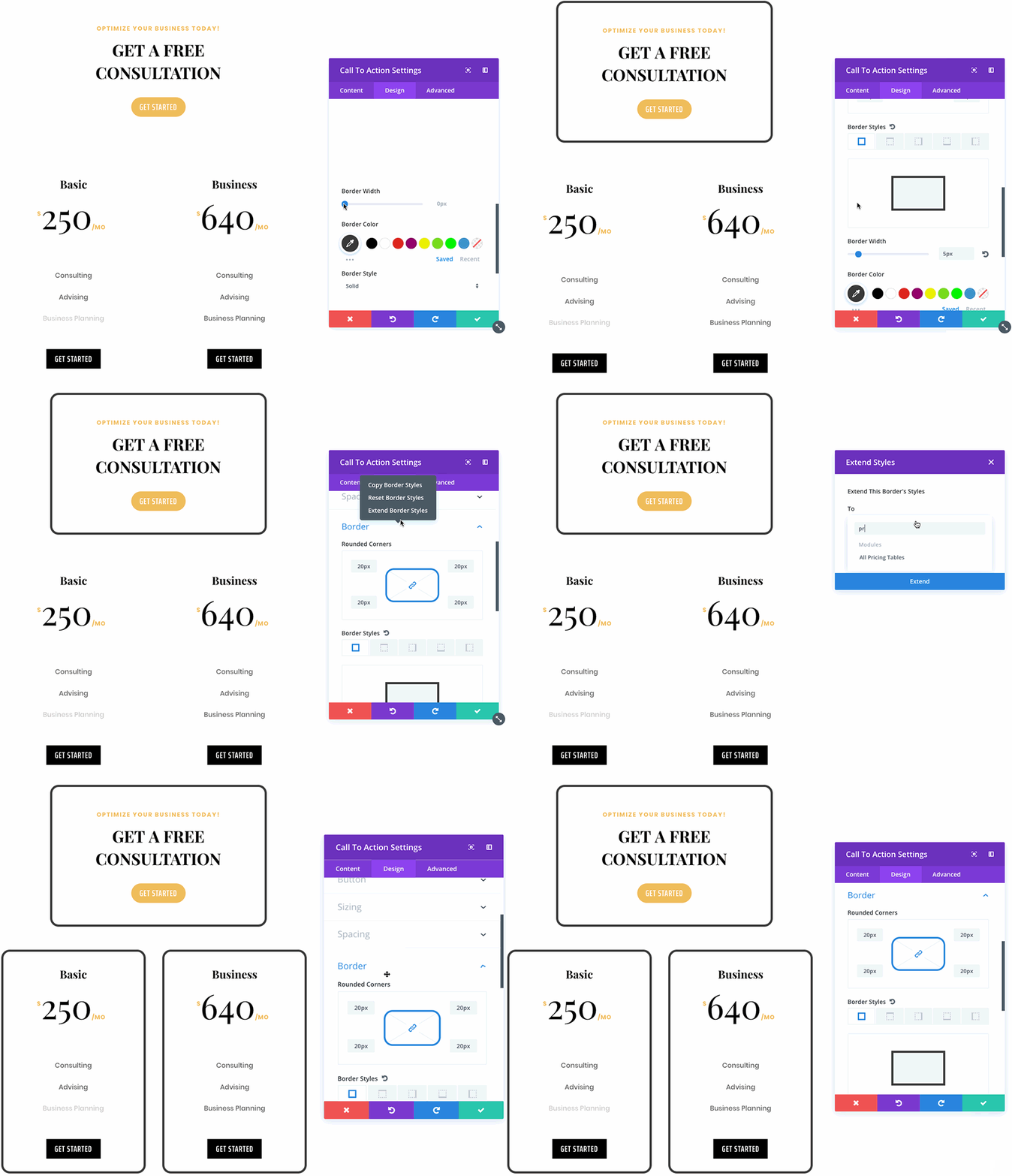
Extend Styles expands upon some of Divi’s recent fluid styling innovations such as Copy Paste Styles and Find And Replace. Unlike Find And Replace, however, Extend Styles isn’t limited to finding and replacing specific values, but instead can be used to transfer design styles to any module, regardless of its current design. This means you can take freshly built pages and quickly transform them into something wonderful, or take existing designs and quickly take them in entirely new directions.
Extend Styles is available today, so download Divi and it for a spin. Let us know what you think in the comments and don’t forget to check back next week for even more great Divi features coming your way.
Get 10% Off Today!
Today's The Best Day To Get Divi Or Upgrade Your Account To Lifetime
Join the most enthusiastic and loving WordPress theme community on the web and download Divi today. Using the new Visual Builder, you can build websites faster than ever before with its incredibly fast and intuitive visual interface. You have to see it to believe it!
Join Today For 10% OFF!Renew Your Account Today For 10% OFF!Upgrade Your Account Today For 10% OFF!


Nice one guys keep the rolling.
With extend styles is there any need for using a child theme?
Hey Nick,
Just a useful suggestion about Pages – why don’t you create a ‘Pages Module’ just like the Blog Module?
The reason being that of all my site’s Cornerstone Content are in Pages and not in Posts, as each article carry between 6000 – 11,000 words. These pages are ranking extremely well for highly competitive keywords so it would look really great if all these pages can be put in a Blog style module -Thanks.
PS: Also hoping to change my annual subscription to lifetime soon ?
Hoolie Doolie! Awesome, I love this monumental time saver, So clever 🙂
Thank you
Great update, thank you.
I wish there is a tutorial video for each in and every page in each section included for much easier reference. Since I am not a techie person, it took me time to finally understand on trial and error and many times I do not know what features can really do without looking a tutorial video. A tutorial video included in each section or segment showing what each features can do.
This is a must for people who has very little knowledge of creating a website. This would be great for newbies.
tutorial videos are in your Account area, Login and you can find them in there.
Right Click?! I’m on a Mac and mostly ipad where right click isnt used, or doesn’t exist, how can I access this feature…
Extraordinary!! Congratulations…
I’m a fan!
Header Footer feature please!
Great! Finally! Thanks Divi Support
Another great feature to streamline the building process.
Nice work Nick and Elegant Themes team!
And I thought the new 6 columns feature was exciting!
Amazing news. Just what I needed to speed up my work. Thx a million.
Superb new features!
BiG tHX @Divi
This is awsome. Real time saver.
Thank ET!
It’s amazing, but Divi Theme Slow Loading Websites.
Woot! This will save so much time. Thank you
Woow, Great! ?
Thank You
Something Ive wished for so loooong. Great job!
It would be a even sweeter weekend start if Ferrari announces Kimi’s 2019 contract;)
Thanks! Just in time to adjust the font color on one of my long pages.
David Peric – Writer’s AutoCorrect Abbreviation Dictionary
Works only in Visual Builder, right?
A much-awaited update will make my life so easy. Hope you had this from day one. Brizy is another plugin which is challenging our Divi theme, hope we do better than Brizy. But I like the Brizy way of web design. Pre Made Sections Light and Dark Sections make life easy to just add and edit and publish, hope we have such a feature in DIVI also. Ready Made Sections, Like the Pre Made Layout Packs. I request Divi, and Nick to add pre-made Sections in light and dark style, which would make designing a ease. Please add this feature. I too used to collect all similar sections from all your layout packs and have made a collection, from where I used to use the sections, which is exactly what Brizy has done in an organised way. I hope I can get these features in DIVI itself and don’t have to add Brizy to my kit… But its really tempting to design in Brizy, but its new platform, hope DIVI takes this seriously, and don’t allow competition grow. Nick, please look into this. A serious threat to our community. I like DIVI so much for so long, it has changed my life forever. Clients like the designs. Even another AI-based design is taking over as bookmark and others. Not anywhere close to DIVI though, its good to kill the competition before it really becomes a threat…
Another great feature. it really feels like all the most asked for stuff is gradually coming together. another month or 2 or so and we will all need to start thinking what to ask for next 🙂
This is great! Thank you…
Nick,
All these new features and value added suggestions / tips and tricks are getting somehow lost in the endless blog ‘scroll of death’ and the only way someone can find out is by way of ‘search’.
Personally, i feel its about time we have a separate navigation menu section ‘Academy’ and have ‘how to divi’ ‘tutorials’ and ‘tips and tricks’ videos and knowledge base loaded there. While the ‘Resources’ can carry all the child themes and other downloads along with specifics to those themes.
Just my thought and suggestion.
If anyone else feels the same, please vote.
Yes exactly, same happening with me also. Great updates, we love them, but while using DIVI, really not able to remember to use them. Need to PRactice the same once they are launched, so we can remember.
hello Nick. Great consistent innovations & support from your humble team!! i am new wordpress user and elegance theme member, and i can understand & build website in a most simple and effective way.. simply elegant!! thank you very much.
YESSSSSS! Thank you!!!!!!!
Thank you so much! This is actually something that I have been waiting for SO badly!
Awesome! Thanks!
Some nice features, and I really like them. Can you please not exclude them from the backend builder.
Second that. I don’t care for the visual builder.
Wow!! I jumped right in to test this out and was thoroughly impressed with the level of detail that can be ‘extended’ anywhere. This is already saving me so much time on animations. Keep up the excellent work and thanks!
You guys are great! Keep up your awesomeness.
Really cool! I normally did this by creating classes and then giving each element its respective class. Which did not take too long or was too difficult, but it is good to know now is even easier than before!
Another fune update!
Next step – Extend Styles to not just the page you are working on but select pages in your divi library!!!
Now you got my attention. Great time saver!
Super! Eso es todo! Get in Motion Team!
i think the comments about time-saver are the best – what i’m waiting for is an implemented timeline, cu
Awesome, guys. Great job.
Patiently waiting for actor or entertainment artist theme. Anything in the works.
Use another layout and change the images, titles and colours!
Yes Sir !
Neat! Looks like we have finally hit Divi version π! I was not expecting this to come as soon as it did! This is definitely a really nice time saving feature. As others have stated, it would be even cooler if it worked across pages, but having it at all is definitely a plus.
Some stuff I would like to see added in the future which has not already been announced as planned:
– Gutenberg editor styles support in the Divi theme: the upcoming 3.8 release of Gutenberg will make it much easier for themes to style the Gutenberg editor to look like the front-end, and it would be really neat if the Divi theme utilized this to make the Gutenberg experience in the Divi theme more WYSIWYG.
– overhauled layout system: I think rows and sections should simply be modules like everything else, and you should be able to insert a module directly into a page or into a section. Right now Divi forces a lot of often unnecessary markup to be generated.
– Gutenberg block integration: tying into the previous point, I think the modules, rows, and sections should all eventually (I don’t expect it to happen anytime soon) become Gutenberg blocks. Blocks are going to end up replacing widgets and become the main way of inserting content in WordPress. It would be really neat if Divi modules became usable all over a WordPress site and even outside of the Divi Builder. And on the flip side, using Gutenberg blocks in the Divi Builder would be really neat. The need for plugins adding Divi Builder-specific modules would be gone; plugins could add blocks which would automatically be compatible with the Divi Builder (and perhaps could optionally add additional Divi-only functionality for things that do not yet exist in Gutenberg). The use of HTML comments instead of shortcodes would also make transitioning away from Divi a lot less painful as content would look far less mangled.
Of course, I don’t expect most of this to happen soon, and I would prefer things like Theme Builder and Dynamic Content to happen first, but after those are all finished and released, I think those suggestions would be a good thing to focus on next.
Finally, here is my usual analysis of the Divi sneak peeks:
The Elegant Themes team said that all the new Divi feature releases would be something previously shown in a sneak peek. That means that one of the following will be the next thing to be added:
(This list is in the order of when each feature was announced.)
– Dynamic Content
– Theme Builder
– Hover Options
– Global Defaults
– New Divi Builder Experience
– Multi Select
– Support Center
– Global Presets (not yet officially announced; mentioned in a blog comment)
The New Divi Builder Experience (back-end builder update) is a rather large change, but maybe enough time has passed for it to be the next feature update.
I wonder if the back-end builder replacement needs to happen before Dynamic Content can happen. Features like Extend Styles can be implemented in just the Visual Builder and not require any change to the back-end builder. However, something like Dynamic Content includes changes to how content is stored in a module and would probably require changes to the back-end builder UI. But why update the current back-end builder when you are about to replace it?
It would not surprise me if the back-end builder overhaul ends up happening before Dynamic Content, and therefore also before Theme Builder, which requires Dynamic Content. The same applies to Hover Options; that seems like it would involve changes to the back-end builder as well if it was released right now.
Then again, More Column Structures has now been released before the back-end builder update, so maybe they are willing to keep updating the back-end builder until the overhaul is ready. That said, adding the new column structures to the back-end builder may not have required much effort. I guess we will just have to wait to get a better idea of what features seem to be blocked by other ones.
Assuming the New Divi Builder Experience is a blocker for other features, a revised list where features dependent on another are indented below that feature may look like this:
– Global Defaults
– – Global Presets (not officially announced)
– New Divi Builder Experience
– – Dynamic Content
– – – Theme Builder
– – Hover Options
– Multi Select
– Support Center
Out of the features that are probably not blocked by the back-end builder overhaul, Multi Select seems like the most likely since it is relatively simple compared to Global Defaults, which is the only older sneak peek that would probably not involve having to significantly modify the back-end builder.
At this point, though, Global Defaults is starting to seem pretty plausible, given it has been a while since it was announced.
Support Center was the latest sneak peek, but it seems to be a relatively simple feature, so perhaps it may come next.
Global Presets has not even been officially announced yet, so you can count it out.
Personally, I am getting a bit excited. I don’t really find Support Center that exciting, and Multi Select, while definitely cool, is not really that big of a change. But once they have been added, that means that the next feature update will almost definitely be either the back-end builder overhaul or Global Defaults, which are both changes I am really looking forward to. The former would open up the door to Dynamic Content (a huge and very useful change), which in turn would allow the even more anticipated Theme Builder update to happen.
It would be really crazy to move the whole DIVI Builder thing over to Gutenberg. Do not think it is ever going to happen.
Our weekly meet up.
One should check out the Froala editor.I spent less than a minute with it and it is everything that WordPress should have been for the last number of years.
https://www.froala.com/wysiwyg-editor
The interface just makes sense. Goes some way to offering some kind of IDE interface for code and does so in one click and full screen to boot. In addition respects code indentation and recognises tab indent.
Plus doesn’t need to explicitly scream blocks and not a comment tag in sight.
We’ll see what happens!
Froala is really nice (except for it being proprietary), but it is not flexible enough to do page building. I think perhaps something like a freeform text editor similar to Froala would make for a good block, though. I mean, the Classic block is kind of that, except it is mostly just there for backwards compatibility and its UI is designed to look just like the TinyMCE box in the Classic Editor.
I think editors like Froala are good for just text editing, but the scope of Gutenberg is much, much wider, including not even just page building in the long run, but also website template building and merging with the Customizer. (I imagine that themes would end up evolving into merely collections of premade templates and default styling.)
Froala could not replace Divi Builder, and likewise it couldn’t replace Gutenberg. But something like it could exist within Gutenberg. I think there is an opportunity for someone to make a plugin that adds a freeform text block that isn’t just a 1-to-1 replica of the Classic Editor instance of TinyMCE. You could have something like the Froala editor, but embedded as a block.
Personally, I prefer the each-paragraph-is-a-block design despite the inability to select lines across blocks. I actually find that the block UI makes it easier to move or remove multiple paragraphs, which I do way more often than copying text from two different adjacent paragraphs. But that’s just my preference.
Notably, delineating blocks with comments allows for things to be given semantic meaning without adding any markup to the front-end (comments are removed from the final output unless the block fails to parse). You could have 2 blocks with very similar markup but with completely different editing UI tailored to their purpose. Without the ability to distinguish blocks, editing controls become reliant on parsing the HTML markup to determine what something is.
A gallery is nothing more than a list of images, but what if there is more than one type of gallery you want to have? What if you have a section of content that consists of multiple sibling HTML elements, and you want to edit them as an individual unit without wrapping them in a containing element or applying a class to all of them? The block system allows for that.
On a related note, I really like the contextual controls of blocks. I have never liked large toolbars of various buttons that are not relevant to what I am doing.
I will say one that one thing that annoys me a bit is the lack of formatting/indentation. I know why there isn’t any, but I really hope they will eventually not have to worry about any backwards compatibility stuff with the Classic Editor and bring back the auto-formatting.
I also hope that the Code Editor in Gutenberg gets some kind of syntax highlighting in the future. The syntax highlighting in the Custom HTML block makes a big difference in the readability of the contained markup.
As for screaming blocks, I think the recently added spotlight and unified toolbar options make for a pretty clean-looking interface that does not look blocky at all.
Also, as it turns out, the 3.8 release of Gutenberg includes a full-screen mode, which is neat.
Another improvement is that the block ellipsis menu is being moved to the block toolbar, which is a big improvement in my opinion, and there is a PR being worked on to add a dedicated drag handle between the up/down movers, which will finally get rid of the frustrating invisible drag areas that currently exist around blocks.
https://github.com/WordPress/gutenberg/pull/9569
In general it feels like Gutenberg is getting more and more polished. A lot of the main issues have been or are being resolved. Having followed the Gutenberg project since late 2017, I can definitely say that it has improved drastically since then. I would not say that it is ready for core just yet, though. There are still plenty of things left to fix and improve. I do think it can be ready by the current proposed merge proposal date in December, but if not, then I’m sure it will just get postponed again.
I always look forward to this day when features come out. Great job and always great and useful additions
I always hoped this day will come, this is a real time saver. Great job!
Nice, but I would really like to see this feature capable to do site wide styles. Some of my static page sites have upwards of 100+ pages. Also, I hope I read it wrong that the back end editor is going away. Currently the visual editor is 4 to 10 times slower for me for the work I do. There would have to be some significant speed enhancements before I could switch. I really do not want to be forced into abandoning DIVI.
Second that. While the Divi Visual Builder is nice, I find myself often working in the backend. I cannot even start to imagine teaching a beginner how to use the visual builder. There is way too much to keep in mind. Do I work on section, a row, a module? And the nightmare to fix things when they changed settings and destroyed the design.
the visual builder would be much easier for a beginner to learn as it is … visual. if for some reason they prefer the back end building blocks then just switch the visual builder into wireframe mode.
It’s going away…
https://www.elegantthemes.com/blog/theme-sneak-peeks/divi-feature-sneak-peek-a-new-divi-builder-experience-is-coming
Have you tried the Wireframe view in the visual builder?… It’s reasonably close to the backend builder layout.
We are working on a system for editing global module settings 🙂 https://www.elegantthemes.com/blog/theme-sneak-peeks/divi-feature-sneak-peek-global-defaults
Hello, Nick.
Many thanks for the regular innovations.
I would like to ask a question again:
Is it planned to include hover functions soon?
And if – when?
Thanks a lot and keep up the good work!
Eric
Nick said in the comments last week that the Hover feature is heading into QA testing this week or next. So you shouldn’t have to wait much longer.
Can someone say “Timesaver?”
Thank you very much!
Very good update, congratulations!
But I’d like to do this action sidewide, not page by page. Hope you do it soon!
Awesome feature 🙂 real time saver ..
I can’t wait to see Dynamic Content .. with ACF it can be a Swiss knife <3 <3
Thumbs up guys! This is fabulous!
A really cool new feature 🙂
.. and I wonder how ET figures out what to do next? Mind reading perhaps? This is truly one of those pain points I’ve faced and thought “I wish there was a way to apply this to the entire page”… or “to this section”. etc.. #mindreaders
Weeeeeeeeeeee!!! Awesome, thanks!!!
What a T.I.M.E.S.A.V.E.R.
HOORAY!
Update/ETA for Theme Builder and Dynamic Data(hopefully with robust conditional display options)?
I know I sound like a broken record, but the above functionality is needed much more than tweaks that allow us to more easily do something we could already do.
Here’s hoping next week… again… haha
This is so cool! The lifetime suscription is the best investment I’ve made!
Great new feature! Also, Nick, really like the yellow shirt. The white on white was killing my eyes!
Amazing! Loving all the updates. I wish though, I was able to do this sitewide, not just page by page. Very often I have completely different layouts going, but want the same fonts/buttons/colors. Thanks for an awesome theme!
Great idea and very helpful. You guys have put in a lot of effort into the builder but what I really want is things like more module options, better portfolio options, more header/menu options, the ability to easily add an instagram icon for a social media link, etc – please!
I have been asking for the same things for a year. All of the Divi sites look the same because of the lack of options when it comes to the menus/header.
You guys are absolutely amazing! No other company offers such powerful new features as often as ET!
Great work guys… but….
When moon… ehmmm when Header & Footer modules?
We’re all waiting for what could be called Divi 4.0.
Then you’ll destroy all your competitors!!!
Header & Footer modules would be great!
I agree ! We are all waiting. It will be a watershed …
Amazing!
I wish there was a way to do this between pages. Also the copy/paste style function. I sometimes use pages from different layouts, and don’t want to have to style each page separately, you know what I mean?
Very good resource! Congratulations. Now we need the theme builder.
Looks great! Will this feature be available in the backend builder as well?
Very interesting & useful feature
Great feature. Can it be extended to work outside the visual editor?
The visual editor(builder) will replace the backend builder in the near future, so all features will be available everywhere.
Unless you mean can the feature extend beyond the single current page to affect an entire site… that would be helpful. Although maybe not necessary when ET finally releases the Theme Builder with templates.
I still run into situations in the visual builder where modules are too close together for me to target the intended one. I end up having to toggle over to the backend builder.
You should try using Click Mode in the Visual Builder. It solves that problem. There is also Grid Mode and Wireframe View, which is almost identical to the backend builder 🙂
It’s good to know, and I’ll have a look. There are a lot of people nervous about the demise of the back-end builder.
Please no. The Visual Builder is painful to use, and the backend builder has always been great.
Thank you, thank you, thank you, thank you! Haha this is an awesome time-saver!
This is awesome, Nick! Well done everyone. This (and all the other related features) shows the innovation that you guys are putting into the product that sets Divi apart from all other page builders.
Question: Will the Extend Styles feature (and Find & Replace) be able to extend styles to all or select pages/posts as well as the current page?
#GlobalStyles
+1! You guys are awesome!
You will be able to edit modules site-wide using our upcoming Global Defaults system, and then manage global styles using a global class system that we will be releasing after that 🙂 https://www.elegantthemes.com/blog/theme-sneak-peeks/divi-feature-sneak-peek-global-defaults
Waiting for this too 🙂 When do you plan to release this?
Looking forward to this! Page specific features are nice to have and works fine for onepagers but if a site has more than 5 pages (which 90% of all websites have), global styling is a must have. Especially if not so tech savvy clients should be able to administrate the site and create new pages by them self.
Woohoo, this is what we need, especially if the global class system integrates with the child theme CSS file so styles can be updated from the front or back end
That’s great to hear! I’ve been wondering for a long time that a system where you make a golbal style and then could apply that to any elementswould be best way to style things.
And beyond that, imagine if a golbal style could be a refrence point to a child style and all shared propertied changes cascading accordly.. Like one would expect from the css 😀
Great stuff. The global class system sounds interesting.
Testing new feature on a site with some global blurbs in grids on several pages. As expected, extending on these is redundant, so disconnecting them from global and then extending across the page works for differentiation works.
I suspect the global class system will allow us to return/add selected items to a global set site wide. It’s all starting to look very flexible. Nice.
wondering the same
GREAT – thats what i wait for – THANKS a lot
Yes !
Good question ! 🙂
I’d like to second this comment. It’s a great feature, but the real value for me would be if I could (for example) extend a style change to all my blog posts. Will this be available soon?
A big must to be useful site wide and for big projects.
Great new features. Thank you
WHEN DO U GUYS TAKE A BREAK OMG!!!
Love the update! Saves so much time!
Loveeeeeeeee this!!! Thank you.
Nice one. And it’s good to see you are back on track with regular updates after the holiday season!
Awesome! Love it! Thank you!
Amazing; a real time saver. Thank you!
Very thoughtful enhancement! Thanks – you guys are truly amazing.
First? haha
This is superb! ? thank you, ET.
Oh Yeah…