Today, we are excited to release Customizable Responsive Breakpoints for Divi 5. 🥳
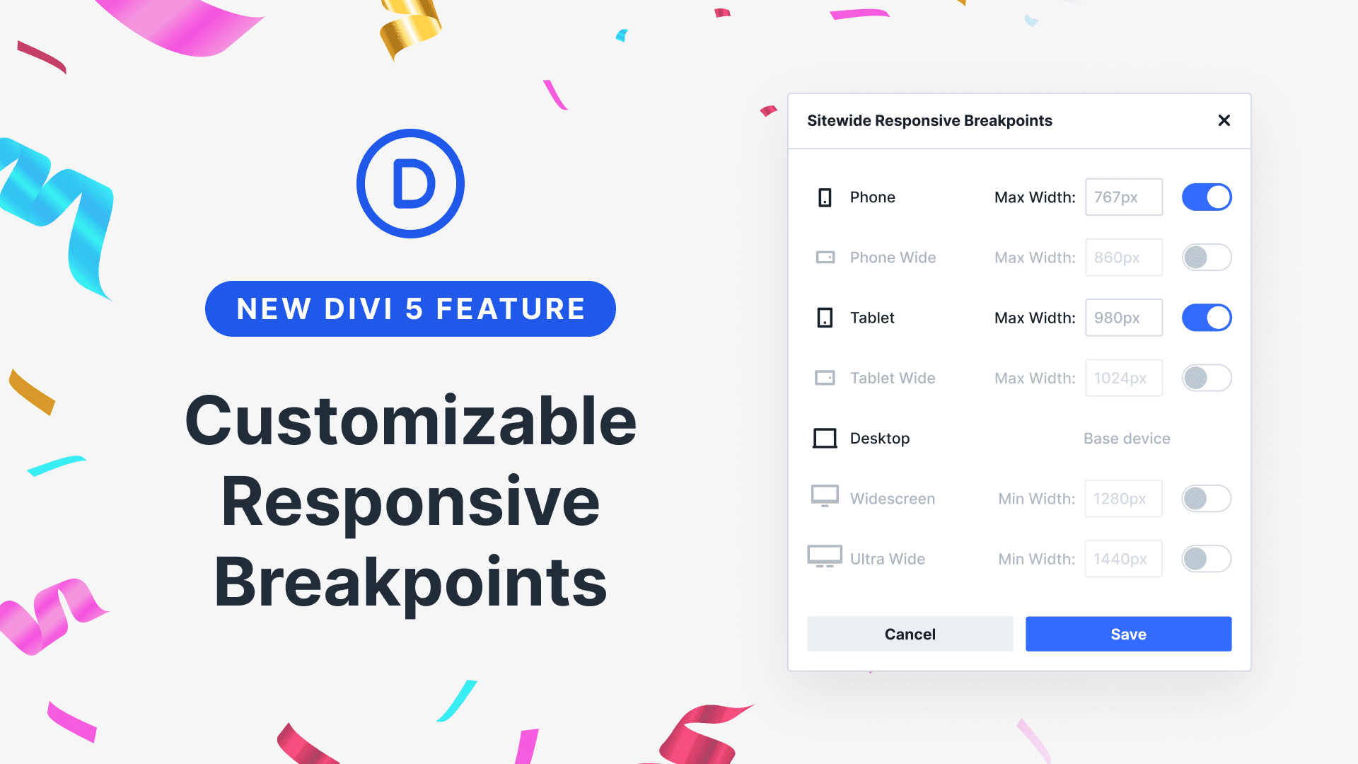
Divi 5 now comes with seven pre-defined breakpoints that cover every type of device, and you can customize the width of each breakpoint, giving you control of your design at every size. It’s fast, it’s easy, so let me show you how it works.
Check out the following video to see the new feature in action. 👇
Customizing Your Website’s Breakpoints
In the Visual Builder, you can switch between breakpoints using the icons at the top of the interface. Click the triple dot icon to open your website’s breakpoint editor, where you can enable or disable any of Divi’s new default breakpoints.
We bolstered Divi’s original set of three breakpoints with four new breakpoints, including Phone Wide, Tablet Wide, Widescreen, and Ultra Widescreen. They cover all modern devices, allowing you to optimize your design for everything.
Adjust The Widths Of Each Breakpoint
While the pre-defined breakpoints should cover all your needs, you can adjust them to target specific devices. Within the breakpoint editor, you can define custom widths for each breakpoint.
Intuitive Responsive Editing
In Divi 5, there is no need to enable responsive editing at the option level. Any change you make within a particular breakpoint will automatically apply. Switch views, then make changes to optimize your design for screen sizes within the selected width range.
You can drag the edge of the canvas to view the design at any width within the active breakpoint.
Design For Any Device Thanks To Canvas Scaling
The size of your design scales down proportionally when a breakpoint’s width is larger than the width of your canvas. You can design for ultra-wide monitors, even on a small desktop or tablet. Using a small device or a compressed browser window, you can visualize how your design will appear on larger monitors.
And, of course, everything is so fast in Divi 5, which is especially noticeable when using the new responsive editing system!
Try Divi 5 Today
Customizable Responsive Breakpoints are available today, and it’s one of many features coming to Divi this year.
You can follow along as we progress through the final release of Divi 5 and beyond, with updates every two weeks. Depending on your priorities, you can use Divi 5 now to build new websites or wait until we add more features and address more feedback, whatever works best for you.
As outlined in Divi 5’s original multi-phase release schedule, the Divi 5 Public Alpha is like “Divi 5 Lite.” It’s missing a few features and may not be suitable for existing websites, but it’s ready to be used on new websites if you prefer the experience to Divi 4.
We want you to try it, and if you love it, use it; when everyone loves it, we’ll make it official.
More Features Incoming Fast
2025 is the year of Divi 5. The tedious work is behind us. We built the super-fast foundation, fixed the bugs, and now it’s time for Divi to make its comeback.
We spent two years building the Divi 5 foundation with the promise that it would act as a springboard for us to sprint forward and develop new features quickly. It’s time to fulfill that promise.
If you’re here for the Divi comeback, do us a huge favor and let us know by liking this video and leaving a comment. It means a lot to us to see you cheering Divi on, and it’s essential to feed the algorithm and spread the word.
Don’t forget to follow us on YouTube and subscribe to the Divi newsletter so you never miss an update. I’ll see you soon for another Divi 5 feature announcement, which I promise will be right around the corner. 😁


Awesome can’t wait for the full bug free launch in 2025 so I can update all of my Divi websites.
Hi, great news today and this implementation presented today is excellent. However, I would like to suggest the implementation of new features:
1- The ability to customize the width of the columns.
2- The ability to insert columns within other columns.
3- Within the Theme Builder, the ability to divide templates into categories and for each category of templates, to customize the Header and Footer independently without using conditional commands.
Thank you for your works
*customize the Global Header and Global Footer for each category of templates independently…
sorry
I was an early bird back in the days. Maybe one of the first to get Divi. Used to love it with all my soul and really improved my web design skills to the best thanks to you guys. I still don’t understand why Divi keeps avoiding primordial things like flex and grid. Things being released a decade ago. I would love to see this implemented and start to work with Divi again. Until then will be Elementor and Breakdance. Can’t get my head around this. Don’t take it wrong – as I said, without you guys I have never had a chance back then. Thanks again for the great work.
I have a couple of sites in Divi 4. Can I convert them to Divi 5, or can we only create new sites in 5?
If I can convert to Divi 5, I’m guessing it’s not possible to revert to 4.
Divi 5 has an option to migrate Divi 4 websites using the Divi 5 Migrator. Once migrated you will have an option to revert back to Divi 4 using the Restore Divi 4 Content in Divi 5 Migrator:
https://prnt.sc/35n8FEAyvImH
https://prnt.sc/NVEmW3KO2VQ1
But at the meantime, we do not suggest using Divi 5 on live sites because it’s still not stable, you could face bugs in the process.
Super!!!
I’m thrilled to hear about this latest development about the breakpoints and am really looking forward to trying it out.
Truly outstanding!
This feature has become absolutely essential with the increasing variety of screen sizes and resolutions.
Thankfully, there were excellent extensions that allowed for these adjustments, but what you’ve just created for Divi 5 is simply brilliant!
Thank you for this indispensable functionality!
On the content width default for rows, I see that this can be set globaly in the customiser.
In the front end builder, we still don’t have the header and footer visible. This is imortant to make design judgments.
There is still too much context switching in Divi to navigate through all the template parts and even between pages. Things still seem to be in magic areas. There needs to be UI, like in Bricks Builder, wherreby one can jump from editing a page layoutr to another. without having to go via the WP dashboard.
Great new feature but is responsiveness still based solely on viewport width? Can we please have options for CSS orientation e.g
@media (orientation: landscape)
@media (orientation: portrait)
Or is this inherently part of the new options?
I mean, especially for images, I’d much rather have the image selected based on orientation than on viewport width.
I mean, especially for images, I’d much rather have the image selected based on orientation than on viewport width.
I’m very excited about the release of Divi 5. I think it’s a great step forward for the Divi builder and I’m really impressed with the new features and improvements.
I have a few suggestions for future Divi updates:
More default navigation layouts
More default footer layouts
More default page/blog post layouts
More blog module layouts
Easier to use background masking (mask moving, resizing)
Image masking (custom shapes, decorations)
Stacking order settings for rows
It is very important that within the seven predefined breakpoints, each nested element such as text, image is adjusted separately, without changing anything in the appearance of the other six elements.
It is very annoying to go from one point to another and have everything move when you have already set it once.
If I’m confused and don’t know how to achieve what I’m asking, I apologize. Still waiting for an answer.
I would just like to mention that since the Update to Alpha 7.2 there is a Problem in the Builder with the Dividers, when activated the Module disappears in the Builder and you can’t see what you are building.
Is that only in my local environment, or is this something new?
I am on a MacBook Air running local with Apache, PHP 8.3.11 and MYSQL 8.0.35 with WordPress 6.7.1.
Try reinstalling the Divi 5 Theme by downloading a fresh copy of the file and uploading it in Dashboard > Appearance > Themes.
https://prnt.sc/cKb9TcdBRPmW
If the problem persists after that, feel free to reach out to the support team by starting a conversation from the website: https://prnt.sc/13joHk-k8Gdk
Will you be able to chance the row columns in the breakpoints?
We’re working on Flexbox controls next, which will allow you to set different breakdowns on each breakpoint!
This also answers my question above, right?
It seems that when I set one breakpoint, the view of the others is broken…
I love this feature you are adding and can not wait for it BUT…. I am currently building a site and all the standard Divi breakpoints look fine and ready to go but I am having issues when viewed on an IPAD PRO 12.9 (It looks awful). Is there away you can add this functionality to Divi 4 now as an update?
Hey, Mat! Feature development for Divi 4 has ceased, with the exception of eventual security-related updates. All further feature developemt is happening on our Divi 5 branch.
iPad Pro devices are interesting as they sit somewhere between desktop and tablet devices and targeting them specifically can be challanging. Challenging, but not impossible: here are some specifically tailored media queries to target all types of iPad Pros in both screen orientations: https://codefile.io/f/HBWQwXdXQp
To implement them, please, use Divi’s Free-Form CSS capability.
If you need any further assistance, don’t hesitate to reach out to our friendly support team!
I have added the “tablet wide” as a breakpoint on my site from the builder, and I can see I now have the option to customise things in the builder at this breakpoint in addition to the normal desktop, tablet, and phone. However, I cannot see the option to toggle visibility on or off in this new breakpoint. In the visibility menu I still only see the desktop, tablet, and phone options. Am I missing something?
Thank you so much
Hey, Irene!
The visibility option in Divi 5 currently supports the original three breakpoints: desktop, tablet, and phone. Although you can add and customize additional breakpoints like “tablet wide,” the visibility options are not yet extended to these new custom breakpoints. This means you won’t see visibility toggles specifically for “tablet wide” or other added breakpoints in the visibility menu at this time. The system applies visibility controls only to the standard three breakpoints for now.
For managing visibility on the new breakpoints, at the moment, you will need to use CSS or need to wait for future updates that expand visibility toggle support.
Hope this helps! 😊