![]()
Improved Code Editing For Divi!
Today we are introducing a fully-featured code editor to Divi, greatly enhancing the experience when adding custom CSS and other custom Code in the Visual Builder and Divi Theme Options.
Today we have an exciting update for developers who use custom CSS and custom code in Divi. When building a page in the Divi Builder, every part of every module can be customized using your own CSS rules. In addition, custom code can be added to your page and to various parts of your website using the Divi Theme Options. Today, we are greatly enhancing the code editing experience in Divi with the addition of a fully-featured code editor that makes writing and editing code so much easier and enjoyable. Enhancements include syntax highlighting, error reporting, autocomplete, color picking, multi-line select, search, find and replace and more!
![]()
Lots Of Improvements
That Developers Will Love
The new code editor comes with a lot of improvements that will help you write better code and help you write it faster.
For Custom CSS, Code Modules
And Theme Options
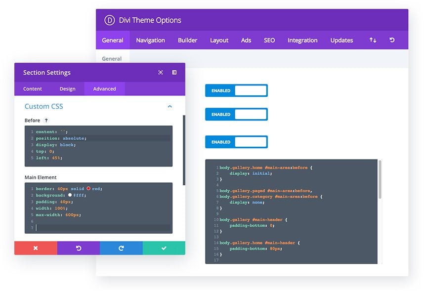
Today we are improving the code editing experience for Divi in several locations. Within the Visual Builder, you will now experience improved code editing when adding custom CSS to your modules as well as when adding custom CSS to your page. You will also experience improved code editing when writing custom code in Code Modules and when using both the custom CSS and integration settings in the Divi Theme Options.
Smart Syntax Highlighting
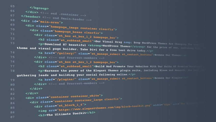
Custom CSS and custom Code in the Visual Builder and the Divi Theme Options now feature rich syntax highlighting that makes it much easier to read and understand. Everything your write will be color coded and formatted automatically, and all lines will also be numbered for your reference. This makes writing and editing your code so much easier!
Warning And Error Reporting
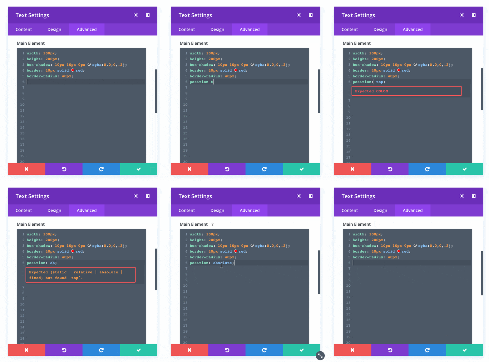
Adding custom code to your website comes with the responsibility to write code that is valid and error free. Syntax errors in your custom HTML or CSS can cause a lot of problems if left unchecked, and even the most experienced developers make mistakes. That’s why we are really excited to introduce automatic warning messages and error reporting to Divi. When you write custom code in the Visual Builder or the Divi Theme Options, Divi will automatically detect any problems and let you know how to fix them.
Autocomplete And Suggestions
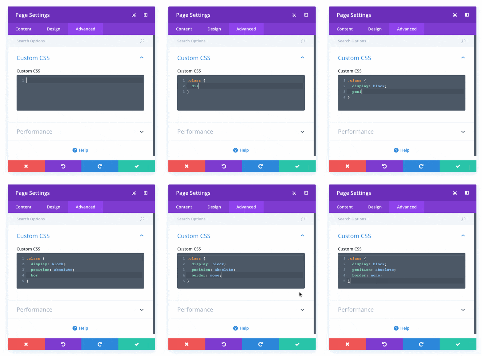
Writing custom code is a lot faster now thanks to smart autocomplete and suggestions. Tags will now be closed automatically as you write them and suggested values will be displayed as you add new variables and properties, speeding up your workflow.
Easy Color Picking
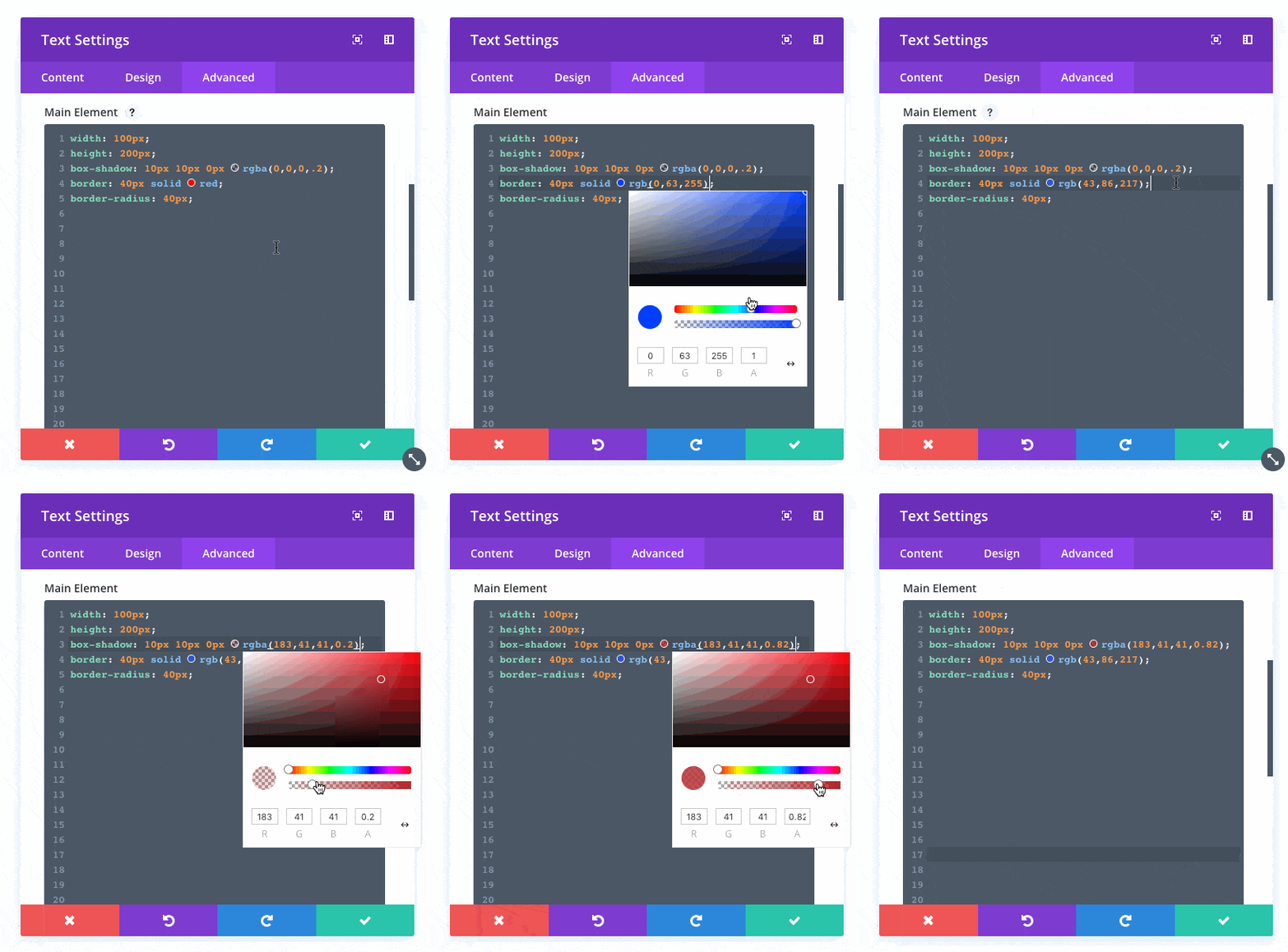
Color pickers will automatically appear for all color values inside the new code editor. You can use these color pickets to explore color options, or you can just type in your desired color value.
Multi-Select
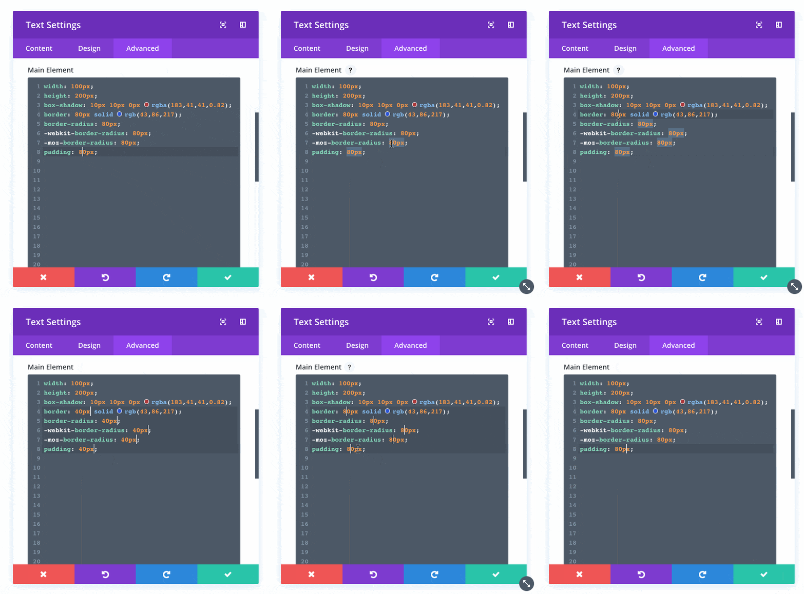
You can use Ctrl+Click and Alt+Drag to enable multi-selecting. This allows you to select multiple lines or multiple values at once so that you can make quick batch adjustments.
Search, Find And Replace
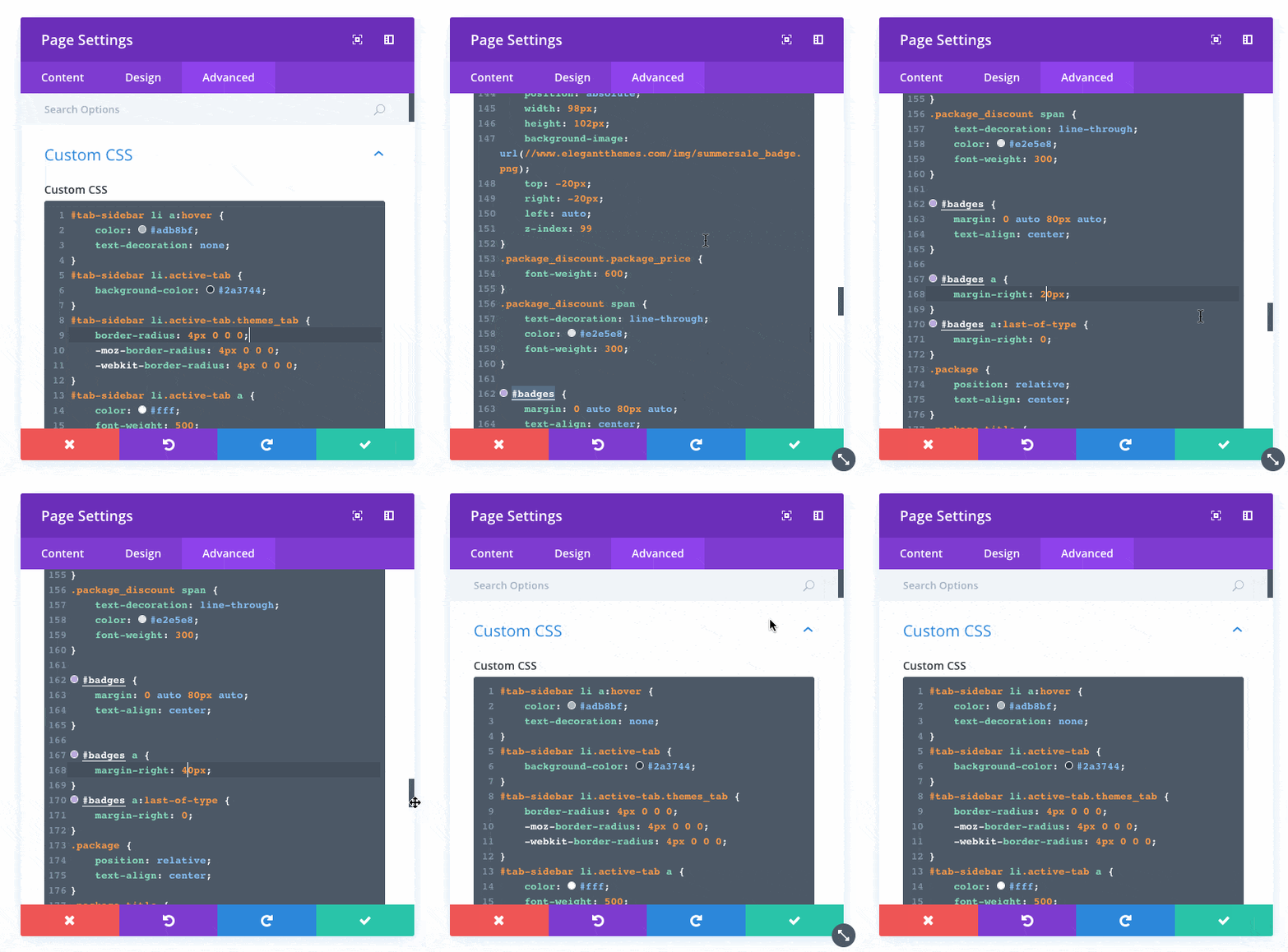
The new code editor comes with built in search functionality that you can use to quickly locate specific pieces of code. You can also find and replace value if you need to make sweeping adjustments across the entire document,
![]()
More Custom CSS Options
We went through all Divi modules and added new custom CSS options for all major module elements.
More Custom CSS Options
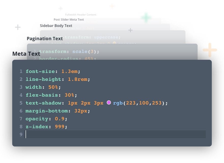
We went through every Divi module, row and section and made sure that custom CSS options were available for every major element. We filled the gaps and added over a dozen new settings that will make it easier to customize the appearance of each Divi module using your own CSS styles.
![]()
Improved Loading Speeds
In addition to adding the new code editor, we also greatly optimized the Visual Builder application to improve loadings speeds. That means you get the new code editor without any loading speed cost!
More Features, But Faster Load Times!

Every time we add a new feature to the Divi Builder, the builder itself gets a little bit bigger. We aren’t talking about the load times of your website on the front end, we are talking about how long it takes for the Visual Builder interface to spin up once you start editing your page.
In this update, we spent a lot of time optimizing how the Visual Builder app is bundled together and how each part of the application is loaded to help reduce the time it takes for the builder to launch. By splitting up the application into separate chunks and lazy-loading in necessary elements on demand (invisibly in the background), we were able to reduce the size of the Visual Builder by 35% and significantly reduce load times. That means you get all of these new code editing enhancements without sacrificing anything at all 🙂
Get 10% Off Today!
Today's The Best Day To Get Divi Or Upgrade Your Account To Lifetime
Join the most enthusiastic and loving WordPress theme community on the web and download Divi today. Using the new Visual Builder, you can build websites faster than ever before with its incredibly fast and intuitive visual interface. You have to see it to believe it!
Join Today For 10% OFF!Renew Your Account Today For 10% OFF!Upgrade Your Account Today For 10% OFF!




The windows of editions are much too small!
And the main editing window can no longer be resized!
The code editor is okay but really needs the option for a bigger window. Bit like editing through a letterbox.
Also the error checker flags global colours (declared in :root) that are legal syntax according to W3C.
Hi, about the syntax problem you’re encountering, this isn’t specific to Divi; it’s a broader WordPress matter. WordPress relies on CodeMirror for this validation, which means any CSS code, whether it’s part of a theme, a plugin, or custom code, can trigger syntax problems if it doesn’t adhere to CSS standards.
try
.CodeMirror {height:900px;}
resizes all the code panels in Divi options
Thank you guys! You are the best!
Looks like I may be the only person who does not like this, but I much preferred the previous conventional Custom CSS area.
White background with black text is far easier to read and edit than the new area with very poor contrast.
It would be good to at least have an option of either.
For now I will use an external text editor and copy paste code.
Agree on that. One should be able to choose the background.
Wonderful, guys! I really love the way you are going. The only thing that bothers me is that the Visual Editor messes up a lot with my pages, everytime I turn it on. As an example, there are always some weird signs added to the Blurb modules, making them behave unnormal (even if leaving the Visual Editor without changes). I suppose it might be due to other pluggins, but…. BUT I only use pluggins you recommended as the extension to the Divi Builder.
This way, after nearly two years of using the new Divi/ Extra, we can assume that allowing third parties to improve Divi in a form of pluggins, instead of improving your own “child” is very risky. It’s like allowing vaccination program against influenza which causes autism…
Once again please don’t force useres who only want to fix problems with Divi, to reach for 3rd pluggins! With all your talent and capacity, you can improve the Divi in the safe way. Thank you very much!
On a semi-related note: am I the only one who uses beginning/end of line shortcuts (on Mac) and has the toolbar jumping around back and forth across the page (docking to left and then to right) when I’m trying to navigate around lines of code?
Is there a way to disable this behavior?
Thanks again for all your work guys!
I was hoping this update was truly for developers, but it seems that it’s for newbies who like to tinker with CSS and not much more.
I want to be able to use my child theme’s style.css file and have full control, without Divi taking over and bullying all other code.
That is great!
Unfortunately I have an issue. My map modules are not working anymore. Google maps could not be loaded properly. Directly after updating; I checked that on a second site.
Also on the last update before. I am happy about the new dividers. But I can not flip them vertically and horizontally. They disappear, when I try that.
Has someone else the same problems?
I Had that also. It disappeared in the visual builder but shows on the live site…
this should be fixed now – update to ‘105’
Great!
YAAAASSSSS!
Great! Works just fine, real improvement. After first using the child theme CSS, then the JetPack CSS editor (until that moved to the Customizer, which rendered it too narrow to use), and after that the SiteOrigin CSS editor, this might very well become my CSS editor of choice.
One minor flaw: the editor window should be bigger, or at least have anchors to resize it. In an average 100 – 200 lines of CSS stylesheet, it’s too much scrolling.
Keep up the good work!
Great news !
But I’m waiting for improvements for the archive pages and the blog.
And adding features for SEO.
Thanks
Awesome! Really appreciate your constant development of your products. Many could learn from that.
Please consider following ideas for future updates 😉 :
– page template builder (single.php, archive.php, etc.)
– Custom post mason/grid with filters
NICK!
You guys are SO Awesome. Almost every day when I open email there’s something from you guys making our lives better and easier!
THANK YOU for all you do and for this especially!
Warmest,
Chris
First off, I love Divi and ET. I also love this addition. However, PLEASE PLEASE PLEASE bring this feature to the backend builder. I know your visual builder is your big product you want to push, but I never use it. One of the main reasons I don’t use it is because it does not truly represent what I will see in the browser. This is especially true when it comes to padding and margin. Another reason that I don’t like to use it is because it often causes things to break or change appearance on the site after I use it. For instance, I used some tags for a specific reason. They made the text break like I wanted them to. Then, I used the visual builder to test out the new section divider feature. After saving and viewing my live site in the browser, all of the tags were showing like text and none of the lines of text broke how I wanted them to.
If this new coding feature is marketed toward “developers,” why not include it on the place where a lot of the developers I know word, namely the backend builder. There are definitely two communities here, visual builders and backend builders. It’s just feeling like the backend builders are benefiting less and less from the divi theme updates.
+1 the VB sometimes also breaks content that is added by a shortcode.
For some content (like a restaurant menu, business profile, contact form etc) I use plugins. So you use a shortcode to add that content to a page. When you start editing the page with the VB, it needs a very long time to understands there is a shortcode involved. If you edit to fast and save the changes, the VB actually saves back the published content in stead of the shortcode.
+1 as well. Please add the CSS editor to the backend modules. It’s MUCH faster to work in the backend than in the VB.
+1 for all of this!
Nice update, but if it’s for developers then it needs to be in the backend builder. I never use the VB because… well I’m a developer, I work in code. It’s just quicker and more accurate (for me) to work in the backend. So it would be great if a coding enhancement was available where many (most?) coders tend to work, no?
I do get the impression that we’re moving towards a VB only thing, or a situation where the VB gets all the good stuff and the backend is neglected – that seems to have started already. I shall continue to use the backend builder – but if that disappears or becomes practically unusable then I’ll be looking for a new theme – it’s about the only thing that could drive me away from Divi.
IanB, thank you for your comment. I would encourage more people to learn the workflow of using the backend builder and the browser inspector together. I know generally what structure I want to create and build it quickly in the backend builder. Then I hop over to my browser and make edits using inspector. That lets me see exactly what things will look like. I then go into the backend and make the changes quickly, along with adding custom code into my child theme when necessary. For me, compared to this, the visual builder is slow and hit or miss when it comes to knowing what it will really look like on the true front end. I was so excited by how this new coding addition would help my workflow, but finding it was visual builder only was a big hit.
I’m not a developer, and I use backend builder and browser inspector method too. Haven’t used the VB at all because I prefer to see exactly what I’m doing in the backend (so I can undo it if I mess something up). This code editor would have been more helpful where I need it.
It’s a great idea though.
Great feature !!!
Congratulations! Keep-on the exceptional work!!!
Great update. Divi is definitively more than a template. More important, updates seem to be well tested (not like some OS!) and it’s a secure way. Stay in this mind thinking.
That’s nice but I can see that even support srcset still is not implemented to Divi, while WordPress has it inbuilt for 3 years already. Please follow the standards first then make all these candies.
Regards
Please support CSS custom properties. When using –color-variable: #FFF (for example) it gives error “Expected RBRACE”.
Yep this was needed and was longgggg overdue… finally.!!!
What about PHP integration? That would REALLY make some people happy.
Think about it elegant themes.
Agreed! Some visual builders already support PHP. Hopefully ET will follow.
So happy to see the “developer” side of Divi getting more love!
You guys are amazing!
Ok this update is fantastic, although for my part I prefer to use the CSS style sheet.
But, guys, seriously, it’s been many months that many expect an essential correction: the use of native WordPress fields for alternative texts and titles of images.
Months that the posts on this subject multiply in the support of the theme but that nothing happens.
Months that you multiply the update and additions of various and varied features without correcting this problem.
Please, think of that as well. I use the Format Media Title extension usually on my sites to fill these fields automatically, unfortunately I can not use it with Divi anymore.
Come on guys, we believe it!
Yep totally agree that the image title and alt tags that are set in the media library should be picked up when you add an image to any Divi module (image module, blurb, header etc).
Also, the fields to set the title and alt tags are tucked away under the advanced tab. Who thinks of going there each time? It belongs on the content tab right below the image.
A lot of sense in these points.
The new features a great and welcome but some basic housekeeping should take priority.
Divi: the best!
I was absolutely flabbergasted with last week’s new feature, the stunning dividers. And now this! You guys are doing an excellent job. Thank you so much.
Absolutely awesome update! Thanks guys and galls!
What if I prefer a light color scheme. Maybe make an option for choosing a color scheme as we all do in our code editors?
I prefer light color scheme too.
ET team is always improving & adding features to help us designers and developers, THANK YOU!
Awesome. Very welcome enhancements.
Does the “Custom CSS” textarea in the page-level Divi Settings Popup get the same love? –
doesn’t seem to be the case based on my quick test.
Also, being able to increase the width of that editor would be great – it’s too small right now.
very handy feature… i always think it would be nice to be able to see what modules etc have custom css added without having to click into the module.
I got all excited at first thinking this would be the hooks and actual developer code stuff that some of us have been waiting for. This is awesome, but I just stick to using child themes and external editors. I have way more control than what this will offer for now.
Thank you for your updates, I love to receive your thursday’s emails.
I think is a very good improvement, but is always better to use custom styles (and scripts) on child theme.
Is it possible now to add “hover” styles in Divi? If you could set hover styles I would consider making “some exceptions” on quick particular styles, but I think is always better on a child theme.
There’re tons of same requests in Theme Suggestions section of the forum… Hopefully, here it will be more visible to developers.
I can’t wait to play with this.
Looks amazing! Thanks!
A much-needed feature! Thanks!
Any known conflicts, issues with using plugin; HTML Syntax Highlighter for editors in Admin?
Fantastic!
Wow! This is an awesome feature. Thank you guys, I just can’t wait to see what you come up with next.
Again, many thanks and best wishes from the UK
Sweet! Where can I leave a suggestion for a future feature?
Support Forum.
This has been near the top o my wish list for some time. Finally!
You guys continue to amaze. Thanks so much!
Awesome! Nice work, nice addition!
Just when I think you can’t surprise me with a new feature, I’m surprised. This is going to be a huge help when one missing semi-colon or bracket can ruin your whole day!
always further
You are great guys! Well done and great update!!
Awesome! Best update yet!!! Thank you!!
Best update yet!!! Thank you!!
Hi ! Does it works with EXTRA theme too ?
Congrats for this update <3
I don’t see media queries in the examples, but I’m hoping to be pleasantly surprised!
Yeah, I don’t get why this hasn’t been addressed. 🙁
Wow! Thank you so much. Looking forward to the increased loading speed. So much good stuff coming from Nick and his team every week.
Can’t wait to see what’s next.
All this features are great and very useful. But still I’m waiting to get an update for speeding up my divi websites.
That looks awesome. But why does the color picker not provide the default colors that are set in the Divi theme options?
Fantastic work guys, I love your commitment to the ongoing improvement. It’s sincerely appreciated.
Another amazing update! Thank you.
Extreme cool feature and save lots of time. I love you guys!
Absolutely great!! Just today I was thinking should I suggest something like this and you’ve already made it!
This made my day!
Genial, gracias por todas estas mejoras que sin duda nos facilitan el trabajo
amazing work! do an intergration! with cobalapp and you stayed, even better!
cobaltapps.com
Divi meets Submime. I love it.
Is that an underwater mime or a mime sandwich with salami and pickles? 😉
Marc, maybe something from here and something from there? Like an underwater sandwich
Thanks a lot for this update, it’s really exciting. Most of the custom code we write for Divi is using external editor, but maybe this is not necessary anymore.
Still will need an external editor for the regular text module when marking up large amounts of content.
Great job as always Divi Theme team!
UPDATE
Had to disable “Minify And Combine Javascript Files” and “Minify And Combine CSS Files” to get things working again.
Please, include hooks to modify easily the header and footer.
The gave up on improving the “theme” a long time ago. All Builder updates going forward, it seems. 🙁
Jon, but look to other builders that compete with Divi, such as oxygen, for example, they do support it, so Divi has to keep up! If our requests don’t work, competition will be the reason they’ll do it. Hopefully not too late.
DIVI 3.2 will have that feature imo.
Richard, how do you know? I’m afraid it will be in DIVI 32.2, but even that is not for sure. I hope you are right though.
We are all waiting for that amongst a lot of other things.
There is always the option to apply the Divi builder plugin to any theme we like with the heade and footer we want, but still not the complete solution that a Divi would be with more options inter header/footer areas.
Can we change the code colours or editor background colour? Medium grey background with medium shaded colour text doesn’t offer very high contrast.
I like white background much more than grey. And many other people too. Let’s hope this improvement won’t take too long.
+1 for this. Very difficult to see the highlighted text.
Why not just utilize the Code Mirror version built into WordPress now? Also, please make the Theme Options CSS box taller!
I don’t see why they didn’t use the native WP Code Mirror too. They seem to like inventing bicycles.
Or, at the very least, put back the ‘resize’ option for the browser so that we can make it larger manually.
Feature suggestion if not already implemented: Could we use it to edit the proper child-theme style-sheet?
Appearance > Editor > Divi Child > style.css
WordPress has its own syntax highlighting.
I will continue to edit the style.css in the child theme with firebug and brackets
Excellent feature for us coders. Thank you.
Well, it’s the day after Valentine’s so I think it’s still okay to say I love you 🙂
Thanks!
One of my fav updates.
P.S you NEED to add the color picker feature to the color selection in the VB.
Nice one!
This is a great update although I still will be using my child-theme style-sheet. It’s just easier to see all customization in one place in a full screen view without having to search every nook and cranny for the code. Unfortunately, features for developers seem to be few and far between. Most updates are purely for designers (My other hat). I’m still waiting for some love for Custom Post Types which has been promised many times.
Yep, this is a welcome update, but I’ll still be sticking with editing the Divi Child style.css via the Appearance > Editor
Ditto
Me too!
Same here, regarding some updates regarding CPTs.
Amazing!!! Thanks, Nick & ET Team.
So we pay for a theme but we almost get a web based ide as well? Amazing! Best purchase ever!
was thinking the same thing
Wow, great update. Will this editor render JavaScript snipplets? (or whatever they are called, I’m not good at coding*!) thanks
Wish you guys would simply buy WordPress.org and tweak that thing. Start with having a single place where all plug-in setting interfaces load, and then put this CSS editing feature on it. Then, buy WooCommerce and fix THAT!
You’re the best developers anywhere.
Can’t really do that as the WordPress itself is worth at least 1 billion bucks.
I highly value being able to edit a page in Visual Builder on my iPhone 6s Plus using Content, Design and Advanced tabs. To date, it is very difficult to select text. The interface is jumpy and parts of the editing area and tools fall off the edge the iPhone screen. Please work on that.
Very Very cool
This is fantastic.
Only thing is in the themes options I can’t stretch the CSS box. I only have a small window (it is bigger than before).
In the custom CSS inside the modules I am able to stretch the box, plus the box grows larger as you add CSS (Nice :-))
I am blown away by all of these updates.
My lifetime membership was a smart investment.
Thanks for everything.
Keep it coming.
This is an awesome feature! Thank you!
They put friggin DREAMWEAVER inside DIVI!!!
Amazing!! Love it!
I should hope not. It’s way better than Dreamweaver!
No they didn’t, otherwise we’d have true global layouts. 🙁
A much-needed update in recent times.
You’re the best!!! I Love!!!
Great feature !!!!
People with little coding skills will be able to do more things 😉
Thank you Guys
I’d like it better if I could resize the box. Can’t anymore and stuck with having to scroll a long way…I use stacks of custom CSS.
Oh no… really? I can hardly imagine they facilitate extensive coding and then restrict that to an edit window of a few lines!
Obviously it would be a document sized text area in that separate window.
Wait. Are you saying this update takes away the ability to resize the Theme Options > Custom CSS box at ALL? It has always been a pain… stretch it a little, scroll back up, stretch it a little more, scroll back up and repeat… I have suggested numerous times that they make the default size of that box bigger or (even better) give a way to toggle it to full screen. But if the ability to resize it at all is gone, I’m going to be in a world of hurt!
That’s not great. But to be honest I never found the user experience of writing substantial amounts of css or markup the best in the Divi provided text areas, which is why I generally use child themes with less/css stylesheets enqueued in the functions file.
It has been acknowledged by the ET theme that some of the UX/scroll issues could be better, when I complained about it, so perhaps some improvements are on the way there.
I have suggested that the settings panels open in a window separate to the main browser, ala Chrome inspector, so we can use them on a second monitor. That might be a technical bridge to far though.
I agree. It would be a great addition to be able to open the customized CSS box in a separated window o tab or whatever…
This is awesome ! Well done ! Seems like we might be doing away with the child theme in the near future?
With the Visual Page Builder, a page can not be created optimally responsive without additional media queries. These necessary CSS instructions should be integrated into a style.css in the child theme. Google does not particularly like the instyle CSS instructions. I will now create a page with these new ways of inline styling. I’m curious what Gmetrix, Pingdom and Google Pagespeed mean.
“In this update, we spent a lot of time optimizing … to help reduce the time it takes … to launch. … we were able to reduce the size … by 35% and significantly reduce load times. …you get all … without sacrificing anything at all ?”
Respect !
Nick I would feel MUCH better if you would address the looming Gutenberg issues and potential ramifications for Divi users. I love Divi and I’m all in with it. However, I have many sites and have built many client sites. The thought of all of them crashing at once and my phone ringing off the hook with 911 emergency site issue calls isn’t something I want to experience. What can you share to help put the Divi community at ease?
Hey Britt,
Gutenberg is a very important project for the larger WordPress Community, and our team will be doing everything they can to make sure Divi works alongside Gutenberg.
At the moment, it is too soon to tell exactly how compatibility will work due to the constant changes leading to the full release into WordPress Core. However, you can rest assured that sites using the Divi Builder will, at the very least, continue to work just like they do today. ?
Gutenberg is a very important project for the larger WordPress Community?????
I still do not know why it is needed when we have around 5 major WordPress page builder plugins that already do exist…
When Gutenberg first releases in WordPress 5.0 we will still be able to use DIVI without any problems.
I hope that is indeed the case. I read a lot about it last night and it didn’t make me feel warm and fuzzy inside. Apparently there is a plugin we can install that rolls back the changes, but that begs the question of whether it will cause theme and plugin conflicts etc.
I concur. There are aspects of Gutenberg that are interesting but I am left cold that it and the current incarnation the TinyMCE editor don’t come anywhere near the functionality of a proper text editor as we are seeing in the updated version of the Code module or what we get in SublimeText and other full blown IDEs.
Looks like text module in Divi is still tied to the TinyMCE way of doing things in the Text tab. Proper code text editor is achievable, as evidenced by this update, so I hope to see the Divi team roll it out into all areas.
In SublimeText with the correct packages installed you only have to type tags, e.g. p to automatically get it code completed to with your cursor ready to type in between. Would be nice to see this in Divi.
OMG !! Absolutely love this .. I’ve been reading and studying up on CSS and this enhancement comes around just in time for me to hone my development skills. Thank you Divi team !! It just keeps getting better and better!!
I’m to happy with this update. Awesome work keep that up
Another incredible update Nick. I am not a big coder but I can see how this will be great for those that are.
Nice! Thank you!
Only one word!: VERY COOL!!! 😉
Great update!
One thing though..
Why is this only in the Visual Builder? Why not in the regular Edit Page function?
Thanks!
MD
Yeah, makes no sense to me. I never use the VB, just too slow to work like that. Think you might be right about them phasing out the backend builder – which would be a shame because that’s about the only thing that would make me stop using Divi :/
I’m also a fan of the backend builder, but I have a feeling that’s mostly because it’s where I was first introduced to the power of Divi.
From the little I’ve played with it recently, wireframe mode on the frontend seems to be essentially the same…
…with the exception of third-party modules not showing up, which is a major bummer. Come on ET, give us some kind of official API for implementing our own modules!
If that’s true, it seems they really want us to only use the Visual Builder. But it’s always an extra click-and-wait after loading the Backend Builder which is painful when wanting to make quick or basic changes.
ET needs to figure out how to let us jump straight from a page/post list to the Visual Builder without having to load the Backend Builder(or standard edit-page/post screen) first.
Maybe you want to have a look at my plugin “Divi Enabler” on Elegant Marketplace. It adds a “Edit in Visual Builder” in the posts action row so you can jump directly to the Visual Builder 🙂
I think they’re just phasing out their backend builder completely. I would be fine with that, except I have some shortcode elements that don’t display in the visual builder (and take a long time to load in the VB) for which I prefer working with the backend builder.
Good Job. The best as always
This rocks!
Thank you
YAY!!! One for the developers! 🙂 thanks for this.
You guys rock. I love the way you keep looking for ways to improve your users’ workflow.
That’s a great idea. Thumbs up! (again)
Yeey! That’s huuuuge!
Thank you Divi Team.
Unbelievable! Game changer.
Hallelujah!
Sounds like a great update. Thanks.
This is awesome!!!
I am so giddy right now!!! Ahh! I’m also so glad you added the missing CSS boxes for some elements!
Absolutely amazing!
Yay! Boy you guys work hard! Awesome. 🙂
Another solid update here. WANT the columns update the most!
When they do release it they will call it “The Richard Ginn Update.” 🙂 Really hoping for this soon too, just had another situation where I needed to resize columns.
Agree with Richard.
Don’t make me wrong, the code udpate is awsome and it will be great to spend a few time on the basics to improve them like columns. Mayke less sexy to develop but definitely WANTED by several of us there.
Next week ? 🙂
What’ the Richard Ginn reference?
Oh! I see your man above.
hhahha I say in 2018 it will come out. It will be out before version 3.1 of the DIVI theme for sure, but this is like the most important update period.
We still need hover and Theme customizer update as well before DIVI 3.1 release.
Hi Richard,
These vertical tabs could really come in handy, I hope they add them to the module soon.
My main update request would definitely be on the header, it’s currently extremely limited compared to other themes out there.
+1 on the header enhancements
Agree that this is an excellent update, I really hope they do something with the header soon, it desperately needs an overhaul.
I just finished these two sites with Divi, let me know your thoughts. http://www.bajaware.com and http://www.excel.mx and I just sent out 4 website proposals that I hope I can build with Divi + Woocommerce.
Nice work!
Hey Mario,
just one curiosity. How did you do the menu on this page? http://bajaware.com/soluciones/
It’s very cool, and do not need the reloads
Hi Alessandro,
I’m using Divi’s TAB Module and just styling it so the list items float to the right.
Mario, how did you do the mouse rollover effect on the menu on the right side of the bajaware.com/soluciones/ page?
Hi Cruz,
I’m using Divi’s TAB Module and just styling it so the list items float to the right.
A couple of suggestions for your two sites (since you asked):
Bajaware.com – In two of the three modules under the hero image on the Home Page, on rollover, you’ve justified the type. Instead, make the type “flush left” and allow it to rag on the right. This will eliminate those awkward, large spaces between the words.
On excel.mx, the Home Page video is autoplaying. In addition, when I turn the video off and begin scrolling, it autoplays again. Not the best UX. Also, the video autoplays on mobile, which is definitely not a best practice (mobile users may not want to use their precious data to stream a video). Hope that helps!
Hi Jeremy,
Thank you for your suggestions, these two things that you pointed out unfortunately are requested by my clients. I initially justified the text to the left and it looked great but my client wanted them as they are right now.
Regarding the autoplay again, clients request. I consider this very annoying (only my personal opinion), additionally I sent them some publications regarding autoplay policies for this year but they still wanted it.
Mario, those sites are gorgeous. Excellent work!
Thank You!!!
Tem algum plugin de AMP?
this is absolutely wonderful. Many thanks.
Feature request: have the desktop, smartphone and tablet toggles like other options, so we could easily apply general code for different devices.
Ex: Main Element CSS for Smartphone {color:red;}; Main element CSS for Tablet {color:blue;}
oooo yes please!!!
+1
OMG, what I would do for this!
+1
+1!! It will be wonderful if you add this also… Marvelous!
Great Update!
Excelente!
All I can say is this…
THANK YOU.
OMG !!!!!!! I don’t believe it !!!! AND I never get this excitable !!!! AWSOME !!!!
Been looking for this in WordPress itself for years.
GREAT NEWS !!!!
Looks like the regular text module doesn’t get the new code editor in the WYSIWYG area. Probably too hard to implement in that one.
Divi builder loading nice and quick, quicker than before.
Sumptuously!
Great features, editing CSS previously was tedious and this certainly improves matters. Most of my CSS lives in child theme css files however I might just consider using this new functionality going forward.
Have been waiting for developer update for a long time. Its a great start. Thanks!
Nick, You are the best man. Best Wishes and thank you so much for making our life easy.
Getting married in June, But no, Nick can’t be my best man. I won’t go that far.
Incredible! Beautiful!
WHOA!!! Can I just tell you…. I LOVE YOU GUYS!
Looks damn great. Again.
Pas mieux! (not better things to say)!