
The New Documentation System
The Divi documentation system has been redesigned and articles have been consolidated into one easy-to-use location.
Every Tutorial In One Place
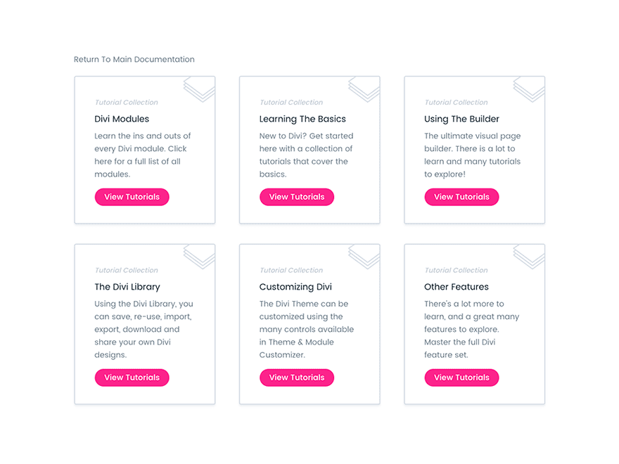
We have taken all of the tutorials from Bloom, Monarch, The Divi Builder, Extra and Divi and combined them into one central location. This makes it easy to browse all of our documentation articles at once. It’s also a lot easier to remember where to find the Elegant Themes documentation since each category branches off the www.elegantthemes.com/documentation/ homepage. Previously, the documentation of each product was hosted on its own unique URL, which made it difficult to find without logging in to the Elegant Themes Members Area and clicking the links from there.
It’s Searchable!
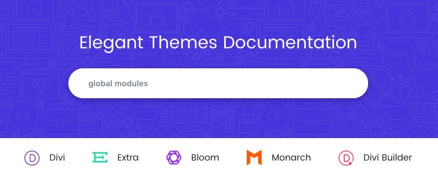
All of our documentation is now searchable (finally)! When we first started writing tutorials for Divi, the list was rather small. It was easy to digest on a single page and there wasn’t really a need to search. A lot has changed since then, and now Divi alone has over 70 tutorials on its documentation page. The larger our collection of docs become, the bigger role search will play when looking for help. This is especially true as we begin working on the developer documentation for our upcoming Divi 3.1 release.
The Search Is Enhanced
The documentation search does more than just find tutorials, it also searches through our blog and our support forum. When you search for something in the documentation system, it will display relevant posts from our blog and relevant questions and answers from our team along with the standard documentation results. Now you have access to hundreds of tutorials, thousands of knowledge-rich articles and million of answer-filled conversations from one easy-to-use location. It’s a really amazing resource.

Updated Divi Tutorials
Every single Divi tutorial has been updated with new text and images, and brand new video tutorials are in the works.
Fresh New Docs
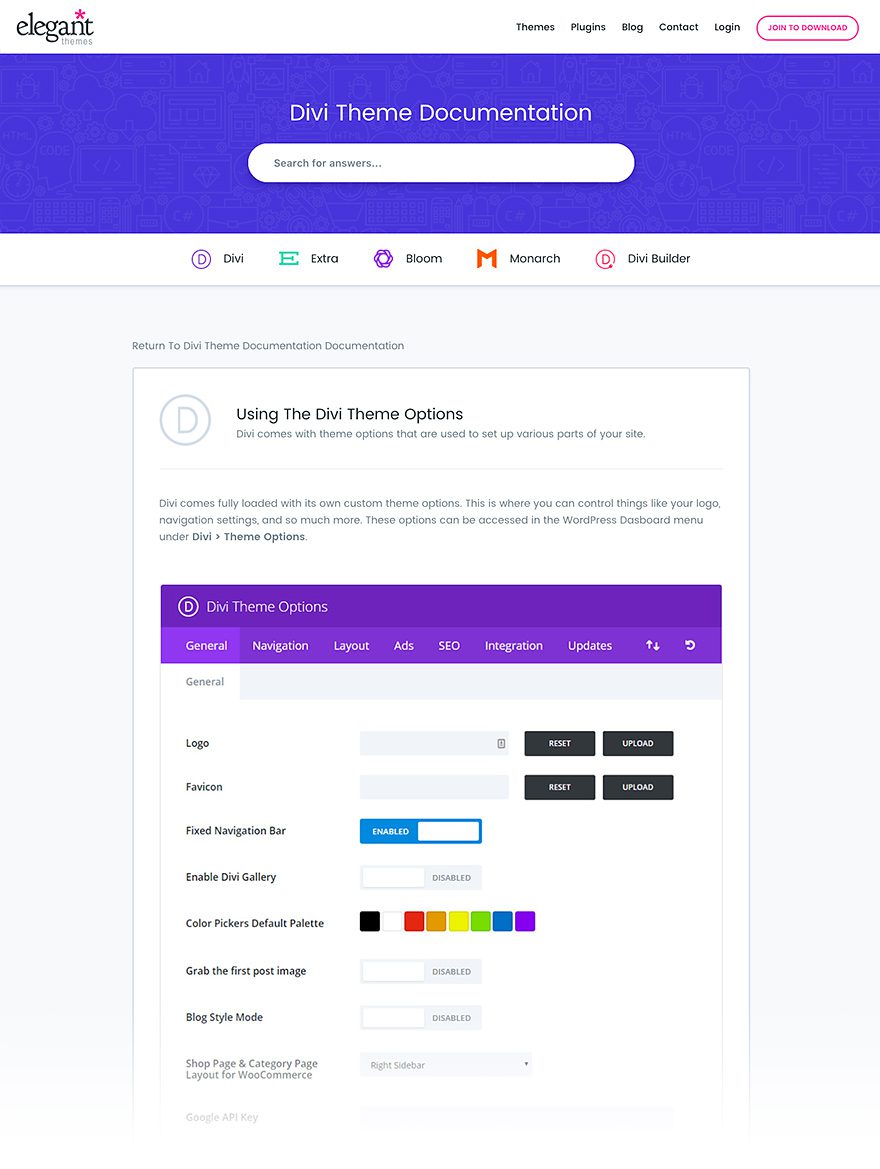
Before today, Divi’s documentation articles were in varying states of freshness. Each time we added a new feature or changed the Divi Builder UI, all 70 Divi tutorials needed to be updated. We finally committed to getting everything up to date, and after a few weeks of hard work we have successfully combed through every tutorial and made sure that the information provided is accurate. This means that all of the latest modules settings are listed and all of the screenshots are relevant. Now that we are all caught up, we will remain committed to keeping things current.
Videos Are On The Way
We are now working on new videos tutorials for the Visual Builder and we have some exciting plans for how these walkthrough will be integrated into Divi. We want to make it as easy as possible for anyone to jump right into the builder for the first time without getting lost. We still have a lot of work to do and a lot of videos to record, but it’s something you can look forward to very soon. In the meantime, stay tuned for more great Divi updates coming your way next week!
Get 10% Off Today!
Today's The Best Day To Get Divi Or Upgrade Your Account To Lifetime
Join the most enthusiastic and loving WordPress theme community on the web and download Divi today. Using the new Visual Builder, you can build websites faster than ever before with its incredibly fast and intuitive visual interface. You have to see it to believe it!
Join Today For 10% OFF!Renew Your Account Today For 10% OFF!Upgrade Your Account Today For 10% OFF!




French translation ? maybe someday ?
Divi = Pure Value! Thanks guys.
Hi,
What about the documentation translation?
The endless creative energy that you guys have constantly astounds me. You help make all of us work better!
Hi,
Very nice that it’s finally updated, but don’t integrate them into embedded videos on our sites, that’s way too far. Please don’t, or disable it by default!
Thanks!
Jeroen
Hello!
It would be great to have documentation with translation for several languages.
I know it’s difficult, but it would be a good differential.
The design of the documentation topics is really problematic.
light grey with lighter grey color scheme, the huge DIVI-logo in every topic … eating the space where information is needed
did you ever test the layout on a non-mac-machine?
On a PC your design is nearly invisible, to small contrast
please keep in mind that people work in different light environment and need strong visibility, that the users are of different ages with different eyesight…
and more than 10 pages to navigate without obvious structure (at least for me)
Please overhaul your layout so that it is usable for more users.
Thank you for making something awesome and for investing in making it better. Updating the tutorials must have taken a lot. Way to go and thanks again.
This is awesome! Thank you for your commitment and continual improvements to your products.
WOW, LUV THIS!
Thanks
THANKS !
This looks great! Are there any plans to release a Divi template for those that need to create a documentation site like this? Or, was there a specific plugin used with Divi to make this work?
Thank you Nick and the rest of your crew. Since I build sites for a living I need my time for “building” and not researching things. This will go a long way to increasing my productive time.
Jan
This is great and I love it!
One side note though, I would love to see a blog on how you are embedding your videos on these blogs, I really like the button hover and how the video pops up once you click 🙂
This is brilliant! Love me my Divi!
congratulations sir nick & elegant themes team! i’m looking forward to the videos, i hope that those documentations inlcdg. videos will also be downloadable 🙂 that would really be sweet! thank you!
It would be nice to have link in your navigation to the documentation
Just took a look at the new documentation system, makes perfect sense. What an upgrade. Also appreciate the explanation and the picture as to what you’re trying to achieve in the settings. Thanks for making me look like I know what I’m doing, meantime it’s you guys that know what you’re doing.
wow! and just wow!, you keep improving the best theme ever…
p.s. Imagine when Monarch have WhatsApp sharing XD
Merci Beaucoup for this amazing resource and your attention to detail!! Saves me so much searching time.
I’m looking forward to the integrated videos for my clients.
Question: I’m hoping that the videos will be integrated to the point where using the Divi Role Editor will ensure clients only see/have access to videos for features their role can use. Will that be the case?
Wonderful!!! I have been grumbling to myself about this for quite a while. Thank you for seeing the need and rising to the challenge. When I discovered Divi I bought a lifetime membership right away, which is something I never do. I just had a gut feeling that this was the “One” for me. It has proven to be so. As well as building all new sites in Divi, I’ve been slowly switching all sites I’ve designed in the past and currently maintain, to Divi. I love it. And a good part of the reason I feel that way is because of your culture of proactive attitude.
What an amazing addition. I am always searching for divi tutorials. This will help out a lot.
In spanish too, please
+100000
I think we were about +570 million Spanish-speakers, at the last count and rising … 😉
That’s a great addition! The design and functionality are impressive.
It will be good to have entire block clickable rather than just the titles or the buttons. 🙂
Thanks so much for creating this! I really appreciate it. 🙂
Thank you! I look forward to seeing the new collection of tutorials.
Thank you so much. I have created 40 plus sites in Divi for my customers. In fact its the only theme I use. I am glad I decided to go this route. Now I have a fantastic training resource for my customers.
I am starting to use only this theme too 😉
Super duper, first the section arrangement now documentation…frankly, ET is teaching some set of web organization skills..lolz.
Permission to use ET blog content on my site?
Cheers!
Please integrate with divi dashboard or a make a plugin , and it must show in main dashboard like bloom settings appear in the wp dashboard not like inside appearance settings , so that not only admin , the editor , author and contributor can see it. And this will be a great helpful
A great addition
Awesome job guys! Make sure that when videos are “Linked right inside the builder” they can be viewed on a second screen while working clutter free on the main screen with the Divi Builder.
Keep up the good work!
Holy smokes!!! I am just LOVING all these updates and appreciating all the hard work! One more thing I adore is the fact that we are notified WHEN the updates occur… such wonderful surprises. 🙂 Well Done!
As usual (or very often, I seem to be one of the first to comment….)
Well, I expected to see a link to the documentation in the main menu of elegantthemes.com
Please add it!
I just subscribe to Divi and I like the way you present themes options thanks
This is great.
But there’ no link to it anywhere like in your website main menu or even in the members area it is not there.
Why wouldn’t you make this great update just a click away?
I read the blogpost yesterday and I took a first glance on the documentation.
I came back today to find some info and read the changelog and I could not remember where to find this documentation on the website
It still is the same click-orgy as usual to find some information and I still don’t find it “by intuition”
Dear DIVI-team, I think you don’t do yourself a favour to hide the documentation and the changelog like you do now.
Navigation is the A and O of web-structure! So please follow the simplest rules of usability ;=)
Cheers, Connie
Agreed. It should be in the main navigation
Great stuff! Thanks for taking the time to compile everything in one place. Can’t wait to see the video tutorials. Big fan of Divi!
This is great and will prove to be extremely helpful.
Now – can we get some documentation on the internal Divi functions so we can use the Divi modules in our data driven websites? It would be awesome if it were easier to figure out the function that renders a particular module along with a full documentation on the parameters it accepts.
This is a really great feature. Looking forward to the new videos.
I find it really refreshing that you guys are investing time and energy into growing Divi. I certainly will be renewing my subscription when the time comes as it’s clear you have a lot more up your sleeves.
Awesome! It was something really missing this way, great work.
Thanks!
Wow. Nice job overhauling all of those docs and screenshots. That must have been quite the task! I am really looking forward to the developer docs. Really impressive stuff lately, I appreciate it!
10% discount on account renewal doesn’t seem to be working for me. Is there a code or something that I’m missing?
Nick,
Thanks, delighted to see this, there was a lot of great resources on the site before but a job in itself to find anything!. This will make life a lot easier.
Regards
Ian
This is a great resource! I’m glad you guys have included support forum solutions into this resource. There are so many helpful contents floating around in the forum that answer many frequently asked questions.
Thanks and keep up the good work!
Nice! But new videos even nicer)
Well done.
One question.
You have used the Divi icon all the way.
Perhaps, in some cases, you can change the Divi icon for module icon.
It’s easier to find.
yes, I support that, but I would think a list of modules is better… because it is a pain in the a… to click through 5 pages to find a module, without any chance of guessing in which order the modules are listed ;=(
Good work. But I also believe that practicality and simplicity must sometimes prevail over elegance. I do not see it logical to have 5 pages to navigate to all modules with 10 modules per page. Also the description of each is the same “How to add, configure and customize the Divi **** module”. Better a table with 25 or 50 modules per page so you can see them all at a glance and choose.
yes, the intro-text should describe the purpose of the module so that you know what will be documentated.
I know a lot of users who don’t know what the modules are for… if they look into the documentation the info-text should give a hint to find what they are looking for or to discouver something new ;=)
Agree. Too much space and scrolling.