![]()
A Better Way To Be Creative In Divi
Fluid Styles helps unlock your creative potential and improve your web design efficiency through an innovative new style management system.
Today we are introducing a game-changing new way to be creative in Divi. This new feature allows for fluidity in your design process and will save you hours upon hours of time when building new websites, plus it’s not something you can find in any other website builder. Today we are introducing Fluid Styles, a feature that lets you take any design style or collection of styles from one element, and quickly transfer those styles onto any other element on the page with the simple move of your mouse and the click of a button. It’s hard to explain just how awesome this new feature is, you really need to try it for yourself!
![]()
Adjust Styles On Your Page
Like Never Before
Fluid Styles is a revolutionary new feature that enables individual styles or collections of styles to flow freely throughout the page, allowing you to copy and paste design styles to and from anywehere.
Unleash Your Creative Process
The goal of Fluid Styles is to revolutionize style management by adding modularity to all Divi options and to allow for the free flow of ideas across the page. To put it simply: any option or collection of options in Divi can now be copied from one element and transfer onto other elements on the page with the click of a button. No need to configure the same design options over and over again. Just copy and paste anything, from anywhere, to anywhere, instantly.
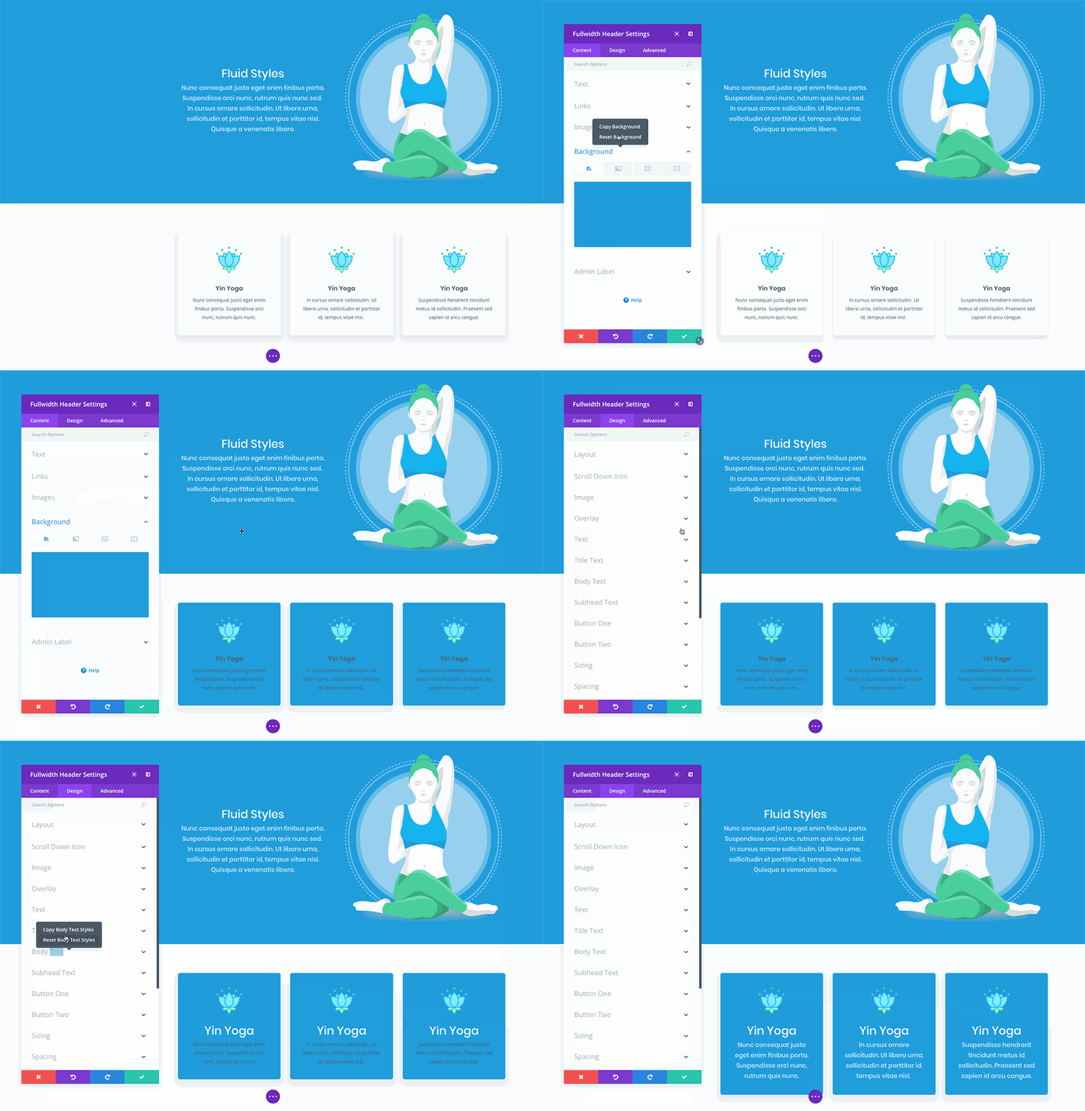
Let’s say you are working on a Pricing Table, and you have designed the perfect new button style for your page. You can now right click on the Button Option Group and copy all of your custom button configurations. Instead of having to configure all of those options again in other modules, you can simply right click on any module and paste the styles. The beauty is that these styles are not module specific. You can take buttons styles from a Pricing Table module and place them onto a Button module, a Slider module, a Call To Action module, or any other module that has a button. In the old version of Divi, you would have needed to configure dozens of options over and over again, which could have taken hours. Now it takes seconds! And button styles are just an example, this system works for all module options.
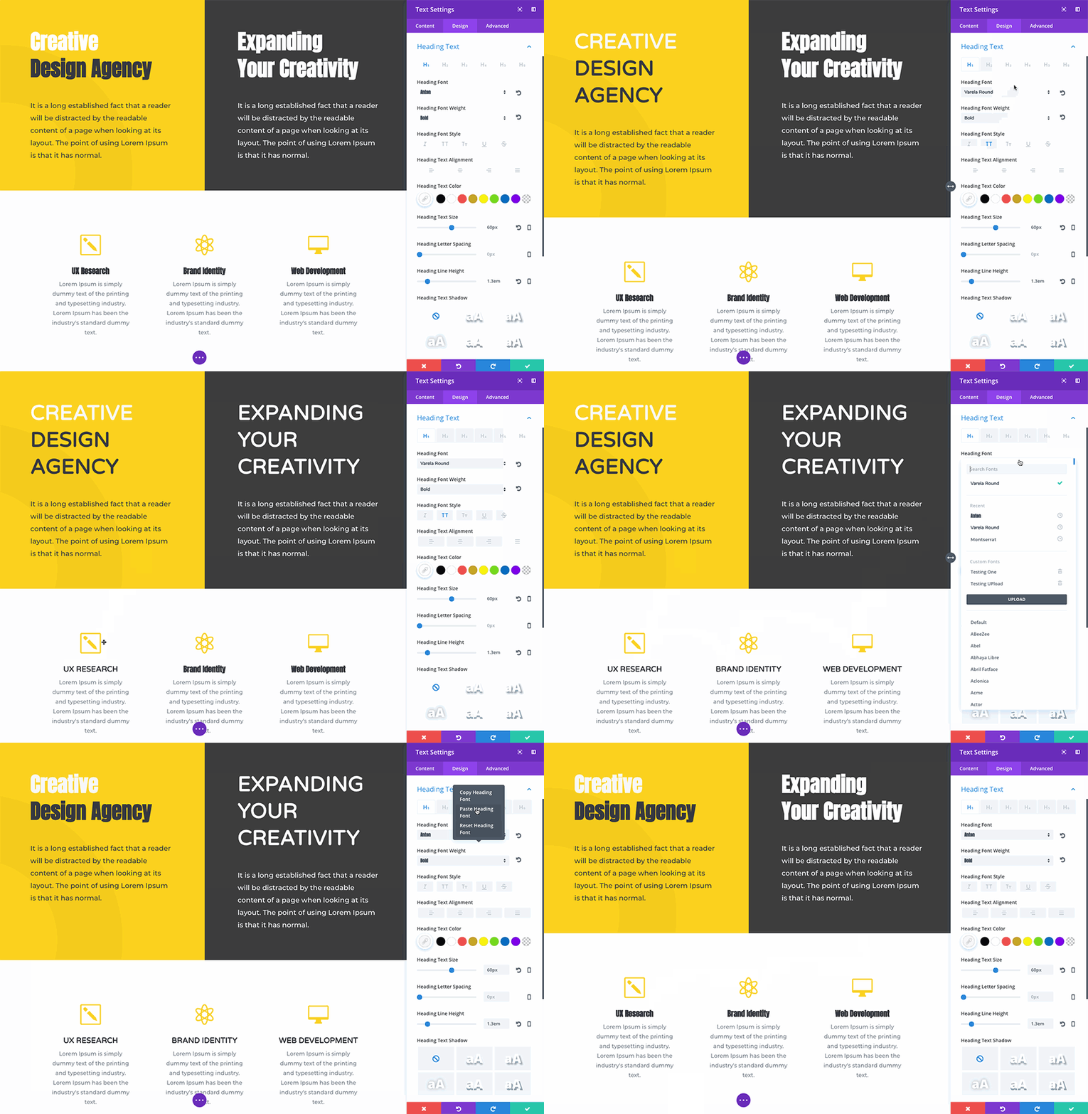
You don’t even need to right click either, instead you can use the cmd+option+c/v and ctrl+alt+c/v keyboard shortcuts to quickly spread styles across your page. Let’s say you are working on a Text module, and you have decided on a new font for your page titles. The individual title font can be copied, and then placed onto every other module on the page in a matter of seconds. Divi knows that you copied the title font and will transfer that value to the correct element for each module.
When we say that anything can be copied, we mean it! Let’s go over everything in even more detail.
Individual Options
Any individual design style can now be copied from within the settings modal and transferred to other modules on the page. Let’s say you are in the middle of designing a new page and you want to use a different font for some of your page titles. Almost every Divi module has a title and dozens of title text options to go along with it. Instead of opening up every single module and changing your title text font, you can simply copy that font from one module and then paste it onto every other module that you want to use that font on. Since you only copied the title font option, all other font styles (such as color and size) remain unchanged as you transfer the font across the page.
Entire Option Groups
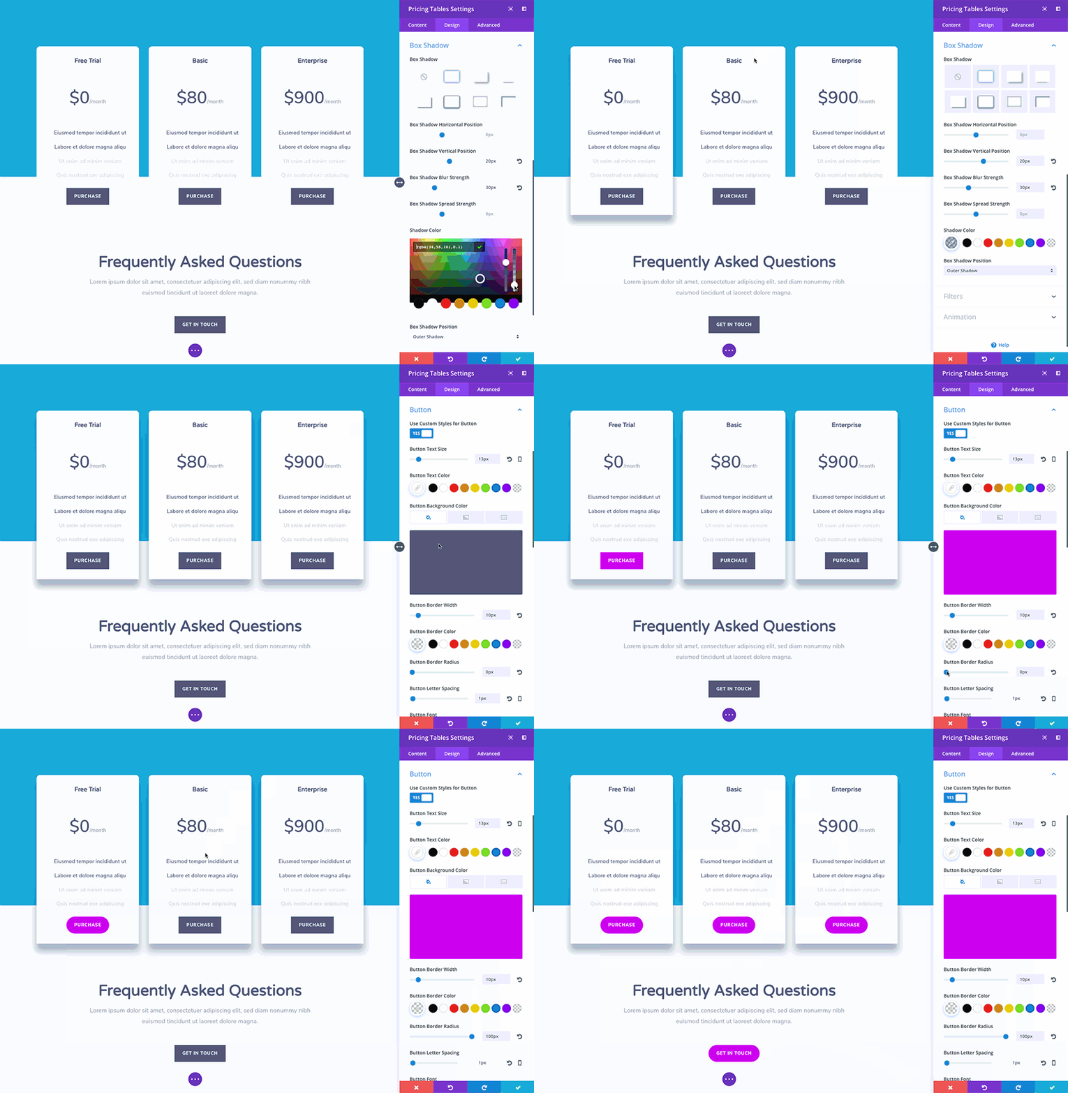
Not only can individual options be transferred, so can entire option groups! Let’s say you are working on a new Box Shadow style and a new Button style for your page. These two option groups contain dozens of settings and you can spend a lot of time perfecting them. Taking those dozens of carefully crafted button style and box shadow options and transferring each of those options to a variety of different modules could have taken hours of time in the old version of Divi. Those days are over! If you want to take your button design and use it on another module, simply right click on the button option group and copy it! You can then transfer those buttons styles to any module that has a button. Same goes from box shadows. Just point, click and use that custom box shadow anywhere.
Entire Module Designs
You can also transfer all design styles from one module to another. When you copy and paste design styles, only the design options are transferred. All of your module’s content remains intact. This allows you to quickly mirror the design across like modules or groups of like modules throughout your page in a matter of seconds.
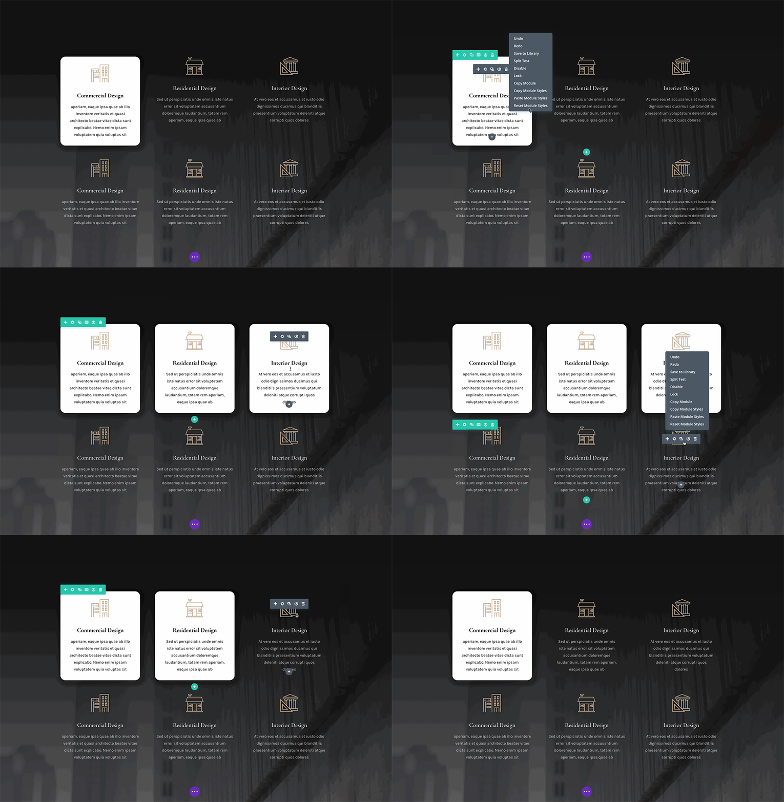
Across Different Types Of Options
What’s even more amazing, is that the style transfer system supports the transfer of things like colors and images between different types of options. Just because you copied a text color doesn’t mean that you are limited to transferring that color to other text options. You can copy a text color and quickly replace other color values on the page, such as button colors and background colors, or even colors within gradients. You can copy images from image modules and place them as background images, you can copy a title font and place it as your button font and so on. No need to copy hex values or image URLs. No need to hunt through font lists.
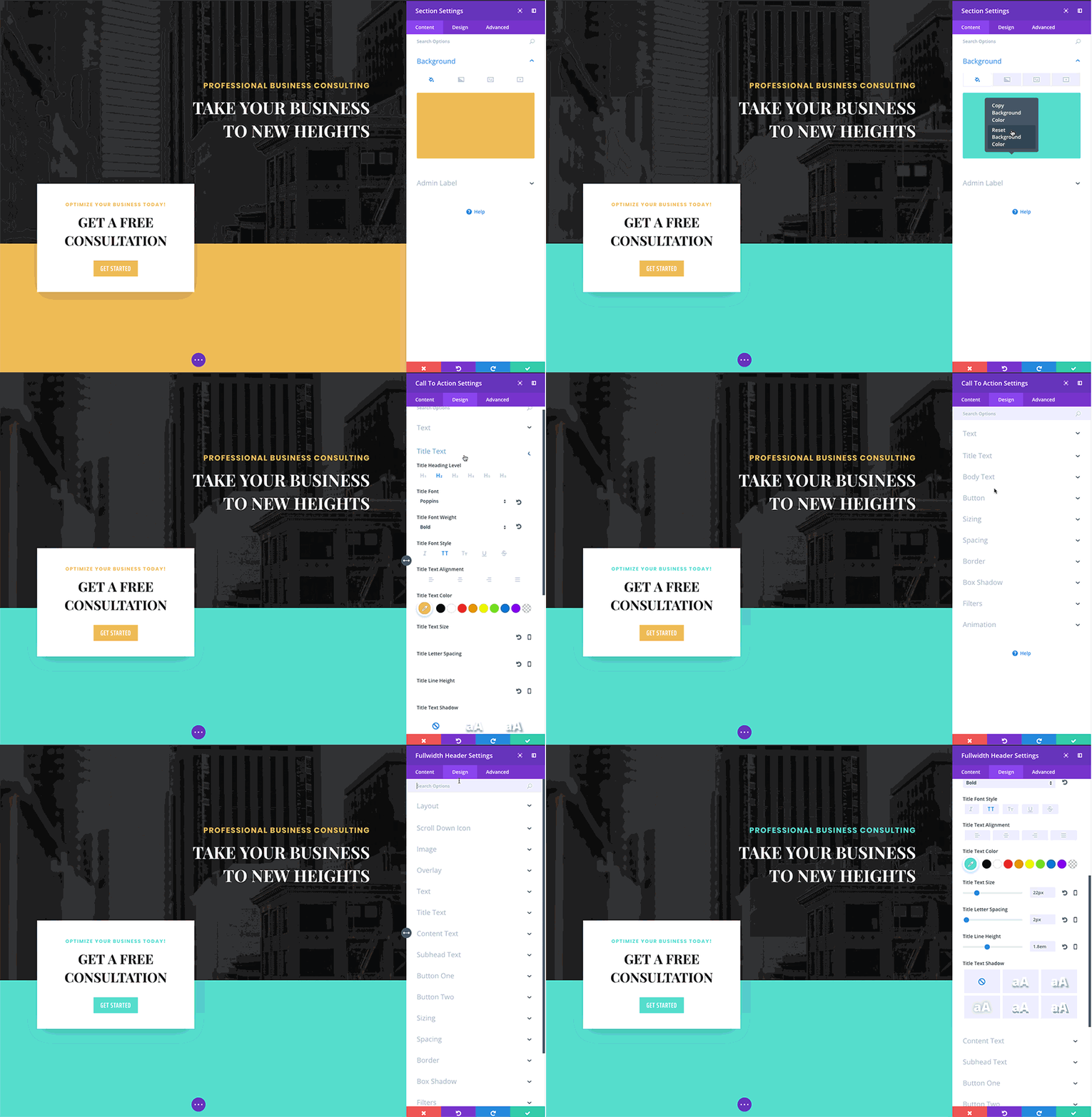
Copy Anything, Paste Anywhere
No matter where you right click in Divi, you will have the option to copy and/or paste styles. You can paste styles into individual options, parent option groups, parent modal tabs or onto the parent module itself. Divi is smart about knowing what areas can accept your copied styles, and it will give you the option to paste them whenever possible.
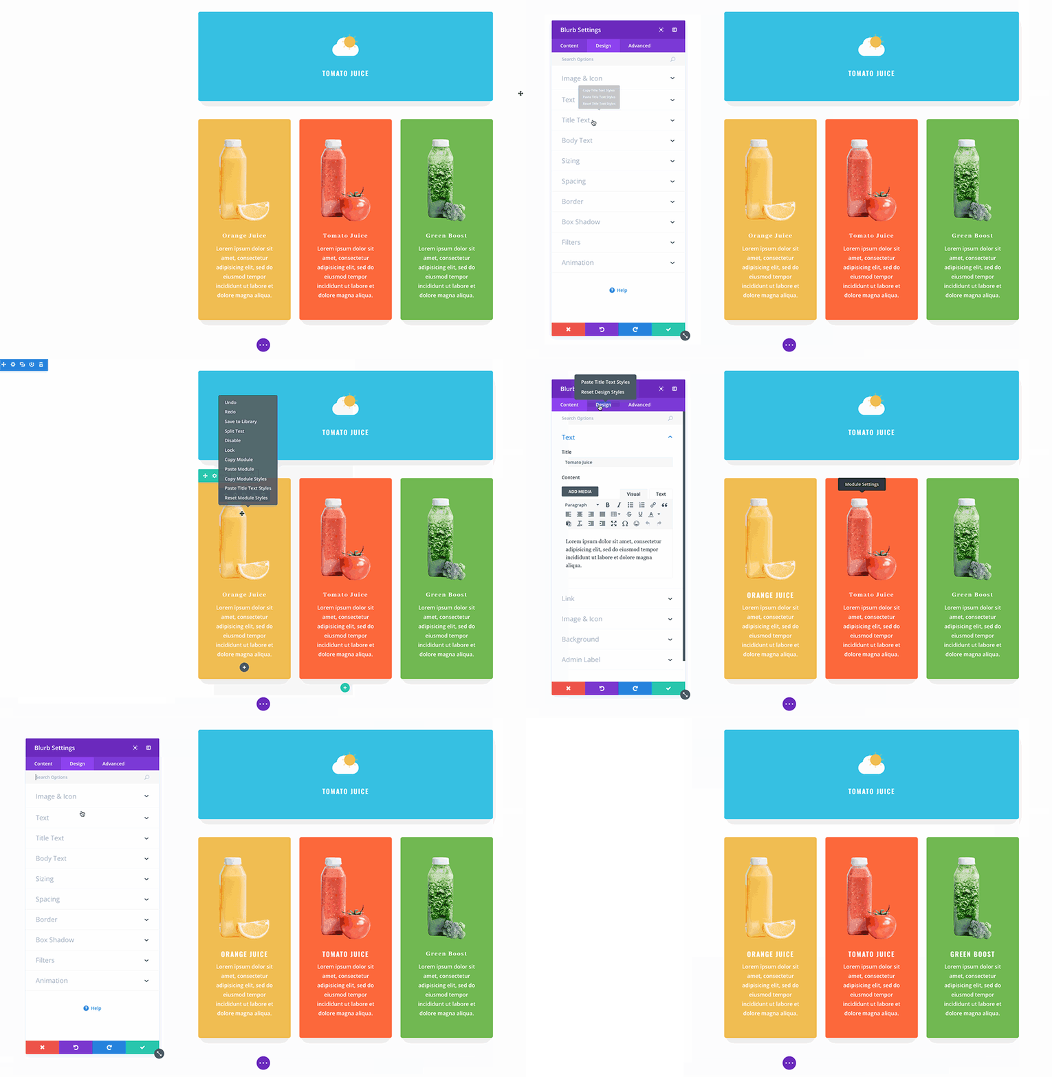
For example, if you copy a title text color from a Call To Action module, that color can be pasted directly into the title text color option in another module, or it can be pasted into the parent Title Text option group, the parent Design settings tab or onto the module itself. Whenever you copy something, it can be pasted laterally or up the settings hierarchy.
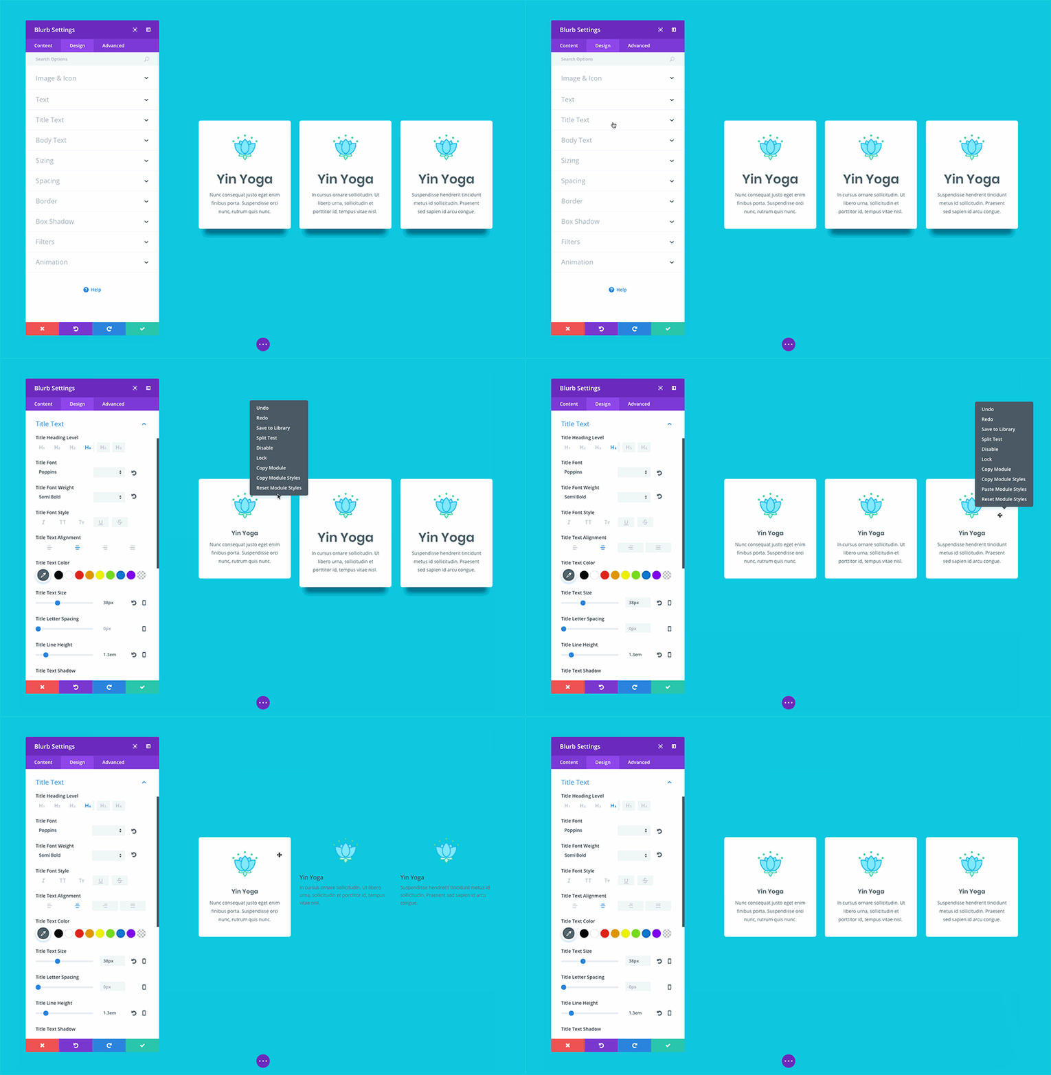
Quickly Reset Options
Not only can design settings be transferred, they can also be easily reset. Whenever you right click on a module, settings tab, option group or option, you can quickly reset them back to their standard default values. No need to painstakingly reset dozens of options when you change your mind about your design direction.
![]()
The Amazing Difference
Of “Fluid Styles”
This new modular design system will have an outstanding impact on the way you build websites forever!
Improved Creativity
We think that Divi is a place where creativity should flourish, allowing you to take a blank canvas and mold it into something extraordinary. There is no greater enemy to the creative process than the heartbreaking tedium of configuring a hundred different options over and over again, and across a variety of different modules as you try to land on that perfect design concept. Luckily, those days of frustration are at an end. Now, whenever you design something in Divi, those design styles become modular, and can be copied and transferred to any other element on the page instantly.
We want the builder to be a place where you can come up with great ideas and have the freedom to explore those ideas without being bogged down by inefficient tasks. We think Divi can be a completely replacement for design tools like Photoshop and Sketch when it comes to designing websites.
Hours And Hours Of Time Saved
What all these changes really come down to are the minutes, hours and days of time that you will save when building new websites. One of our biggest goals for Divi is to greatly improve the efficiency of your design process. It’s not just about what you can build, it about how fast and easy it is to build those things.
This Is Just The First Step
We think this is an amazing update that will greatly enhance the efficiency of your design process. What’s more, it’s just the first step towards a greater vision of how styles can be better managed not only throughout the page, but throughout the entire website as well. We really hope you like these new features, so download Divi today and take them for a spin. Let us know what you think in the comments, and don’t forget to check back next week for even more great Divi features coming your way.
Get 10% Off Today!
Today's The Best Day To Get Divi Or Upgrade Your Account To Lifetime
Join the most enthusiastic and loving WordPress theme community on the web and download Divi today. Using the new Visual Builder, you can build websites faster than ever before with its incredibly fast and intuitive visual interface. You have to see it to believe it!
Join Today For 10% OFF!Renew Your Account Today For 10% OFF!Upgrade Your Account Today For 10% OFF!



Gran trabajo chicos!!! Hablare muy bien de vosotros y os recomendaré.
Hi guys nice feature but I think I find a bug or it’s me maybe.
If in the theme customizer > button style, you set the option, to turn of the icon then all your custom padding are now reset to the default style of Divi and you could not customize your padding anymore, because of that css .et_button_no_icon .et_pb_button:padding: .3em 1em !important;
Anybody find this bug too??
Please need help
Nice Update
Baffled again! Amazing! Glad I upgraded to a lifetime with last promo because amazing updates with you guys just never stop! Keep on going 😀
thank you!
Great! Thank you!
As a small agency I bought the Divi system a few months ago. I’ve built a few sites in Divi and have been very pleased with it so far.
What I have REALLY appreciated, though, are the steady improvements to the Divi system. From what I had already seen: managing styles across a website was a weak point for the DIVI system. And here, is a great improvement addressing that, with, it sounds like, more planned for the future.
Well done! And keep up the good work…
Love this feature – but how do you copy parameters between pages?
Comme toujours vous êtes au top !
Hi there!
How could I copy and paste styles in windows? I tried Ctrl + c / v and it does not work…
YEEESSSSSSSSS this almost resembles the workflow in Adobe Fireworks or Photoshop you can use to reuse colour values of elements, simply amazing… this is truly a great feature.
I am annoyed that Elegant Themes has given any time during the last weeks to develop those features – however nice they might be.
Far more important it would have been to give answers concerning GDPR compliance.
!!!!!!!!!!!!!
All of Your European customers urgently wait for this.
You have had two years to develop a proper solution.
Now it is only a couple of days left.
All the comments given by the ET-Support-Team since January either show a poor knowledge about the subject or they are ignorant.
I want Nick Roach to give an official ET-Statement:
– at what DATE DATE DATE the GDPR-Update will be published?
– what will be included?
– which part of GDPR is not covered yet?
This would help much more instead of giving another boah-what-a-fantastic-update-show.
Nik.
I agree
This is fantastic!
Bravo for this update. Like others have commented, I prefer the backend builder more than visual builder for same reasons cited above. I’ll give the visual builder another try just to see how this new option works on a current project. Thanks again for all the hard work the ET team puts in for us! Another reason that, to me, ET and Divi has no peer. Cheers!
Please, where can I find the post for Divi Front End Builder Keyboard Short-Cut. It seems more love is shown for the front end than back-end hence need to shift my design iterationwith Divi builder.
Thank you! This is going to save hours of work when we have to update simple things across multiple modules. I couldn’t be more pleased to see this!
OMG I love you guys 🙂
This could have not come at a better time for me as I have been pulling out my hair over the past weeks avoiding to have to make some of the changes I have to make across my sites because they are a pain to do manually.
This is perfect.
DIVI to the rescue once again
Thanks,this update is deep and would help in streamlining the design faster than ever.
How about releasing the Divi/Extra header menu on our playing field so that all Divi/Extra header menu don’t take weeks to customize.
Divi Builder framework is the best D ‘N’ D. Thanks for releasing this web visual wizard!
Cheerio!
YES YES YES !! Divi slept with Photoshop YES !! 🙂 lol love it!
Good work!
Brilliant.
The new update looks good and quite useful, however, not being a big user of the visual builder I decided to try it out today.
This update (or the VB) seems to be quite buggy to be honest.
Stuff disappearing while editing, but its still on the live view of the page.
I’m not sure if its always been this way though.
I hope the next update fixes this weird problem.
Hey,
Sorry to hear that. We are not aware of such an issue. If you can, please open a ticket in our support forum and we will be happy to take a look.
Hi Team ET, Amazing update,
You guys are too creative.
Thank you.
That’s really great feature addition. Would like to see if we can drag and drop contents to any hooks and corner without much a do in future improvements. Really loved this one because I was missing this feature all the time.
KICK ASS
Truly, WOW!
This is a revelation not just an enhancement. It was taking a long time to make changes like this and hated having those conversations with clients at times, THIS makes DIVI Magical…. AGAIN!
Like most updates that is an amazing update.
This is an amazing feature, no doubt.
But your Menu design styles need more customization options. Divi menu has very limited styling options and I believe it needs an update. Please insert some more menu options to Divi.
Yes, an update to the design versatility of Divi’s header/menu is long overdue. At this point, it is often very easy to spot a site built with Divi because the menus are so similar, if not identical, from one site to the next. In the online world, the header is the *first* place a brand needs to differentiate itself visually. Elegant Themes: Your continual upgrades to the builder are much appreciated, but please put some serious resources into affording us some *real* design flexibility in the area that people see first when they visit a site.
+1000. I believe this will still come but we don’t know when….
The best thing about this update is that it gives us designers a massive boost in production times. Thanks ET, I may even get to stop late night working 😉
Awesome guys!!
Just AMAZING! Thank you so much ET team 😉
Awesome!
Admiration!
So beautiful!
Hands clapping!!
hey guys, I’ve tried the new version and this fabulous, still missing for example that you can copy the style from one template to another or for example from one section to another different but they are details, thanks for taking the time for me to save My time
Love it! 🙂 You are the best 🙂
Excellent! A huge time saver too. No more writing values down to place, just sweet sweet copy & PASTE! Thanks again!
Wow, an amazing feature which I would have needed yesterday where I had to change all title headers on the page (law firm). – Thanks
As amazing as all those features are I really hope that we will have a 100% compliant GDPR | DSGVO DIVI before 25 May 2018 for testing as if it is not compliant we would need to move some important (governmental) sites to other frontend builders before 25th. Please release the GDPR update at least 3 days before 25th! Thanks!
In Germany, we have to make sure that we know which services get used and where the data gets stored – hopefully not in the US! This includes also IP addresses which are treated as private in Germany and that also gets strict enforced already since years. Even WordPress recommends now NOT to use Akismet and instead Antispam Bee instead – try to switch your WordPress to German language and check out Akismet! So WordPress themselves are very aware of those huge problems which might occur if you are still sending non-anonymized IP data to third parties.
Additionally, since April It is recommended to no more use any US Provider or Services or Companies which store their data in the US. The problem came up when the Cloud Act passed the Senate more or less pretty hidden and right immediately the supreme court tried to force Apple again to open up their data which is stored in Ireland – a pretty secure place for storing data and also very affordable place since decades. Many IT companies do that and tons of support hotlines run actually from Ireland.
With the Cloud Act companies which have something going on or are located in the US can get forced to surrender their data to the US government. As all US companies and all Services running from the US have to comply to the Cloud Act they are in clear violation to the GDPR | DSGVO.
https://www.computerwoche.de/a/in-der-wolke-ist-die-freiheit-nicht-grenzenfrei,3544860
In Germany you can find well known WordPress companies who write on how to make your site DSGVO | GDPR proof and most of it is to avoid installing fonts from a Google server, using Cloud Spaces located in the US, Hosting in the US, Installing Google maps as Image and linking it to a Google map rather than using the Google API. We already got asked to do exactly that when we had to work on Governmental sites.
With DIVI there is not a big problem actually.
As long as the Google API does not get filled in and that script gets loaded.
As long as it is possible to deactivate the loading of external fonts and instead save them on and load them from your local server instead.
As long as also Jquery and other necessary scripts can be saved locally and loaded from your own server instead.
Thanks to http2 (I hope you already switched to it) there is no benefit anymore to run scripts form a cloud instead – of course you should run your side on SSDserver too or like we do we run our local cloud for all our scripts in the same data center (Hetzner) where we host also our sites (in Germany and in Finland of course / inside the EU and in countries with very high-security levels on privacy). Internal traffic is free.
And it must be possible to simply deactivate the cloud stuff used by DIVI and if the customer likes that feature it would be himself to have to agree that data gets send to a third party.
I hope we will see this update latest on 22 May!
Thanks Andi for those explanations which are very helpful and I hope that ET staff will take this into consideration so that we get an update compliant to GDPR. There are many Divi customers building websites for Europeans!
Hi Andi,
Thanks as well, So much to consider. If you all want to store your stuff over here in Kilkenny I have a big shed out the back with a rusty padlock on the door. ; )
All I can say is D-A-Y-M-N!
This is Fabulous! Thank you!
But what about all of us long-time Divi fans who really liked copying and pasting in hex codes? Kidding…this is amazing!!! I can’t believe how far Divi has come in four short years.
Wow – THIS is a feature I’m excited to test ASAP !!!
Un-freakin’-believable! THANK YOU SO MUCH!!!!
Wow! This is outstanding. What a time saver. Thank you Elegant Themes. I am really glad that I have come back to working with Divi.
This is a great time saver! Thanks Nick and team!
Are there any major Divi updates for Woocommerce coming?
Re-look at this:
https://www.elegantthemes.com/blog/theme-sneak-peeks/divi-feature-sneak-peek-dynamic-content
+10000000000000
This should have been above the new “copy & paste” feature.
YES its amazing update .have fun .
Great great stuff! Thank you, ET team… 🙂
WOW!!! This will be very useful and save loads of time.
I had to use a different theme (sadly) on a project yesterday as the client wanted the header in a format that I couldn’t get to work in Divi…. and it was SO frustrating to use!! Divi is by far the BEST theme for designers.
(But hint hint… it would be awesome to see more options for the header layout!!!)
That’s an awesome update!
May I add a suggestion: it would be absolutely amazing if we could also somehow link & keep those copied/pasted options (or any set of selected options) always “in sync” during the entire build process in Divi. Think of how Global Modules work across the website already, but only on one specific page! That would’ve been so cool! Right now I have to create a lot of Divi Library variations of global modules and it’s getting out of hand. If we had a bunch of page-localised global modules/settings/options, then Divi Library could be dedicated for just site-wide content and not to unify module styles for a specific page..
WOW! Just WOW!
Love it Love it Love it. You guys are awesome!
Thanks for all your work!
Looking forward to more articles/how to’s on editing the default post style and/or creating your own post styles using Divi please!
Great Job!!! 🙂
Well I’ve read a lot of blog post on here and never felt the need to comment until now. While I appreciate all of the efforts the Divi team puts into these updates it has me wondering if Divi is right for me. Reading through all of these comments and seeing that people are ecstatic about a new feature where you can copy, paste, copy, paste, copy, paste to add styles to an element has me shaking my head. I echo the statements of the minority on here that this is what a style sheet is intended for. With much less effort it can be used across ALL PAGES with or without being in a visual mode or not. Introducing & promoting the ability to make so many singular random style changes through the editor has always made me cringe. This goes against all best practices of web design and I assume the people that get excited about this just don’t know any better (no insult intended). Perhaps it is just me but this is the reason why I am wondering if peers, employers and professionals in the industry will take people seriously using Divi. And yes I know a global editor is coming but I can’t help but think the damage has been done to those who were striving to become professional web designers/developers and instead have become kids who get excited about using every crayon in the box. Just my two cents.
I’m with you. 🙂
For the record, I think it’s still very much possible to follow best practices. All of the sites I set up are making heavy use of a stylesheet in the child theme, so not all hope’s lost. Just don’t try to outsource work as many, many people that claim that they “know their way around Divi” really ONLY know their way around Divi and Divi’s module customizer and nothing else… so you’ll have a pretty hard time turning their designs into best practice with a stylesheet in the child theme.
Thanks, Oliver nice to see someone else is on the same page. I guess my comment was a little bit of a knee-jerk reaction. I don’t have an issue with these types of updates. Sure inform people about the new feature, functionality and explain to those who are learning how the feature works. I would just prefer that they also take the opportunity to educate that there is a better way or a correct way to accomplish the same goal that follows best practice. Any company looking to hire someone competent in WordPress is not going to hire someone who does not follow or use a set of defined styles that are in line with the companies branding guidelines. And if you happen to be the lone WordPress developer at your company you are doing it wrong if you are building sites without defining styles and using a style sheet. I just think a teaching opportunity is lost. That is evident when people are asking questions like “does this work from one page to another?” and “Does this only work in the visual builder?” Please don’t get me started on the “Layout Packs”. After every layout pack released there are several follow up comments requesting very specific layout packs. Come on people – the layout packs are created to use as a starting point. Use some creativity to design your site and don’t rely on the Divi team to create a layout pack that you can sell off to your next client as a “custom design”. Sad days for web design.
This is awesome and it is going to save me so much time!! Thank you
What a team! You justify all the bragging about you I do to my clients! Just make sure the headiness of this progress doesn’t make you lose sight of the backend quality, including continuing to organise and streamline legacy options management approaches. The devil is always in the details… Cheers
A great boost for creativity – thanks
Awesome! Have I said I loooooooove “Divi” lately?
I definitely see myself utilizing this feature. I’m still an avid user of the backend builder. But it’s getting more difficult to ignore all these features for the visual builder. The backend builder is getting left behind. I now find myself using both visual and backend builders to design my web design projects. There’s nothing wrong with that, but users like what they like.
I’m still looking forward to the custom post types updates which means a layout catered to Woocommerce.
Also, is there any plans for multisite integration? This is in regards to the user role functionality within a multisite network.
It’s been a long while since I’ve done a standard wordpress install. I’m all about multisite these days.
Either way, this is another step to dominating the world of web builders for WordPress.
Amazing Job ET Team!
THANK YOU!!!
You guys are amazing! This update is so awesome. I’m blown away at the constant improvement in quality. Well done!
Very nice. Thank you for the continued hard work and improvements that you always create.
This is revolutionary. time saver. WOW <3
Thanks for this great feature
You’ve probably just halved my development time. Thank you!!!
The first time I purchased Divi, i knew I will enjoy and yes i was right. You guys are the best.
Nice job guys. Love getting excited every time a new feature is announced! Bring it!
DIVI is growing into a web design studio tool!
Awesome work, guys.
What a powerful new feature set. I love it!
You guys are the best. This is such a helpful update. So helpful! Thank you!!!!!
You basically showcased what can be done with a simple css class where you could, in a CENTRAL location, specify something like a background-color or a box-shadow and then apply it to each and every element that shares this class.
You left out the part where you explained that you could just change the specification of said css class in the stylesheet and change all the modules with said class AT THE SAME TIME.
So basically, you came up with a feature that is more like a bug… it goes against best practices, which would be the use of a child theme where you specify these classes so your website looks like it’s following ONE corporate design.
Also, when you clicked on each and every module, I couldn’t help but shake my head. This was a VERY obvious demonstration why we need GLOBAL settings for header sizes and fonts…
This is a really underwhelming update and a slap in the face of all European clients that only care about the stupid GDPR right now. Delivering _that_ super requested update only days before the GDPR turns into law is insulting and selling us a worse version of css classes as a new and exciting feature is a really bad compromise.
Sorry, but I’m really not impressed with this…
Hi Oliver,
Thank you for your feedback!
We do plan on addressing some of your concerns in a future release for a site-wide style management system. Stay tuned!
I think this new fluid feature is GREAT, when you are first designing a site – and trying out new combinations to get the right “Look and feel.” However, once you have that figured out – then the ability to “apply this style to all buttons” or “apply this style to all blurbs.” would be great – I also like the more difficult to do, option – of then going in and tweaking a few of the buttons or blurbs, if they need to be in the same family, but need a larger font or a darker color – or something for emphasis. So the ability to then, once they are the same, to then go in and individually edit/change one. so I like his idea of global…but I like more flexibility. But really interesting idea that I will use, but I DO hate going through every page and changing every button etc. tedious
Hi Cat,
If you read back through the comments you will see that the team are suggesting that we are on the way to getting the overall Global design settings. I agree the fluid feature is useful in the early design phase, then moving it into styling in a child theme or, eventually Divi’s global settings, wherever and however they implement this. And this is useful where we have something slightly outside the main overall design styling.
I am kind of seeing where ET is going with how they roll out features. They don’t go, “Hey we need a Header/navigation builder because x/y other themes have one already. Let slap one together and release tomorrow”. They spend time doing it in a considered manner to give us the best UX approach possible. For the first year that I used Div, till last year, I didn’t follow the ET blog and was completely oblivious that there were many new features added with all the updates. In the two years I have been using it I am really impressed in how they implement new features with what ever software development lifecycle they are using. I have read the theory behind Scrum and Agile and I see it being used effectively in the way ET works.
I am wondering if what they are doing here with the copy/paste fluid approach, is to have an on the fly option in the right click menu to push this design configuration globally to all other modules that are set to follow global overall site style. That’s tricky because where and when do you decide what is in this global domain. It in itself is an fluid organic thing that is firmed up as one goes through the design process of building a site. If you are experienced you will probably be tying down the style site wide for modules in a child theme’s style sheet. If Divi gets sensible way of doing it directly through the theme’s builder/visual builder then this is a welcome plus.
I empathise with those who use the back end builder and are feeling left behind. I personally find myself predominantly using the front end visual builder for design purposes on single pages, the back end builder for templates for Toolset Views and not at all for custom post types for data entry (they pick up the template automatically and I just see regular form fields on the back end, not an inkling that Divi exists at all… everyone has their own workflow). What I do know is that the backend and frontend use two different technologies and I am guessing each has its limitations.
And GDPR?
Next Week Feature Update guess.
Great feature. Also waiting for the Footer and Header builder feature 😉
Not to late!
So are we getting a theme update next week or a juicy teaser video??
Hey Richard,
A new sneak-peek video will be published tomorrow and a new feature release next week.
O.M.G That is AMAZING! Watched that in genuine awe, so brilliant thanks guys
I SEE YOU DIVI!!!!
I APPRECIATE YOU DIVI!!!
Hey guys. First off, I love the Divi builder. It’s by far my favorite web design tool. You guys rock. Ok, now… I am having a slight issue. I updated Divi today it broke two of my sites 🙁 I had to roll back the database to yesterday to fix them. Is there an issue with the update? Or is it just me that’s having problems? Thanks.
I am having problems too. Particularly with the slider.
Fixed with 3.3.1
Hi Josh,
Sorry for the trouble.
If you still see the maintenance message I suspect there was an issue with the update process. Please open a ticket in our support forum and we will happy to take a closer look.
I would also reach out to GoDaddy so they can investigate the error logs.
I tried again on another GoDaddy Managed WordPress site and got the same error saying “Briefly unavailable for scheduled maintenance. Check back in a minute.” However, within a few seconds the site came back up and now works just fine. Looks like it’s working now. Thanks.
Strange, I just did this on a GoDaddy Managed WP site and got the same message, but its been 20 mins and still giving this message? I hope it comes back on like yours!
Thanks for pointing this out. I am waiting to see if they respond before updating now. But regardless, it is a brilliant update.
Ok, so just to test things further, I updated on 4 sites total. Three of them broke immediately, giving me the message “Briefly unavailable for scheduled maintenance. Check back in a minute.” Only one site worked. The one that worked is hosted on GoDaddy’s C-Panel hosting. The the three that broke are on GoDaddy’s Managed WordPress. It may be an issue with GoDaddy’s Managed WordPress. Just FYI.
Thank you!
What a time saver for new website designs:-)
This is awesome! Waited for this for a long time! How do you use it across pages? If I have a gallery I styled and I want to copy the style to a gallery on another page… Thanks in advance for clarifying.
+1 for me on this. It’s a bit limited if you can only copy styles within the active page.
That looks amazing 😀 I can’t wait to try it. I was just re-designing my websites and that will help a lot…
May we know if this is usable accros 2 pages where the visual builder is opened too? As well as copying modules? Copying modules from a page to another is possible in the back end editor but not on front end. THAT whould really save some crazy extra time too!
Did not work for me. Will have to be some new feature down the road.
YESSSS! You guys read my mind with this feature! Keep it up.
Hi, is this feature already activated? I am not able to use it.
This is such an exciting step forward for Divi. Keep bringing it! Awesome guys. Thank you so much. Wishing you more success.
This looks promising!
WOW! Fantastic! Thankyou Divi.
Great update.. Thanks!
As usefull as this feature is, you still have to copy & paste your settings from one place to another. So I have a few questions:
1) What are your plans with the module customizer. An even bigger time saver would be if all design options from every individual module was availabe in the module customizer. A change there would apply to the entire website, without the need to copy & paste styles everywhere.
2) Can you copy styles to a different page? In the backend builder you can copy modules to a different page, but you can’t with the visual builder.
3) Does this copy option exist in the backend builder?
4) Has this been properly tested with copying from/to global modules? Asking because with every recent updates something breaks or does not work with global modules.
Thanks
JP
Hey JP,
1 and 2- We plan on having a site-wide style management system that should address these two points. ?
3- The functionality is only available in the Visual Builder.
4- We performed intensive tests against all existing functionalities, including global modules and sync.
I agree with the peeps questioning this “feature”. Yes it saves lots of time, but that time is something I could argue should not have been needed in the first place. The development approach for Divi, which can be applauded for all its advantages, has also created many disadvantages.
Copying and pasting settings, rather than using style sheets, especially global style sheets, is two steps forward and one step back.
+1 for all design options from every individual module to be availabe in the module customizer
+1 for bringing Fluid Styles to Divi Builder (as I also find many sites do not suit Visual Builder)
Never new you could copy/paste across two backend pages open in separate tabs. Cool. Would be useful on the front end as well.
Thanks Vlad. That’s great news. Are 1+2 just plans or already in the works? Any time frame you can share?
That’s quite some copy & paste discrepancy between the back-end and visual builder.
– Visual builder: lot’s of useful copy functions but limited to be pasted on the same page.
– Back-end builder: you can copy to other pages, but that’s limited to entire modules.
So it means switching between VB and BB even more…
@Richard, the post author gets that treatment. In this case, that’s Nick (but not always).
@Nelson, I know it’s a CSS thing, but at the moment ET team members don’t have their own class so there’s nothing to target.
On a side note : It would be helpful if ET team member replies would be easier to recognize. Like the green background when the author of the article replies, all team members should have a different background color from normal visitors.
That’s a WordPress thing. You can target the CSS class of the author, or user to change the background color of comments.
Yeahhh… It seems that only nick gets this treatment which is not good enough.
It like stinks it does not work in the backend builder.
+1
This is going to make things SO much faster! I love your updates Nick. For real!
Excellent Divi Team! This is truly an amazing update, I’ve been waiting for sometime now. Great job! Keep it coming. Thanks a lot!
Great! 🙂
By the way, is there a form or page where we can request/suggest and vote new functionalities for Divi?
We have the support forum where we can make suggestions.
We do have a full slate of upcoming updates including columns, color pallets, Theme builder, etc…
+1
This is indeed amazing! Well done, Divi!
What in the world are you doing in DIVI Nick and the team? You are killing me softly with this AWESOMENESS for every update you have!!!
Why oh why!!!!! Thank you DIVI team! Love you more and more!
Guys, you are amazing AGAIN!
Almost magical how the DIVI team pushes out improvements so quickly, time after time. I’m happy you found such a good workflow to make this all possible for the community. Thanks!
OMG! You guys seriously ROCK! You truly show there is no limit to greatness!
Just one word: waouhh !
Thanks for the update! I’ve been comparing my use of Divi against other popular themes and builders, and Divi continues to stand above the rest. Especially with almost non-stop new features and updates, Divi is the easiest to understand and use.
Most other themes I’ve tried come with a builder plugin of one type or another, but these others either lack in front-end editing, or miss important features – not to mention cost is much higher. Greatly appreciate the work you guys and gals do over at Elegant Themes!
Another awesome update. Keep em coming!
Stop production start working on dynamic content ASAP please!!!!!
Don’t worry, we are!
WOW! This is an amazing update! It is going to save SOOOO much time!
Ok… I juste have to say WAW!!! This is awesome. Great work (once again!!!)
Impressive! How do you make these short videos in your posts, by the way?
There’re times I thought to move to another builder. But yiur team is awesome and Divi is the best. So I don’t ever think to migrate again 😉
Wow, now that’s slick!
Simply awesome, my kind of feature update! <3
Awesome as always. So glad I’m an ET member for life! You guys literally are the best!
I hope that you will also do the same to the plugin world as you have to the theme world.
Here’s an idea… how about an auto-swatch feature? Let’s say I select a mood (happy, dark, serious, fun, etc.) or a color or two… Would be cool if Divi gave me a choice of swatches to match the mood or color and then, when selected, apply it toward the whole site. For us self-taught designers, this would really help kick our design up a notch.
greaaaaaaaaaaaaaaaaaaaaaaaat thanks and loves from egypt to divi team from the little one to ceo really wonderful
Smashing
Like many others I am impressed with the speed of new feature releases by the Elegant Themes team. I also look forward to a header/footer builder addition and thank you in advance!
Yeah, I agree… everything that you do, guys, is amazing… but a header builder is a top priority (at least for my needs). Thks.
i think it will be soon as i expect
Divi is an amazing theme and I use it in a number of projects. I love the new stuff you’re doing, but I worry that some arguably essential features are being passed over.
For example: as far as I can tell, and as far as support has been able to help me, there doesn’t seem to be an easy way for end users like me to adjust the width of individual blog post pages.
On the first site I asked for help with, support asked me to install a custom plugin so they can go in and make adjustments manually. But this is hardly a scalable, long-term solution. You give us buttons and sliders for virtually every other aspect of designing a WordPress site. Could we have some for this too?
OMG! Mind officially BLOWN! Thanks so much and congrats Divi team.
Guys, I just want to say thank you very very much for what you guys do. You’ve changed the web design business in ways you can’t even understand. Another great update from you all.
Just when I thought Divi couldn’t get any better! You guys are amazing.
I am super excited to try this. Just an amazing triumph of programming with the user in mind.
I am concerned though for people like myself, that is to say people who use the backend builder over the visual builder. The visual builder does not give an accurate representation of what the browser will do, especially when it comes to padding and margin. Furthermore, I try to use my child theme style.css file to control styling when I can, as it just allows me to change my site styles from one place and in much less time. The visual builder does not play nice with child theme custom css, often ignoring it all together and not giving me an accurate picture.
My question for divi is this: are you still concerned with creating improvements backend builders will enjoy as well? There are so many great features coming out that only visual builder users can enjoy and benefit from. The new sublime text based code boxes – visual builder only. The new color picker – visual builder only. Section divider previews – visual builder only. The new fluid style system – visual builder only. What’s more, I have a bug support ticket in regarding the section dividers not supporting responsive height settings and I believe it only affects the backend builder.
I just want to know if we backend builders are being slowly pushed out or not. Are any of these great features going to make their way to us?
Thanks for any comments and replies.
+1 and I wonder if you can copy & paste between pages. You can do that for modules in the backed builder, but you can’t in the visual builder.
I don’t like the visual builder either. My two biggest issues are:
1) it keeps on adding no break spaces to text areas by itself
2) it breaks third party shortcodes. They take a long time to render and if you don’t wait for them to finish rendering you risk Divi saves back the rendered output rather then the shortcode.
Furthermore, the visual builder is not good with custom html. The backend builder has no problem. However, if I then switch over to the visual builder, it will try to interpret the html in it’s own weird way and completely break it. I then have to go back into the backend builder and fix everything.
Here’s what people need to realize: using the backend builder allows you to build the site the right way. It allows you to build a site that can scale and adjust. It forces you to learn the dev tools and to learn to customize your own child theme. However, it seems like I’m going to have to learn to start using the visual builder if ET keeps going this way. How annoying will it be to have to reload the visual builder after every time I make a change in my child theme css file? OMG!
I’ll finish up with a simple yet powerful example of why you need to style using a css file and not completely in the visual builder. Imagine you make a blue button and completely style it using the divi settings. You place that button all over your site of 20 pages, maybe 40 different places. Then, you present it to your client and they say, “Great! But, can we just change the button color to green?” Your stomach sinks. You now have to go into every page, look for every instance of the button, and change it manually. Myself, I go into my child theme css file, use my organization system to locate the button styling rules, I change the color in one spot, and all buttons across the site are updated instantly.
I might be wrong, but I suspect the reason we don’t see much happening with the back end builder is because everybody is waiting to see where Gutenberg is going to take us as the default back end editor and general interface for dashboards. At some stage, when things firm up in what it can do, tied to whatever box model structure it provides with an API that themes and builders can use, we wil see Divi and others focusing attention on it.
This! I don’t want to use the Visual Builder. But they’re sure making it hard to stick with the regular Backend Builder.
Way Cool Option!
Amazing
great job team !!
Great update. Definitely a huge time saver. Thanks.
Very cool and appreciated, Nick!
Looking forward to testing this great feature out.
Woohoo! Game changer. Thank you for this ????
By the way, it will be nice to make custom collections of styles, or to save every experiment so to have a possibility to return to any style made before.
What d’you say?
+1
Ok, sorry if I missed the point here but what happens if you decide that after all you (or your client) want to change the button background color to yellow instead of pink? Would you go through the same process of going through every single element and re-apply the new styles all over again? I don’t see how that’s going to save lots of hours… Wouldn’t it have been ten times better to centralize the styles management, create it once and for all and apply the class to the elements rather than duplicating all the styles? Again, sorry if I missed the point here…
Xavier – Divi has an approach for that! Use Global Modules and selective sync! The most underrated feature of Divi. (But my personal favorite.)
@Ray, that’s also why I use global modules with selective sync a lot, but they also cause several issues and updates do break them once in a while and ET doesn’t quickly fix them, unfortunately.
Example: selective sync on the gallery module broke 3 versions ago, and is still not fixed. If selective sync for the gallery items was disabled (logically) then it is now enabled and it can’t be disabled anymore, so all gallery’s using that global module get the same images as soon as you dare to edit a module or add a new one. Details here: https://www.elegantthemes.com/forum/viewtopic.php?f=187&t=855880
I second this. But, it’s not just the gallery. I think it’s all global modules. If you disable one instance, they all become disabled. Then, when you reenable, they all reenable BUT with the same content and design settings. The first time I realized that, I had a ton of toggle modules that all got written over. Thank God I had a backup to revert to. Global modules are scary things my friends. Use your child theme.
Global modules should be more reliable. Until then, probably controlling the styling from the child theme is the best bet.
I guess having the ability to use all the options mentioned above and selecting how to use the judiciously is the secret here.
No doubt the day ET gets around to a really good UX solution for this will be welcome, but these things take time.
Exactly my thoughts. I just don’t understand why ET keeps on neglecting the module customizer.
No other page builder has a module customizer to configure side wide defaults. Only Divi has it, but at the moment, each module in the module customizer has less then 5 settings while the actual modules have over 50.
In my opinion, the module customizer is the single place to configure side wide default stylings for every module. Having that would really be a huge time saver.
Sure this feature is very useful, but you still have to copy and paste and a lot.
I thought the same way when I watched this demonstration. Missed centralized styles are a weak side of Divi. I hope the ET team will find some solution.
That’s why I try to skip styling in the divi settings and style within my child theme style.css file. I create a class called “general-button” and then style it in my css file. I then add that to all my buttons, allowing me to change all of them site wide in one place in only a few lines of code.
Well exactly and that’s why the ET team should teach designers how to work properly and efficiently IMHO…
Or you can of course make the button global but then unglobalise say just the button text and URL
You could do that. However, global modules are not always reliable in the behavior of their consistency. Also, if you have a global module with only certain settings set to be global and you disable one of these modules, divi has a bug where all of the instances of this global module then become disabled. Once you realize this and try to reenable the original module, you’re too late. As soon as you do that, all the global instances will now have all of the same settings and content, thus ruining all of the custom settings of your individual global modules. Lastly, you can’t have a global module inside of a global row or section in divi.
Holy Smokes! That is going to save tons of time. Thank you for being so awesome Divi team. Hats off to you.
WOW!!! This is pretty useful!
Keep up the great work.
Thanks Divi!
This is soooooooooo cool!
Amazing work!!! I feel like changing something on my website just to try it!!
Pretty nifty, but what made you guys decide this should be the next thing? Was this feature asked for as often as, or more than, the long-standing request from many Divi users that Divi and the Divi page builder be able to support customizing native headers and footers? Every time I see an update notice from you guys, I think, “Is THIS going to be the day, finally, that they hear us on this fundamental necessity?”
The header should be at the top of the list. It’s such important role in the design process of every website you build. It can kill the feel and look of a website.
Divi is still my favorite builder on the market.
I agree. The header is usually the first thing to be considered. It’s the brains of a site and dictates navigation to the most important parts of the site.
Oh yes, exactly my thought! And there are some more pending things that are being missed every time. Did you know that when you use Image module and choose smaller version of an uploaded image, Divi anyway will put the largest original sized image in the odule, even if you want use it in small 100×100 pixels sized block Divi, will put there the full sized image. So you will have to make an appropriate sized image manually if you want your site load faster. Haha
We are working on that too 🙂 Check out our Divi Feature Sneak Peeks that we now publish on the blog each week. We have another one coming out tomorrow!
But, again, what made you decide to prioritize this feature add over the long-requested support of headers and footers?
Also (and I know I sound like I’m nitpicking, but I have a habit of thinking like a user *and* like a developer), if you’re going to recommend we check something out on the blog, please provide a link *in the comment.* Remember the number one rule of user experience: “don’t make me think.” 🙂
Also also: I criticize because I’m invested. Lifetime membership.
Hi Nick,
Those Sneak Peeks won’t appear on the blog.
Please have a look on that.
My head is officially blown! Thank you guys!
Amazing! You’re creating a Photoshop of web builders!
That’s the plan 🙂
My mouth dropped to the floor with this update.
I’m surprised how much you can continue to blow my mind each time you release an update.
This update removes everything boring from designing your website.
Really love the update!
Awesoooooooome!
Imma let you finish… but custom post content Divi is all I’m waiting on…
Simply Awsome as alway’s you continue to Inspire and excel. Love it. Keep up the fantastic work you do for the divi community and more..
The bummer about something like this, that seems exciting, is that you can only use in the Visual Builder, which has never worked for me since day one. Sure, I can make some mods, but there are things as simple as changing the font size, that don’t work correctly. Also, I have found over the years, and with the newest update, that when I do ANY work in the Visual Builder, there are unexpected changes in styles on the same page I’m working on. Since I can’t rely on the Visual Builder to work as designed, I don’t use it, except in rare cases when I can’t get the customization I want for padding in the default builder, and use the Visual Builder to experiment with padding.
You are right Matt, the Visual Builder doesn’t work correctly! Would be great from ET to bring the Builder to a reliable level; it’s the number one on my wishlist!
I use it all the time and, while I’d admit that the early releases were painful to use, now it’s a great tool.
Perhaps if you gave it another go, you’d find the current version quite robust.
The ability to work with styles at this level is something a lot of us have been waiting for! This is a GIANT leap forward in productivity. I may have to raise my rates (and get more time off in the process)!
My Divi wishlist keeps getting smaller and smaller.
Hi Nick and the Divi team,
This is the type of update that make a real difference to the way I work. Its the type of thing that makes Divi great.
As a visual builder tool it look excellent. I will look into it more and see if it works on the standard editor… which i still like for some extra design control in certain circumstances. (done using multiple screens).
Thanks again for all the hard work and keeping Divi usable… not too resource heavy or over engineered.
Chris
You are right! These are amazing new updates and they really will increase our efficiency. And perfect timing…I just decided yesterday to change a text style throughout an entire site. 🙂
Thanks! Great feature!
Please add possibility to edit header and footer in the same way.
Hi my friend,
as always, you are full of great ideas.
This feature will speed up and smooth the process of building websites. Love to be Life Time member.
Thanks a lot for your great work
Cheers
Vlad
OMG! You’ve once again stepped up the game. Thank you for making it so much easier to design a site. Can’t wait to see what you’ll introduce next!
That’s really awesome. Easiest for users and helpful for developers 🙂
Gonna try this right now, concepts and video look AWESOME! just what I need!!! AS ever thanks Nick and the team.
Brilliant!! Thank you!! This is going to REALLY speed up design change requests!!
I would still like H1-H6, p, span (size, color, font, spacing) to have global settings so we can set once and it applies to the entire site. Change once and it changes globally.
Thank you ET team for the continued hard work!!
Global settings are coming, but we are flipping the script a bit. I really believe that the builder is where designers will be creative, and that global styles should be extended from there. A new system is in the works and it’s going to be really cool!
Right now designers find themselves being creative in Photoshop and then painstakingly transferring those ideas into the Theme Customizer and other option lists. That wont be Divi’s path.
You feel like a true visionary. Have an idea where you are heading with this..
I never touch photoshop. I do hate having to change those values on each page. If the builder can set defaults and then override them site wide,that would be great. i don’t really care where I set the values, just so they are set.
Thanks Nick!!
+ 1 … global settings are in the pipeline, but when released?
Nick! you are unique! never sell out! you are an artist (others are business men)
That just blew my mind!!
Great Work! awesome ! I love DIVI 😀 very very coool thanks !!
Glad I chose Divi over Beaver Builder.
Is this automatically included on exiting DIVI sites?
Hey Chuck! All you need to do is update to the latest version. ?
WOWOWOWOOWOWOWOWOW! Thank you! Amazing!
Great update!!
Wow!
As a designer coming from a strong offline background #28yrs Divi makes the line between using AdobeCC and online design even grayer!
Superb work Nick and team!
Another amazing feature 🙂
OMG I love it 🙂
how we can update these news if we already are lifetime member? my site doesn’t show any update on the theme now…
Sometimes it takes a little while before updates appear in tour Dashboard. It will show up soon.
That’s awesome! We were just wishing for that feature last night.
This is great…… seems like a huge time saver….. Will check this out immediately
WOW.. you guys ROCK!! Thank you guys so much!
Heck Yeah! I noticed the new tool popping up just a few minutes ago while I was building a page, this is just fantastic Nick! You all make us awesome.
Thank You
Wow! Nick great update! One question, can you copy and paste styles in the backend builder as well?
This new feature is only available in the Visual Builder. It’s the new Visual Builder technology that makes awesome updates like this possible 🙂
And from one page to another ?
+1 to being able to copy from page to page, please 🙂
This is something I’m curious about too.
WOW! This is totally going to save me time with design. Thank you for supporting web developers!
Awesome! This is a truly epic update. Thank you, thank you!
Yihaaaaaaaaaaaaaaa. thats what im talking about. Good job!
Thanks! This is so cool! WOOHOO!
This is just plain awesome. I love it. DIVI to the rescue once again.
Great Work! Keep it coming!
Stunning! Yet another reason to never use another theme. Thanks guys 🙂
good job as usual! Elegant themes is awesome!
btw – is the fluid builder just part of Divi 3.0 now?
Have I said before I love you guys?! I’m speechless… WOW!
Seriously…two days ago I was wishing this functionality existed!
Thank you!
Travis
+1
You never cease to amaze me. This is incredible!
Agreed!
Awesome!
Another homerun!! Good job Divi Team .. #divirocks
..
ps. please add LinkedIn icon to the bottom footer bar (pls pls)
https://almostinevitable.com/divi-tip-add-instagram-to-the-social-links/
This is about Instagram, but It still works. (as long as ETModules has LI. otherwise you can use fontawesome.)
Just one line of code. 🙂
It takes all of about 5 minutes to code it in yourself. Why do you need a plugin or something done by Divi?
I get you man. I’ll usually just assign a css class to the section, row, or element and then fine-tune the attributes using those classes, to keep consistency.
The reason I use DIVI is I don’t want to code stuff… So Nick, keep up the great work. I appreciate immensely!
Exactly! I bought Divi because I am not a coder. I am a designer. This type of upgrade is what most Divi users want to see!
I purchased Divi Booster ($19) just to do that. Works great, plus lots of other “boosts” for Divi.
This is a wonderful new addition! A massive time saver! I look forward to using this feature today and the future. Thanks for the awesome update!
Awesome 🙂
YOU GUYS ARE AWESOME! We love utilizing Divi in our Web Design Agency.
This is great! Your innovation is why I use Divi the most.
Awesome !!!
Yes, you nailed it again. Congrats, Divi team. Incredible pace of innovation.
Nice one Nick. It’s this attention to detail that makes woking with Divi a pleasure to work with.
Very nice new features. The GDPR update is coming next week?
Talking about GDPR…
Yes, it will be nice to add an option of send the IP_ADRESS when submiting a form with the contact form module.
Not to mention that also would be amazing to attach files.
I am curious about this update also, so that we are GDPR Compliant on the day of it being enforced.