![]()
New Border Options For All Divi
Modules, Rows and Sections
Divi and its design capabilities have been expanded once again with a new set of border options for all Divi Builder elements.
Today we are excited to announce Divi’s brand new border options. Now you can easily add custom borders to every Divi module, row and section and control those borders using a new and intuitive interface. With this update, Divi’s advanced design capabilities are expanded even further, giving you more control over the appearance of your pages and allowing you to craft uniquely styled content for you and your clients.
Check Out The New Border Options In Action
![]()
The Brand New Border
Options Interface
Divi’s new border options are managed via a simple and intuitive interface that has been extended to all Divi modules, rows and sections.
The Border Options Interface
Divi makes it easy to manage border options for all modules, rows and sections using the new border options interface. Within this simple and intuitive UI, you can customize your border color, size and style and adjust each edge individually. If you are working in Wireframe mode, you also get the benefit of a live border style preview within the settings popup!
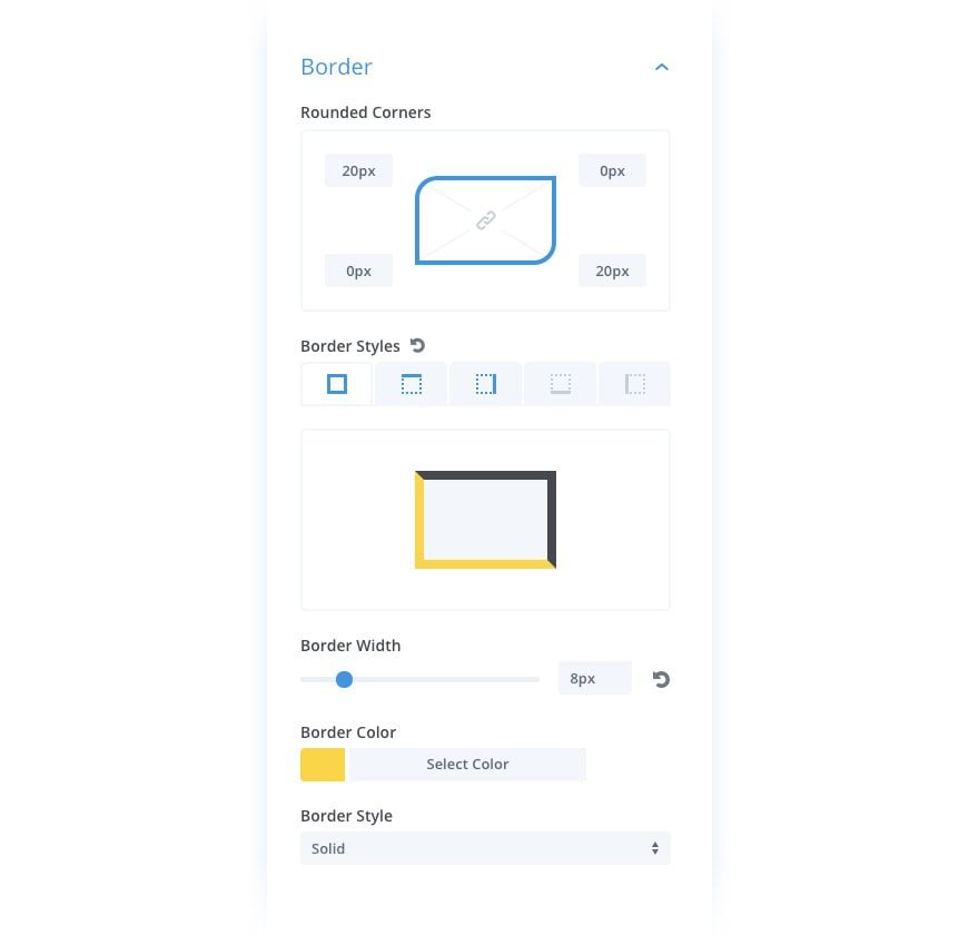
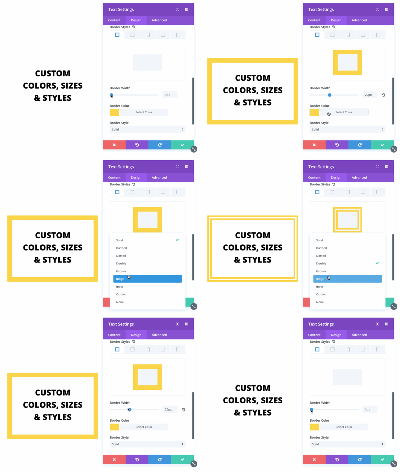
Custom Colors, Sizes And Styles
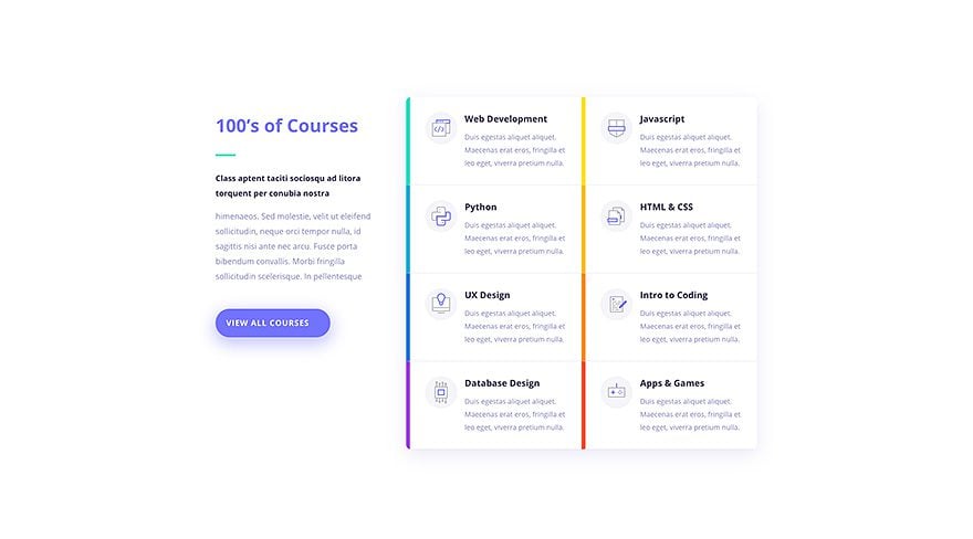
Every aspect of your borders can be customized. You can change their color, size and pick from 9 unique border styles. Using these settings in different combinations can result in some really unique design elements.
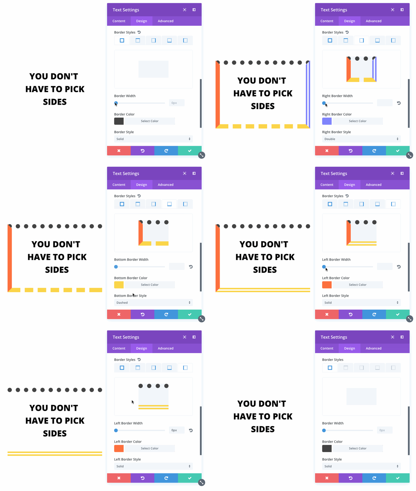
Control Each Edge Individually
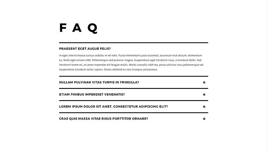
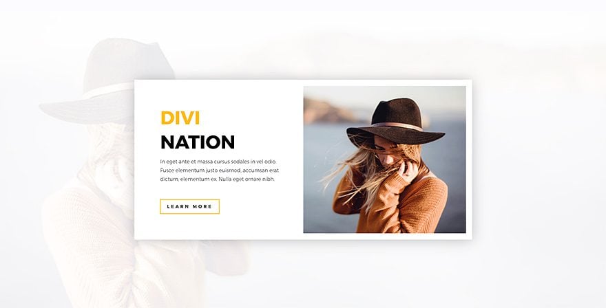
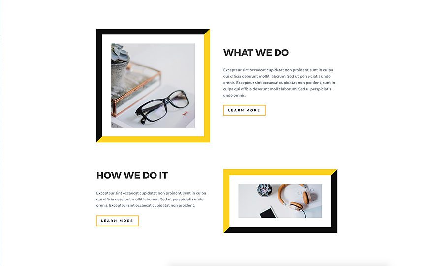
Not only can you adjust your element’s overall border, you can also get creative by customizing individual edge styles. You can add borders to one edge, two edges, three edges or four and you can adjust the styles of each edge individually. Highlight your module by giving it a bold border on all four sides, or just give it a small spark of color at the top or bottom.
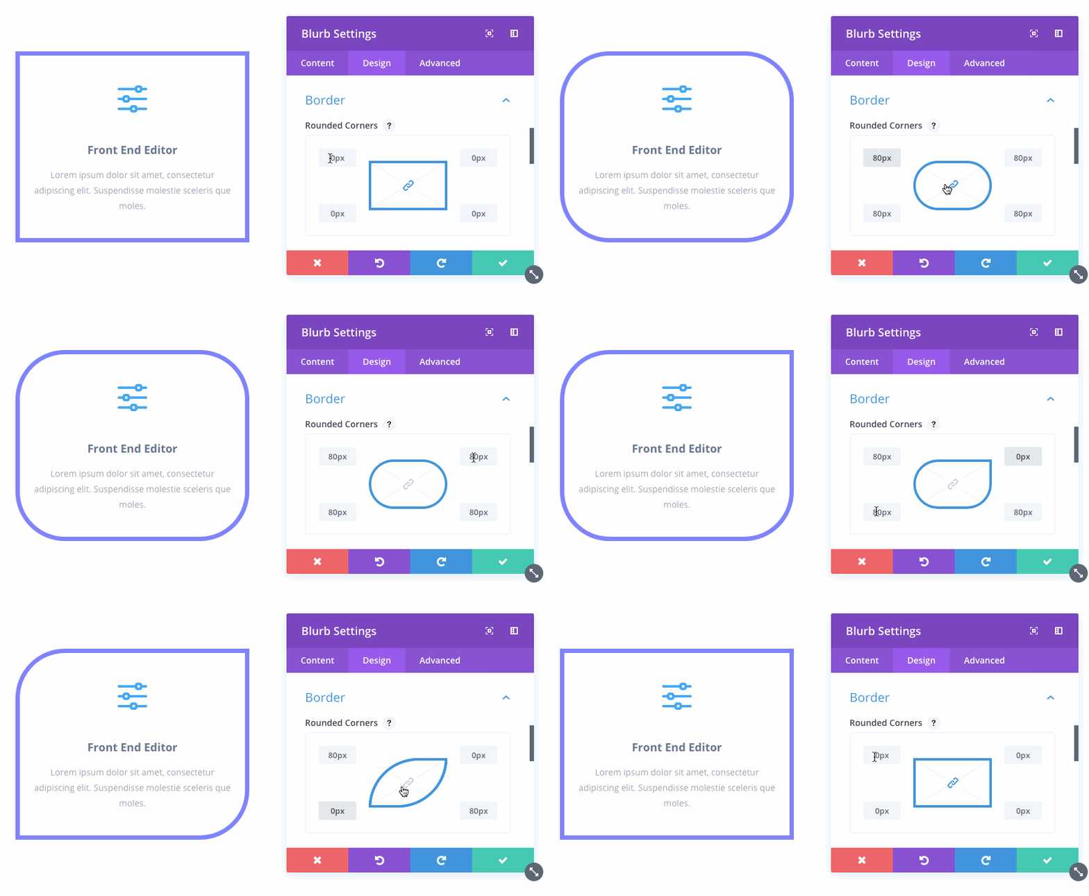
Rounded Corners
The new border options also come with the ability to create rounded corners and the adjust the border radius of all four corners individually.
![]()
13 Stunning Examples Of
Custom Border Styles
There is a lot that can be accomplished with borders, you will be surprised! These new options open up a whole new set of possibilities.
Countless New Possibilities
These new border options are available for every Divi module, row and section. In total, we have added hundreds of new options that open up countless new possibilities. If you are looking for some inspiration, just take a look at some of the amazing designs our team was able to create using these new features.

Example One
Example Two
Example Three
Example Four
Example Five
Example Six
Example Seven
Example Eight
Example Nine
Example Ten
Example Eleven
Example Twelve
Example Thirteen
These new border options are available today, so download Divi and take them for a spin. Let us know what you think in the comments and don’t forget to check back next week for even more great Divi features coming your way.
Get 10% Off Today!
Today's The Best Day To Get Divi Or Upgrade Your Account To Lifetime
Join the most enthusiastic and loving WordPress theme community on the web and download Divi today. Using the new Visual Builder, you can build websites faster than ever before with its incredibly fast and intuitive visual interface. You have to see it to believe it!
Join Today For 10% OFF!Renew Your Account Today For 10% OFF!Upgrade Your Account Today For 10% OFF!







Hallo! Great! They are full of opportunities!
But…I’m trying to customize my extra child theme: pages and articles come with a line on top that I don’t want. But I’m not able to get rid of it, I really don’t know where to set those borders…
Solved! It’s just that when you open the design panel, you have to click on a border to see it’s options.
Thank you, great job!
Love the borders! BUT, would love them even MORE if they could be column-specific, too (via rows) vs. just module-specific. Currently, even when the columns are equalized, the vertical border(s) on one module will be shorter than the borders on a module next to it; it doesn’t follow the background color “equalization” because the color is set on the column but the border is set on the module.
Any ideas? Thanks!
There’s a bug: borders don’t show in Firefox
YOU ARE ALL REALLY ON YOUR A GAME!!! This is just what I needed, AWESOME!
Thank you all for creating it 🙂
Hi– this is fantastic, but it would be really helpful for the padding options to only ‘push’ the -content- inward, and not the border as well. At this point, both increasing the margin and increasing the padding do exactly this. I’m trying to inset an image with padding while keeping the border on the outer edge of the module, but unless I’m missing something this is not currently possible.
Great otions, but the borders do not show up in Firefox. OK in Crome and IE Explorer, but not in Firefox.
Yet another brilliant power-up for Divi! Well done ET.
Great update – good work!
@Nick , I asked this a couple of times before, but got no answer. I will try 1 last time 🙂
Will there be a menu builder or some deep menu options in the future?
If not, can you reply?
I’m building websites in bulk and heaving limited menu options is hard to keep making original menu headers.
Thanks!
Hey Gille,
We do have future plans for a better header customizer which may also include new navigation controls. It’s still being discussed so I don’t have much to share, just wanted to let you know it’s on our radar.
Please can you fix the fact borders don’t show in Firefox?
Thanks Vlad! Keep up the good work.
Will there be a downloadable layout package for theses 13 Stunning Examples Of Custom Border Styles?
Nice, but will you guys fix the code that sets everything to pixels even when the value is zero? While something like padding: 0px 10px; works, it isn’t valid CSS and the Divi builder keeps adding px to 0-values…
Hey Roland,
Thank you for your feedback! In CSS, setting the unit identifier is optional and it has no impact on the performance or the CSS validation. Basically, both 0 and 0px are correct and valid.
I don’t know what has changed over the last few months, but EG seems to have lit a fire under its own butt and really been pushing forward with some long overdue quality of life updates and tons of great new features. As someone who has been using Divi for years, I was close to moving to Elementor for many reasons, but these latest updates have made me reconsider that decision.
Keep it up.
Brilliant!! just last week I wanted to be able to do exactly what this update provides! Divi you are wonderful 🙂
One more time big +++
Thanks, Elegant Themes!
Nick, I’m sorry, but You and Your company – God!
I’ve got an the artist’s fantasy. I’ll probably scream from happiness when you release Divi theme ver. 3.1… =)))
The Solid option doesn’t seem to show for me. Not sure if it’s cause of a CSS interference – just making sure I’m not the only one
Hey,
I’m sorry to hear that. We will have to take a closer look. If you could, please open a ticket in our support forum and a colleague will assist you as soon as possible.
Nick, having some issues with this with borders being applied to objects on a page when other edits being done. If you try and fix with the back office editors, they update and then borders show up on other objects. Seems to work ok if you stick to Visual editors.
Have had a support forum ticket in since late Friday night. Other people have reported the same issue, but no feedback from anyone on the team yet. Trying to decide if we need to do a full rollback across our installs, but would be good to know if you all have a fix for this that’s going to be pushed. Can you let us know?
Hi John,
Sorry for the trouble. Our development team is looking into this particular issue and a fix will be available soon. Thank you for letting us know.
Hi Vlad, Nick,
Same problem here. I’m getting 3px border ober every module after any change.
I have the same problem here. Any page I edit gets 1 pixel borders around all modules: text, images, portfolio’s. I thought it was me not able to find a default setting.
Beautiful update! Now using it on my website!
Awesome feature, just rounded some corners – thanks!
Looking forward to doing mockups too!
Apsolutely TOP! You are the best.
So how do we get Border updates if we already have DIVI?
Just update Divi in your WP’s Theme section. The update should be ready and waiting for you to install.
This is exactly what I want to know too.
Thats nice! A bootstrap looking Divi card
Nice update and great examples of how to use it.
Who would have thought that Border Options could be so exciting 🙂
So good!
In future releases try to make DIVI lighter, because it is becoming heavy and very slow.
Thank you.
Maybe a Divi light version release might be a good idea. For when you don’t need all the other things and just a plain section, row builder.
Is there auch Chance to make auch z-index Option?
Great update guys! I heard that Mexico will pay for this big border update! Even more awesome… 😉
Don’t worry The EU is looking after it in their Brexit negotiations with the UK. They want to stick with Joomla but will eventually see the error of their ways without border options.
Hello!!
This is exactly what I needed for my new project!! I’m amazed with all these new updates!!
Thanks a lot guys 🙂
hello divi nation I am very happy for the new options it will allow me to improve the disign of my site without much touching the css is huge I encourage the team of elegant theme good luck thank you and made us dream.
Wow…ET’s hater count just went up 10 fold hahaha! Divi has monopolized the premium theme market lol. This really empowers someone like me who focuses more on design more than anything. I barely do ANY css at all while using divi. You guys definitely make my projects so much easier.
I don’t think those people are ET haters. They are just a bit miffed because the issues they mention mostly get ignored, or so it seems, in favour of pleasing the woohoo people which no doubt generates more income for ET.
Personally I would like to see more balance. For every new feature released perhaps one long term issue fixed! 🙂
This is all cool and I am grateful, thank you so much.
But when are you going to put some more work into woocommerce stuff?
And certainly the most if not only annoying thing left in divi, the text module that does not have a static text control bar. I find it extremely annoying that the control bar scrolls, and when you want to make something down the line bold, you need to scroll all the way back up just to get to the controls.
How’s the developer update coming, with all the hooks?
Nice update. But why can’t we have the demo file?
I am struggling to understand how you built some of the demo ones, so would have like to download them and played around with them.
Be sure to follow us on Facebook because we do live broadcasts every week where we walk you through how to use the new features and re-create these demos 🙂
Brilliant! Thank you guys!
awsome, this plus the button enhancements and other visual things . . . wow
Another move forward! I will be using these on one of my current projects as it enables me to do just just what my customer asked me to do last week.
just awesome
Hey, Nick,
nice new options. Or better yet, nice new toy?
Great work.
But when are you going to fix the long known bugs and inconsistencies in DIVI and EXTRA?
When will it finally be possible to set the distances between the individual modules GLOBAL? And above all, when will it be possible to change ALL distances without CSS tricks?
Or when does EXTRA get all possibilities for the category layouts? Before all full width and high modules like Divi has?
Where Extra came onto the market, you said, there will soon be no more differences in the optical possibilities.
Since then, nothing has changed in EXTRA, but EXTRA is just as important, or much more important for the entry into the professional market of magazines and magazines.
But they won’t use EXTRA as long as it contains beginner’s errors.
Another example:
Why is there a comment module, but no review or AuthorBox module? Why are these two always outside the article?
Why is it not possible to place them as a module where they look nice, and if they are already there as a module, then you can add the nice new borders to them.
Which unfortunately isn’t possible now.
Why is EXTRA NOT WPML or Polylang capable?
Sorry for the nagging, but the guys in the support forums are doing their best, but they’re always giving support for the same things that could have been fixed in the theme for a long time.
So, since I didn’t get any answers to my last questions, I’m willing to save some more words, but I’m willing to give you more points and help you and your team to make these great tools much better.
With kind regards
Micha
Translated by DEEPL from German
I was in the same mood, but now I think ET should add the category builder to divi. Others differences seem managable. That would be logical regarding the fast growing of Divi market and community. A second theme (Extra) doesn’t really seem necessary and create more problems than it could solve to benefit from the community.
Hi Francois,
that would be the Best way, and i ask even for that thins booth on the Market.
This 2 Theme make no sense.
Make it the new and only star at the Themeheaven: DIVI EXTRA
+1
Your so right. Working with EXTRA is really a pain at the moment.
Divi is getting fat with all the candy added, while EXTRA is starving.
It was so promising at the beginning of EXTRA.
Rolf
I like it!
This is a nice addition. Would be helpful to have the per-device (mobile/tablet/desktop) settings for borders as well.
Divi web design suite is massive!
Can we get the layout for the sample page? It would be helpful.
Borders!!! F’ing BORDERS!!!!!!?????
WHERE ARE THE RESPONSIVE IMAGES FFS????
How many times do I have to ask, and I’m not the only one. It’s been built into WP since 2015 FFS!!!!!
PLEASE LET ME ACTUALLY USE DIVI FOR A REAL PROJECT.
Just cos I have a lifetime license doesn’t mean I wanna wait a lifetime to be able to use it professionally.
…and on the subject of CSS, it would be good if Divi’s wasn’t so full of !important rules, which makes overriding them a pain.
I tend to agree with this. Having a nice interface for CSS is all well and good, but I’d prefer development on stuff users can’t do easily, like yes, responsive images, or category layout templates.
The other thing about specifying styles separately for every element on every page is that it’s inefficient, and goes against the whole idea of site-wide styles.
There are a few different asks I’ve seen around this. One, is echoing core, which can create really blurry images on small devices, given that most phones and tablets have a way higher resolution than desktop devices. And the other is to actually use lower res images for small columns, which can be counterintuitive given that small columns can actually become wider as you move to smaller devices.
I’m no developer so I can’t speak to feasibility, but it seems like this could potentially create a lot of unwanted automation, requiring complex controls to properly optimize. I’m not sure this is as trivial as bringing in the functionality from Core, but I hope we can find a ways to properly bring these types of functionalities and optimizations to Divi as we move forward.
I’m sorry this has kept you and others from using Divi for professional work.
I was supposed to be working today! I took a break to get a coffee, when I came back to the desk, I saw this update on email.
How am I ever going to get work done with this new update to play with! The mind boggles with all the new and fast creative possibilities, I’m using Photoshop less and Divi settings more!
As a relatively new life member, (almost 12 months in now) I’m still struggling to comprehend how spoilt we are with Divi. Each day, moving forward I could kick myself for not jumping on board with ET years ago.
Is this new borders update available in the Divi builder for any of the ET themes in general? or is it just for Divi only?
An answer to this would save me from installing many of them to check!! I’m Happy either way 🙂
+1
Excellent update, thank you!
As a computer programmer since 1981, I’ve done all the manual stuff, and I definitely like the visual interface MUCH better.
Two questions:
1. What provisions are there for duplicating borders from one module/row/section to another? We could spend quite a bit of time tweaking one module to make it look “just right,” but need that same setup, perhaps with different colors, in several other modules on the page. It would be boss to be able to copy a setup (not just borders, but shadows, etc.) to other elements. Then, all we’d need to do would be to adjust the color (if needed), and boom. Done.
2. One of the most crying needs these days is for borders on fields in forms. Does this update provide for this? It is most frustrating to want to fill out a form and be unable to see where the fields are, because some designer who thinks they’re “bleeding edge” and “cool” wants to make it so low-contrast as to be virtually invisible. I need borders on forms, and currently have to tweak CSS to provide this.
Thanks again.
Hi David,
1. In the Visual Builder, you can copy and paste the style from one section/row/module to the other. Right-click on a module, choose “Copy Style” and then right click on another module and choose “Paste Style”.
2. Yes, it does. If you choose to set the borders on the parent settings, they will apply to all fields and you also have the option of applying different settings on individual fields. ?
Very cool update! But when are all these cool new settings added to the module customizer so we can configure site defaults like you would do with CSS?
Right now we are thinking about how we can completely re-design the Module Customizer and replace it with a full version of the Visual Builder with a list of all modules and all options. In addition, we want to add the same default customization on the page level. So you could customize all module defaults and have the values cascade from Websites > Page > Item.
We are exploring these options instead of investing more work into the current Theme and Module Customizer right now.
This is some really good news and I’m very much looking forward to that update.
Don’t get me wrong, I really like the little updates every week, but contrary to what I’m reading here and there, I do not think that those are changing the website game. Yes, they are making it _even_ easier to use Divi, but the theme is already ahead of the pack.
What I’m really needing are global options because at the moment, I _still_ _need_ child themes to pull off a unified layout (make all headers look the same, etc.) for the entire site. Unless I want to touch each individual module. And yes, I am aware that the “copy styles” option exists, but this is not what I consider a valid fallback.
Sounds great, Nick. This, in combination with truly Global and nestable templates/layouts including editable regions(see Dreamweaver) will make Divi much more suitable for large sites.
Great!!
You can think too about the posibility of write text over the image module.
Its necesary too more options on hover animations, like superposition layer with text hover. This is full necesary.
Best regards!!
Divi has no limits and no borders 😀
🙂 great comment!
Maybe next will be ..links /hover ?
awesome, we need flipbox animations for the modules like these https://codelights.com/elements/flipbox/
I meant for blurbs mainly
Yeah for a new DIVI theme update!
Want that all important columns update more though.
Is there a link to download the layout of the demo page? Would love to have it if possible. Thank you.
Hey Chris,
This particular demo layout is not available for download, sorry. However, the various elements you see are from other layout packs that are available for download. The following links should be helpful.
https://www.elegantthemes.com/blog/?s=Layout+Pack+for+Divi&x=0&y=0
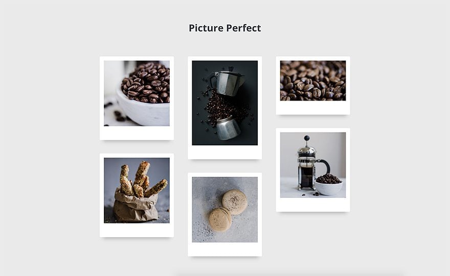
Hi Vlad—See the section with the “polaroid” images? I’d like to achieve that—where can I find that section? Thanks.
Yes, as Piers explained that is how you do it. It’s very easy, I made a small video for you that might be of help.
http://screencast-o-matic.com/watch/cbX6YE22GK
Or just create tilted images in Photoshop and add them to Image Modules. Think outside the box.
Just do it with the new border properties. Add an image module, and surround that with a 15px white border top and sides, and a 45px white border on the bottom.
You could even give it a drop shadow. Simples!
Hi Piers—The borders are easy (now)—it’s the staggering I want to achieve. Things always look so boxy and linear. That’s why I’d also love a module rotate (tilt) feature. See how those images look staggered? That’s what I want to do.
Please add rotation and padding options. That would rock our world. Thank you.
+1
Rotation??? We already have an animations update.
I don’t want dancing baloney. Just a little tilt of a module will do.
My baloney just loves to dance
With there be a hover effect update any time soon?
It’s in development as we speak 🙂 A lot of these design options, and some of our upcoming design options (like Filters and Transforms) will become really useful once our new hover option interface is finished.
Pretty sweet, Nick! I’m loving the borders so far. They really open up a whole new world of things to do in Divi.
I am waiting for the same
I hear they are going to do something for the hover effect.
That would be great !
I hope it comes soon too :).
Just in time for Brexit. The Tories never considered our border with the North of Ireland. Now with Divi Border Control all is sorted!
Great one!
lol
Oooh… a drop shadow around the 6 counties with 80% opacity on Newry… I like it
The funniest thing I’ve seen all week, thank you Stephen.
Best theme on the market. Period. Also the best investment I’ve ever made, bar none.
Thanks, Elegant Themes!
1+
Awesome update again Divi team! Really love DIVI each day more!
Very good update, this catches us up with some missing features.
Like I say every time: Easy with CSS, easier with Divi.
I’m guessing the column update is next?
Custom borders are the last custom CSS I have on several sites – thanks for launching this nice feature 🙂
Amazing, thank you very much!
I was wondering, Nick; do you have plans on adding scroll interactivity for divi elements? (like ScrollMagic, or Webflow’s ‘interactions’)
Nice! Next up: This border radius interface for margin and padding.
That would be a dream! Margin and padding still take up half (or more) of my development time!
Oh yes!
I think I’m in heaven. This border options update will transform the way people use Divi. Thank you, just in time to show a potential client, this is exactly what they want. Once you show them how Divi works, they’re delighted.
Cannot say enough thanks to the Elegant Themes design team and Nick Roach for producing such excellence.
Hi there,
I see a few updates already with just more styling options, I get it, necessary.
But Box Shadow, Border, … all in a seperate update? This is a hassle.
Just my 2 cents.
This is Agile project management. Iterative updates (Sprints) more frequently instead of waiting month and months and getting everything at once.
If you don’t like the frequency, then wait for multiple updates to be released before updating.
I agree with Marty.
LMAO
Very cool!
Hey btw, how do you do the video popup modal you used on the top of this page?
They use a js script called “magnific popup” that does that, I think if you want the none coding solution it comes in the “Divi Overlays” plugin
Thank you.
We just need a “rotate Module” slider now. Image that polaroid look gallery with them at different angles a opposed to all straight.
Awesome. I can’t wait to play with this border options.
Awesome update, creating mockups in the website by using this update is brilliant!