![]()
Quickly Identify And Access
Element Design Settings
Now it’s even faster and easier to identify and access design settings for module sub elements.
Today we are releasing yet another major design efficiency improvement for Divi, making it easier and faster to identify and access design options for every element on the page, including module sub elements. These new Quick Access options make it easier to understand which design settings affect which elements, and more importantly it allows Divi designers to access those settings more quickly.
![]()
Design Things Faster
With Quick Access
Stop hunting through long lists of design settings and jump directly to your desired option group using the new Quick Access buttons.
We want to embrace the Visual nature of the builder in new ways and give designers every opportunity to leverage visual design to improve their workflow. When you open a module settings, some of the beauty of the visual builder is lost in the tedious task of hunting through long lists of options as you try to modify specific elements. Luckily, those days are over.
Quickly Access Design Settings
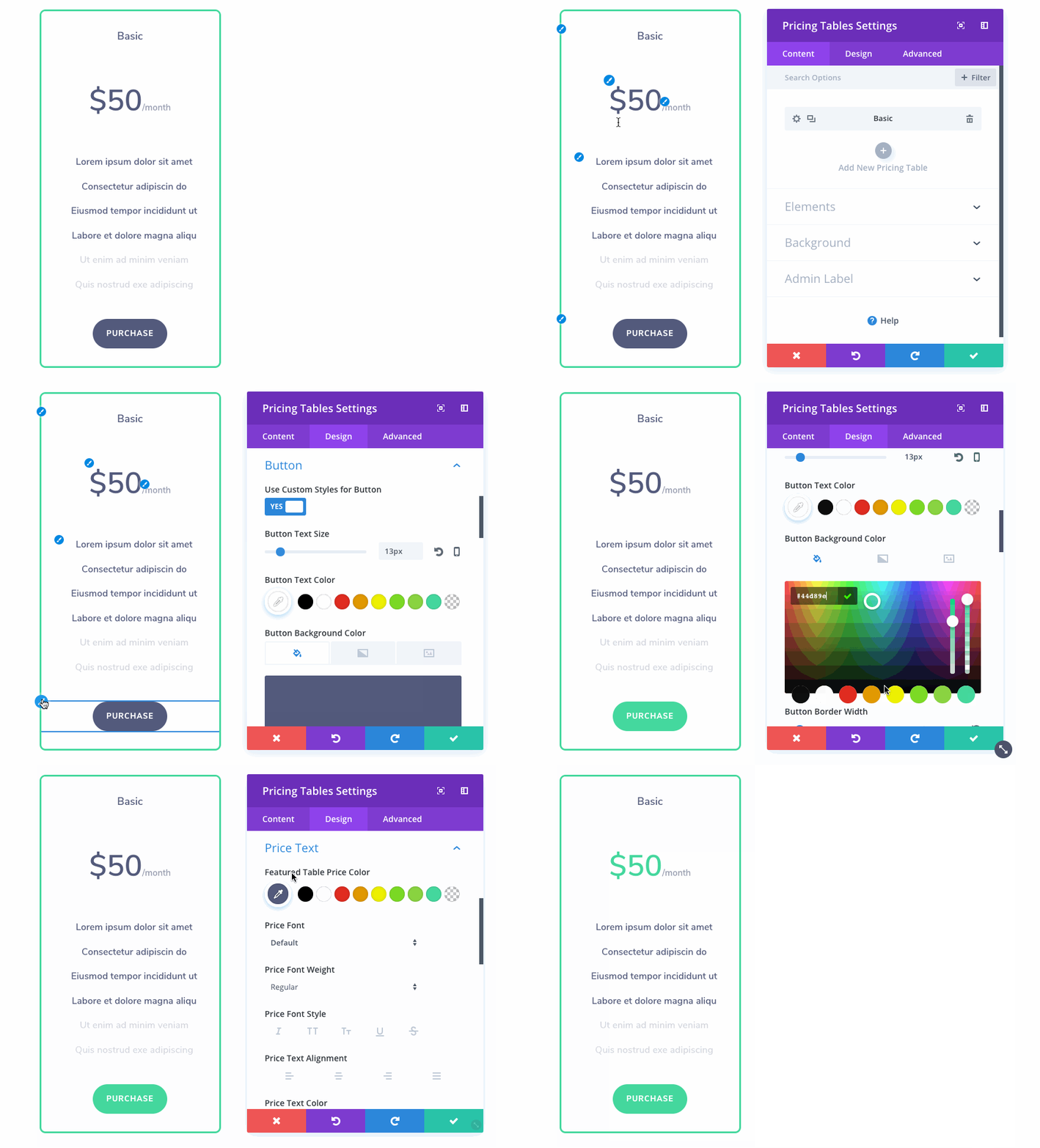
Now, when you are editing a module, you can hover over the module to reveal its sub elements along with Quick Access editing buttons. When clicked, these new quick access buttons will take you directly to the relevant design settings for that particular element within the module. No need to hunt through the module settings to find a desired option group. This makes it so much easier to understand a module’s structure and how each option relates to the module’s design.
Easily Understand Design Settings
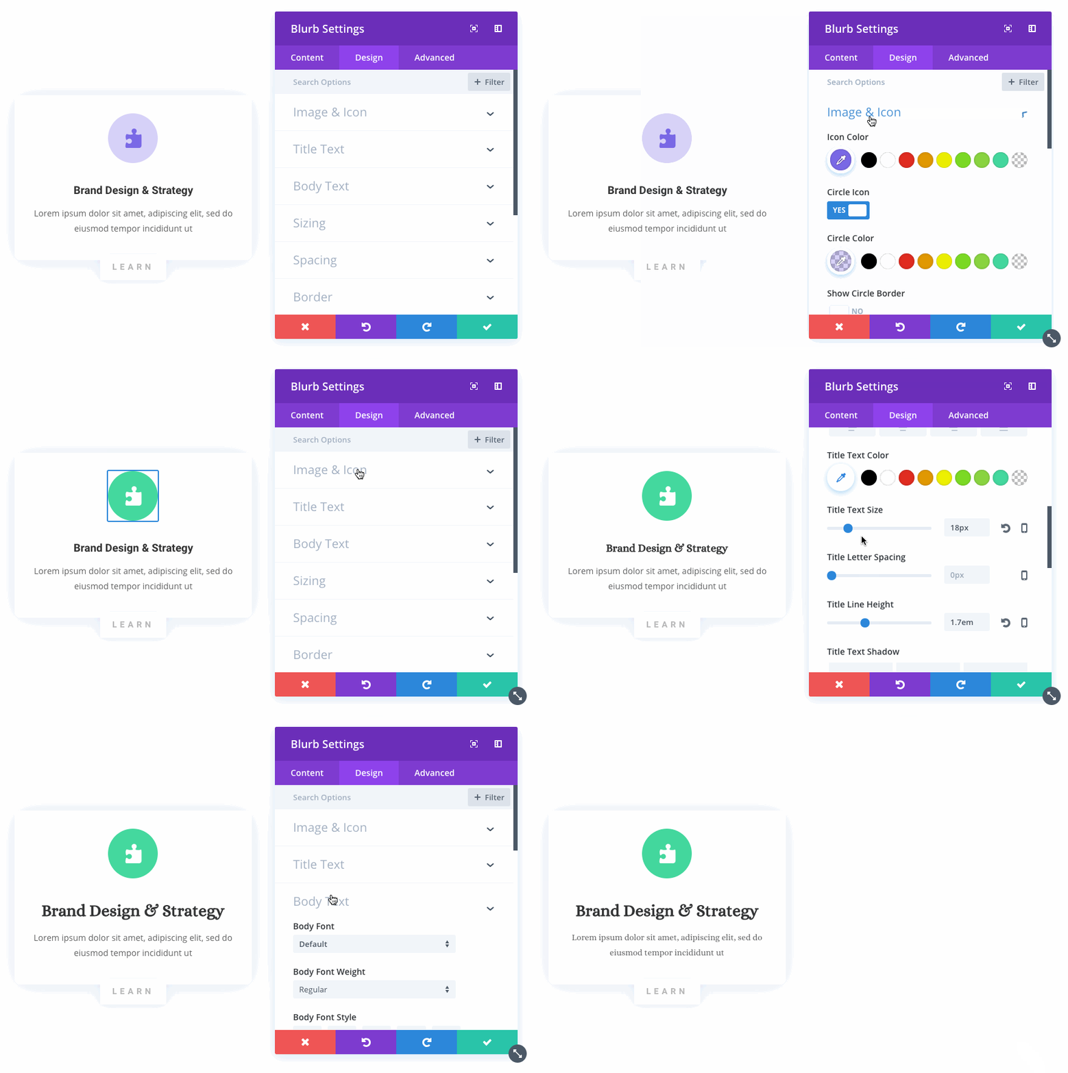
The new system also makes it easier to identify relevant elements on the page while navigating module settings. As you search through options, Divi will indicate which module element each option group belongs to. You can quickly hover over the list of options and use the visual cues to identify your desired settings and begin customizing each element.
The new Quick Access options are available today, so download Divi and take them for a spin. Let us know what you think if the comments and don’t forget to check back next week for even more great Divi features coming your way.
Get 10% Off Today!
Today's The Best Day To Get Divi Or Upgrade Your Account To Lifetime
Join the most enthusiastic and loving WordPress theme community on the web and download Divi today. Using the new Visual Builder, you can build websites faster than ever before with its incredibly fast and intuitive visual interface. You have to see it to believe it!
Join Today For 10% OFF!Renew Your Account Today For 10% OFF!Upgrade Your Account Today For 10% OFF!



Great! Thank you for another wonderful update.
This is a really great addition. I can’t wait to test it out. I’m hoping this upgrade also makes the visual builder a bit more snappy.
This is a really great addition. I can’t wait to test it out.
es excelente muchas gracias una vez mas.
Sweet! Any idea when we will have granular control over headings 1-6?
I LOVE DIVI! I love the fact that you keep trying to make Divi better and better for the community, and this development is something I hoped for but thought that it would be too great an ask…Thank you developers for a great update and cannot wait to try it out. One question: would this work for the themes that are already uploaded or only when the theme is updated? And do these updates also work for Extra?
Hello Elegant team:
I am really tired to search how to change the color of my text en the menu and submenu in the head. I got the divi booster but it’s the same. I can not change it. Any efect in the menu for móvil. I have the duvi theme. But in the movil version i can not change the color of my text when I pass my finger to choose an option it changes in the desk version but in movil nothing. No hocer, no underline, no change color. Really dissapoint.
Thank you so much for this great Divi update!
This is a good feature as sometimes you do get a bit list with all the feature options on the module.
You guys are just the best. I have yet to see theme developers that are so actively improving there themes. This is just brilliant. Thank you, and keep’em coming!!
Excited to give it a try!!!
Thanks for staying committed to improvement. I love the tool and it makes my success as a web developer possible.
I have to admit, while I embrace any visual usability innovation, I crave power user implementations that allow designers to fluidly modify page elements in actual css (in tandum).
Wouldn’t it be brilliant to have the option to ‘view css’ on any element and see the style classes available as they stand and simply tweak css within the environment? That would speed things up for those with the (rudimentary) skill set.
I’ve been trying Divi out and I believe in the project, and though this new feature is definitely responding the hours of time I’ve wasted during my trials digging around for things that I change in builder and want to change. My current position is to make any changes I can within a child theme css file. I would love to see enhancements on such a workflow, because sometimes things are really hard to override! Php development is the big monster I, personally, am happy to avoid with your product :)!
Keep up the good work. This framework surely takes the sure-agony out of web design for right-brained people (aka creative people/artists), but a solid hybrid approach (best of both worlds), that skirts php coding requirements, is the peak I am rooting for.
fabulous
I keep a keen eye on this Blog to see what is happening in Divi ecosystem. I’m a lifetime license holder and Divi was my first page-builder. After seeing Divi 3, i was blown away and now, after reading every ‘feature release’ type blog post on this blog, i can only see the demise of a beautiful page builder slowly.
I think, ET team needs to pay attention to the market demand of a robust theme builder. People are quickly moving to true theme builders like Oxygen Builder. I am moving too!
Well, I don’t know much about design trends and how it should be designed but my thoughts are really simple if design offers great user service then thumps up to these guys.
Nick, Absolutely awesome update!
John
Thanks for the updates, no doubt ET is the best WP theme developer. The roadmap should start learning towards making the features not just usable but also more powerful, small il hacks like this one offer no real value to a business. We’re still missing ability to make category and widgets easy to work with. Also some major bugs such as no option to set the alt tags for “advertisements” still exist..
Absolutely love the update. you guys are well worth your pay cheque. Keep up the good work i appreciate every one of you. Thanks. A delighted Divi User. Brian
Another nice addition making the interface more useable and useful.
Before I get too excited…
Would it not be better to have the view on hover edit icons available for all items on the page at a glance before a settings panel is open? The feature is a little bit too much on the spectrum of discoverability and in danger of being overlooked as a useful tool.
I just love this update, its something I always seem to struggle with. I know may are waiting for the header footer update myself included for that matter but this was a surprisingly valued update.
PS – I mean that on the scale of a header footer update this is about the same level of value for me
Ok…I like this improvement. This will be big help especially with my current project and the fact that I don’t have a big team.
Still looking forward to the custom post type feature and MULTISITE.
Great new feature. Thank you.
😀
Finally, just thinking about it, you are grat DIVI Team always known the right time.
I am so grateful for the work of Elegant Themes! I am not a developer and I have been able to use their themes with great success. I do read some of the comments wherever they announce something new and can hardly believe the ungratefulness that is sometimes expressed and can’t help but wonder that if you think you can do a better job than they are doing, why aren’t you out there developing something? Please try and show more of a sense of gratitude instead of always displaying a sense of entitlement. Many thanks to the team of Elegant Themes! Keep up the good work.
This looks so good!
This is what I love most about Divi and the developers, they aren’t just thinking of the end user, they are also always looking at ways to make life easier for the web developers as well! Keep it up Nick and Divi Team, love your work!
Just updated and the new update does not show in any way.
+
fantastic .. now we can do faster to every work ..
These updates are awesome without any doubt. Seems I can build a web page quicker than I can design a flyer in Adobe software.
I do have to agree with most comments though about the header and footer. Three main elements on a web page are header, content and footer. For two out of three of those elements, we have limited design control over (which is very evident by looking at the majority of sites built with Divi).
Although there are many ways around this and several paid for plugins available, we shouldn’t have to resort to third-party plugins and custom code to achieve a design we want, especially from a premium page builder.
Regarding WooCommerce, Toolset is extremely powerful for designing those pages, especially when using the Divi Builder to design the Toolset layouts (although it is a steep learning curve and not without its own quirks).
I’m aware of a change ET have planned to assist in WC pages. It is down to how WP has worked in the past and the way WC code there plugin – every theme developer has the same issue from what I have read up on.
Some of the modules aren’t polished off either, few little issues here and there and more time should be given to the default typography settings for tablet and mobile for modules, not just desktop. Plus, some style settings just aren’t there that should be.
My background over many years has been to open a text editor and build a website with the help of a framework like Bootstrap. Made the choice to learn WordPress, tried a few page builders and a friend asked for some help on Divi, I’d never even heard of it until that day, but quickly seen how powerful it is and got myself a copy).
Divi is awesome and I’m sure I’ll use it for years to come. If it wasn’t so good, I doubt the community would even bother to bring up issues.
The builder is awesome, team ET are too! Keep up the great work.
Just my two cents.
PS. There doesn’t appear to be a forum space for community discussion, hence why people reply with all kinds to a new post.
Mark
Work with the Div/Toolset combination as well and it will be interesting in how well the two will continue to work into the future with the introduction of the dynamic content features. Toolset is very powerful in what you can do with it but their documentation can be difficult to follow. The tutorials with tutorial sites are the best bet if you want to get a better insight into what you can do with Toolset.
On a side note. A topic that is slightly off the radar is the iceberg that is Gutenbergagedon which will be in core and Default once WordPress 5 is released soon.
Apart from the usual compatibility issues, Gutenberg is a mixed bag of the new, with some merits but, completely missing the mark in some obvious things it should have been engineered to tackle. It is the editor that is coyly saying it isn’t a page builder but actually is, one that is really watery and weak compared to the likes of Divi, Elementor and Oxygen. It is partly being created to add some consistency for changing themes but only caters for bloggers who want to add content in a vertically linear manner down the page. There is no attempt to do anything to address the more complex layouts that page builders target. The opportunity to offer a block system based on the Sections/Rows/Column and/or flex box or grid model is missed.
Providing a basic foundation with an api which page builders could work with would be ideal affording seamless and pain free experiences when switching themes > I’m looking at you Divi shortcodes.
Taking into consideration the mixed reviews and the controversy surrounding Gutenberg I worry about the talk of schisms and forks where one set of plugins and themes head off in one direction and others that I may need use as well go in the other direction.
Hi Irishetcher,
I purchased Toolset long before I bought into Divi. The learning curve was so steep that I left it alone for almost 8 months, but I did watch a training vid or two on a daily basis.
Bought Divi during that time, but once I learned Divi, soon realised that I needed Toolset for WP pages (I’m kind of getting to grips with Toolset, finally). The two can work great together as you mention.
Been keeping an eye on Guttenberg since its initial Beta release. I agree, it’s so far behind compared to Divi etc that I’m not too concerned at the moment. Dare say, it may never be comparable to the likes of Divi. Divi has a sole purpose of pixel perfect page design, and light years ahead of Guttenberg as it stands now.
Recently stumbled upon Adobe XD. Designing a prototype design for a client in XD that I will transfer over to Divi. Will be interesting to see how closely I can match the XD design with Divi.
Cheers,
Mark
Mark,
There is a support forum where people can comment on other posters’ issues and comments, there is no need for people to post issues on a blog post like this when they can go there and get professional advice from the developers as well as the Divi community. NOT aimed at you, just your comment about other people.
Hi Terry,
Yes, I’m aware of those forums. Guess I what I meant to say was a forum dedicated to ways to improve Divi with an open discussion board rather than a “help me use Divi” Q&A board. I have actually posted some answers there myself at my attempt to help others.
Cheers.
This is a fantastic update!! you guys are providing designers with the BEST web building tool.
I would love to see more flexibility with the Header Banner though! I have clients who want different layouts for header elements, and I have to say ‘I can’t do that’……
But that is my ONLY complaint. Divi is so superior to any other wordpress page designer out there. THANKYOU!!
Nice new feature, but I do recall specifically a few weeks ago prior ET mentioned a long-awaited header modification feature will be released in the coming days/weeks… What’s the ETA of this?
No, no, no, no. You guys are doing magic now. I thought it was coding, JS and PHP. Did you hire Merlin or something?
Heading to the forums… update messed up at least one homepage that uses parallax backgrounds. One was fixed by switching from css to True Parallax. The other — still broken.
I like the updates, in general, but 2 out of the last 3 (3.7 and 3.8) have been a problem. Thank goodness for the new rollback feature.
Sorry to her that Nicole, we will certainly do everything we can to help you. This particular update doesn’t affect your website at all. The only changes made were to a JS file that’s loaded with the Visual Builder, so it’s impossible that the update itself caused the issues you are referring to. However, you may be experience a cache related problem. Once you open a ticket we will take a look 🙂
FontAwesome, Google Material Icons, and Nucleo please.
+1!
Buenísimas actualizaciones, igualmente espero algo REALMENTE relevante: funciones de hover sobre módulos con transformaciones de sombra y colores, cambios en el menú principal y pantalla completa sin necesidad de css en sliders.
Igualmente: feliz y contento, gracias!!
s p e c t a c u l a r
This is just gold! You are making our lives so much easier with designing for clients. Love what you guys are doing and the quality you give to us. So good!
Great feature update!
Please stop. Better concentrate on making Divi work instead of more fancy bells and whistles. It’s all for nothing when the theme is not stable: I had to rollback from the latest Divi update since I can no longer load a layout. The screen keeps loading and loading and it never stops. I’m ready to give up on Divi if I can’t trust it to just do the most basic things after updating.
Hi Jon,
Sorry for the trouble. If you can, please open a ticket in our forum and the support team will be happy to take a closer look. Thank you!
https://www.elegantthemes.com/forum/
There’s no point. Found 2 other webmasters with WordPress experience and they have the same problem. One of them figured out that it’s the totally pointless Your Existing Pages choice in the builder that was added with 3.8. If you have more than a few hundred pages Divi chokes. If you can’t provide a way to disable Your Existing Pages choice Divi is basically useless for large websites.
Hey, Vlad and Elegant Themes – is this true?? Haven’t updated to 3.8 yet and am concerned.
Really good feature!
One question – how I can enable Quick Access option in Visual Builder after update to the versoin 8.3 ?
8.3?? We are not even at version 4 yet..
3.8
Hello,
i have the version 3.8, but no Quickly Access?! How to activate it?
Björn
3.8 even! But yes we seem to be flying head first into Divi 4 territory. Am I right or am I wrong?
We will wait and see…
The hits just keep coming 😉
Love it! Thanks a lot!
Absolutely brilliant!
excelent the builder becomes more and more easy and fast to use, it will allow us to advance quickly.
Kudos on the continual development and innovation of the DIvi platform. When the visual builder was first introduced, I was excited to have a visual design option that shows what the actual layout and design looks like.
However, I NEVER use it for one reason – I can’t seem to find a way to hide disabled modules in the visual builder. With every new update, I try it again, but it still shows disabled modules and modules meant for mobile when I am in the desktop preview and vice versa. Am I missing something? Or does the visual builder insist on showing every disabled module, row and section.
I rely heavily on disabling modules to experiment with design variations, or to save some modules for future use. With all disabled modules showing in the visual builder it is extremely distracting. There should be a switch in the display options to hide disabled modules (as per phone/tablet/desktop views) in addition to the “Show disabled at 50% opacity” option.
There is an option in the Visual Builder interface settings. https://ibb.co/byxVS8
Great! I wondered that too and never noticed that setting =)
Loving this, but i have lost some customizations (hand written css etc) when using the visual editor, so now I use it rarely. Would love to ensure that little problem is taken care of.
Looks great though!
For on page design these are great.
However I’m still waiting for these featuers on a global approach to design since that’s a key to consistent, not random design.
+1
+1000
Way more global controls is much better than settings on individual modules.
+1
+1
+1
Yep, me 2
Another non requested feature.
What about the header and footer builder?.
What about the Woocommerce features? As you might know the Divi theme is a really bad option if you need to build a Woocommerce site.
What about using the Divi Builder inside Widgets. This is a must!
We know that you are going to tell us that “these features are in the roadmap”. But they has been in the roadmap for a very long time.
There are many (many…) comments asking you for “header and footer builder” and “woocommerce features”. We don’t really understand why you don’t listen to your customers. Have you considered to use something like uservoice(dot)com to allow us to give you our requests/feedback, so that we can tell what is important to us.
Don’t get me wrong, we love your theme (and use it every day) (we’ve been paying the licence for three year so far) but it seems to us that you are just interested in the “Divi Builder” and not much in the “Divi Theme”. Not to mention the woocommerce features.
We’ll really appreciate if you take a couple of minutes to share your thoughts with us?
Thanks.
And still no SRCSET responsive image support! And many have requested it. Been in WordPress officially since 2015!
Yes, PLEASE, to responsive images
Hey Walter,
Why is this bad for a woo commerce website? I am just creating a divi website.
Hi lovely,
Try a full featured ecommerce theme like Flatsome and you will see why.
+1000 for uservoice (or getsatisfaction or something similar). I have suggested that several times before. In the theme suggestion forum I got a reply from support saying it would come in the first half of 2017 but it was subject to change. Now we are 1 year past that and there is still no voting system for feature requests.
So I just upgraded and now getting an error message when I attempt to edit my type:
et_pb_text could not be displayed.
Note to self – make sure you update WP before you complain on the blog! Sorry! Great and useful update.
I love the way you guys just know how to make a developer/designer’s life easier. Yet another reason to use nothing BUT Divi
One of the best feature updates so far.
Will you make it possible to enable this feature for 3rd party custom modules as well? An update of dev docs with implementation of this feature would be much appreciated.
+1 3rd party custom modules
Once again you guys make our life so much easier. Wow Thanks. Can’t keep up with all the new features and improvements.
Wow!! The DIVI team is constantly pushing the boundaries and making their builders one of the best!
When will we have a builder that can allow to move elements ANYWHERE we want using a grid system, so the element can snap into place, but still have the freedom to move it around on a canvas. Also to make elements any size we want, being able to instantly widen, lengthen or shorten?
This would makes things so much easier, but I supposed harder for the coding Jedi’s lol
I have seen those features on some of the now many builders out there. The implementation is good on some but when you examine the overall UX and usability of those themes compared to Divi they are nowhere near as good, Oxygen, as mentioned above, being the exception.
So yes, how easy it is to code and how much it could be a hit on performance are all factors in wether something is added or not.
Elegant Themes have a very considered approach in how it rolls out new features that create a foundation for others yet to come and often brings UX improvement that you just won’t see anywhere else. In this context, all the features we are looking for will arrive in a logical manner.
Great update, but I agree with DigiRod, the edition of the header and footer is what Divi need,… to me is also killing the wait and I’m using some very good plugins like Divi Visual Footer, Divi Ultimate Header and QuadMenu,…
These are good, but they still need more development and this is slow,… and the ideal is to have native modules in Divi for this,… the customization of the menu also needed a breakthrough,… keep up the good work.
Saves so much time!!
Love what you’re doing with the visual builder!
??❤❤
Thank you!
Great! Thank you for another wonderful update.
Very impressive!
Take me off this list!
Hi Sarah, if you’d like off of our mailing list there is an unsubscribe link at the bottom of each email.
I was just thinking to myself the other day how beneficial these features would be. Keep up the amazing work!
GREAT UPDATE!
Not only am I THRILLED with this update, I’m super impressed with the video quality. But before I ask about that, please let me thank you all at Elegant Themes for making such a great product that makes it easy for non-coders like me to produce stunning websites, great content and a good living as result of it.
Back to my video question – have you done a blog post about the lighting setup and camera that you’re using? Plus the editor? I’m sure it’s not for the solopreneur but it looks super high-end and awesome, and I’ve love to aspire towards such a look in my content marketing evolution! Thanks, in advance, for your tips.
+1 for the video setup
Wow. This is like my wife’s apple pie. Just when you think it can’t get any better…
Nick, Sounds great! Gonna try this now!
Hi Nick,
This update is actually really cool.
Just want to inform that today we have reached the 2 months gap between the first sneak peek of the year and its awaited matching release, and I suspect that gap to be able to reach up to 6 months…
Hey just an FYI, that’s not exactly how this process is working. We’re not releasing Divi Features in the exact order we have released the sneak peeks. We release sneak peeks when development work on a feature has officially begun. Some of those features will simply take longer than others to complete and release. Today’s feature is actually one that we’ve sneak peeked. Next week’s will be as well. And I believe every feature release from here on out will be one that we’ve sneak peeked. But again, not in the exact order that we began work on them.
I like the sneak peaks guys. I was able to decide whether to put a few things on hold or not so I wouldn’t have to redo or duplicate work. So sneak peaks are good. We know great things cannot be built overnight.
So there was no sneak peak for improvements on the module customizer. Does that mean that it’s not going to be improved for months to come, if at all?
Hi Nathan,
Thanks for replying.
Well, it’s okay for the order but I was wondering when one of these sneak peeks would have its actual accomplishment. Now we are set but I will remain teasing…
This means that one of these 2 months sneak peeks is 2 months away from today. That puts the gap to 4 months since the first sneak peak… ^_^ Okay kind of exagerating…
What I mean is that some of the promised features are greatly awaited.
Richard said the same thing above, about today update being one of the sneak peek.
Well HyperTiti this DIVI theme update was first unveiled in a sneak peak video from June 9.
Well it will be really nice to get only teaser video updates from now on.
Superb update. I love Divi. ❤️❤️??????
Cant wait to update this.
Quick question : when will we get new modules??
If ET would open a VB Store, I bet you would see new modules from 3rd parties come very quickly.
I have no clue when we will get new modules. A bunch of modules could get new updates to them though.
That will definitely make workflow a lot better, love these updates
Your team is developing at a notable pace, evolving the tools to be better and more efficient. Keep up the good work.
This is pretty cool! I was annoyed again today because I had looked for the settings on every single page in every module. Thank you for the update. (:
The best got better yet again.
YESSS!! And this update idea was in a teaser video!
Would you please remind me which one ?
Well HyperTiti this DIVI theme update was first unveiled in a sneak peak video from June 9 of 2018.
I just submitted a ticket. In short Divi simply stopped working and it looks like it corrupted my home page. It’s nice to see updates, but I really need some support or will have no choice but to make another product decision. I really like what your doing, so would much prefer getting it resolved.
You now have the opportunity to test the new Divi rollback feature 😀
Hi Steve!
I’m sorry to hear that. I just got back to you in our support forum.
Beautiful! I like it… I have to admit that I am so desparate for Custom Post Type access that I have purchased and am trying out Oxygenbuilder.com at the moment… I am NOT giving up on Divi… but I really need that access and I can’t wait any longer…
Same here, I’m looking at Elementor and Oxygenbuilder for the custom post type support. Whilst Divi is the best page builder on the market, without support for dynamic data it’s falling short as a serious CMS page builder. The teasers look promising but how long are we going to have to wait, weeks, months, or is years away?
If they are promoting new features in the teasers they are hardly not going to release those in the near future?
Agree, there are things in Oxygen builder that are done the correct way in terms of how site wide elements are handled globally and how you can change these centrally, in a to hand manner from whichever context you are working in. Divi lacks this but there was feedback, several months back from Nick in feature update comments, that they were investigating something like how Oxygen is doing it, and it wasn’t through the theme customiser. The other thing is how Elegant Themes implements global in Divi. It is the wrong way round. Global should be the default, controlled by globals settings and the exception should be modules with styles overridden by the user again, just like Oxygen builder.
1+
Wow, that builder is interesting, keeping my fingers crossed that is similar to what divi has in store for us. The custom post builder is amazing.
The team are focused on making it easy for people who can’t code.
and what happend whith header and footer Edit??
Another nine months, and the baby will be born
Divi has a longer gestation period, generally unspecified.
+ 1000
Seriously though… +1
the limitations in divi header is a really serious impediment in its overall utility, as in the market the others are very keen in developing in its priority based ..
It is coming. This is like the first update that from the bunch of teaser videos that have recently come out.
+ Header and Footer wait is killing me!
Cool.
Awesome! Loving all these speed improvements!
LOVE LOVE LOVE THIS!!! THANK YOU!!!