![]()
Build Divi Websites Faster And More
Easily Than Ever Before
We want to help Divi users build websites faster and more easily by removing inefficieny.
We love releasing new features that make the lives of Divi designers easier. When it comes to speed, efficiency and intuition, we want to go above and beyond, because that’s what a great design tool is really all about. Today we are introducing yet another design efficiency improvement in the form of Filtered Option Search, allowing you to more easily locate active and relevant options so that you can make quick adjustments without wasting your precious time.
![]()
Filtered Search Lets You Quickly Find
And Modify Your Desired Settings
Never hunt through hundreds of unused design settings again!
The New Search Filters
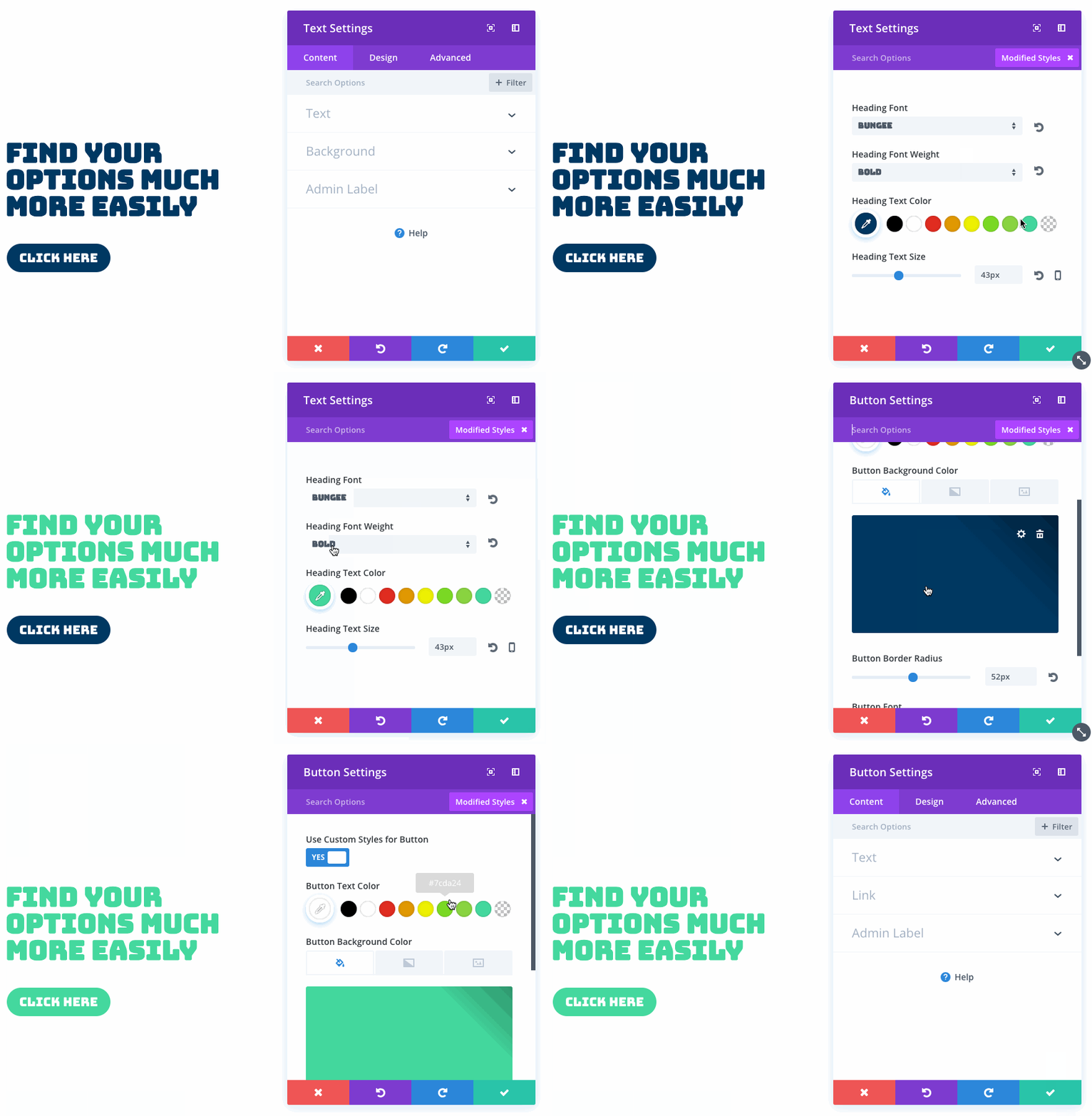
A new filters button is available inside of all settings modals. Filters limit the visibility of the many available options that appear within each modal. These new filters include: Modified Styles, Responsive Styles and Active Content.
Perhaps the most useful of these new filters is Modified Styles. Once selected, only active design settings that you have adjusted will appear, allowing you to quickly locate your desired settings and make the appropriate changes as your design evolves. If you need to make a quick adjustment to your custom design, you no longer need to hunt through hundreds of options to find the ones your are currently using. The Modified Styles filter will take your directly to your active styles and you can work from there. If you are familiar with browser dev tools like the Chrome Inspector, this new feature is much like viewing “computed styles,” or in other words, the styles that are currently affecting the appearance of a particular element.
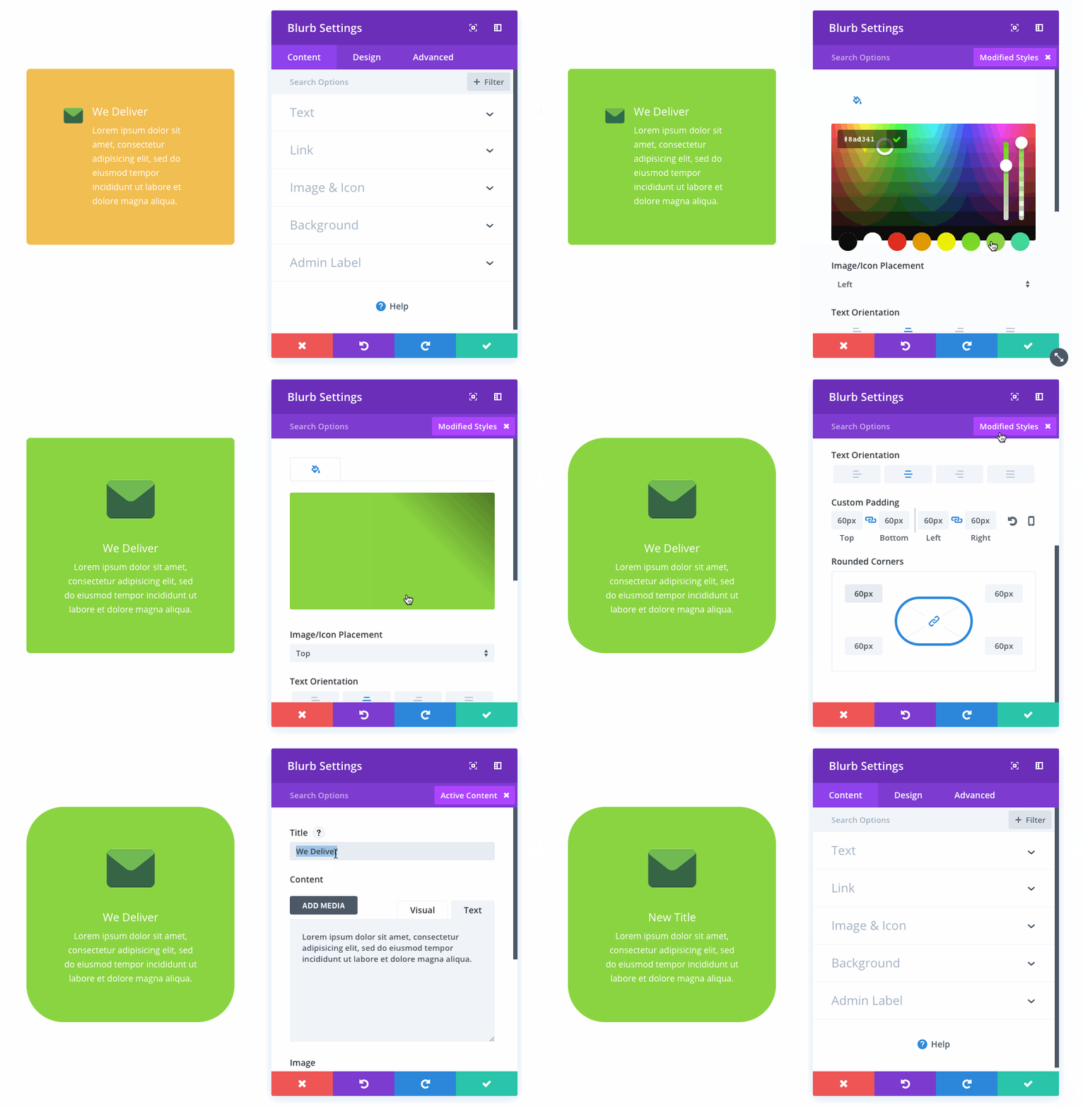
Much like Modified Styles, the Active Content filter will take you directly to all of the content that you have added to your module. If you want to change your Fullwidth Header’s title text, viewing Active Styles will take you directly to the content elements that are currently in use and remove the noise of the many unused content elements.
Combine Filters With Search Queries
Filters can be combined with search queries to hone in your results and locate settings even faster. If you filter by Modified Styles, but are greeted with a long list of active options, you can search through those options to narrow the results.
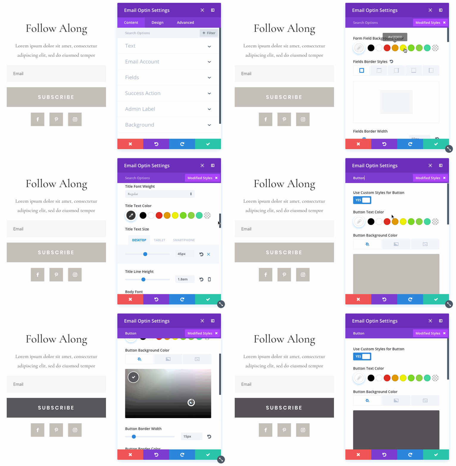
Right Click To View Modified Styles
We think that the Modified Styles filter is so incredibly useful, that we have added a shortcut to the builder’s Right Click menu so that it can be quickly accessed at any time. If you want to quickly locate and adjust active design settings, simply right click on any element and choose “View Modified Styles.” This will take you directly to your active settings.
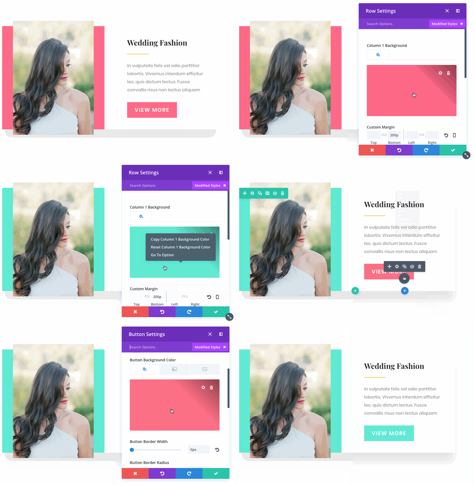
Quickly “Go To Option”
You can also quickly jump from search results to the design settings relevant to any option within the results. Simply right click on any setting and choose “Go To Option” to open the setting within its parent option group and display all relevant design options. If you have the Modified Styles filter active, but you want to view more styles relevant to a particular active style, simply right click and choose “Go To Option.”
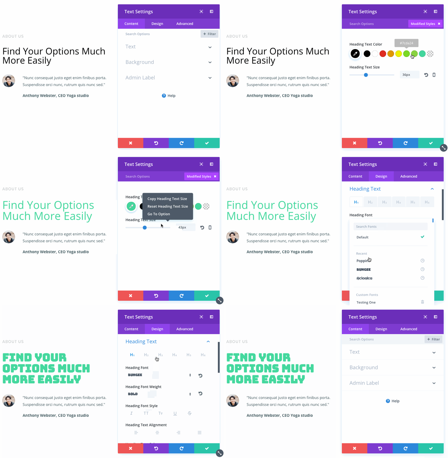
Edit Layout Packs With Ease
These new filters are especially useful when editing layout packs that you have recently downloaded, since you may not be familiar with how the layouts were created and which design and content options were used to achieve the custom results. If you want to change a color, but aren’t sure where to find the relevant design option, viewing the module’s modified styles will take you directly to a list of active colors and give you a clear picture of how the module was built.
![]()
“Modified Styles” And “Fluid Styles”
Are The Perfect Match
Using the Modified Styles filters along with the Fluid Styles copy and paste feature leads to ultimate design efficiency.
The Modified Styles filter, when combined with the Fluid Styles copy and paste functionality leads to ultimate design efficiency. Quickly locate, change and transfer styles throughout your design in a matter of seconds.
The new filtered options search is available today, so download Divi and take it for a spin. Let us know what you think in the comments and don’t forget to check back next week for even more great Divi features coming your way!
Get 10% Off Today!
Today's The Best Day To Get Divi Or Upgrade Your Account To Lifetime
Join the most enthusiastic and loving WordPress theme community on the web and download Divi today. Using the new Visual Builder, you can build websites faster than ever before with its incredibly fast and intuitive visual interface. You have to see it to believe it!
Join Today For 10% OFF!Renew Your Account Today For 10% OFF!Upgrade Your Account Today For 10% OFF!



Thank you. Just thank you!
Know what would really make a designer’s life easier… the ability to set a custom grid. I still don’t understand how this isn’t an option as the predefined grids are extremely limiting.
Oh and ability to align content using flexbox or css grid.
This is pretty standard stuff in other builders!
Huge is the right word, I don’t know if anyone else noticed. but divi builder became a little bit sluggish after the update. Nice update all the same.
Simply fantastic! Such a time saver!
Difficile de suivre les évolutions de DIVI depuis quelques semaines !…
Bravo et félicitations pour ces évolutions.
Nicely done. Great to see another handy feature being added to the DIVI system. thank you…
I’ve been in the Internet space for over 20 years and have worked with many CMS and web development tools. I have to say, y’all are the epitimy of Agile, rapid releases, innovation, and how to clearly and effectively communicate product changes to customers.
Continue providing value. We love it!
A loyal Diviist for sometime now 🙂 Congrats on all the recent 3.x improvements.
Suggestion for reducing the associated overhead while developing, specifically PHP processes, CPU and bandwidth. Using the Divi Builder on 1-2 pages with previews can kick off 6-7 PHP processes and max out basic hosting limited to 512MB mem and 1Mbit i/o.
OK – I’m pretty sure I’m going to LOVE these new features! Thanks for making DIVI so great that I now use it for ALL of my new websites.
Hi guys for your next update PLEASE consider adding more social icons to the footer and header without us adding extra code
Yes
You guys make it really easy to build custom websites for clients in no time whatsoever! Productivity to the max. Your focus on UX is incredible, part of the reason we only build with divi.
This is awesome, thank you!
Now please work on this in the visual builder
* faster rendering of 3th party shortcodes
* fix issues with saving content from 3th party shortcodes (save the shortcode and NOT it’s content)
* fix the no break line spaces that are randomly added by the VB
And improve the module customizer to give a real big boost to design efficiency.
Thanks!
The nb space issue gets my upvote
You guys are really making it too easy to build bespoke, custom sites for clients in no time at all! UX to the max. Keep it up guys.
I absolutely love this feature update. It’s a nice addition very much appreciated.
SHuuuuuuuuT the front door!!!… Stratospheric leaps ET, BRAVO!!!… The right hemisphere of my brain is in overdrive now!… VRRRROOOOOOM!!!
Fantastic! I’m just saying one thing: before, it took me 20 days to make a website, now just 2 days. Productivity at the highest level. Thank you for your work.
Thank you so much, Mr. Nick Roach, and for your brilliant team. I truly appreciate of your hard work.
Regards
Abhishek
ET may be slacking on addressing some of the more long-term issues like the Blog, Tabs, and Slider modules, but it is design changes like this that keep me around. Features like this show me that ET sees the importance of the user experience and gives me hope that older issues will eventually be addressed in a professional and well-thought-out way.
Now…if we could only eliminate the horrendous shortcode left behind when you uninstall the theme. 😉
Hi Geekcheck,
I am hoping that somebody over on the Gutenberg project will see the light and actually apply the concept of blocks to something sensible other than a re-invention of the editing experience (don’t get me wrong there are aspects of it that have merit, and many others that are horrendous).
What I mean is blocks being used as a standard for the page structure that everybody, theme and plugin can and should work with. The structure would reflect the box model structure of sections, rows, and columns for layout and would provide an API for builders to hook into for the provision of all the features such as those provided by Divi. It would be a lot of work for Elegant Themes to convert over but the end result would mean the end of the shortcode detritus we get if we ever need to switch to a different theme. For WordPress itself it would finally address the issue of switching themes in a more frictionless manner.
I would go so far as to say that Gutenberg itself should be a page and visual builder on the front end, albeit a rudimentary one for new users and basic starter themes. There is to much pretence in the Gutenberg camp that it is just a new editor for content creation and to this end the project is falling between two stools.
Nice but what’s up with Multisite Nick? Any future plans for the multisite users?
What about it? Is there something that does not work with Multisite?
@Eugene Kopich
I’m talking about the role editor portion of Divi.
Something along the lines having global role settings that can be controlled through the network admin area. Global settings that doesn’t affect the super admin role.
Let says I edit the Admin role to have specific settings and not give them full control of Divi. The issue for me is that even if I’m logged in as the super admin, once I go to one of the subsites to do work my super admin user gets ignored. It treats my account as an administrator.
I would have to toggle back on whatever options I turned off for the administrator user role in order for me to edit the subsite.
Hope this made some sense….?
You guys are just amazing. I have no word. A 100% Divi user for all my websites for 3 years now, I would never look elsewhere, and I hate any project where I need to go in a work with updates in another theme 😀 There is just no comparison! Thank you for making my job so much fun!
Fantastic! fewer click.. much time saved!
Nice to see more updates. But what about adding support for responsive images? SRCSET is a must for a modern website. Came out in WordPress core in 2015!
Currently, any Divi or Extra site is being killed performance wise in PageSpeed scores.
+1
Congrats Nicke and all the Divi Team!
Maybe some day we wil have news like these and new amazing layouts for Extra!
Cheers, Josel
As always, you are doing a great job. I’m not a web designer, I’m a doctor and I manage my site myself. I decided to start it from scratch, redrawing page by page. Divi has really spared me hours of work. I made the ‘lifetime’ subscription and recommend it to everyone. Very frequent updates, new designs to inspire us weekly, and the team is always creating new tools that make the creation process much easier and faster. It’s worth every penny! Congratulations to all the staff.
Amazing! Please add the search, filter and global select features to the backend.
Lots of folks have requested that they add the new features to the back end as well. They are, as Nick has pointed out, written on two different platforms. I’d imagine, therefore, that adding every new feature to the backend too probably significantly extends the project.
What I’m getting to is that I firmly believe they will be forced to choose front end editing over back end at some point. It just doesn’t seem like they’ll be able to effectively “double develop” every feature.
Just my opinion, and why I have spent the last year and a half living through the VB’s growing pains.
Once again, a nice addition to Divi, and I’m quite excited to know that dynamic content will be available in the near future.
I have one minor issue however. The Visual Builder is evolving at a fast pace, but there are more and more areas where translation is missing (or weird).
I work in France, and many people are not comfortable with English.
Why is the Divi Builder partially translated? Would it be possible to contribute to the translation? This is something we already do for some Open Source projects, so don’t hesitate to contact me.
+1
In Spanish they are a disaster too. We all work better with our native language, except with Divi. Personally I chose to change it to the original in English, because too much options are incomprehensible in its translated version into Spanish.
+1
Dutch translations have always been bad too. I have already asked ET over a year ago to let users contribute. I gave a few suggestions on how to do that, I have sent fixes for the most incorrect translations and nothing is done with it. All you get from support is to put it in the suggestion forum and it still sits there untouched.
Translations in French and Dutch are indeed very bad
This one goes along the previous update, which lets us control and copy current settings of an element to one another. The more I use ET, the more I can produce at the same time, the more I fall in love.
Thanks to the magic team
I guess this is a faster alternative for those not comfortable with css but so much easier, consistent and global with a style sheet. JMO.
I am so happy I started using Divi! You guys really are doing some awesome things!
I was kind of hoping we finally get the header/footer re-designing option update..
Something I would REALLY APPRECIATE is a change re: FONT SELECTION for all places where Divi font dropdowns appear (body and heading), reducing the current “crazy huge” list of 800 fonts to a selected subset of favorites.
To me, the prior set of 200 fonts was already more than I really want to see in a dropdown, thus adding 600 wasn’t something I really saw as an improvement (: although some may have appreciated that.
What would be better is to allow SELECTIVE ADDITION and DELETION of fonts – any Google Fonts and-or current 800 Divi fonts – to an initial installed base of a few dozen popular fonts.
To me, that would be a HUGE improvement because, project to project, I spend a lot of time scrolling thru the huge font list trying to find what I want. These changes are ones I and my students and clients would really appreciate!
a search option in fonts, or used fonts would be handy.
That already exists. You can search through fonts, and there is a list of recently used fonts in the Visual Builder 🙂
I think that we need a way to customize the tags “H” globally. Now we need to put the CSS manually on Theme Options and it is not nice.
+1
Not only has this been requested, they have committed to do it in a future release. Their dev team is well aware of short comings in the Theme Customizer.
Awesome update. Big time saver.
You guys Rock.
IMO this is more lipstick on a pig (a big bloated one at that). We still need API’s at the E.T. admin panel to be attached to url’s like they are in the rest of the world, so we can disable updates and sites from there for contractual reasons if it occurs, and we can also see which API’s belong to which sites. And hopefully we can “eventually” get to change the default “Projects” CPT to something else, or at least disable it. And please, a “Divi Lite” version. Still, lets keep focusing on “the precious”…
+1
Hi Al,
Thank you for your feedback! ?
Most of these updates, like this one, are addressing the Visual Builder and they have very little to no impact on your editing experience. It’s the same with updates that do apply, in part, to the front-end.
We have added countless improvements over the years and we are monitoring everything closely, constantly working on further improving all aspects of the Divi experience.
If you have a specific issue that you need assistance with you can open a ticket in our support forum and the team will be happy to assist.
+1
I hadn’t even thought of this option. It’s very nice to see it in action. I like the creative minds that are working on the theme, I honestly don’t think I could have come up with this easily. 🙂
Yes this is an area where Elegant Themes excels; clever UX/UI innovations that make working with the theme outpace other page-builders. Yes, I know, there are a lot of obvious things that should be in Divi but many are things that some of us can implement ourselves in a child theme.
Beautiful work. Thanks!
Love the new filters and some of the previous updates. The one feature of these updates I I may be missing is when I go to a particular module (iamge module of example) and make a style change and then copy the change, while on that page I can copy and paste the changes to any of the other image modules on the page. That is great! The one issue I see is that if I change pages, I can’t paste changes from the previous pages to any image modules.
Let me give you a real-world example. I have a new site that has many product images that are spread across many pages. When I go to a particular page and add border and border color with a shadow, I can only copy and paste those settings on that page.
question is, and I may be missing this, but I can’t seem to find a way to save these changes so as to use them on other pages on the site without going to a new page and creating the same look over again and then applying the changes.
Any thoughts on how to save individual changes across the site so you can use modified changes/styles across multiple pages? This certainly may not be available and may be a future update.
Thanks for any suggestions or comments.
The only thing you can paste between pages (open in different browser tabs) are whole sections, row or modules and only through the back end. Being able to copy styles this way, backend or frontend would be a boon.
Another, but probably a big ask, would be the option to open the settings panel in a separate window, much like how you can do with Chrome when you use the Inspector. Would be useful where you have a second monitor.
+1 I too would like to copy between pages as I work with two monitors all the time.
This looks really great. I think it will make things easier.
Wow.
I just did a ten page plus site makeover in an afternoon using this updated version.
Not beautiful, but way better than it was and my client is absolutely thrilled.
He has a complete new look site for 5 hours of work…
Divi makes this job so much fun. Anyone remember how awful all those old fixed themes were? Remember the hassle when a client told you they didn’t want such a deep header, or the map above the form on a contact page?
I was an early-ish adopter, been here over 4 years for sure, maybe 5. With the exception of 2 sites, I haven’t used another theme since.
I just love it when a client comes along with a theme they love, that costs like $100 and you can just say, ‘Yeah, I’ll make you something that looks just like that, no need to buy the theme’.
Have won business several times with exactly that approach.
Every update seems to be more impressive than the last! Why isn’t everyone a lifetime member?! Seriously great value and support. Thanks Elegant Themes Team!
Wish I could log in to Elegant Themes and not have to put my information in every time i want to comment. Great updates here but I rarely comment due to the process. Wrong spot I’m sure but will there be, some day, a way to have Divi be responsive without using media queries? Most every Divi website I build goes smoothly but every Divi build takes hours to be responsive on all devices. Seems it’s always 1366 that the issues occur.
Hi Bobby!
You can tick “Save my name, email, and website in this browser for the next time I comment.” and the information will be saved.
I’m sorry to hear that. We are not aware of any issues that occur on that breakpoint. Could you open a ticket in our forum with more details about your issue? The support team will be happy to take a look. Thanks! ?
Great stuff. I can’t help but wonder when the headers will include Schema markup though. Is this on the to do list?
Another update for the Divi Builder, well… what about the Divi Theme 😉
Header builder
Footer builder
….
Hi Walter! ?
The Theme Builder is in the works actually. ? In case you missed our sneak peek video you can check it out on the following link.
https://www.elegantthemes.com/blog/theme-sneak-peeks/divi-feature-sneak-peek-the-divi-theme-builder
Great to hear that Vlad. Divi is awesome but we desperately need more flexibility with header, something like they have on Be Theme or Avada.
Can’t speak to Be Theme, but Divi simply blows Arvada away in totality. If you wish to focus on one area, headers and footers is a weakness of Divi. But the entire tool is far, far superior to Arvada.
no.. DIVI is good but does definitely not blow the Be Theme away…
Hi Nick, et all, this is a wonderful function and one that will save a lot of time for many of us along with the other recent updates over the couple of months, but we need the facility to update, change and style the divi header and footer, among other core improvements. I for one sit tenaciously awaiting the news when this will be part of an update. I know it’s in the pipeline but the development team must know what the timescale is.
Sorry for sounding negative, I truly appreciate all this functionality and constant updates!
Hey Jon,
Thank you for your feedback!
These updates are intended to bring us closer to that goal. The team is hard at work, we just need time to paint the full picture. ?
+1 Yah been waiting on those myself!!!
+1
A great update and I appreciate the focus on workflow efficiency; time is indeed money.
Was wondering how this will dovetail with the (hopefully/promised) upcoming release of global type styling.
Will there be a ‘notification’ if the styling was done at a global vs. local level?
Hope I am making some sense here.
Been playing with this update on a test site and it is very clever, intuitive and efficient.
Cool adition
Heads up, If you don’t check the option for Save my name, email, and website in this browser for the next time I comment, you may not see your comments.
Not sure if that is a bug?
These workflow improvements are so exciting to discover, they make web development more fun and more effective. Divi is becoming so amazing it has become my hammer and everywhere I look are nails LoL!
Just been playing with this on a test site and it is super intuitive and efficient.
A very good addition.
R.I.P. backend builder. 🙁
Hey Jon. Feel your pain. I mainly use the front end now but understand if your workflow is grounded in the backend.
I do use the backend builder myself for certain use cases. In others no Divi at all, where I am using Toolset views to build a singular template with Divi, applied to a custom post type site wide. All the user will see is a typical backend WP form to fill and in some cases none as the information is gathered from other CPTs and views.
I am guessing that the backend doesn’t get much love these days is down to the impending arrival of Gutenbergagedon. Either Divi will move away from the back end completely or ET are waiting to see how best to integrate with Gutenberg once its any way fully baked. Interestingly both Gutenberg and Divi (on the front end) are built with React so there may be opportunities there down the line.
Like anything new Gutenberg has its merits, some things are cool but unfortunately in many other aspects is pretty disruptive and much potential of what it could do for basic structuring of content is, I fear, possibly being overlooked.
Looking at the recent update since 3.1, the developers review, feature updates are moving through the numbers, 3.2 to 3.5 quite quickly. My hunch is that all the sneak peaks may arrive all at once in the form of Divi 4.
I use the backend builder exclusively. Why? Because I do most of my style changes in the child theme files, not in divi’s built in code blocks or modules. This allows the site to scale and be edited later in a much faster way. I would love to use the visual builder, but in many cases is handles child theme css horribly. It will either ignore the style or it will mess it up. It’s hard cause I see so many other high end divi devs using custom child theme changes as well. What’s our option if we are forced to go visual but the visual does not play nice with custom css?
+1 on this. While the visual builder has come a long way, I still found myself more comfortable working in the backend and using a child css to modify. (Occasionally I’ll use the visual builder for tweaks) It’s easier to diagnose issues when everything is in a single file versus having css mods all over the place. (Also, the css box in the modules doesn’t seem to allow for @media queries, which is needed since Divi’s options are too broad with their screen break rules.)
For us it’s definitely not one or the other. We use child theme style sheets as a matter of policy, we tend to develop the raw page design in the backend, and now always finish the dev in the VB.
Have not see significant issues with the VB rendering custom CSS; in fact, my biggest heartburn is how long it takes to load shortcode-based things like forms.
R.I.P. vinyl records.
R.I.P. 2G cell phones.
R.I.P. candles.
The list could go on…
🙂
U.S. Vinyl Album Sales Hit Nielsen Music-Era Record High in 2017 though. That is what Billboard reported.
Brilliant!!
Awesome. Great. Smooth. So intuitive you think it must have been there from the beginning.
I suggest that the theme be optimized rather than visualized, and the theme is not perfect in many places.
Great job. This is going to make life so much easier and so much more efficient.
These options are amazing. But please consider extra modules to be used in DIVI builder
Seriously? With something like 45 modules available, there’s something else you want?
Hard to believe, but if you really want more modules, I’d think that being specific would be a great start.
Yes, but it’s obviously those modules, only available in Extra that they want.
Absolutely love everything you’re doing. Would really appreciate some attention to new blog layouts – long overdue.
I think they may address it at some point of time. We have so many other all important update coming like Dynamic content, color pallets, columns, Theme builder, etc…
You are right, the awesome team puts huge amount of time to improve features insted of to add more functionality, like responsive section height
beautiful idea…thank you!
This is more than awesome, now I can find in seconds how you guys did your free layouts (took a while before :). Thank you again.
That is the best thing with this update.
+1
+1
This is going to save so much time! Well done team
awww I thought this was it, our spank new theme builder.. Hopefully next week!
#nooffense, I can only guess the huge amount of work behind each update, but most of us await desperately the theme builder with custom post design enable for woocommerce products and archive pages. Better not put anymore feature update until you release the theme builder update. You are just deepening our misery. Thanks!
+1
10,000 Active Divi Developers are waiting for a blog, woocommerce and archive styles for 7 years. Nothing done!!!
Two days ago we’ve tried to integrate a new Instagram icon to footer and header. It took ONE hour of work of 2 developers from our side and one guy of a support team. Everything conflicts with everything inside a theme.
And again an update brings a foolish improvement that can save (MAYBE!) few seconds of your working time.
You are serious? TWO HOURS for an icon to implemet? Must be really bad developer, sorry…
Is cool! 🙂
Thanks, Team Elegant Themes!
U guys making my job wayyyy to easy 🙂
Each update is – WOW! You guys are amazing. I feel like I’m stealing from
Elegant Themes because I bought a lifetime membership a couple years ago and the functionality has increased 10x since then! Very impressive update!!!!
This is freakin’ awesome. I can’t wait to use the filters.
I’ll update my Divi now 🙂
Am I the only one who didn’t understand what is this update about?
Karen, you’ve got it!!!!
Basically, when you’re looking at the site in preview mode, you can right click on page elements and see contextual design settings, tweak them, and see how it looks immediately. Also, you can copy the color off, say, a button, and apply it to a headline in a box feature on the site, for example. There’s more, but that’ll make tweaking the visual look quicker and more intuitive.
I’m having a hard time as well.
I feel a lot better now! When this was released, I read the post and had no idea what it was either!
It’s like Search. But for the properties of an element you’re currently editing.
At first I didn’t understand, but then I read it.
The use cases are subtle:
1) you open a module and want to see only those design settings that are modified (Modified Styles)
2) you open a module and want to see only the content you’ve ‘typed/attached’ (Active Content)
3) you use the “modified styles” filter AND you use a query string “Button” in the search, which hides all other settings for that module, you can quickly reveal all the other settings again by selecting “Go To Option”
Emilio, this is gold. THANK YOU!!
I had to read carefully to be fully cognisant of what the new feature does. It’s one of those hard to explain/describe features (like explaining to your grandmother what FTP means) but once you get it it makes sense and becomes indispensable once mastered.
Nice addition.
It basically filters down the elements that were modified in each section/row/module settings. This way you don’t have to scroll through all the option to get to that one element you just want to make changes. Hope makes sense.
All these updates are awesome lately! Nice work!
Yet another super cool feature from ET… Thanks team. Keep up the really good work. You’re changing the history and defining the future of WordPess. ?? ???
More great stuff! Appreciate the continuous cool work you all do!
?