![]()
Introducing The Latest Visual Builder
Interface Enhancements
Divi 3.2 brings various enhancements to the Visual Builder interface that will speed up your design workflow.
Today, Divi’s Visual Builder gets even faster and more intuitive thanks to a collection of really awesome interface improvements that will greatly enhance your website building experience. While developing Divi as a web design tool, we look for every opportunity to improve the way you interact with the content on your page and to enhance your creative process. Today’s new features do just that!
![]()
Improve Your Web Design Workflow
We love making Divi faster and easier to use, and today’s update comes packed with great interface improvements that will enhance your building experience.
Fine Tuned Unit Adjustment
One of the main setting types in the Visual Builder is the range slider. Ranges sliders are great for making sweeping adjustments to text sizes and module widths, but sometimes it can be a challenge for your mouse to land on that pixel perfect value. Now all range slider inputs come with clickable arrows that can be used to make fine tuned adjustments. Each click will increase or decrease the value by a single unit or decimal point, allowing you to navigate the range with precision. You can also click and hold down on the arrows and your value will continue to increase or decrease. The longer you hold down your mouse button, the faster the units change!

Adjust Values Using Arrow Keys
Whenever you click into a numerical input field, you can now use your keyboard’s arrow keys to increase and decrease the value. This allows you to make fine tuned adjustments without using your mouse at all. You can use your tab key to navigate through the options panel and your arrow keys to adjust values. A single click of the arrow keys will change values by 1 unit. However, you can also hold shift while clicking the arrow keys to adjust by 10 unit increments. This makes it quick and easy to reach your desired value. You can also hold down arrow keys to steadily increase values at a steadily increasing speed.

Gesture Based Unit Control
All numerical inputs now have a gesture based control mechanism that you can use to slide values up and down with the swipe of your mouse. Things brings range slider functionality to all standard input fields, and this new method of interaction really lends itself well to the visual nature of the Visual Builder. You will find this new control mechanism on settings like padding and margin, as well as border radius.

Linked Spacing Values
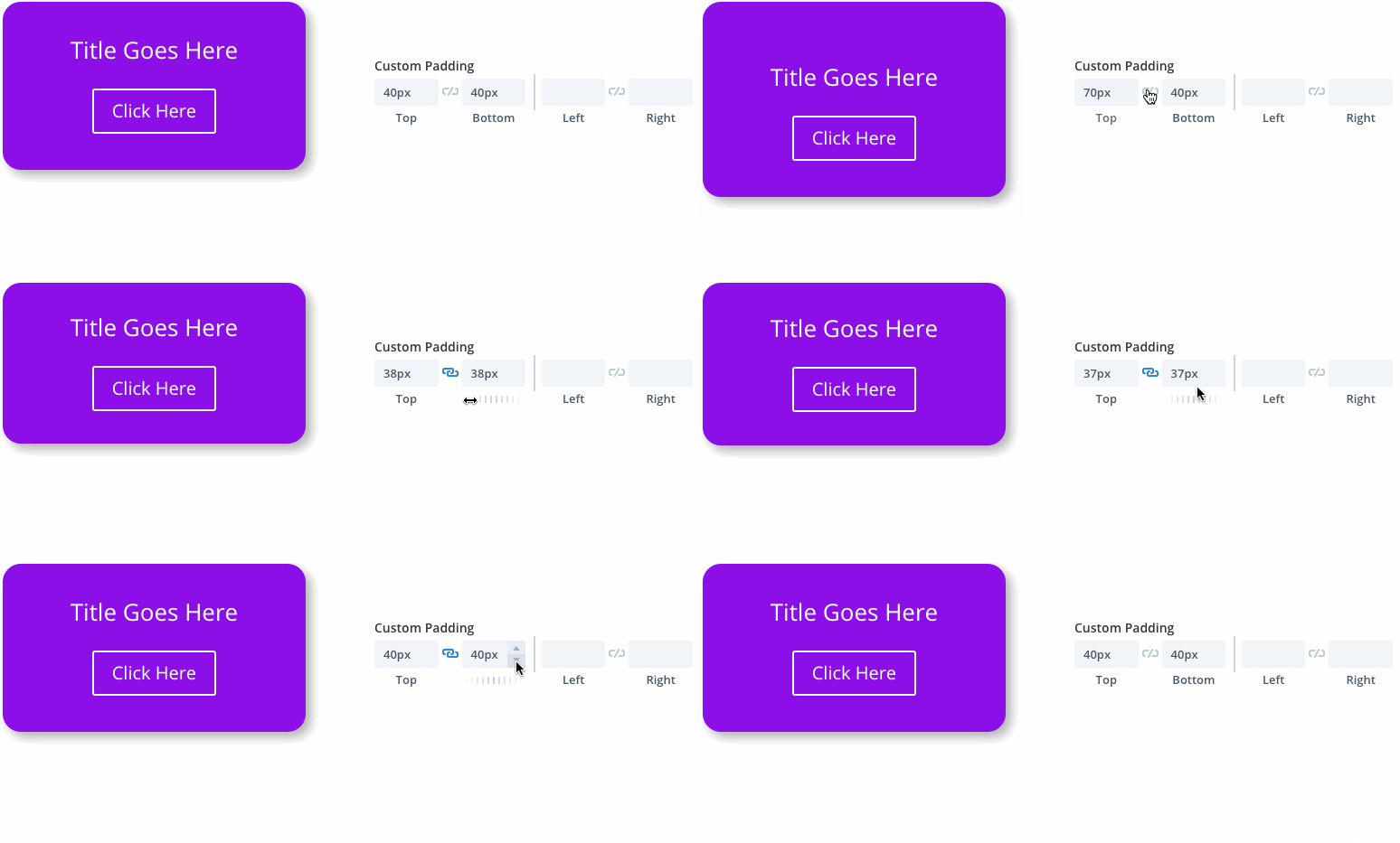
Padding and margin values within each module can now be linked together. Once two values have been linked, adjusting one value will automatically adjust the paired value, keeping the two in sync. This makes it easier to keep the spacing of each element on your page uniform. Unit sync can be enabled within the settings modal as well as within the live draggable padding interface.
New & Improved Color Picker
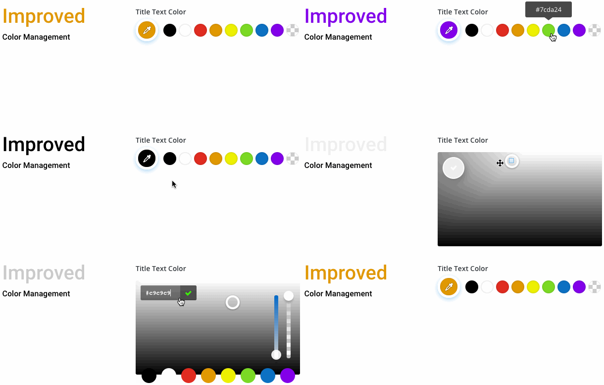
We love making changes that save you time and reduce clicks. All color settings in the Visual Builder have been improved to make your website’s color palette more easily accessible. This color palette can be customized within the Divi Theme Options and all of your favorite colors will be just one click away. No need to open the color picker to access your saved colors.
Visual Previews For Media Inputs
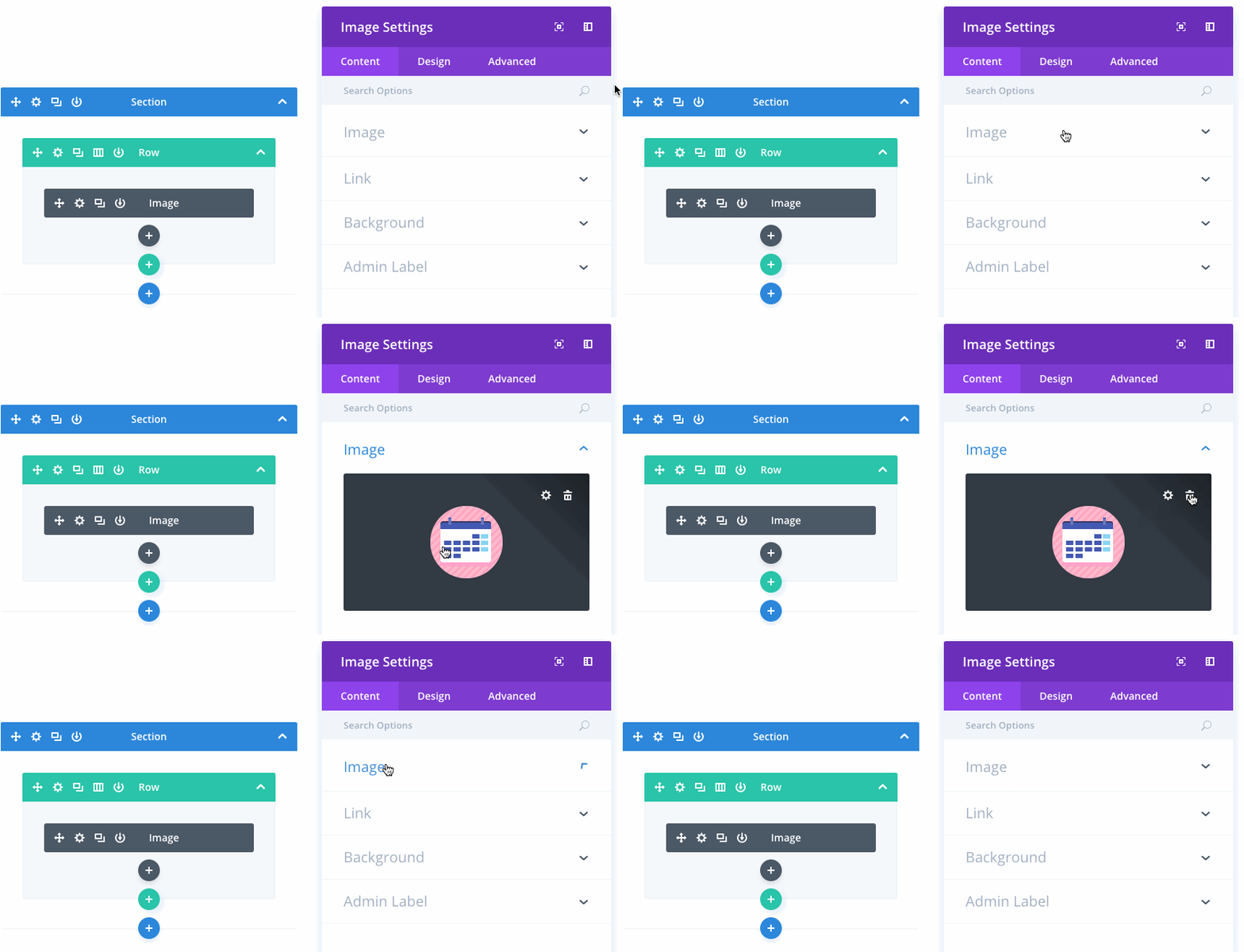
The visual nature of many options have been further embraced to make those options more clear and the modification of those options more intuitive. All image and video inputs will now render a live preview of the file within the settings modal, which is especially useful when editing the page in Wireframe mode.
Better Gallery Management
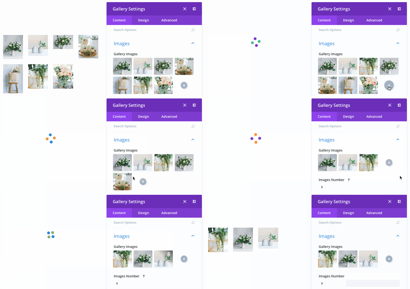
Editing galleries in the builder has been greatly improved. A live interactive preview of your gallery will now be rendered in the settings modal. Using this new interface, images can be added, removed and re-arranged without entering the media library.
Quicker Prototyping
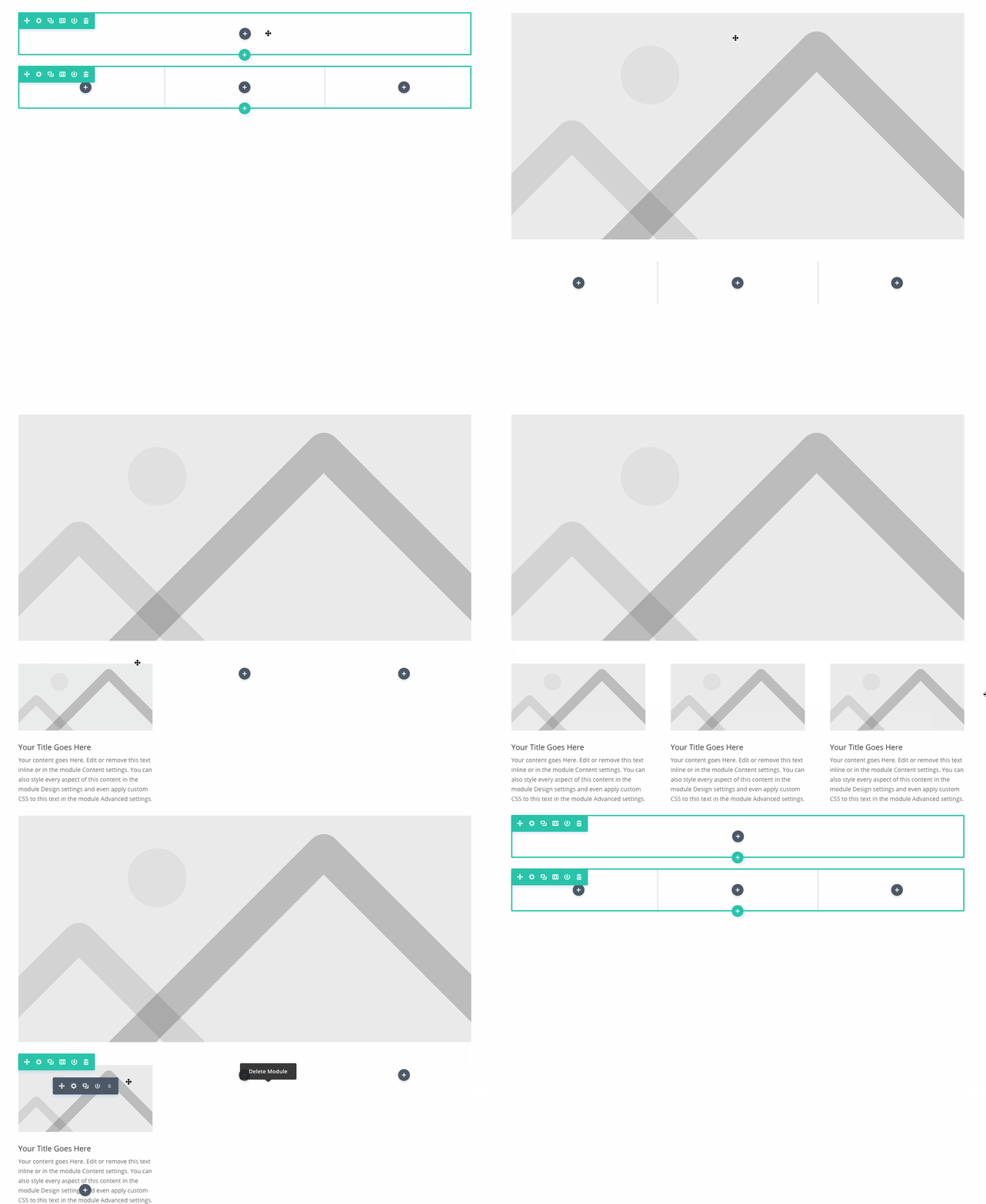
When adding elements to the Visual Builder while in visual editing mode, modules will now be pre-filled with a minimal amount of content so that the module can be rendered visibly on the page right away. This allows all relevant design settings to become usable as soon as a module is added. We think this really improves the design flow of the Visual Builder, and also makes it easier to understand how modules work for new Divi users. Don’t worry, this option can be easily disabled in the Visual Builder interface. It’s also disabled by default in the classic Divi Builder and when using the Visual Builder in Wireframe Mode.
Improved Option Clarity
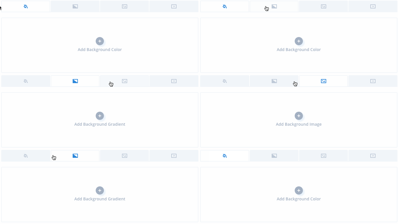
Clarification has been added to various settings, including all media inputs. This makes each setting easier to understand, especially for new users. We realize that sometimes icons alone can be confusing, and in these cases the added text helps to clear things up.
Inline Spell Checking

You will be happy to hear that browser-based spell checking has been added to content options in the Visual Builder settings modal. Spell check will also work when using the inline editor to edit text on the page. As soon as you click to edit any text on your page, misspelled words will be underlined in red.
Improved Module Default Settings
Every Divi module comes with some default colors and text sizes. For the most part these defaults were uniform throughout all Divi modules. A few modules, however, had some strange default values that simply didn’t make sense. We went through all modules and fixed these outliers. For example, testimonial modules will no longer have unreadable light text by default. Slider modules will no longer have white background colors by default, and all modules with background colors have been updated to inherit the theme accent color by default.
![]()
A Better Versioning System
Starting with Divi 3.2, a new versioning system has been put in place that will give you more information about what each update entails.
You will notice that with today’s update, Divi has been bumped to version 3.2. Since it took us over a year to get from 3.0 to 3.1, this jump might come as a surprise to many. Divi 3.2 is the first update to use our new versioning system. This new system does a better job taking into account the content of each update and assigning a version number that represents the size of the change. Moving forward, all Elegant Themes product versions will adhere to the following formula:
- X.0 (For example, 3.0) – Whole number version changes, such as a move from 3.0 to 4.0, will be reserved for massive product evolutions. You might see an update like this once per year.
- X.X (For example, 3.2) – First decimal version changes, such as today’s update from 3.1 to 3.2, are reserved for small or moderate feature updates. You can expect new feature updates like this every week or so.
- X.X.X (For example, 3.2.1) – Second decimal version changes are reserved for critical bug fixes that may need to be released between minor feature updates. If you see a third decimal update available for your current version, it’s probably a good idea to upgrade!
This new system makes each update version much more informative, and gives you a better idea as to what might have changed between the version you are using and the latest available version.
The new interface improvements are available today, so download Divi and take them for a spin. Let us know what you think in the comments and don’t forget to check back next week for even more great Divi features coming your way.
Get 10% Off Today!
Today's The Best Day To Get Divi Or Upgrade Your Account To Lifetime
Join the most enthusiastic and loving WordPress theme community on the web and download Divi today. Using the new Visual Builder, you can build websites faster than ever before with its incredibly fast and intuitive visual interface. You have to see it to believe it!
Join Today For 10% OFF!Renew Your Account Today For 10% OFF!Upgrade Your Account Today For 10% OFF!



Great additions to speed up design timeline.
Can you add these to the backend design functions too? I’m an old fashioned back end designer, and would love to be able to scroll and lock together the margins and padding in the backend tools.
This is the best update so far, to a fantastic product. Thank you.
Specifically, the spell check function is a life-saver!
Great as always, but need some improvement on translations.
When will we see an update so the the new improved color picker shows my own defined colors?
Thanks for the new features
1. new versioning system: Why won’t you add the version # to the zip filename of all your products?
e.g. Divi_v3.2 this would help a lot to all of us.
2. Quicker Prototyping: Will you please allow for this valuable feature picking languages other than EN and also of RTL languages (with RTL and right alignment).
Thanks
I noticed that Divi makes inconsistent use of units like mixing px, % and em.
For a theme that needs to be responsive, it would be a big step forward to make consistent use of relative units.
This is responsive design fundamentals:
„A key concept behind responsive design is fluidity and proportionality as opposed to fixed width layouts. Using relative units for measurements can help simplify layouts and prevent accidental creation of components that are too big for the viewport.“
Source: https://developers.google.com/web/fundamentals/design-and-ux/responsive/#use_relative_units
I would not mind if Divi breaks or forks a version that has a cleaner CSS code base and a UI reflecting these changes. Divi updates always break something anyway, so at least it would be for a good cause.
NO NO!!! Why me? So far none of these features work on 3 of my DIVI sites I tried it on.
I cannot edit the settings as shown. For example, when I click to edit a module, all I get is a little blurb saying “Module Settings”. But no settings appear.
Any ideas?
Well done guys good job.
But I still think Divi is lagging behind in many areas. I have suggested few things, it’s been almost a year. I would love to see these changes am sure most of you might as well. Come on Divi team buckle up… Why don’t you guys create a lib that would allow us to choose certain feature that we would like to apply and customise (e.g. menus)
https://www.elegantthemes.com/forum/viewtopic.php?f=22&t=726804&p=3988514#p3988514
The audio of the video voice could be improved a lot. He sounds like he is in a rain barrel. A great clip on cardioid condenser mic that goes to a small mixer that can be EQed to take just a little low end out and help with the hollow sound might be a great low cost investment. Boom mics and camera shotgun mics are not the best for sound quality in an environment that has a lot of background reverberant sound qualities. The lighting and video quality are great and the audio should match. I would be happy to talk further if you have any additional questions on these topics. I have worked as a sound and lighting person on tour and studio’s for over 30 years.
Divi is the best…no 1 in the list of top 10 best wordpress theme
Great! those are great improvements. I would like to ask more Shop module improvements so it is more Woocommerce friendly and better integrated with for example filters, product design, breadcrumb, widgets, related products, and so on, with the design capability of Divi. Keep the great work! congrats to the whole team!
[apparently my comment didn’t post]
Great additions, thank you!! I really like the placeholder content. Great for wireframing out a page.
Gallery is a huge time saver!
On the color palette, can you also give space for name? Graphics will provide color, hexadecimal and RGBa, but also a name. CTA Background. Anchor, Anchor Hover, Blog Title.
I would LOVE to see the Theme Options to have H1-H6, a, a:hover [size, color, font face, weight, etc.] so these can be set globally! With ALL the features of Divi and VB, it’s hard to believe that something done so often is not automated. Add in mobile styles and you saved quite a bit of work.
Have ability to link color to the color palette so if that changes, so will the style. Give an indication in the palette as to which elements that color is linked to.
While your reading… can you make setting to turn off ‘suggested videos’ in YouTube videos? I have to embed to do this, but I much rather use the module.
Thanks for all the hard work and listening!
These updates are just a few weeks late 😉 I’ve been working on a big project where I would have loved some of these features.
Keep up the good work. One thing I’d love to see in the future is improved switching from desktop to mobile in the visual builder.
The visual builder is now showing BLANK units for my margins and paddings. How is this an improvement?
I can see them when I go into the backend, but not in the visual builder
I hope you will give us a beta test
I love this updates.
hopefully you can add more functional feature in the future.
goodluck Divi 😀
Awesome. Particularly loving the prototyping, what a difference it makes!!
Love it, thanks ET.
Wow. Very impressive. Thank you for making these features.
Great, another update for the Divi Builder.
But… what about the Divi Theme, I mean the options for the theme, like header, footer…
+1
+1
Thank you. Great update.
One small issue after the update: A Padding (Top) definition for a row of 0px is now changed to 0. No px after the number. After entering (0)px it works again. When 0 is ignored, all rows, which sticks to top of a section, get the standard padding (4%).
I’m having padding issues too! Glad I’m not crazy
Great, update. Now I do not need to add my own place holders or copy and paste lorem ipsum.
I think a long overdue update is flexible column adjustments, options for more than 4 columns with options to custom size each. Im pretty sure im not the only member here that has asked for this…
Otherwise great updates thus far! keep up the great work!
+1 That would be geat
Thanks for such amazing improvements. 🙂
Encore une fois BRAVO !
Depuis un an que j’ai découvert DIVI c’est un réel plaisir de concevoir des sites web pour mes amis et relations.
Excellent. Well done 🙂
Great update, especially the colourpart.
I hope the spell checker isn’t enabled by default though or that you can turn it off easily.
We never use spell checkers and it’s extremely annoying to see those red lines everywhere (we use english for the WP interface, but make websites in different languages).
`Looks good but why oh why can we not have the extra blog modules brought into DIvi – just needing some practicalities round here for us who actually use Divi as a blog
After the update 3.2, the visual builder does not open on any site. only white screen.
WOW! Awesome improvements & finally you are using right version system. Really like the wireframing feature, life saver!
Well thanks, regarding the new color picker – what happened to my custom colors I set in the Divi control panel. I can’t see them on my modules. Thats not good! 🙁
aaaargh! I never compliment people but Nick is a rock star in the WordPress world…
every improvement is beyond our needs! it’s like the Jordan or Ronaldo of web design 🙂
You guys rock ! I am so greatful to have found Divi. Your theme is awesome, your pricing is really unmatched and the support is outstanding ! Thank you !
Thank you for making these features available to us.
looks good, with my pick of the bunch for usefulness to me being the content placeholder 🙂
Keep up the awesome work! I love developing in Divi … and my clients absolutely love the ease of managing their sites with Divi.
Amazing features for next divi development!
But i still waiting, when divi has category builder features like extra magazine wpthemes?
Thank you so much for amazing themes and update.
Great update !
What i really love to have is the ability to build column grid freely. At this moment, there’s only limited predefined grid. Of course, we can do it through CSS. But some other builder able to make it out of the box like Elementor (Drag and Drop) or Visual Composer (through math pattern: 1/5+1/5+3/5).
Hope this is something ET Tram considers as well
I second that wish!!
As always great improvements. My fave this time is the pre-loaded content, really allows for even quicker build times.
Massive thanks to you all for your hard work on continually improving an already fantastic Theme builder.
Investing in the Elegant Themes lifetime membership is without a dought one of my all-time best purchases/investments for my design business.
The placeholder function just made my day, no wait – my month!
These are the types of updates i like seeing most. Thx guys, Kudos & keep up the gr8 work.
I am brand new to website building, and obviously Divi. I love the improvements and can not wait to dive in and learn more. I am glad I chose the lifetime access. Thank you.
@Nick… Whilst i think your implementation of better versioning was needed, there was a statement about your incremental updates that I need clarification on.
3.1 -> 3.2 is an incremental you mention this can update every week… that is 52 updates a year, maybe my math is bad but how are you going to fit 52 increments in the 3.x range once you get to 3.9?
Are you planning on going to 3.10, 3.11 all the way up to a possible 3.52?
What will happen to the minor updates in this case 3.52.1?
Going by what WP does there is no such thing past 3.9 range, after 3.9 will be version 4.
I would actually prefer you follow the way WP is doing it now. 4.7 -> 4.8 is a major update 4.8.1 is the minor update (security fix)
On the Flip Side the same people behind WordPress are going up by .1 for every single release of Gutenberg.
This update added extra spacing where all of my text modules are and everything looks like garbage now.
Wow, great improvement. Thanks Elegant Themes..
The padding cursor is genius! : D
It would be nice to adjust values using mouse wheel while hovering the target input field. And also using the same shift modifier. This is my preferred way of adjusting values.
Have you heard that Apple pushed the pause button because with all the new functions they introduced the more bugs introduced and it came to point that users were suffering.
Just a thought…
This update addresses some of the issues I have had, like setting a font size with the sliders. Too often I just had to type it, which did not contribute to an efficient workflow.
Looks great! Now what about Multisite compatibility?
Great improvements.. thanks 🙂
Very nice. Great improvements. Another wonderful update!
Please do not forget:
– More fields for Form (Ex. date and upload file)
– Entrys Form in database and can export to csv
– Builder for header
– The columns update
– Visual builder for Woocommerce (Single page products)
– Animation text (Ex. Typing Effect)
– On-hover animation
Again, thanks for making the world easy!
Please, Visual builder for Woocommerce / Single page products/,
Thanks,
YES Please!
exact!
+1
Very cool!
Sweet!
Cool, especially linked spacing values and the spellcheck.
nice !! now we need a header builder and it’s perfect.
Thanks, these are the features I didn’t know I needed.
Thank you so much for all your hard work!
Nice. But I’m wondering why you cannot make the toolbar in the VB text editor sticky? It is so annoying with longer texts to always scroll up and down. And the sroll bar is rather thin as well.
The glitchy scroll bar problem needs fixed for once. Long time overdue bug.
Hi,
Great improvements.
I just get impressed with all the new things you are making all the time.
congratulations!
regards,
Gaby
I have sell more than 700 divi courses online in spanish. I have a Divi Youtube channel with more than 60.000 views and more than 400 students and a Divi Facebook group in spanish with almost 2000 divi lovers and I am a bit sad today.
Too many updates for us. You are killing the online Divi courses.
I love Divi and I updated my course last week and now I have to record everything againg.
It is almost imposible to have a Divi course updated.
I would like to have information of the updates before. At least the teachers with so many students or to have Divi updates all together every six months or something like that.
Teachers like me advise to many people to use Divi so I think you should to try to help us.
Thanks in advance from Spain
This is my site http://www.cursowp-online.com
Gonzalo
Errrr, how can you blame Divi for keeping its product up to date, it is not their fault your trying to make money out of it by selling courses, i recommend you only update your course with major updates if minor updates are killing you.
Hi Mitch
I’ll do that. thank you for your suggestion.
I do not blame Divi. I love divi and in my YouTube channel I have hundreds of videos where I defend it. In fact in Spain and Latin America many know me as a divi specialist. in fact it is more an idea because in online training it is a very important market that also reveals Divi and all its wonderful advantages. I was just trying to propose a formula so that the updates are more orderly and benefit everyone: users, students, freelances and teachers.
a hug
Totally agree, the new version numbers don’t help at all since there’s no way to pick between updates. Either you take everything or nothing.
Assuming they even bother with version numbers – I see another version-less hotfix in the downloads. I don’t know what ET has against proper software development practices, but they sure seem adamant about their position… :/
ok so i love the new uppdate but i have one small issue? i cannot add modules or adjust any modules or even content in the front end? i can sort of do it in the back end, but i cannot access all the optinos? anyone else have this issue?
Wow – some really nice enhancements to a very nice build which will definately speed my workflow. What I would really like you guys to do is come out with a builder for both headers and footers just like THEMECO has with PRO
I Love Divi! Nice improvement would be, when the editor is enabled, to move the dialog to a second screen.
Small enhancements like this much appreciated.
Cheers again.
Have had a go, on the back of last weeks update, at making a module. Just the sample in the tutorials. Everything works well but need to do some more research in how it all works.
Tried adding the advanced fields for setting the font for the header using the sample in the documentation but. was seeing adjustments in css being applied to the settings interface and even the footer. Hacked around a bit more and solved that but the module seems to behave as if it has global setting i.e. make module with Header, large font size, colour -> orange. Make another and it has the same settings. Adjust that one, the first module follows suit.
Obviously I have a bit more learning to do, so looking out for some extra docs/tutorials on Elegant Themes site or elsewhere.
And those Hooks? How do we do with those? Can we hook in divi sections saved in the library?
Nick, is there any way to send feature suggestions / possible bug to the development team?
they have both the suggestions area and a way to open problem tickets on their site…
Thanks Patrick.
I’m a regular support user.
I’ve been a Divi member for a couple of years but never found a suggestions area!
Great, i am always happy to see the upgrades, i am grateful. Thank you so much.
A great set of enhancements and refinements. Good work Divi team!
Does this new update work on the Divi builder as well as the Divi theme?
Hey John,
Yes, as always, any update to the Divi Builder will be available for Divi, Extra and the Divi Builder plugin.
Hi Nick,
Good job, Divi Divi becomes more and more intuitive and complete, now I use only it !
I might be the pickiest Divi user. I love these improvements and I am very happy that the team seems to be working fast to constantly improve Divi. I used the Visual Builder the other day and was happy to see that it’s improved a lot since I last used it. It’s still a little buggy but it’s a lot better.
Issues:
When I have a global section, I am always prompted that I am leaving the page regardless of how many times I update. I’d like to have shortcodes for menus so I can use them in my own footers. Icons could be easier to add—unless I just don’t get it. Image attributes should be picked up from Media Gallery and modifiable…Yoast SEO doesn’t play nice with Divi, is there another option?
Thank you, Nick. I’m very happy to be a relatively early adopter and lifer!
Chris
Hey Chris,
Thank you for your feedback! ?
We are looking into the global module prompt issue. Sorry for the trouble.
You can use the Fullwidth Navigation module to add a navigation menu anywhere in your page content.
We are also looking for a way to have the image alternative and title text included automatically, possibly as an editable default as you suggested.
For SEO there are other options like All In One SEO Pack. If you have a specific issue with Yoast SEO you can open a ticket in our forum and we will be happy to take a look.
“… The fullwidth navigation menu . . .” Wow! I’ll try that. If it REALLY works, then I’ve (you’ve) solved my problem. Thanks!
Now if I could only get the menu from the attachment page of the post page to disappear!
Love Divi so much. Been using it for a year now and it’s gotten 1000% better in that time. Using divi is like getting a present every week. Like I almost feel bad that I only paid the lifetime thing ONCE and you just KEEP giving me stuff. I’ve never experienced any piece of software like that. I suppose Sketch is a distant second with the amount they give as well. Anyways, you guys are rad as cuss.
Yet another amazing update to Divi. Already updating all my sites. Just amazing
Tema Divi + Divi builder + Bloom + Monarch. Combinação simplesmente espetacular!!!
Wow wow wow! Things are much getting easier everyday! Great job ET team. Thanks Nick for these awesome updates.
How about implementing global settings like headers h1-h6 etc. via WP customizer controls, so that these can be overwritten in individual modules, sections, pages etc. on a need-basis?
Divi Children by divi4u does just this. The child theme plugin is free, tutorials are fantastic. NOt an affiliate, don’t work for them. Just a fan. They easily accomplished what we’ve been asking for from divi developers for a while now. https://divi4u.com/divi-children-plugin/
Thank you for your mention of Divi Children, Brandi, and for your kind words about it.
Geoff,
Have you seen our Divi Headings (h1-h6) Customizer? It includes all of Google Fonts as well as Gradient Colors for your Headers (h1-h6). https://besuperfly.com/product/divi-header-customizer/
Hey Geoff,
We plan on improving the customizer controls and their relationship with the Divi Builder. Stay tuned! ?
Hopefully you mean eliminate customizer and replace with a sitewide settings panel similar to the page settings.
DIVI is great! By now I’m waiting for an update for own color options. By now you must give everytime a color-code. Can there be an update to save your homestyle colors, so you can click and save?
When will we see an update so the the new improved color picker shows my own defined colors?
I totally agree!
We still can not define the archive pages, simple blog pages (author footer, …), and the ability to customize the header and footer is very limited. Other page builders of the market have these capabilities. 🙁
Actually, you can make your own and save to the library as global—this works beautifully for footers and it is a lot better than messing around with 3 section footers and widgets.
What you comment does not work for pages that can not be defined in the wordpress dashboard, for automatic pages it can not be used, so it completely invalidates this system.
Elegant Themes must provide special systems for these problems.
+1 Have spent weeks trying to build a blank post page. Divi has a blank page page, why not a post, too?
U R Killing it! Placeholder images, hooray!!!
Bravo!
I am sooo impressed with Divi, absolutely awesome product. Really well though out, brilliant features that make tricky stuff easy. There must have been tens/hundreds of man years effort gone into developing Divi. Love it, keep up the excellent work guys! Wish I’d discovered Divi a long time ago.
This looks extremely promising. I’m very much looking forward to trying out these new features. Thanks ET team, you all rock! 🙂
I’m so pleased with how you all constantly update and improve on this great platform. I’ve been recommending Divi for months to all my friends and I use it for every new site I build now. Keep up the great work.
Wow! I´m so used to the old builder, but it´s time to change the workflow. Great news guys!!
I will say these are very welcome updates. THANKS!!!
Every updates is incredibles, I’m a great Divi fan and your fan Nick. Congratulations for your work and conception , and congratulations for your stellar team.
Wonderful. Great and thought trough additions. It’s the best UI on the market for visual website building. Period.
Brilliant!! Thank you!
Can we have H1-H6 defined in the Divi Options like the colors?
Thanks!!
Little usability tweaks like this are nice but they just don’t cut it right now…
Elementor has added the ability to visually design templates that can be applied to ALL single posts of a post type/CPT, archive pages, headers and footers with full conditional settings to control where they’re used!
They’ve also introduced dynamic widgets(modules) that use DYNAMIC DATA and will be tied into Toolset and ACF. This is MASSIVELY useful stuff!!!
These are the types of changes we need to see in Divi now days. The ability to create a single template where all options can be filled dynamically, and the ability to apply these templates to entire post types. The ability to design the template for a single post item of an archive page with dynamic data and have that template be looped in grid, row, masonry etc. The ability to use any dynamic data from any custom field powered by Toolset or ACF to control the content of ANY Divi module field. The ability to fully design headers and menus.
I’ve been with Divi since I moved to WordPress a long time ago, before Elementor even existed. Now Elementor seems to be leading the way and ET is playing catch-up.
Come on ET team… It’s time to think bigger!
+10
Crossing fingers that ET starts to think bigger than just twicking the interface.
Awesome contribution, Peter! I agree with everything you mentioned.
I find Divi, missing some really useful functions which other builds are providing.
WooCommerce, should near the top of the list if not the top. It’s only one of the worlds largest e-commerce platforms. 90% of sites I build are online shops…
Agreed, all of the above needs to be addressed and hopefully will be addressed given time. But yes it would be better if it was done now.
Nick said they will outpace the competition in 2018…hmm. I’m cheering Divi on, I just need something prove it.
We could get one Thursday update a week for the next 8 weeks.
Frequent updates are great IF they deliver features we need to really change the way we BUILD websites… not just the way we decorate or interact with them.
I guess ET needs to decide if they’re:
A) Developing tools for ONLY designing static 10 page single post type sites.
B) Developing tools for ALSO designing dynamic 1,000 page multi post type websites with custom fields/meta data.
There’s a huge difference between the two and the tools needed to efficiently build and maintain them. Elementor seems to be on it’s way to option B and I really hope ET and Divi not only follow suit, but figure out how to take the lead.
Peter, great way to put the core problem Divi has.
I love the idea of what Divi can do.
But if B) is your goal, you draw yourself in a corner pretty fast. Right now Divi isn’t built for good code maintenance.
The theme options are a inconsistent as is the backend visual builder. To a degree that it is not funny anymore.
Agreed, Timon. I was thinking to myself earlier that it seems ET has put 95% of their energy and resources into building just the Visual Builder… a tool for designing a SINGLE page at a time(unless Divi changes). While doing this they’ve to some extent ignored everything else about Divi and what people expect from a modern theme and builder.
I mean look at this update, there’s really nothing new here. They’ve just made it slightly easier to do something you could already do fairly easily. So they’ve spent however much development time slightly improving the UX, but it doesn’t really let you do anything new. So I have to ask, what would Divi users ask for if ET gave them the option of:
1 – Dials and arrows for adjusting numerical values or
2 – The ability to use dynamic custom fields to design your own archive pages and single post templates that can apply to one or more entire custom post types.
Like you said though, even existing areas of Divi outside of the Visual Builder need help too. I’m aware however that some areas like the Theme Customizer aren’t getting updated because ET is working on something better to replace or augment it. And I’m pretty sure ET just wants the backend builder to die already. lol
I just hope ET/Divi don’t fall too far behind. Now that 3.1 is out, I hope to see some great strides over the next couple months. But even though I have a lifetime membership with ET and would have to pay $100 a year if I switched to Elementor, the day isn’t that far off where the value proposition makes the switch worth it.
I agree! Sad though….
+1
You have explained very clearly. I’m not comparing with others. But these options are so compelling, they should be implemented asap.
+1
If you made a layout that you liked, saved it to your library with all sections except for the blog content being global, wouldn’t that do what you want? That same process would allow creation of template pages too, right? Am I missing something?
Chris, that sounds like a work-around.
Global templates with selective sync are a wonderful thing. For me, it’s not a workaround. Yeah, there are other improvement we could use for Divi, but I’m not worried about Elementor. It’s a good product and we could switch, but why? It’s got shortcomings, too.
I’m thrilled with Divi!
It did not impress me – there are really other important changes that must be made.
1. improvements in blog styles
Headings and menu. Already elemementor pro allows to build headers.
Fingercrossed
1. Nav Menu (!important)
2. Blog Style
3. Hover Style (at least a few micro interactions)
4. Single page, archive page style that can apply throughout the site
What an awesome upgrade to the DIVI builder – woot woot – ESPECIALLY the custom colour palette control and content placeholders.
It’s like you read my mind.
Thanks!
Nick this is Fantastic!!! thanks for all this new feature, I hope you add more features and layouts for EXTRA too.
These features apply to the Divi Builder, Divi Theme, and Extra Theme. Also, the layouts they release work the same in Extra.
Fantastic update to the DIVI builder – woot woot – ESPECIALLY the custom colour control and content placeholders! Exact things I’ve been wishing for but never requested. It’s like you read my mind.
Thanks for all you do with DIVI.
Yup, Im sooooooooooooo happy I went life time membership 🙂
These are very nice improvements! Thank you Elegant Themes, for continuously improving this fine web development tool.
Does the “Improved Module Default Settings” include a fix for bad line height? Some modules have 1em and I need to manually change every one to 1.3em or 1.7em.
Thanks for this. But any sign of when a header builder is on the way?
This. The page builder is great but the lack of options for the header means a lot of sites look the same.
We need more layout options, adding of social icons without having to edit php files and desktop/responsive logos.
Our new plugin – Mhmm. Mighty Header & Menu Maker – allows you to build your header/menu area with the Divi Builder: http://mhmm.madebysuperfly.com/ =)
Fabulous! Will get this!
John I actually bought this today and have it set up on a new domain already. It’s amazing.
Thanks Nate! Enjoy! =)
+1 – and also global settings via theme customizer, i.e. headers etc.
Incredible! Divi just keeps getting better, yes, you’re making life easier for us to show other people how well Divi works for them. When something is this good, you can’t keep it to yourself.
Very cool !
That was cool. Divi the best builder, save time and pretty much cool layout
About the Gallery Managment.
Is it possible to make it possible to add links to the pictures in a gallery instead of showing an enlargment in a lightbox?.
I need it for my customer http://www.optiekkristien.be
Thanks for your answer.
Guido
Yes you can always Put External Links on images.
Nick
Really pleased to see the addition of dummy content when adding a module! Divi continues to evolve. Keep up the great work!
That was cool
So far these changes are amazing. Cannot wait to build out with the new functionality!
Not what we “need” as far as a priority in an update but these are nice.
nice add. was not on my radar at all.
Great!
Great update. Moving sizes in small increments will help speed things along.
I’m curious, does all these additions bloat the theme? I notice Divi seems quiet a heavy theme as it is.
Look forward to more updates!
https://www.elegantthemes.com/blog/theme-releases/divi-performance-enhancement-improved-google-page-speed-scores-reduced-file-sizes-and-requests
Combining files and minimizing the number of requests became irrelevant with HTTP/2.
So I agree with Mike, there’s a lot of work to be done in reducing and cleaning up the CSS code and minimizing the delivered overall page size.
+1
+1
I am loving it, keep going Divi team!
We greatly appreciate these improvements to the visual builder, don’t get me wrong. But I’d like improvements to the backend options as well. The general Divi Options feel extremely short when compared to the Visual Builder; as well as the Theme Customizer…
Are you working on this?
Regards.
+10000000
I heard they are working on the backend, at least the general options. Very much looking forward to what they come up with.
Theme Customizer update coming as well.
Excellent!! Great job ET. Thank you for your constant efforts to refine the feature set of Divi Builder. Congratulations!
I’ve been following Divi for a few weeks as I’ve been evaluating WordPress web builders, and this update looks great (as does all the other upgrades you have done)!
Brian, I’ve been using Divi for several years and it’s brilliant, so user friendly to build and then pass off to clients. The documentation is also fantastic!
Some other WordPress users I’ve run into prefer Elementor–but maybe they’re just not caught up on all the improvements in Divi! 🙂
I agree, the documentation in Divi is great. That really is one of the things that makes Divi extra attractive.
The major problem I see with Elementor is the lack of a set of cohesive pages that would go together to make a website. They have a Cafe group, and and Architect group (if I remember correctly). Otherwise, you will be stuck with assembling pages that look different, or maybe you would have to buy a theme at additional cost? Also, do you need additional plugins like Bloom and Monarch to assist the website?
Muito bom. Obrigada, Nick. Eu amo o Divi! <3
Another wonderful update! Divi is awesome!
Brilliant guys! i love that you keep working to make it better and easier – keep up the good work and give yourselves a pat on the back 😉
Adding in the prefilled content is a really nice touch. I’ve been annoyed many times when I’d create a text box but then couldn’t seem to even click into it to add text in the visual builder. I’ve been manually typing in a random asdsasdafas when I add widgets just so I can find them afterward.
This will be much smoother now.
Thanks! Keep up the great work.
Wow, superb nick, great and really fast update
Great updates! I like the end when Nick goes “see you next week for more features” 😉
+1
All great improvements, nevertheless I was hoping for the on-hover animation options to finally be added.
It’s coming soon, don’t worry! It’s a tricky feature so we are just making sure we do it right 🙂
+1
+1
Excited for the hover state option when it comes available. I remember Nick mentioned that it would fit hand-in-hand with the new-ish Filter settings.
Sounds like it will be a blast to work with. Take your time, I’d rather have a well put together update than one that is rushed.
Thanks ET Team!
This reply just changed my whole day!
Believe me, I’m waiting for that too …
(But Nick, you have said that’s coming, a few months ago … 🙁 )
Patience, Zahin. I would rather they took the time to get it right than rushed it out for the sake of the audience.
Improve the WOOCOMMERCE visual builder options and you will be the boos forever!
Currently looking for a Woo -> Divi solution – any recommendations?
I use different theme for shop website, but few of my colleagues are very satisfied on woocommerce product builder from divi kingdom.
+1
Wow!! You guys are friggin’ incredible! You make my life easier with every single update!
Loving these updates! “The Quicker Prototyping” feature… Oh my gosh, Awesome! Thanks Team!!!
+1
Needs to be thought bigger…
Love it! Thank you Elegant Themes!
Very nice. Great improvements. Can’t wait to update and take the features for a spin.
Was thinking this would have been a GDPR update???
The columns update is the one I want the most!!
Yeah, we need more than 4 grid.
Both are on the way 🙂
GDPR update would be nice till let’s say May,14 … not 25 … we have to update a lot of sites. thx
Excellent. GDPR friendly optin forms are gonna be essential.
When will GDPR update will be released. We should know this in Europe for our time management and planning!
HI guys, I need to underline text line for buttons on mouse over. Please add it there. THX
Hi Bert, the easiest way to do this currently would be to add a line of CSS code to the “Custom CSS” in the Divi>Theme Options. The following code would underline the text for buttons on mouse over for every button throughout your whole website:
.et_pb_button:hover {
text-decoration: underline!important;
}
So….you guys don’t sleep, right? Do you have any idea how much easier you’re making our lives? Yeah, I didn’t think so… 🙂
Fantastic additions. My favorite new feature is linked spacing values. Very simple way to make sure things are consistent. Also, less clicking/typing. Having a life-long subscription to Elegant Themes was easily the best decision I’ve made in recent years. Thanks!
I rarely have commented on update announcements but have to say that these enhancements are great. They will make using Divi so much easier to use and refine designs. Thanks ET!
Like it!
but please fix the free space while using the font icon to be a fit fine
To infinity and beyond. I love DIVI
Nice! I’m particularly glad to hear about linking padding/margins, and having that draggable dial. Thanks so much!
This is totally awesome. I agree that padding is difficult in getting the correct look. Having these new features will make Dive an even stronger theme.
Amazing as aways!
Can you add a way to input negative values while padding sliders? I had to stop using Divi sliders because they have a lot of unnecessary space both above and below the text/image.
Also note that you can set “default” padding and gutter width for your whole site in the Theme customizer settings. You mentioned padding though, which CANNOT have negative values, not because of Divi, but because it is a CSS rule. They work like that. What you are looking for maybe is negative MARGINS, which has always been available in Divi 😉
Is there a video that can help me to set up default padding and gutter width for the whole site?
My problem is that mobile look is SO different from the laptop. I hope you would improve divi so that it would be what you design on the laptop would be automatically optimized for mobile so the spacing etc on mobile will be adjusted accordingly so we won’t have to spend hours adjusting mobile look too.
I used other themes on themeforest and those sites are automatically adjusted for mobile.
Thanks.
You can adjust padding and margins for all modules, rows and sections. Margins support negative values, and our latest UI improvements support them as well. You can arrow key down into negative values, and slide down to negative values as well.
BOOOOOOM! ^_^
I’m a very happy person. Superior work, as always. Keep killing it, Nick and team!
Great improvements. Can’t wait to start using them on all my client sites!
You guys have built the best WordPress builder and themes ever and I’ve seen a lot !!
Keep up the good work. I love developing in Divi. My clients love managing their site with Divi.
Well done to all of the ET team, give yourselves a massive pat on the back and go out and party hard !!