![]()
New Ways To Customize And Interact
With The Visual Builder
Today we are introducing brand new ways to interact with your content in the Visual Builder along with new ways to customize your Visual Builder interface.
When it comes to building the best website builder on the planet, it’s important that we focus on not only what the builder can do, but also on how those things get done. The Divi Builder interface is a place where hundreds of thousands of designers spend their days. Each click, each move of the mouse, every single interaction is important to us and we want to create an interface that is a joy to use for everyone.
Today we are introducing new interface customization options along with two brand new interaction modes for the Visual Builder. These settings put the controls in your hands, allowing you to tailor to perfect building experience for your unique preferences.
![]()
Two Brand New Interaction Modes
Today we are introducing Click Mode and Grid Mode to the Visual Builder, giving you two new ways to interact with your modules, rows and sections.
Introducing Click Mode
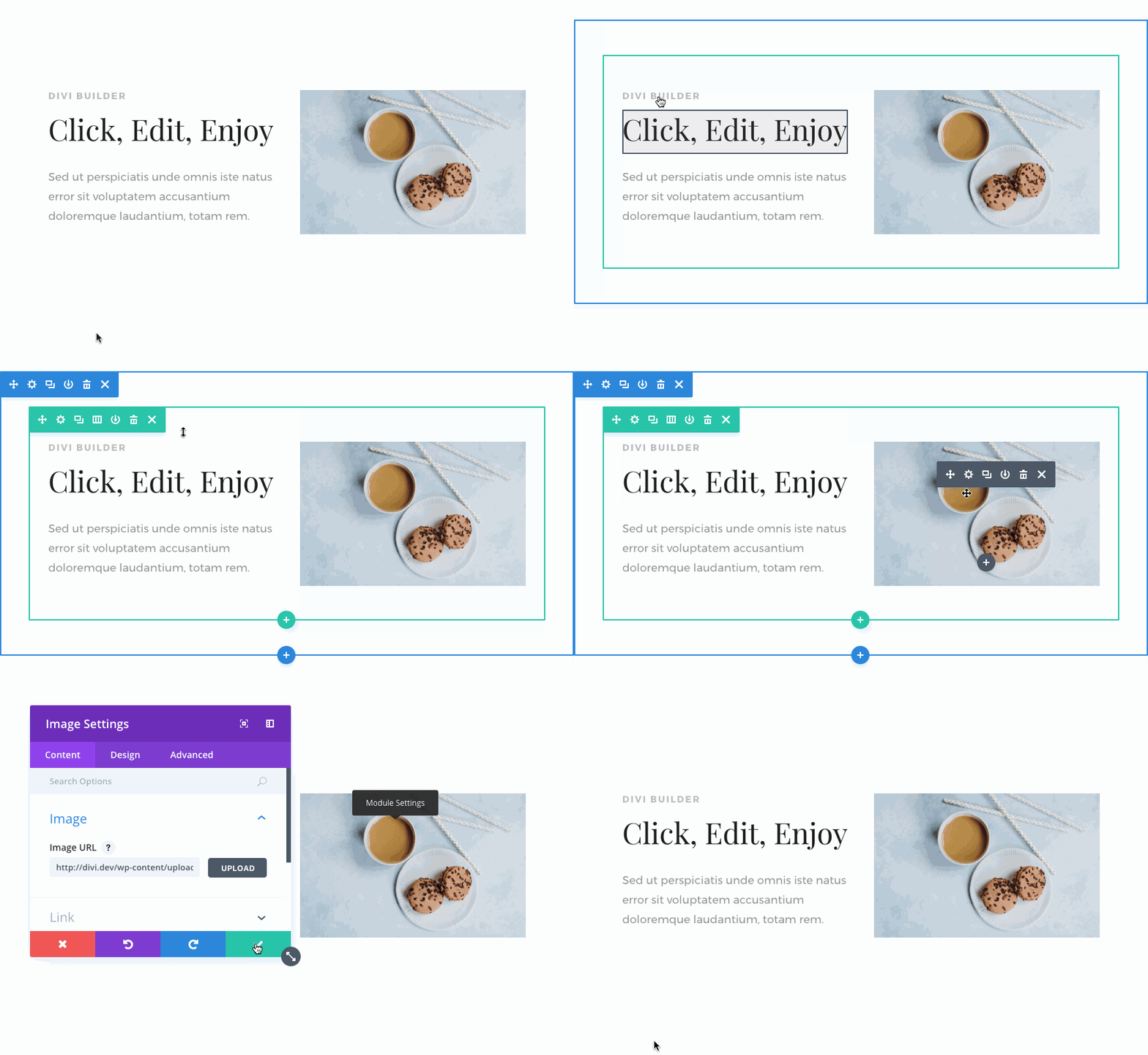
By default, the Visual Builder’s main form of interaction revolves around hover. Hovering over modules, rows and sections reveals their controls and these controls can then be clicked. This is a great way to quickly access controls and it’s our preferred method for page building. That being said, we realize that not everyone enjoys this method of interaction and it can be frustrating when your mouse overshoots a desired control and the button disappears right before you are about to click on it!
That’s why we built a brand new interaction mode for the Visual Builder called Click Mode. Unlike Hover Mode, when you are in Click Mode controls are shown when you click on an element rather than when you hover over it. Once an element has been clicked, its controls stay visible until you click on something else or exit out.
Click Mode also makes it easier to find elements on the page by giving you a clear outline of all elements when you hover over them. This makes it much easier to locate and click on the exact item you are looking for, especially when you are dealing with a series of small modules.
Introducing Grid Mode
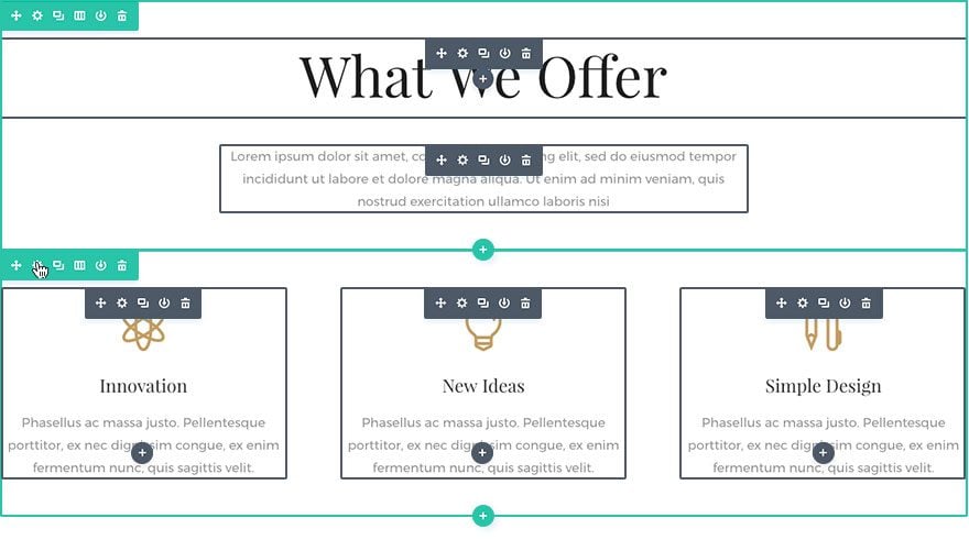
In addition to Hover Mode and Click Mode, we are also introducing Grid Mode. When grid mode is enabled, all of the module, row and section controls on the page are displayed at once. No need to click and no need to hover. Once you open up an element’s settings, the grid disappears and you are given a clear picture of your page while you make your design adjustments. Even if you find Grid Mode too distracting for continued used, it’s quite useful to toggle the mode on and off to get a clear picture of your page’s structure, especially when you are dealing with lots of custom sizing and spacing.
Improved Hover Mode
Not only have we added two new interaction modes, we have also greatly improved Divi’s default Hover Mode. Our main focus was to improve the positioning of hover buttons for small modules and to remove unwanted button overlap that made it difficult or impossible to access controls in certain rare situations. The result? You will no longer find yourself unable to access hover buttons because they are just outside the module’s mousetrap and just out of reach!
![]()
Customize Your Toolbar And
Control How Your Interface Works
Now you can control how your Visual Builder interface works by adjusting default settings to tailor the experience to your unique preferences.
Customize Your Toolbar

The Visual Builder toolbar is now customizable, allowing you to control which view modes and interaction modes are easily accessible while you are building your page. Get quick access to Wireframe Mode, Click Mode, Grid Mode, Zoom and all of the Responsive Previews with a single click. Alternatively, these modes can be removed from your toolbar to free up space if they aren’t something you plan on using.
Open All Options Toggles By Default
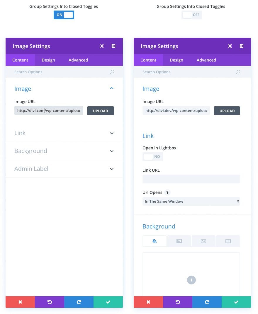
When you open up a settings popup in the Visual Builder, all options are organized into groups. These groups are closed by default and can be toggled open with a click of the mouse. Today we are introducing a new “Open All Options Toggles By Default” setting that changes this behavior. When enabled, all option groups are opened by default, revealing all options at once and allowing you to scroll through the entire list of settings.
Completely Hide Disabled Modules
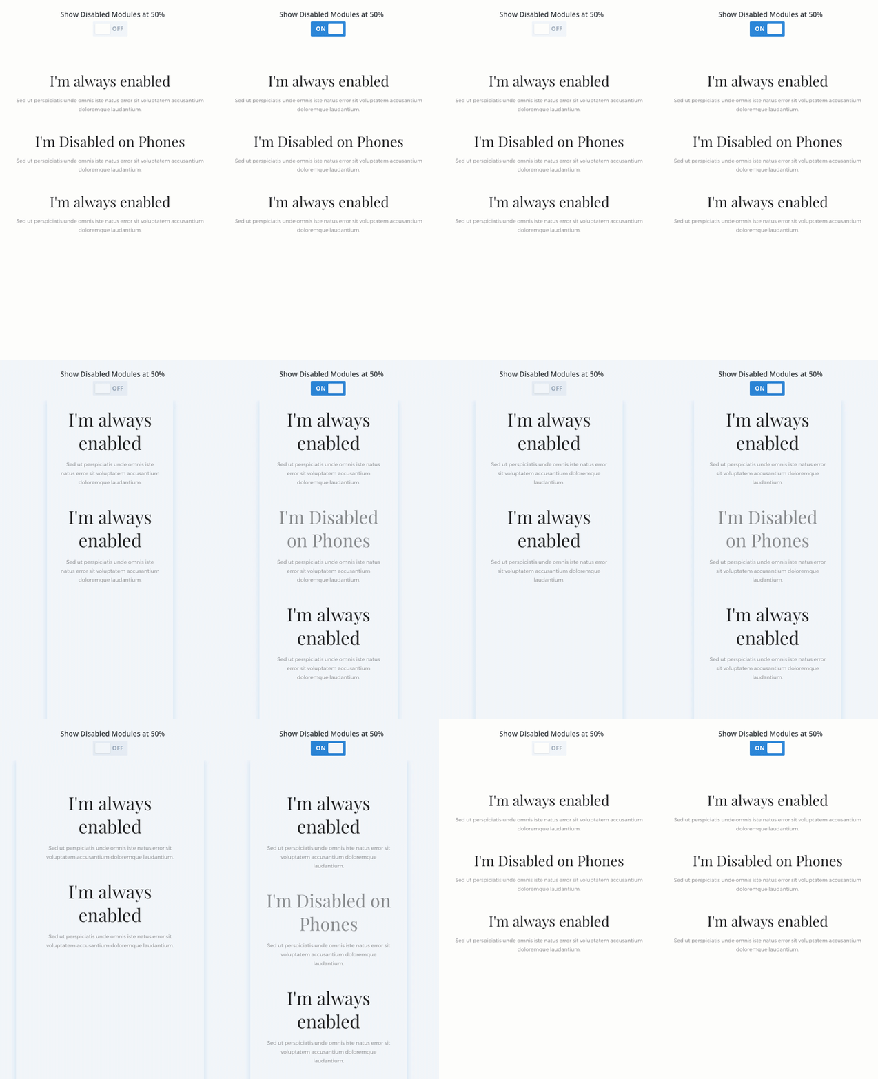
The Divi Builder allows you to hide modules on some or all breakpoints. In the Visual Builder, disabled modules are displayed at 50% opacity. This signifies that the item is hidden but still allows you to see it in the builder so that you can access its controls and make design changes visually. However, this can be quite distracting as it doesn’t allow you to see exactly how your page will look on the front end. Today we are introducing an option to completely hide disabled modules. Once this settings has been enabled, disabled modules will be completely removed from the Visual Builder preview. You can toggle this option on and off, allowing you to preview your hidden modules and make adjustments when needed.
Remove Divi Builder Interface Animations

The Visual Builder interface contains subtle animations throughout. On older computers and older browsers, these animations can hurt performance and cause the builder to become less responsive. Today we are introducing an option to disable all animations in the builder to help speed things up for those users.
Choose Your Default Modal Position
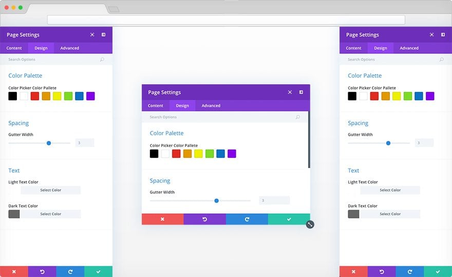
Settings popups in the Visual Builder are quite customizable. You can change their position, their size and you can snap them to the sides of your screen. By default, the builder will remember you last used popup size and position and the next time you edit a module the popup will appear accordingly. Today we are introducing a new option that allows you to define a default modal position that will override that behavior. The next time you enable the builder and open a settings popup, it will appear in the default position that you defined.
Control History State Creation Frequency
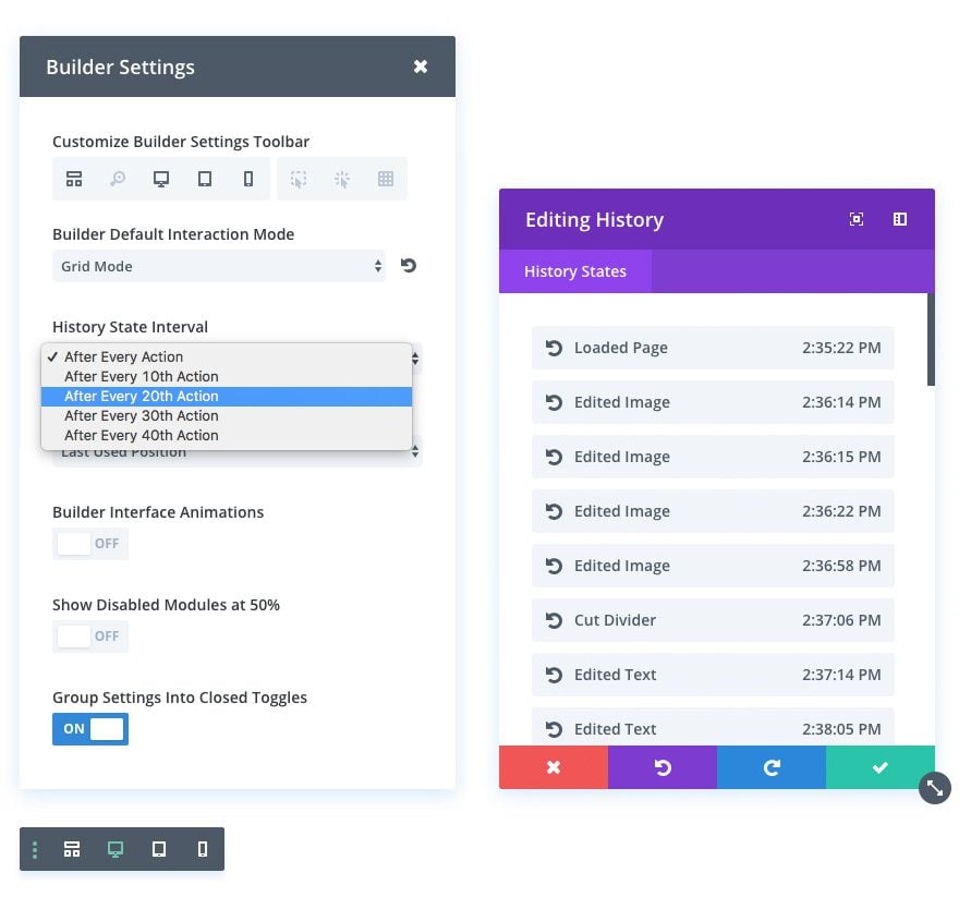
By default, the Visual Builder will create a saved history state for every action you take in the builder. You can then revert to this saved state using the history settings popup. After a long editing session, this list of restore points can become a bit excessive and locating your desired restore point can be difficult. Today we are introducing a new setting that allows you to limit the history state creation frequency to make this list more manageable and to improve performance on older computers.
Choose Your Default Interaction Mode
![]()
With the introduction of Grid Mode and Click Mode, the Visual Builder now that three unique ways that you can interact with your content. By default the Visual Builder loads in Hover Mode, but if you prefer one of the other modes then you can define it as your default mode. The next time you open the builder, your chosen interaction mode will be enabled automatically.
Get 10% Off Today!
Today's The Best Day To Get Divi Or Upgrade Your Account To Lifetime
Join the most enthusiastic and loving WordPress theme community on the web and download Divi today. Using the new Visual Builder, you can build websites faster than ever before with its incredibly fast and intuitive visual interface. You have to see it to believe it!
Join Today For 10% OFF!Renew Your Account Today For 10% OFF!Upgrade Your Account Today For 10% OFF!




I have a website in wordpress and I am using divi theme. I am facing a problem that I am unable to edit my website any section / part text except main slider text by using divi visual builder. Please help me why its going like this.
Good job, Divi, on fixing the hover issues with the Visual Builder. I quite using the Visual Builder because of that problem (even though I never have a problem using the Frame builder).
I especially like the ability to switch on the ‘Grid Mode’ and work within it. However, I still would like the ability to have it within the Theme Options to make it a permanent choice. Meaning, if I want to only work with ‘Grid Mode’, I should be able to make this a permanent setting in my Divi Theme Options so I don’t have to always enable it for each page I build/edit. Right now I have to (extra clicks, extra time).
On top of that, I would still like to see an option within the Theme Options that would allow me to have as a default setting to edit every page within the ‘Visual Builder’ mode instead of editing the page and then clicking the ‘Use Visual Builder’ button. I could save a lot of time and steps with this additional setting.
Otherwise, I’m glad to see Divi’s continual growth with its builder and satisfying the needs of easier builder activity. Keep it up!
Sadly, the visual builder still works horribly on my iPad Pro.
Hello, can elegant divi’s team replace actual id and code for divi update in dashboard wp menus with asteriks? So my clients can’t see my divi’s update id and code.
Not all my clients choose, divi theme full version package.
Thank you
This is brilliant, i always had the hover dissapear issue, so these changes are very welcomed. I would also like to start seeing some sort of minimal interface mode in the back end builder as i still find the padding of each section, row, element is too big, they can be compressed a lot more to fit more on screen.
Last update of Divi builder have broken my wordpress editor. I can’t change between text editor and html editor. It’s impossible to change. Only works fine if I desactive the plugin divi builder so It’s a big problem for my, please update the plugin fixing this error
Big fan of the new Visual Builder update, especially the grid view. I’ll probably start using visual builder more often now. Hope to be able to pin the modal position soon, even if it’s just blank when you’re not in the options of an element… or show cat videos in the inactive modal space… no, no… bad idea… oh look, a rabbit!
Almost all my sites are having loading editor issues with the latest build.
Anyone with problems too?
My issues started a few builds back, Divi + Visual Builder load issues.
Yeehaw!!! Thank you for the update!!
Thanks guys for keeping at it. I love your vision to make this product better and better. I would also vote for the sticky top bar in the back end editor.
Another great reason Divi is in a class by itself. It’s not a Theme, it’s a platform.
Am I missing something obvious. I’ve updated the theme, but I don’t see the new features. Do I need to enable it somewhere?
very nice blog and i like the video on the top.
Is this a teaser post or is there a link somewhere where this upgrade can be downloaded? The video still says “Download Today” I downloaded the Divi Builder at it is the same version I already had. Anybody else wasted time trying to find this upgrade?
Speaking of clear communication, can you stop with the annoying popups to Join and get your Newsletter AFTER we login. Dude, we already joined, that is why we were able to login! And after we login can you get rid of the annoying “JOIN TO DOWNLOAD” BUTTON LINK in the menu.
C ‘mon man, this is simple stuff that distracts from the quality of your work. CLEAR COMMUNICATION, PLEASE! You’re suppose to be experts in UX design.
There’s been a number of updates recently that have less than wowed me. Too many basics get ignored for effect…wooing non-designers and non-developers into the Divi world, closing the gap between professionals and the ‘wananbe’s’. A mass of demo content on the way…what web designer needs those? I realise you want more people to buy Divi.
But this update, at last, solves a lot of the fundamentals of the Divi builder that made the simple things frustratingly hard. From me, a big ‘thank you’ goes out to Divi, and I can remove a lot of negatives that had been building up over my exclusive use of Divi. More of this type of update and I can see forwards to a longer lasting Divi relationship. The one that I imagined when I first bought Divi.
I’m guessing we will still experience a lot of the eternal hanging issues of losing updates, of never being quite sure if the restoring the browser version actually recovered the last thing you did, or was it better to say no!?, of being logged out in the middle of changes, of updates completely messing up your installation.
But this….is a great update. Well done Nick and your team. More of the same please! More meaningful features currently only available by adding plugins. More SVG support. More contact form support and development. Site colour palette everywhere. Serve scaled images, spacing on buttons, and a lot of places like Fullwidth Header modules where Title and sub title line heights can’t be altered in the builder. Why not?
Looking forward to the next updates!
Oh my, my opinion is this is by far the best update since the launch of Divi 3.0 itself. So many of the little issues that made things difficult are now fixed. Click and grid mode is a total game changer! The hover thing was always a bit difficult, sometimes buttons were hard to edit, settings on rows and columns used to be hard at times to click on the settings. Spectacular job with this guys. Also love how you can set to the mode you want by default. Now being able to hide disabled sections is awesome too. Again, can’t wait to see what happens next.
Vote for your favourite mode:
Hover
Click
Grid
Classic
bought the divi . its awesome website building tool.
Typo in the page settings. It should be color palette, not pallete.
Hello,
As always thank you for the constant updates. However I’m quite concerned that your team is more interested in releasing new features while not fixing reported bugs for a long time. I’m strongly of the opinion that bugs should be fixed before feature updates, esp bugs that affect the end user. I have open bugs (reported and acknowledged by tech team) which have not been fixed. How come?
You guys are making so much improvements on the visual builder. I just hope you guys don’t take out the backend of divi builder???
I’m still stuck on the backend of Divi Builder lol…I have yet to design a website using the visual builder. I don’t even think about the visual builder when I start designing a website. What’s wrong with me?! lol
Great! many thanks for the new features, DIVI is still my first choice for web design, greetings from Asturias
How can I update visual builder to latest update of it?
Impresionante! Cada vez se está mejorando la interfaz del usuario para que cada vez sea más fácil personalizar los diseños. Y más ahora, que se permite personalizar a gusto de cada uno cómo queremos ver los paneles de control para que nuestro trabajo sea más óptimo. Un gran avance. ¡Muchas gracias!
Impressive.
very useful … not worked out which mode i like best yet, but works well and nice to have the various options of how i want to work. another job well done 🙂
“…mission on building the best website builder on the planet”
Mission completed. Now is just a matter of keep updating and improving it to keep the title.
Keep moving forward ET team 🙂
OMG This IS the best Update in a while. I so struggled with the visual builder to the point that I kept going back and forth in to the Wireframe mode. I can’t believe this is listed as a minor update from 3.0.77 to .78!!! THIS is a MAJOR update, one that is a MAJOR Welcome!!!!
Why not put this level of design consideration into making SPACING between Modules, Rows and Sections actually MAKE SENSE.
I can’t use the Visual Builder for format/layout work because it doesn’t display spacing accurately, and frequently it doubles the space between lines of text when I Save.
So I *attempt* to modify spacing between elements in the Builder backend, but IT DRIVES ME INSANE! I’ve done EVERYTHING to try to make sense of it. I assign background colors to various elements so I can see the padding and the margins, but in many cases even that doesn’t clarify the confusion.
For example, the Blog Module maintains two different margins (or maybe padding…) above and below. No matter what I do, I can’t get rid of them. I *DREAD* having to format each Divi page. I DREAD the fact that I will waste up to an hour on each such page – and in some cases I never actually achieve the layout I’m attempting.
The time I’ve wasted going round-and-round-and-round trying to make sense of this would SHOCK YOU. It shocks me!
At very least you should produce a series of *very* specific, very extensive VIDEO TUTORIALS on how to use this arcane system.
Too strong?
I’m no Divi expert (having only used it for a month or so) but I know you can drag Rows etc to adjust spacing. However, to get more consistent spacing I just use a combination of Chrome Dev tools to adjust the padding/margins to my liking and then write my own CSS rules for these.
It’s not ideal but it does work.
I do agree with you that it would be better if we had more control via the Visual Builder though.
Thanks, John.
Oh, look! More FREE product development feedback (from a hapless ‘Beta Tester’ who is actually a Paying Customer). I think ET should provide diagrams and video tutorials explaining the following in very clear terms:
1. Exactly what are the DEFAULT PADDING and MARGINS for Modules, Rows and Sections. I suggest implementing a USER-DEFINABLE GLOBAL DEFAULT that would include the option of ZERO. That would make everything simpler.
2. Exactly how do Theme Customizer settings INTERACT with modifications to Padding and Margins for individual Modules, Rows and Sections. I’m referring specifically to Theme Customizer settings here:
Customizer > General Settings > Layout Settings
Customizer > Mobile Styles
3. And for the record, “GUTTERS” is a typography / page layout term that means HORIZONTAL space between columns on a page. So why do Divi “gutters” affect the VERTICAL spacing between Rows? This contributes greatly to the confusion.
4. It would be incredibly helpful if a VISUAL INDICATION of Padding and Margins could be implemented. Perhaps a GREEN BORDER depicting the PADDING, and a RED BORDER depicting the MARGINS. These could display (toggle on and off) in the Builder Page Editor and maybe in the Visual Builder.
5. Given: A page contains multiple Rows.
Given: I’m editing the page in Builder > Edit Page.
When I save modifications to a Row (or Module or Section) there’s no indication of which Row I just modified. Modifying spacing in Divi is so confusing that I frequently am not sure which Row I just changed. Some VISUAL INDICATION of which Row (or module or section) was just saved would help a lot. Perhaps a color change for that element…?
Divi packs some amazing capabilities, but in some cases the user interface is counter intuitive…to put it mildly.
For this set of features, and all subsequent ones, it would be really helpful if you could briefly mention somewhere in your articles which version of Divi they are initially released in.
I’ve not tried these particular ones out yet, but they look like a really helpful set of improvements. Nice job.
Thank you, thank you, thank you…
Thank you, the new editing modes are really helpful. Can you consider assigning a keyboard shortcut to toggle between modes?
There are actually already shortcuts for each 🙂 You can find these in the shortcuts cheatsheet in the Visual Builder by pressing ‘?’ at any time.
Hover Mode = Cmd + Shift + H
Click Mode = Cmd + Shift + C
Grid Mode = Cmd + Shift + G
Nick, you guys are unbelievable.
(And, yes, that’s intended as a compliment. As in unbelievably awesome.)
This is why I love Divi and Elegant Themes, you guys are truly unstoppable!
I congratulate the update very well
Thank you!
Vous assurez grave !!!
This is all one big update to improve a designer’s workflow and I love it. UX design! WOOT!
Hi there, great improvements.
Just a general wish for when you announce updates here. Could you please mention clearly somewhere about which version you are talking here. I gather those new features come with 3.0.78?
Suggestion to expand toggles feature:
“Group Settings Into OPEN Toggles” on a module level, like:
– open all toggles
– close all toggles
(per module)
Finally some much needed fixes to the Visual builder. These are all improvements that kept me from utilizing it.
Impressive improvements
I love the clickc mode !
Keep up the good work !
Grid mode is a good news!
This is fantastic, but can the Extra Theme get some love soon too?
One thing has always puzzled me. Why are you guys not adding more layouts ts to the blog module?
How about the ability to chose the number of columns yourself?
This is something that’s really missing.
Thank you, Ionut! We do have future plans for extending the layout options for various modules, including the Blog module. ?
Vlad, thank you for the confirmation. Looking forward to it. Maybe encourage the team for upgrades on the menu display as well.
and with a sidebar please 😉
Classic is mode is where I do any serious work. Visual mode is where non-tech support people fix typos, etc. For those that have been working primarily in visual mode until now, I just don’t understand how that was possible with all of the overlapping elements, controls that disappeared, slower interface, etc. This might nudge me to take a second look at visual mode.
Nice update
Can we have a setting to disable FW individual slides on mobile devices, because the png slide images and two tone backgrounds don’t show up on mobile,
Therefore all that is viewable on mobile is a large white space instead of the background and png image making it look like on mobile a slide has been skipped or is missing. I’m sure there was a setting previously to disable individual slides on mobile?
It is like you’re reading my mind! Love this new feature.
Very Clever, I’ve been using the Classic mode, as it’s been too busy to spend time clicking to try and get the visual builder to play nicely and be still.
Please don’t take away the classic back end, as I genuinely prefer it, I like to see everything set out at a glance, So please leave the old way as is, In time I may even get some free time to play around in the builder front end. However it’s all very cleaver!
Liz, I agree with you. Please do not change the Classic mode.
Did I tell you how much I loved you lately Nick, Mitch, Andy, Nathan, Jason, Mak, Kenny and all the ET team? Keep innovating guys!
I’m having a bit of a bro-mance too! The Visual Builder is becoming a very useable product these days. I love the continued enhancements.
Keep up the great work ET.
Great new way to interact with the visual builder!
Please consider upgrading responsiveness and how the recently added ANIMATIONS work on mobile.
For instance: I’d like to set a specific timing to each version of the website (desktop, phone and tablet).
Nice update! Thanks for all your hard work and time!
This update made me very happy. Thank you
I love you
You are killing me. Amazing new update but WHERE ARE RESPONSIVE IMAGES????????????
I still cannot, in all good faith, produce a website for a client until you fix this. And I’m a lifer!
Hi Paul. I read your comment and am wondering what you are referring to. If you use the Image module images are responsive. Is there something with the Image Module you are referring to or are you talking about when adding an image to the content area of a text module, for example?
Great new updates recently, but I am with you. This is the most important feature in our list that we are really waiting for. I hope they will find a great solution for that too soon.
I can’t get over how incredible you guys are! This is by far the best investment I’ve ever made for my website. I used others wordpress site builders for years, and I could have saved myself SO MUCH PAIN! Anyway, proudly purchased my lifetime subscription, I’m with you until the end. Keep it up, and thank you!!!!
I used to get excited by new things that Apple and Steve Jobs would come up with, now I get my excitement from Divi and Nick Roach.
+1
Thank you Nick and the team at ET. I’ve worked hard over the last year to incorporate the Visual Builder into my workflow and am now a fan of it. These usability improvements are great.
I love the click mode and the grid, thank you very much for that
But, when are you going to work a little on SEO benefits like upload speed and remove css and javascript versions so they can be cached by google?
I just updated to the newest Divi Builder but I do not see these options. What am I doing wrrong?
Crazy ! I was about to post in forum an idea about improving the VB that is nearly the same.
…So for me it’s BIG YESSSSSSSSSSSSSSSSSSSSSSSSSSSSSSSSSSSSS !
Nice!
Love this BUT .. PLEASE .. fix the text editor. Please anchor the toolbar (top of edit-window) so we can WRITE!!! Why is DIVI so against writing .. this is why we have blogs, we produce content. As the editor is now, it’s virtually impossible to write more than 500 words without going crazy… PLEASE!
Thank you, Keith! Glad you love this update. ?
I can confirm that we are looking into this. The plan is to have the toolbar sticky. Thank you for your patience.
Thank you Vlad. This is very important and long overdue for many of us to continue to choose Divi for client sites and to recommend Divi to those who ask.
+1000 for this
just tried the new visual builder and it crashed my chrome, consuming too much of my mac book air resources.
PLEASE fix this, and since you’re on it, please make the whole text editor screen/area bigger – seriously, i beg you to try to use it, and you’ll see that there is a large amount of unused space on the pop-up that could be used to provide a better UI experience.
the visual thing is cute, but people editing multiple posts, with multiple modules per post, will always prefer the text editor option.
PLEASE!
Real improvement. Love it.
This is great! I am not a fan of the visual builder, but these improvements might just have won me over! Thank you!!!
Great features!
Thanks guys!
Wow, this is amazing, great job guys!
Click Mode will mean I may now use the visual builder finally – hated hover mode so ended up frustrated and did not adopt it at all. Grid mode looks a useful option also. Have a new site not yet launched so will give it a spin there before upgrading all clients.
Keep up the great work ET!!
If you censor posts please delete this positive one dustugusted !!!
Sorry ignore delete my previous post i thought you had deleted my posts
i just tried it and the visual builder crashed Chrome… it’s just too slow and consumes too much of the computer’s resources…
I tried it on a site I am building and it completely screwed two modules – the Bloom Shortcode got replaced with its code output rather than the shortcode – I left the page and did not save the page – yet it retained what it had done and had to go back in delete the changes it had made and place the shortcode back in.
I am using a theme from Divi Den and it completely messed up one of the layouts they had provided again I did not save the page yet it made the changes – I thought you could leave the page and any changes would be ignored – I think I now need to work out how to hide the visual builder so clients don’t screw up the site trying to use it – not a convert just yet!
Cliff I think you can use the edit history to undo any changes…
Thank you for addressing this! Trying to hover and edit a module has been such a miserable process before! I’ll be sticking with Click and Grid mode from now on!
ah, that’s cute!
now, for those of us who work on the non-visual builder (i would bet real money that it’s the majority), may i ask when will the post compose box be updated to make it more friendly? for instance, having to scroll all the way up whenever i want to add a button, an image, or access the toolbar is not friendly, and it’s already been solved by many other top theme providers…
thanks!
How can you not use the VB? It’s awesome. For me, it has increased productivity by 100%. I can’t imagine going back to the old method.
to each their own – if they offer one experience (VB or “classic”) then it’s because there are people who will still use it. I suggest not judging others for preferring a different UX, UI or feature than what we prefer 🙂
Agreed – whilst I am using the VB more and more for fine tuning content I still add blocks of text, do the initial edit and structure my pages using the back end. It’s seriously irritating scrolling up and down to simply add a tag. The inability to switch between normal and code view when in expanded view is a bizarre design decision in the editor too.
The recent additions to Divi have been fantastic but perhaps someone could have been assigned to fix more the long term niggles of Divi too. It’s fall in SF now and it’s getting colder and more Karly so perhaps they could sort this 🙂
Don’t be afraid of the Visual Builder. I was too…when I finally switched, I realized I now hate the backend editor.
believe me, i am rarely afraid of trying new technology – unfortunately, i tried the visual builder (in the past and today, after this update), and it’s incredibly unreliable, it crashes my Chrome browser or becomes unresponsive (on a pretty good mac book air). Too much risk, and time sucked by using this.
again, it would have been a lot better – albeit less flashy – to update the divi builder text box, in order to make the top toolbar stick to the top, and i cannot even imagine how thrilled i’d be if the text box itself would be made bigger
As well as the CSS boxes!
YEEES!!! These are wonderful!
Great !!!!! This update sound really good !!
And what about an update of posts loop ? Currently there is only one blog module to display a posts loop. It will be super cool to be able to choose a custom post type.
Does’t matter. Divi remains my only favorite theme. ?
Agreed! I have being hoping for the same.
I think it´s time to start editing in visual mode. Till now i´m using the classic Divi builder. Great step forward guys!
Agreed! I’ve avoided it for a while, but it’s getting pretty spiffy. I like the Grid mode best, I think, but I love the idea of different options.
Would be good to see some of these features incorporated into backend editing such as the search and toggles etc or maybe even when editing a module in the backend get the same popup as the visual builder as when editing after closing it can be confusing as you go back to the top of the page which if you have a lot of sections etc can make it awkward.
i like this new update so nice to work with
Omg, finally, expand all without having to click click click in settings!
Best day of the visual builder for me!
Jeroen
I so agree with you!!
oooohhhhh a nice little update.
Click mode for me guys.
Love these improvements 🙂