![]()
Easily Add Stunning Text Shadows
To Any Module
Every Divi module and all text elements have been updated with a full set of text shadow controls and a brand new text shadow interface for the Divi Builder.
Today we are excited to add even more design customizability to Divi with our brand new Text Shadow options that make it incredibly easy to add stunning shadow to any Divi module and to customize those shadows using a simple visual interface.
Check Out The New Text Shadows In Action
![]()
The New Text Shadow Interface
Adding and customizing text shadows is easier than ever thanks to Divi’s shadow presets and a full range of text shadow controls.
A Brand New Interface
The Divi Builder is equipped with a brand new interface for controlling text shadows in every module, and this new interface can be found within all text option groups.
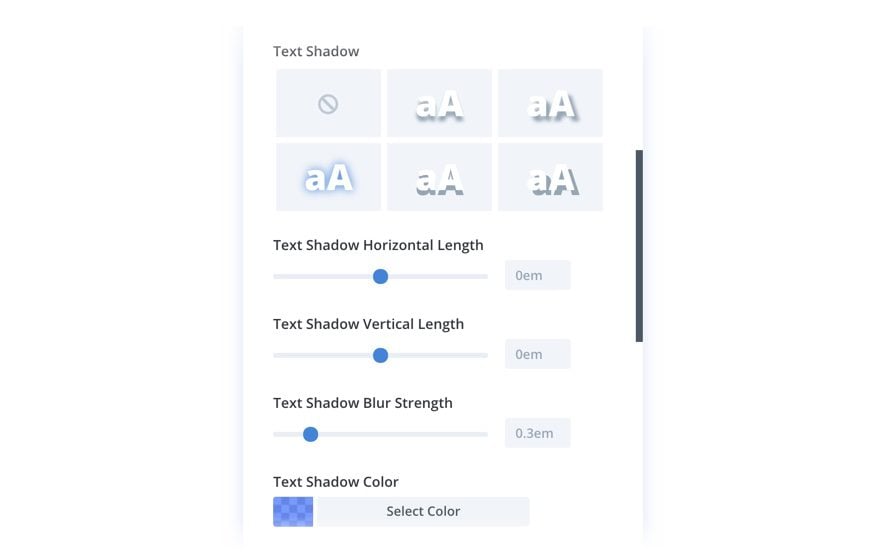
Easy-To-Use Presets
Adding great text shadows to your page is super simple thanks to our shadow presets that can be applied to any text element with a single click. We have pre-designed 5 unique text shadow styles that work great with any text size. These styles are perfect starting points and can be further customized using the full set of text shadow controls.
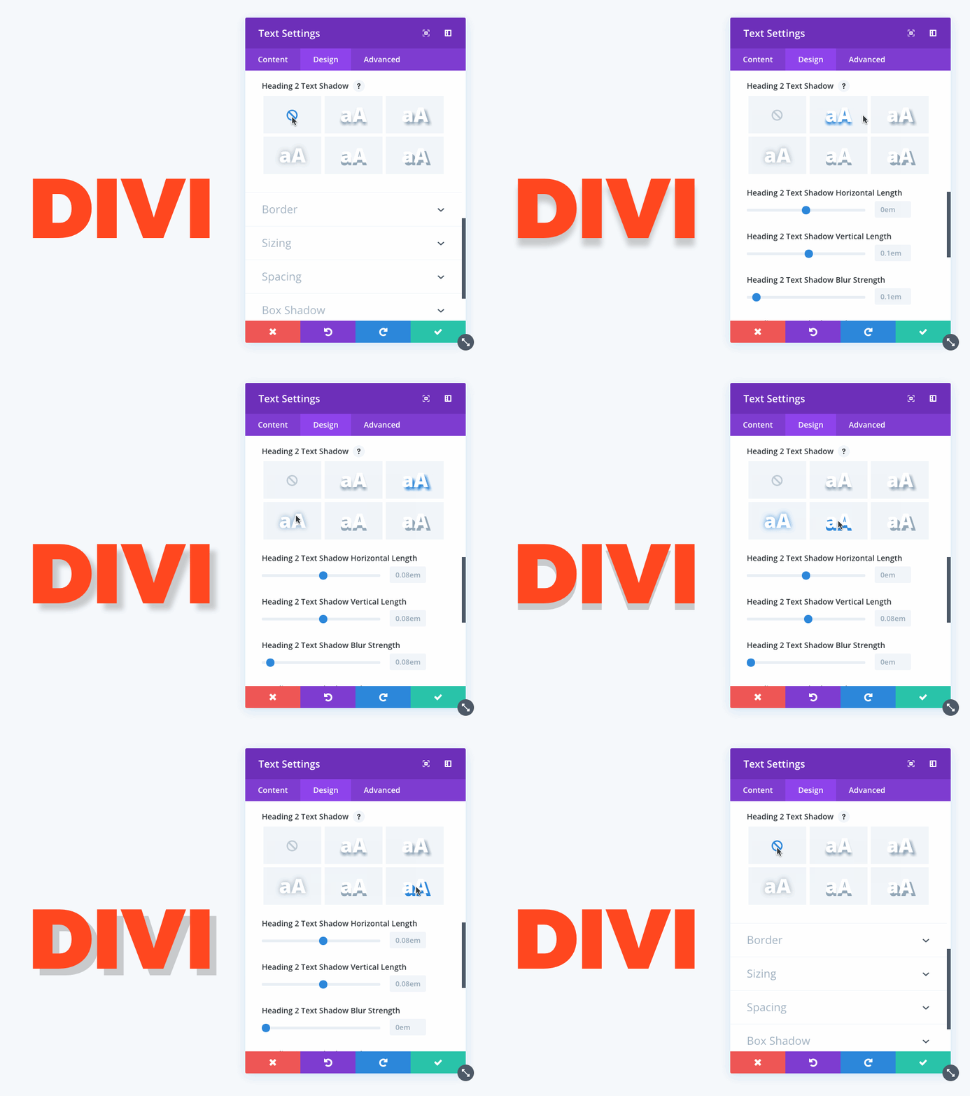
Completely Customizable
All Divi modules have been updated with a full set of Text Shadow options, each of which can be managed within the brand new Text Shadow interface. Every aspect of these shadows are customizable, including position, blur strength and color, and building custom shadows in the Visual Builder is a truly wonderful experience as you watch your shadows move and transform right before your eyes.
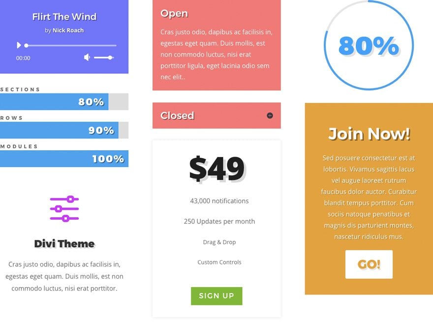
Works With All Modules
The new text shadow interface is available for all modules and text shadows can be applied and customized for each individual text element.
![]()
Create Beautiful Designs With
Creative Text Shadow Effects
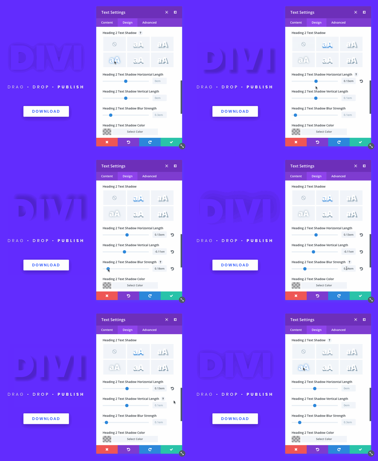
Text shadows can be stunning when used right, and our team has been having a blast creating some awesome demos that showcase what’s possible using these new options.
Countless New Possibilities
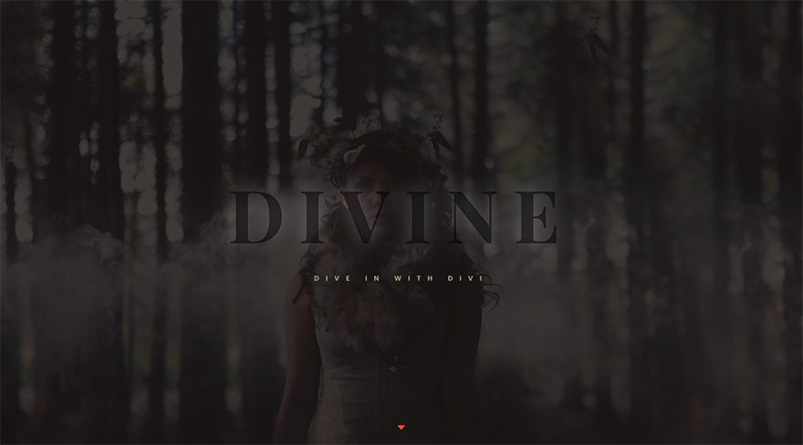
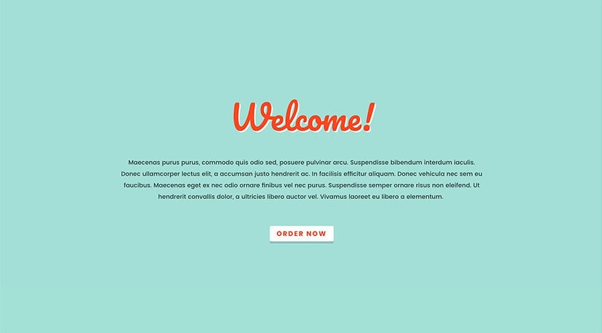
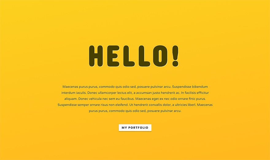
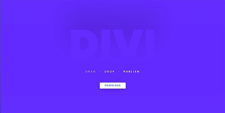
You will be surprised and delighted with just how much can be accomplished with these new options. There are so many inspiring new possibilities and we can’t wait to see all of the great designs you create. Just take a look at some of the amazing designs our team was able to build using these new features.
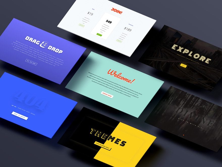
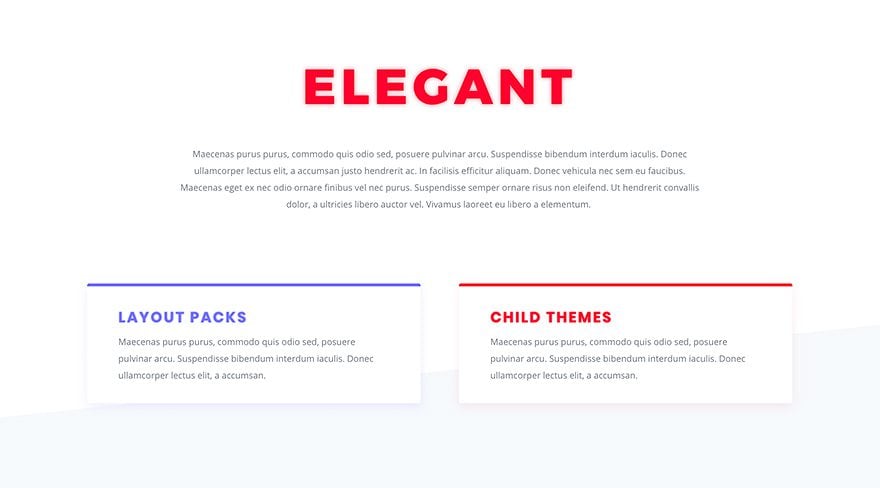
Example One
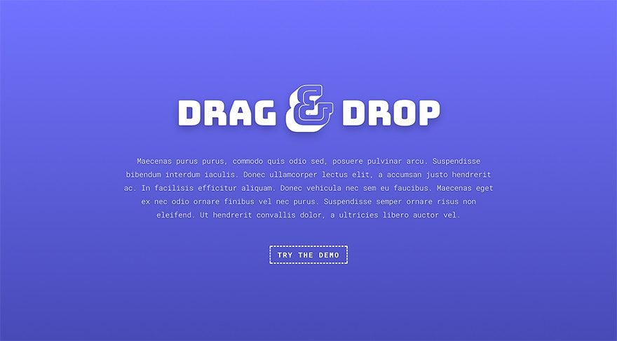
Example Two
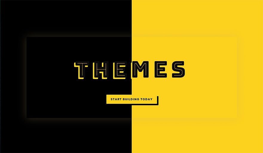
Example Three
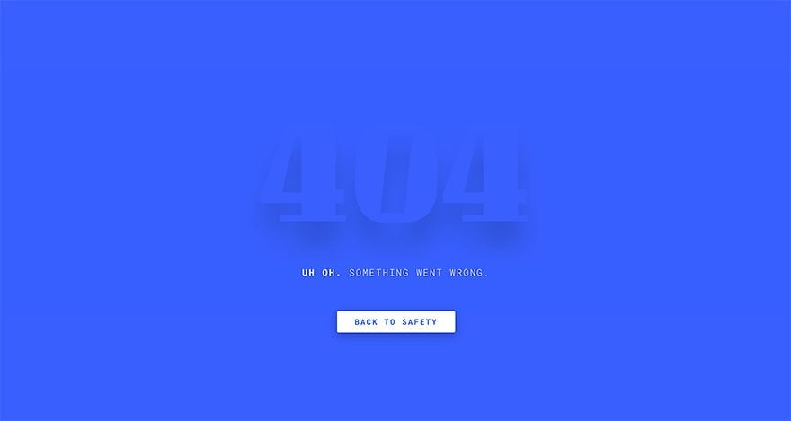
Example Four
Example Five
Example Six
Example Seven
Example Eight
Example Nine
Example Ten
The new text shadow options are available today, so download Divi and take them for a spin. Let us know what you think in the comments and don’t forget to check back next week for even more great Divi features coming your way.
Get 10% Off Today!
Today's The Best Day To Get Divi Or Upgrade Your Account To Lifetime
Join the most enthusiastic and loving WordPress theme community on the web and download Divi today. Using the new Visual Builder, you can build websites faster than ever before with its incredibly fast and intuitive visual interface. You have to see it to believe it!
Join Today For 10% OFF!Renew Your Account Today For 10% OFF!Upgrade Your Account Today For 10% OFF!






Aww… No text stroke?
I know it’s a “non-standard” property, but it works on all the most popular browsers.
Regardless… awesome update, in general. And, as mentioned.. would also like to have it as a global (page/site) option as well.
Don’t want to sound ungrateful, but the last few Divi updates have been things that users can do themselves with CSS. In my opinion, it would be better to spend development time on things which users cannot do themselves, such as support for srcset.
Nice progress in the right direction!
Can you please also consider shaped section transitions as discussed here in lots of the comments:
https://www.elegantthemes.com/blog/divi-resources/how-to-create-irregularly-shaped-section-transitions-with-divi
Elementor (to name some competitors) does it very well (https://elementor.com/v130-shape-divider/). Please take some inspiration there – and please apply the divi touch to it ;-). That would be awesome.
Hi there,
After this update I find the following error.
Focusing on the Slider Module, before the update I could put a shadow in the tittle through Advanced/Title with the following code: text-shadow: 1px 1px 1px #fff;
Now this does not work and you have to put it in code in Advanced/Description.
Can anyone corroborate this?
Thanks
Great stuff
This is amazing work
Top!!
Great Stuff!!
How does all the new added features impact speed load time??
Hope the theme gets not overloaded with huge code …
Divi sites look awesome, however woo commerce pages within look simply ugly by comparison, actually “Very ugly” on second thoughts Extremely ugly in fact!!
Is there anything that can be done to help Woocommerce store pages look uniform and at least like they belong within the same site !
Thank you for amazing work!
Can we expect gradient fill for text? 😉
Awesome work guys, you are just taking Divi to another level. Just a Question, I am a Divi fan but using Elementor for now. I want to switch to Divi because of the Lifetime payment option, so are you going to improve the responsiveness of Divi like what Elementor does especially on the tablet?
Awesome! Divi Builder turning to Photoshop software for modern web designer.
Hope to see more menu header designed modules and ability to tweak to one’s taste.
May I ask if ET is planning to go Plc?
Thanks a millions.
Nick,
Thanks for continuing to improve Divi with new features that make it easy for designers.
One major feature that would help Divi designers to win more deals and build more sites in Divi is to degrade gracefully like other builders. That Chris Lema post and recent CodeInWP post emphasizing the “lock-in” effect of Divi scare off some potential customers. All of Divi’s major competitors have it, and I understand not wanting to make it easy to switch themes away from Divi, but as all the other major builders add it, Divi just looks worse and worse.
Aside from that, loving Divi and hope you keep going with the feature adds!
Thanks!
OMG i love you guys!!!! so looking forward to trying this out in my web designs. I am really needing more schema markup plugins though… especially for local web design seo.
After updating the text shadow new feature
when using the visual builder the setting for the module disappear (the black one)
is it happing just to me?
Sorry for the trouble, Nissim. Did you clear your browser cache, plugin cache, server-side cache and/or CDN cache? If you did that already and you are still having trouble, open a ticket in our forum and we will be happy to assist you. Thank you! ?
Gosh, you guys really continue to impress. Thank you.
YESSSSSSSSSSSSSSSSSSSSSS…. I swear someone is reading my posts and putting into practice what I want……….I LOVE YOU GUYS….
https://www.elegantthemes.com/blog/theme-releases/divi-feature-update-introducing-box-shadow-controls-for-all-modules-rows-and-sections
Ok, maybe my next request will be brought to life also….
WE NEED MORE MENU CUSTOMISATION, and I mean as part of the Visual and Divi Builder if possible…. we shouldn’t have to hack the hell out of it to achieve unique combinations and style the menu as we see fit…. 😀
Again… thank you 🙂
Love this! Can we please, please get more blog layout options? I pray every year I renew that this will be addressed.
This is so good! Much easier than using CSS and the end result will be that websites will look better as we will use dropshadows on text more frequently.
On a more sombre note I am struggling with the Divi New Font Features which came out in the previous release. I personally found Mac’s Youtube very difficult to see on screen and so far I have not been able to achieve the things it is purported to do. Rats!
On a really positive note, I have used the new drop-shadow feature on sections of a new site and the clients are still in awe of what I have done. I plan to revist some of my older sites and add some drop-shadows to different modules and sections. Brilliant! If you haven’t done so already I recommend that you have a look at what you can do with this facility.
Keep going guys, you are bringing us so much!
Text shadow!!!!??? WTF. When are you going to implement responsive images in all modules? When, oh when, oh when?????
I’ve asked this question for over a year and have not received one cogent response from Divi.
I have a lifetime license but have not ONCE been able to publish a Divi site because of its bizarre lack of responsive image implementation, when it’s been baked into WP for years now.
Help.
Hi Paul, yes every 2nd client complains to me there image is cut off in sliders… Revolution slider works perfect I dont know what issue is with divi slider. Another issue is header options… you can tell a divi site a mile away…. it has to be the number one most boring part of doing a divi site… logo left right or centre… please help ET let us divi fans make something a little different at top of page!
Please consider what Paul and Darren is saying.These stuff should be on top of your list with the possibility to resize,add columns as we would like to,even Page Builder by SiteOrigin which is completely free has this capability.Please someone from ET team respond.Would like to see Nick’s comment on this
Crickets…
I agree this is what is holding me back from divi… I just bought a couple weeks ago and was so disappointed when I started running into these issues… everything there adding is awesome but is secondary to these main issues in my opinion.
I am used to doing that with Photoshop, this makes it sooo easy. No more image optimization and text alignment headaches.
Well done!
Hey Guys – this is great and I actually just did this manually on a site – so this is very timely. One question – any plans to implement this with blurb icons as well so they can match the text shadow of the blurb title? That was allow for some nice consistency on the blurb module.
Thanks again!
Wow! I was just hoping for this last night for a new site I’m doing. The Text box shadow wasn’t working and I was going to have to add a Text image (even though I uploaded my font), because I needed a drop shadow. Now I can do it all in Divi. Yay!!
great !!!!
Hi Nick, are you guys looking at my latest clients development site? Last week I had to add css to give some buttons a shadow (and keep messing with the values until it looked ok) and the day after you add it to Divi and then this week I had to add some css to do the same to some text(and keep messing with the values until it looked ok)………….. and then you add it to Divi. Now I can do it on the fly!
Thank you Nick and the gang – awsome.
Keep the updates coming (would love to see the header and menu options get an overhaul).
PS.
Heads up on what I am working on this week in my new clients site: World peace and a winning Lotto numbers generator. I look forward to both in next weeks Divi feature update. 😉
Header and menu yes… can you add slider height to your list Antony?
Antony. You should consider buying a lottery ticket!
Done Randy
Anthony please please please start adding some css to header and menu options. Its the best chance we have of getting it sorted 🙂
Already done on my new clients site Darren. In fact on most of my recent clients sites (Hint Hint Nick).
You guys are on a creative roll! Keep it up.
Now, how ’bout adding a easy and fast corner ribbon for all sections, blurbs, modules etc.
Nick,
This is a great update, and will save a lot of time! Thanks!
On another note, though, I and I believe many others have been having issues with websites loading correctly in IE. Do a search in the support forum and you’ll see them.
It’s very frustrating that currently none of the websites I’ve designed look good in Internet Explorer.
I’ve opened a ticket, but have not gotten a solution yet.
I love the new features, but maybe you could spare a person or two to help fix bugs and slow down the feature updates.
See my comment above about some browser vendors. The more developers as a group flag browsers like that, the users might just abandon those browsers for ones that just work.
I’m all for banishing IE from the web forever. But unfortunately tons of people still use it. Which is why it’s very frustrating that I and many others continue to have these issues.
My clients are not happy, and as much as they regularly make me look great – right now Elegant Themes is making me look pretty bad.
I hear you. But when you think about it, it is the tail wagging the dog. MS has the resources in their development teams to make their browsers conform to standards that most other browser keep up with. Instead we have all the collective hours of manpower wasted by web developers and designers wasting their time to make their work fit the odd one out.
There is a name for this and it is called intransigence…on MSs part. It one of the more disgusting aspects of the tech world.
Wonderful news, however, I have installed version 3.0.85, the problem of the ‘DIVI Builder time limit’ has been solved, but the problem of the white margin between the page header and the title in the woocommerce product pages has not been solved.
This is a DIVI problem starting with version 3.0.83, can you please solve it?
https://www.elegantthemes.com/forum/viewtopic.php?f=187&t=768805
Thanks for your help.
Love it!
Looks fantastic!
On a technical level though, could you list browser compatibility numbers when releasing new features? It would be good to know which browsers can’t display the created effects and what fallbacks are in place to make sure content is still legible when effects fail.
According to Can I Use, text-shadow is supported in 94.63% of browsers in Canada. Sounds pretty high but that’s still 1 in 20 visitors who won’t see the shadows. If you’re using text with the same colour as the background and are depending on the shadow to make text legible, 1 in 20 visitors won’t be able to read your text. This number could go higher if building a site that draws an older audience.
The effects are great to be clear. I’m just saying that since many of Divi’s users are designers and not developers, some may not realize that these effects do not work for all visitors. So it may be helpful if ET released browser compatibility numbers and warnings about common problems that could be encountered if the effect fails.
Or not. Just a thought. 😀
Yes I +1 this.
I found this an issue also. I started using background image blend and linear/gradient features thinking they were the best thing since sliced bread! Only to find out 4 sites later Internet Explorer did not work for. So all my background text you could not see over background image… as I used a blend to make text stand out.
As you said knowing this before hand would have been nice as something like 15% of users still use IE. I did find a fix after 2 days of effort but how many uses are not aware of this.
Some themes/developers are bold enough to flag browsers that are not up to the job in terms of conforming to current standards by displaying a nice message to that effect in rendering the page. Some browser venders do need a kick up the proverbial in this regard, especially the ones that nowadays have a low market share:
Firefox and MS variants. They deserve to shrivel up on the vine.
You guys keep knocking it out of the park! Every time I see an email in my inbox from Elegant Themes, I involuntarily get giddy because you’ve conditioned me to expect awesomeness almost every time. It’s like web designer Christmas every other email newsletter. Great work, great vision.
Me too, I enjoy every new email from you 🙂
thank you
Ditto for me, too. Although I always hope that there’s some improvement to header navigation
And when they slow down on the release cycle, yiz will all be going cold Turkey.
I wonder what’s in the water cooler at Elegant Themes, that they can keep pumping additional features each week?
Good to here global customisation setting will be happening as well.
Absolutely wonderful concept of shadows! I will use that immediately. Please keep up the innovation! Thank you!
This is awesome!
Awesome as always! And yes, definitely need all these great new features to be available in the customizer.
I just can say… w u h u u u u !!!
Awesome feature. Good job guys!!!
YESSSSSS!!!! Thank you Thank you Thank you Thank you Thank you sooo much!
This is freakin’ awesome!
Can you please, please, please add all these new font, shadow, etc, options to the customiser? Site-wide stuff shouldn’t have to be re-done in each module. Or better yet: move all the theme and module customizer stuff into the Visual Builder into a “universal” or site-wide settings modal. You could even include the Divi Theme settings there as well.
Then if you also moved the Divi post meta settings into the page options modal, we would never have to leave Visual Builder! As it is, we have to jump between 4 or 5 different places as we design. It’s quite confusing UX.
Agree. This new feature is one of the best ones so far; incorporating a “site-wide settings modal” would make it outstandingly useful!
We are definitely planning to do some work on the Theme Customizer soon. We also want to add more page-level options to the Divi Builder so that you can configure all these basic settings on the page level instead of the module level. This would be really useful for saves layouts!
Good news Nick, I look forward to sering all these great new features added to the theme custimizer.
That’s great to hear! Please not just the theme customizer but also the module customizer. It would save a lot of work if all module design/css settings would be available as global settings in the module customizer.
Great news, Costomizer fonts control of all the new feature is a time saver, really a must.
Nick, please explain a bit the kind of font embedding that Divi does and how it affects minify and speed.
Thanks
That’s great news, Nick !
Amazed to hear that, Nick !
OMG. Thanks Nick that’s very reassuring!
Yeah the theme customozier does need a boost.
Cool! Can we expect to see “:hover” state settings for these new text/module shadow options?
+1
Our plan is to add hover options to all Divi module settings so that they be configured independently similar to the way responsive editing works. It’s one of our upcoming features 🙂
Amazing !
Please this time also add it to the Divi and module customizer settings as global settings that can be overruled individually by modules. That’s also the whole idea of CSS, so you don’t have to add all these settings for every instance of an item.
If you are already doing that, don’t forget to add box shadows in rows on a per column level as well as hover box shadow on a per column level.
Or make it even better and give us a 3rd party API already so we can add our own settings to each and every module via the ET_Builder_Module_Fields_Factory. The box and text shadow settings are going the right way. It cant be so hard to make this it a little bit more generic so you could plugin your own global settings fields.
And a little bit of documentation would be awesome as well 🙂
Coooool!
Awesome, Nick! You are a game changer!
Yes. This is a must.
Glad to hear that, Nick !
Yes, we need that! Hightlights hover for links as overall site too. I double that!
I triple that!
yeah for text shadows… Still waiting on the major columns update..
I double that !
Text shadows are cool but there large amount of other stuff we need. Like more options for Animation, more modules, text improvment, gestion of the tables in responsive design and the most important I think is the :hover configuration !