![]()
Introducing WireFrame View
Wireframe View transforms the Visual Builder into a block-based application similar to the standard Divi Builder, allowing you to make quick updates to your page and switch back and forth between different view modes instantly!
Today we are introducing a brand new View Mode in the Visual Builder called Wireframe View. Enabling Wireframe View transforms the Visual Builder into a block-based application similar to the classic Divi Builder. For those who still prefer to use this type of simple, streamlined interface when making certain changes to your page, this new mode will allow you to switch back and forth between Visual View and Wireframe View instantly. No need to bounce back and forth between two entirely different builders because The Visual Builder now gives you the best of both worlds!
For long, complicated pages, switching to Wireframe View allows savvy users to make super-quick updates to their page by easily locating, moving and modifying blocks of content. Now the Visual Builder can accommodate different users with different building styles, allowing you to choose the mode that best suits you or your current project. This is the first of many different view modes that we plan to release to help enable the Visual Builder to adapt to people’s varying preferences, editing styles and experience levels. We have a bunch of really cool ideas in this area, and we can’t wait to share them with you. There are so many amazing things we can do with the Visual Builder, and we are just getting started!
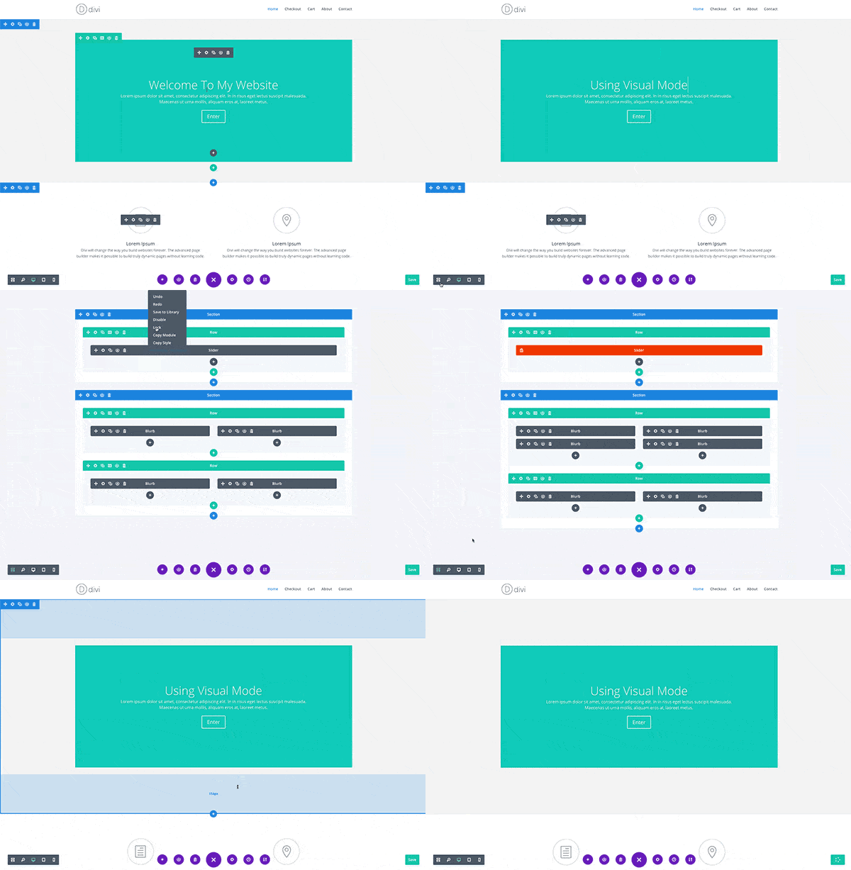
Unlike the standard Divi Builder, Wireframe View lives inside of the all new Divi 3.0 Visual Builder. This means seamless transitions between Visual View, Desktop View, Tablet View, Smartphone View and Wireframe View while editing your page on the front-end of your website. Using Wireframe View is a lot like using the standard Divi Builder, except it’s faster and it has some added perks, like the ability to edit labels right on the page and with the huge added benefit of living inside of a modern WYSIWYG application.

Wireframe View is available today, so update Divi and let us know what you think! Also, stay tuned for more great Divi features coming your way soon. We are really excited to keep pushing Divi forward, and we hope you are too.
![]()
The First Of Many New Features
Coming Your Way Every Week
We are on a mission to bring you killer new Divi features every single week for the next few months while we work up to Divi 3.1. Stay tuned!
We have a lot of amazing features planned for Divi, and we are releasing them one at a time over the next few months as we work our way towards Divi 3.1, the developer update. What new feature is coming next? You will just have to stay tuned to find out! Don’t forget to subscribe to our newsletter and follow us on Facebook so you never miss a beat.
Get 10% Off Today!
Today's The Best Day To Get Divi Or Upgrade Your Account To Lifetime
Join the most enthusiastic and loving WordPress theme community on the web and download Divi today. Using the new Visual Builder, you can build websites faster than ever before with its incredibly fast and intuitive visual interface. You have to see it to believe it!
Join Today For 10% OFF!Renew Your Account Today For 10% OFF!Upgrade Your Account Today For 10% OFF!





Amazing! The Divi theme has really grown. Would be amazing to get some material design on divi 🙂
This is the update that is getting me to use the Visual Builder finally! Thanks guys!
Feature request: it would be great if the Divi Editor view or the similar Wireframe view automatically included some way to identify each module. It could be a tiny thumbnail of the first part of a module, or a few-word excerpt from the first text in a module. I know there is a way to manually add an identifier to a module, but the method is cumbersome and manual. For a long page (such as with single-page sites), the current views make it hard to easily figure out which module (or, really, each row and section) are.
Nick: The header/footer update would be great, if you get time take a look at a theme on Themeforest call BeTheme by muffingroup there header feature is great. Not saying Divi would need all that but options would be great.
That aside, the Wireframe feature is great and something I have been wanting, so great job on that.
Feature Request: Are there any plans to make editing sections/modules on mobile user friendly? I know someone came out with a plugin just can’t think of the name right now. I know from time to time I have to make a quick update or fix a problem from my phone when not having my laptop or iPad around. On some other themes that use a builder it’s not a problem but on Divi I end up having to wait to I get back to the office. Really not a big deal, just wanted to know.
Thanks.
Will be great to have possibility to edit Divi based website on Tablet-landscape view..
I love what you’re doing and I think this new feature is a great addition.
Something I would love to see is some free blog page layouts. The layout packs were a huge hit with everyone, but the blog page design is pretty stale with Divi.
Blog Page Layouts would be awesome!
Thanks for your hard work,
Brandon
I just have a comment, when are we going to get some of these cool things added to Extra? You have left us out again? Unless of course we can use this but it doesn’t seem to indicate that.
My site is still in staging my listed site is my old one.
What about the loading speed. Is it good for Search Engine? Your pagespeed insight score is 49/100 for mobile and 63/100 for desktop. Its not good at all
It seems that most of the people here celebrating something cool, but I don’t 🙁
after updating, all I can see is still the iconic four icon view, zoom, desktop, tablet, and phone.
I wanna celebrate it to 🙁
It seems that most of the people here celebrating something cool, but I don’t 🙁
after updating, all I can see is still the iconic four icon view, zoom, desktop, tablet, and phone.
Perhaps it’s conflict with other plugin 🙁
I wanna celebrate it to 🙁
Ahoy …. We just updated. YES! good job, great feature, you just sped up the build on my current project 🙂 Thanks! BP
Love!!!!
I can’t see any updates.
I just noticed this in the front end and that ends the back and forth. Great addition and this is why I use Divi. It keeps getting better. Thanks guys!
With a child theme activated, this new feature isn’t available. When I reactivate the main theme, it’s there…
Any solution for this?
Ok, I found it. I had a filter function to remove query string version numbers in my functions.php. After removing this function, it works fine.
Hello,
A real good progress, because I really do not like working directly with the visual buider (just a shame that it does not include improvements added by TinyMCE Advanced)
A good management of the paralax and some improvement on the slideshow and the photo galleries and we will really have a great base to work
Can you also make a tutorial how you did the video on top of the page, I couldnt find an option to make a video play on lightbox.
Thanks
Wow, divi just gets better and better.
Thanks
Impressive. Really. Your visual builder just keeps on getting better.
Hmmmm ok this might entice me to use the visual builder more. I know how to use the visual builder but I’m so stuck with using divi builder on the backend. But this wireframe view is a nice addition! Time to play!
Great update – Almost very useful… Would be totally useful if the boxes representing the different content gave a clue as to which is which.
I opened a page with a whole bunch of different images and text boxes, and couldn’t correlate them to the visual version without opening and closing the elements in a search and find way.
But I’m still loving it!
Just click the gear and scroll down to bottom and change the name in admin label … ta-da … I’m busy doing that right now to get this new feature cooking. Loving it as well. 🙂
I believe it’s possible to set custom names for the boxes, no? This may help you correlate them to the visual version.
I ALWAYS rename my boxes like this: “Image” becomes “Image | Dog and Bone CU” or “Text | Intro to sales pitch.” Not only is this good while you’re editing but later, when you come back after an extended period of time, you don’t have to try to remember to which image or text the box is referring.
Looks great! Thank you Nick and the team at Divi land!
Genial!!
Seria muy bueno que se le agregaran nuevas caracteristicas al blog divi, tambien nuevos estilos al modulo. El blog es una caracteristica olvidada por parte de ET seria muy bueno agregarle nuvos diseños y caracteristicas
Great!!
It would be very good to add new features to the blog divi, also new styles to the module. The blog is a feature forgotten by ET would be very good to add new designs and features
You read my mind with the update – thanks so much! In my opinion, both views have their benefits and now it’s extremely easy to toggle back and forth.
Do you have any plans on adding more fonts, and adding more icons?
Great work guys!
…but… as others stated before… there are other modules and features that are currently more pressing. I’m specifically missing blog features. Things I partly find in the Extra theme, but not immediately available in Divi. Combining the two would over time be beneficial I guess.
Finally, you could become really revolutionary — in many ways, over-classing WP itself — if you would support management of custom post types with page and view design. Templates as it were, dynamically filled with content from (fields from) custom post types… It would turn WP somewhat more Drupal-ish, with all the advantages of DIVI.
Anyways…
Great work!!
Wait till end of this month. Currently working on template plugin. 😉
Please, let custom modules be visible (and editable) in new modes without editing and injecting javascript.
But the Visual Builder still does not work with WPML. And I here without being able to finish the web of my client and without being able to charge it. This is a real disaster.
What do you mean it doesn’t work? I am about to finish a project and though divi is compatible with wpml. You have problems with strings?
I have always used Polylang and thought it’s a great solution for multi-lingual websites. Maybe give it a try; I’ve been using it with Divi a couple times and never had any issues.
But does polylang have translation of shortcodes or do you have to re-design each page for each language?
For each page in the backend, you can set its respective language. For the shortcodes that come with Divi, the respective translation file will be loaded (assuming you used the correct locales for each language).
If you’ve written a shortcode yourself, you’d have to program it accordingly so it’s using a .po/.mo file for its translations. So this is very much possible and not all that complicated.
Great update! I’m really looking forward to this new functionality.
Yessssss!
Hi! Is there a keyboard shortcut for switching back and forth between those modes?
Oh, yeah!! Love it. You guys never cease to amaze and delight.
Very cool initiative Divi Team. Huge supporter over here!
Man, I wish the builder would be half as fast as it always seems to be in those demo videos. ^^
I like the changes, but I’m afraid I won’t be able to really make much of it as the Visual Builder has often been too unresponsive to be usable to me and I stuck with the regular Divi Builder.
Me too. The demo videos make it look wonderful. My reality appears to be very similar to Oliver. Crashes, timeouts, jumping modules, unresponsive clicks – on Chrome, Firefox, Opera, IE – on multiple hosting accounts with different hosting companies and different instances of wordpress. I want to love DIVI, I really do, but I’m finding it difficult.
As has been mentioned above, please keep going, please keep adding features !! But also please keep an eye on stability and performance too.
This looks cool! I’m looking forward to giving it a whirl.
Hi Nick,
Excellent new feature, I prefer to work in the back end builder so this gives us the best of both world and helps me get used to working in the visual builder too.
Keep up the fantastic work on Divi only thing I need now is more than 4 columns natively out of the box please??
Cheers
Martin
Hello, I have been a customer for over 4 years now and I love divi, but I really dislike the blog section. Not a lot of love has been given on the styling of the blog.
Please give us option for blog! Magazine style too, not just stacked boxes
De acuerdo. Este modulo hace mucho tiempo no presenta una evolucion, los estilos, diseños ya han cambiado y este aun permanece intactO. ET ya deberia darle un giro a este modulo
According. This module does not present an evolution for a long time, the styles, designs have already changed and this still remains intact. ET should already give a turn to this module
I agree. Several years ago, we used PageLines to style WordPress blogs – looking back, that still gave more options than Divi does today.
¡Thanks!
Very usuful.
Good job
Great and very useful feature! Thank you!
DIVI, I loooooove you!
THIS is awesome!
Great Nick, gonna try it right away 🙂 Thanks
how is the feature enabled?
Have updated and can’t see any change.
I like the update, but it would make more sense to have the toggle switch up in the left top next to enable / disable Divi Builder. I know it seems like no big deal to go to lower corner, but it adds additional clicks if the menu is not open and it is not in the same location as the other mode switches.
This looks exciting – looking forward to giving it a go!
It’s time someone gives DIVI an Award!, this theme is beyond normal!
This looks great! Thanks for listening to your customers.
Whilst I appreciate the team’s development of Divi, please, please, please can we have more customisable headers.
The ability to simply have the logo ranged left or right above or below the menu (not just alongside it) without doing loads of custom CSS would be fantastic. Would also be handy to have more options on adding to / styling the contact details in the top header. An option to have separate menus for mobiles / desktops would be good too. It’s a big ask, but to be able to drag and drop modules into headers would be fantastic.
Better options for styling the blog module would also be handy as many of the sites we develop use this feature – it’s very limited at the moment.
Keep up the good work.
Yeap +1 for header and footer more options out of the box at least for basic things like social, widget options etc…
This is definitely on our radar, as is the thought of creating a new header & footer builder that takes advantage of the Visual Builder interface. Don’t worry, lot of great features are coming, but we can only take one step at a time 🙂
Yep, same here: more header and footer options plus menu display and behaviour, to better ‘disguise’ Divi sites. Would love to keep on using Divi for a long time, but in my opinion the headers/footers/menus look a little too akin right now.
Divi modules in the header and footer is a must! That would truly make Divi a better drag and drop builder. I used custom code before but there is a very good plugin called Divi Extra Layout Injector which I used on my last project, works great!
Yeap +1 for header and footer more options out of the box at least for basic things like social, widget options etc…
Hi Nick,
Another vote for the header and footer builder! Please sooner than later 🙂
Thanks!
Sounds promising, thanks Nick.
That would be fantastic!
I concur!
Nick, aside from the promised Dev Release, I agree that improving the page-common design features (i.e. headers and footers) would really help us design sites that look truly unique. While that is technically possible now, it is most certainly not that way out of the box and often takes a great deal of CSS and fussing around.
Ditto to Phil’s request! The navigation and header could use more design features.
That’s great to hear!
Nice! This is a great new feature. Can’t wait to see what’s next!
Amazing! So exciting! Just what our team has been wanting. We are so pleased with ET and Divi we are about to move our third website into Divi.
Thanks so much for staying innovative!
This is very useful! Thanks!
Nice work Divi Team. I love this theme. Efficient. Eagerly Waiting for the next update.
Cool but I wish you would work on getting the core functionality of the VB correct. The thing’s so flaky I often have to exit in frustration and perform changes in the normal builder.
I’m fed up being unable to actually get the cursor in just the right spot to be able to do something as simple as adding a module or selecting the module, row or section I want to edit. Many times it’s actually impossible to do certain things because the VB effectively masks one item by switching focus to another. Incredibly annoying. As for getting accurate visual feedback for proposed alterations, well, it seems to have a mind of its own! I was experimenting on a contact form last night where my changes would mean not displaying an image in the relevant column yet the VB was happily showing the image during all my edits. It was only upon exiting the VB that I could see the form how it was supposed to look. All things like these should be fixed before embarking on new features.
I love the enthusiasm with which every Divi national goes about improving the theme and explaining things, true commitment, I would say. Nonetheless I’m sorry to say that for me VB behaves exactly as Gary reports. Since day one and many a filed request it fails to function unobtrusively. I hesitate to invoke it to do even the most basic changes in texts etc. As was stated, one module panel covers up the other leaving me groping blindly. Padding/margin changes don’t accurately reflect until I check the (often differing) preview.
No real option yet.
But go on developping with that same fervor, please. I just hope that VB does not impede performance of the built site as such…
+1
I’ve stopped using the visual builder and stopped reporting bugs for some times already.
I’m also very careful when applying Divi too frequent updates. Never ever on the production site without having tested carefully on the dev site for some days.
Don’t get me wrong, still like Divi very much for its core features but I think things like Visual Builder are and will remain a never ending source of bugs.
Yes. It is full of bugs and does not work with WPML.
If you are experiencing any particular bugs, please open a ticket in the support forums so we can take a look. Often times third party Divi plugins or Divi Child themes can cause CSS conflicts with the Visual Builder. In those cases, switching to Wireframe mode is definitely an option.
What he is talking about in VB with clicking on a edit icon on a module, row or section is not so much a bug as it is the way it is implemented. Adding a right click > edit option or a hotkey > click option would greatly improve the edit option in VB. Having to pop to page edit or now even wire frame defeats the wysiwyg benefits of VB. Ad does the seeing mobile / tablet view modules opaqued out when editing a desktop view. VB should HIDE those until you switch to that view. These are not bug, just design flaws.
ABSOLUTELY! I’ve mentioned this earlier, too. Seems so obvious and simple. But . . .
I did just see that if you click to WF view, you can click edit then switch back to VB view which works, but adds additional clicks to work flow. This is a work around but I HATE workarounds for common tasks. It is inefficient.
As Gregory says, Nick, these seem to be design flaws rather than bugs. I’ve experienced the things I mentioned when running nothing but Divi and the builder!
There are other issues too including VB jumping up and down the page just because I’ve hovered over a particular area. It can be extremely disorienting, especially if one is working on a tight, complex portion of a page. Text which is supposed to be clickable and editable right there on the page won’t do anything sometimes. I can select it and try to delete and it’ll just stay there as it was.
The concept of VB is great but I’m afraid, in the real world, it feels like some kind of beta product that requires testing and improving. The more you move forward by adding new features the more I fear that a lot of basic functionality will be left behind, not working the way it should. I’d much rather have a feature-limited VB which is rock solid and fast.
Please don’t be disillusioned by my comments, Nick. Please do take note though and make VB more solid than it currently is.
Superb ! Will help both designers and their clients a lot ! One step further to a front-end only edition for editors members.
Er… and don’t forget to allow editing posts title from the front end as well (even without having the ability to edit the slug in front end). 😉
This looks really good! Will try it out as soon as it is available.
I really like the idea of being able to use the backend-editor in an easy way, since it has more functions!
Thank you so much! Just what I needed. Sometimes you just need to see the frame to change things and now you can!
Thanks for the new bugs too – I just found that after updating we get a bug in our own custom module section that wraps P tags around our modules.
It wasnt their before hand. I guess this is yet another reason to open a git repo or early release to the growing plugin and theme developer community.
This has already been fixed, so you can re-download and re-upload Divi to apply the hotfix.
This is so welcome. Even editing the labels on the fly – seems like a small thing but it is so much more intuitive and user friendly. Great work Divi elves!
This looks great. Im updating and checking it all out.
Looks great! Can’t wait to give it a whirl.
Nick, I enjoy all new features, but my ultimate request for Divi, what would set it apart from all other builders, would be if we could lay out templates for custom post type posts/pages and archives. To have the ability to draw information from any custom field into all Divi modules. To have a new “Loop Section” where we can lay out looping information so we can design our own archive pages etc. Trying to do this clumsily now with Toolset, but having that ability right in Divi is the dream!
Beaver Themer that just got release for Beaver Builder and does exactly this. It will only be a matter of time before Divi comes up with their own solution. until then there’s always the ability to add custom code for this via a child theme or use a third party solution like toolset. I think the release of 3.1 will make extending the system with something like this much easier. If Divi doesn’t do it expect someone in the community to release a really solid solution at that point.
I concur. Trying to integrate toolset layouts with Divi seems like a bad hack. Using the Divi integration plugin adds layout options (full width sections) but makes things worse by having to rebuild the header and footer.
There definitely is scope for your suggestion. Some third party vendors have layout injectors that can be used with custom post types and fields. Check out Tortoise IT but but this mix doesn’t offer the broad range of features offered by Toolset.
Another feature would be hooks into above the header, after the header, content etc. Again Divi Space does have a plugin for this but would prefer if Elegant themes would implement it themselves.
Awesome. I was just thinking something like this would be great last week ! Looking forward to trying it out.
Hey Guys, awesome update! It’s building for Divi Builder Plugin too?
Thank you guys 🙂
+1
Nice!
This will be amazing for dividers that when duplicated sit on top of each other and you can’t tell how many are there until you see the back end.
Also sometimes it’s hard to hit the edit module buttons when sections have little or no padding and things like that.
Love it, cheers!
This is a great feature! Makes it really quick and easy to switch between the two modes!
Cool! Keep on going!!
Amazing! You guys are well on your way to taking over WP World
Howdy, Thanks for updating new features in Divi, Please Update some cool Divi Blog Modules Please Please Sir,
Thanks
This is AWESOME! Thank you!
Hi Nick,
This is perfect for me as often I would have the Visual Builder for a page open on one screen and backend view on the other screen for more complex pages or when the Visual Builder conflicts with certain plugins on other sites.
This now eliminates that and improves my workflow! Thanks so much!!
Can’t wait to see more updates!
YES! This is the feature I’ve always wanted since 3.0, but never knew I wanted. Great job guys!!
Good point, Tim … Same here! My clients said the visual builder was way too confusing when trying to do almost anything but edit text, and this new wireframe view should help a ton!
Excellent addition that really boosts the productivity of the frontend Divi builder!
It’s great! Thanks! Amazing features!
Can you make divi available on all pages in woocommerce pages.