![]()
An Amazing New Way To Use Divi
Quick Actions makes it easier than ever to find what you are looking for, navigate the builder and perform tasks with speed and efficiency.
Today we are introducing Quick Actions, an incredible new way to use Divi. Quick Actions is the Divi enthusiast’s secret weapon. It allows you to do anything, go anywhere and find what you need within the Divi Builder and on your WordPress website with incredible speed. Using simple commands and an intelligent search system, you can really speed up your web design workflow.
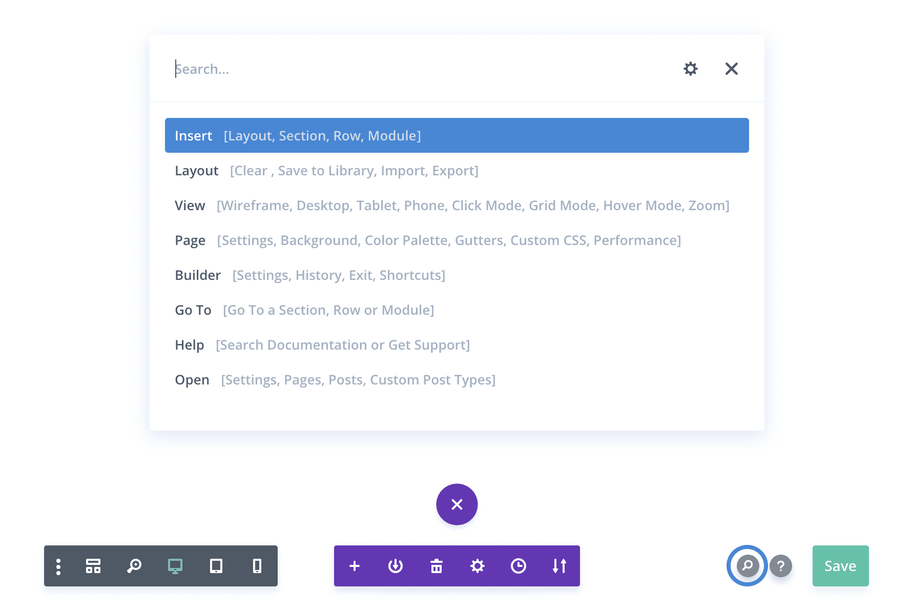
To use the new Quick Actions system, simply press Shift+Space while you are in the builder, or click the new Search icon within the page settings bar.
![]()
A Robust Finder And Navigator
Using Quick Actions, you can easily find and navigate to specific elements, options and pages.
Quick Actions acts as a really robust search and navigation tool. It allows you to quickly locate and navigate to specific modules, rows and sections on your page as well as to specific builder options that would otherwise be nested several clicks deep into various settings windows. You can also quickly navigate to entirely different pages right from inside the builder and jump straight into editing without having to click through your WordPress dashboard at all. You can even quickly jump to relevant Divi settings pages, the Divi Role Editor and the Divi Library.
Quickly Navigate Your Page While You Build

Using the Go To command, you can quickly search through and navigate to specific modules, rows and sections on your page. This becomes especially useful on long pages. If you are using custom Admin Labels, these labels will become searchable within the Go To command. If you know the admin label of a section and want to jump to it right away, Quick Actions makes that super easy. If you are an avid Backend Builder user and prefer to build in Wireframe mode, this command is especially useful since it’s often difficult to hunt through the block interface for specific items, even when they are labeled well.
Find & Edit Specific Builder Options
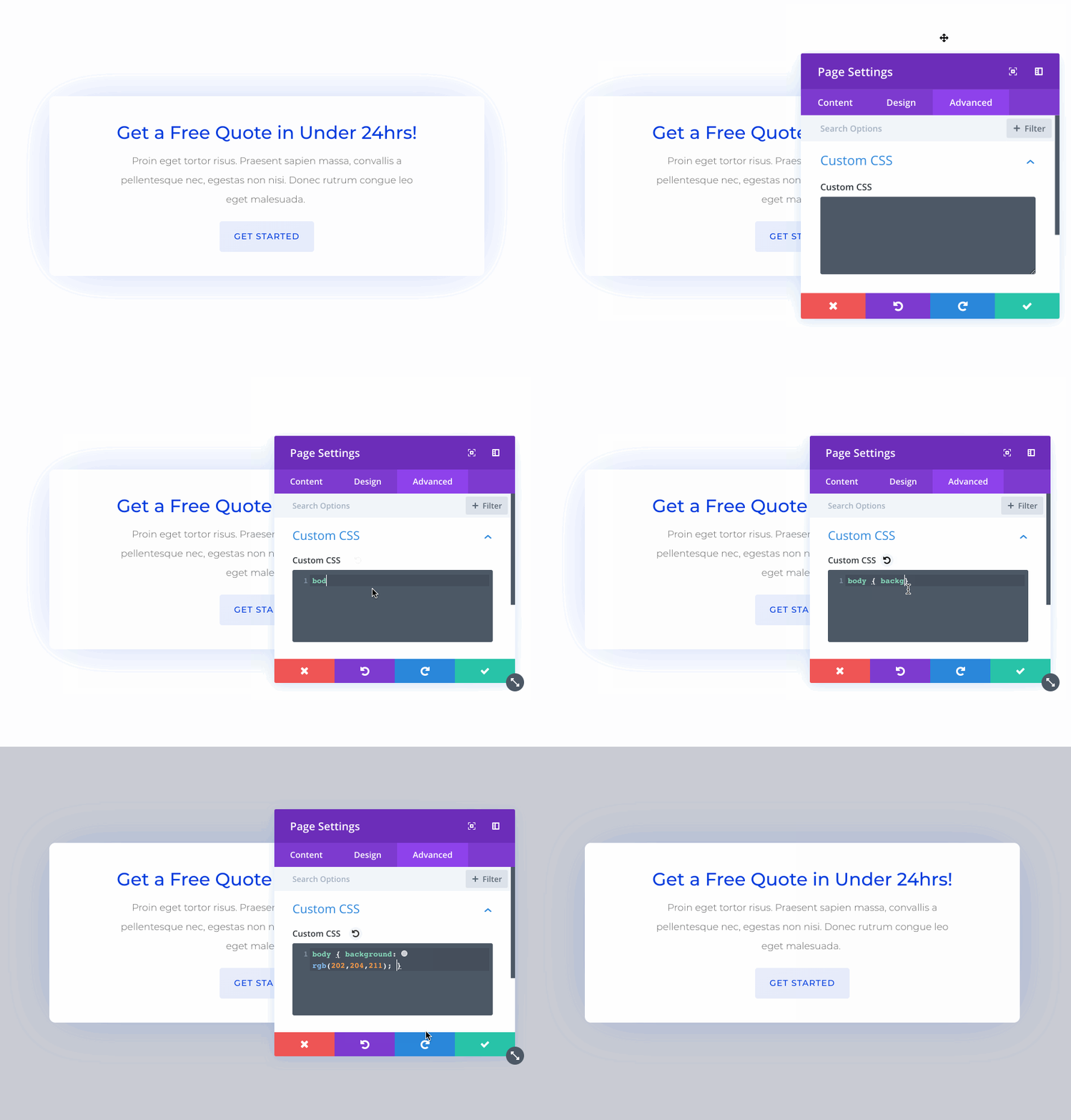
The Divi Builder has a lot of options. Even if you know what you want to edit, specific options can still be hard to find. Now these options are easily searchable in the Quick Actions toolbar. For example, if you want to edit the Background Color of your page, you can just type in Background Color and hit enter. The page settings window will pop up and you will be navigated directly to the Background Color option. This works for Divi Builder interface settings too. Using the Builder and Page commands, you can easily navigate through all available options.
Quickly Jump To New Pages And Start Editing
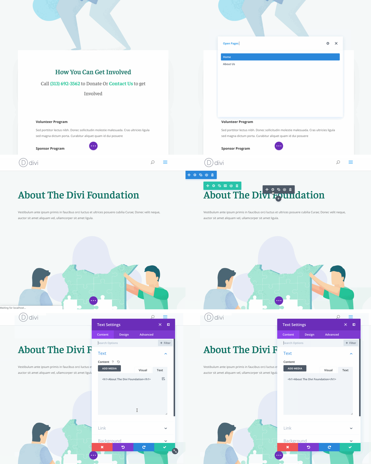
Not only can you search and navigate through your current page, you can also search through your WordPress website and jump to entirely new pages, right from inside the Quick Actions toolbar using the Open command. If you want to edit a new page, you can easily find that page and launch the Divi Builder without having the click through your WordPress dashboard at all. It’s so much faster.
Easy Access To Divi Settings, Role Editor And Library
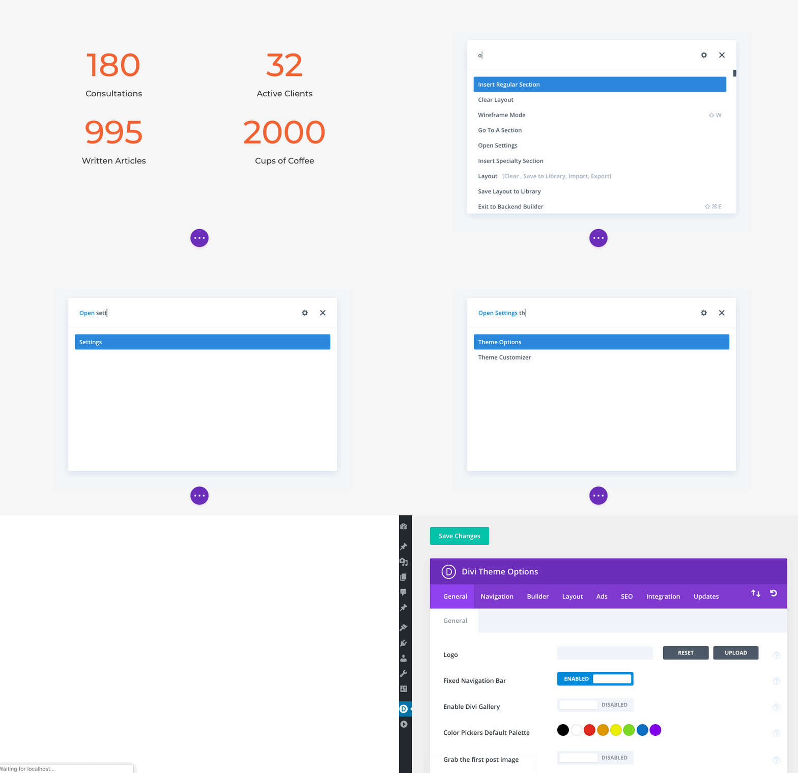
Not only can you quickly jump to new pages, the Open command also gives you quick access to relevant Divi settings pages such as the Theme Customizer, Theme Options, Role Editor and the Divi Library. You don’t need to leave the builder and click through your WordPress dashboard to navigate to these areas. The Quick Actions toolbar gives you easy access.
Quick Access To Help Videos And Documentation

Quick Actions is also a great way to get help. When you type into the Quick Actions toolbar, it automatically searches our online documentation system for relevant articles and helps you find contextual help videos right inside the builder. Using the Help command will guide you through our internal and external help systems and get you the help you need.
![]()
Don’t Just Find Things. Do Things!
Quick Actions is so much more than just a finder. It also allows you to perform complex tasks within the builder with incredible speed and efficiency.
Being able to quickly navigate your page, the builder and your website is really cool, but Quick Actions is so much more than just a finder. It’s also a doer. You can quickly insert modules, rows, sections and even saved library items without having to navigate the builder interfacer at all. You can toggle view modes, import and export layouts, save your page, and switch between the back end and front end editors with ease. It’s really amazing and super convenient.
Insert Modules, Rows, Sections And Saved Library Items

Using the Insert command, you can quickly add anything to your page. Instead of having to click multiple times and scroll through a long list of modules to locate and add a Slider module, just type “Slider” into the Quick Actions toolbar and hit enter to instantly add a Slider module to your page! Not only that, you can even search through and add items from your Divi Library. All of your available items are right there and fully searchable.
Save, Publish And Switch Between Backend And Frontend Editors
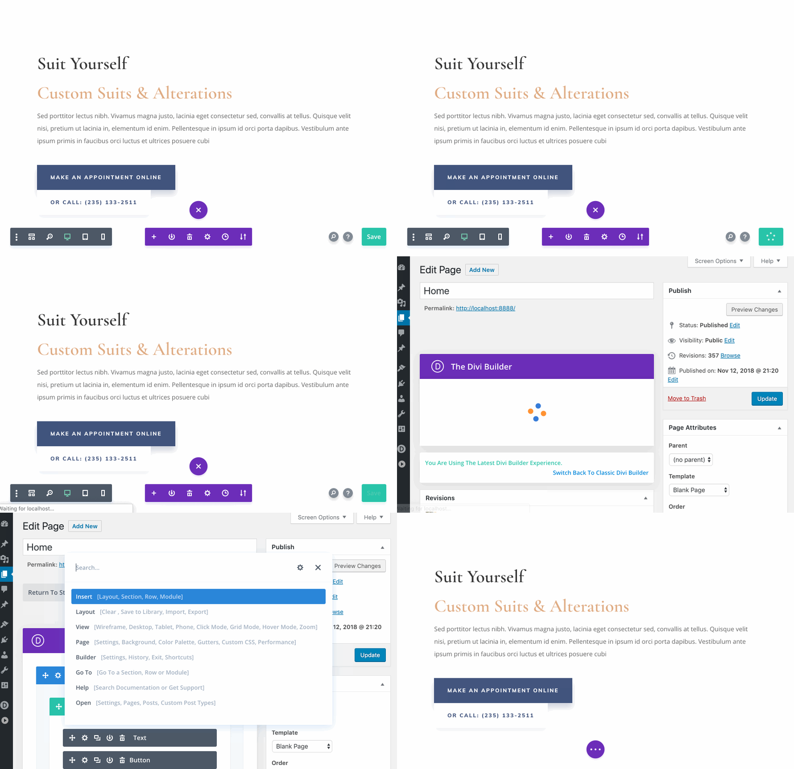
Quick Actions makes it easy to save your page and switch between the Backend and Frontend editors. We have done our best to add every action imaginable into the Quick Actions toolbar. If you want to do something, just open up Quick Actions and start typing. There is a good chance that your desired action will be available.
Toggle View Modes And Interaction Modes
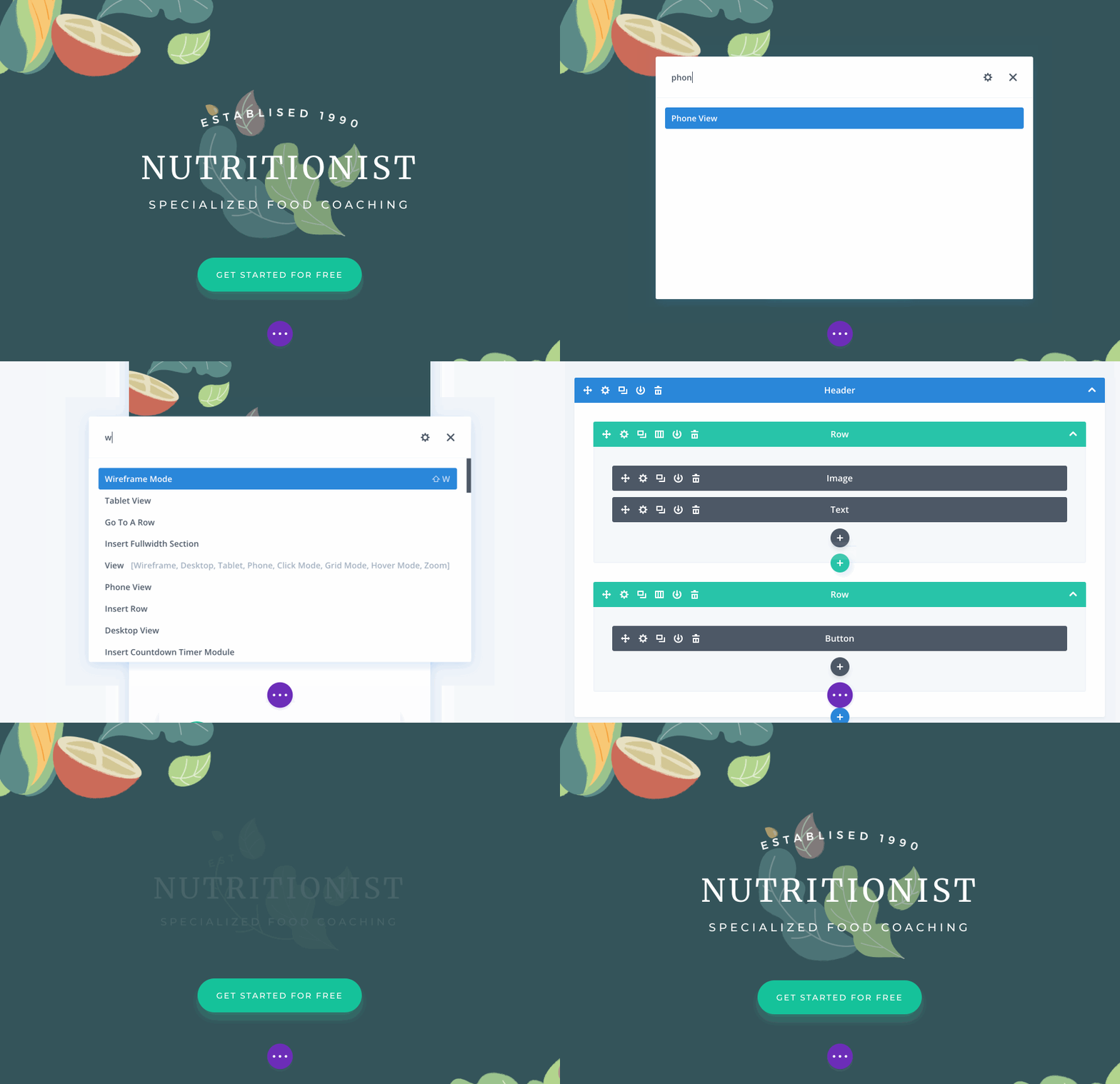
Using the View command, you can quickly toggle between the various Divi Builder View Modes and Interaction Modes. You can switch between Wireframe Mode, Visual Mode and Responsive Modes. You can also quickly switch between Hover Mode, Click Mode and Grid Mode.
For Experts And Newcomers Alike
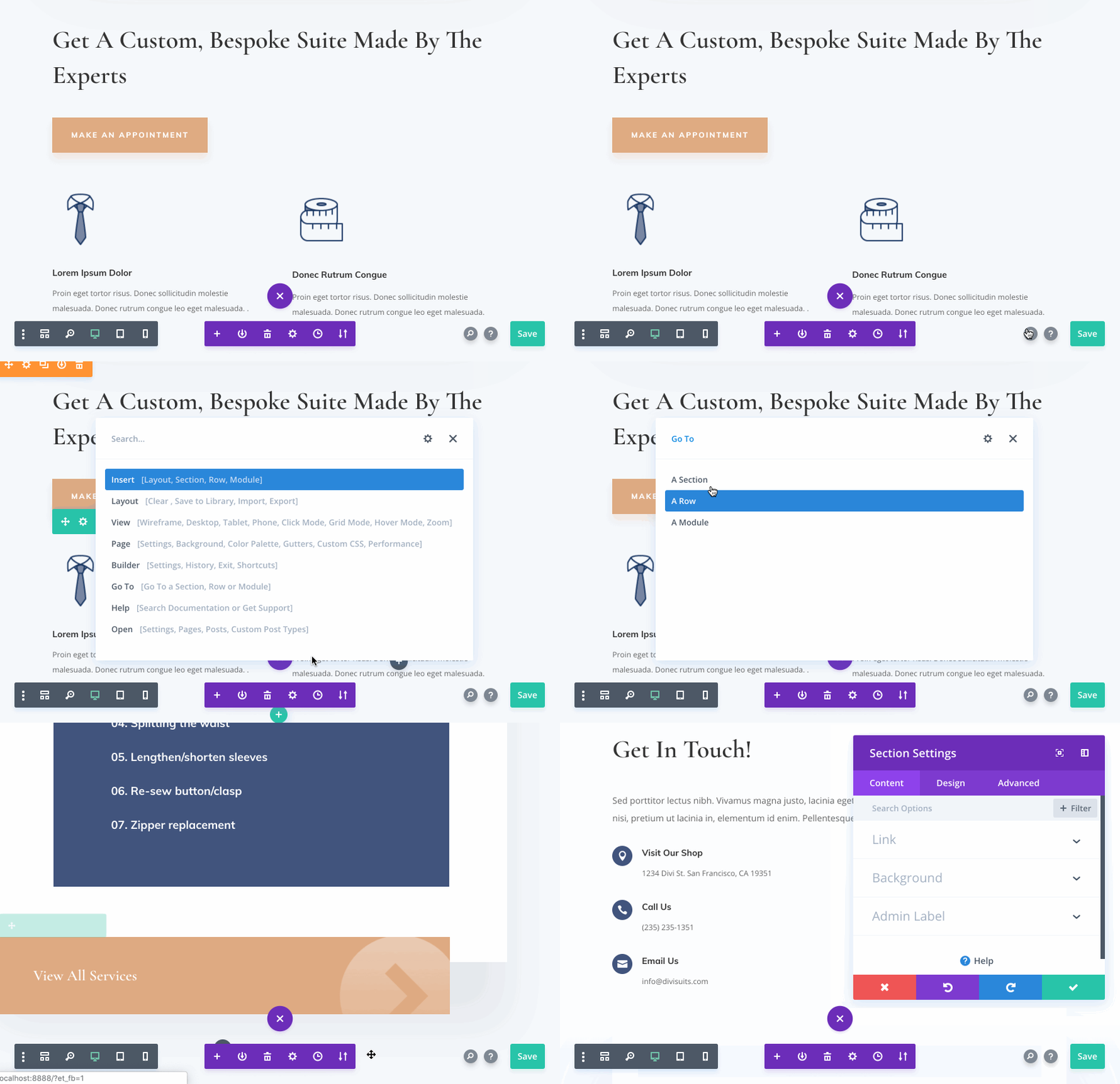
A master of Quick Action commands can navigate the builder and and perform tasks with incredible speed, but even if you aren’t familiar with Quick Actions, you can still use it as a search tool, or simply click through the available commands manually. You don’t need to memorize anything. Just start typing and Quick Actions will help you find what you are looking for and help you do what you are trying to do.
The new Quick Actions system is available today, so download Divi and take it for a spin. Let us know what you think in the comments and don’t forget to check back next week for even more great Divi features coming your way.
Get 10% Off Today!
Today's The Best Day To Get Divi Or Upgrade Your Account To Lifetime
Join the most enthusiastic and loving WordPress theme community on the web and download Divi today. Using the new Visual Builder, you can build websites faster than ever before with its incredibly fast and intuitive visual interface. You have to see it to believe it!
Join Today For 10% OFF!Renew Your Account Today For 10% OFF!Upgrade Your Account Today For 10% OFF!


Awesome article!
Okay, great feature. With one caveat.
Can you change the shortcut to something other than a common keyboard usage? I keep inadvertently calling up the shortcut when doing quick edits.
Because I type kind of fast, SHIFT+SPACE always runs in line with my typing.
For me personally, and I don’t know if anyone else feels this way, it really gets in the way.
This is so cool! Thanks Nick and ET/Divi Team! I have not seen the comments section yet, don’t know if anybody has thought of this idea…but am liking the idea that instead of calling it DIVI ACTIONS…it’s more appropriate to call this feature “QUICK NICK”! Haha! 🙂
Hey, Nick!
Gotta say I’m blown away by how cool Divi is and how it keeps improving radically! My lifetime membership is, by far, the best investment I’ve ever made in web design tools – super stoked.
Many thanks!
To be honest, I find this to be a gimmicky feature and would rather see more attention paid to implementing and improving the countless modules that have gone untouched for years like the Gallery, SLider, Blog, Carousel, Social Media, Tabs, Portfolio, iconography and many others.
At first, the new developer tools were a nice addition, but lately, I feel too much attention is being given to improving workflow processes that never existed. It’s the old adage of an answer in search of a question that no one asked.
The Divi modules seriously lag behind other premium themes and improving modules would go a long way.
Found some quirky behavior when using the new editor on a page which is a destination for a multiple domain mapping page (we have a subdomain mapped to this specific page). Once mapping was removed the editor behaved as expected.
1) finally make Dynamic content for languages other than English! (Still with October waiting for!)
2) it is convenient, but again the search will work with other languages.
3) Woocommerce, poorly configured from the side, you have to write a lot of additional CSS, because in most cases the styles are interchanged in Extra & Divi themes
4) to Introduce the possibility of GDPR for the application forms
And this is only a small part.. The rest of the chat with tech support
It’s definitely nice how you keep on improving Divi with useful things nobody asked for or even knew they wanted it.
When will you start working on improving existing features that many people already did ask for because they know they want it?
Here are a few things that have been asked many times by me and others in the old theme suggestion forum and in the support chat. All we here from support that it has been added to the list and then we never hear from it again.
Bug fixes
– iPad portrait: blurb image doesn’t span the full width (so you see a white margin around the image).
– Full width header not correctly centered on mobile (especially with 2 buttons) and not enough space
Improve existing features
– Add Social Media channels for header/footer + setting to open link in a new window (similar to the social media follow module)
– Person module: add more social channels + website + email option (similar to the social media follow module)
– Social media module: option to add a website + email + custom link (Avada has that).
– Gallery module grid: re-add the ‘Random order’ setting it exixts in WP + classic builder and has been removed from the visual builder.
– All image modules to use the title + alt tag that are specified the media library.
– Contact form to send comfirmation to submitter
– Maps module: alternative for Google Maps
– Save global design settings (without global modules)
– Theme customizer for the backend builder so you don’t have to switch to the front (or make all page backend page settings available in the front end).
New features
– Add Global color settings (like oxygen)
– Add Font size settings for each header h1, h2 etc
– Add a responsive breakpoint for iPad in ladscape mode (and/or option to add custom breakpoints)
– Border + shadow settings for columns
– Timed content: a setting on sections, rows, columns and modules to specify the from/to date and time that item should be displayed
Please also consider using a tool like GetSatisfaction or UserVoice so users can vote on idea. That way we and you can see what feature reguest is most valued by the community.
Thanks
JP
+1
Many of the things mentioned above need to be and can easily implemented in Divi. Taking the alt image content automatically, if it is filled in, has already been prototyped in support forums:
https://www.elegantthemes.com/forum/viewtopic.php?f=22&t=828115
NOTE: As is mentioned, you can implement this yourself but, it can be problematic with future theme updates. Best that Elegant Themes implement it.
Fix this bug dynamic content in other languages that English.
I’m starting to lose patience and for a project I’m going to start in January I’m thinking of using Elementor and who knows, if Elementor is good I’ll say goodbye to Divi.
Frankly the Divi team disappoint me greatly.
+1
Esta gente de Elegant Themes no tiene muy en cuenta a la gente que no hablamos inglés.
Lástima.
Top languages by population per Nationalencyklopedin in millions
Rank Language Native speakers
1 Mandarin (entire branch) 935 (955)
2 Spanish 390 (405)
3 English 365 (360)
4 Hindi[a] 295 (310)
5 Arabic 280 (295)
6 Portuguese 205 (215)
7 Bengali (Bangla) 200 (205)
8 Russian 160 (155)
9 Japanese 125 (125)
10 Punjabi 95 (100)
11 German 92 (95)
Amazing update 🙂 thank you very much 🙂
Question – with this, if I ask it to take me to a new page, will it save the work on the page I’d been working on? Or do i need to save first, then have it take me to another page?
Going to have to go upgrade and play around!
I will try this out now and let you know… one of the first things I also wondered when I was reading through the post.
Useful feature, but I would have chosen another shortcut, I think that CTRL+SPACE is more appropriate. When writing fast and using SHIFT to make an uppercase letter immediately after a space, it often triggers the Quick Actions accidentally. Is it possible to change the shortcut?
Fucking Awesome! (Pardon my profanity)
This is awesome! Thanks!
Hi, first of all thanks for the great constant work they do.
I work with Divi in Spanish.
Do I have to write the commands in English or Quick Actions understand Spanish?
Because presently the translation of Divi is not complete. There are parts of the builder, the theme, modules, etc. that appear in English.
Or do I have to memory learn all the commands in English instead of working intuitively in my language?
Quick actions will find the result i are looking for if I write it in Spanish and just that term is not translated?
Or otherwise
Quick actions will find the result i are looking for if I write it in English and just that term is Spanish right translated?
Thanks and Merry Christmas to all!
Wow and Merry Christmas from Divi and Elegant Themes – Honestly you guys are just killing it! Thank you for such frequent and great new features to your builder, along with just incredible documentation and support. Just love the experience and flexibility Divi brings me and my clients.
Now just one major item left on my wish list…
How about a custom header and footer builder?…
please make templates like optimizepress
Thanks, guys. That is amazing! I love how you solve UX problems we didn’t realize existed. And the style and function seems to be really spot on. Thanks for that.
And while I do understand the need for growing in a full theme editor I see it underway – and would like our community to just reflect the features at hand. ET is working hard, obviously. They will grow to a full fledged theme framework and redefine a few UX shortcuts on the way. I am waiting curiously.
Very cool feature!! Great Job Nick!!
Nice! Can we get a Quick Actions cheat-sheet with a quick list/reference of the commands?
+1
Wow! Another amazing new feature focused on helping those in the trenches. Congrats Elegant Themes team and thanks! Have a wonderful holiday!
Excellent development !!!, I just learn about the new constructor … and include new shapes !! It’s awesome !!, congratulations to Nick and his team !! Greetings from Venezuela.
Dear Nick.
Let’s speak frankly, without haggling.
I have the greatest respect for your constant will to innovate. But the fact is that you better get the existing functions running first so that they work 100%.
There are so many small, but incredibly annoying bugs in the theme.
That’s why I wish you’d step on the brakes for 14 days and turn around to the past. Because there is still a lot to perfect. You’d be showing your true greatness.
THX and Greatings from Germany
Eric
Neat! This will definitely be helpful for doing things a little quicker than before. I certainly thought some other feature would come first, but I’m glad to see this one be released right now!
Also, I noticed this in the recent “Gutenberg and the New Divi Builder Experience” post:
“However, we are working on exciting integrations (coming soon) where you can use your favorite Divi modules within Gutenberg, or use any registered Gutenberg blocks within the Divi Builder.”
I am _really_ looking forward to this. This is the kind of integration I have been hoping for since I first started following the Gutenberg project.
On another note, here are some things I would like to see in the future:
– Option to change the heading level (h1-h6) used in a Blurb and other modules.
– Option to change the HTML element used by a section or row from a div to a section element.
– Making a module act as a link should change the HTML to use an anchor tag or wrap the module with one, instead of using JS events.
– Overhaul the layout system: Fullwidth sections have been obsolete for a long time thanks to fullwidth rows, so they should be removed. Specialty sections shouldn’t be a thing; you should instead be able to nest any row in another row. You should also be able to have modules on a page without nesting it in a row or section. Divi currently forces a lot of unnecessary markup for simple layouts compared to other builders/editors, and I think most of them also have better base layout systems… especially Gutenberg and Oxygen.
– Dark mode support. There is a plugin called Dark Mode which is likely to be merged into WordPress core in the future. Unfortunately, some of the Divi UI (particularly Divi’s modifications to the Customizer) does not work well with this plugin, so I hope this can be fixed in the future, particularly if the plugin does indeed end up being merged into core.
– It would be really nice if Divi users could somehow contribute code to Divi. Brizy, Elementor, and of course Gutenberg all have code on GitHub, so contributing via issues and pull requests is relatively simple. It would be really cool if Divi could do something similar, though I am not sure how it would be done since Divi has no free version.
– The “Use The Divi Builder” button in Gutenberg should be responsive and shrink to just an icon or move to the ellipsis menu on mobile. Currently, it eats up a lot of space regardless of your viewport width and makes the editor harder to use on mobile. Also, it should probably read “Use Divi Builder” so it can be a bit shorter.
– It would be really nice if Divi users could somehow contribute code to Divi. Brizy, Elementor, and of course Gutenberg all have free versions on GitHub, so contributing via issues and pull requests is relatively simple. It would be really cool if Divi could do something similar, though I am not sure how it would be done since Divi has no free version.
Finally, here is my standard analysis of upcoming Divi features…
Every Divi feature update these days is sneak-peaked first. Here’s a list of all features that have not yet been released, in order of announcement:
– Theme Builder
– Global Defaults
– Support Center
– Transform Options
– WooCommerce Modules
– Column Design Options
– Draggable Sizing + More Sizing Options
– Layers View
– Global Presets (not yet officially sneak-peeked; mentioned in a comment)
So which one of these will be the next feature released? Well, this comment from Nick on the Bulk Editing update blog post helps:
(In response to a question about when Theme Builder is coming.)
‘Dynamic Content will come first. That feature is quite close to being ready actually, and will likely enter QA testing within the next week weeks. Our whole team will be on vacation next week for our yearly retreat. Global Defaults and Hover Options will also likely come first. The Theme Builder is the “last piece of the puzzle” when you consider the various features we are currently working on.’
Dynamic Content and Hover Options have both come. Global Defaults, however, has not, so I would expect to see it come before Theme Builder. Global Defaults is the oldest announced feature not yet released other than Theme Builder, so it would appear to be the most likely next feature release. However, other features may be easier to develop, so something like Support Center or Transform Options may end up coming first.
Hi!
Like everyone else, I’ve got my priorities on what updates/new features/fixes I’d like to see next. But I also understand that it’s not possible to do them all at once and immediately.
I appreciate all the great work you and your team have been accomplishing! Keep up the good work. Must be trickier now with the addition of Gutenberg and all the changes within WordPress itself.
C’est très, très génial!!
I like the way the insert elements works you can hover around till you decide where you want it to go then click on the element above to insert below. Opening other pages and settings open them in a new tab, as it should do.
Looks good.
A gentle reminder. I am still seeing a quirk in the new backend visual builder where, if you use a height using a vh value the section or row zooms up the background infinitum. It’s like it can’t determine what height the browser window is and keeps enlarging so you have a lot of scrolling to navigate past the element.
Plus one on this reminder – as I am also finding the same thing… And wishing it were not so…
Plus one here as well. The wireframe view should not display any custom css styling. It should only display structure. I have to actually open the Chrome inspector while working in divi wireframe mode, find the section that is uber tall, and give it height: auto. That causes it to be normal height. ET, can you give height auto to all wireframe sections, rows, columns, and modules so we don’t have to experience this?
Had a look at this issue again. If you add a max-height value after the height value, you can control this, and prevent the zoom:
height: 94vh;
max-height: 900px works for my Fullwidth Header settings.
Thanks. I tested this with chrome inspector. It’s more bearable with this “hack” but the height CSS of my child theme is still affecting the height of the section/row/column/module. Their latest release did not fix this issue. I think all they need to do is give any section/row/column/module a height of auto when it’s in wireframe. That would force it to be normal wireframe hight for each block.
Fantastic!
This gonna save a lot of time..
Nick and team – this is a game changer – I have a funeral site with 20 pages and over 1000 obit posts this makes it so easy to jump around THANKYOU happy Christmas!!
Very cool! Thanks! Look forward to trying it out.
Increíble! siempre dándonos grandes sorpresas, gracias equipo Divi! Lo máximo!
Great!
Thank you!
I really like the fact that you keep speeding up the work flow. However, will you guys make it possible in the future to adjust the design of the blog category pages?
Yep, that’s already in the works. You can read more about it here.
“Theme Builder are already in the works”
Jeez…you have been saying this for so long! It’s been SEVEN MONTHS! since the sneak peek, and in that blog post you made it clear that the features sought have been awaited pretty much for years.
“Since its launch Divi has been popular because of the power it provides and the creativity it unleashes for every WordPress user. And for nearly just as long those same users have wanted us to extend that power and creativity to every page, post, area, and template file in WordPress. Well now, it’s happening.”
I have held back on even using blog posts because I hate how they look in Divi. The same with the ugly blog list page.
Now even seven months after stating how you would “finally (and officially!) announce that [you] are hard at work bringing a robust theme builder to Divi” and nothing there yet, Gutenberg arrives and one of the first things you guys do is release a blog post about creating Gutenberg post templates!!!
I don’t want to design my blog posts in Gutenberg, this is the completely WRONG way. WordPress is supposed to separate CONTENT from LAYOUT and DESIGN!
With the Gutenberg editor, this is going backwards!
I was expecting to be able to enter content in the simple WP editor and for that to transform inside of Divi layouts saved as default TEMPLATES.
All previous Divi blog posts about designing blog post layouts were missing that point! They don’t save them as templates. So the workflow would be to open a Divi blog layout and make manual page setting changes, then fill in the content manually. But that does not give you GLOBAL STYLE control!
Can you explain what the path of Divi is when it comes to page and post templates, how it all fits with Gutenberg going forward (I think Gutenberg is a big mistake!), and when we will have full header, navigation menu and footer customization control, and global style control in a central place (and how does THAT fit with Gutenberg?) ???
I have my moments where I just feel Divi should just dump WordPress altogether and become an independent Website builder.
“WordPress is supposed to separate CONTENT from LAYOUT and DESIGN!”
That’s one I totally agree with and while the new WordPress block builder paradigm is interesting it doesn’t address this one thing seriously in a user-friendly manner, at least not yet.
Standing back a bit you do though have to appreciate that WordPress has, for a long time, been a bit a silk purse from a sow’s ear and this is why we have solutions like Divi and other builders to fill the gap when it comes to layout. From the start, since 2009, I have found WordPress an odd mix of conflicting approaches to web design. It’s the reason why we have to hack together solutions for things to work, and this is the situation of the developers of third party builders added to WordPress.
To add to the mix developers have the, late to the game, Gutenberg headache to deal with so I guess we have to give the folks a bit of slack to deal with all the peculiarities that this throws up.
Back to the WordPress is supposed to separate CONTENT from LAYOUT and DESIGN issue there are solutions for this. I use the Toolset suite of plugins for all this.You can create Divi layout templates with Toolset Views and it will apply these automatically to the front end on post creation, while you can configure the back end to appear with no evidence that Divi exists. You can create as many different templates for your post type that you need, set one as default, and have the option to change to one of the others when publishing your post. This works great but learning all the powerful things the Toolset can do is quite involved and is not for everyone. It also is a premium option and probably outside the budget for many builds.
When Divi gets this type of functionality you can bet it will be done in a very user friendly and smart way. Thing is though, it takes a bit of time to get such designs right, so we need to be patient.
I kinda agree. It is useless to make custom pages and all if you can’t make it default and the user has to select a layout each time. By then it will cut you and your business completely if they learn that almost everything can be done with Divi and they can learn it for free online.
When?
This is a great feature and one with few equals in the page builder world, kudos! I hate to chime in with another suggestion but our biggest struggle is using custom post types in grids. Would love a query builder in the post grid module! Support to display ACF custom fields would make it even better.
The whole blog module could use a major update.
+1 on this 🙂
+1 for this. The grid module would be *sooo* much better if it just supported some basic wordpress queries. For instance, there are times I want one grid to display alphabetically, and another by date. Can’t be done. One extra query variable would sort this, and it would still be backwards compatible because it could default to date (as grid currently does).
Love these new updates, but disappointed they come at the cost of long-standing shortcomings.
When are we going to be able to reorder columns in a section on mobile???
Another method:
https://www.elegantthemes.com/blog/divi-resources/how-to-change-divis-column-stacking-order-on-mobile-devices
I was wondering about creating duplicate content. Disable On Mobile or Desktop.
This creates extra hidden content that can slow down the page.
Is this true?
Or does the hidden content not load at all when the website is viewed on that device?
So if I have two images. One hidden is hidden on Mobile. When loading the mobile page, will that image be loaded but not visible or is that image not even loaded?
I couldn’t comment in that thread
Try this css by Ania Romańska (Divilover). Its much easier:
First, add a custom CSS class of reverse-columns-mobile to the Row settings,
in which you want to reverse the way columns stacks on tablets and phones.
Then, in your stylesheet or Divi Theme Options, add this CSS:
@media (max-width:980px) {
.reverse-columns-mobile {
display: flex;
flex-direction: column-reverse;
}
}
.mobile-first {
-webkit-order: 1;
order: 1;
}
.mobile-second {
-webkit-order: 2;
order: 2;
}
.mobile-third {
-webkit-order: 3;
order: 3;
}
.mobile-fourth {
-webkit-order: 4;
order: 4;
}
When you learn to think for yourself… You can do this now by creating another row with the preferred mobile order of columns and disable one row on mobile and vice versa for the other row.
Been doing this since day one.
Yes and it’s a pain in the butt, having to duplicate information. +1 for better re order of columns in mobile rather than just duplication.
If you thought for yourself, you would realise that that is a really bad solution. It means having to maintain duplicate content.
@melissa & @arran +1
Looks great.
Good that you add stuff to make things easier. I love the theme.
However, maybe think about fxing old buds too? You have an old issue in DIVI that is never fixed. When updating a plugin that is not configurated with correct credentials DIVI will an error message in the update page.
e.g.
“An error occurred while updating Awesome Support: Private Notes: Before you can receive product updates, you must first authenticate your Elegant Themes subscription. To do this, you need to enter both your Elegant Themes Username and your Elegant Themes API Key into the Updates Tab in your theme and plugin settings. To locate your API Key, log in to your Elegant Themes account and navigate to the Account > API Key page. Learn more here. If you still get this message, please make sure that your Username and API Key have been entered correctly”.
I notified you about this for about 2 years ago, and it still happens. Its really annoying and webmasters are spending hours trying to figure out whats happening… costing their clients $$ every hour they search for the solution.
GREATEST Christmas Present EVER! Thank you SO much!
Ctrl + Shift did not work!
Tested with FireFox and Chrome
Sorry that was a typo. It’s Shift+Space, or you can click the search icon the page settings bar.
Tested, Shift+Space works fine. Great feature!
I am incredibly excited for this! I was just trying to explain things to a client today, and she was a little put off by looking for all the settings.
This will change everything! I hope it’s as useful as it seems! Can’t wait to give it a go!
Awesome update!
Time is money… Increasing work efficiency is always a great idea! Divi continues to keep the business part of all this in mind. Great stuff.
At least you have an estimated release date for these functions. Theme builder, Woocommerce Modules and new method for Add columns?
We don’t have estimated release dates. We tried giving estimates in the past, but all it did was get us into trouble. I can assure you we are working full time on all the features we have revealed, and each one of them will be released as soon as they are ready. Some features are bigger than others and take longer.
Nick, Divi is very good, one of the best on the market for a great price. But other builders are coming fast and they already have header features. At least set the focus on the header builder because it’s really out dated. Thanks for all the work!
We are focused on the Theme Builder, trust me 🙂 That doesn’t stop the rest of the team from working on other features though. We have a lot of great stuff in the pipeline.
Nice, but not a must-have… Would prefer WooCommerce integration as already planned or more customization possibilities of header/contact form module for example 🙂 But still impressed by all the upgrades you are providing!
+1
I really appreciate the effort, but this update is not very useful in many ways. If I have the save button next to the search button, why do I have to write Save page if it is easier for me to click on the save button?
There are many other more urgent updates. The DIVI team should reinforce its efforts in the design functions such as the theme builder and Woocommerce modules among many others.
Come on, Christmas and New Year gift would be great to have the Theme Builder, and in a short time is going to meet 1 year since they announced it as a new function.
Don’t agree with you on this one Jaime.
On the surface it may seem daft (as in ‘irrelevant’)
However – using keyboard vs GUI-based actions is soooo much more efficient in soooi many ways… to fully comprehend incorporated in your workflow.
Would not fly my Mac without it – so very glad Nick and his team got inspired 🙂
Thanks and happy Xmas
Some of us are keyboard kaptains… I’ll take keyboard shortcuts of mousing any day of the week.
Thanks for the feedback Jaime. Quick Actions does a lot more than just save the page. It does everything else too. WooCommerce modules and the Theme Builder are already in the works. We have a large team and work on many features at once. They each get released as soon as they are ready.
Amazing! Nick, don´t forget the Woocommerce / Divi Builder integration so we can creat custom product pages. We had to use Elementor on a client site because he was in a hurry and Divi/Woocommerce is not available yet.
I agree with Paulo. It’s a great feature but I have just completed a WooCommerce build and went with Elementor for this very reason.
WooCommerce modules are already in the works and will be released as soon as they are ready. You can read more about them here. We don’t release features in any specific order. We simply release them when they are finished. We are actively working on everything we have sneak peeked.
It’s Quicksilver for Divi!
Woooooooww
Very very creative guys. Love divi