![]()
More Sizing Options are Coming to Divi!Including Draggable Sizing for All Divi Elements!
Soon you’ll be able to adjust height, max-height, max-width, and spacing for sections, rows, columns, and modules with an improved Draggable Sizing UI.
Today, I’m excited to announce we are working to add Draggable Sizing to all elements of the Visual Builder. Draggable Sizing is currently limited to adjusting the padding and margins of sections and rows. But this update will add Draggable Sizing to columns and modules as well. Plus, we are also introducing more sizing options to Divi such as Height and Overflow settings.
An Improved UI for Draggable Sizing
The new Draggable Sizing UI update will make the process of sizing elements in the Visual Builder more intuitive. For example, even if your padding is set to 0px, we will be adding helpful hints when hovering near the edge of an element (within a 15px range) so users can easily begin dragging the size of the padding they need.

You will also have the same intuitive UI for adjusting the width and height of an element as well. Simply hover over the edge of the element (within a 5px range) and start dragging. It’s that easy.

![]()
More Sizing Options!
Divi will soon support sizing options for max-width, height, and max-height. No longer will you need to resort to custom CSS for these options. They will be right there in your settings.
In addition to width, we will be adding more sizing options to the Sizing Option Group of every Divi element. These new sizing options max-width, height, and max-height.
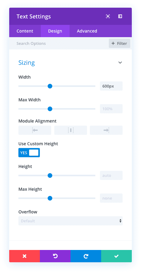
There are many ways these new sizing options will improve the design process. For example, if you wanted to make give an element a circle shape, you will have the option to set both the width and height to 300px. Then you can add the border radius (50%) to make the module a perfect circle.
New Options for Overflow
In addition to the new sizing options, we will also be adding a brand new set of options for overflow. These overflow options are important for when users want to set a specific height or width for an element. These options include the ability to control overall, horizontal, and vertical overflow settings.
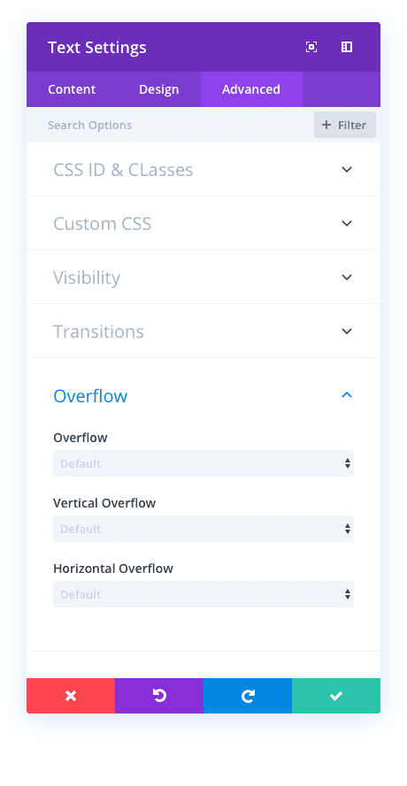
The custom overflow values that will be available include:
- Visible
- Hidden
- Scroll
- Auto
So for example, if a module has a height of 300px, you can set the vertical overflow value to “hidden” so that any content that extends beyond the 300px will not be visible on the page. Or, you could set the vertical overflow value to “scroll” so that that the user can scroll through the content within the module.
![]()
Divi. Taking Pride in the Little Things.
We know that the value Divi brings is a direct result of the time and energy spent on making the smallest feature as powerful and useful as it can be. These upcoming sizing options and the draggable sizing upgrade will know doubt play a small, but powerful, role that will make Divi more valuable. Let us know in the comments what excites you most about this update.



Psyched for every Divi sneak peak.
Given that only “height” and “max-height” are presented, I’m assuming that “height” essentially acts as “min-height.” Is that correct?
So.. Does this make possible to adjust column width by percentage like other page builders?
Say, 20%:30%:50% on 3 columns.
When will be able to insert images by selecting from the WordPress custom image sizes? It’s totally crazy that we still can’t do this!
Nice! Will there be support for vh, vw, vmin, and vmax?
Those units are already supported.
Hello,
Good feature, however; I still prefer using CSS/the current system over this — unless this would allow specific sizing options for mobile, tablet, and desktop.
Thanks,
Eugene
Thank you for great update..
Awesome!
But please, please, please add the Vertical Alignment options for sections/rows/columns as well!!! It’s such an important part. And all of Divi’s competitors already have that out of the box.
Also, would be amazing to have ability to make a section/row/column full screen height, which, combined with this sneakpeak’s Overflow option, would amount to awesome layout possibilities!
I’d think you could do that (full screen height) once this is released using the new height option just by using 100vh – am I missing something?
+1
Another vote for the Vertical Alignment options please – above comment says it all.
+1 for Fullwidth
+1
Wow! wow! wow! Nested columns would be awesome as well. Great job, guys!
What can I say. There you go -> draggable sizing. Very nice!
Using the Extra theme for the first time. This is a nice fit where you want to have blog posts nicely laid out from the start. In some ways better than the Dive theme itself.
On pride in the little things. Would also be nice to see all those small things users have been asking for like auto population of the image alt test from the media library if the field in the advanced panel of the image panel settings is left blank.
+1 – nice new features which look great on marketing blurb and are genuinely useful but I’d really like to see an ET swat team on some of the issues and requests that have been hanging around and irritating people for what seems like forever.
Personal irritation – global header styles. We really still don’t have them?
+1
It’s like you folks are adding controls for every CSS property that exists! The need to use the Custom CSS boxes is decreasing constantly. Definitely looking forward to this update!
I am also really looking forward to the column updates that were sneak-peeked recently as well. I’m hoping they pave the way for the custom-width columns and/or even nested columns I have been wanting since I started using Divi.
Some things I would like to see Divi add in the future after all of the announced features have been implemented:
– Option to change the heading level (h1-h6) used in an instance of a module like the Blurb.
– Option to change the HTML element used by a section or row from a div to a section element.
– Making a module act as a link should change the HTML to use an anchor tag, instead of using JS.
– Gutenberg editor styles support in Divi theme: The upcoming new default WP theme, Twenty Nineteen, styles the editor to make it look like the front-end. I think it would be really nice if the Divi theme could do the same thing.
– Remove fullwidth sections: They’re obsolete these days since any row can be fullwidth, so any exclusive modules they have should be ported to the standard sections and existing fullwidth sections should be converted to standard ones.
– Overhauled layout system: I think rows and sections should simply be modules like everything else, and you should be able to insert modules directly into a page without having to put it into a row/section. Right now Divi forces a lot of often unnecessary markup to be generated. Nearly every other builder (especially Gutenberg and Oxygen) have better base layout systems right now. This would also eliminate the need for specialty sections, which are a clunky and less flexible way of implementing nested rows compared to other builders.
– Use blocks instead of shortcodes: Content created in Gutenberg degrades gracefully when block comments fail to be parsed, as the comment delimiters are invisible on the front-end. Shortcodes, on the other hand, leave a mess when they fail to load. A lot of page builders have this problem. I think Divi should switch to using blocks, or at least something similar to them that uses comment delimiters rather than shortcodes. Notably, I think shortcodes still make sense for inline stuff like, say, dynamic content in the middle of a bunch of static text, but using it for the entire layout system is something that page builders should be moving away from, in my opinion.
– Inserting blocks in Divi Builder: If you switch to using blocks or even something really similar, then that should make it easier to support inserting Gutenberg blocks using the Divi Builder. Divi’s support widgets is less than ideal compared to other builders, so it would be neat to see Divi do a better job with blocks. (Speaking of which, the current plan for Gutenberg phase 2 includes phasing out widgets in favor of blocks.)
– Separate theme from builder: It is not considered good practice to include plugin stuff in a theme, so I think the Divi theme should be completely separated from the builder. It is great that you can use the Divi Builder plugin by itself, but I think you should also be able to do the reverse and use the theme by itself.
– Dark mode support. There is a plugin called Dark Mode which is likely to be merged into WordPress core in the near future. Some of the Divi UI does not work well with this plugin, so I think Divi should try to make its CSS integrate better, particularly if the plugin does indeed end up being merged into core.
Some other notes:
– The “Use The Divi Builder” button in Gutenberg should be responsive and shrink to just an icon or move to the ellipsis menu on mobile. Currently, it eats up a lot of space regardless of your viewport width and makes the editor harder to use on mobile. Also, it should probably read “Use Divi Builder” so it can be a bit shorter.
– It would be really nice if Divi users could somehow contribute code to Divi. Brizy, Elementor, and of course Gutenberg all have free versions on GitHub, so contributing via issues and pull requests is relatively simple. It would be really cool if Divi could do something similar, though I am not sure how it would be done since Divi has no free version.
As usual, here is my analysis of upcoming features…
Every Divi feature update these days is sneak-peaked first. Here’s a list of all features that have not yet been released, in order of announcement:
– Theme Builder
– Hover Options
– Global Defaults
– New Divi Builder Experience
– Support Center
– Transform Options
– WooCommerce Modules
– Quick Actions
– Column Design Options
– Draggable Sizing + More Sizing Options
– Global Presets (not yet officially sneak-peeked; mentioned in comments)
So which one of these will be the next feature released? Well, this comment from Nick on the Bulk Editing update blog post helps:
(In response to a question about when Theme Builder is coming.)
‘Dynamic Content will come first. That feature is quite close to being ready actually, and will likely enter QA testing within the next week weeks. Our whole team will be on vacation next week for our yearly retreat. Global Defaults and Hover Options will also likely come first. The Theme Builder is the “last piece of the puzzle” when you consider the various features we are currently working on.’
It makes sense that Theme Builder would be most useful when the other features were all in place: creating header menu navigation is better with Hover Options to change how menu items look on hover, and Global Defaults would be very useful for general website theming.
Side note: I wonder if Theme Builder will end up being marketed as Divi 4.0. Since Divi seems to ignore SemVer standards, it seems like that update would be the one most worthy of a major version bump.
Knowing this, if you list features indented under the feature(s) they probably depend upon, you end up with a list that looks like this:
– Global Defaults
– – Theme Builder
– – Global Presets (not yet officially sneak-peeked)
– New Divi Builder Experience
– Support Center
– Transform Options
– WooCommerce Modules
– Quick Actions
– Column Design Options
– Draggable Sizing + More Sizing Options
Notably, Theme Builder may be dependent on not only Global Defaults, but also Global Presets, Transform Options, and WooCommerce Modules.
Global Defaults seems to be the most likely next update, with New Divi Builder Experience being second. Theme Builder is getting pretty close!
“Every Divi feature update these days is sneak-peaked first. Here’s a list of all features that have not yet been released, in order of announcement:
– Theme Builder
– Hover Options
– Global Defaults
– New Divi Builder Experience
– Support Center
– Transform Options
– WooCommerce Modules
– Quick Actions
– Column Design Options
– Draggable Sizing + More Sizing Options
– Global Presets (not yet officially sneak-peeked; mentioned in comments)”
Hover options were released on Oct 4.
Dude, why don’t you have them build you a new house while you’re at it?
No they spent all their money already buying me a chateaux in the Loire valley to stop me randomly commenting on their posts.
Thanks for the complete outline
Very nice (:
I’ll definitely have to start using the visual builder!… 🙂
Hope all this sizes have options for mobile, right now rows can’t be adjusted, thing I still don’t understand
Let’s hope this draggable sizing sets the size only where you want it and not like dragging for example the bottom row padding that also cause the left/right padding to be set to 0px and the top padding to be set to some default value.
I don’t call adding this to all modules a ‘little thing’.
Some real little thing would also be nice, like
– More social media icons for the secondary menu and footer, the person module and social media module
– An auto responder for the contact module, so I can finally drop third part plugins
– Make the recently introduced hover setting (the mouse pointer) always visible so I don’t have to hover over each and every setting to see if hover is available
– Visual builder that shows everything the same as how it will when the VB is closed.
– Media queries that make sense with previews in the backend and visual builder.
– Bugfixing (lot’s)
Thanks
JP
I wondered about the social media thing myself… Like, for instance, why create a FACEBOOK or TWITTER entry? Just create generic entries with the ability to upload more icons and do whatever you want?!
+1 for John’s comment on a VB that looks the same as the true front end browser. Basically, once you start adding any custom CSS in a child theme, which you have to do to make your divi sites truly pro, the VB ignores a lot of it. There is a whole separate style sheet that comes into play when in the VB and it overrides a lot of child theme CSS. This basically makes the VB useless as what you see when designing is not what you see in the true browser. They need to figure out a way to ensure child theme CSS is not overridden in the VB.
+1 ! thanks JP and Mark fot this very relevant comments. we need absolutely all these things to be fixed or improved.
Oh! Man!!
Teasing after teasing!!!
Interesting, I have never been able to adjust the margin visually in the VB like mentioned in the video, only the padding. Has anyone else been able to actually adjust margins visually?
I think that I am most excited about being able to adjust the column widths! I love that you guys are always putting out new stuff. Really great features coming our way!
Greta work – Love it!
Please .. more breakpoints. Three just doesn’t cut it anymore.
Cheers!
+1
+1 Or at the very least, make those breakpoints configurable, so that we could decide what is a size for Desktop, Tablet or Phone.
+1
+1
+1
Move up to like 5 from three would be nice.
Great news! Can’t wait to use this in the future!
This is awesome! One of the most useful features for me. When do you think this will be rolled out?
Max height with overflow hidden is something I am doing manually just now on about 50 blurb images, great timing 🙂