![]()
More Column Structures are Coming to Divi!
Today we are proud to announce that yet another one of our most requested features of all time is currently under development: more column structures!
The ability to create a wider variety of page layouts with more columns and more column structures has been something that our community has been asking for for a long time. Well we’ve been listening and we’re excited to share our vision for the first of a few planned feature releases around Divi columns.
![]()
4 New Column Widths & 16 New Column Structures
In the first of our planned column features releases we’ll be introducing four new column width, which will create sixteen new column structures you’ll be able to choose from.
When you add a new row in Divi now, the column options are displayed in a three column by four row grid. As seen below.
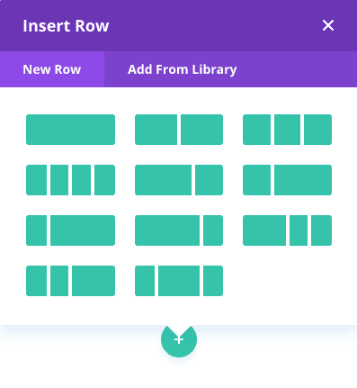
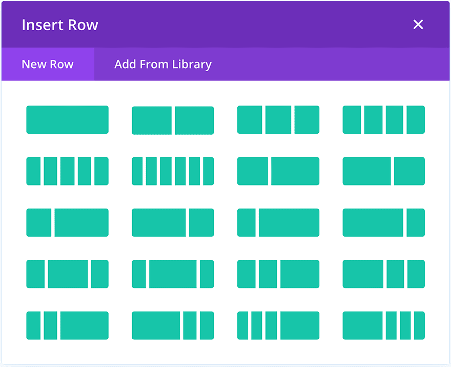
When our new expanded set of column widths and combinations are released, you’ll see a new grid that contains four columns and four rows of various options to choose from. When adding a regular row, you’ll have nine new row structures to choose from.
When adding a specialty section, you’ll have seven new options to choose.
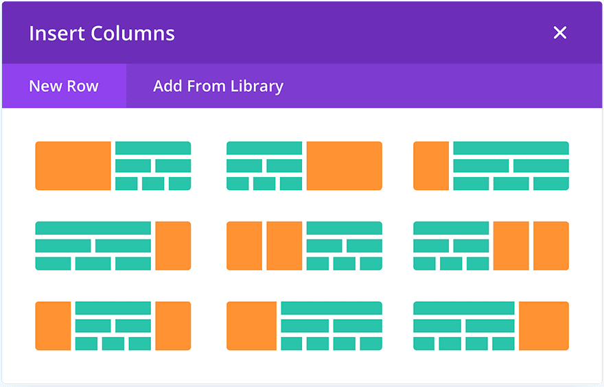
These new column structures will bring with them four new column widths previously unavailable in Divi: 1/5th column, 2/5th column, 3/5 column, and 1/6th column. Making even more interesting and intricate designs possible with Divi than ever before.
![]()
Even More Column Magic to Come
As we mentioned earlier, this is just the first of a few planned feature releases around Divi columns to come. The next couple releases to follow will focus on adding more design options, flexibility, and even custom column widths!
As always, we can’t wait to see what you will create with these new column structures. And seeing as how this has been on so many people’s feature wish lists for so long, we’re sure you know exactly what you’d like to do with Divi’s new column widths and structures.




WTF, this was two months ago where is it?
basically… when it will be released??? please respond to our requests
Any news about the release? It’s been a while now. That would be great if sneaks picks would come with an approximate timeline ;).
A while? Two freaking months!!
When do you think guys will this be available?
I’m hoping this is released today.
Any ETA for this? The video is about a month old already 🙂
Great news!
I also would very much want to know when this release will be.
Finally … when will it be released ?
Hi, need to know when it will be released. Thanks in advance,
A few people have asked when but there has been no reply. When is this feature expected to be released? It’s great to see all these sneak peaks about what is coming but would be great if you could also give an estimation timeframe. Thx and looking forward to hearing back.
I need the 5-column feature sooner than later. Thank you for making such great continual improvements!
when will this be released
What I really need is the ability to set the number of columns by media width. For instance:
7 for large desktop
5 for small desktop
5 for horizontal tablet
3 for vertical tablet
2 for horizontal phone
1 for vertical phone
I know this would be difficult under the current column setup. Perhaps a new item called flex columns.
This is a very long awaited update. It will make my life so much easier. Really looking forward to it! Thank you Divi Team
What is the expected date of release?
With even number columns below a full width image (unless you want that look) – you always have that centre gap (or join) acting as an uncomfortable visual pivot. So if there is to be an initial limit, I’d go for 7 columns rather than 6 as (IMHO) that would make the grid system far more versatile. Ideally I’d like to be able to define the number of columns in a section to suit the content and make better use of full width layouts, be that 1,2,3,5,9,12 etc…columns. Modern screens are a wide (or wider) than double page magazine spreads – count the underlying (layout grid) columns in a double page spread – definitely more than 6!
Yaaaaaaaaay! Oh, this will make my life so much easier! No more custom CSS just to put a few little Affiliate logos side-by-side. Thank you to the Elegant Themes team! This is one of the most useful updates to Divi thus far! This announcement made me unreasonably happy…
Can’t wait to see this update. So many potential new options!
Thanks.
With even more columns, it would be great to also be able to number each module within a same section, that the mobile view would respect when displaying each module one after another. It’s convenient when you’re doing a “zig-zag reading” on desktop.
For example:
Top row: text left 1, image right 2
Bottom row: image left 4, text right 3
This way, on a narrow screen it goes: text, image, text, image.
This would be an excellent feature.
Yes please, this would be fantastic.
Wow, this is going to be a great update. Cannot wait.
Do you have a clue for us when more or less this will happen?
Finally!!! I’ve been waiting for this from day 1 beacuse all the other builders gave u the option already.
Thanks ET Team!!
Awesome!
YESSSS !!!
Thats great, thanks a lot.
It will be usefull to have control on the number of columns at mediaqueries for tablets, and mobile device…
Is it in the pipline ?
That might happen in the second or third update for columns.
After digging into what was going on when the ET team pulled back the covers on the 3.1 release and following along with these planned feature updates, I’ve started to imagine Divi and the builder less as a traditional WP theme and more like the ultimate visual IDE for building React.js apps. Of course, you will always have more power when you drop down to command line, but you will also never be as productive. It takes incredible discipline to evolve a legacy technology, stay true to your roots and respect the investment of your core user base, while still pushing the bounds of what is possible at the cutting edge of modern technology. By expertly balancing on that tight rope, the ET team has delivered a modern server side rendered React.js app with all the client side bells and whistles that the cool kids get excited about, without us ever needing to learn a line of Javascript… Pretty darn slick! Thanks again for all you do!
The people have spoken 🙂
Hells yeah! This will save me so much time when I need more options on column width! Keep up the amazing work guys! Looking forward to the dynamic content too! Game-changer!
Great news! Keep the good work up. This update, the hover effects update and the “Divi everywhere” update will be an elegant christmas celebration. 🙂
Christmas 2019
Hey absolut great Feauture. Whenn the Roll out Start??
I look in the notifikation on my them every hour 🙂
Thanks
Thomas
Fantastic update 🙂 Is there scope for the user to create their own custom Column Structures? ie: mini drag and drop interface? The most common structures could then be available as templates aa per the current process etc. Thank you Elegant Themes 🙂
There is no update at all – like ET Support just wrote to us!!! – It is still a dream!
Thanks ET.
You guy’s Rock like Dwayne Johnson!
Awesome, more flexibility for better web design. Divi Rocks.
Congrats, Elegant Themes! That will help us a lot! Maybe in the future, some custom column width options will be a great improvement as well. Anyways, this one update will be a huge improvement itself.
Another thing, I’m not being ironic, I’m just expressing my experience regarding the blog posts here. Sometimes I don’t know who the person in the video is. In this video, what is his name? Who is he? Since the very first time, I haven’t seen him mentioning his name, or any description below. I believe he is one of the Elegant Theme’s developer, and his name might be Richard, the person who answers the user’s questions here, but I’m not sure. And this post is signed by Nathan. Well, has Nathan written the post and “Richard” read the text in front of the camera? This makes me a little confused and it is not the only example.
I miss some quick description under the video mentioning who the person is. Who is this nice guy with glasses and what is his name? Sorry if I missed some previous post explanations, or if the confusion is just on my end.
The person it the video is our newest video specialist. His name is Matt Philie!
Thank you, Nathan!
Great news!!!
Will there be any Masonry Grid Gallery templates in the pipeline?
The plugin I currently use is a bit clunky. I have been waiting for this feature in DIVI for a looooooooong time.
Please DIVI…. come to our rescue!
Finally!!!! Now, when? hahaha sorry… i just can’t wait.
Great! I have ticked that off my list of wants.
Looking forward to trying it out and getting a different look.
Also looking forward to a more customisable header/nav, better slider, button integrated into the blurb module, more gallery options such as mosaic, more footer options etc
Go Divi!
Can you please add to the features requirements doc for the user to be able to:
1) show/hide the column by media query
2) adjust width of column by media query
This current lack of flexibility really limits development for mobile and is very fundamental for css frameworks such as bootstrap or foundation. This is along with the lack of column layout options is a big blocker of time for most projects I use divi for and would be a tremendous efficiency improvement for users. I could even take a shot at some UX for you if you like to throw some ideas your way. I have a couple idea for implementation in my head…. Just email me 😉
Yeaah, thanks alot ET..
yes yes yes plzzzzzzz
Thank you for this update!!
Seriously good this is awesome news for us and further reduces the need for custom code or additional plugins. Thanks and a big kudos to the team for keeping the awesomeness coming.
Awesome update! Very useful, I think
Yey! Can’t wait 🙂
Will the new column structures be available with the Extra theme? Because the would be AWESOME!
Yes they will be available in Extra as well 🙂
It’s also good that there will be some sort of flexibility to adjusting custom widths to columns as well. Hopefully we will be able to do this on the fly with a drag cursor.
I appraised two other page builders this morning, King Composer and Oxygen 2. Both offer a lot of features that Divi needs to include. While most of these can be achieved with a bit of coding skill it would be better if we did not need to do this. In view of this Elegant Themes needs to get their skate on with alternative themes nipping at their heels.
Oxygen I though handled covering global in a more to hand manner and gets consistency better where all modules of a type update in sync with whatever changes are made in one of them. In this respect Divi need to rethink how it does global, almost like everything is global by default and you need to break out individual module where those need to be different.
I like how in King Composer and oxygen if you click on modules any open settings panel will jump to the settings of that module. It also has draggable on the fly areas for top and bottom margins as well as for padding. In the menu bar is a toggle to quickly hide the builder contextual menu so that you can get to the browser contextual menu to access inspect element.
Both Oxygen and King Composer have more previews for different sized device screens, King Composer’s being slightly better with a user defined option to preview at any breakpoint.
Oxygen has a whole set of tools to work with flex and vertical alignment.
These are some of the features on offer and I hope that Elegant Themes are taking note.
All said though, I think that when ever ET adds new feature to Divi they do so in a very clever and appealing manner. I suspect that the recent feature update 3.1 to 3.7 are laying the foundation for some big new major updates, possibly appearing all at once as Divi 4.
OXYGENE in its version 2.0 and its speed in developer friendly features will out run DIVI soon!
Okay on further inspection here where is the 4/6 and 5/6 column??? I say they are needed here as well…
4/6 is 2/3
Is it powered by the new CSS-grid spec?
Not a chance. That’s too advanced of a system for something like Divi. If you want that kind of power you have to build it in on your own.
I am going to say no here and the column update when it does come out will still be powered by what currently powers the DIVI theme.
Great Job!
Bye bye Sean B.
Also Sean B’s plugin goes up to 7, and 8 columns, not just the 5 and 6 Divi is adding. It seems odd they stopped at 6.
Even if it is Bye Bye Sean B. his plugins have been very useful for the time they have been available.
I’m not going anywhere! 🙂
Yes it seem a lot of the plugins that he has made will become redundant. Fair play to him though for providing the stop gap functionality.
Great.
What about variable column width?
Not yet?
This is awesome!
Thanks for updates that make our lives simple. one suggestion though, please improve mobile view. which ever content we have optimized in mobile view are not working in real mobile phones. no one use a mobile measures 12cm width (in my 17 inch laptop) where as my real mobile width is about 6.5 cm. Sorry for writing an unrelated post but few people have requested for this in theme suggestion but no action has been taken.
saradhi
this is almost true, maybe a 4th option for mobile sized views
as many people, where i live, still have the teeny old Nokia telephones!
+1 and also landscape viewmode, the ability to select different images for each screensize and maybe also the ability to select specific devices.
This is so true and I have been suggesting this for a long time now. Once the mobile / tablet previews are up to par I will use divi more. Now I only use divi on low budget and small page websites. No offense but the mobile needs a fair share of tweaks. Regardless the columns update are great.
Good news, tired to do it manually. Thanks a lot, Elegantthemes team, you always read my mind 🙂
This update has been a request even before DIVI version 2.5. This is one of the oldest requests for a theme upgrade.
Halleluja….. ist this really true? After a few years the users wishes are been heard. Thanks!!!!!!!!!!
yes it is true and not a mirage… A columns update is coming.
This is perfect! I am waiting for the header footer updates too! 🙂
YEAH!!!!!!!!!
I guess the idea of custom column widths is going to take a while longer than just a simple code change in the back to move from 4 columns to 6.