Multi Select Will Boost
Your Productivity in a Heartbeat
Divi and its upcoming Multi Select feature will help you reach peak performance while creating websites with Divi. It allows you to select, drag and edit multiple design elements at once and see results in real time.
Divi’s continuous growth is split up into two main categories. The first one being the functional features that are most requested and needed by the Divi community. We work very hard to make sure these features come your way as soon as possible.
On the other hand, we’re also working on features you might not have thought you needed until you actually laid your hands on them. For these features, user experience is the priority. We want to help you create your best work by making the design process easier and more intuitive. The upcoming Multi Select feature is part of that journey. It allows you to work quicker and better.
How Multi Select Will Work
The main goal of this feature is bringing your creativity to life by minimizing the repetitive steps you’d normally need to take. This allows you to focus on what’s really important.
The upcoming Multi Select feature will help you perform various actions when having multiple items selected. Let’s take a look at what you can do and how it will work.
Select Multiple Items
Selecting items will work the same way you’re already used to on your computer. You can select different items on your page by pressing cmd/ctrl and clicking on the different design elements. These design elements don’t necessarily need to be of the same kind. You can select sections, rows or modules at the same time.
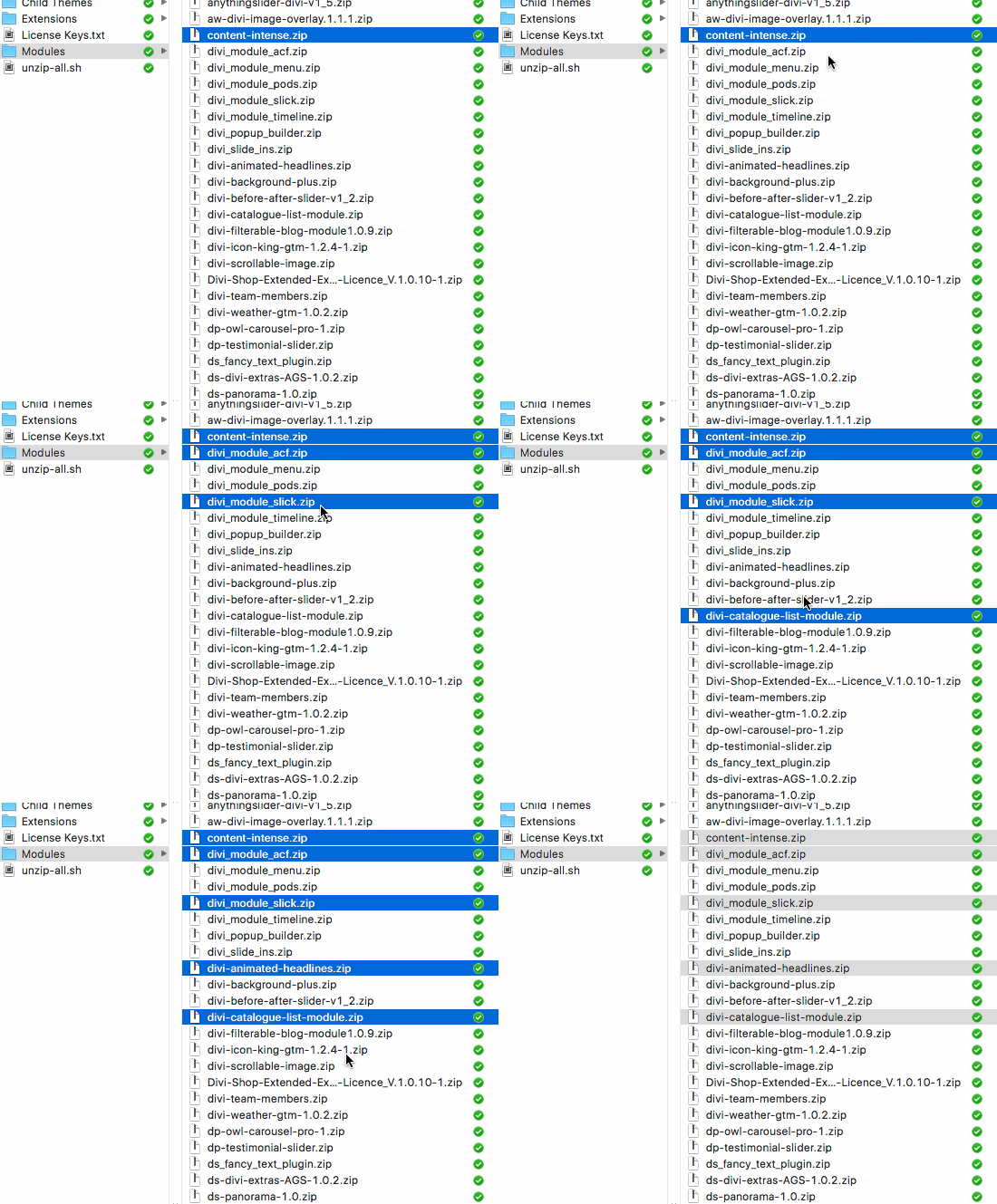
Or, instead of having to select one item at a time, you’ll also be able to select multiple design elements at once by pressing shift and selecting the beginning and end point of your selection.
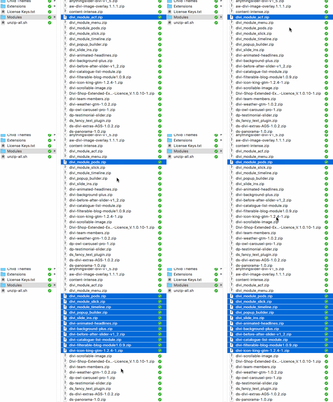
Drag & Drop Multiple Elements at Once
Once you select multiple elements, you can drag and drop them elsewhere on the page you’re working on. You’re not limited to selecting and dragging design elements of the same type. You can select modules, rows and sections at the same time. If you’re selecting modules from different places on your page, for instance, they will be placed in the first column of the row you choose to place them in.
Edit Shared Design Settings
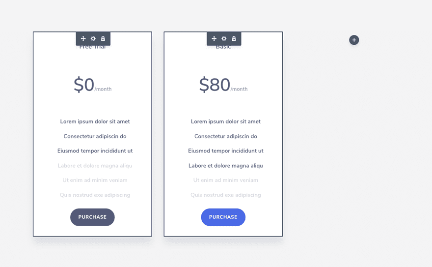
You’ll also be able to modify multiple items at once in a shared modal. Once you do, all selected items will change at the same time. This doesn’t only save you a lot of time and effort, it also helps you see the entire result in real time without having to modify each one of the design elements individually. Want to delete multiple items on your page at once? You’ll be able to that as well.
Right Click at Any Time
Besides dragging multiple items, editing them or deleting them, you’ll also be able to right click while having multiple design elements selected. Depending on what combination of design elements you have selected, you’ll have the possibility to lock them, reset settings, undo actions and more.
Divi Speeds up Your Design Workflow
Making your design experience better and better is what drives us to bring out amazing new features time after time.
We’re looking forward to the Multi Select feature and we hope that you are too! It will change the way you approach your workflow and it will help you get things done more quickly. Make sure you check back with us next week for more Divi awesomeness. Be sure to let us know what you think of this upcoming feature in the comment section!


Whilst Divi has a number of tools available to help levelling rows or modules, as a relative novice using a WordPress theme. Would it be possible to have a grid overlay that is turned on & off to assist levelling and balancing items on the page when using margin and padding adjustments
Other than that I think Divi is wonderful and the level of support far exceeds what I expected. Thank you
Wow! Multi-Select is seriously a game-changer for designing quickly & efficiently! We love how Divi has been upping the game when it comes to making web development easier for people who don’t care to learn how to code! Thanks so much for all you guys & gals do!
p.s. THIS is exactly why we refer Divi to our clients! Simplicity & elegance all at once!
Awesome, this new functionality will be a great productivity enhancer. Thanks for the great work Divi team.
Love all these new features you guys have released and that are on it’s way!
Haven’t kept up with it all so want to ask if this feature is something that’s been requested and are in the loop: the same text settings that are available in modules to be available in the general theme customizer.
The font settings available in modules are so great but to get the same for the overall theme settings one need to add a plugin, would be great to have it built in!
One word – Awesome.
Started using a lot of these new features lately and sometime I kick back into old habits but then I realise there is an easier way to do it now. Can’t wait to kick the old habits.
I have only one request from divi which is the login module: if we could accomodate a redirect to whatever page we would like and not the current page it would be great. And also include a place for registration in this module as well. Even a button to redirect to a registration page Would be good. Other than that life with divi is awesome and gets better and better.
Another great new feature that’s coming to Divi, thank you! I would also like Divi to have more icons (e.g. for the blurb module), as it is missing some basic icons like a car or a spoon & knife icon for restaurants.
This is a nice feature as at this moment you can only copy and past one at a time, i use this feature a lot and it is just going to make life easier to select multiple sections, rows, and modules all at once and past where you need them.
Great work on this one
So copy a style of one element, ctrl-click on any number of elements, right click and paste the style?
No I didn’t know I needed that, but it totally makes sense to me 🙂
I must admit, I enjoy the efficiency enhancements we’ve seen lately a lot. Keep ’em coming! 🙂
Yep, that is one great example. Actually with this update you can select multiple elements of any type, open a settings modal and edit them all at once. No need to copy and past anything 🙂
Great ! The inability to select and change multiple elements at once has previously been so frustrating. Can’t wait to get this one working. Thank you ! 🙂
I have the happiness
Hello Nick.
Very nice work with Divi.
It is time to create also the Divi Academy.
Learning how to use all this futures special for the new members.
i think also it is time to raise your prices and change your policy about the forever members with only 249$. Restrict that to 10, 20, 30 web sites. Maybe for the old members but not any more for the new ones. Professionals can pay a bit for all your nice work.
Thanks again for all the nice work.
I would prefer that there was a single site licence that clients purchased themselves. Say €60 with a yearly renewal of €40. Vast majority of people only need one site and if they decide to not use a developer any more, they are responsible for the site and updates. As it is a dev with lifetime licence can hand out site willy nilly and have other devs take over and get a free theme…Then again, with so much opinionated stand points on web development, the new dev is more than likely to rip out the theme for something they think is more zen, mindful and ideologically a-tuned to their feng Sheri ?
We do have a yearly option for membership, Irishetcher. It’s $89 USD per yer, and it’s unlimited on sites. You could always get your clients to sign up for that program.
You guys are awesome (not a term I use lightly). It’s amazing how you keep bringing out really useful new ideas (and layouts) so rapidly. Are you working in parallel universes?
Impressive as always!
Great feature, but the background music is a pain in the neck.
I also found the music very distracting. It was too loud and diverted my attention away from the message.
No kidding. Strangely, it was repetitive, and isn’t that what this sneak peak was all about eliminating?
As far as the feature, I heard all the words and read all the very SAME words, but I have NO IDEA what any of this means. I guess you couldn’t actually show us because it’s still a concept and not a reality?
I might get excited when I can SEE what this means.
While I wait, I’ll just hum the background music to keep the buzz going.
+1 I had no idea either what it was all about.
The feature is multi-select. You can select multiple things at once and perform any action to those group of elements, instead of having to perform that actions multiple times or dozens of times depending on what you are editing.
I need to see actual examples from start to finish…these animated gifs did not explain this ‘multi-select’ (and then what?) to me. The guy is still only just reading word for word what’s written in each sneak peak, he’s also not showing anything that is not already contained on the page.
Why not actually show what exactly can be done with this in an example or two, from start to finish?
Personally, I think Donjetë is doing a much better job at tutorials than the way these sneak peak videos are presented. I also really think that all videos should be done by the person actually writing the content, and be an additional source of information, rather than just a copy of the written info already on the page, presented by the same guy each and every time.
If we showed the finished product, that wouldn’t be a sneak peek, it would just be a feature release 🙂 The point of these sneak peeks is to give you a roadmap of upcoming features. Since the feature isn’t ready, the sneak peek will never be a full preview.
so many sneak peeks….
One feature per week, one sneak per week.
Sorry Nick but when will we see them released? We are seeing lots of sneak peaks which is great but no idea of when eg multiple columns was ages ago and still waiting. Is there a timetable you can give us for all this stuff?
Cheers, Linda
There is no specific order to when our sneak peeks will be released. They are simply released when the feature is ready and fully tested. We sneak peek everything that we are currently working on. Every time we complete a feature, we start working on a new feature, which is why you get one feature release and one sneak peek each week.
How hard is it to implement more than 4 columns?
Other builders leaving Divi in the dust at the moment.
Nat…
Just in case you aren’t aware, more columns and column structures are coming…
https://www.elegantthemes.com/blog/theme-sneak-peeks/divi-feature-sneak-peek-more-column-structures
Nick will you have a look at how the se comments are nested on mobile.
They don’t
Look great!
Same here for mobile replies. It’s really hard to read things, and I only look at this blog through my iPhone 6 because I get the blog updates through email subscription. As I’m typing this now the letters are individually stacking on one another because the width of the reply box is so small.
But otherwise I’m loving everything you guys are doing for divi. Thanks!!
Unfortunately, as they’ve written many times before, they can’t give dates… Features will be ready when they’re ready.
I know that’s frustrating to read, I too am impatiently waiting on new features such as dynamic data, CPT templates and the theme builder. But if it weren’t for the sneak peaks letting me know these features are coming eventually, I probably would have jumped ship to another builder. So the sneak peaks are doing what I assume is their job.
As impatient as I am, I hope they take the needed time to make these new features BETTER than the competition’s, not just match them. As always, really hoping for very thorough and powerful conditional display options when the dynamic data feature is released.
Would be nice too if we could perform some custom data manipulation/formatting using regexs etc when displaying dynamic data.
That’s definitely a new fence in the background, surrounding the compound where they keep anonymous sneak peak guy locked up.
This and many of the other incremental tweaks to Divi welcome. Interesting to see how they all work together in a few months
Thanks to YouTube recommending me random videos, he’s not anonymous anymore. His name is Matt Philie and his YouTube channel is https://www.youtube.com/user/swashinTV . And he’s not in a compound, he’s in a pimped-out garden shed. 😀
As for this sneak peak, I’ll have to try it to see just how useful it’ll be. Changing settings/styles for multiple modules etc at the same time could be nice. For dragging and dropping, it’d be nice if Divi included a feature similar to Oxygen’s Structure panel which provides a tree-menu style layout of your site. This makes it easy to drag elements great distances and easy to select elements that might otherwise be difficult to select such as empty/collapsed or overlapping elements.
You mean… like the wireframe view in Divi?
The wire frame view often stretches beyond the window height forcing a drag and wait to see if the window will scroll which can at times be a bit finicky. There was a sneak peak way back, prior to our current set of sneak peaks where there was something like Oxygen’s structure panel suggested.
On another note relating to applying style changes globally to elements or specific groupings Divi could do with some improvements. Oxygen allows for granular uniformity of selected modules by allowing you to apply a specific class to the objects. I presume that the style adjustments are added to this class. For those of us who have a child theme set up we can more or less do this through a style sheet.
Yeah, but like you are saying, in Oxygen you can add a class to any element and then actually style those elements visually while those styles are then automatically attached to this class.
This is different to adding a CSS class to an element in Divi, because with Divi your styles are only attached to the CSS class if you manually code them.
I know. But it’s all we have to work with at the moment and is better than nothing. I should hope that this is something ET would implement.
wooooowwieeeee. good work