![]()
A New Quick Access Feature is Coming to Divi!
Divi and its upcoming Quick Access feature will allow you to find and edit the design settings you want to faster than ever before.
As every Divi user knows, Divi comes packed with a wealth of design settings that make it easy to customize nearly every aspect of your website. But at times, the shear number of options, menus, and toggles can make it difficult to find the exact setting you want to edit quickly enough to maintain a smooth workflow. Thankfully, those days are numbered. When the Quick Access feature is released you’ll be able to click on specific parts of a design element you have the settings modal open for and the design settings associated with that part of the element will automatically appear in the modal for you to configure.
![]()
A New Clickable UI Layer
Divi’s Quick Access feature will add a new clickable UI layer to modules in the visual builder when you have their settings modal open.
The new UI layer will clearly indicate which design elements you can quickly jump to with a single click. Here’s how it will work.
How the Quick Access Feature Will Work

Let’s say you’ve just opened the design settings modal for a fullwidth header module. Quick access icons will appear next to the design elements you can jump to with a single click.
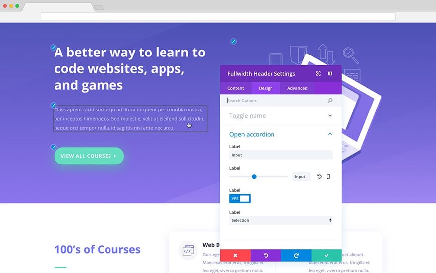
When you hover over one of these elements an outline will appear around it. And when you click on the outlined element the corresponding toggle in the settings modal will open, taking any and all guesswork out of finding the settings you’re looking for.
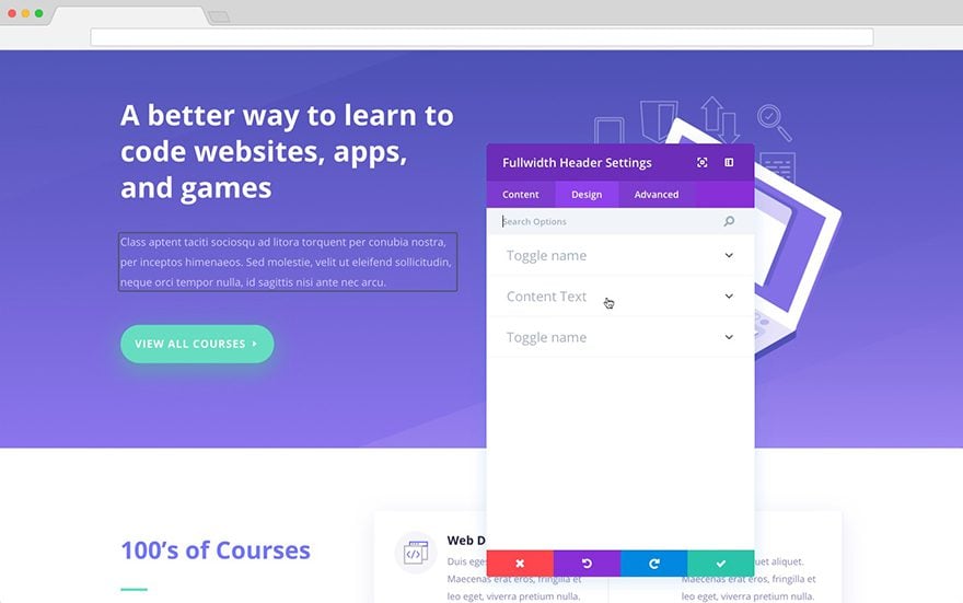
Additionally, if you’re mousing over toggles in your settings modal the quick access feature will allow you to quickly confirm which design elements are controlled by the settings in that closed toggle by highlighting the quick access element. Then, when you click to open the toggle the outline will disappear taking you back to the normal design experience.
![]()
Faster Workflows Here We Come!
We’re always looking for new ways to improve and speed-up the web design workflows of Divi users. We’re confident that the upcoming Quick Access feature will do just that.
Whether you’re a casual user, busy freelancer, or design agency pumping out Divi site after Divi site–spending less time finding design settings and more time making the changes you want the better. So stay tuned for this release and enjoy the power (and spare time!) of a faster workflow.



This adds more clutter for me. Soon it will be like a cockpit
This is amazing!!! Will definitely speed up building and customising.
I would like to ask is there a shortcut that will go to the previous field.
I would use TAB and it jumps to the next input field – usually the shortcut (Tabs + Shift) would do that for any program, however in your theme this shortcut switch tabs.
Is there a alternative for this?
This feels like something that should have a toggle in Theme Options to turn off. Some of us that is Divi every day already know exactly what every setting controls.
Folks, in case you didn’t notice, this is a “sneak peek”. It’s not a feature announcement, documentation for a new offering, or anything like that.
Is this really the place to gripe about what this feature doesn’t do? Almost every one of the feature requests noted in this thread have been made and made again. And, almost every one Elegant Themes has committed to do.
Sure I’d like a better theme customizer and more flexibility in the design of headers and footers; but seriously folks, that’s been mentioned like a 1000 times and again, the vendor has promised to do it.
Now as to the quality and production of the videos themselves, yep they could use work. Yep they are a bit jarring and in your face; nothing I haven’t seen before in marketing.
It seems like replies to these posts would be more useful for everyone if they focused on this promised feature and gave input as to how it might be made better yet. That’s especially helpful when the design is not yet complete and users have a chance to influence how the feature is finalized.
Great. Love all the new updates.
Another great feature!! Keep pumping them out. GO DIVI!!
Something Divi really needs is a reduction of the current dropdown scroll list of 800 built-in fonts to a much smaller subset of “favorites.” I lose a lot of time font-hunting and many of the 800 fonts are basically redundant. Shipping with the font dropdowns showing a core set of 40 or so best-of-breed fonts that can be supplemented by adding any of the current 800 and-or any Google Fonts would be a much better setup re: workflow.
Effectivement, pouvoir ajuster les largeurs de colonnes en % ou en px serait un grand plus pour nos mise en page !
This seems to me extremely useful and is complemented by the new filter feature with which we can see the sections that we have modified, a thousand thanks for this ET
Ok! I like this…I’m definitely going to utilize this feature since I’m a small agency. This came at the perfect time with my upcoming web design service. But we’re all still crossing our fingers for more important features…Great work either way ET!
I had to stop using Divi, lacks to much had to start using Elementor as it has all your sneak peaks already.
How can add comments to the pictures in my galleries?
Thanks in advance
What does that have to do with this post?
*Thanks Squarespace*
sheer number
Nathan, I’ve used many Builders and Divi is becoming one of the best, but there are two things that it desperately needs.
1. Column Width Sizing by % like SiteOrigin Page Builder or by smaller than 1/4 divisions, Bootstrap supports up to 1/12, like the MuffinBuilder and Visual Composer.
This ability allows us to create a Row with a small Column to put a logo and then a Heading without the Logo being 1/4 of the Row for fumbling around with tables, etc.
I have used 1/6 Columns with the MuffinBuilder and with the SiteOrigin Builder I could just adjust the %.
It would be great if Divi could allow the choice of %, 1/12(s) or Pixel Widths.
2. The ability to have a more usable Section & Module “Templated Selection View” of the Divi Layout Themes and for the Section & Module Templates we create to reuse.
Elementor and MobiRise do this pretty well enabling a designer to view Saved Sections with “Graphical Representations” to speed selection of a Predesigned or Saved Template.
The New Layouts Divi is adding are great, but you have to pick and create the whole webpage to get the design into a webpage.
I would like to be able to select “one Section out of the webpage layout” to add it to an “existing page”.
Then have the design setting choice to either “remain as in the Layout Template” or to “update” to the “Destination Web Page Design”, just like Divi’s new copy and paste design settings.
THIS WOULD BE AWESOME AND DIVI WOULD INSTANTLY DOMINATE!
(Even more, than it is starting to now… 😉
There are great designs in the Layouts, but they are difficult to access without going through the whole process of building an entire webpage and saving a section as a template to get them.
Please pass this on to the Powers of the Divi Builder Features Gurus.
I have mentioned these same feature enhancements in a few posts now, but have not received any feedback…
I hope this is received well and thank you for your time!
Tim
+1 This…NOW. Workflow is one thing…and Divi is doing great at that…but, Columns control and 1/12 factor is needed desperately.
I had to add Bootstrap libraries just to do what I need..would prefer less overhead.
Cheers
I know the columns update is coming. I have no clue when and would love to see a teaser video for it.
this is old news lol you can see in last year’s comment something about columns update is coming…
+MILLION!!!
Nice, but the huge time savers you are talking about week after week is nothing compared to the time a full fledged module customizer would be.
Can you just give us a module customizer that allows us to change website wide design settings before adding all nice bells and whistles to find, change or copy individual settings on the ‘on page’ module settings?
Not sure if you already saw it or not, but they are actually working on a complete replacement for the current Module Customizer called Global Defaults, which allows you to set the defaults for every style option of every module without even leaving the builder:
https://www.elegantthemes.com/blog/theme-sneak-peeks/divi-feature-sneak-peek-global-defaults
+1
+1
Nice to see that divi is ever evolving, but i feel it can have some higher priority on header customizations so that it may be freed from jumping header issues fully, even when the custom modules are placed in header..
Very nice, like a lot except it says DOWNLOAD TODAY Go figure???
I’ll mail over a crate of Red Bull. You Divi guys are obviously working way too much. : 0
About “Download Today”
I told this in the comment section of the previous sneak peek.
But it seems that my comment didn’t reach the person in charge of this…
Terrible sneak peek presentation – sorry for being blunt. I usually read through all sneak peeks first and then watch the video. I didn’t understand much of it, and it is getting increasingly annoying that these videos are nothing but reading out what’s written down already.
This time, the features were not actually SHOWN, you just zoomed into the screenshots already posted on the page. I still don’t really understand it. I need to SEE it in action! I understand they may not be ready to show yet, but the screenshots didn’t do it for me.
Furthermore, please change your ‘promotional’ presentation style…you just power through the text by reading it out forcefully as if you are broadcasting a radio commercial to ‘sell’ Divi. Most of us are already using Divi. The background music is also way too loud, and adding to the annoyance.
Thank you..
I hope this time they actually read those notes and do something about it..
I’ve been struggling with the Loud background music (PLEASE, Stop the music) and the guy yelling at the screen or what?
And just TOO much words per min. slow down, use less and less words.
How hard is that?!
You sound like you’re in a hurry to announce this, yet these are just “teasers” never know when they will come to reality. #NoRush
I kinda like the presentation style. Although the music could be a bit less loud for me. One thing: the last slide on the videos seems to be wrong a couple of times. This one says: color manager. Could you check that?
+1 Thinking the very same thing!
Kind of agree with all that you said.
That’s what I call a sneak peek of an upcoming sneak peek…
I read through it a few times and understand it now (I hope), but I usually understand these things straight away – I’m a visual type learner and the static content describing what it would be doing just didn’t cut it for me this time. Don’t take it personally, please.
Can’t wait for the next black friday. ?
I’ve never thought of that particular feature but it’s a huge time saver!!
Before Divi 3.0 I used to design in Photoshop, but with the ‘new’ (it’s not that new anymore, hehehe) visual builder I do it there from scratch and things like the new features u’re adding reduce a lot the testing and designing times.
Thanks again ET team!!
very nice!
Nice idea… Was hoping for the columns update teaser video though.