Layers View:
A Brand New Way to Effortlessly
Control All Design Elements
is Coming to Divi!
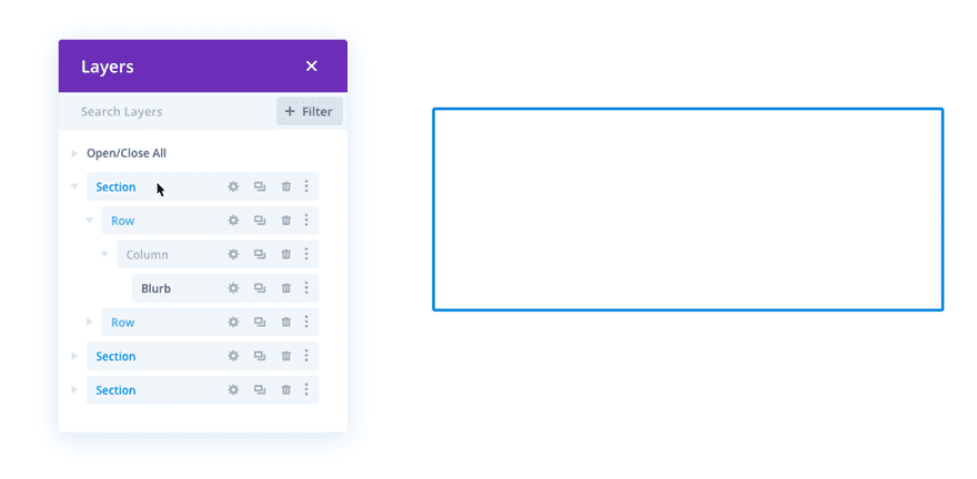
We’re excited to announce that soon a new Layers View feature will be added to Divi. This feature will help you speed up your workflow by allowing you to access the hierarchical layer structure of each and every design element.
Divi’s Visual Builder and Wireframe Mode have undeniably become indispensable when creating websites with Divi. To take this experience to the next level, we’re soon going to add the Layers View feature as well. Layers View will give you a structured overview of the hierarchy of your layout at any moment. This allows you to quickly make changes in real time and use Divi’s efficiency features in an even more effective way.
What’s to Expect
Layers View helps you reach full control over your layout structure.
Let’s take a closer look at Divi’s Layers View feature and its many benefits.
Navigate Instantly to Layers View
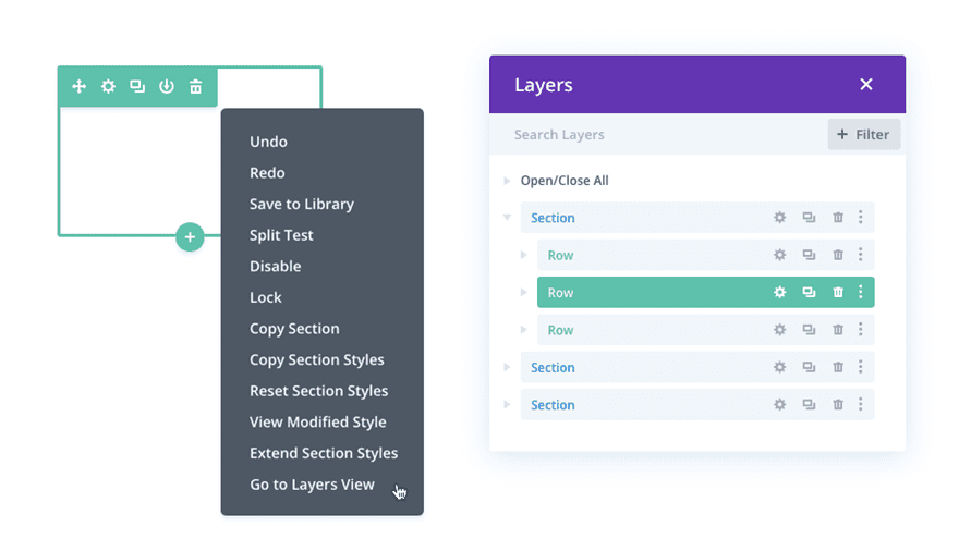
The Layers View of every design element on your page will be easy to access, but won’t show up unless you actually want it to. The only thing you’ll have to do is right-click any design element on your page and select the Layers View option for it to show up.
Expand & Collapse Nested Items
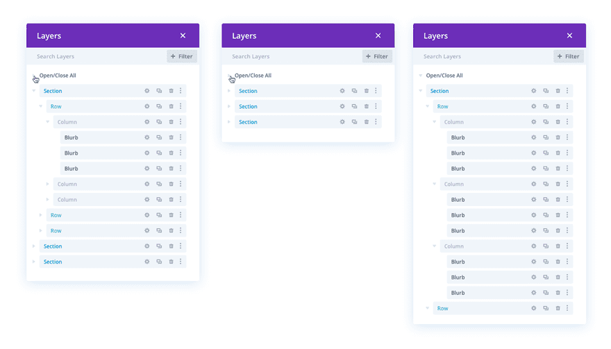
You’ll also be able to view the hierarchy of your layout by expanding and collapsing nested items whenever you need to.
The Divi UX You’re Used To –
Applied to Layers View
Layers View + Divi’s existing efficiency features = The design experience you deserve.
Layers view will feel familiar at first sight because we’re using the user experience you’re already used to. Let’s explore the intuitive built-in possibilities you’ll soon be able to welcome.
Drag & Drop
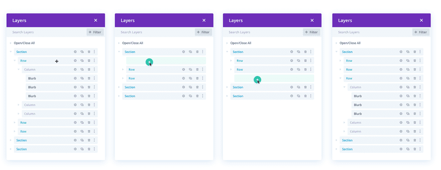
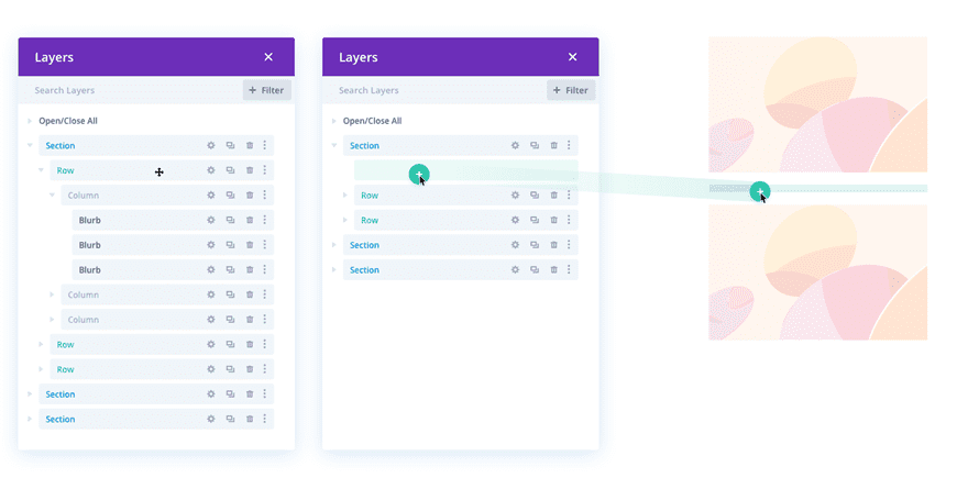
The Layers View feature will allow you to easily drag and drop design elements and see the changes happen in real time. You can also directly drag a layer into the Visual Builder. This cross-experience will not only save you time, but it will also help you maintain a great overview.
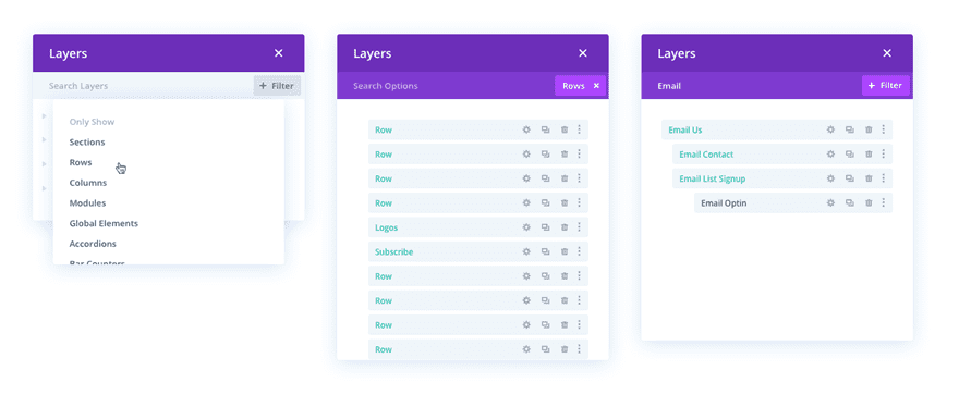
Filter by Type
The Layers View feature will include a filter option as well which will help you go from the entire layer structure to the layer structure of a specific design element in no time.
Multi-Select
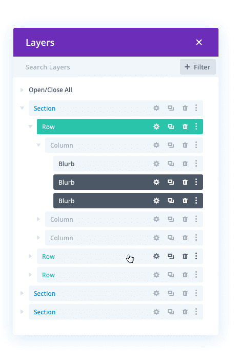
You will also have the possibility to multi-select different design elements within your Layers View at the same time.
Rename
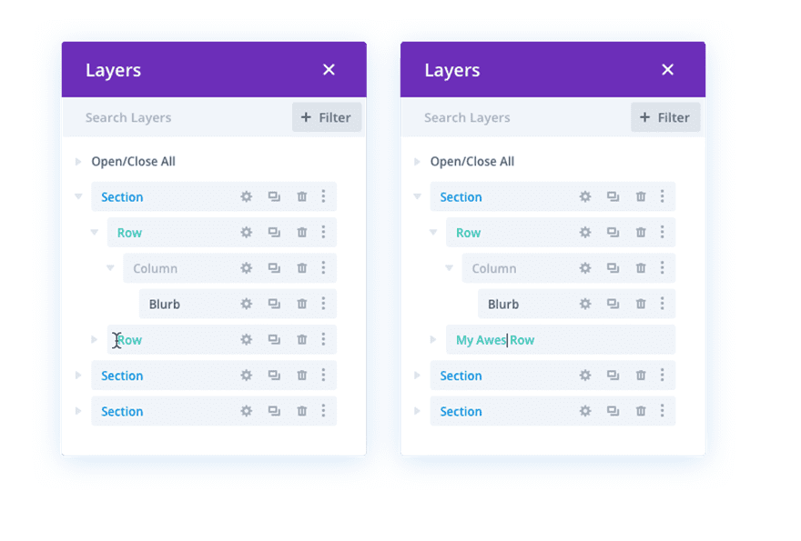
No need to switch over to Wireframe Mode to rename a section, row or module. Open the Layers View and change it as you go!
Right-Click
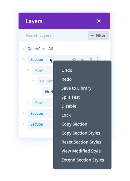
You’ll be able to enjoy all of Divi’s right-click options for each one of the layers in the Layers View as well. This includes design efficiency features such as extend styles + copy and paste.
Highlight
Whenever you hover an element in Click Interaction Mode, the relevant element on your Visual Builder will be highlighted so you won’t get the chance to mistake one section for another.
Divi Empowers You to be
Simultaneously Creative & Efficient
We’re always focusing on how we can make your design experience quicker and better. Seeing all the beautiful websites out there that are created with Divi inspires us to strive for a continuously evolving version of Divi – day after day.
We’re looking forward to seeing you take advantage of this awesome feature that’ll speed up your workflow in no time. Let us know what you think of this upcoming feature in the comment section below and make sure you check back with us next week for more Divi awesomeness!


good work but when the header & footer customizer will come and we need more elements for woocommerce elementor already providing all this from a long time and its a long requested feature here please do something about it .
excellent feature, thanks for continued development and improvement
i’m so happy thanks
Great Blog
Like others have mentioned, the name Layers view is deceiving. It does seem to imply it’d have something to do with z-index and stacking elements.
In reality, this feature is similar to a standard tree view. Maybe name it what it is and save the Layers name for when you release some sort of z-index feature?
This is cool, but please add already the possibility to set default template for posts and projects 🙂
Yeah, years ago I used a software called ToolBox to make interactive presentations and the software allowed us to lay images over images and pages over pages as layers. Having then been use to using layers in CorelDraw and PhotoShop, I made an assumption. Who knows, maybe one day.
Yeah, the age and ass part – I’ve got that nailed.
Uh, damn it! That’s about all I have to say. I was thinking of layers, as in Photoshop, with the idea that I could put a box over an image and adjust the transparency, etc, and stack layers so they show in sequence. I ran toward this new feature thinking “won’t that be cool” only to find a lot of stuff that I know nothing about. Okay, even though I am 70 and some of my earlier memories in life were of my oldest brother teaching me to drive a team of mules, I still think I should be able to learn this stuff. But then, I read a little and suddenly conclude, “who am I fooling? I am not smart enough to be doing this.” Thanks Divi and Divi users – you’ve made an old man feel completely stupid. But that’s my fault, not yours. BTW, mules to webdesign – while the difference in technology is extreme, the level of stubborness has not changed.
Me too! Except for the age (46) and the mule part lol. I was super excited about the layers in anticipation. Now. Not so much.
A good portion of the planet are still pushing oxen and plough around fields for a living. You never know, the way things are going, we could all end up back there soon!… a far from Dé hAoine Dubh.
Hey Darryl — I’m 70 also (for another week or so), and I have slowly learned to work this system. It’s not so hard. In fact, it’s the easiest way to build a website that’s even come along! Just start with one page, one section, add a row with two columns, stick a module in one for an image and another module in the other side for some text, and continue the same way.
If you can outsmart a mule, you can run Divi.
Bill
Bill, I have a website and I’ve been using Divi for almost a year now. It was reading all of the previous comments that made me question my level of usage. My website is to websites what refrigerator art is to art.
I don’t see much of additional efficiency with this layer view. There is already a grid view where it’s easier to drag and drop.
Real design efficiency would is:
– being able to store design settings of elements as a template that can be re-used. And be able to change the template settings to apply it everywhere the template is used. Oxygen has that.
– have global color settings, use it everywhere and when you change the color it changes everywhere. Oxygen just introduced that.
– copy & paste across pages.
I know Divi has global modules, but they have many issues. It looks like most issues arise when you switch between front and backend builder.
I agree – we NEED to be able to copy styles from one page to another. Or to be able to apply a style to say…all blurbs. +1 also for “being able to store design settings of elements as a template that can be re-used. And be able to change the template settings to apply it everywhere the template is used”
In the backend builder you can copy elements between pages. That may go soon once the Visual builder is put on the back end. I tried copying stuff on the backend from one site to another, but that doesn’t work.
Actually that functionality is coming soon to the Visual Builder 😉
This update is mainly for sites with one super long page and with the layers view you can quickly move a section from like the bottom to the top and actually know what section you are moving.
I’m afraid I also don’t understand what’s supposed to be so useful about this update. Maybe it’s supposed to be for folks who don’t have a clear understanding how the structure on a Divi page (Section -> Row -> Column -> Module) is organized?
To me, this does not seem to be introducing anything new that I need.
+1 to your suggestions that could improve productivity by a lot.
U were publishing every week but u did a month break. I hope new sneak peak will be next week tho
When woocommerce module update and simple styling blog page and single blog post via customizer?
Really need it soon.
Thanks. 😀
This is great, and thank you.
Can we get current functionality cleaned up?
Slider module needs work. There is no good photo gallery as grid or slider isn’t artistic.
Contact forms needs work. Great that we can add radios, checks and more, but the styling isn’t great.
Why isn’t there a better mega menu like in Extra, but ready for 2019?
Please don’t get like Apple who tries to add so many new features, that current features lack.
Thanks!
I don’t agree with thse priorities. Divi already has reasonable slider and contact form functionality. There are many 3rd party plug-ins that allow uses who need more to get it…without bloating a fairly heavy theme further.
Myself, I do not want your specialized slider and contact form functionality to burden every site I make. I want to be able to add those features only when I need them.
a hybrid of wireframe and visual builder live preview… i like it 🙂
Great stuff! Happy thanksgiving… 🙂
I’m working on a client project that required a section to only be visible during certain hours each day. I found a plugin to handle the job, but would rather have this functionality built into Divi to avoid yet another plugin requirement!
+1 This is a killer feature, we would really appreciate this too. It would add endless new options to Divi websites.
So, if I understand right, I can change the layer order of columns in a 4 column section, and by doing this the z-index stacking order also changes? This would come in handy when letting elements overlap…
As presented, this has nothing whatsoever to do with visual stacking order as in z-index. This is the order the design elements cascade down the page…not what displays on top of what.
Now, as to an ability to specify/override column stacking order for mobile…one cannot tell that from the information given so far.
Great feature, thanks for continued development and improvement of Divi!
Happy Thanksgiving!
When will this roll out – Lets Bring It!
Awesome feature. Let’s bring it!
Feature request.
Please add either an additional label for library elements or just show the label as it is named in the library. This is because when editing a library element especially one which is global it is not clear which one it is unless you make the admin label global but that is usually used to describe the content.
+1 Its currently impossible to see which global module a module belongs to, unless you look at the shortcodes
+1
and talking about global modules, could please fix the issue with globals opened in these posts 15 days ago:
https://www.elegantthemes.com/forum/viewtopic.php?f=187&t=893463&p=4883260#p4883260
https://www.elegantthemes.com/forum/viewtopic.php?f=187&t=893262&hilit=cannot+edit+global&p=4883259#p4883259
How do the the layer will behave with global modules?
I need Divi Lite
“more divi awesomeness” .. I concur! #divirocks
Very useful where you have a page that has a lot of elements on it.
On Gutenberg (like it or loath it) and WordPress 5 with the block editor as default, we need and update for Divi to integrate better customisable content widths to control the the backend content width of the block builder. Kadence blocks has default, wide and fullwidth settings that currently don’t work with the Divi theme. On top of this the Divi plugin was never been able to breakout of the content width when used on third party themes where Elementor can.
Most importantly for my workflow on custom post types using Toolset Types and Views Divi integration, each time I use it I have to hack out the styling to remove the default title and meta and other structural aspects to allow the Divi builder work to its full potential. All this should be automatic, as happens with Divi on regular pages. We also need default settings for all post types for fullwidth and no sidebars. And in the customiser settings more fine grained percentage in the content/sidebar ratio so that it can be specified to match what the Divi builder does on say 2/3 to 1/3 layout setups.
Finally the ability to rename a row or section!!
LoL!
Yes, this options is there for over a year now.
you know what I really I aiming for?
sleep/hide module…
I stream courses, then I have to put a video placeholder…
If I have 2 modules, I can switch them without changing code every time, but sleeping/hiding modules… not switching all code in them
you can hide a module if you want by going to Advanced->Visibility and tick all 3 fields. That easy. Or you can go to Advanced CSS, Main element and write visible:none;
That ability has existed for a long time. In wire-frame mode either click on the name and edit it or open the module and scroll to the bottom to Admin Label.
That’s right Gary, I name all my modules in a way to make it easy for clients. Been a feature since inception!
But it’s not automatic 🙁
And just how could it be automatic? Does it magically read your mind as to what the label should be? I mean really…jeez.
It’s not that difficult Patrick. If there’s a title, use that as a label, with an image, use the title or alt tag (or the file name) and if there’s no title, use the first few words of the text.
All this combined with the name of the module, so it should be something like “text – lorem ipsum blahblah…” or “blog – recent posts” or “image – treeline in canada”.
Of course, we should still be able to adjust the labels ourselves.