As web designers, we strive for perfection in our day to day processes. Although we are human, many of our daily tasks are to handle designing and developing projects down to the nearest pixel. Along the way we sometimes overlook the details we’d rather not to maintain our professional edge.
Below are a list of 10 mistakes you’re probably making as a web designer. Use these mistakes as a means to correct bad habits or overcome the hurdles we are all guilty of.
- 1 1. Using Flash
- 2 2. Massive Images
- 3 3. Fixed heights and widths
- 4 4. Assuming your design fits all screen sizes
- 5 5. Overuse of animations or effects
- 6 6. Poor link treatment
- 7 7. Not using the DRY approach with your CSS
- 8 8. Graceful Degradation & Progressive Enhancement
- 9 9. Non-user friendly navigation
- 10 10. Focusing more on design rather than content
1. Using Flash
Flash is amazing but it just isn’t what it used to be. While Flash offers some amazing animated experiences, it also comes with some baggage. Long load times, no mobile support or having to learn another complete language is what has caused it’s recent demise. Currently, only a handful of mobile devices support flash with additional support from plugins.
Future support for Flash looks a bit bleak as new libraries come forth. JavaScript based libraries like jQuery or AngularJS are changing the way we use the internet and at insane speeds to boot.
Various JavaScript libraries available to introduce all types of functionality into your web designs and apps.
2. Massive Images
A common trend these days is to use larger images throughout a website. While this adds to the experience and gives users plenty to look at, it also adds a few complications to the mix.
A big result of using larger images is the increased page load time. Various tools assist with image optimization like GruntJS-ImageMin(For all you Grunts), ImageOptim (via command line or GUI), and apps like CodeKit and PrePros which do image optimization automatically inside the application. These tools help our workflows but won’t solve those dreaded load time issues completely.
Lately, a lot of designers have been adopting the SVG trend and using code to draw or animate graphics in the browser. The result equates to accelerated page load and still plenty of eye catching elements to look at.
Another reason images complicate things is their non responsive quality. An image has a set width and height and that won’t ever change. A browser can skew and scale an image but the file size lies unaffected.
This problem is currently being addressed by the W3C to include the new <picture> element into our current HTML5 markup. Adding this element allows for different image sizes to be called inside the element depending on screen width. The end result is the best experience for any user on any device.
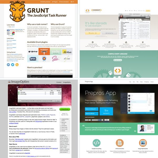
Screenshots of helpful task runners and image optimizers for web designers and developers.
3. Fixed heights and widths
Fixed sizes restrain adaptation for all users. While there are workarounds, these principles should be avoided to allow for a truly responsive web design pattern. Setting a fixed height in your CSS for example limits what is viewable to the user unless that height is later adjusted with a media query. Having this extra code leads to performance issues and bloat that is otherwise not needed. There are exceptions to this rule but as a basis setting fixed sizes should always be avoided if possible.
4. Assuming your design fits all screen sizes
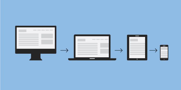
Designers that work inside of Photoshop, Sketch or any other graphic editor, design for specific breakpoints in their responsive workflow. While these screen widths cover a lot of devices, it doesn’t always cover them all. With so many devices on the market it’s really hard to design for everything.
Forward thinking and proper planning can offer the best result with your design at certain widths. Make sure to always keep this in the back of your mind and definitely test on the devices you have access to. While most of the design can be done in a graphic editor, much of it will be designed inside the browser once this stage is reached.
5. Overuse of animations or effects
Many websites are breathtaking to experience. Some offer unique experiences while others offer amazing content. The key and real secret to web design is to combine both of these principles. Many websites want to impress the user so much that they forget about why the user came to the website in the first place, the content.
Popular animations or hacks get in the way of the experience like elements fading in, up, down, around, etc.. or scroll hacking for example. Using these treatments can definitely add to the experience but you should be vigilant when implementing them into your projects.
6. Poor link treatment
Be sure to appreciate what a link is and what it does. A hyperlink allows the web to exist if you think about it holistically. To go from page to page easily a link is required. Users need quick access to links to get the information they came for. Make sure your links look like links and not those default blue underlined kind as well!
7. Not using the DRY approach with your CSS
Use the DRY approach to benefit yourself and your users. DRY stands for Don’t Repeat Yourself. This method helps keep your code clean and concise while only using the necessary code to style up your website.
Traditional CSS requires a lot of repetition when styling specific elements inside other elements. Your selectors commonly grow in size and end up taking more time to write. Use classes throughout your design rather than styling each element you have in your HTML independently.
CSS pre-processing languages like Less and Sass are the latest and greatest of CSS technology. These languages speed up the design and development process by offering features such as nesting, variables, mixins, functions and more. The code produced is then compiled into the regular CSS code we all know and love. Less and Sass allow web designers and developers to write fewer lines of code without repetition.
8. Graceful Degradation & Progressive Enhancement
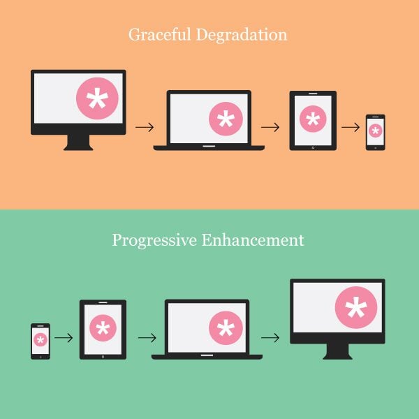
Graceful degradation is the practice of building your web functionality that provides a certain level of user experience in more modern browsers but degrades gracefully to a lower level of user experience in older browsers.
A common example of this is support for Internet Explorer 7 and 8. Many users simply don’t update their browsers and as a result some level of support is required to succumb to this factor.
Developing a modern website seems like a walk in the park at times until you realize later you have to support some older browsers that have their own specific dependencies.
Progressive Enhancement is similar to graceful degradation but it does things in reverse. Start with a basic level of user experience that every browser supports. Then you also build in more functionality automatically available to browsers that can use it.
Both of these approaches are hard and are what sets some good websites apart from bad websites. There are many different browsers available to support different scenarios. A lot of times web designers and their client must decide what will and what won’t be supported for their users. At best, you should try to use both approaches in your projects to provide the best experience to the most active users you can.
Navigation is a key component to the functionality of a website. Designers must find a way to make the experience almost natural for the user to navigate across a website by providing a common user experience. Most users gain knowledge of the experience instantly if it is well designed and thought out.
If the user experience is poor, the user will become frustrated and likely not visit the site again looking elsewhere for a better solution. Always keep usability in mind. Your design could look amazing but if it’s not functional and easy to use or learn then the design is rendered useless.
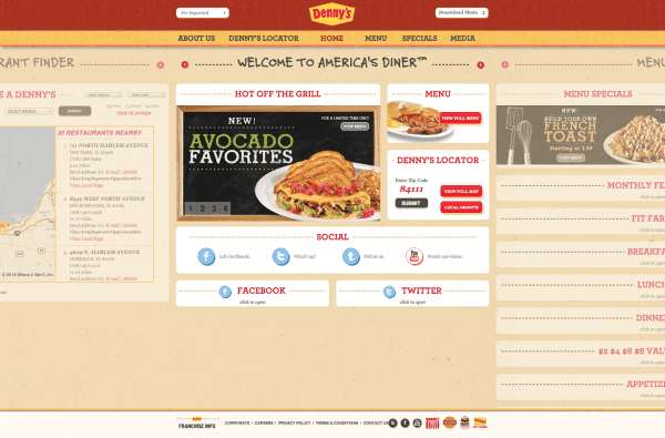
Denny’s recent design displays a lot of content but relies on both horizontal and vertical scrolling which makes for harder navigation.
10. Focusing more on design rather than content
A common principle form follows function was made popular in the 20th century during the industrial design phase of modern architecture. This principle stands high alongside any form of design in recent history.
The same rules apply for everything from architecture to graphic and web design. A form of an object should be first based on its intended function or purpose.
Websites are like buckets of information collected across the internet. Users use each and every website they visit to digest the data of their choosing. If the user can’t get the information they need due to a bad user experience then they move on to another source. People want information fast which is a big reason why the internet is so huge and so powerful.
Form over function plays a massive role in the success of many properly designed websites. These websites are both aesthetically pleasing and naturally functional.
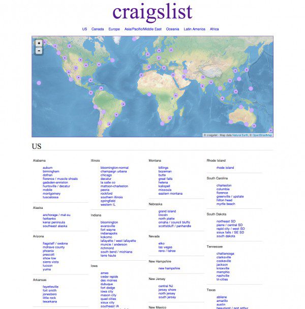
Craigslist focuses on content first as opposed to design. Users would likely react negatively to a complete redesign of the user experience.
We’ve only covered a handful of mistakes web designers commonly make. There are many more mistakes we all have experienced. Share the mistakes you have made below and fill us in on what you did to correct them.
Article thumbnail image by Ingka D. Jiw / shutterstock.com


“Assuming your design fits every screen sizes” – Every. Single.Time. One of the biggest mistakes during my work. I can agree to this post, they are the most popular mistakes for sure.
Don’t have URL yet much less a web site. What I really really desire, is someone who can build a web site for me to use on eBay.
I know how to manage Nursing homes, Mortuaries, Law Offices, but know nothing about what web sites. Would be happy to talk with someone who does what I know nothing about.
Regarding #6 “Poor Link Treatment” – What does “Make sure your links look like links and not those default blue underlined kind as well!” mean? Why shouldn’t the link be underlined, are people supposed to guess where the links are? How exactly does a link “look like a link”? Just a different color does not sound like it would be recognizable to me. Maybe you could be more clear about what you mean here – also how to accomplish it. Even better how to get the underlines if you want them – I can’t find it in Divi. Maybe there’s a good post on link design somewhere?
Hi Andy, thanks for this great list! It covers many common mistakes that influence the website performance. We’ve also gathered our own list, showing various examples and focusing on slightly different design issues, too. Feel free to jump in: https://netguru.co/blog/design-development-mistakes-website
I think the most irritating thing for any user is the extra long pages. I would urge designers like myself to avoid long pages: guess what, if the user needs to scroll down forever in order to read your content he will probably just skip it altogether.Thanks for the tips.
Thanks for the great article! Really appreciate the info, since I’m still in the “knows enough to be dangerous” newbie phase.
Totally agree with those who don’t like automatic pop-ups. It’s like having an annoying two-year-old brat who slaps your face because s/he wants attention NOW and doesn’t care about your priorities at all — only their agenda matters.
Two other annoyances I come across as a site visitor:
1. Minuscule font size (and the heading is generally over-sized, so you know they have larger fonts available).
2. The ever-increasing trend to use very pale gray font color, often accompanied by a very “skinny” font. Looks beautiful, but dammit, I want to READ the content, not just LOOK at how pretty it is!
Both have to do with legibility – or rather, the lack of it. I hate having to fiddle with a page so I can read what it says.
I’d love to see an article on what fonts are most legible – I know they’re different for screen and paper…
Nice Article……….
Thanks For Shayring this post
Good article … One thing … have to disagree with the note “fixed sizes should always be avoided if possible”
Unfortunately, long load times and massively long pages are turning the net into a “wait and see” game …. wordpress is a big culprit … loading dozens of scripts (not one with all), & often not used, big images – just so they can be ‘responsive’ to an iphone, and 4 metre long pages, is leading to bloat. Using image sizes appropriately will speed up load times.
I guess the “always be avoided” is main disagreement. Form over function?
Cheers
sd
I to am curious about Sheryl’s commentary regarding percentages. I’ve just signed onto ET, and am exploring a bit to familiarize with all the new terrain. On sites prior to now I’ve used percentages a lot. I’ve assumed that won’t be so necessary with ET themes, particularly Divi. I would be very interested in hearing more in these regards. Sheryl’s Bri site behaves quite well at different widths, as well as being a very nice site.
Thank you for this great post. I myself have been making the mistake of using way too big of images and making my website run slowly. I will take your tips into consideration. Thank You!
Great collection of pointers, and can certainly agree on most of them. Design has its place, for sure. But message and user experience are the priority.
Being a veteran ET subscriber and now Divi user almost exclusively, I don’t see the need for the CSS stuff mentioned above. But I do have a gripe about CTAs, especially the one that pops up on this blog! The reason I’m here is because I AM a subscriber to the blog. I get the e-mail notices and come here. Then I get the CTA! There has to be a way to handle that, cuz that’s annoying!
And to Sheryl, NICE SITE you designed for Bri. I’m in Los Angeles and I’m going to give her a call! But I must ask why you need to alter the CSS for responsive behavior, when that’s supposed to be built into many of ET’s themes, and most certainly into Divi. The Bri site looks good when I minimize the size of my browser to simulate phone or tablet displays, but so do the sites I’ve designed in Divi. Please clarify… (thanks!)
Definitely looking forward to – thx for the heads up!
Re: #3 fixed widths and heights… Are there any plans for Divi to move to a more fluid design in the near future?
I’ve built a bunch of sites on Divi (and a few on other ET themes) and the first thing I always do in my child theme is create a section called /***** fluid ****/ and change the row, two containers, various column combos, blurbs, and testimonials to percentages. It makes the responsive work that I do at the end much faster, and if I don’t do it, I find my ET sites don’t look as good on as many devices. Plus, I find it’s a great way to keep sliders visible even on 320px (check out foodbybri.com on the smartphone as a good example … I think Divi makes sliders display:none; at 768px, which is an iPad’s vertical display). I know some commenters don’t agree with sliders, but I think it looks great when used properly, and the pages seem to load fine on the phone.
Anyway… hoping to see fewer px and more % in the core Divi style sheet in the future! Aside from that minor inconvenience, I’m a huge (HUGE) fan of Divi. Thx!
Hey Sheryl,
Do you have a portfolio web page?
-Chris
Hi Sheryl,
I would be interested in EXACTLY how you do that /***** fluid ****/ section in your Child Theme/custom CSS with Divi. I’m not that great with CSS. 🙂
Thanks!
Deb
Wooos. That was supposed to say “looking forward to /picture/” but I forgot to escape it. 🙂
Yes, please add me to the list of interested parties for the child theme you use on your Divi theme for the /***** fluid ****/ section
Thanks!
Hey Andy, this is a really a great set of tips. I am developing websites but I have never thought about these things. And more of that I wasn’t aware of LESS and SASS. Thanks for sharing this.
Nice read, as the most of your posts, by the way…
😉
Perhaps a bit off-topic, but I’m wondering: what plugin you use for the floating social icons next to the single posts?
Have a nice weekend and best regards,
Ronald
Sorry, found it already:
http://www.elegantthemes.com/blog/resources/best-social-media-sharing-plugins-for-wordpress
$ 12 per month is not cheap…
Thanks Adam. This is a great article worth spreading around. I am a designer at heart and developer out of necessity. But obviously there is plenty for me to learn in the area of design as well as development and this article highlighted a few.
But this excited me the most…
“This problem is currently being addressed by the W3C to include the new element into our current HTML5 markup. Adding this element allows for different image sizes to be called inside the element depending on screen width. The end result is the best experience for any user on any device.”
Thanks for the update Adam! Something to look forward too!
Thanks for the “continuing education” that’s been increasing on the ET blog over the last several months. This is now my best source for website design, plug-in and other resources and trends. Have always been grateful for the support forum. Now appreciate all the extra knowledge coming from the ET Team!
Important points indeed ! though many of these issues are already adressed by your great themes like Divi or Nexus. But it’s true that after a lot of customizations, we might get out of the “handy interface” path 😉
Useful article. Thanks for sharing. Never heard about the new concept “Progressive Enhancement” . I will surely implement this in my next design.
Excellent article, and thank you.
However, I’m a little dismayed. As I have no experience in building websites, I chose an ET theme because I thought – these people know how to design websites, I don’t, so I will choose one of their well known and robust themes whose ‘form’ supports my ‘function’. But now, after quite a lot of work, I’m hearing on an ET blog that sliders are a really bad idea, and of course the theme I’m working with features an entry point slider! I’m at a bit of a loss to know what to do. Start again from scratch?
I’m also wondering whether the slider, with all its images (which I have compressed as best I can) will mean the front page loads too slowly. Do ET sliders feature lazy loading? I guess not.
I don’t think Sliders are bad, if they make sense for your website. If you want complete control, why not take a look at our Divi theme? Using Divi, you get to pick and chose every element on your page 🙂 So if you don’t want to use a slider for your current project, there is no need to add one.
You can also disable the Homepage Slider on any of our other themes using the ePanel Theme Options.
As for loading times, the more stuff you add to your page, the slower your website will load. If you are worried about it, then I would recommend adding less slides to your slider, or use smaller images for the BG image.
Great article, it addresses many overlooked aspects of webdesign. A nice way to check if your design skills are up-to-date 🙂 Thanks for sharing!
Thanks for commenting!
Andy,
You talked about the issue with large image files and the move by some designers to ‘adopt the SVG trend and using code to draw or animate graphics in the browser.’
Where would one learn more about this? and do you know of any sites which might serve as an example of this technology in action?
Thanks,
John.
Hey John,
I’m not sure with your familiarity with SVGs but here’s a little background. An SVG file is essentially code in which you can build upon to animate and or draw. An easy way to get started is to use a vector editing program like Adobe Illustrator. When you are finished drawing a graphic you should have the option to save as “.svg”. From there a document gets created that’s nothing but code.
Browsers are capable of rendering this code and have been for a while. Anyways, there are elements within the code you can apply classes or id’s to just like your HTML. From there you can style it any way you prefer and add animations via CSS or JavaScript. There’s lots of sites which speak of this. I’d just do a Google search and look for code examples primarily.
I get it. thanks for the explanation.
Good points made, I usually have problems with assuming that my desing fits all screen sizes. Nevertheless, since I moved to ET this is no longer such a great problem, but of course redesigning themes for my needs is another thing, but that is a whole different story.
Being more of a designer with coding experience, I am confused as to why any sites except REALLY massive ones would need to use LESS or SASS? When I build a site, the CSS is extremely well organized using my own naming conventions (I give everything a 3 letter prefix. For example, buttons all start with btn-, form styles frm-). Most everything is grouped together and commented with this in mind, so I actually don’t even see the need for multiple stylesheets. If you have to load them all anyway, what’s the point of breaking them up? I just can’t wrap my head around it.
Also, I would offer an opinion that if you are a designer, your site SHOULD focus much more on design than content. People want to see your work, not read about your life story (usually).
Hey Tim,
Sass and Less are useful on any size of project. Reason being is because you aren’t repeating yourself. Those extra files you speak of don’t actually get loaded on the site but are rather compiled into a regular ole’ CSS stylesheet in the end.
Everyone has their preference and really any style site doesn’t need to use Sass or Less. The benefit for each is the valuable functionality at hand like nesting styles, using variables for repetative things like colors or fonts rather than finding and replacing each one in traditional CSS. The list is really endless. I invite you to take a closer look into Sass or Less and give it a try. I think once you understand it and see how powerful it is you’ll find it hard to go back to traditional CSS like I did.
I’ll actually be writing a new article soon about using Sass with WordPress. Keep an eye out. Thanks!
I’ve read about it, and I understand how it could be useful to some, however it doesn’t seem faster than doing a global find and replace on a text string or hex color or whatever.
By using LESS or SASS, there is an extra step you have to do by compiling them at the end, so I just don’t see how it is saving time. But, again, that’s just me.
And now that I am thinking more about it, you have to go through the extra work of creating all the variables and then trying to remember the names of them and what color they are when applying them to all the elements throughout a site. I guess I just like to think in terms of numbers rather than saying this variable is, “blue used on footer link text” or something.
Definitely see your points which are all perfectly valid. To each his own 🙂
I will say that variables are pretty powerful though. Mainly because if you find yourself repeating the same line of code, a hex color for example, why not make it a variable so later if you decide to change it then it’s only on little line to change? Your project just updates on compile.
Initially yes there is some prep but what project doesn’t have this step?
Andy:
Websites that place client oversize image/video ads at the top of their Home Page infuriate me as a customer. They ram it down your throat to make extra money from the advertiser. Yahoo is especially bad in this regard with an ever increasing ‘load’ of ads on every page – even at the top of your email list.
The current home page Apple ads are especially annoying in that Yahoo has not even put a “close ad” or timed close on it. You almost can’t get rid of it to see the news or other items on Yahoo’s home page. These ads get bigger and bigger (currently full width and almost 1/2 of the space above fold.
I (and I suspect others) may well be moving to more customer focused products.
Another good share! Thanks Ron
I have to say: this is the best article i’ve read in elegantthemes blog yet. It does go over some well known facts but also share others not easily seen. There is my internet point for you sir.
Arturo, I can’t thank you enough. That’s great to hear!
One thing that drives me crazy is clients that spend money on a website and then provide really naff images. “Oh I took these myself of my restaurant” or “my mate Keith took the photos” and you get a zip file of badly composed, off centre, blurred rubbish. Now I insist clients get professional images done or use decent ones from one of the big image libraries. Great design and content can be murdered with poor quality images and/or icons. Best design advice I every got was “teach yourself to say no to the client”. You’ll lose some (as I have and still do) but you get a much better portfolio and the good clients always see sense.
Very good point. And the same goes for content. The design is only there to bring out the content and images, so if they’re poor there’s no design in the world that can save a website.
Simon, the word “no” has gotten me farther than the word yes to paint a picture. Clients or potential leads will do anything they can to get what they want for as little as possible. Those type of clients we all can live without and saying no will simply help you benefit in the long run. Thanks for the comment!
I’m a blogger/writer not a designer, but appreciate what you’re talking about a lot. It was tough to find a theme both visually appealing and user friendly.
My 2 cents is to make sure the “side door” pages/posts look awesome, too.
I can’t tell you how many themes blew me away on the front page, but were flat out boring on a single post template.
Most of us get +80% of our traffic directly to one of these posts. It won’t do any good having a great front porch when the kitchen looks like a hospital room!
Great post, and good points from Joe C.and Cliff particular.
I would agree on sliders but add that popover CTAs are annoying at any time, and should be avoided at all costs. Like sliders they take control away from the user.
I’d like to nominate Imsanity as a great image shrinking plugin. Just be careful setting max image dimensions!
Hi, Andy – First, great info and insights in this post! In the second-to-last paragraph:
“Form over function plays a massive role in the success of many properly designed websites.”
Do you really mean “Form OVER function” or “Form FOLLOWING function”?
Just thought this could potentially be a typo.
Kevin
You are correct Kevin. It should read “Form following function”. Sorry for the mix up!
Andy, this is a great post. My favorite points are about the DRY method and User-friendly navigation. If someone can’t navigate your site, they’ll either leave, or they won’t find what they are looking for, which means they’ll be less likely to come back.
The DRY method of not repeating yourself in CSS is essential for clean code. This is super-important.
I actually made a post like this, but it was about Graphic Design: http://www.creativebeacon.com/common-graphic-designer-mistakes/. It’s more career oriented, but it definitely applies to fellow web designers, too.
Thanks for the awesome post Andy!
I use the Smush.it plugin for images. It doesn’t crunch images as small as I would like and shrink images above 1MB. Perhaps I should try a few of the plugins mentioned above.
My site loads pretty quickly but of course, milliseconds matter.
Thanks for the post!
I’ve recently discovered “Imsanity” (not a typo).
Basically it resizes your pictures -no matter their initial dimensions- to a maximum height and width that you can set with decent granularity.
I suggest giving it a try as, together with smush.it, it has done MIRACLES on one of my sites. Read carefully its description, anyway, you’ll see it’s not for everyone as it shrinks the original files.
So if you have many hi-res downloadable pics it might not be for you.
There are many other options out there for image optimization. Thanks for sharing another!
Great primer and reminder. Of course, thanksfully, I never make mysteaks.
Good thing. If you were making yoursteaks, you’d have to cut them off your glutes. Painful! 😀
Yeah.. I’ve never ever been wrong…. however, I have been miss-taken :p
Another booked market page from ET. I’ll certainly come back and digest this.
Now to go and get rid of that slider of mine :/
Nice one!
One I might add is designing for your client rather than for your client’s customers or prospective customers. This comment is related to some of the “forego the bells and whistles” admonitions above. It’s hard sometimes to explain to a client that their ideas are many times less important about the design of their site than are the needs of their visitors. But it’s got to be done.
Definitely agree. In the end you’re working for your client and they are mostly responsible for how their deliverables work out based on their own likes, dislikes, needs, and wants.
I heard about progressive enhancement from TeamTreeHouse.com and I’m kinda love it. Also, to me, I’m beginning to think that design of website appeal to some gender group. Naturally, women love shining armour, bell and whistles, ding-dang, fluffy-colors etc while Men will always be men and love something classic but not necessarily flashy. However, one need to balance things up by building sites both aesthetically pleasing and naturally functional.
Thanks Andy, the post is cherished.
I don’t think you can make that statement across the board. It may be that the women in your experience like overdecorated frills – certainly, some women I’ve known do too. I’ve also known women who are fond of a very sleek, ultraminimal style – think of a city apartment decorated all in tones of white.
As with anything else, design preferences can vary by country, socioeconomic status, what courses they take in school and much more.
Rather than generalizing by sex, my experience over the last 31 years* is that it’s more profitable to agency and client alike to do a full creative brief that identifies a variety of relevant demographic and psychographic traits in the target audience.
Then the resulting aesthetic can come out of what that audience will actually respond to: a world-class female athlete, for instance, will actually focus more on product performance and less on whether something makes her look fearsome. Likewise, if you try to sell her something pink, she will feel sure you don’t understand her needs.
Still, the generalization I made is just that – a generalization. It would be foolish to bet a client’s entire budget on my assertion – better if we can do some real-world testing and find out what approaches really convert.
Cheers,
Mary
AKA Your Mom
And I code.
*Of course, 31 years ago, there was no internet, nor even computers. I started in print, doing layouts with markers and tracing paper.
Mary, TOTALLY true. I’m designing a shop for a woman who owns a party supplies store that literally loathes all the other party supply stores because they’re so “fru fru.” She opted for a clean, minimalist, WHITE design, with red and yellow accents (logo colours). I personally don’t like busy sites either… and I’m pretty female…. LOL Thanks for your insight! 🙂
From beginner to professional designer, all these points are noteworthy. Thanks for sharing it.
Thanks Ashmita!
13. Sliders/Carousels.
I know this sounds like blasphemy, but more often they’re there to appease the customer or their stakeholders than serve the end user. And the stats and research support the idea of not using them — or using them within very specific constraints. See http://www.ShouldIUseACarousel.com.
I agree, but it also depends on how you use it. It does make “something happen” and it also provides variation. But I agree that it’s not good for CTAs.
Joe C – I agree. Sliders seem like the ‘shiny object’ of the moment, but, to me, they are form over function.
I know how you feel! A common trend I have seen over the years are sliders/carousels. They provide a bit a flair but in all fairness provide poor conversion rates as opposed to call to actions, videos, or buttons.
I just wanted to throw in a couple more…
11. CTAs that immediately hide or move the page.
It is frustrating to users when they land on a page, only to have it covered up, within the first 10 seconds, by a pop-over call to action or, worse, having the page move to expose an ad or other CTA (I see this a lot on newspaper sites). Let your users settle in, then GENTLY get their attention with a CTA. Don’t blow them off your page with your CTA — it defeats its purpose.
12. MIDI, WAV, or auto-play video on pages.
I’m shocked how much this is still used. Let the user control the A/V experience.
Good points! Those two are really annoying.
I agree on both points. The ET “newsletter signup” on the blog springs to mind…
Great article though!
The ET newsletter sign up is the correct way to use CTA. It doesn’t appear (pop-up) until the end of the post, and it remains in the bottom right of the screen as to not interfere with the user experience.
Well done ET!
Nope, not at the end. I clicked on 4 articles in today’s newsletter, and despite the click-through being FROM the newsletter, EVERY SINGLE TAB had a CTA for newsletter signup, because I hadn’t closed the CTA in the first tab. (consequent clicks, now that I’ve closed that CTA, do not have the popup.) That was irritating, because I open the articles I want to read in new tabs all at once, so I can then get the email out of my inbox. I deal with it because I LOVE the ET articles, but it is highly annoying.
Being fretting about site that use this lately, instant pop-up within 10secs! I usually acted on supersonic impulse to close it asap!
Couldn’t agree more about the audio. Thanks for sharing!
BTW: Andy, this is a great article because you spoke to mature designers (not that I’m there yet but aspiring). It’s great to come here and learn and not just get reinforcement. Thanks for bringing this today!
Andy, you make some great points here. I especially like the part about graceful degradation and progressive enhancement. Although I have thought about my designs from the perspective of graceful degradation I never even heard of the term progressive enhancement until now. Thanks for explaining the difference and value of designing with both in mind.
Adam I’m glad you found it useful. Graceful degradation and progressive enhancement are very crucial aspects of web design as every user and experience varies. Thanks for the comment!