When it comes to sales, it’s all ultimately a numbers game. To sell 1,000 products, you do the numbers to find out how many people you need. If you have a 10% conversion rate (that is, 10% of the people who visit your site go on to buy), you need 10,000 unique site visitors. If you want to increase sales to 1,500, you must either find an extra 500 site visitors or increase your conversion rate to 15%.
Most eCommerce strategies focus on increasing site visitors. SEO, social media marketing, content marketing, PPC ads, and traditional advertising methods all focus on casting a broad net to drive more traffic to your website. Conversion optimization focuses on encouraging your visitors to become customers after they’ve found your site.
Regardless of the importance of conversion optimization, it remains one of the most neglected aspects of eCommerce marketing. Most online stores have an average conversion rate of 1-3 percent; they don’t focus on the psychology of web users. But if conversions remain low, it will be difficult to run a sustainable business.
That’s why you need to address the hiccups in your conversion funnel. Conversion optimization is about getting more out of existing customers and increasing the ROI of your current investments. The profit is tied to the conversion rate, so it pays to focus on this metric.
To that end, here are 10 simple measures you can take improve conversions immediately:
- 1 1. Improve the copy
- 2 2. Use images effectively
- 3 3. Leverage videos
- 4 4. Split Test Everything
- 5 5. Capture the “Almost” Conversions
- 6 6. Give social proof
- 7 7. Simplify guest checkout
- 8 8. Combine value with urgency
- 9 9. Highlight returns and refunds
- 10 10. Upsell and cross-sell
- 11 Final thoughts
1. Improve the copy
It is often said that the Internet is a very visual medium. In a way, this is true. But the Internet is more than anything else a very verbal medium. It’s all about the written word. The problem is that in many cases, content is only an afterthought. Design is important, but only insofar as it should fit the branding, be consistent, and not distract from the message.
eCommerce copy is not like writing a high school English paper. It combines the persuasive techniques of the sales industry with the writing skills of a novelist. This is where you convey your message. Like in-person sales, there are many different techniques, and which one you choose should depend on your product, your brand image, and your target demographic. A skilled sales copywriter can help you, but there are a few tweaks you can make to your copy if you’re going solo.
- While English teachers tell you to avoid passive language, sales writers will tell you to use passive language appropriately. Passive language is identified by looking for “be” verbs: be, am, is, are, was, etc. Passive language is appropriate when you want to avoid casting blame. In all other settings, eliminating passive language (or reducing it) helps encourage a reader to take action.
- Always include a call to action. For a long product description, these call-to-actions (CTAs) can be included periodically in the copy. For shorter product descriptions, you can include a CTA at the end. eCommerce rookies will sometimes forget to ask for the sale. The CTA is the online equivalent of “asking for the sale”.
- Always lead with benefits. Your product has specifications, features, and benefits, but your customer cares only about benefits. For example, a fountain pen has many specifications: It writes with black ink, it’s red, it has a retractable tip, and so forth. One of the features of the pen is that it has a clip so you can clip it to your pocket. But the benefit of that clip is that you won’t lose your pens anymore. Good sales copy will focus about 40-50% on the benefits with the remainder divided between specifications and features.
- Considering creating a product buying guide to help potential customers with their decision making process. The last thing you want is to lose a customer because you gave them too many choices!
2. Use images effectively
Images can help increase sales, but as Derek Halpern of Social Triggers points out, they don’t always improve conversions. “Images can either help you achieve your business goals, or hurt.” When selling a physical product, it’s important to have images that show the product clearly. As with copy, great images will focus on the features.
Halpern says, “When you’re selling a product, what’s the main reason why people will buy your stuff? Once you know that answer, put that in an image… or a few images, and you’ll notice they help convert visitors into sales.” IKEA, the popular furniture and home goods store, applies this principle expertly. For example, consider the Micke Corner Workstation product images:
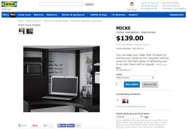
One of their product specifications is the magnetic dry-erase board on the back panel. The feature of that is that you can write on it or use magnets to hold papers, and the benefit of this feature is that you can keep your desk clear of paper clutter. With one sentence, they addressed the benefits, features, and specifications (leading with the benefits).
While the first image is a clear image of the entire unit, the second image clearly displays their unique selling point for this piece.
3. Leverage videos
For years, Internet marketing gurus have been touting the importance of video on a sales page or in a store. Steve Roller, founder of Copywriter Café, says, “Who are the ones shouting loudest that VSL’s (video sales letters) are the greatest thing since sliced bread? The ones selling us seminars on how to write VSL’s. Of course they work for some marketers, and they work for some audiences. Lots of people dislike them. Others love them.”
Video can improve conversions when used properly. However, it’s important to remember that not all site visitors will have access to your videos. Certain video players (like Adobe Flash) aren’t licensed on Apple devices, so Flash video content won’t normally load for users with an iPhone or iPad. Additionally, video requires a fair amount of bandwidth. Depending on your industry and target demographic, the exact number of visitors could be more or less, with increased mobile use among younger consumers.
Best practices for using video on your website include:
- Always include a written transcript or written product description in addition to your video. Many users will not watch your video but want to know what was said.
- Use video like you would use images. For example, show the product clearly with a 360-degree view, or show the product in use.
- Always use split-testing or A/B testing when using videos. Simply put, they work in some niches and not in others.
4. Split Test Everything
Split-testing or A/B testing is where you create different landing pages with minor tweaks to assess the effectiveness of those tweaks in increasing conversions. To use the video example from before, Josh Loopser of Digital Marketer found during split testing that in his niche, the text-only (no video) version of the landing page had a conversion rate almost double than that of the sales letter with video embedded . Internet marketer Jason Fladlien finds that video sales letters increase conversions on products priced about $497, but decrease conversions for products at a lower price point.
The simple truth is that your audience is unique, because your business and products are unique. What works for your competitor may or may not work for you, and the only way to determine what really works is through split-testing.
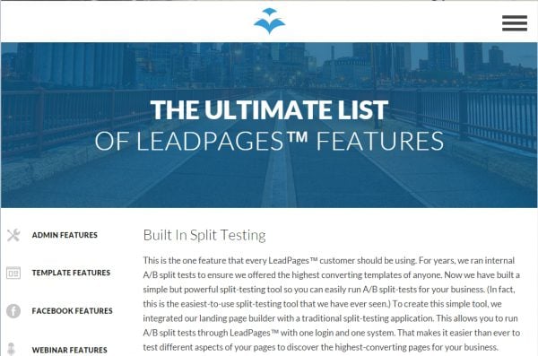
Some tools offer easy A/B testing or split-testing. For example, LeadPages makes it easy to split-test different versions of your landing page and to analyze the difference that a simple tweak can make.
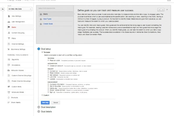
Google Analytics, a free tool, also enables you to set up “Experiments”, which make it easy to see the results of split-testing. In order to accurately determine the outcome of your experiment (your conversions), you’ll first need to set up a goal that Google will help monitor for you. In the Goals section, you can build goals that center around revenue, acquisition, inquiry, or engagement.
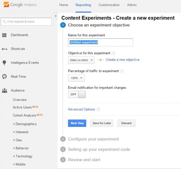
Once you have you goal set up, you can set up an experiment by going to Behavior > Experiments. Here, you can input your landing pages, determine the percentage of traffic sent to each landing page, and specify your goals for the monitoring period.
5. Capture the “Almost” Conversions
A great way to capture your “almost” customers is by paying attention to cart abandonment rates. Cart abandonment means a customer would add items to his or her cart and then simply surf off the website without finalizing the purchase. In some cases this is the result of a design flaw. A website that has outbound links on a sales page may be driving shoppers away. A shopping cart that doesn’t appear secure or isn’t easy to use may be causing shopping cart abandonment.
If design flaws are not to blame, you can use techniques to attempt to reclaim the “almost” customers who abandon their online shopping cart. Business Insider reports that about 63% of online shopping carts are potentially recoverably by retailers . When the customer’s email information has been collected, an email sent a few hours after abandonment have a 40% open rate and 20% click-through rate. For instance, Amazon sends the following email to its customers who abandon their shopping carts.
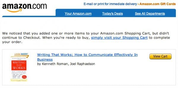
Another technique to recover abandoned sales is ad retargeting. Retargeting (or remarketing) allows the retailer to use PPC ads or Facebook ads to show previous visitors to the site an ad for the site. A visitor views your shopping cart (or your website) and then banner ads or display ads for your site appear on Facebook or on other AdSense websites they visit, reminding that visitor to return to your site to complete their purchase.
Finally, many companies find success with a live chat feature on their website as a way to reduce shopping cart abandonment. Live chat can allow customers to easily ask questions about the product or the purchase, and it can be a great way to help troubleshoot or debug any technical problems the customer may have with the checkout process. Live chat can also be a great way to collect feedback; by analyzing the calls and live chat logs, the company can discover common problems with the site layout, design, or functionality.
Social proof in eCommerce implies that your online store is liked and trusted by real people and influencers, and it’s not just hyped up by clever descriptions from your content department. Social proof is useful for tapping into consumer psychology – when customers see the experiences of other people, they get a cue.
Social proof can come in different forms, but for eCommerce websites, the following are recommended:
- Online reviews and ratings
- Text, image and video testimonials from customers/influencers/celebrities
- Numbers and statistics (10,000 people bought this product last week)
- Trusted by signs/descriptions
This air conditioner from overstock, for example, has a rating sign.

It shows potential buyers that other customers have a solid opinion about this product, so it can become the reason for them to make a purchase.
Note: Social media buttons may make your products appear unpopular. That’s because shoppers may not share product pages. If there’s a low count on Twitter and Facebook buttons on the product pages, it may turn customers away.
The bottom line of any kind of social proof is to create an experience which shows potential buyers that that they’re not the only ones considering the same purchase decision.
7. Simplify guest checkout
eCommerce checkouts come in different forms, but a majority of online stores want customers to sign up before they can proceed with order completion. However, it hinders conversions when customers don’t have time to enter their credentials or just don’t want to sign up. In this scenario, the guest checkout is where the money is at.
Offering guest checkout with few steps as one of the options can reduce cart abandonment. It can even be useful to returning customers who may have forgotten their credentials when returning to your online store after the couple of months. An advanced shopping cart will allow you to offer this option while making sure the guest shopper receives all the requisite information in their inbox and you’re able to record the transaction.
ThinkGeek offers a simple guest checkout process to its customers.
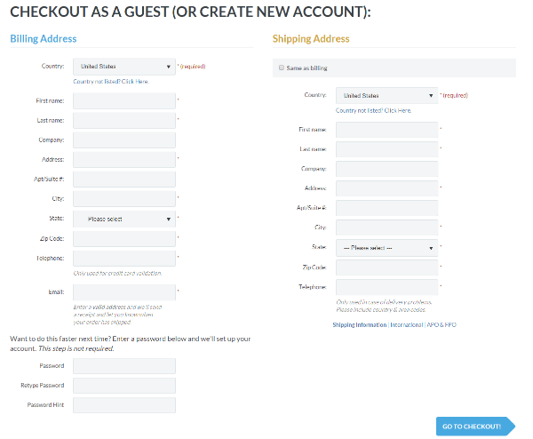
All the details enable the company to update their sale records. The company also provides customers an option to enter a password if they want to setup an account.
8. Combine value with urgency
Research has proven that humans can be irrational in case of loss aversion. Because they can’t stand losing out on offers, urgency combined with value is a powerful tool in your conversion tactic toolbox. You can create both real urgency (when something is limited for example) and implied urgency (buy before the stock runs out for example) to evoke a shopper’s sense of urgency.
There are different options for creating urgency, but the following are the most recommended ones for eCommerce:
- Limited time offers
- Stock scarcity (only 4 pieces left)
- Size scarcity (only 4 left in ‘s’ size)
- Time-bound shipping (purchase before 12 pm to qualify for free shipping)
- Other customers having their eyes on the purchase
It’s important not to go overboard with urgency. You don’t need to execute all tactics with multiple countdowns, as it can be seen as manipulative. Urgency, like most conversion rate optimization tactics, is a subtle art, so moderation is going to be your best way forward.
Booking.com does a great job at creating urgency when its customers are looking at rooms to book.
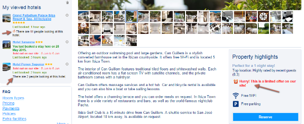
The company shows how many other people are looking at the room, and how many rooms are left.
9. Highlight returns and refunds
When shopping for products online, one of the biggest concerns consumers have is ‘what happens if they don’t like the product?’ or ‘what happens if anything malfunctions after a week?’ By highlighting your returns and refunds policy, you eliminate any ambiguity around such concerns, as customers are reassured that sending an item back will be the worst case scenario.
Returns and refunds can also be an opportunity to convert more customers. Shoppers often return to an eCommerce site to make additional purchases after a positive experience. That means taking care of customers demanding refunds and returns could lead to additional conversions.
Zappos has a great landing page for returns and exchanges.
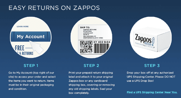
Everything is clear and there’s even a video explaining how customers can complete returns using the company’s self-service model.
10. Upsell and cross-sell
Upselling and cross-selling is when you introduce complementary items to shoppers for products they are considering to purchase. The benefits aren’t limited to the store owner, but extend to the experience of customers as well. You’re effectively making sure that the shopper is selecting the right product, and has everything to use that product efficiently.
Predictive Intent informed that upselling is 20 times more effective than cross-selling when product pages are considered, so you would want to focus on that more. But make sure you focus on customer experience instead of increasing the average order size (upsell items relevant to consumers).
Amazon uses these two tactics effectively.
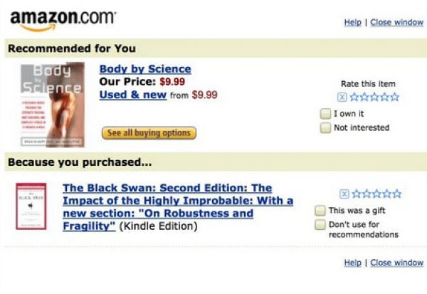
In this example, a customer is recommended a book based on the title he/she purchased previously.
Final thoughts
While this post has only covered 10 measures to increase conversions, you have been given some ideas that you can integrate into your own eCommerce conversion strategy. If you have any other hacks worth sharing, feel free to add them in comments.
Image Credit: 0beron / ShutterStock


To increase sales and conversions on e-Commerce I also use video demonstrations of products, customer service chat, mobile marketing campaigns gradually increased over Christmas and Valentine.
Speaking of A/B Split Testing– perhaps a post on that from a tutorial standpoint might make it onto the Elegant Blog roadmap?
#NotKidding
=:)
Hi and thanks for a good post.
I almost didn’t look at the post because of the word hack but I’m glad I did. (Rightly or wrongly I associate the word hack with tricky and somewhat sneaky.
But I am going to have a good look at the post and possibly share it.
Thanks again
I like your tips on how to improve conversions.
As an Internet Marketer, one has to know that they are dealing with different kind of audiences. For Example, in my authority site, I use both test and images to improve conversions. This will make it accommodate all types of people.
I like the notifications. Thanks.
Hi Dan,
good article and interesting tips for eCommerce
Best wishes
PramaWeb
Great post Dan! I’ve bookmarked this one. Appreciated the breadth and conciseness of what you shared.
Please, I’m begging you, don’t use the word hack! Tips, shortcuts, ideas…anything but hack. When I see or hear that word I start to convulse. Thanks.
The word hack has many meanings associated with it according to the Urban Dictionary.
I like this one because the is what I associate it with:
==============================================
Urban Dictionary
hack:
a clever solution to a tricky problem
to hack is to mod or change something in an extrodinary way
===============================================
These are nowhere near ‘hacks” these are well known strategies to help with sales (cross sell and up sell is as old as the idea of sales has existed)… others are less obvious but have been present in retail for a long time, easy return policies, benefits first sales pitch, others are more tech oriented (use analytics, etc.).
Not a bad article, but the title is a sorry use of the word hack, maybe the author lost a bet or something like that.
Or a clever A/B Split Test Link-bait gambit.
#JustKidding
I agree with Matt, I almost deleted your email without reading the content as soon as I saw the word “hack”
This could be #11 on your tips – Chose your words!
I’m afraid I have to agree with Matt and Bill.
The word hack makes me think Black or Grey Hat techniques and not entirely legal loop-holes.
Also the email notifying me of the post went into my junk mail as the word hack flagged it as spam!