You love your website. We get it. And why wouldn’t you? After all, you have put in hours and hours and sometimes quite a bit of money into bringing it into the world.
As a consequence, any insult hurled into its general direction is taken personally (and the perpetrator called a doo doo head – or worse). How dare they say bad things about your baby!?
However, I hate to break it to you, they might have a point. And in your heart of hearts, you know it, too. For weeks your bounce rate has been climbing, conversions are falling and your reputation dwindling. All the signs point to the need for a change.
Consider this an intervention. To open your eyes to the truth, in this article we will list all the things people hate about your website and that make it hard to use, confusing, badly designed or simply out of date.
Ready to take of the rose-colored glasses and get to work on your website’s flaws? Then let’s go.
-
1
Here’s What Your Visitors Probably Hate About Your Site
- 1.1 1. Your Site is Too Slow
- 1.2 2. It Doesn’t Look Good on Mobile Devices
- 1.3 3. It’s Littered With Popups
- 1.4 4. Your Website is Stuck in The 90s to Early 2000s
- 1.5 5. Two Words: Stock Photos
- 1.6 6. Bad, Overly Optimized or Too Much Copy
- 1.7 7. A Bland “About” Page
- 1.8 8. Your Site Structure is Non-existent
- 1.9 9. Your Titles and Headlines Suck
- 1.10 10. Multimedia on Autoplay? You Gotta Be Kidding!
- 1.11 11. Two-site Syndrome
- 2 What Things Do You Hate on Websites?
Here’s What Your Visitors Probably Hate About Your Site
Still here? Alright, now it’s too late to turn back. Let’s see if your recognize your site in the points below.
1. Your Site is Too Slow
People have never been as impatient as they are today. We want everything and we want it now. Especially on the web. I know you think that once people know how fantastic your site is, they will gladly wait for it to load. But that’s just not true.
47% of customers expect a site to load within two seconds. 40% will leave after three. Yes, one friggin’ second makes that much of a difference. In fact, Amazon found that one second delay in page loading would cost them $1.6 billion per year. That’s right, one second!
As a consequence, slow page loading times are one of the best ways to annoy the heck out of people (especially on mobile). It’s one of the things people most hate about websites. So much so that it will keep them from coming back.
Luckily, there is plenty of things you can do, from changing hosting providers and reducing code to optimizing images and more. Even luckier, we have detailed article on this very topic.
2. It Doesn’t Look Good on Mobile Devices
Having a mobile optimized site is mandatory in today’s Internet. Nobody, and i mean nobody, likes to use the old zoom-and-pan technique to consume your content. Neither do they like hitting the wrong menu items because your buttons are just too darn small.
Is there a quicker way to get people to rage quit your site? Probably not.
However, it’s not just human visitors. Search engines are just as annoyed of websites that fail to deliver adequate mobile experience. In fact, Google goes so far as not even show websites in their mobile search results that they deem unfit to use with phones and tablet.
So, your existing users will quit your site while Google will stop sending you new ones. Sounds like a lose-lose situation to me. Time to stop being annoying and fix it already. This article will help you do so.
(By the way, a good step in the right direction is to use a mobile-optimized theme. Divi is one such example.)
3. It’s Littered With Popups
Popups can be a very effective too for building an email list, if used the right way. However, if not, they also have the potential to be the bane of your user’s existence and send your bounce rate soaring.
Nobody wants to close a welcome mat, normal popup, and a slide-in form just to get to the content. If that is you, no wonder people are disgruntled with your site.
Keep in mind that there are other websites out there that don’t do the equivalent of yelling at their visitors. Plus, the back button is just a click away in every browser.
I’m not saying don’t use any popups (you want to build an email list after all), I’m just saying be smart about it.
Take advantage of technology to stop showing returning visitors the same ads (especially if they have opted out before). Use exit intent to serve popups only when they are about to leave or at least give them a time delay. Or run A/B tests to find out which of your calls to action are actually effective and double down on that. Your visitors will thank you. These popular popup plugins have these tools so you can create good popups and not spammy ones.
4. Your Website is Stuck in The 90s to Early 2000s
Look at the image below and tell me what’s wrong with it:
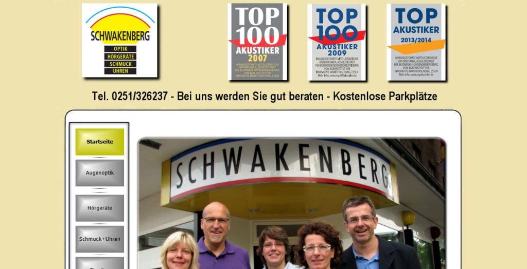
Hopefully you can see it right away. The site looks like the person who built it learned web design on MySpace in 2004. Nice blast from the Internet archive, right?
However, don’t be the fooled. That is a website advertising an actual company and its services today! Of course, that is an extreme example and I don’t think your site looks like this. However, if it contains some of the design hallmarks of that same era, it’s time to rethink if you are not sending visitors away screaming.
Blinking GIFs, elaborate animations, flashing ads and other eyesores – just say no. They are distracting, annoying and in most cases not furthering your goal. If your site fits this description, you have found the explanation for the hate mail your receive.
5. Two Words: Stock Photos
Do you know this woman?

Image by Ariwasabi / shutterstock.com.
I see her literally everywhere. My wife and I actually have a running gag to point her out whenever we spot her. I have noticed her advertising everything from gyms to dentists to opticians.
That’s what happens when everyone uses the same stock images. Businesses (and websites) become indistinguishable from one another. A death sentence in marketing.
Plus, many of these images are cheesy, generic, non-genuine-looking and other unflattering adjectives.

Yeah, none of us actually work here. Image by Pressmaster / shutterstock.com.
Of course, you should use images in your content. And there are are exceptions (for example these).
However, stay away from stuff like above. It makes your company or website look as generic as the images.
A much better idea is to use unique images or stuff people can’t find elsewhere. For example, the Art of Manliness blog uses old vintage photos. Custom illustrations are another option. If that is not your thing, at least try to use real photos of your employees or clients.
6. Bad, Overly Optimized or Too Much Copy
Depending on how old you are, you might still remember the bad old times of SEO. Back in the day, when the motto was “the more keywords, the better”.
You would find pages with the same key phrases squeezed into every possible nook and cranny. Or copy that sounded as repetitive as the jokes in bad sitcoms.
Thankfully, search engines have caught on and punish people for said behavior. Yet, unfortunately, not everyone else has.
If you are one of those who still engage in keyword stuffing, it’s time to cut it out and get with the times. Read up some SEO copywriting tips, learn how to write in a way that is engaging and creates a connection instead of using marketing speak. And exchange your long prose with some multimedia! People only read 28% of your text anyway.
7. A Bland “About” Page
Especially if you are running a personal blog, the about page is usually one of the most frequented pages of a website. Visitors care about the person behind the writing and want to learn more about them.
However, this also contains the chance for failure. An impersonal about page filled with industry drivel that says nothing with a lot of words, makes no emotional impact and puts people’s brains to sleep can quickly become one of the things people hate about your website.
To avoid this scenario, focus on language that people actually use, tell a story, connect. Also, make sure everything is up to date, including your contact information.
8. Your Site Structure is Non-existent
Little is as annoying as a badly structured website. People come to your website to accomplish a goal, not wander around like a labyrinth (unless they are minotaurs, who are pretty Internet averse).
Two of the most important factors for site structure are site navigation and internal linking. Get one of them or both of them wrong and your visitor’s annoyance level will show a sudden spike.
Consequently, when it comes to navigation, make sure you first map out the route you want your visitors to take. Only then can you create a proper way for them. After that, give them directions via headlines, copywriting, calls to action and a clearly labeled (and not overstuffed) navigation.
As for internal links, make sure to link between pages on your site that are topically related. The point is always to enhance the experience of the visitor, not run a smart SEO scheme. In the same vein, don’t overdo the anchor text!
And for heaven’s sake, check your site for broken links!
9. Your Titles and Headlines Suck
Titles, especially blog titles are an important part of copywriting. They are usually the thing that pulls people in – or pushes them away.
Page titles also create expectations. That’s a good thing if you can fulfill them, however, an equally bad one if you don’t.
Imagine you had read the headline to this post, expecting for the author to tear you into you about your website flaws and all I’d end up doing is mollycoddle you. That would be a shame, wouldn’t it?
The point is, don’t do the old bait-and-switch and stay away from clickbait practices. It will only annoy people and send them the other way.
For tips on how to craft compelling titles and headlines, check this article.
10. Multimedia on Autoplay? You Gotta Be Kidding!
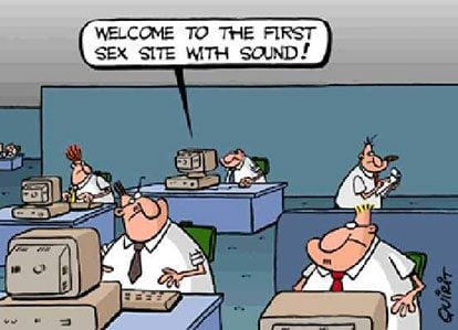
Who hasn’t had the experience of opening a bunch of tabs and suddenly having one of them play an unsolicited video or sound file in the background? And who here thought that was a good thing? Nobody. Especially in office environment without headphones.
If your site does that, keep in mind that closing a tab is much faster than looking for the mute or stop button on your video. Whoops, there goes another visitor, never to return.
If you do have videos on your site (and there are good reasons to do so), make sure they are voluntary to play, not mandatory. Or, at least take a page out of Facebook’s playbook and play them on mute.
11. Two-site Syndrome
Even if you don’t know the term, chances are you have experienced two-site syndrome before. It’s when a company’s information website and ecommerce area are built with two different platforms.
For example, when you find yourself on a shop built with Shopify that takes you to a WordPress.com site when clicking on the blog button. It totally disrupts user experience and looks plain unprofessional. Say goodbye to your conversion rates!
The good thing is, with WordPress there is absolutely reason for the divide. WooCommerce and other ecommerce plugins integrate seamlessly into the platform so you can have everything in one place.
What Things Do You Hate on Websites?
As parents of our web presences, we idealize them. We think they can do no wrong and there’s never been a better website out there.
For that reason, it’s often hard to fathom that others have a different opinion. Yet, your analytics might indicate just that.
The points above are frequent things people hate about your website and websites in general. If you recognize yourself in those points, for the sake of all of us, take some remedial action.
You will find that, even if your site changes a bit, you will still love it. Only this time others will share the sentiment.
What are things you hate about websites? Let us know in the comments section below!
Article thumbnail image by Kit8.net / shutterstock.com.



I’m gonna knock this out of the park because I’ve been to sites that do exactly what I will tell you. You go to a slow loading site and as it loads about a million pictures, a random pop up will scroll along, or as you scroll down reading the content, another pop-up. Sites that requires you to sign up just to see the content you just saw for only a second. This is infinitely worse if you decide to visit an adult site and get several warnings about your phone being slow or infected with a virus and you press the back button a million times to get out. Bonus points if it’s an ad saying you’ve won an iPhone.
It drives me crazy when filling out forms that I have to click in the state box, scroll down to my state and then click on it.v what a waste of time
My number one pet hate on websites is FLASH. But pop-up ads and opt-in boxes showing up before I’ve even had a chance to READ the page are a close second.
A ‘sign up’ in pop-up esp. when reading an article and a cookie reminder.
Yeah, those are annoying as well. Thanks for the comment!
I personally don’t really care about milliseconds of site loading. I can wait even 10 seconds with browsing a previous website. What I really hate is:
1 – a tons of bad written JavaScript which kills a smoothness of scrolling, switching, browsing etc. Or even freezing a tab.
2 – a tons of CSS/HTML which dramatically decrease a page re-render performance in case of JS from point #1
3 – a vary kind of marketing shit like a modal windows with subscription forms, free staff offers, push notification offers etc.
Thanks for the additions, Markus!
1.1 – especially on mobile phones with their weak processors, so a web browsing becomes a real nightmare.
I hate auto play videos, and most sites uses this annoying this.
There must by a way to block them
I agree!
Seems I will have lots of consultation to do in the coming weeks. My no no is the pop up without knowing a nada form the site, thank to Bloom smart features.
Others are video auto play
Video ads making site to crawl like a snail
Slide in video ads from Jupiter
white text (or text not lucid) on banner hero image without overlay
Non mobile responsive in large monitors, desktop, laptop, tabs and mobile phone.
Bland color looking site without rgba color palette
Lots of image/icon animations especially gifs dancing calypso from the header
Site with small fonts that makes you want to wear your specs
Site that want to capture the whole shape to be seen by visitors in the show of we can design…lolz
The rest have been given above by Andre Legris…
Thanks for the additions, bb!
Slideshows that should actually be one-page articles are nothing but a trick to create more ad space, but the worst are slideshows with ads directly beneath them that include the words “Read More.” Seriously corrupt.
Absolutely, Melinda! Slideshows are one of the quickest ways to send me away.
I really likes this post as I am starting to design websites and am using checklists to help keep things better organized. So I took all of your comments plus the advice in the article and condensed them into this simple checklist. Please feel free to add anything else you feel should be on this list.
• Site must load quickly.
• Ensure that the site looks good on all three screen formats (desktop, tablet, mobile)
• Avoid pop-ups (at least until the user clicks to leave the site).
• Utilize a clean, modern design for the site.
• Avoid sliders and/or carousels that are distracting or have no relevance to the site’s purpose.
• Keep the page design consistent throughout the site (page structure, colors and fonts).
• Use easy to read fonts and colors that translate to all screen sizes
• Avoid overuse of stock photos; try to use unique images
• Make sure the copy is well written and easy for the user to read.
• Make the About page personal and interesting.
• Give the site enough structure to make it easy for the user but with enough flexibility they can browse wherever they choose.
• Ensure that all internal and external links work.
• All titles and headlines must be interesting
• Autoplay (audio or video) is evil.
• Keep your work on a single platform, regardless of what your site entails (eg., don’t sent users to a different site).
• Avoid push notifications (except for subscription sites).
• Keep pop-up animations to a minimum, if at all.
• Don’t ask for personal info unless the site content requires it (eg., brick and mortar retail website).
• Don’t use hamburger menus on large-format screens (desktops).
• Make the search fields look like search fields.
• Allow user interaction when the user desires it, such as a feedback or comment section.
• Absolutely no pop-ups that condescend to the user (eg., guilt-trip links).
• Practice honesty on e-commerce sites.
• Never use elements that make the user wait until they can view a website, such as video ads.
• Never use pop-up windows in which the ‘X’ button is also the link to open a new tab.
• Never design a site which requires the user to change their browser settings before being able to view the site (i.e., disabling the pop-up blocker)
• Do not place distracting ads in the middle of a page of text.
• The Contact page must have a human at the other end.
This is awesome, Andre! Thanks a lot! Good luck with your business. Let me know if I can help.
A to slow website, is anoying me the most
I find that annoying as well. Thanks for the comment!
Pop-ups, especially ones that don’t disappear when you click elsewhere in the page.
Meaningless descriptions for businesses in pointless sliders “Assisting integrated solutions” “Holistically incentivised approach”. Total drivel.
Autoplay is definitely on the list too.
Thanks for the comment, Roger!
Unwanted ads are really disturbing for everyone. User experience goes worse when those ads come up one after one automatically in separate browser windows.
A slow site is another thing most of us do not like. Even a blank, broken page without any custom design disappoints its users and even can damage site’s organic performance.
I completely agree with you, Soumya.
What I hate most is the constant popup promos for other tv programs while whatching a tv program. Same with websites…..popups, autoplay, sliders…..some of which call on expternal js scripts….slow things dowm. I’m now going for the KISS methods – keep it simply simple. (I think Stupid is degrading).
I also find that annoying, Frank. Good advice.
Not having a contact page, or any contact options(phone, email, anything) to someone responsible to the website or service.
Yes, that is a pet peeve of many.
No “retun to top” enabled on mobile view (even helpful on desktop). So thankful divi added this a few years back!
Good point, Dave!
“Please disable your ad blocker and click to continue” – that’s what I hate! =)
Haha, I understand that. I actually did it for one site where I thought it was worth it. And their ads were very unobtrusive.
Well said, making my new site and will follow these rules accordingly.
Cool, let us know how it turns out!
My big annoyance is the slider that has no purpose other than to serve up a handful of stock photos with titles like “Professional” and “Integrity”.
I’m with you all the way, Hugh.
Autoplay audio is the worst. Which is why it is surprising that major websites, like USA Today, and even Google’s results page are now using it.
Not a big fan of that either. Thanks, Joel!
(1) Being forced to watch an ad first before I can view a website.
(2) Adding to the annoyance of videos turning on automatically is the latest lamebrained idea of the video being pushed down to the sidebar so you can’t avoid the video by scrolling down anymore.
(3) Including “trick” ads where the ad opens up to the ad’s full website when you hit the “X” button when trying to get rid of it.
(4) Ads in the middle of a blog post.
(5) The worst sin: A company or organization thinking that they can skip having a website altogether and can get away with only having a Facebook page. WTH!
I’m with you on all points, Sharon.
I agree with most of Joe C’s comments. What bugs me the most, though, is the (I guess they’re called carousels) videos that start moving and jumping right away and you can’t stop them.
And pop-ups that come up before you’ve had a chance to see the first page.
These things are distractions and I can only imagine that designers often fall for the latest fad. Just because you can, doesn’t mean you should.
Thanks for the input, Marla. And I agree, not all trends are worth jumping on.
22. Sites promoting a single product which force you to add the product to the Shopping Cart and go to the Checkout before you can discover how much it costs. (It’s as if they know how hideously overpriced it is.)
Thanks for the comment, Paul! I have never encountered this but it sounds awful.
I love blue type on black background, or gray text on white. Looks wonderful on the very high end, calibrated monitors that a graphics person would use – looks terrible or unreadable on the monitors pure mortals buy from Best Buy. “No, really – I do want to work real hard to read what you have to say.” .. click.
Thanks for adding that, Leon.
21. Comment sections that disallow editing comments… (AHEM…)
Haha, thanks Joe.
11. Carousels (aka sliders) – http://www.ShouldIUseACarousel.com.
12. Unlabled hamburger menus on mobile sites. (Just adding “MENU” below drives up usability).
13. Use of hamburger menus on desktop/widescreen sites.
14. Inline form fields (label in the field).
15. Search icons with no apparent search field (e.g. hide the field until clicked). Show the user the darned box.
16. Overuse of fonts (e.g. too many typefaces).
17. Beautiful sites that are hard to use.
18. Church / religious organization websites that feature an image of their building instead of their people, audience, or other relevant feature image.
19. Offer to provide site feedback moments after landing on the page (instead of a little later – or as an anytime option).
20. Guilt-trip links: “No thanks, I don’t want to save money” or “I’m not interested in having a better life.” etc.
Haha, sounds like you have been keeping a long list of grievances. Thanks for the additions!
#19 – super common right now and driving me crazy!
#20!!!! If the website had me thinking they were genuine until then, they lose me after that.
I don’t like when sites ask if they can access my location when there is no reason for it. Also, when I can’t read an article because the site keeps bouncing up and down with ads loading and disappearing.
I’m also noticing that more and more lately. I don’t think I have ever clicked yes, except for Google Maps.
Don’t you hate that, Donna? I will not even try to load anything from Godvine because they have SO many ads running that I can’t even load the actual article or video.
Stock photos of happy people in offices make my day. Not in a good way, mind you, but I do giggle when I see them because it’s like…why? Who thought that was a good decision?
They are sooooo classic though…
It is like the group of workers you wish you could work with, but you never get to do.
Good article. This is the reverse engineering of good design. Know what doesn’t work and then implement the opposite. When the user has a good experience that’s when the design works.
I think this is a great conversation to have. Thanks for verifying the annoying popups, automatic videos, push notifications, dancing moving objects, seriously annoying. Exactly the opposite of what we should be doing as designers.
Happy you like the article, Joan! And I agree, sometimes good design is as simple as leaving out the obviously annoying stuff.
Loved your post! Very informative and I’ve learned some good points. One thing though, is it just me or did somebody leave out the word “no” just before the phrase “reason for the divide” in item number eleven?
Thanks for pointing that out, Leland. I’ll have it fixed.
for me, autoplay vidoe and doubleclick ads are most annoying features on site.
I’m with you on that, Jay.
Pop-up on screen exit that set the html and/or body to overflow:hidden. I have 2 monitors and e-mails coming in all the time. Just because my mouse leaves the browser doesn’t mean I’m leaving the site…
I’ve actually set my ad-blocking browser extensions to remove/block pop-ups and all they entitle for sites I frequently visit, so all I need to do is click a bookmarklet to recover scrolling functionality there. Other sites… I leave and don’t come back.
Interesting thought, Roland. I’m usually a big fan of exit intent, but I have never considered it when using several screens. Cheers!
Which better for reader and SEO, between a site (wp) with using any animations or none?
Doesn’t matter as long as you don’t overdo it, or they aren’t annoying or too attention seeking and repetitive
I don’t like text blocks wider than 500px and the lack of design consistency.
I was very amused to see that this comment was over 500px wide. 😀
I’m willing to forgive most things I notice on websites, but annoying ads and popups are unforgivable. I will leave a site and never come back if my attention is taken away from the content without a really good reason (i.e. like a cookie/privacy notice).
More commonly now I’m seeing sites who want to push notifications to me, so my browser will ask with a pop-up… just as annoying as ads!
Looks like you hit a nerve, Eric. Thanks for the comment!
Nicely said, Eric. Now, let me rub some salt into that wound:
Popups and such on mobile (or responsive) sites. They’re the worst. That X is hard to hit on mobile. Hit it wrong and you’re whisked away from the page. Additionally, you might have to resize the screen just to get to the X.
I once complained to an author on a very significant, highly-respected site about popups making the site unusable on mobile. The author complained to the publisher and son of a gun, it worked — They removed the offending popups. For awhile at least. They came back. Not as offensive, but they came back. Oh well, on to competitor’s sites.
Man you guys are hitting on a sensitive nerve. I too hate annoying popups. Passionately. Period.
The ones where they give you too options to either accept their “good” advice or reject and suffer is too much. I usually quickly look for the “x” and get out of there as fast as I can. The worst is that they only give two option. I am like, “And those are the only options? Like should I suggest some other?” Grrr!
But anyway great article Nick. The only thing that I would disagree with you on is the two site syndrome. I get your point and it is a good point. But I have a site set up for a client in that way. The reason is functional. I tried to get the design close. I am not totally done yet but I hope to make transition seamless where the client does not even know that he/she is switching back and forth.
Now I gave my opinion there. Am I missing something?
Well said, Eric. I totally agree. I absolutely HATE the sites that have a pop-up as soon as you click on the article. How do I know if I want to subscribe if I haven’t even had a chance to read their content? Yesterday I had a site that loaded TWO pop-ups immediately. I clicked out of that site and didn’t return.
That’s the biggie right there!
I agree with you. I’ll never subscribe to websites like this.